
40 Best SaaS Websites To Gain Inspiration From in 2026


The SaaS industry is thriving like never before. The global SaaS market was estimated to reach approximately $300 billion in 2026, and organisations are expected to reach $793 billion by 2029 and $1.25 trillion by 2034. Numbers like these don't just show growth — they hint at the sheer flood of new platforms and products arriving every year.
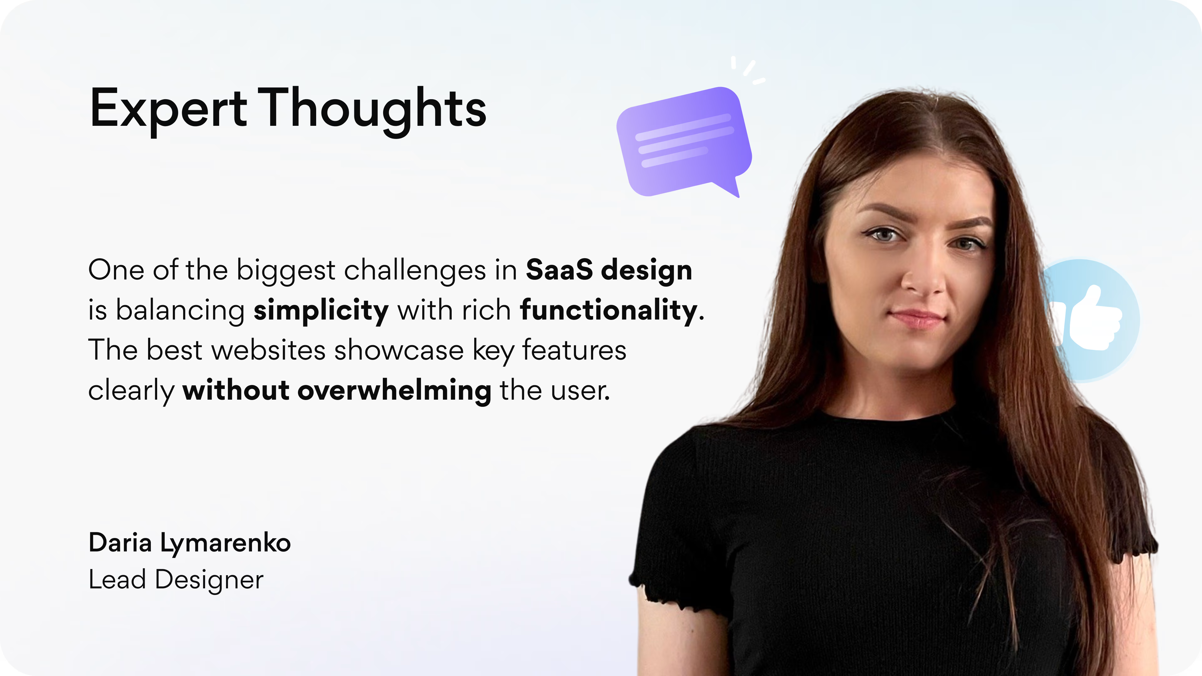
For SaaS companies, the website is typically the deciding factor. An effective SaaS website can communicate value immediately, instill trust, and direct you to conversion opportunities. However, what does an effective SaaS site look like in 2026? Clean navigation? Visually appealing? Clear pricing flows? The answer is yes to all of these and more.
At Arounda, our experts tackle SaaS design problems day to day, working across industries ranging from AI and Web3 to fintech and healthcare. Arounda team has compiled our experience and research into this guide and has identified 40 of the best SaaS website examples for you to reference in 2026.
Article Key Takeaways
In this guide, we've compiled a list of 40 of the best SaaS websites to motivate you in 2026. Whether you're looking for inspiration in AI, Web3 & Crypto, Fintech, or Healthcare, you'll find examples from well-known companies across the world, such as Jasper, Solana, Stripe, and Headspace (alongside a number of platforms we've designed and developed at Arounda).
Every example shows how fantastic hero sections, product storytelling, pricing flows, feature pages, and onboarding experiences work together to establish trust and build conversions. To make it more tangible, we have also provided an inventory of the key pages B2B SaaS websites must have, from pricing to documentation.
40 Best SaaS Website Designs
To illustrate what the best SaaS designs look like in practice, we pulled together 40 standout websites across AI, Web3 & Crypto, Fintech, and Healthcare. Each example demonstrates how good design decisions can help companies articulate their product clearly, inspire confidence, and move their users towards conversion.
Check them out and see what inspiration you can take for your own product.
Top SaaS Website Designs for AI Companies
AI often deals with inherently complex ideas, machine learning models, automation, data-driven insights, etc., so the information on its website must help to distill that complexity down into clarity. The best SaaS websites design uses bold headlines, simple visuals, and engaging interactive demos to help establish the technology as accessible and trustworthy. Better AI designs also showcase transparency, security, and actual use cases to help laugh in the face of skepticism and build confidence.
Arounda suggests:
- Lead with a clear, non-technical value proposition.
- Show interactive demos or product previews early on.
- Use real-world use cases to connect features with benefits.
- Highlight trust signals: certifications, client logos, or performance metrics.
- Keep navigation minimal, guiding users straight to sign-up or demo.
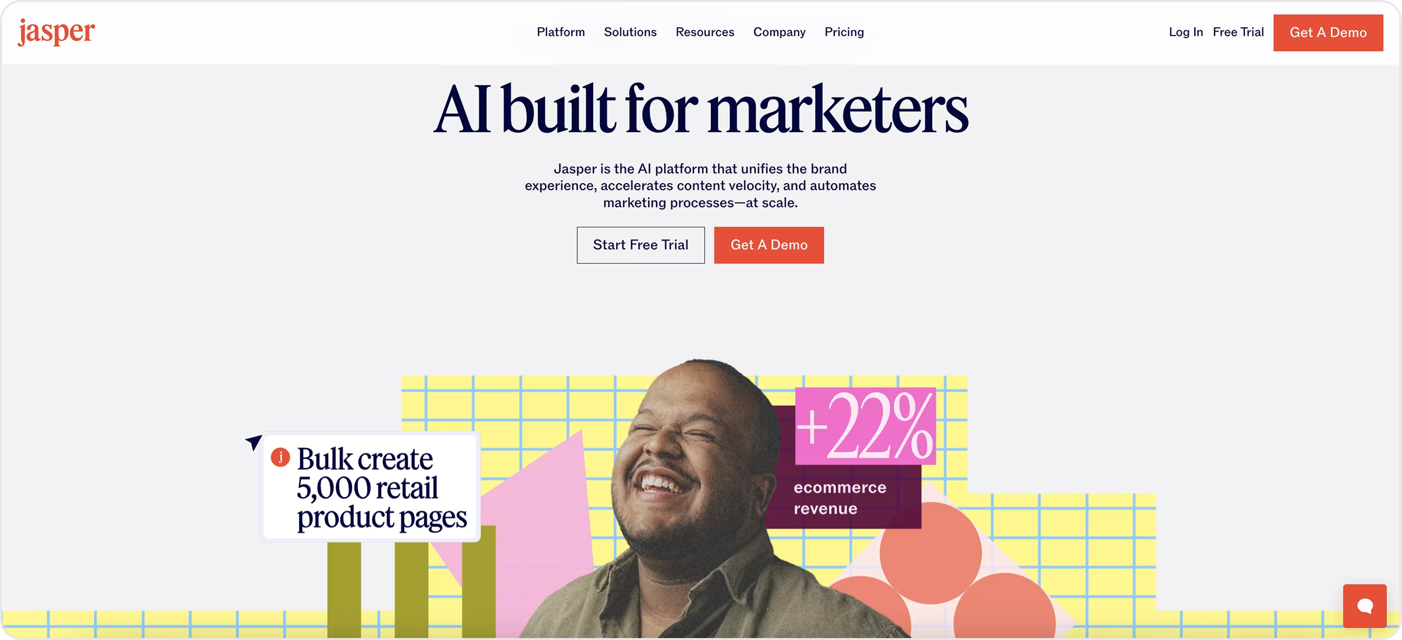
Jasper
Jasper's website cuts right to the chase:
- The headline "AI built for marketers" tells you who it is for.
- The two call-to-action buttons provoke you to act immediately.
- The use of energetic graphics, a smiling face, and a bold number like "+22% ecommerce revenue" brings life and trust to the page.
Some of the backdrop visuals may be distracting, and the subtext could be easier to read, but overall it's a clever design that shows how to keep an AI product simple and convincing.
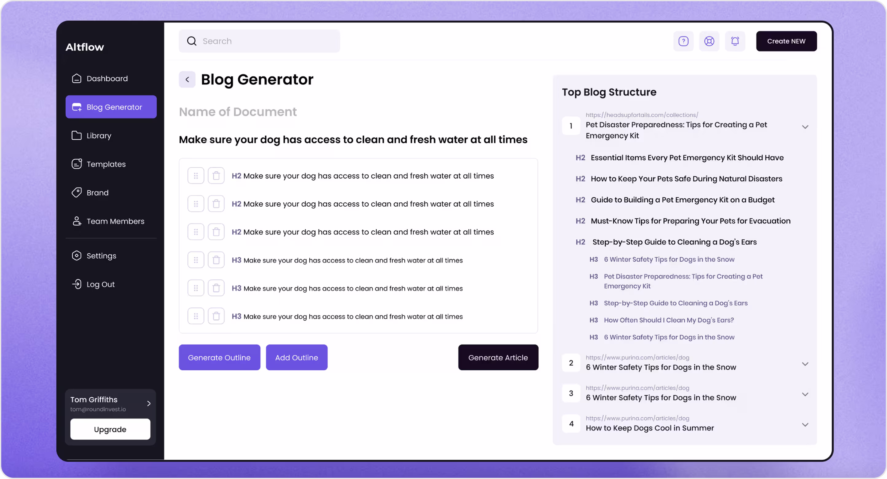
Altflow
Altflow is an AI tool for generating SEO-friendly articles. This was one of our web design projects, and the objective was greater than just building a clean design.
- We defined the product structure from scratch.
- Created a website that was user-friendly.
- Positioned Altflow in a crowded SaaS space.
The design focuses on navigational simplicity, seamless workflows, and easy access to SEO insights. Our result is a simple-to-use yet powerful interface that's easy to navigate, provides instant SEO insights, and facilitates article creation.
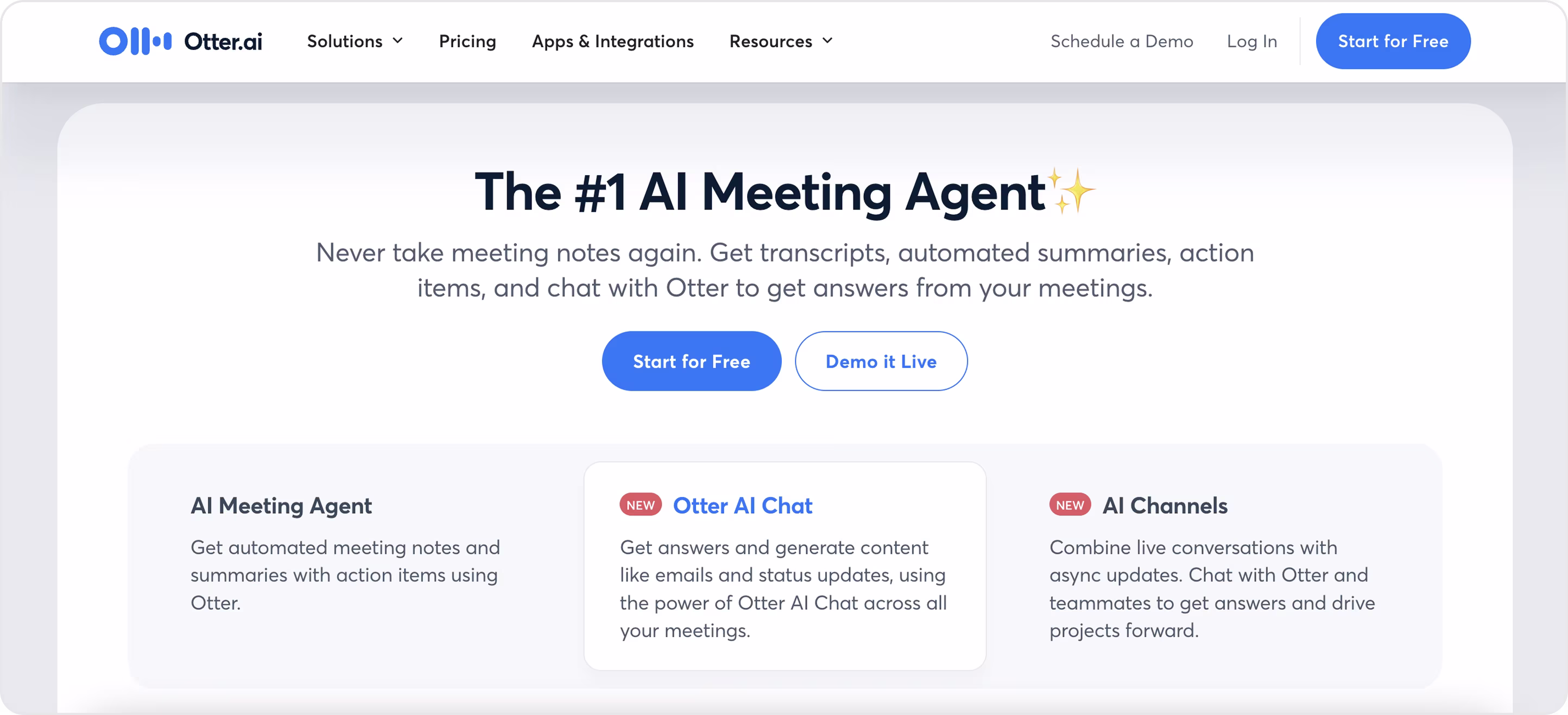
Otter AI
Otter.ai's website effectively places a lot of care on a snappy headline, a clear value proposition, and attractive CTAs.
- Its design is clean with a straightforward layout highlighting the promise of easy meetings.
- The use of simple typography and soft background colors creates a professional, yet approachable experience.
The only downside is that the supporting text seems a bit dense, and a stronger visual hierarchy would enhance scanning. But either way, Otter.ai is easily one of the best SaaS websites because it shows how clarity and simplicity generate trust quickly while increasing conversions!
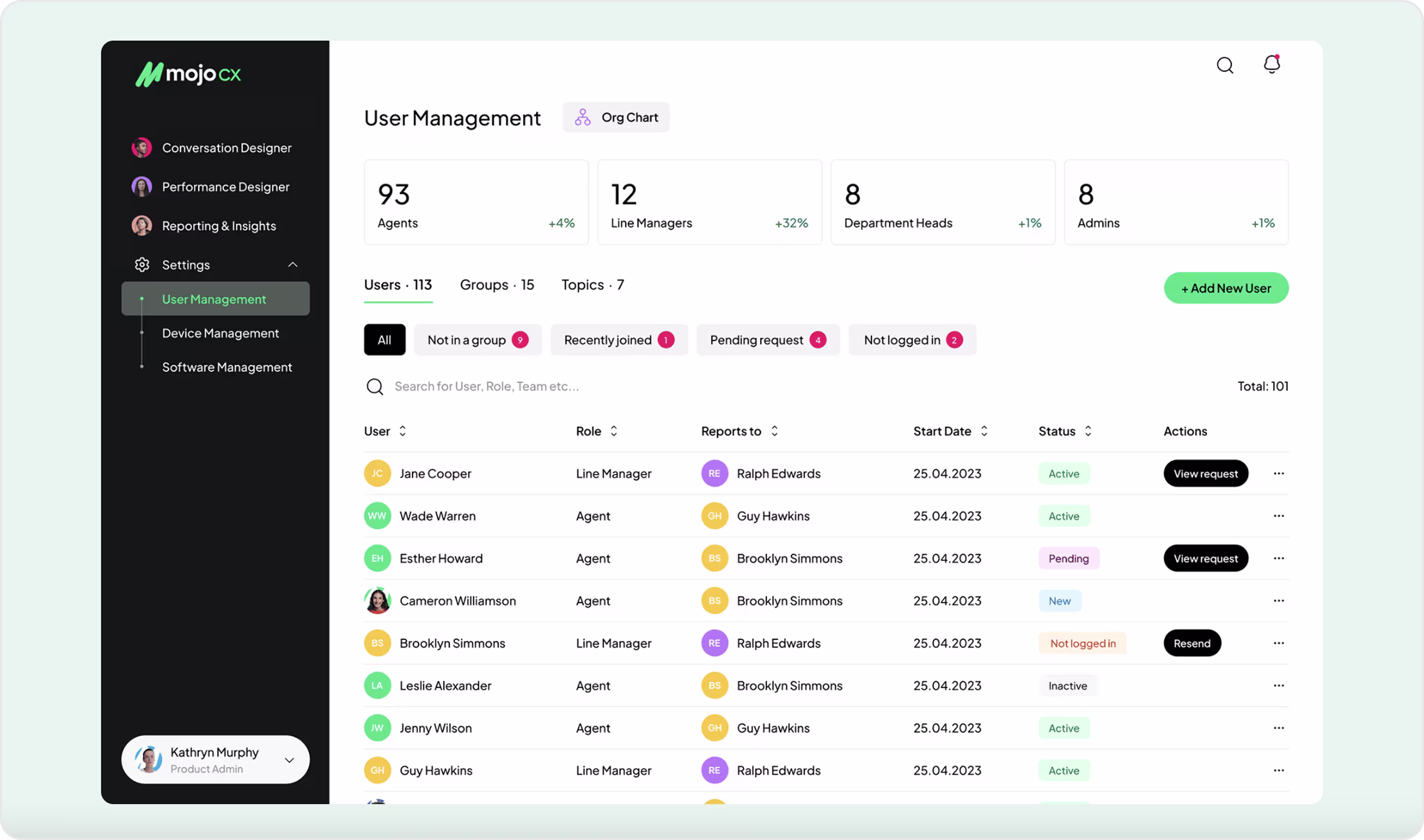
Mojo.CX
Mojo.CX is a platform designed to help contact-center teams perform better by providing real-time coaching and insights. Mojo came to us to merge three different products into one system and create a simple user flow. We redesigned the platform from the ground up, simplified workflows, and created a unified UI and UX for agents and managers.
- The platform now has an integrated experience where all the conversation tools, performance dashboards, reporting tools, and other features work harmoniously together.
- Agents benefit from a simple workspace with all of their tools in one spot, while managers enjoy clear dashboards and KPI tracking.
Mojo raised a $1.5M investment after our work, which is a real testament to how meaningful design and redesign can provide demonstrable business progress.
OpenAI
The OpenAI website demonstrates the effectiveness and power of minimalism:
- The site has little more than a clean search bar with a simple question, “What can I help with?”, placing the product right in the center of the experience.
- Navigation is simple and unobtrusive on the side, while a lot of white space lets you narrow your focus.
This is a great example of an AI SaaS platform using design to exemplify simplicity, confidence, and real value that goes directly to the user.

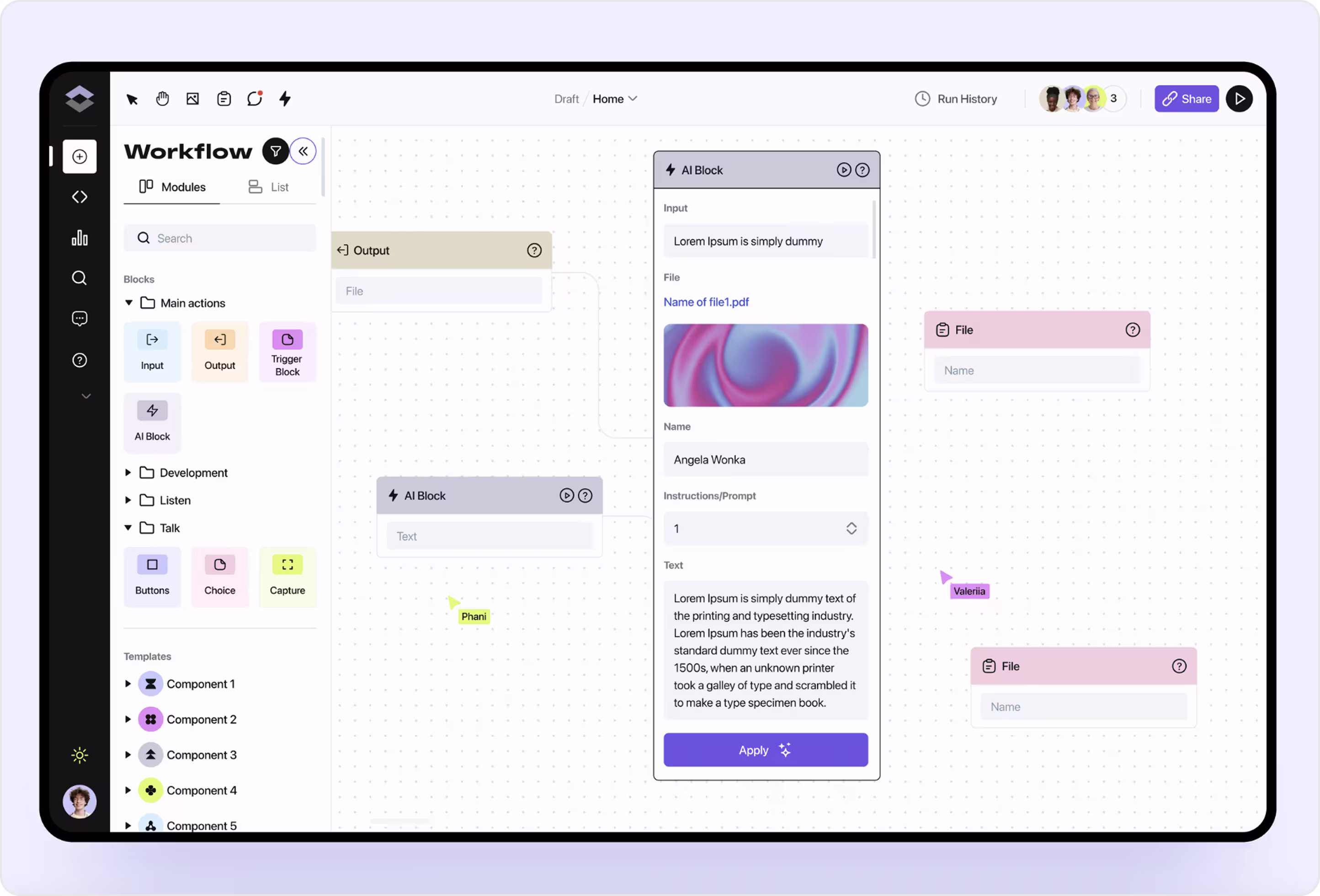
Flair
Flair is a B2B SaaS solution for AI-powered workflow automation. This is one of our cases, where we delivered a new product interface from the ground up. We were given a clear goal: display complex automation in a way that feels simple and natural for any user.
Here’s what we’ve achieved:
- A workflow builder with drag-and-drop blocks, easy-to-understand categories, and simple teamwork features.
- The builder design makes advanced processes less confusing and more convenient in everyday use.
- Different users with various roles can quickly comprehend the system and perform tasks without additional effort.
Now, Flair has a clean-looking product that works smoothly and is ready to grow with their business. This case shows that the right web design can convert a cumbersome idea into an actual SaaS tool that people want to use.
Do you have an AI product that solves real-world problems but feels so complicated to users? At Arounda, we provide UI/UX design services to transform AI tools from complex and difficult to use to simple, clear, and intuitive enough to scale. We know how to design SaaS websites that take advanced technology and give your customers an experience that they actually enjoy.
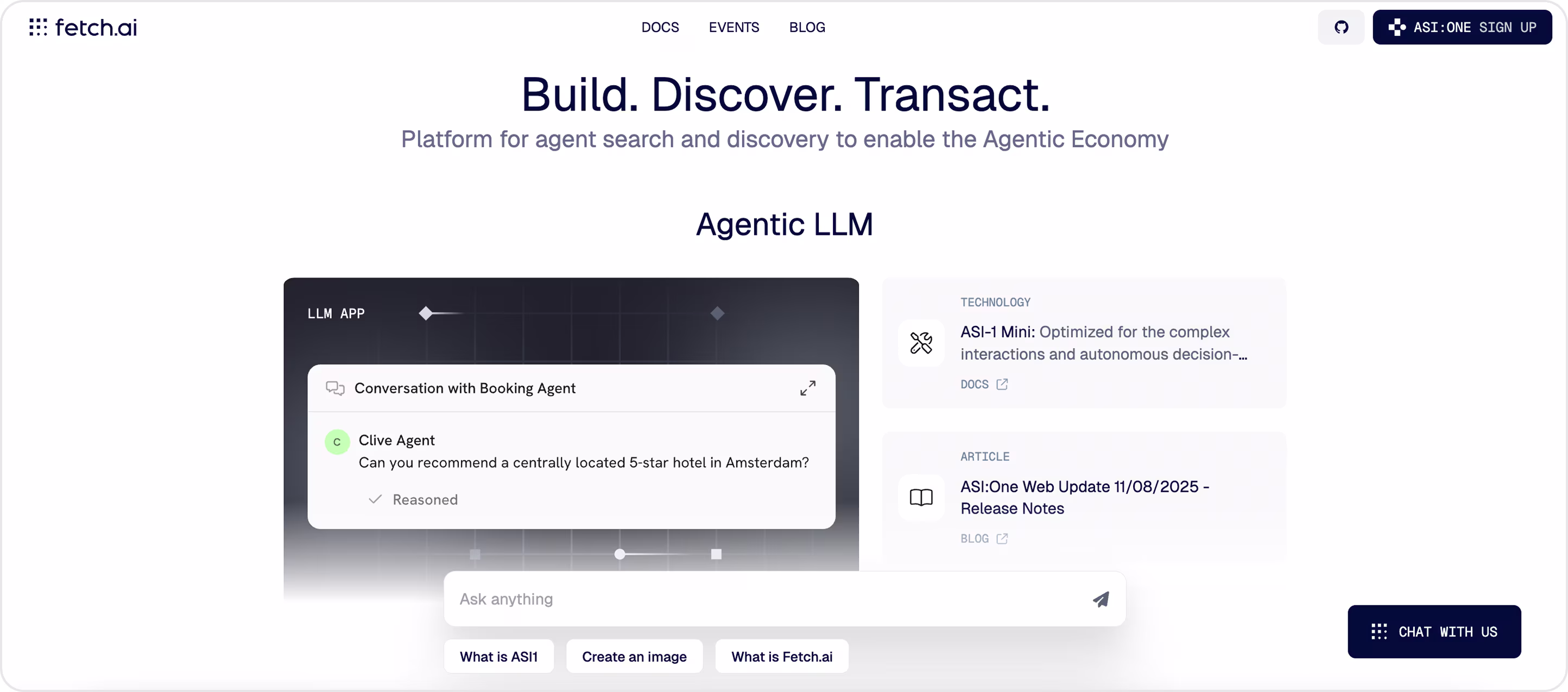
Fetch AI
Fetch AI is a SaaS platform for building and discovering autonomous agents.
The platform’s design showcases:
- Clean layout.
- Strong opening headline.
- Strategic use of interactive prompts allows complex ideas to seem less overwhelming.
By highlighting practical use cases in a simple way, the site reduces complex AI into something the user can immediately relate to. It's one of the best SaaS websites to refer to if you want to see how design can convey innovation through simplicity.
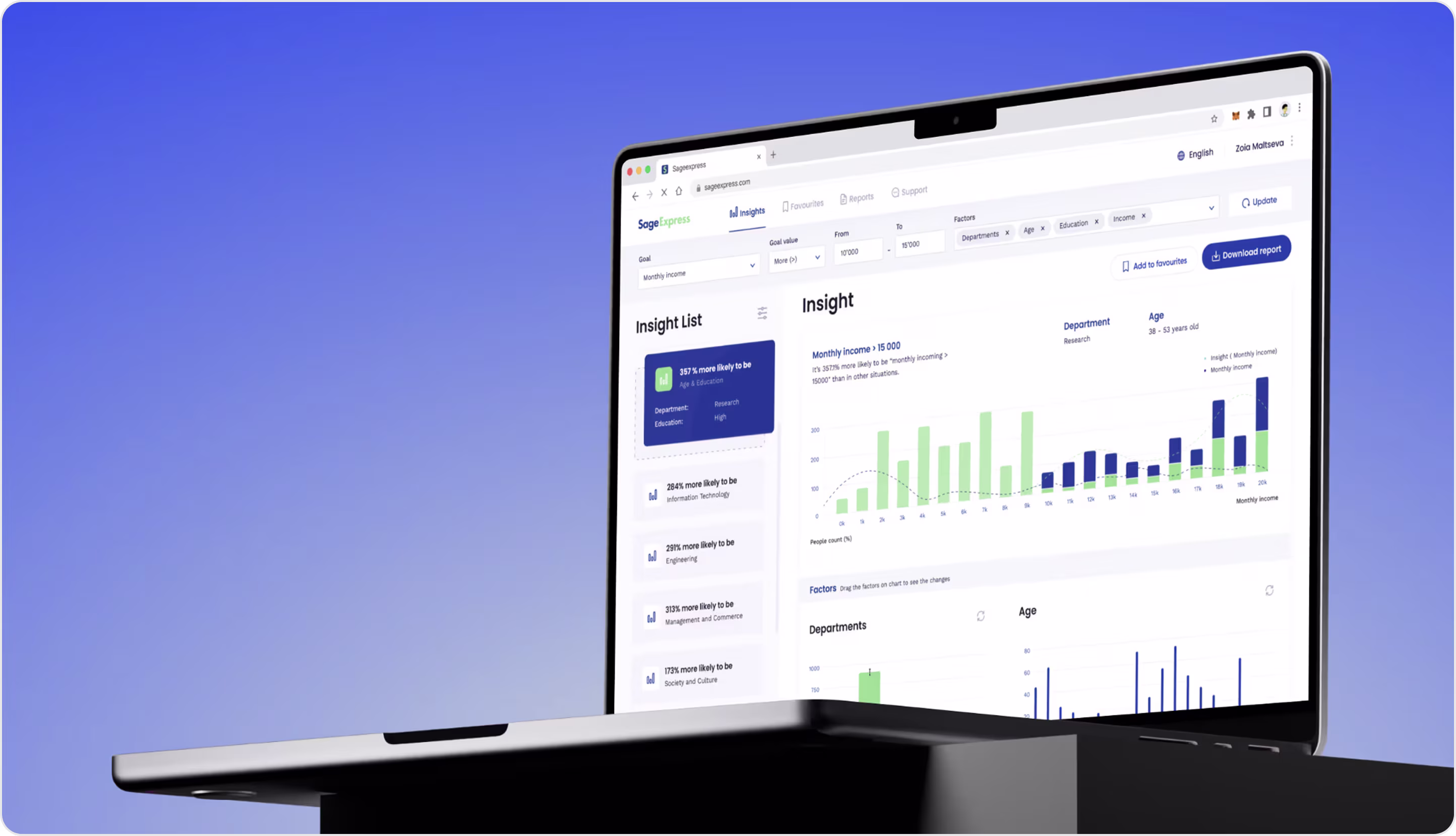
SageExpress
SageExpress is a SaaS platform that helps companies convert data into meaningful business insights. When SageExpress came to us, they were looking for a full redesign, so we simplified a complex product to illustrate the business impact of data. Our team was responsible for the website design, with an emphasis on clarity of function and strong visualization in an intuitive flow.
Our goal was to create an outstanding design with:
- An uncluttered interface with dashboards and charts.
- Data curated with intuitive filters, making it easy to digest.
The end result is an application that is both professional and simple, and provides users with actionable insights in a few clicks. The results of the redesign made SageExpress a stronger force in the market, and helped it raise a whopping $700M in funding — all a demonstration of how smart design drives business growth.
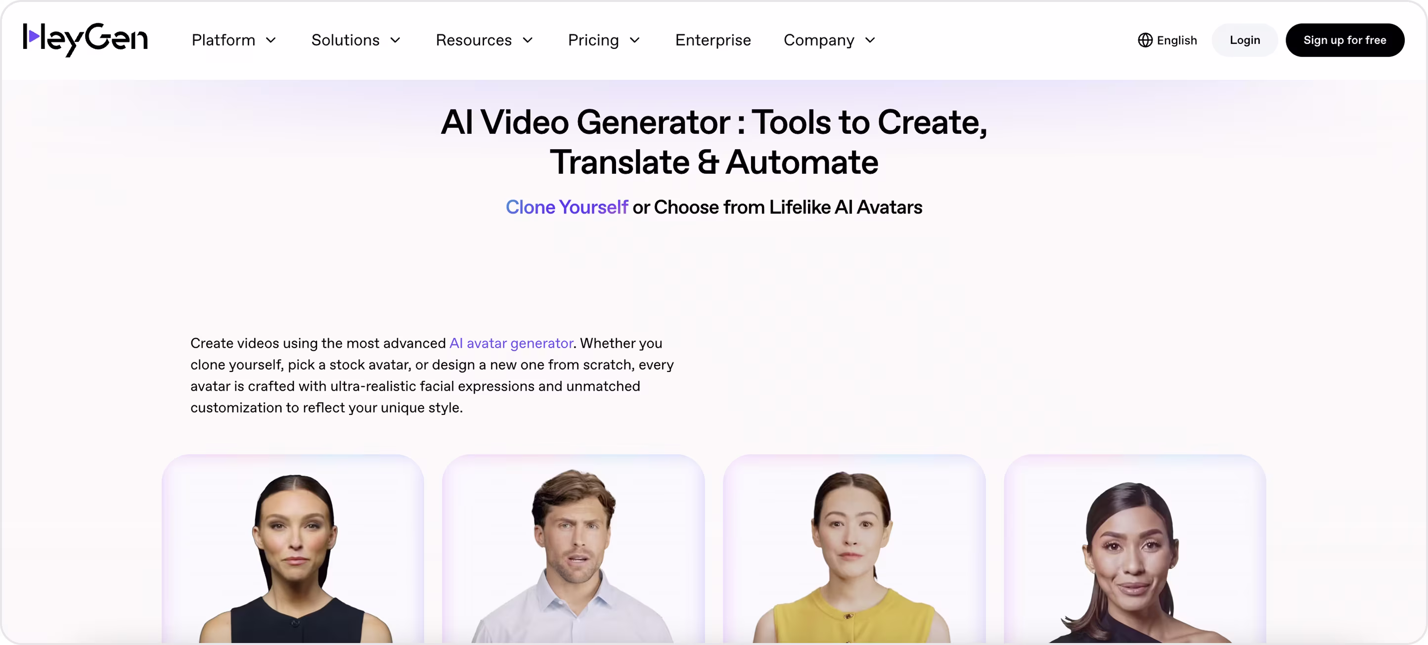
HeyGen
HeyGen is an AI video generator with capabilities for translation, automation, and creation, enabling users to create lifelike avatars. The site is simple and product-focused with a bold headline that immediately highlights the main value, and images of avatars that quickly show the tool's generated avatars.
Here's what you can see on HeyGen’s website:
- The clean layout.
- Contrasting calls-to-action.
- A simple product demo that creates an easy-to-use platform.
It's a great example of how an AI SaaS design can effectively link technology to real user needs.
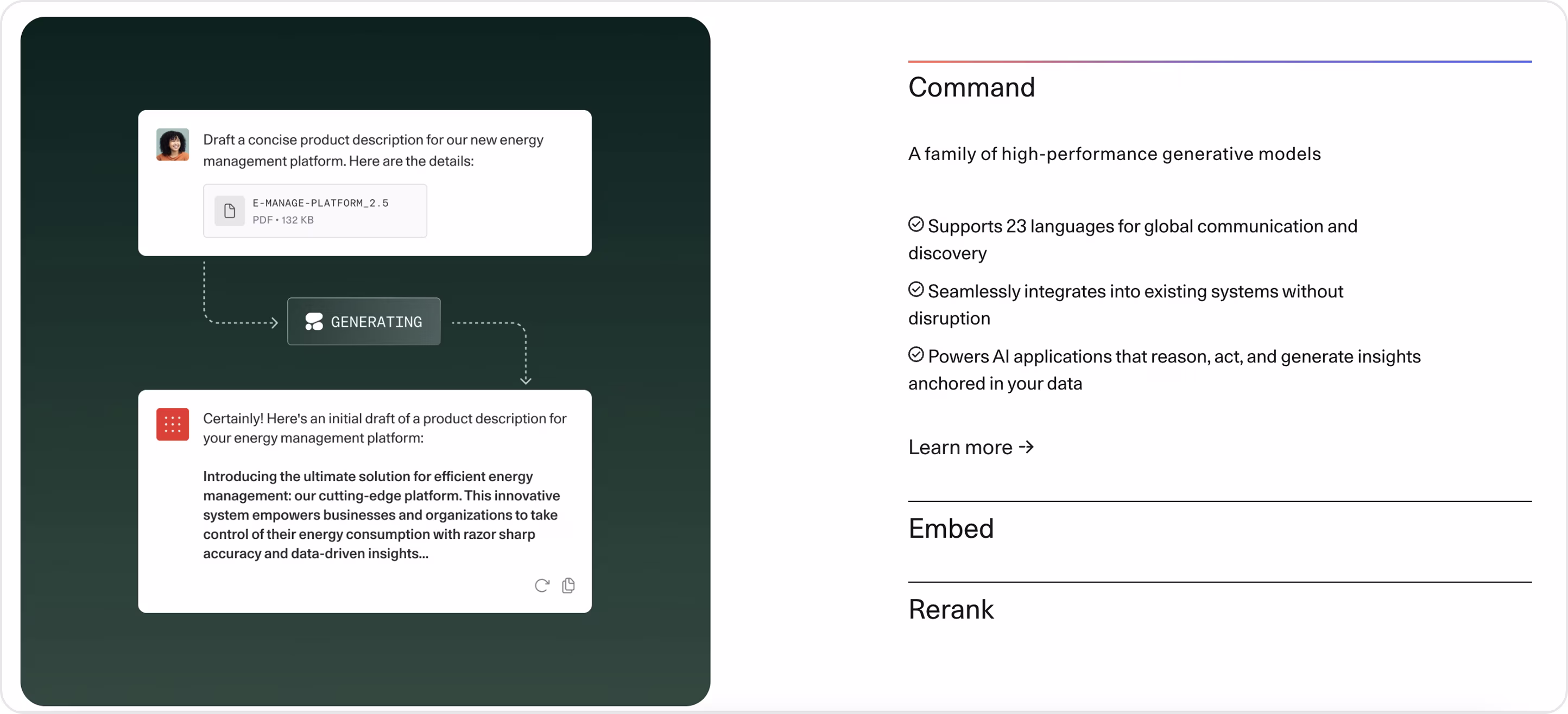
Cohere
Cohere is an AI SaaS platform with a focus on enterprise-scale generative models.
Their website has:
- Clean, minimal, and simple visuals, along with real demos, to explain the functionality of their products.
- Clear copy and organized layouts that emphasize the practical benefits of multilingual capability.
- Seamless integration that helps make complex AI feel approachable and trustworthy.
It is a great example of a practice SaaS website designed for a B2B audience.
Top SaaS Website Designs for Web3 & Crypto Companies
For Web3 or crypto-centric platforms, design needs to visually convey trust and simplify complexity. Given the nature of these products (e.g., wallets, tokens, financial data), an effective website needs to bring feelings of security, transparency, and ease of use. Best designed products should demonstrate how complicated terminology can be simplified to digestible wording, highlight real use cases, and create trust in the security and reliability of the website.
When thinking about SaaS website ideas in this space, it’s especially important to focus on clarity and credibility.
Arounda recommends:
- Highlight Safety and Compliance with visible trust icons.
- Keep the navigation simple to reduce industry jargon.
- Use minimal visuals to show how a wallet, token, and/or transaction works.
- Apply simple CTAs that a user can follow to connect, sign up, or get started trading.
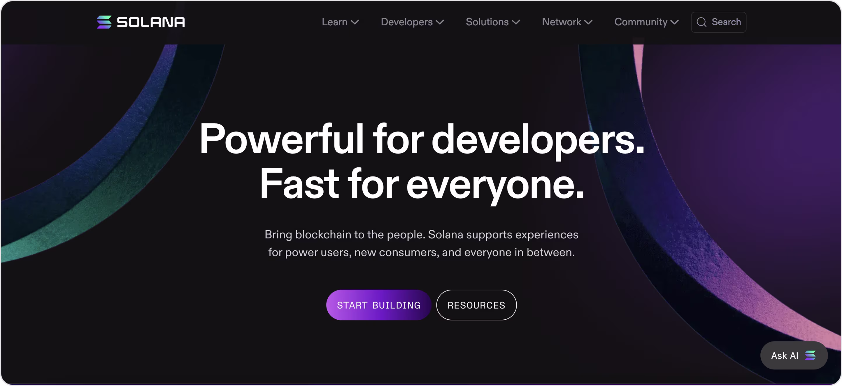
Solana
Solana is a blockchain platform designed for high-speed, low-fee, and scalable decentralized applications.
The website works effectively due to:
- Its cleanliness, minimalism, and scannable content.
- Clear spacing, simple and sharp typography.
- Credible images that help to break down very complicated ideas into simple concepts.
The website could improve interaction through previews of the applications, but overall, this is a beautiful SaaS website example that builds trust quickly and points the user to action.
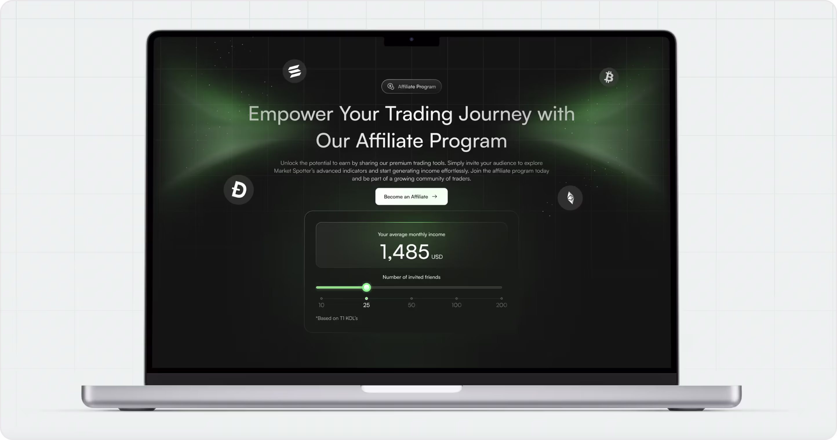
MarketSpotter
MarketSpotter is a Web3 trading platform that gives users the ability to see signals and confidently forecast market movements. This is one of our website design cases where our primary goal was to transform large amounts of financial data into a product that felt simple and engaging from the first screen.
Rather than overwhelming users with an onslaught of charts, it takes a smarter approach that:
- Exposes the central value right away.
- Cuts through frictional screens and confusing interactions.
- Leads users through delineated sections and purposeful interactions.
The design pulls together a dark, narrowed aesthetic, along with strong visual rhythm, reducing complex numbers and graphs to a simple scan. It instills confidence, encourages rapid action, and shows how deliberate design can present trading to users as an easy software as a service experience.
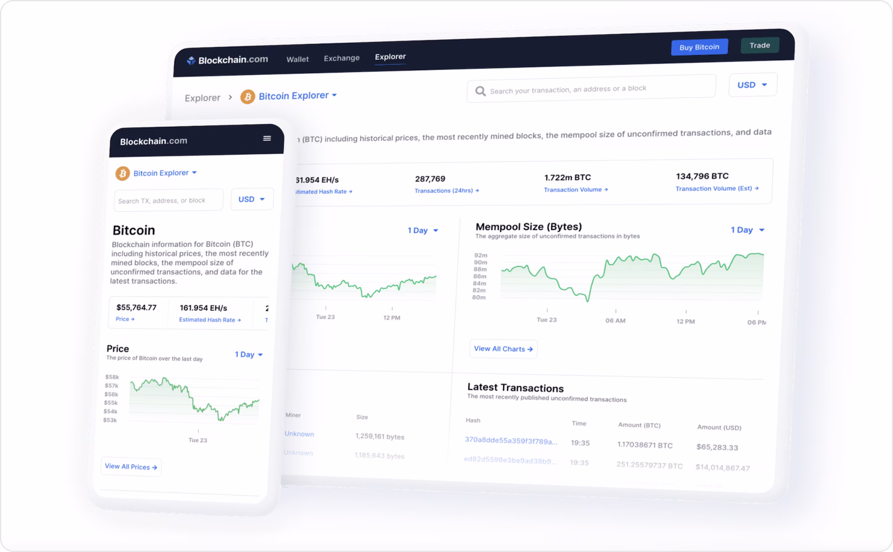
Blockchain.com
Blockchain is an extremely popular and beautiful crypto platform offering wallets, exchanges, and a block explorer.
The website has to present a lot of technical information without overwhelming a user, so the design relies on:
- Clean layout.
- Simple type treatment.
- Very few colors to make the charts & numbers easy to read.
Overall, both the desktop and mobile versions lead users quickly to the essential information, such as prices, transactions, and hash rate.
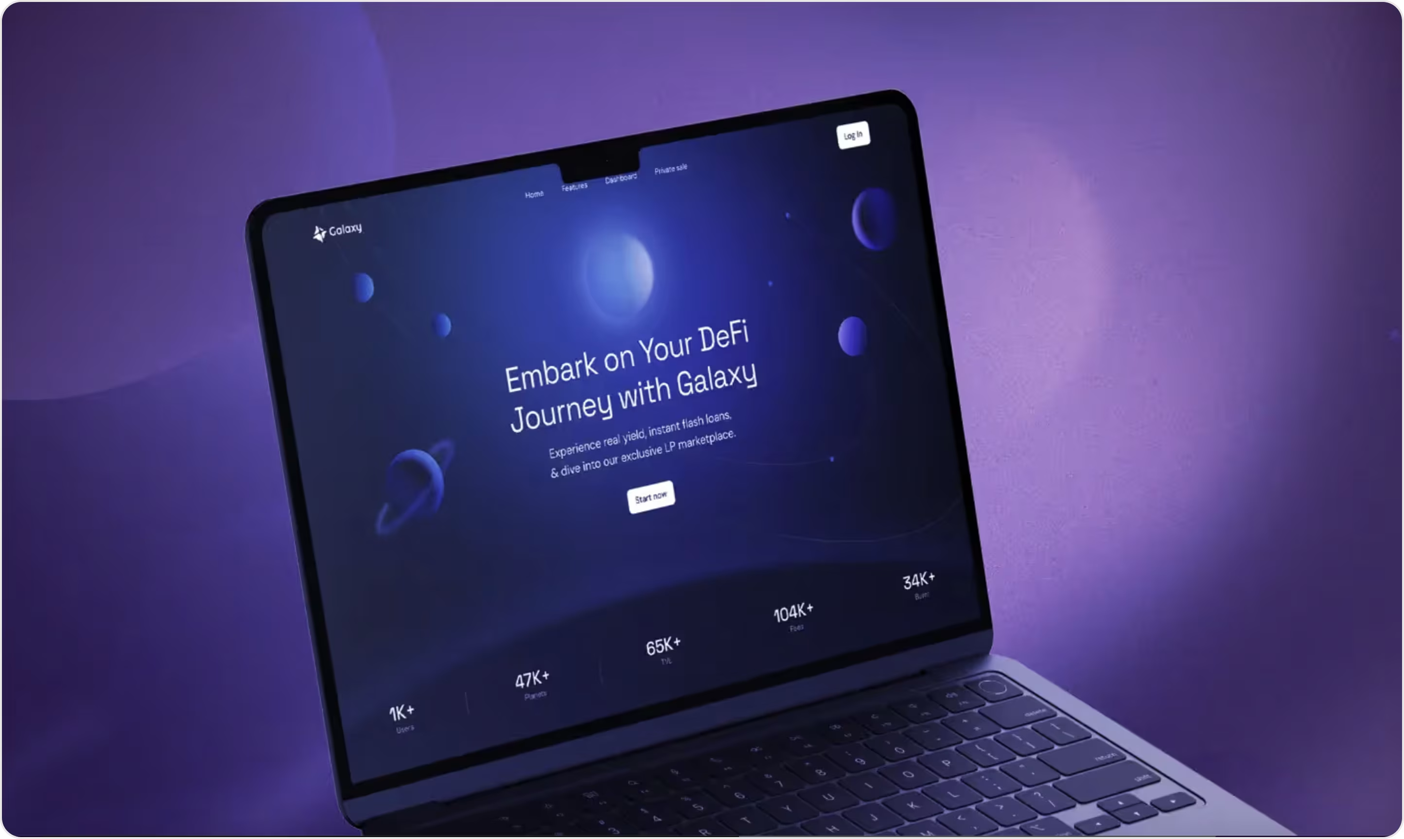
Galaxy
Galaxy is an impressive DeFi platform we worked with. While designing its website, we aimed to create a digital identity that communicated both innovation and trust. This is important in the DeFi space because we want to make a complex space more digestible and appealing to a wider audience.
The web design features:
- A strong futuristic aesthetic with color gradients.
- Extreme contrasting colors.
- Smooth animations.
- Clear typography and writing styles.
- Concise layout building systems.
All this design work provides users with an effortless journey through features, stats levels, and calls to action.
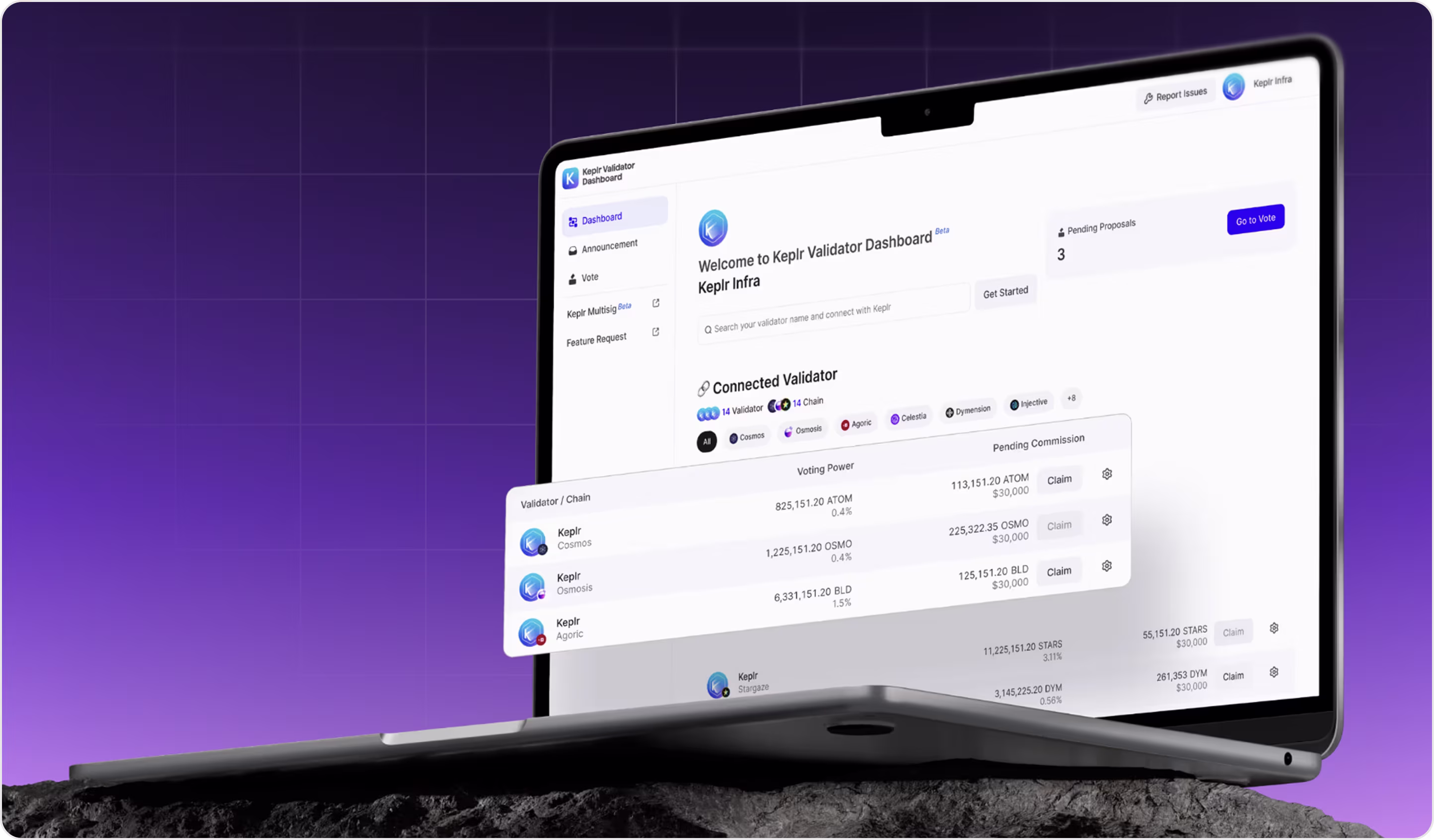
Keplr Wallet
Keplr is a multichain wallet built for the Cosmos ecosystem.
With respect to design, the site keeps things straightforward:
- The layout is structured clearly into sections.
- The typography is consistent.
- Action items like claiming rewards or voting are prominent enough that it feels natural to go through them.
The design is removing friction, allowing users to move quickly, and increasing trust by being transparent, which are the critical components to a positive experience.
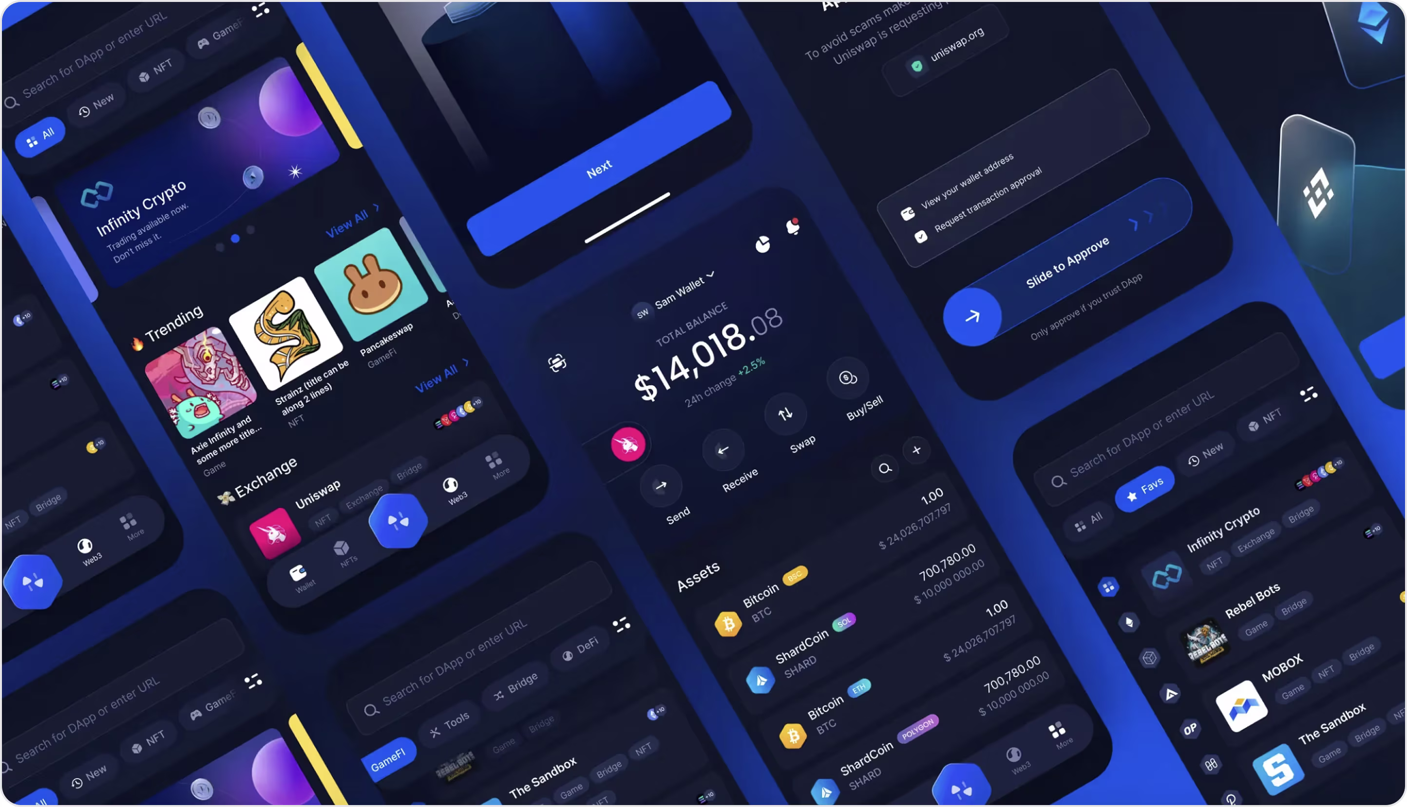
Infinity
Infinity is a crypto wallet and Web3 gateway where users can trade, manage assets, and find decentralized apps. Our team created the product's UI/UX design and branding with a focus on clarity and usability.
We took what could be overwhelming blockchain flows and created a clear and engaging experience from a product design standpoint:
- Dark themes and bright accents for actions of importance create a visually strong contrast throughout the product.
- Visuals facilitate the user experience and add uniqueness to the app’s brand identity.
- Navigation is simple based on structured layouts.
All of these design choices allow for complex actions like token swaps, bridging, or exploring dApps, and feel as simple and natural as possible.
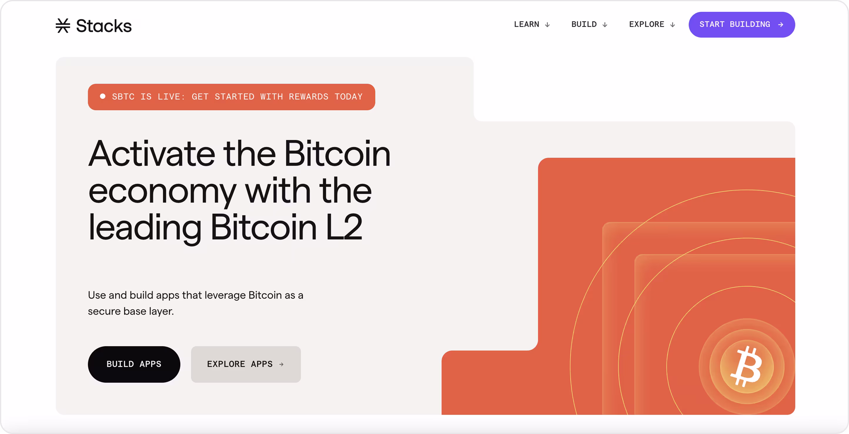
Stacks
Stacks is a Bitcoin Layer-2 platform that provides smart contracts and decentralized applications (dapps) on the Bitcoin network, keeping the security of Bitcoin at the forefront.
The website embodies this mission with:
- A clear, confident design.
- A straightforward communication and structure that makes complex tech feel accessible.
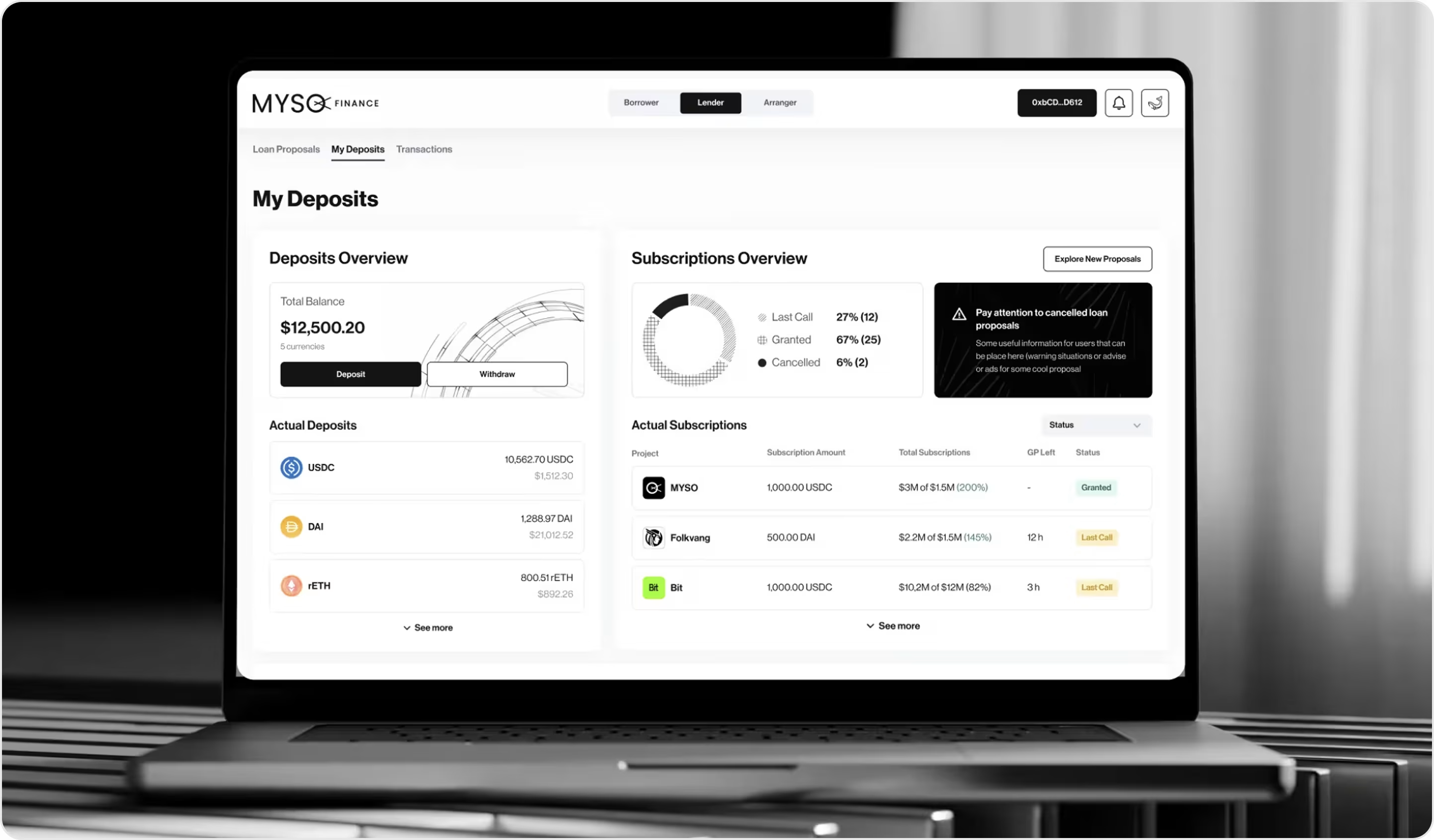
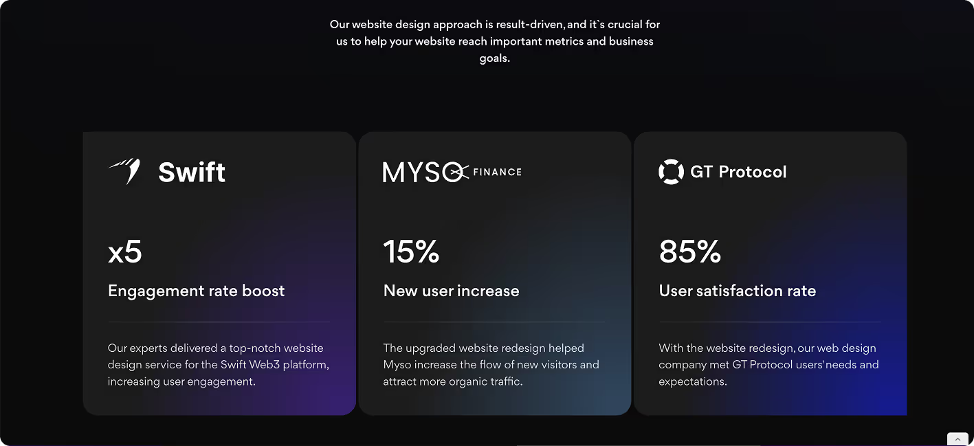
Myso Finance
Myso Finance is a DeFi protocol platform for asset managers, DAOs, and HNWI treasuries. While collaborating with Myso, we created user flows, produced high‑fidelity wireframes, and designed a UI that takes complex financial transactions and makes them intuitive and clickable.
The interface excels at clarity through:
- A thoughtful visual hierarchy and use of responsive elements.
- Refining a color palette to remove ambiguity.
- Smart use of spacing to reduce friction and boost trust.
Early numbers show that these changes raised user satisfaction to 85%, retention to 70%, and conversion by 5%, a clear proof of design enhancing both usability and productivity.
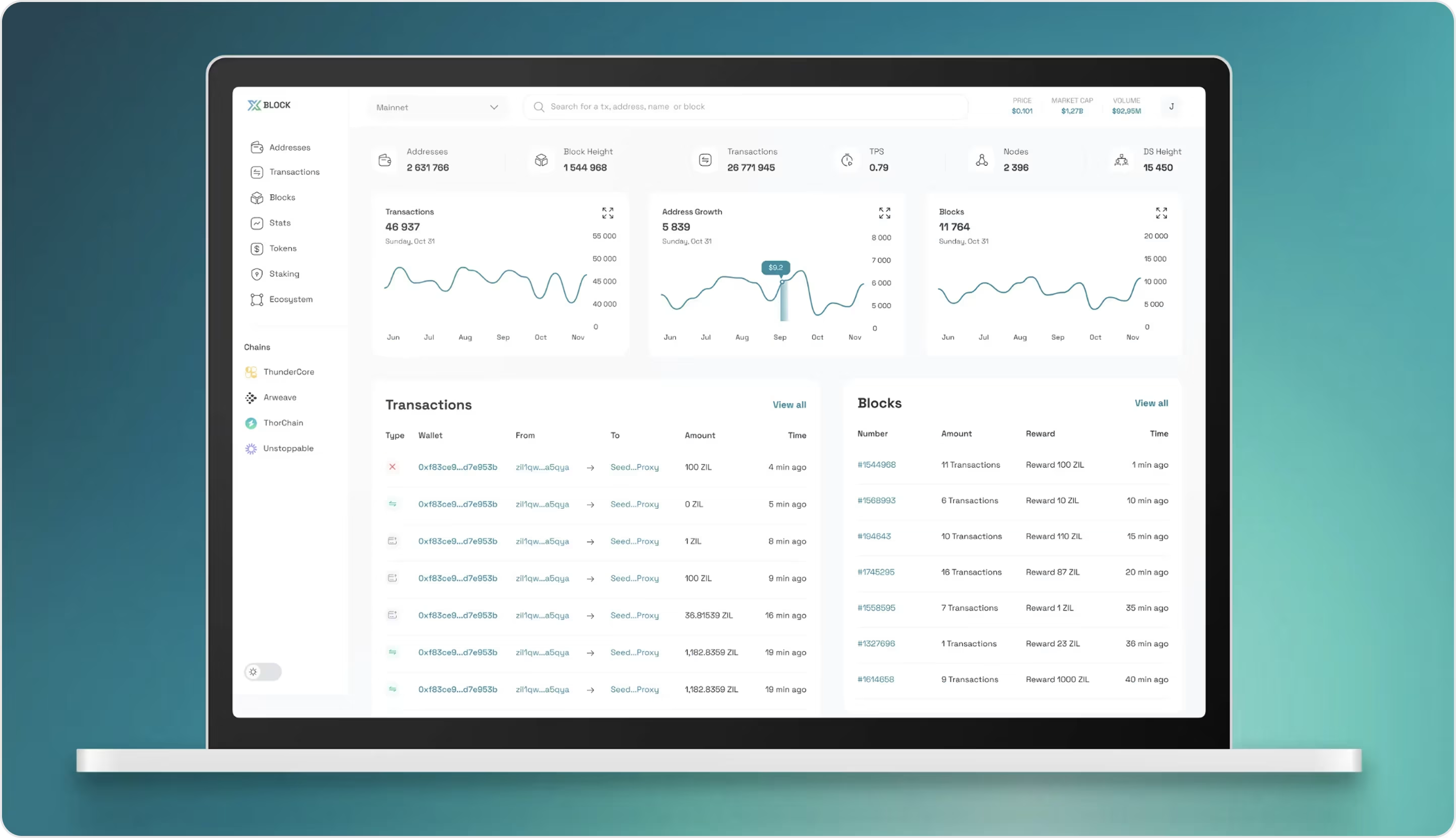
Xblock
Xblock is a blockchain explorer that can process massive data volumes while still being user-friendly to technical and non-technical users alike. One of the challenges our team faced during this website design process was how to display insights about transactions without overwhelming the user interface. We wanted to take complex data from the blockchain and distil it into an understandable experience.
We worked to create an organized, well-structured dashboard where:
- Graphs and real-time lists help balance high-level visibility and granular detail.
- Typography, contrast, and iconography help the eye move through the information more easily and reduce cognitive load.
The final design builds trust and scalability, allowing the user experience for blockchain analytics to be accessible and future-ready.
Dronies
Dronies is a beautiful Web3 NFT storytelling project that takes place on Solana. While it is not a SaaS platform, it still offers informative design inspiration for SaaS teams.
The website design is great in terms of:
- A dark, cinematic design style full of grid patterns.
- Bold typography.
- Smooth navigation.
- Immersive storytelling.
This effort shows how engaging visuals, like telling a story with a strong visual identity, can help websites keep users' longevity, strategies as applicable to SaaS website examples as they are to NFT projects.

Top SaaS Website Designs for Fintech Companies
The fintech sector is one of the fastest-growing SaaS areas. Fortune Business Insights anticipates the market to grow from $394.88 billion in 2026 to $1.13 trillion by 2032 at a CAGR of 16.2%. With such explosive growth, design becomes especially important. Fintech platforms must manage and combine clarity, trust, and usability to win over customers.
The experience you give has to support a clear interface, smooth navigation, and all interactions have to reduce friction. Users want to be sure about the safety of their funds and data — that means even details like typography, color, and microinteractions are critical to build that confidence.
Arounda recommends:
- Design clean interfaces and readable data.
- Utilize a strong visual hierarchy to help users through the financial flows.
- Integrate security and transparency into the design language.
- Consider mobile-first approaches, as many users manage finances away from a desktop.
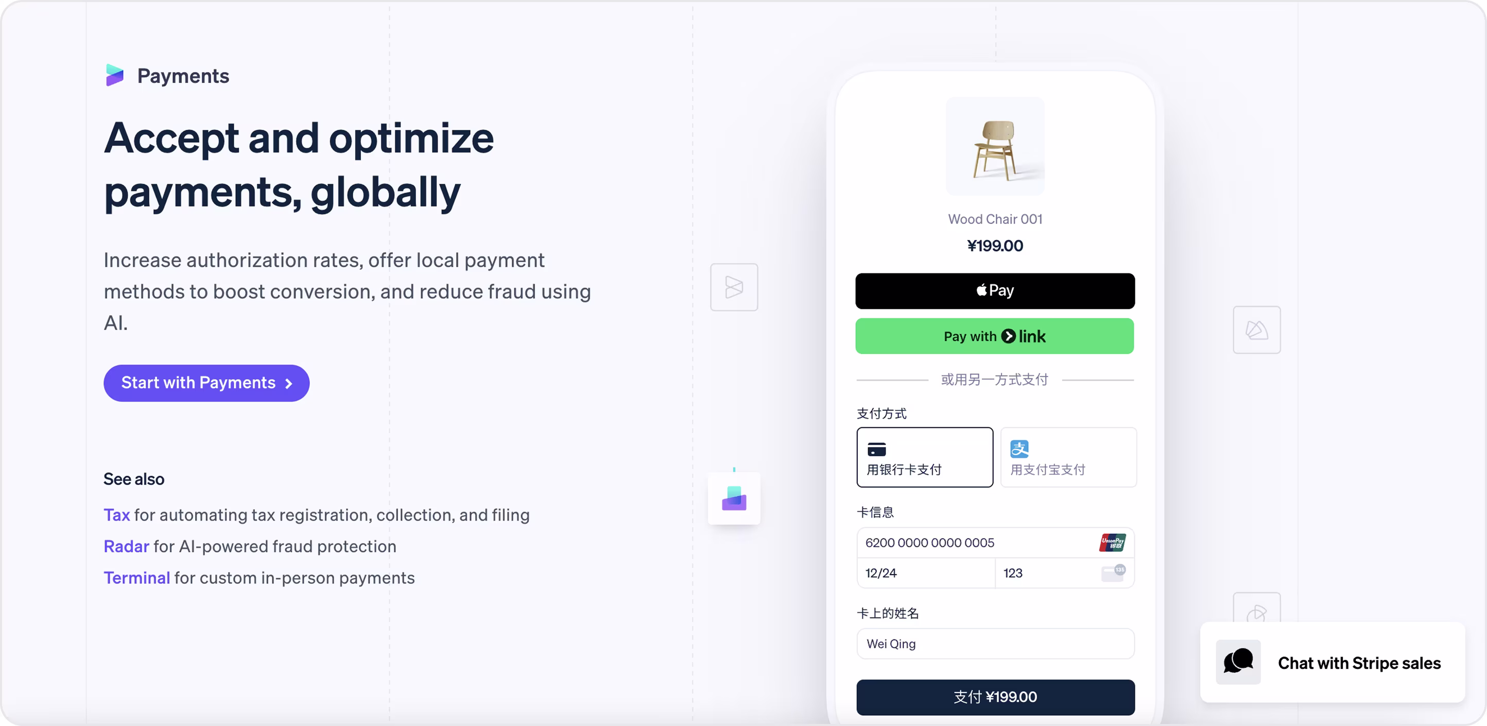
Stripe
Stripe is a SaaS platform that helps businesses accept and optimize online payments worldwide.
What makes their website design modern and clean-looking is:
- The use of strong visuals with clear horizontal, vertical, and spatial hierarchies.
- Presentation of complex payment flows in a simple way, leading the user with trust and clarity.
- Making the interface feel light and easy to follow, so every detail supports conversion and user confidence.
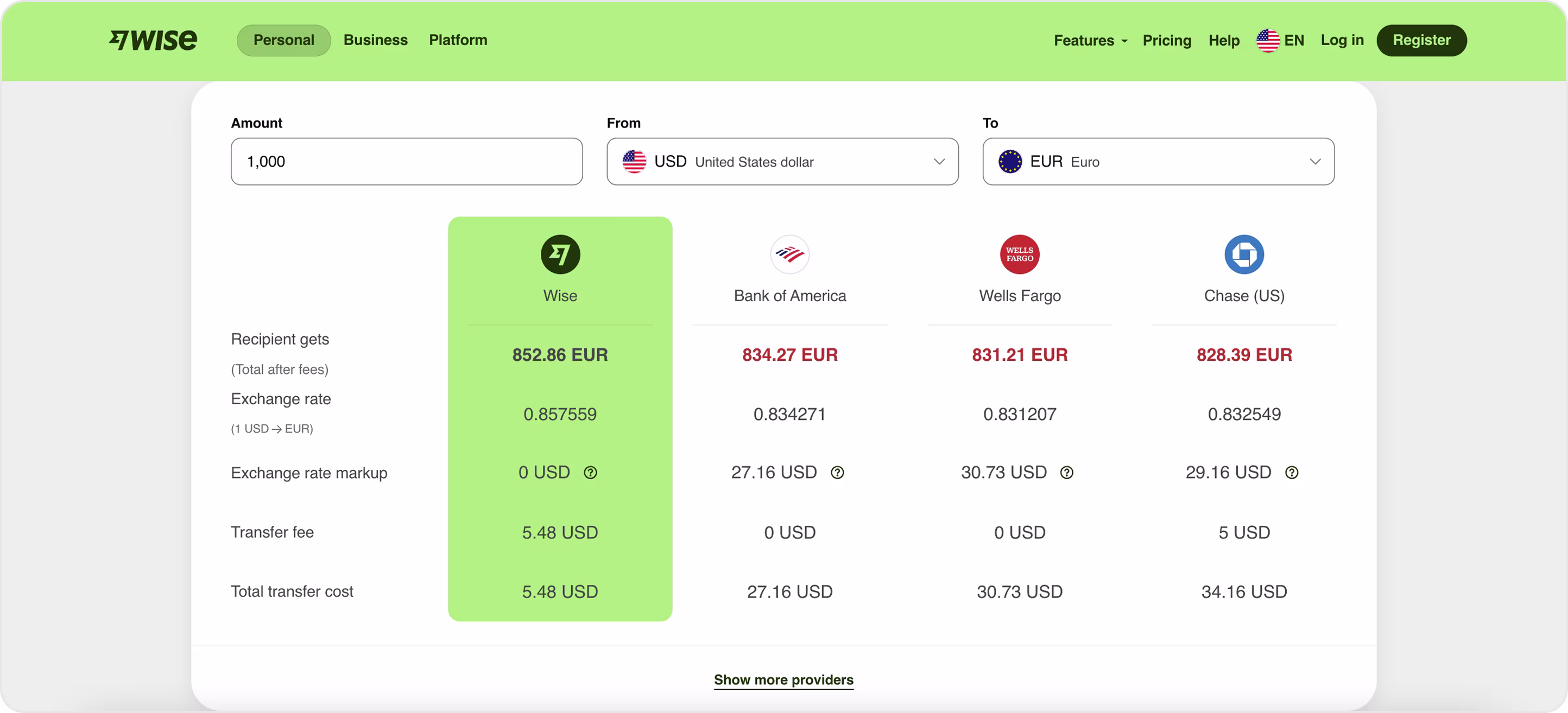
Wise
Wise is one of the best software as a service websites for cross-border transfers. Its design shows how fintech can create clarity out of complexity.
The interface emphasizes transparency:
- Exchange rates, fees, and comparisons to banks are laid out alongside each other so the user can easily see their best options.
- The bold color contrast effectively shows Wise's advantage.
- The simple typography and spacing make the text easy to read.
The design outcome creates trust through its simple and trustworthy presentation of costs and data, which remains fundamental for fintech platforms because user trust stands as their core principle.
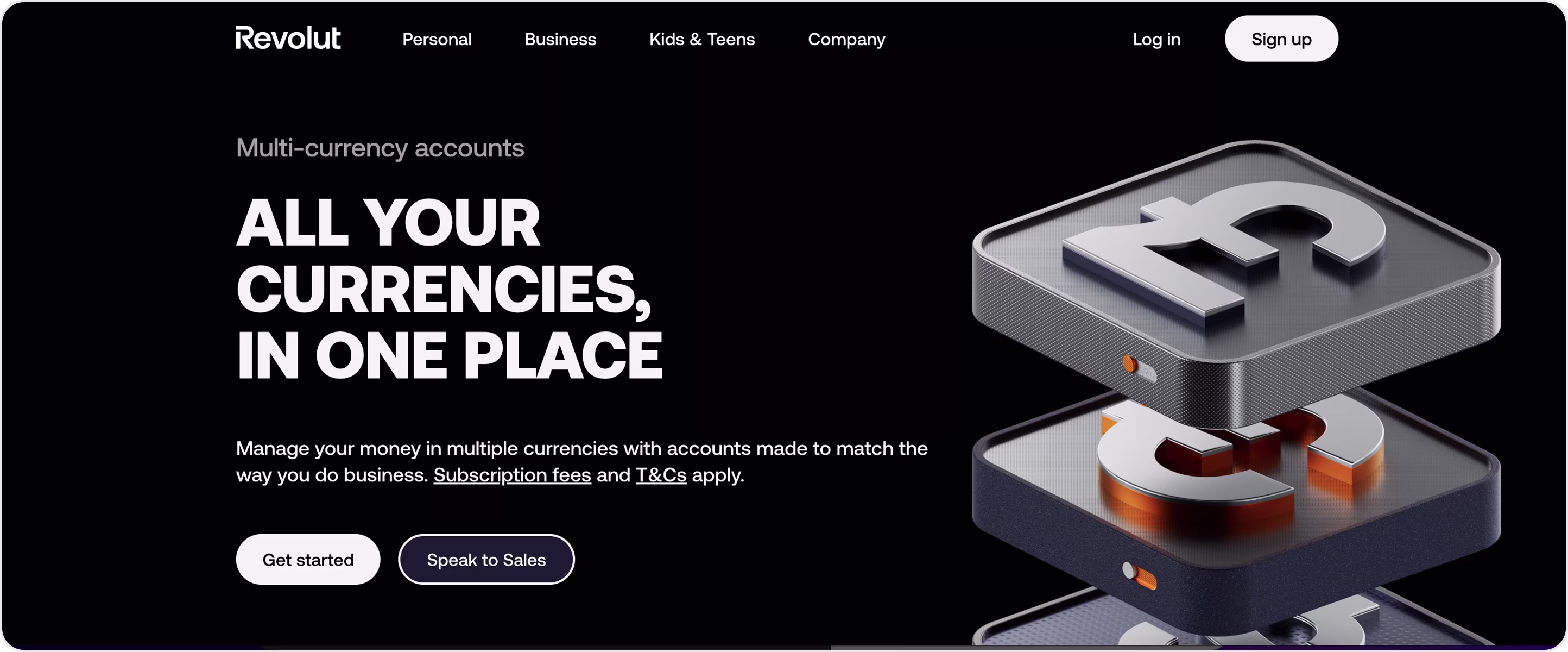
Revolut
Revolut is a digital banking SaaS product with a wide range of services from payments and currency exchange to crypto and trading.
The website stands out through:
- Its structured hierarchy that breaks down complex financial tools into digestible sections.
- The combination of strong typography with subtle gradients and animations helps users focus on key actions without feeling overwhelmed.
- The layout design enables fast scanning, allowing users to quickly understand the features of the product.
The design of Revolut shows how a platform with clear visual priorities and consistent system elements creates an intuitive and trustworthy experience for users of multifunctional fintech platforms.
Xpence
Xpence is a fintech SaaS platform for expense management. This is one of our works where the Arounda team not only delivered UI and UX design but also developed the MVP. The primary objective involved streamlining financial operations and creating user-friendly access to the tool by converting complex processes into straightforward functionality that users can grasp right away.
Here’s what we did from a design perspective:
- We used clean dashboards.
- Categorized expense flows.
- Used smart card visuals to help users instantly grasp data.
The product achieved clarity through its MVP launch, which enabled it to demonstrate its value and expand its operations with assurance. It's an excellent showcase of how strong design and strategy together create real business results.
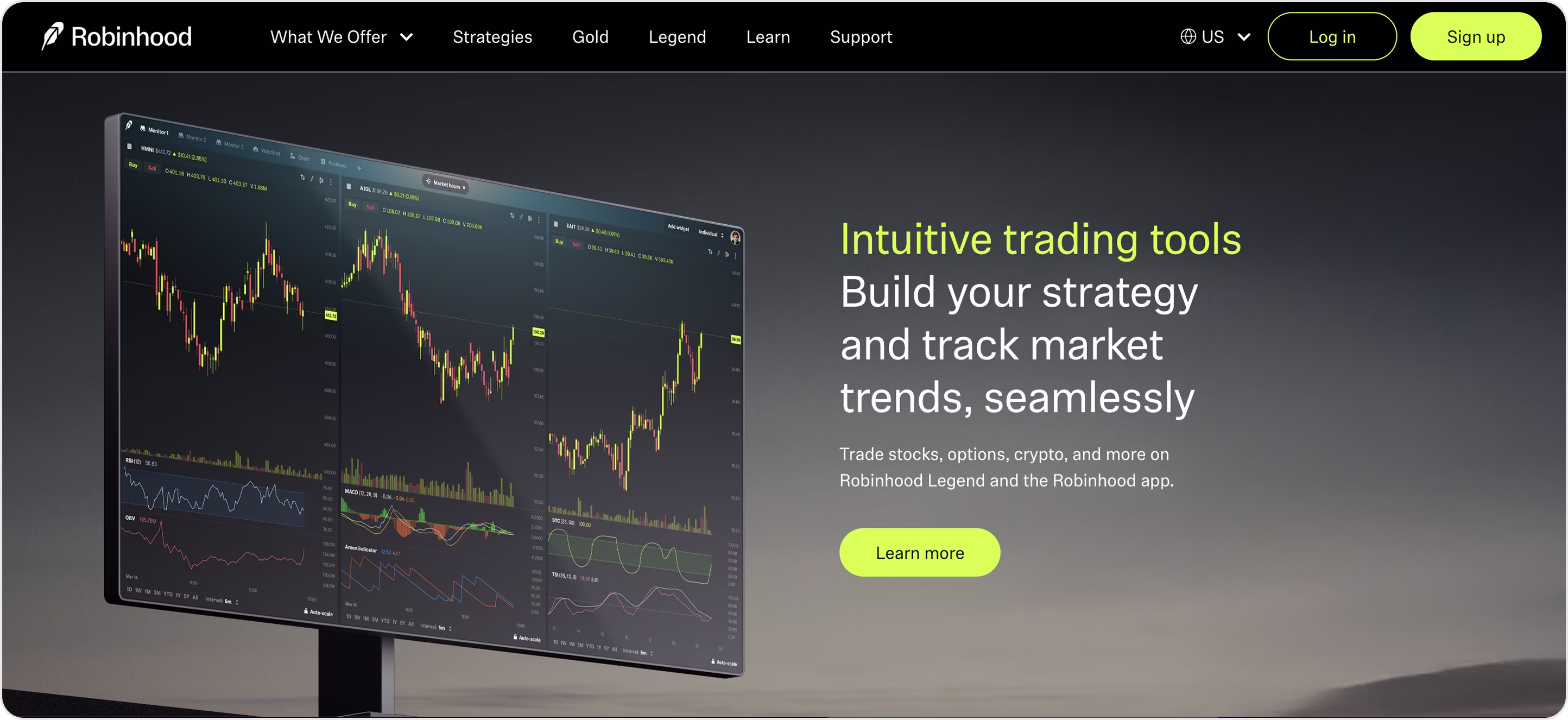
Robinhood
The US-based fintech company Robinhood provides commission-free trading services for stocks, options, and crypto assets.
The website design of the brand reflects its mission of making finance accessible by:
- Simplifying complex trading data.
- Featuring a dark theme with neon green accents to attract user attention to action buttons and essential metrics.
- Achieving user trust through basic design elements, which combine with dense financial data to make complex tools accessible to multiple users.
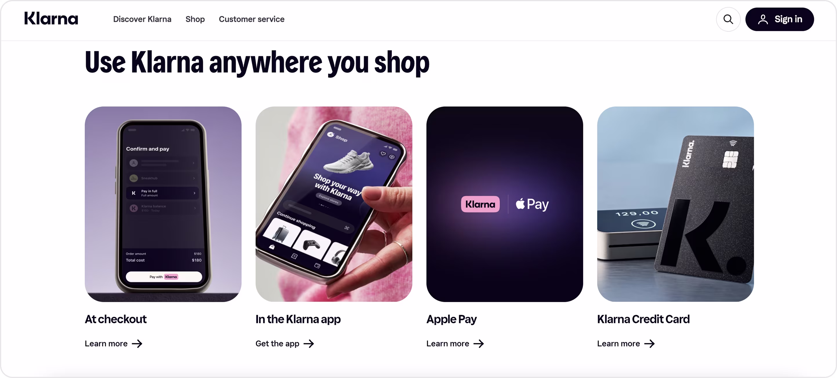
Klarna
Klarna is a Swedish fintech powerhouse and one of the top "buy now, pay later" companies in the world. Its website demonstrates this positioning through a bold yet approachable design with:
- Clean layouts.
- Audacious typography.
- A playful color palette suited for Klarna's youthful, lifestyle-based company.
The user flows, especially mobile, are uncluttered. The buttons "Pay with Klarna" are direct and provide reassurance. Pastel gradients and softer contrasting colors make the financial experience feel less daunting and more lifestyle-oriented.
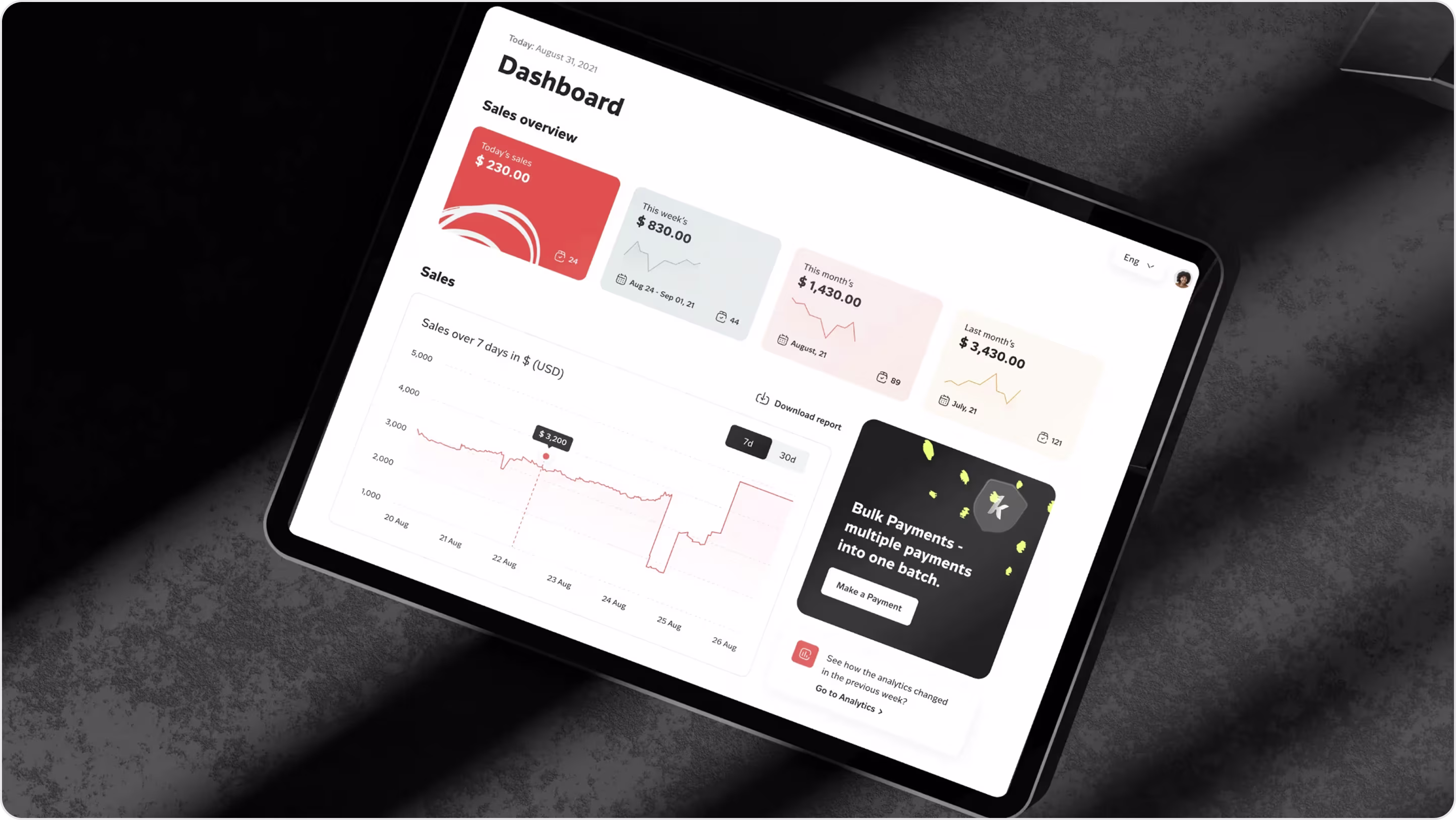
Unlocks Calendar
Unlocks Calendar is a Web3 fintech application designed to help investors monitor and predict token unlocks. They came to us for the website design, and we undertook the entire process from research/planning to wireframes, flow, and moodboards.
Here's what we did from there:
- Developed a clean, responsive website where a lot of token data is transformed into something readable and helpful.
- Logically organized the dashboard with unlock dates, volumes, and alerts in a way that is quick to scan.
- Filtered lists, clean layout, and visually consistent graphics to keep everything simple and make the product feel professional and reliable.
https://arounda.agency/case/unlockscalendar
Alt: Unlocks Calendar website design example
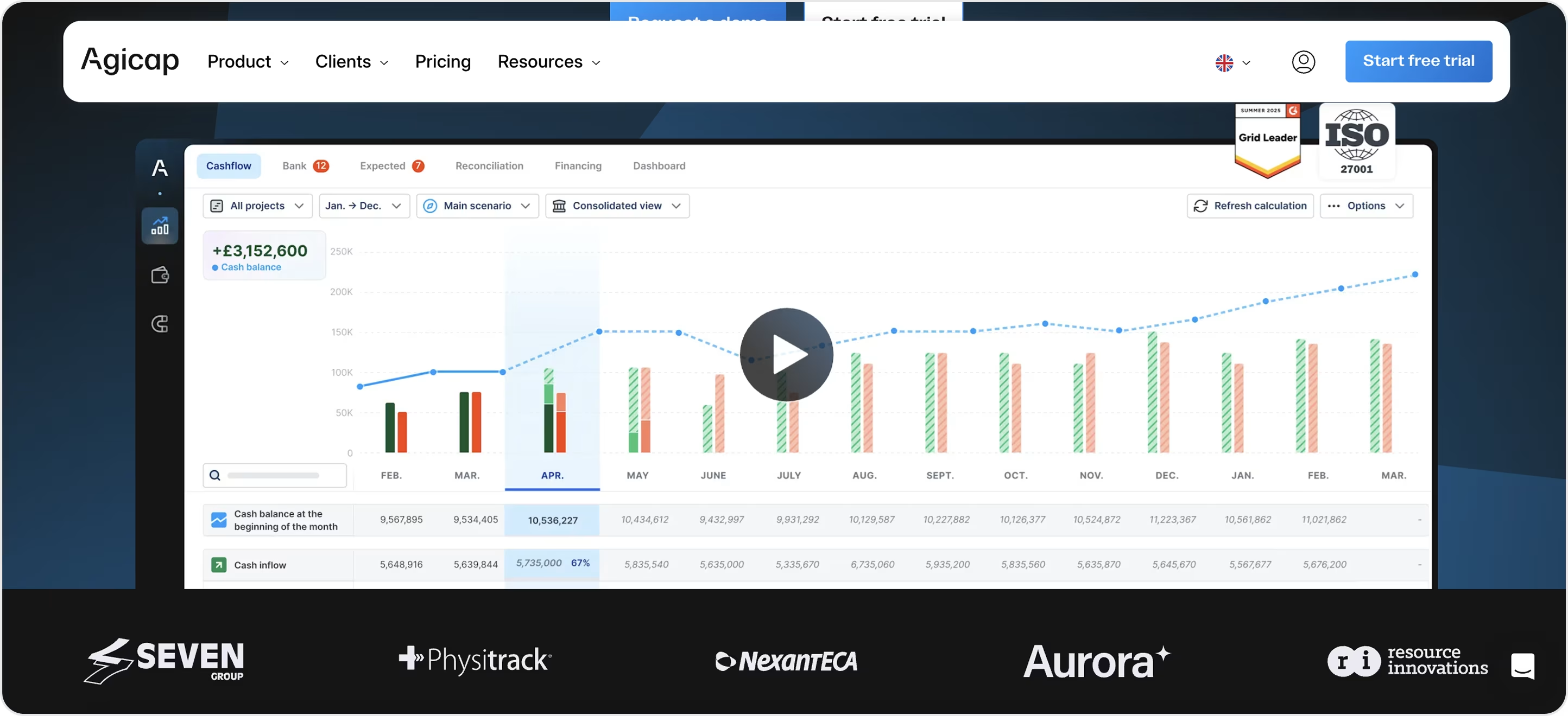
Agicap
Agicap provides SMBs and mid-market companies with tools to predict cash flow and automate payables and bank data synchronization in a single platform.
The system explains finance through a straightforward story:
- By using modular dashboards as a control center and a scenario builder that enables interactive and accessible forecasting.
- Creating strong hierarchy and clean layouts to keep complex data actionable, positioning Agicap less as a tool and more as a real-time financial partner.
Klasha
Klasha is a fintech startup that enables businesses to transfer money internationally - collecting, holding, and sending, in both local and global currency. When we were creating the design and branding of Klasha, the main challenge was to provide simplicity to their complex and intricate financial tools in a way that resonates with businesses and developers.
Arounda redesigned Klasha's brand and product experience with clarity and confidence at the forefront.
We designed the system with:
- Bold visuals.
- Clean flows.
- To-the-point messages.
This helped us keep users focused, on track, and avoid confusion when making payments and using APIs. Klasha's new design system creates professionalism and warmth, while keeping global commerce feel attainable and fostering trust amongst merchants and partners.
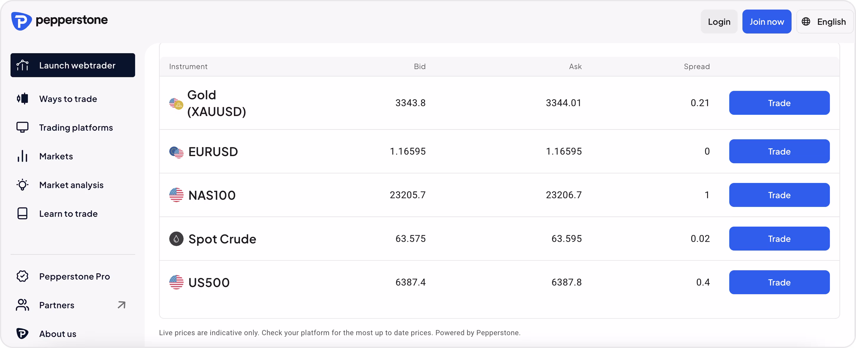
Pepperstone
Pepperstone is a global fintech platform focused on forex and CFD trading, and its website excels at reducing complexity via modular panels, each highlighting tools, platforms, or market insights.
Its modular panels feel ordered yet lively because of:
- Strong contrast.
- Layered navigation.
- Continuously moving market images.
All that makes advanced features feel equally manageable for both professional and emerging traders. The confidence that Pepperstone's design instills is driven by the communication of speed, transparency, and control.
Top SaaS Website Designs for Healthcare Companies
Let's move to the best SaaS design examples in healthcare. This SaaS market is one of the fastest-growing areas in digital health. These platforms are designed to help manage sensitive medical information, connect patients to providers, and assist hospitals, clinics, or private practices.
Healthcare SaaS products must comply with stricter regulations than other industries, meaning the design must synthesize compliance and usability seamlessly. Most users, whether patients, doctors, or administrators, want security and transparency, while the website has to create trust through each touchpoint. Additionally, since healthcare solutions serve users with varying levels of technical skill, it's important to keep user flows intuitive and visuals as simple as possible.
Arounda recommends:
- Prioritize flows such as booking, accessing records, and tracking medication. Make them easy and effortless, as these touch points will create and shape your overall trust.
- Use dashboards, charts, and progress indicators that engage patients and professionals, but do not overload them.
- Display security badges and compliance notes, or include microcopy to remind users that their data is safe.
- Don't just think about contrast and font size, but also design for users with specific health conditions.
- Your visual language should feel warm and human, but still professional. You want the platform to feel caring, but not soft.
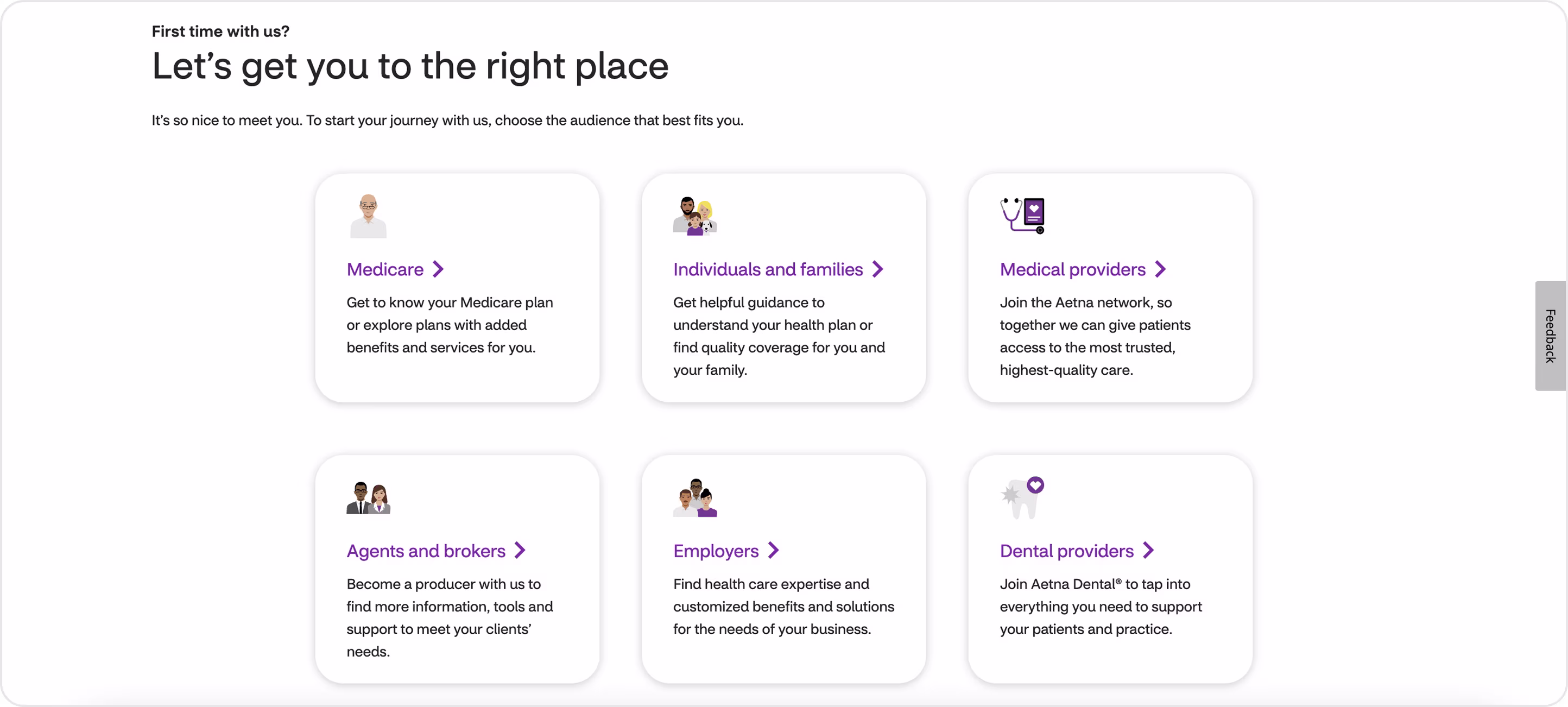
Aetna
Aetna is one of the largest health insurance companies in the United States.
Here’s what makes its website clear and simple to navigate:
- The website is effective in leading its various audiences right from the landing page with a clean "Let's get you to the right place" aesthetic.
- The tiered navigation and quick reference tools make it easier to navigate through a variety of complex healthcare decisions.
From a UX standpoint, Aetna's site excels with its structured onboarding and role-based routing; however, there is an opportunity to enhance trust with a greater depth of personalization.
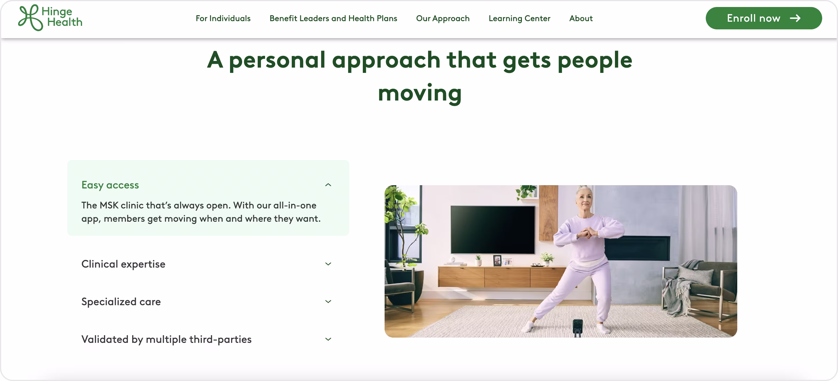
Hinge Health
Hinge Health is like a digital clinic that basically helps folks do physical therapy at home, through virtual appointments, tracking their movement, and getting personal coaching. The website clearly lays out the company's mission; it feels open and straightforward.
What stands out in Hinge Health's design is its mix of clinical seriousness with warmth from everyday life. Rather than using cold, sterile imagery — as many healthcare websites do — it depicts people stretching, moving, and smiling. In doing so, it does not make therapy feel like therapy, but like an active and important part of one's daily life.
The platform also features:
- Clean layouts with plenty of white space, minimizing stress for users who may already be experiencing pain.
- Soft but confident colors and typography make the platform feel both medical and approachable.
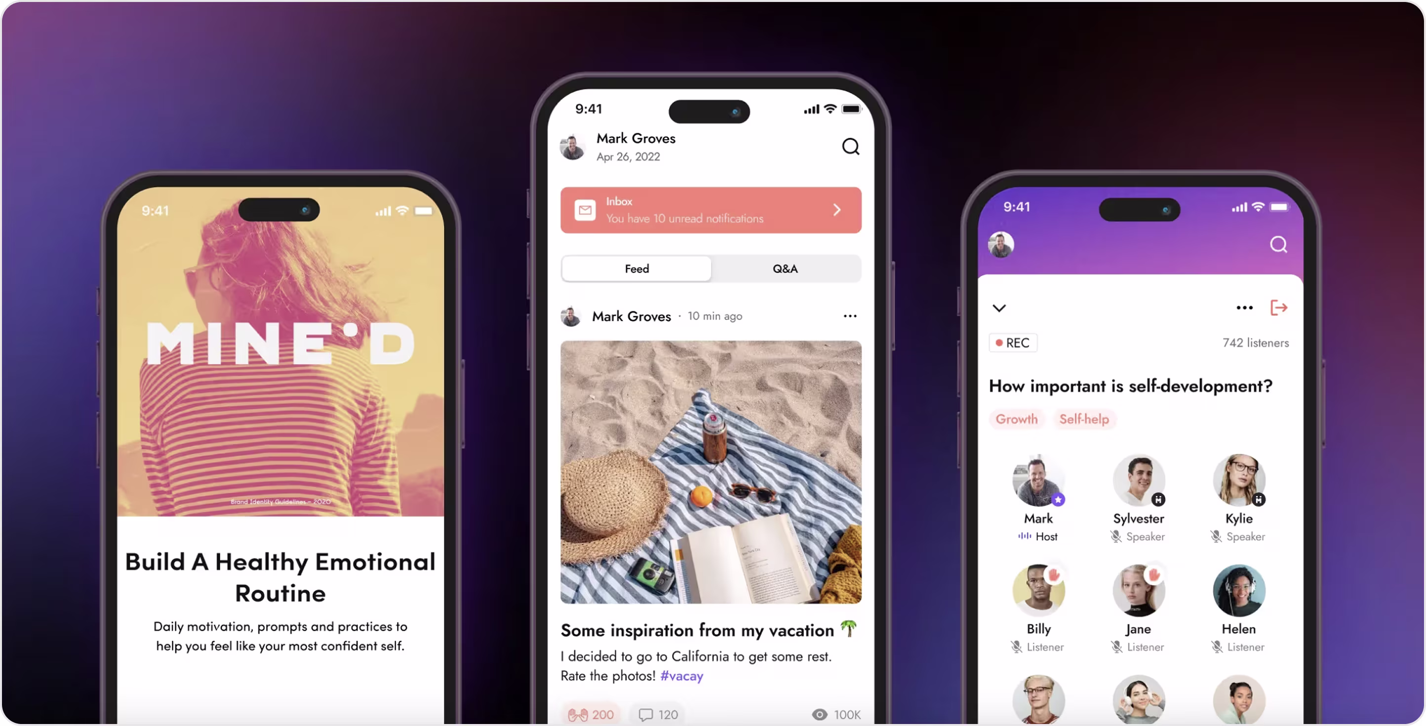
Mine`d
Mine'd is a mental-health platform that connects people with emotional wellness experts and practical solutions. This is one of our projects that involved refreshing the product's visual style and reconstructing the UX to support two separate journeys - Consumers and Experts.
We provided our client with:
- A discovery session.
- Defined the user and application flows.
- Wireframed both journeys.
- Delivered a new mobile experience.
From a design perspective, the fundamental shift was to implement a role structure. Depending on who is using the application, navigation, actions, and hierarchy have the ability to change, so sessions and sometimes guidance felt natural rather than heavy. The outcome was a clearer journey to product and style guide consistency as features developed.
This approach led to actual results: 85% user satisfaction, 87% retention, a 25% increase in mobile users, and an 8% conversion rate.
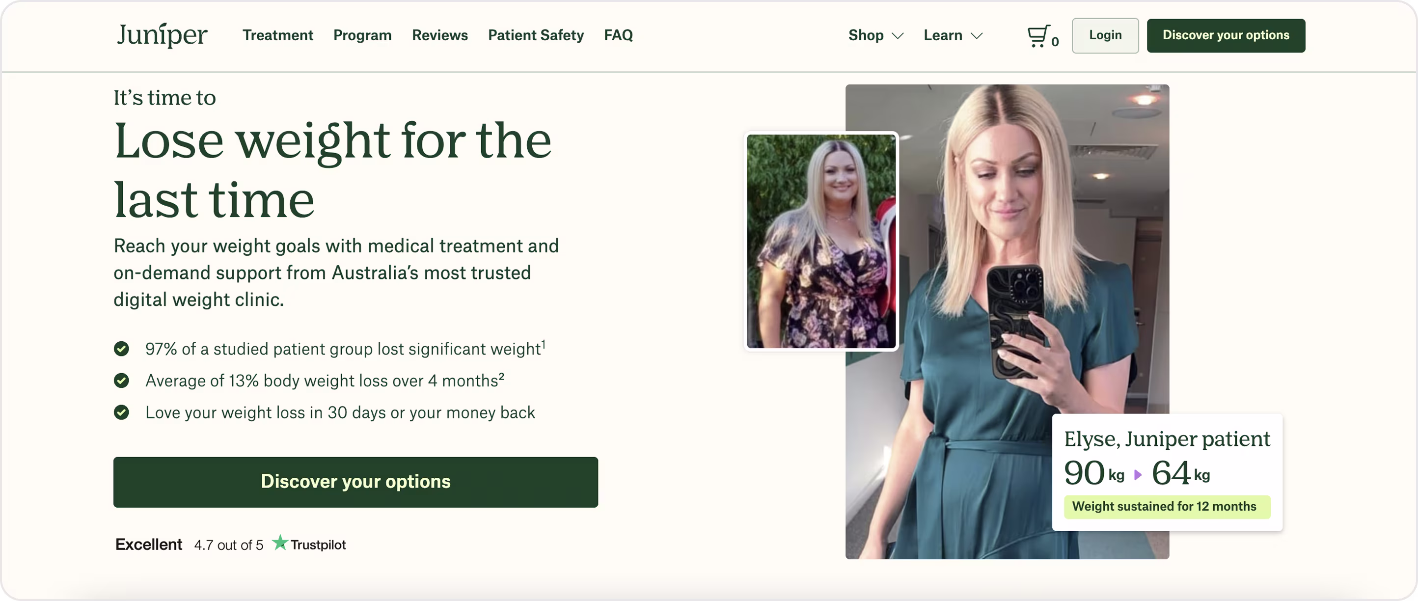
MyJuniper
MyJuniper is a digital health platform for telemedicine and personalized care. It is not a traditional SaaS product. However, the site did incorporate SaaS-like patterns such as streamlined onboarding, subscription-based flows, and data-informed personalization.
The design is very human-centered, using:
- Conversational copy.
- Simple layouts.
- Inviting visuals.
This approach helps de-stress medical topics, and the blend of consumer-leveraged focus with SaaS-like structure is the element that made the website successful.
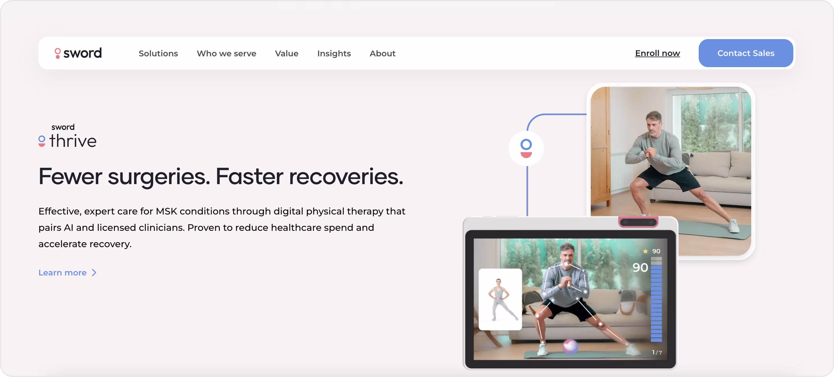
Sword Health
Sword Health is a digital health platform that leverages AI in tandem with physical therapists to treat pain remotely.
Their website, which includes an online scheduler to book an appointment, makes an immediate impression with:
- Effective and clear navigation.
- Bold copy.
- Striking visuals that emphasize movement instead of generic stock photography.
Their AI Care Specialist, Phoenix, is introduced in an engaging and human-friendly way that helps establish a feeling of trust and minimizes perception of risk. They included their data, certifications, and evidence of patient results right up front to help validate their credibility.
NextCare
NextCare is a leading urgent care provider with more than 170 clinics in the U.S., and its website does an excellent job of providing calmness in design while creating a sense of urgency.
The NextCare website provides:
- Quick entry points to either in-person or virtual care, and both options are given equal weight in design.
- A bold red "Reserve Your Spot" button stands out in the soft palette and adds urgency as users are driven to action.
- As supportive measures to build trust, they have included patient reviews with ratings, pre-check-in features, and discount programs.

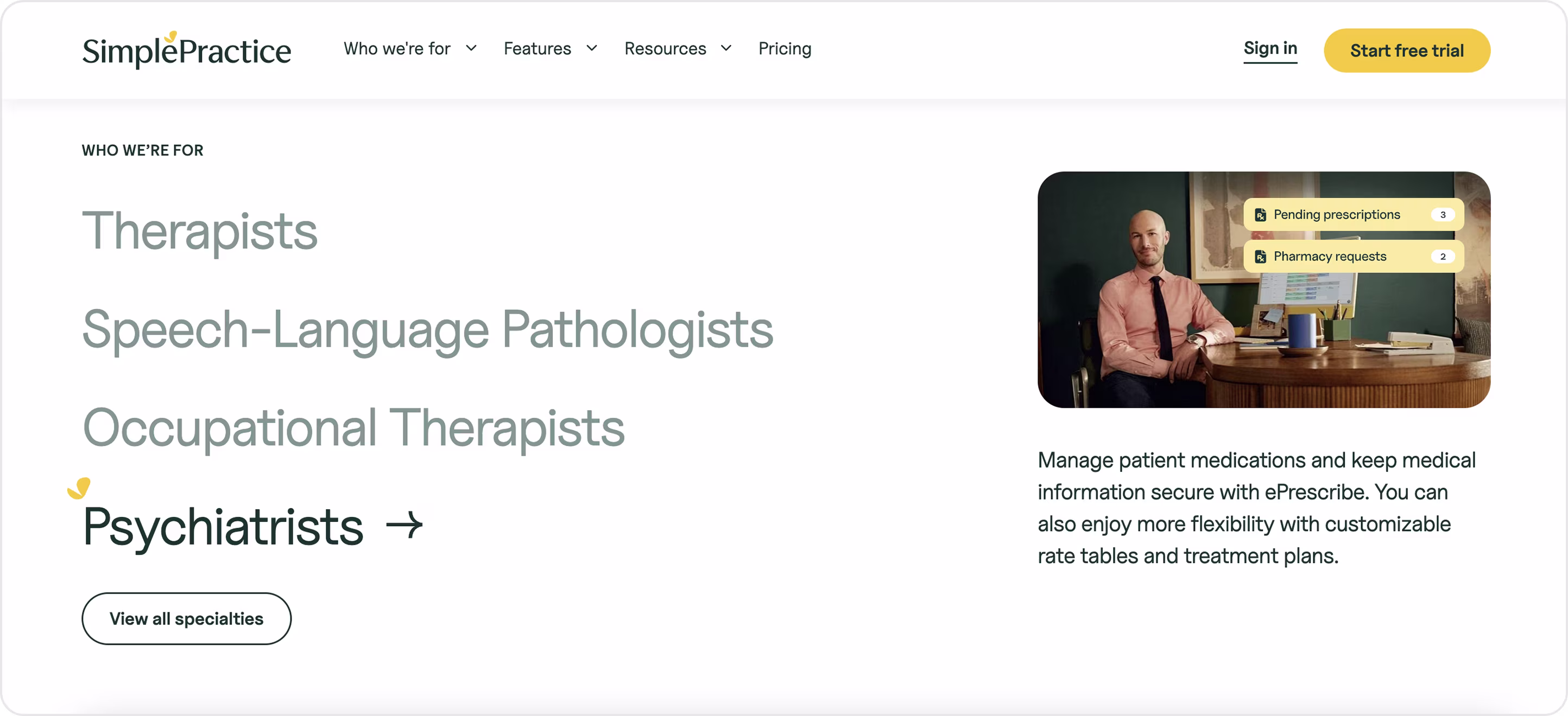
SimplePractice
SimplePractice is a SaaS-based practice management service designed for therapists, counselors, and other wellness service providers.
Its website emphasizes professionalism and compassion equally well:
- The layout is clean, with category cards and hover effects that provide visual engagement.
- Customer metrics demonstrate scale, reliability, and placate trust.
- Trust is conveyed through explicit visible certifications (HIPAA, HITRUST), offering a free trial.
- A consistent brand voice highlights the care given to users.
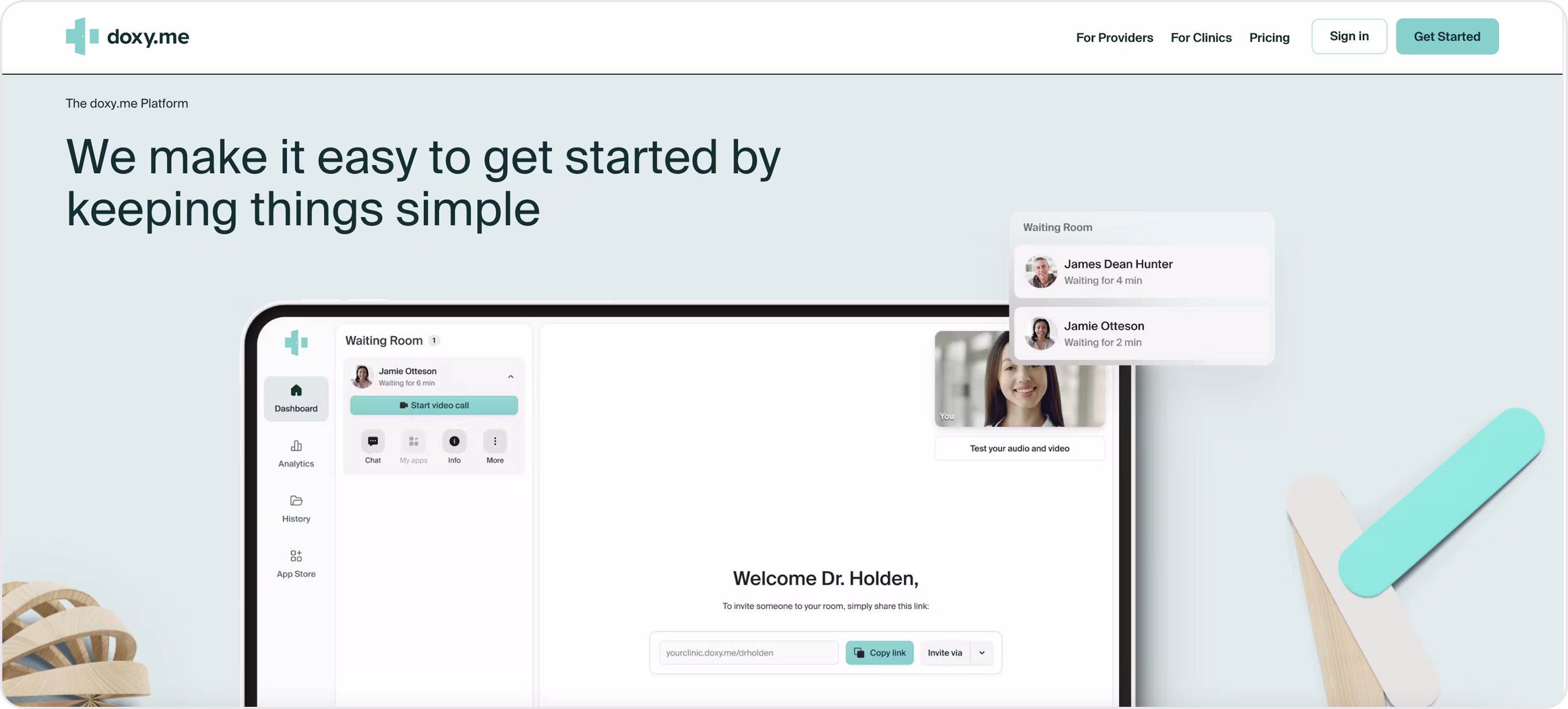
Doxy.me
Doxy.me is a telemedicine SaaS platform that can be accessed through an internet browser, so there is nothing to be installed on the patient or provider side.
Here’s what you can see on their website:
- The site design is uncomplicated and role-based, with clear paths like "For Providers" or "For Clinics."
- Doxy's visual trust signals include HIPAA and GDPR badges, virtual waiting rooms, and queues.
- The UI keeps users focused on three primary and final actions: joining, waiting, and consulting.
This minimal approach makes the experience quick and easy with unwavering reliability, but adding small patient-side cues like countdowns or indicators for readiness would enhance the experience.
Doctor on Demand
Doctor On Demand is a telehealth platform providing urgent care, therapy, psychiatry, and primary care through a clean and easy-to-use site.
A few things divide the platform from its competition:
- The Saas homepage design in this case offers immediate value against the rivals ("See a doctor now") along with transparent pricing to build trust.
- Digital navigation is easy, leading the user to support and care without making them feel overwhelmed.
- The visuals around video calls show that the site is credible and make the idea of digital care familiar.

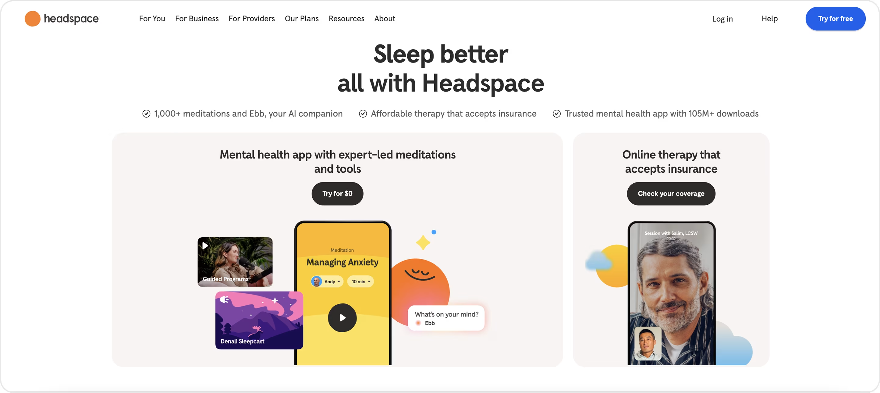
Headspace
Headspace is a subscription service app for mental health and mindfulness, utilizing a website with a modular layout. It meets both individual and collective needs, offers smooth onboarding and navigation by category, stress, sleep, focus, etc.
What makes their website special is:
- The emotional design with the warm colors, playful illustrations, and delightful animations creates a tone of comfort for users, while being clean and professional at the same time.
- Their comprehensive design system was created with Figma using variables and tokens, offering strong brand parity and consistency to scale touchpoints.
It also stands out as one of the best SaaS UI examples, showing how thoughtful visuals and structure can make even complex services feel approachable.
Must-have Pages To Boost Sales On Your B2B SaaS Site
Not every SaaS website page is meant to be a high-converting page, but some pages are truly transformative. These pages are necessary to establish trust, explain the value proposition in simple terms, and provide evidence that the product works.
When done right, they don't just inform – they make it easy to compare, get confident, and make a move. Less friction, faster decisions, and a higher volume of sign-ups or demo requests.
Pricing page
Pricing is one of the first things most people look for. A page that is clear and transparent will create trust and avoid loss of clicks.
- Show the most popular plan front and center, make the differences in features obvious, and keep the layout neat.
- Use tables or cards, have a monthly/annual toggle, and place call-to-action buttons where people expect them.
Remember that your goal is to remove doubt and make plan selection easy and quick.
Solution and feature-specific pages
Feature or industry pages are designed to target specific pain points or industries.
- Each page should target a pain point, highlight the clear benefit of addressing that problem, and make the solution painfully obvious.
- Short copy, impactful images, interactivity, and customer proof aid in the transition from interest to trust.
When done properly, they should also contribute greatly to SEO and bring the right traffic to the site.
Not sure which web pages to develop, or feel like your existing ones aren't working? That's where Arounda comes in. After years of SaaS design work, we know how to create pages that convert.
With our Website Design Service, we will assist you in picking the right pages and designing them around buyer needs to get your product the traction and customers it deserves.
Competitor comparison pages
It's just a fact of life: buyers will always compare you to other options! If you don't present the context somewhere, they will find it. A well-written comparison page displays what you do better than everyone else - without disparaging your competition.
For example:
- Utilize a nice side-by-side grid with features, pricing, and support information.
- Make it scannable and include real statistics or quotes from legit sources.
You want your product to feel like a safer and smarter choice.
Blog
You see, when you have a blog, you're not just writing content; you are creating a sales machine for your product. Valuable content draws organic traffic, answers buyer questions, and builds authority in your space.
You want the design to be very easy to read:
- Clear type
- Big headlines
- Clearly defined categories.
When you add CTAs in posts, you are making your blog a direct part of the funnel.
Documentation
Docs are not normally thought of as a sales driver, but they're a great way to quietly show how solid your product is. For decision-makers, they're an indication that the product is reliable. For users, they limit headaches and cut down on support tickets.
Documentation should be:
- Searchable
- Well-structured
- Mobile-friendly.
A polished docs hub builds trust, and trust will keep customers loyal for the long haul.
Summary
All the best SaaS websites show that design is not just decoration. It is the core of the product story. In fintech, Web3, healthcare, or B2B, effective design builds trust, simplifies complicated decisions, and shows what the real value is. The SaaS website examples we reviewed above demonstrate it: clarity, storytelling, and user-first flows are what distinguish the best SaaS product platforms.
Whether it's your pricing pages, feature highlights, or onboarding flows, design connects your platform to real growth.
Do you want to make your site go to the next level? Get in touch with us and we'll design a high-performance website focused on converting visitors into loyal customers.

Table of contents


FAQ


89+ Reviews
on Clutch

Top Rated Plus Agency
on Upwork

Top 50 Trending team
on Dribbble

Projects are Featured on Behance platform
