
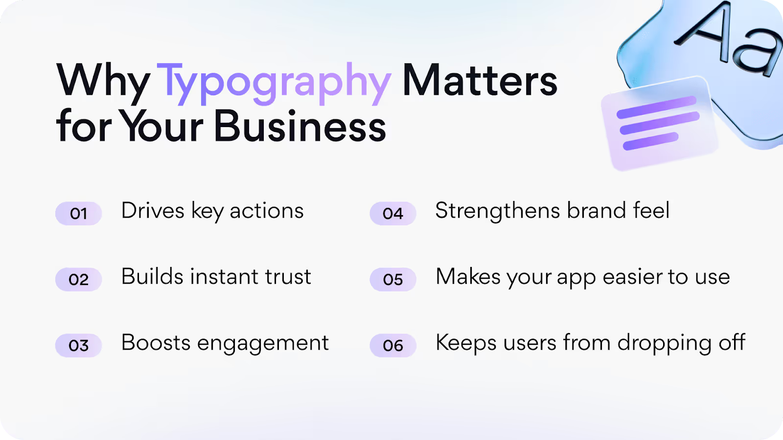
How Typography in App Design Impacts UX and Branding

Typography is more than just choosing a typeface you like and putting it on display - it's a major contributor to user experience within your app and, ultimately, how users will remember your brand. The right typeface can help your product feel clean, modern, and trustworthy. The wrong typeface? Сonfusing, cluttered, and that's if they even remember it.
As screens get smaller, user standards grow, and typography in app design becomes crucial, helping users find what they need faster, read easier, and trust what they see. Believe it or not, it's a growing industry: the global font and typeface market is projected to reach $1.47 billion by 2029, increasing by a compound growth rate of 4.1%. This demonstrates the significant growth of type, not just an aesthetic choice but a real business impact.
Our Arounda team wrote this article to enable you to transform your UX and entire brand identity through your typography choices.
Why Typography Is More Than Just a Design Choice
Typography in web design goes beyond font selection. Typography in visual content and throughout your site can attract traffic, establish a tone, and influence user behavior.
Web typography extends beyond choosing a typeface; it significantly impacts content effectiveness.
Typography sets the mood, like room temperature. It might be warm and fuzzy or chilly and sharp. The right temperature is barely noticeable, but even a couple of degrees off is quickly evident.
Web typography subtly influences site visitors' decisions. Are you trying to get users to stay longer on a page or move on quickly?
The Intersection of Typography, UX, and Brand Identity
Typography combines form and function. It's not only about how things look. Typography is about how things feel and how they function. The right typography encourages readability, encourages flow, decreases friction, and ultimately makes your app or website easy and enjoyable to use.
Typography also provides a myriad of associations about your brand.
A bold geometric font? You feel confident and cool. A soft serif font? You're looking to be trustworthy and timeless.
When you apply the right typography, you strengthen UX and your branding. It allows users to feel something and do something, and that's really what effective product design is about.
Typography Terminology You Should Know
Knowing a few basic typography terms will enable you to make more informed design decisions and communicate more effectively with your designers.
Here are just a few main terms:
- Font: A digital file of a typeface. These are files you download and put into your computer's or website's font book to display the downloaded font.
- Typeface: A typeface is also called a font family. A typeface is a set of particular types of fonts to be used in all letters or type designs (there are many definitions of typeface).
- Kerning: It is the spacing between individual letters. Good kerning improves readability and visual balance.
- Leading: The vertical distance between lines of text. Lines can feel cramped (too close) or loose (too far apart).
- Hierarchy: The arrangement of type that is supposed to suggest a way to direct attention. Headlines, subheads, and body text must clearly suggest structure.
- Weight: How you perceive the thickness or thinness of the font on the page. (Light, Regular, Bold) You can use weight to create emphasis/contrast.
- Line length: The number of characters you can fit on a line. For good readability, we recommend keeping line length to ~50-75 characters in a line on a desktop.
How Typography Influences User Experience (UX)
88% of customers state they will not return to a website that provides them with a poor experience, thus demonstrating how bad UX drives users away.
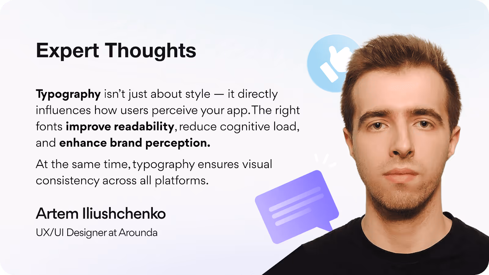
UX design heavily relies on typography as its fundamental element because it determines how users understand and interact with digital content. The design of typography influences both usability and readability while simultaneously creating emotional responses in users.
Readability and Scannability
Good typography in app design gives your users the ability to read quickly and without effort. Proper font selection, app font size, spacing & margins produce content that is easier to scan (which is necessary, especially on mobile). Users are not going to read every word; they skim. When typography takes scanning into account (certain characteristics that include headings, bullet lists, and it helps to have shorter line lengths), users will stay engaged and find what they are looking for very quickly.
Navigation and Cognitive Load
Typography is essential for guiding users through an app or site. When typography is organized, and font has distinct variations between headings, buttons, and body copy, users immediately know what is clickable, what's important, and what to pay attention to next; therefore, it reduces cognitive overload – users don't have to think too much about figuring stuff out!
When typography doesn't provide that visual path, all the text appears the same and is confusing or disorienting. Good typography can help users flow, make decisions faster, and focus, even without realizing why.
Accessibility Considerations
Typography is leading the charge of the accessibility movement in UX design. If text is not legible and usable to everyone, including people with vision or cognitive disabilities, it lacks accessibility.
For accessible typography, best practices include:
- Enough contrast between the text and background.
- Let users who need larger text adjust font sizes.
- Avoid highly styled fonts that confuse or irritate consumers.
Websites that consider accessibility usually use a clean, sans-serif font, with ample space between lines and high contrast.
Emotional Impact and Perceived Usability
Typography goes beyond cue; it has emotion. When a user sees a clean and professional font, they perceive it with a sense of reliability. When they see an adventurous font, they feel a sense of novelty or fun. This can impact how they feel about using your product and whether they will ultimately trust it or leave it.
In UX design, typography is not just about understanding typography as a technical skill but rather as a proposition of professional judgment. The point of typography is to apply it in a way that enhances readability, supports brand identity, and creates a holistic experience for the user.
At Arounda, we get that typography isn’t merely style, it’s part of how users experience your product! If the label on a button is hard to read, or if important messaging gets lost in a block of fat type, the user might miss something important. This is another reason we consider typography an important element in our UI/UX design services - to make sure every word works for your users.
Typography as a Brand Expression Tool
Brand consistency boosts revenue by 23%. Brand identity typography goes beyond choosing pretty fonts. It requires a consistent visual language that reflects a brand's values and communicates across media. This visual language shapes a brand's identity and how consumers engage with and remember it.
Establishing a Distinctive Brand Voice
Here's the deal with typography: it's one of the quickest signals to a user about your brand's persona. Before a user even reads your content, the type is telling the user something about who you are.
Every typeface has a tone. For example:
- Geometric sans-serifs, such as Montserrat or Inter, have a clean, progressive, and technical feel, which is great for new startups or digital products.
- Humanist or serif fonts, such as Merriweather or Playfair Display, have a classic, warm, and trustworthy feeling, which is used in finance.
- Monospace fonts can signify a real technical sophistication - these fonts are seen in developer tools or cybersecurity brands!
Arounda Suggests: Start with identifying your brand's personality (i.e., confident, friendly, or disruptive) and choose fonts consistent with those characteristics. To maintain consistency, limit yourself to 1 - 2 main typefaces.
Consistency Across Platforms
Inconsistent typography gives your brand an unprofessional, chaotic quality, which ultimately makes it untrustworthy. However, when your type is used consistently everywhere you work - website, app, social media post, presentation, etc. - users begin to recognize your brand and build a sense of trust.
Consistency is also a usability benefit. When a user can instantly recognize heading styles, buttons, or even menu fonts, they are able to navigate with more confidence and speed. Familiarity leads to a more seamless and instinctual flow.
Build your typography system: establish font size for mobile app, font pairings, weights, and spacing, and set up rules for their use. Use your system everywhere you go, on the web, mobile, email, presentations, etc., to create a uniform experience for your users.
Typography and Visual Identity
55% of consumers associate first brand impressions with visuals, to which they have responded. The look and feel of a brand are likely the first thing people notice and remember.
Typography often has more visual weight than a logo because users interact with it frequently on every screen, headline, button, and paragraph.
When typography is well-designed with visual flow, your product feels intentional and polished. When it clashes with the other visual elements, it creates friction and distrust.
In our work, typography is one key component that gives brands clarity, consistency, and character.
During our work with WordPress, we designed a new admin dashboard experience centered around clear and modern typography to improve readability and focus. Visually redesigning the dashboard also helped clarify the navigation experience, reduce cognitive effort, and unify the visual and professional tone of the interface.

Best Practices for Mobile App Typography
To create visual harmony on smaller screens, app typography designers must use the proper mobile app font size guidelines. Here are some tips for making mobile typography that is both useful and appealing.
Font Sizes for Different Devices
To ensure your designs are accessible on a variety of devices, font sizes and styles are crucial.
- Bigger screen: The bigger the screen, the more room to work with on the design. In body text, we feel that a base font size of at least 16-18 pixels looks best, and the headings can vary from somewhere in the range of 24-48 pixels depending on the hierarchy.
- Mobile screens leave little space, so you really have to consider what font to use. You want to select the font with the body copy size to minimize the amount of scrolling. The best font for mobile app should be a base size of 14-16 pixels - this is widely accepted as the minimum font size for mobile to ensure readability without zooming.
- Tablets and hybrid devices are messy because their screens vary in size and/or orientation. Fluid typography methods may help to get sizes to change fluidly.
Here’s an example of our work with Javes, where we developed both desktop and mobile versions with fully adapted typography. The desktop version features a clean design with ample space and an organized visual structure.
The mobile version received adjusted font sizes and spacing to maintain text readability while preventing it from becoming too dense. The experience remains smooth, consistent, and easy to use across all devices because we applied responsive typography techniques instead of basic element shrinking methods.

Creating Hierarchy with Type
A solid typographic architecture supports clear connections between text pieces, which helps facilitate users' wayfinding through content. Hierarchical interfaces can help with the scanability and enhance the user's ability to prioritize content.
Here are a few ways to establish the hierarchy:
- Apply mobile font size best practice: Use larger font sizes for primary content and smaller ones for secondary details.
- Font weight: The bold weight is more visually striking and tends to draw attention to important things.
- Color: Use color contrast to signify important things, but follow the accessibility guidelines.
Our work with Swiftbot is a great example of a well-defined typographic hierarchy. We created a simple, readable system that structured content by size, weight, and spacing. The headings are legible and prominent, the body copy is quick to scan, and the overall layout feels balanced.

Whitespace and Padding
The empty space surrounding your text (also known as padding) holds the same importance as the type itself. Fonts require space to breathe. The best typeface will appear cramped when white space is insufficient. White space strategically placed between text elements and lines enhances readability, visual flow, and user attention. Users can scan text more efficiently through whitespace, which also reduces cognitive load and helps emphasize important content.
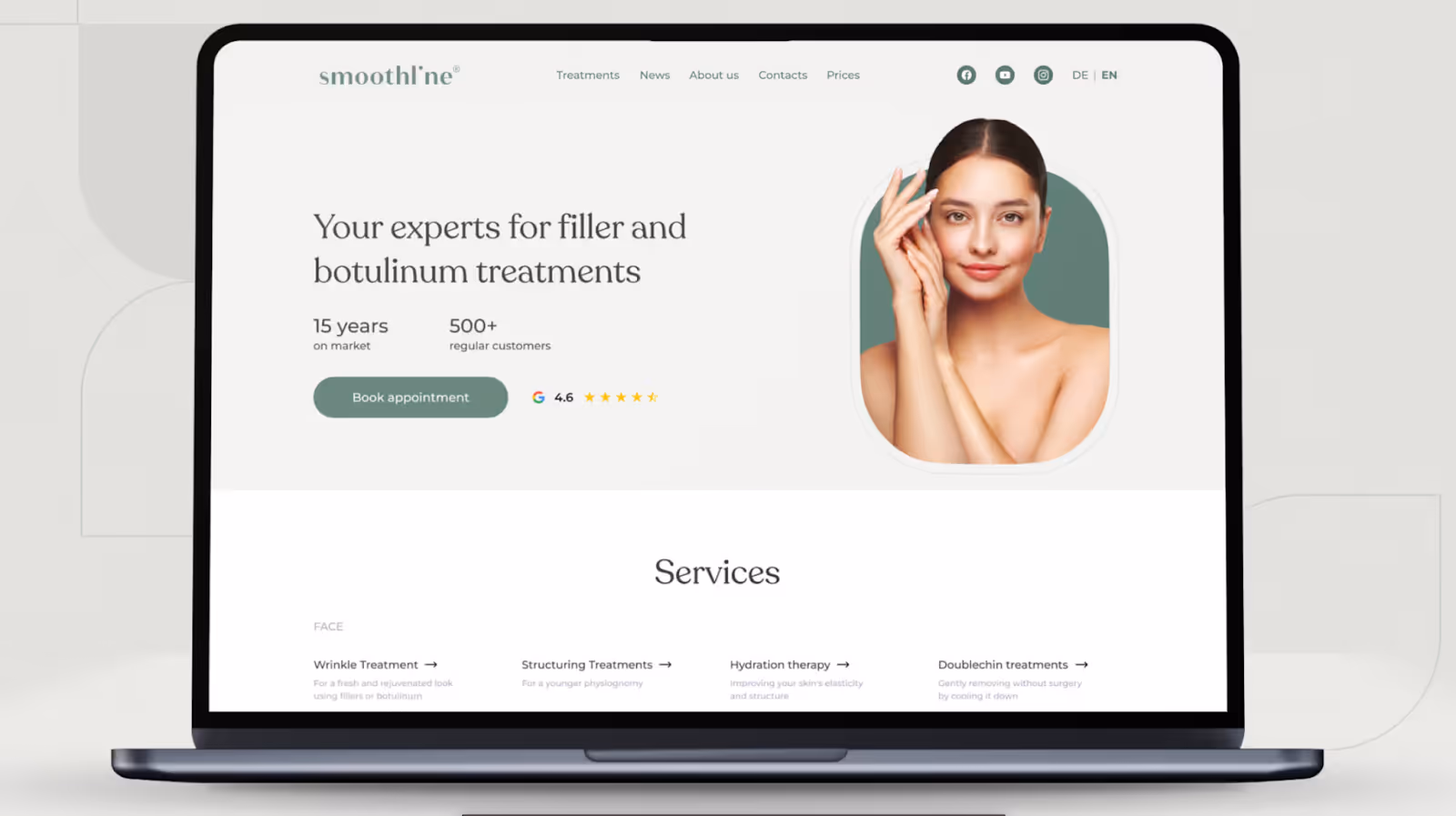
While working with Smoothline, we prioritized typography and generous space so that the UI felt open, legible, and scannable.
If there wasn't enough space in the layout, it would’ve felt cramped. Here, whitespace provides structure, gives focus, and allows content to breathe, enhancing the overall usability and comfort for users.
Responsive and Scalable Typography
Responsive typeface allows users to adapt to multiple screen widths to promote accessibility on any device. Text must be readable and beautiful on every device (desktop, tablet, smartphone).
Here are some suggestions for an extremely responsive typeface:
- Use relative units such as "em" or "rem" in typographic scale rather than fixed pixels.
- Choose fluid typography where the size of type changes automatically based on the size of the screen.
- Test typographic elements in landscape and portrait.
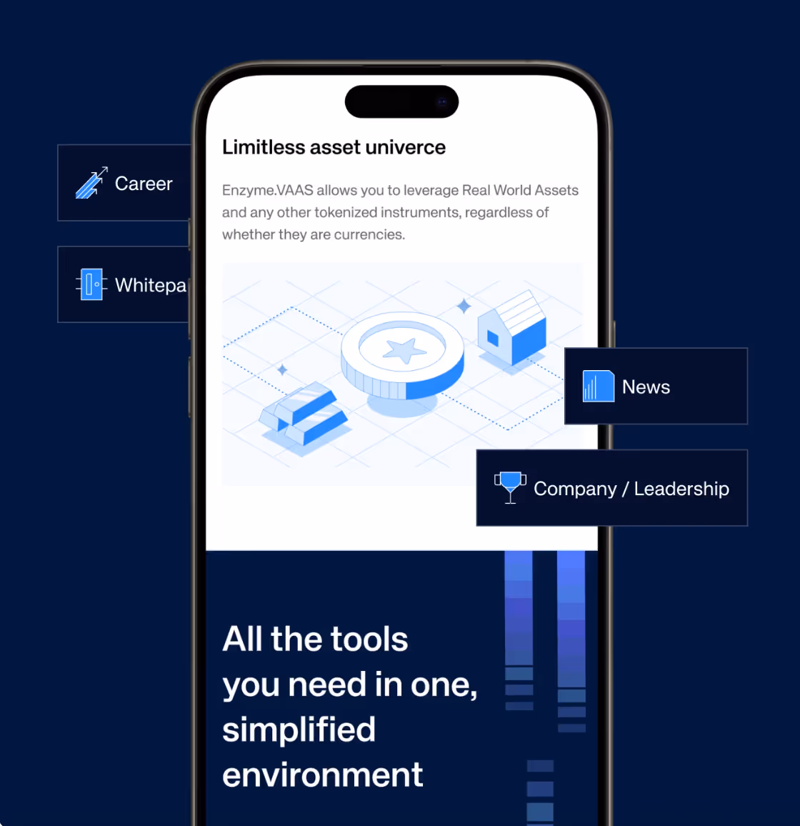
You can see an example of responsive typography in our Enzyme case. For this case, we designed the desktop and mobile versions using fluid typography and relative units and made sure all text was comfortably legible, clean, and balanced, regardless of screen size or orientation.
On the desktop, we employed a roomy layout with large headlines and visually balanced line lengths to promote easy scanning of content and good visual hierarchy.

On mobile, we made changes to font sizes, spacing, and layout blocks to optimize for smaller screens while maintaining information clarity.
Font Pairing Tips
Now let's take a look at font pairing. This is about contrast and balance. You want to choose a typeface for your headings and a typeface for your body text that work together as a pair.
You can make contrast with style or weight, but make sure the two typefaces don't have contrasting personalities! Don't go crazy with fonts. Limit to 2 or 3 fonts at most. For each one, make sure to define its use or role within the app. If you pair fonts consistently, you'll be creating a refined look, beautiful formatted text, and increased readability in the app.
Here’s what we did when working with Astra. The combination of Sora for bold headlines with Poppins for clean, readable body text represents an excellent example of font pairing. The weight difference between the two fonts creates structure, yet their shared geometric style maintains a modern and consistent appearance.

Looking for help with branding or typography?
At Arounda, we know how to make it work. We will create a font system, build a clear hierarchy, and create a visual language that makes your product feel unique, attention-grabbing, and memorable.
Typography in Action: App Examples
Here are some of the greatest examples of apps that use typography not only for decoration but to help the user, promote trust, and reinforce brand identity.
Case Study: Airbnb
Airbnb incorporated typography to elicit a calm, inviting feeling in their experience. The font they made for Airbnb, "Airbnb Cereal," is clean, rounded, and friendly. They were consistent with the spacing and hierarchy when interacting with a listing, so users could quickly get around the app.

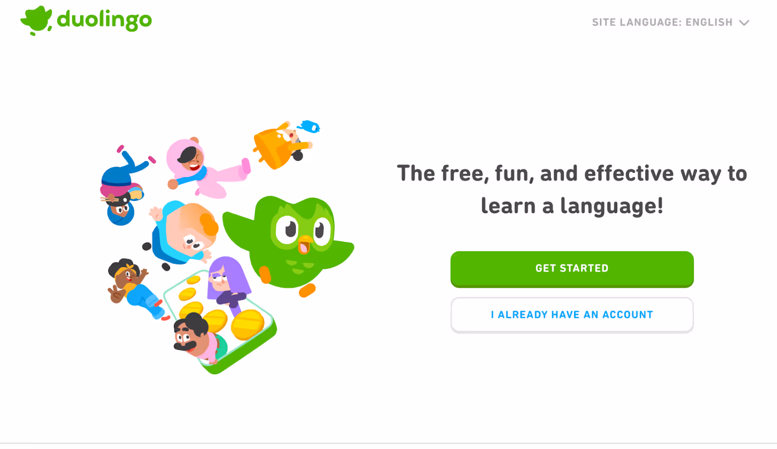
Case Study: Duolingo
The type style used by Duolingo has fun and bold typography. Given that Duolingo's brand is fun and gamified, it is important to support shorter attention spans. The app uses big headings, colorful highlights, and other visual elements that have a high contrast; all of which support readability and reinforce the fun, light-heartedness of the brand.
Case Study: Revolut
Revolut keeps things modern and trendy with sans-serif typography that plays to its modern fintech image. The typography is minimal and elegant, ultimately meant for people who are on the go. The contributions of prominent hierarchy and exact text styles allow users to easily navigate their transactions while making the most complex tasks feel simple.

Common Mistakes to Avoid
- Relying on too many fonts. Although you now have access to every possible typeface on the globe, it doesn't mean you should use them all.
- Misaligned fonts. Selecting fonts that contrast with each other is equally important for pairing; some just work better than others. An excellent example is Roboto and Montserrat - both are sans-serif and have similar weights and styles.
- Not having a typographic hierarchy. Your copy's importance is determined by its typographic hierarchy. In the absence of a defined hierarchy, the content's significance becomes murky. Building styles for body text (p) and a handful of header text styles (h1, h2, h3) is a common practice in web design.
- Lack of or excessive leading. A block of text's leading, also known as line-height, is the distance between lines. Lead was the actual material that typesetters used to separate lines of text. Excessive leading could cause the lines in a text block to be perceived as random, disjointed thoughts. Also, too little leading is bad; it will make the lines of text appear cramped and ugly.
To prevent falling into any of these traps and to ensure that your typography is fulfilling its purpose of improving the user experience, it is helpful to have a team behind you that understands a set of design principles and the impact they could have on the final product.
At Arounda, our Brand Identity Service helps businesses develop clear, consistent, and scalable digital interactions for their customers. We don't choose pretty - we create full typography systems that will support usability, convey your brand voice, and work on the web, mobile apps, and way beyond. Our design process will ensure your product leaves a sharp look, is easy to read, and feels right, from layout to branding and microcopy.

Conclusion
Typography has enormous potential to cachet a brand's identity, promote brand awareness, and maintain advertising life. And yet, it's mostly disregarded. It has the power to impact a consumer's perception on first glance, induce trust, and engage people emotionally.
If you want your product to look sharp, feel clear, and speak with intent, our Arounda team can help you get there. UX, typography, branding, and complete digital design - we have you covered. Contact us and we'll create something bold together.


Table of contents


FAQ
A basic typography system should include pairings of fonts together with size options, weight choices, spacing rules, and application guidelines. The brand design guidelines should contain all necessary documentation, while shared libraries or design tokens should be used across web, mobile, and marketing platforms to maintain team consistency.
The trust required for healthcare and fintech work depends on uniform, clear typography. Your users will feel safe and in control of their experience while being fully informed about their choices when your typography presents clear hierarchies and good legibility with sufficient space between elements.
System fonts usually load faster and perform better for apps that demand your performance. Custom fonts add personality and allow for brand flexibility. You choose what matters most, speed or identity. Many brands will leverage system fonts for their UI and use custom type for marketing or headlines.
Typography helps steer users through onboarding with a noticeable visual flow. Strong headlines, short, legible copy, and spaced steps alleviate fatigue and help users understand what to do next. You will get users to understand your product more quickly.
Check your typography with major product updates, if you do a rebrand, or if your design has changed and no longer feels consistent or modern. If users are struggling to read your text, or it is apparent your brand has changed, you should consider reviewing your type system.


89+ Reviews
on Clutch

Top Rated Plus Agency
on Upwork

Top 50 Trending team
on Dribbble

Projects are Featured on Behance platform
