
22 Dark Patterns Examples You Should Avoid

Most users never notice when a design quietly pushes them toward a decision. A countdown timer, a concealed charge, a “free” trial that automatically renews, etc., all display the small improvements that aren’t glimpsed in the larger picture. The OECD’s report on dark commercial patterns finds that 75% of websites and applications contain at least one such manipulation, such as misleading timers, concealed subscriptions, or obstructed cancellations.
These patterns can improve short-term conversions but damage what really matters: trust. People leave when they feel fooled. When trust erodes, both customer acquisition costs rise, retention drops, and brand credibility suffers as well. Good design is not about “being nice.” It’s about making products people want to come back to because they feel respected, not cornered.
In this article, our Arounda team looks at twenty-two dark patterns you should know about and avoid. We will explain why they exist, how they can hurt your business, and how you can replace them with a clear, effective design that promotes growth the right way.
Article Key Takeaways
Many digital products still use deceptive designs that create short-term clicks at the expense of trust, retention, and brand. Ethical UX and UI can reach the same conversion goals without manipulation, creating loyalty and sustainable growth.
The Arounda team wrote this article to help you recognize and eliminate the harmful practice of manipulative design. We provide 22 real examples of manipulative patterns found in web and mobile applications, explaining their impact on business and why they diminish user trust. You’ll also learn to create authentic, high-converting experiences ethically, leverage real product best practices, and identify and fix bad patterns early in your design process.
What Are Dark Patterns?
Deceptive patterns are design shortcuts that prod users to do things they didn’t intend to do. They cause people to hit “Accept all,” purchase things they didn’t plan to buy, or sign up for some free trial that is hard to get out of. They hide information, confuse the issue in terms of making choices, or create an artificial urgency to get people to do something quickly that benefits the business.
Unlike basic design mistakes, misleading patterns are intentional. They use actual UX skills, but just pointed the wrong way. Rather than help users make clear decisions, they intentionally manipulate users into the easiest or most profitable option for the company.
Even leaders in the digital product space warn about how far these manipulative design practices have evolved. As Benjamin Humphrey, Founder and CEO of the customer research platform Dovetail, notes:
“Deceptive patterns are nothing new, but the problem is that they are infinitely more clever as the stakes get higher: what was once a nuisance on an off-the-beaten-track user experience is now a gamble on privacy, data sharing, and high-stakes unintended financial consequences.”
Recognizing these patterns is the first step to designing better products that earn trust by actually helping instead of manipulating people into action.
How to detect Dark Patterns?
Identifying unethical patterns begins with looking at your product from the user’s perspective. If a flow feels busy, rushed, or just harder than it should be, there’s a reason. Dishonest patterns often appear in the details – such as button text, the order in which layouts appear, or how difficult it is to undo an action.
Here are a few simple ways to spot them:
- Check for imbalance.
If one option is prominent, large, bright, and easy to click on, and the other option is small or hidden, then the site design is attempting to influence a certain option. - Review transparency.
Check to see if all pricing, settings, and policies are clear to the user prior to confirming an action. In other words, if there is anything hidden, like fees or unclear renewal options, privacy information tends to be vague as well. - Test the exit path.
Try to cancel a subscription, unsubscribe, or refuse permissions, etc. If it takes too many clicks or steps that are not clearly defined, then perhaps the exit path is designed to discourage one from taking it. - Look for false urgency or scarcity.
Countdowns that reset themselves, or “only 2 left” alerts, which never change, give ga ood indication of what one is up against: manipulation. - Ask the fairness question.
Would a user make the same decision if everything were explained clearly and both options looked equal? If the answer is no, the design likely contains a dark pattern.
Spotting these signs early on lets you redesign the experience to be based on clarity, trust, and informed choice – values that keep users coming back.
The Impact of Dark Patterns and Their Widespread Use
Manipulative patterns can be found in virtually all categories and all kinds of digital products, from ecommerce checkout to mobile apps, subscription services, and cookie banners. They not only frustrate users but also produce quantifiable harm to businesses. When users feel manipulated and forced into making purchases, they develop distrust. This means that churn occurs faster, retention is reduced, there are more refunds requested, and support costs rise.
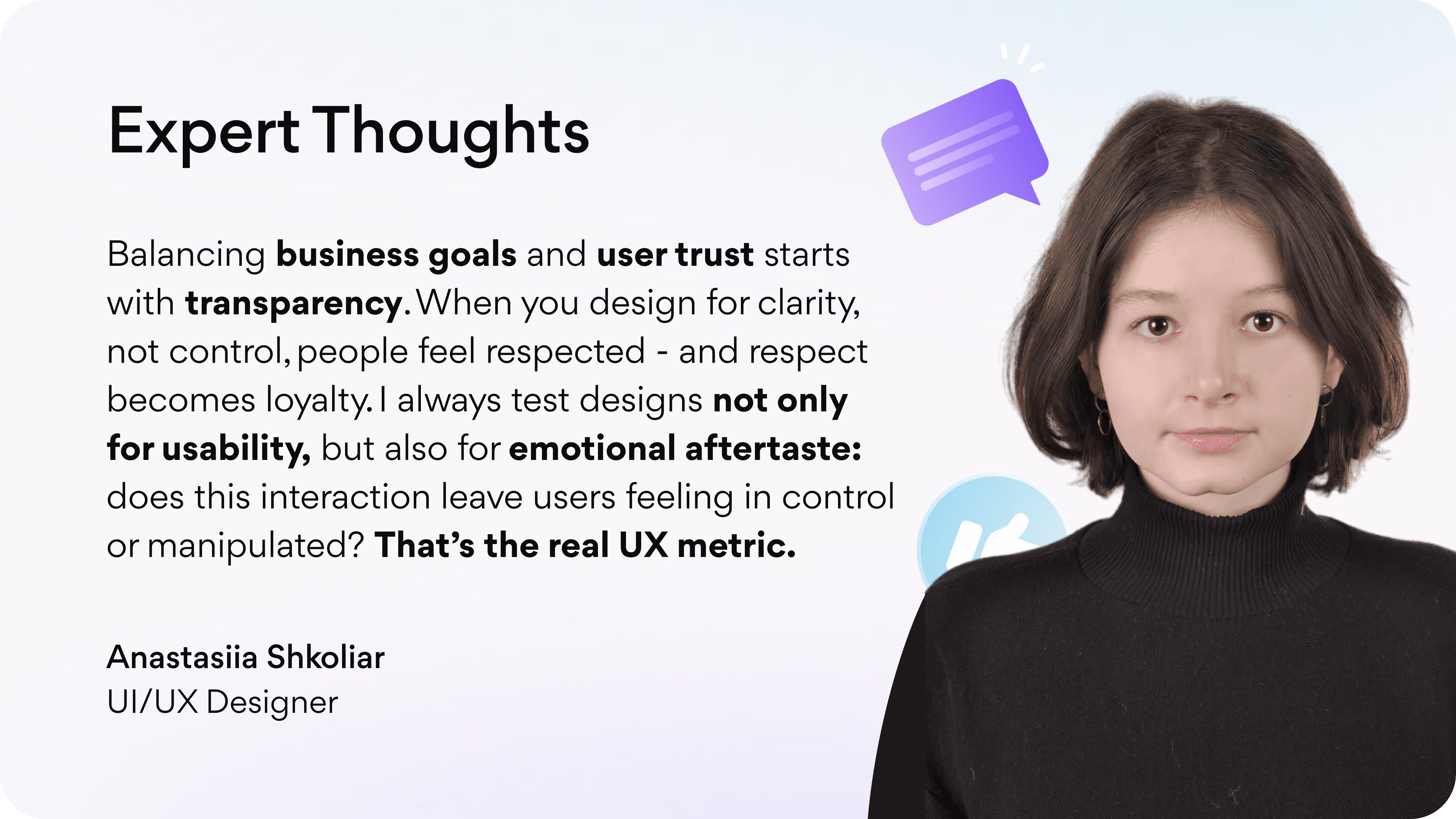
We spoke with our UI/UX Designer, Anastasiia Shkoliar, about how deceptive patterns affect user behavior and business performance.
Anastasiia shared her expert view:
’’Deceptive patterns rarely show their full impact immediately - they accumulate over time. After a week, users might just feel minor irritation. After three months, that irritation becomes distrust. And after a year, it often transforms into user churn and negative word-of-mouth. Manipulative design may win short-term conversions, but it silently destroys brand equity in the long run.’’
US and European regulators are already addressing deceptive design. Hidden fees, vague consent, or difficult cancellations can lead to fines, investigations, and public reports. Each vague checkbox or confusing statement is a potential compliance issue that can damage reputation and trust.
General Dark Patterns
In this section, we take a look at 22 real-life dark patterns examples. Each one shows how one small design choice can lead users astray and damage trust and performance as a result.
For each example, our experts from the Arounda team explain why it is a dark pattern, why it is harmful, and how to correct it.
Hidden Costs
Hidden costs appear when the interface shows a low base price and reveals extra charges only near payment.
On Airbnb, for example, a listing may show that the fees are included in the price, but when the total is shown at the time of payment, consumers notice that the numbers are different, pause, and re-compare prices. Some drop off and others abandon the transaction altogether.
In the long term, trust is lost. People learn not to believe the prices shown; they open more tabs to check and postpone decisions. Refunds and complaints rise, and marketing has to work harder to retain the same customers.
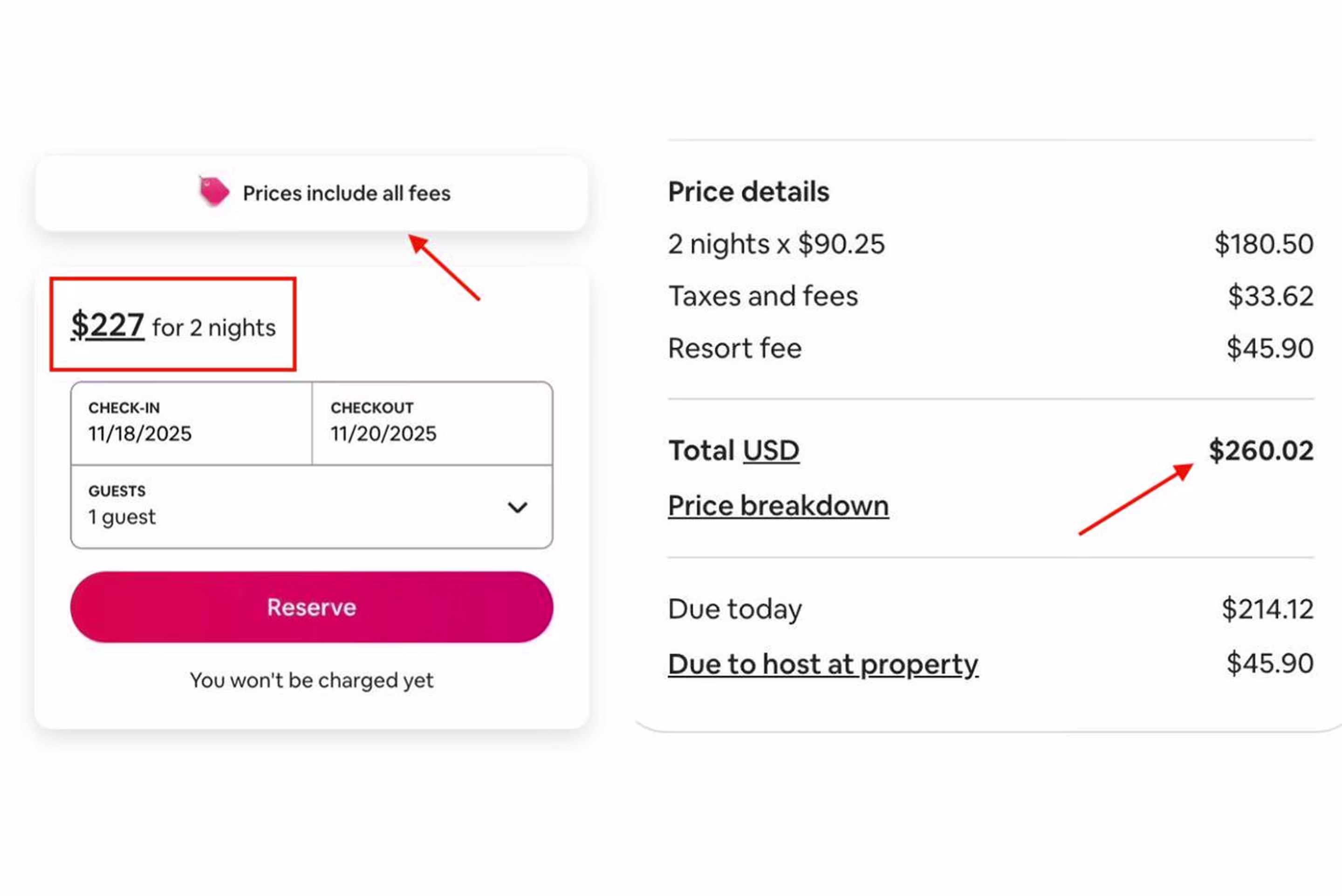
Arounda’s Fix:
- Display the full price, including all fees, from the first screen to checkout.
- Use the same total across every step and clearly explain any changes.
- Let users expand a short “See price details” link instead of revealing fees at the end.
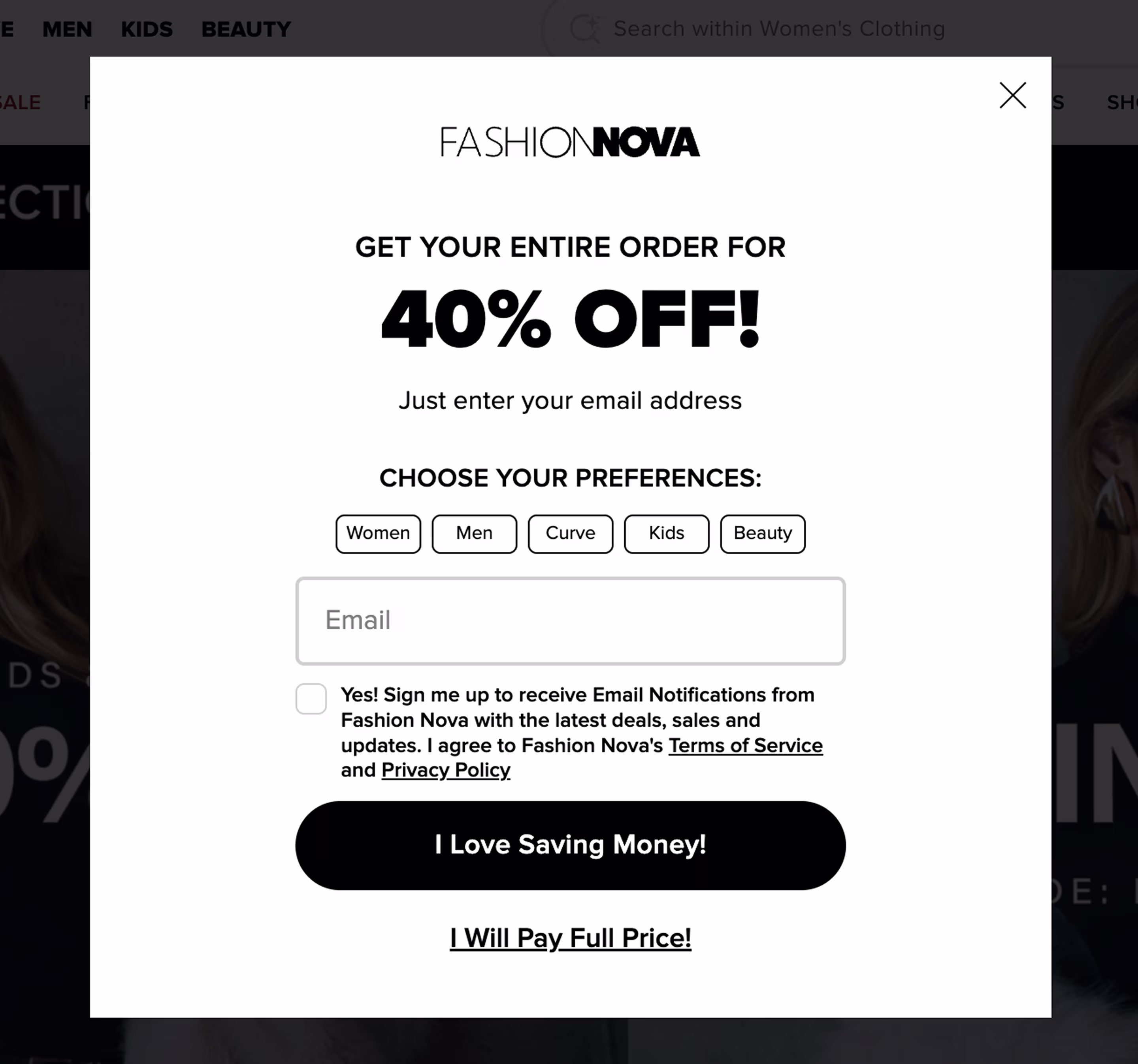
Sneaking
Sneaking means that something is added to the product or service without it being clearly selected by the user. The goal is to make the user automatically accept those extras rather than ask him for them directly.
In the example from a real Namecheap signup screen, we see that the newsletter and marketing communication box is checked automatically. The user’s focus is on the big button, and many of them do not even see that they are opting in. People start getting promotional emails they did not ask for, mark them as spam, and end up not trusting the brand anymore.
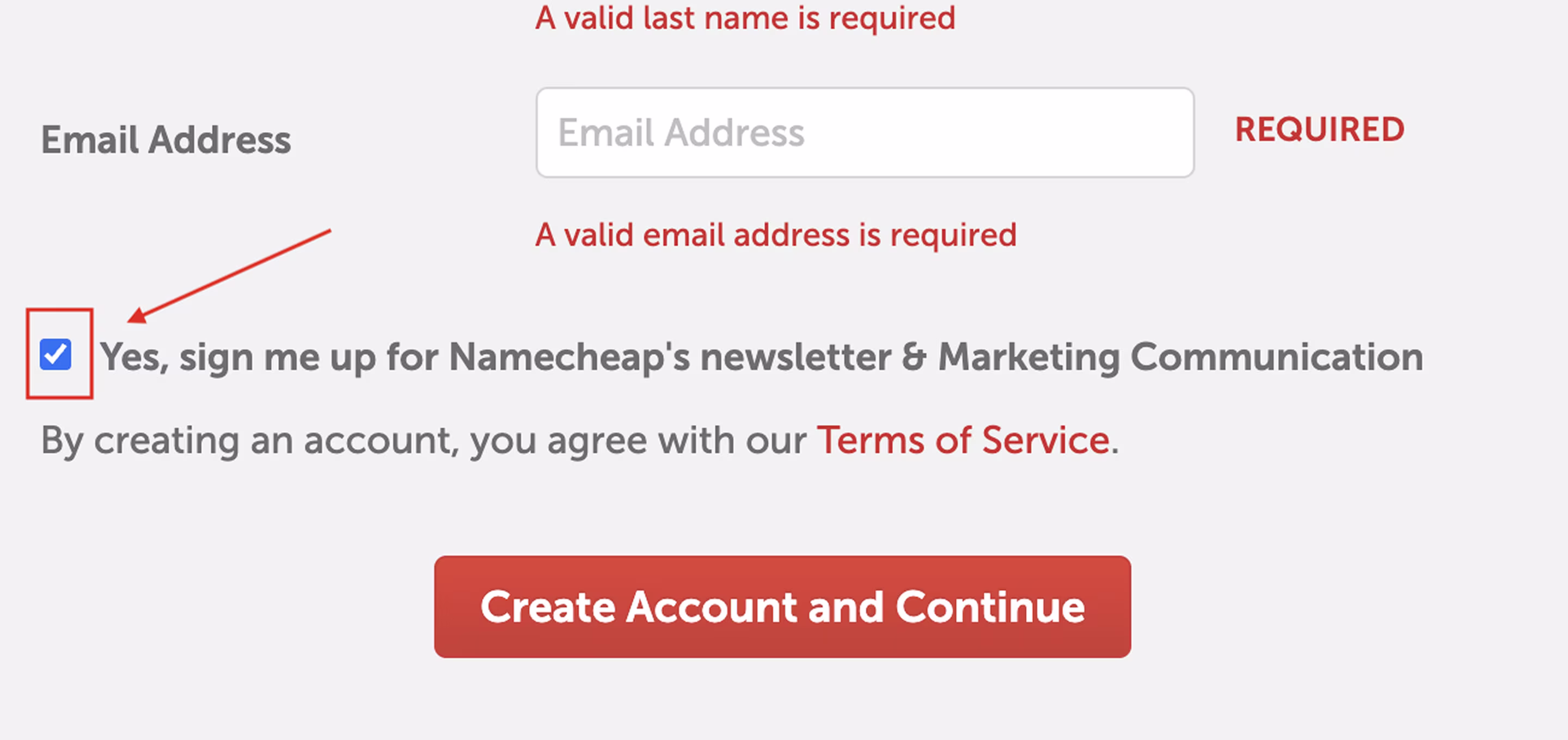
Arounda’s Fix:
- Leave all marketing boxes unchecked by default.
- Make sure users can create an account without agreeing to marketing.
- Add a short note on the frequency and purpose of communication.
Friend Spam
Friend Spam occurs when a service uses your contacts to promote itself without clear consent. It usually happens after you give it permission to connect to your address book.
An old LinkedIn signup flow worked this way: after importing contacts, all were preselected, and invites went out automatically. The fallout was enormous. People felt sabotaged, complaints and lawsuits ensued, and LinkedIn was forced to eliminate the feature and redo its consent flow.

Arounda’s Fix
- Leave all contact checkboxes unchecked and off by default.
- Let users find friends first, then confirm who receives an invite.
- Provide a simple way to revoke access and manage invitations in one place.
Nagging
When an interface continually presents users with the same prompt after they have already declined it, that’s called nagging. Nagging is meant to cause you to relent; it is usually for upgrades, reviews, or other thrust upon your notifications.
Here’s an example with YouTube Premium: the app keeps interrupting playback with the same pop-up. The offer of a free trial keeps coming through, even if users click ’Skip trial.’
Initially, it is rather easy to ignore, but the constant repetition breaks the flow and creates irritation. Eventually, users ignore reading such messages, mute notifications, or even leave the platform.
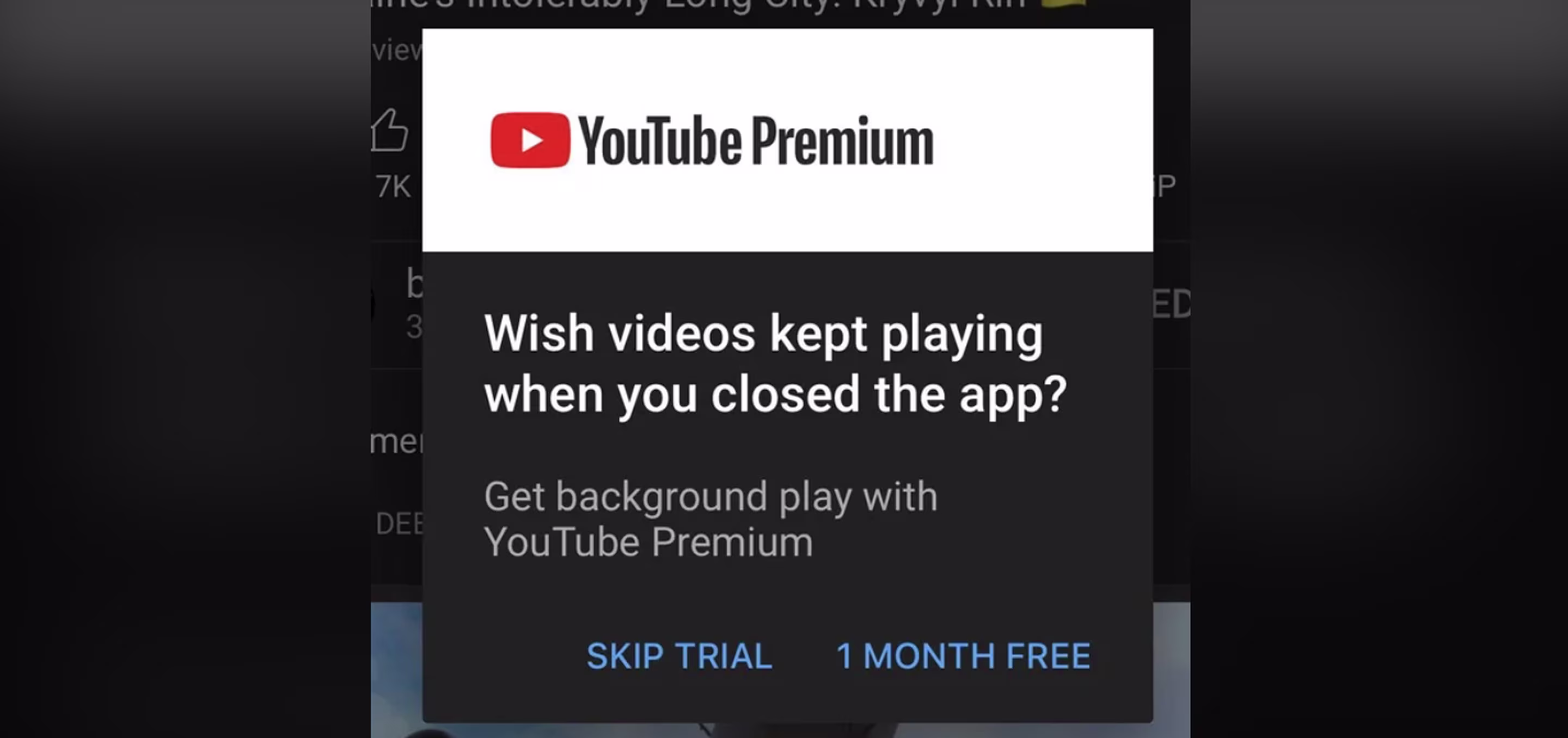
Arounda’s Fix:
- Don’t show the same prompt after a clear “No.”
- Offer upgrades only after a positive interaction, not during active use.
- Set frequency caps and suppress reminders for a defined period.
- Track dismiss and bounce rates to see when users feel harassed.
False Urgency
Fake urgency is when a product fakes the feeling of time pressure and forces a quick decision. You’ll typically see fake urgency in the form of countdown timers or text somewhere that indicates “Only 2 left!” which restarts once you refresh the page!
In this case, the SuperDeals section shows a timer running out. The offer looks like it’s about to expire, but in reality, the same deals reappear later. This tactic triggers FOMO and drives impulse buying instead of informed choices.

Arounda’s Fix:
- Implement deadlines so countdowns appear only when a valid deadline is in effect.
- List offers on a daily or weekly basis.
- Replace urgency banners with trust signals like guarantees or verified stock.
Privacy Zuckering
Privacy Zuckering means a customer is tricked into giving more personal information than intended because of confusing terms of use. The menu for rejecting cookies or limiting the use of their personal information looks easy, but the actual protection of their privacy is hidden in a series of mouse clicks.
On The Guardian, even the “No, thank you” button doesn’t actually block tracking; it still allows essential and sometimes marketing cookies. The real way to refuse data collection sits behind “Manage cookies,” which takes extra effort to open and configure. As a result, users unknowingly share more personal information than they intended and later feel uncomfortable when ads become too personalized.
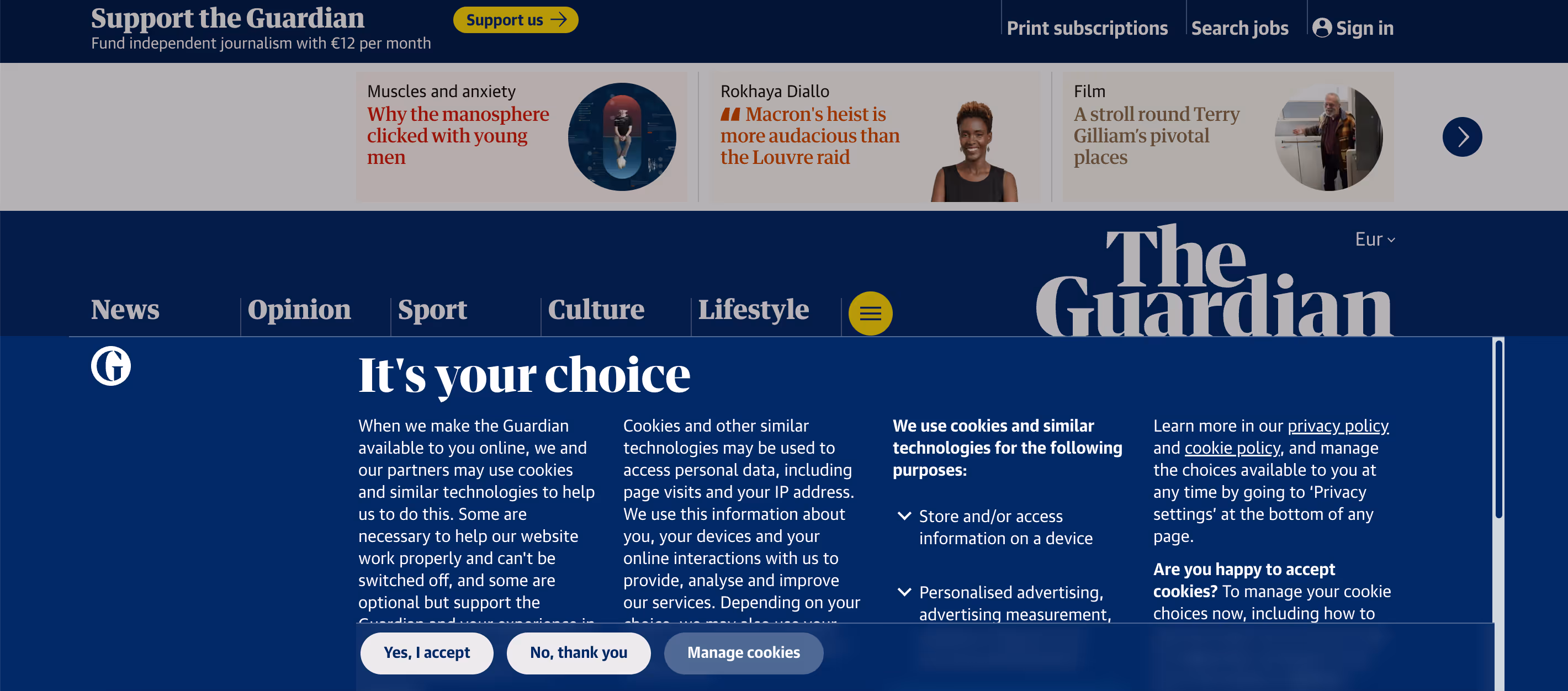
Arounda’s Fix:
- Give Accept all and Reject all equal weight and visibility.
- Keep optional cookies off by default and explain each clearly.
- Place the Manage settings next to the main actions and apply instantly.
Confirmshaming
Confirmshaming relies on emotional manipulation. Instead of respecting user choice, it pushes them with guilt or sarcasm. Over time, this tactic damages how users perceive a brand.
In the beginning, it may lead to increased clicks or signups, but in time, it will create resentment. People find themselves being made fun of or tricked, and they do not feel appreciated. They will unsubscribe quickly, ignore future opportunities, and stop trusting pop-ups. Once users realize a tone in a communication that is manipulative, the brand will lose its credibility.
Arounda’s Fix:
- Keep tone neutral and respectful, avoiding emotional pressure.
- Treat refusal as a valid, easy action and not something to “feel bad” about.
- Use humor sparingly and never at the user’s expense.
- Build long-term trust by offering clear value, not guilt-driven conversion.
Obstruction
An obstruction means a website adds friction to block or delay users from taking an action they want until they comply with a demand. Instead of offering an easy choice, the interface builds an obstacle that blocks the major activity.
Forbes here restricts access to their content unless visitors disable their ad blocker or create an account. The experience is very much like being kept out until you “play by the rules.” This forces users to take steps they did not want to take, increasing the level of frustration and diminishing the level of engagement over time.
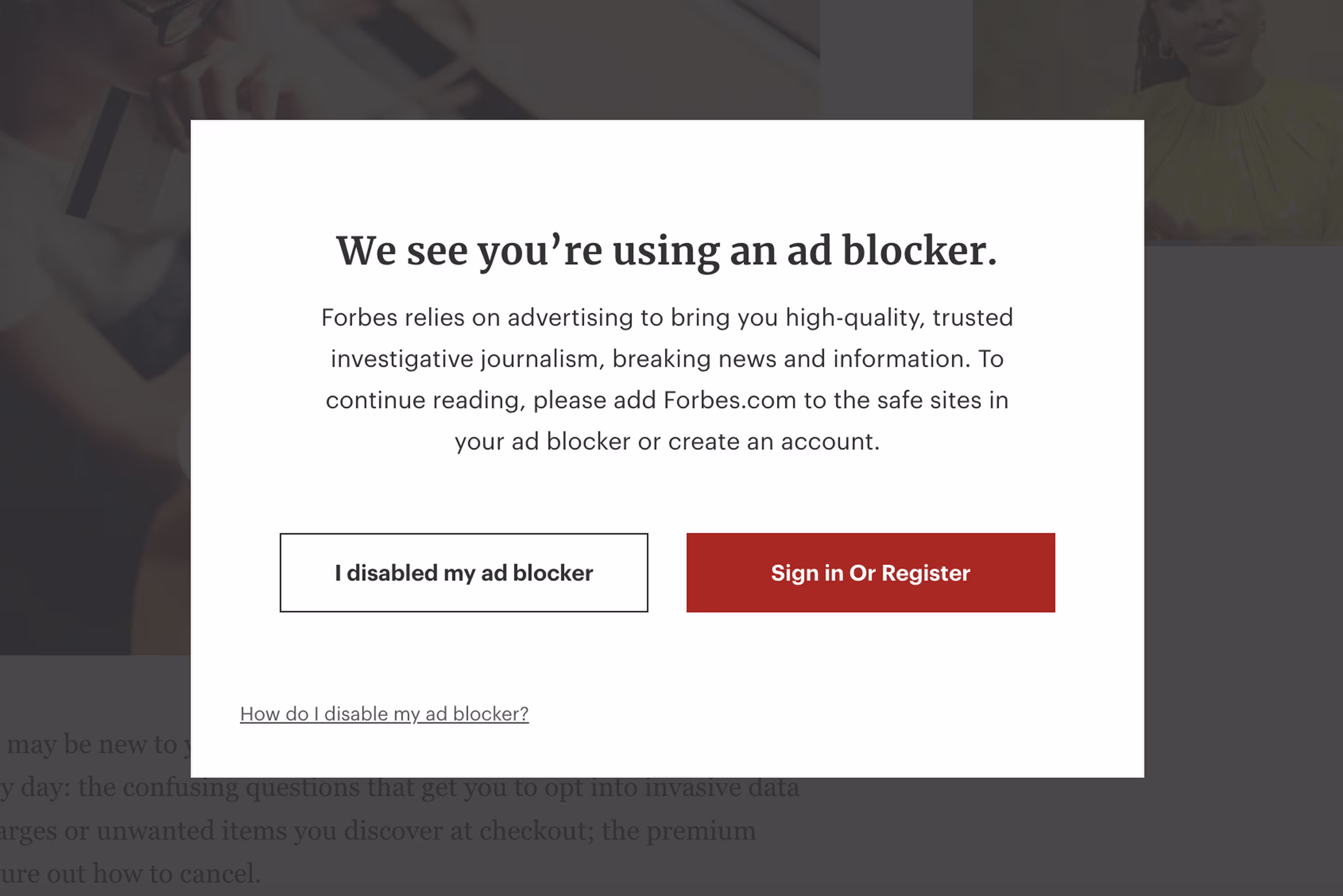
Arounda’s Fix:
- Provide a clear “Continue with limited access” option.
- Explain why ads or registration matter without blocking the main content.
- Use small, dismissible banners instead of full-screen overlays.
- Let users choose support methods, like “Allow ads,” “Subscribe,” or “Keep free access with limits.”
Bait and Switch
In cases of bait and switch, an interface promises one action but delivers another. It builds trust with a harmless-looking option but swaps it for something with bigger consequences.
A well-known example was the MS Windows 10 upgrade pop-up. Users thought that pressing “OK” would close the window, but it actually confirmed installation. There were many who accepted the upgrade without realizing it, lost control of when the upgrade occurred, and had forced restarts.
This breaks trust fast. When users realize they’ve been tricked into doing something major, they become hesitant to interact with future prompts.

Arounda’s Fix:
- Use clear, single-purpose buttons that match their labels.
- Avoid default confirmations for high-impact actions.
- Add a visible “Cancel” or “Remind me later” option.
- Explain what each button actually does before the click.
Preselection
Preselection is when a product "makes an implicit choice" for you. For example, a box is checked for you, or something is added by default, earning the company money for processing a preselected add-on.
On this Ryanair checkout page, marketing consent is checked by default in the contact details step. This checkbox looks familiar, is adjacent to mandatory fields, and unchecking requires extra effort. Users complete the booking process unaware that they will receive promotional emails they never intended to receive.

Arounda’s Fix:
- Leave all optional boxes unchecked and ask for explicit opt-in.
- Separate marketing consent from required booking fields and label it clearly.
- Remember the decision and provide an easy opt-out in every message.
Roach Motel
A classic “easy in, hard out” pattern. Subscriptions are quick to start, but buried behind endless confirmation loops when you try to cancel.
The cancellation flow for Adobe’s Premiere Pro takes users through multiple pages, asking their reason for cancellation, offering them deals, and requiring purchase confirmation multiple times before finally granting cancellation. It looks helpful, but it’s built to exhaust users into staying.
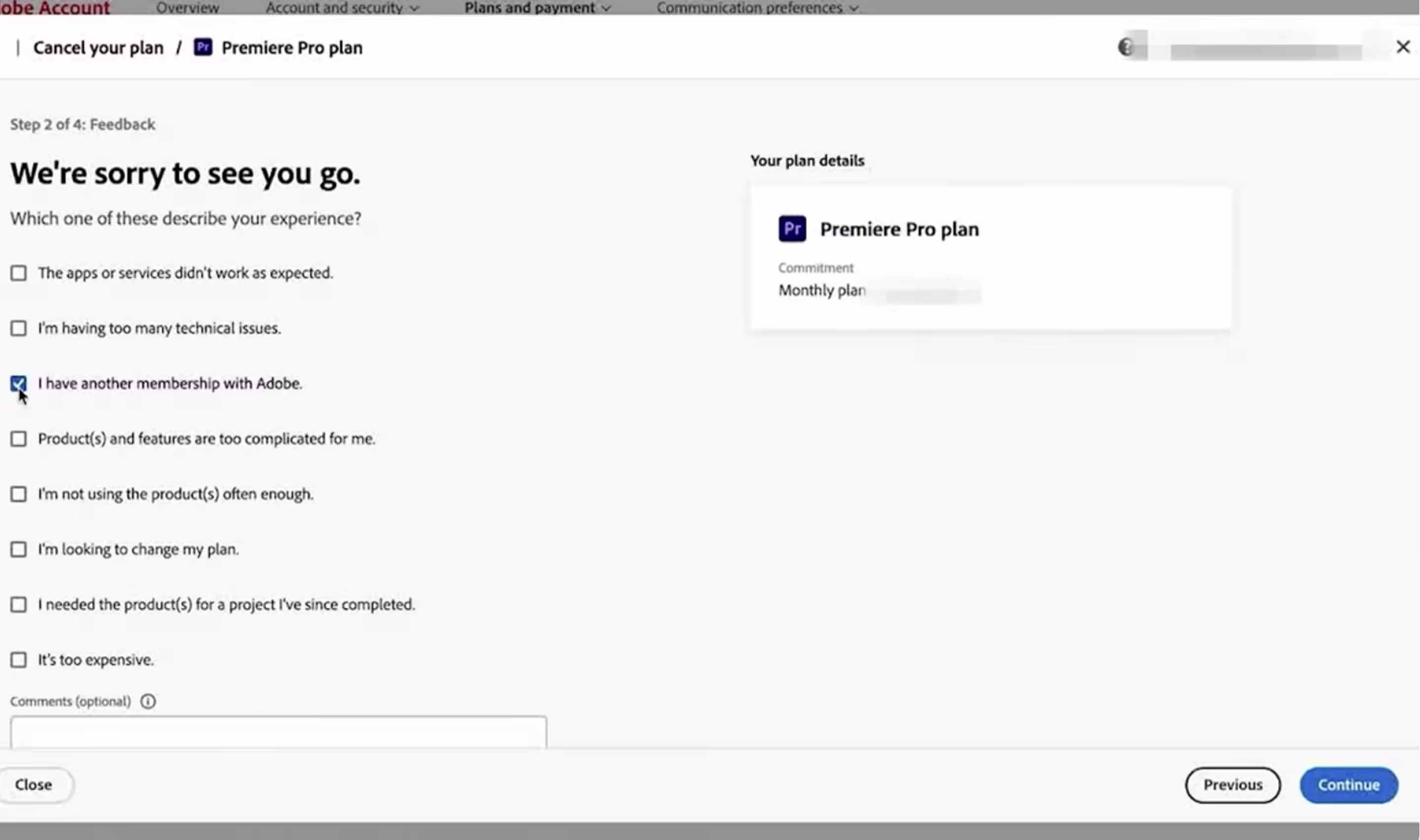
Arounda’s Fix:
- Make cancellation one clear step, with equal visibility to “Join.”
- Avoid guilt prompts and repetitive confirmations.
- Always show the total number of steps left and confirm cancellation instantly by email.
Trick Questions
Trick questions confuse users through language that turns logic upside down. Instead of a clear opt-in, the interface hides an opt-out inside complex phrasing.
This Sky UK example shows a checkbox that says: users will be contacted unless they “click to opt out.” It exploits double negatives, pushing people to stay subscribed by default. Users feel manipulated and stop trusting future consent prompts or marketing messages.
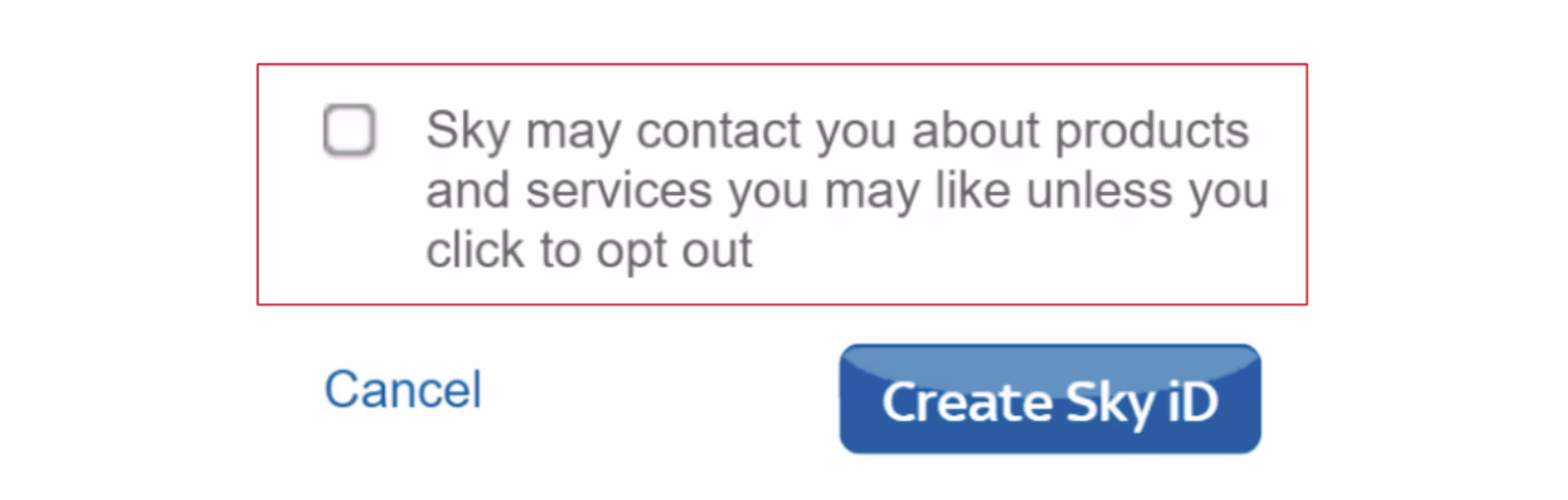
Arounda’s Fix:
- Use plain, one-directional language like “I want to receive offers.”
- Show what users agree to in simple terms, with a visible link to settings.
- Regularly test consent flows for clarity and honest interpretation.
UX Dark Patterns
Having discussed the more general patterns that act towards manipulating choices, let’s now move on to discussing dark patterns UX, more deeply built into the overall structure or flow of a product.
Forced Action
Forced action occurs when a product directs people to complete an unrelated step before they can achieve their goal. Instead of focusing on what the user came for, the interface forces registration, sharing of data, or downloads.
On Medium, readers who just want to finish an article are blocked by a “create an account” screen. It stops the reading flow and creates frustration.
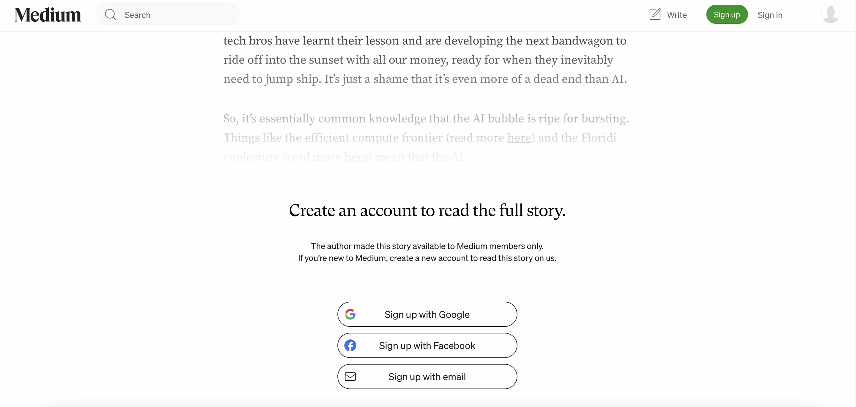
Arounda’s Fix:
- Let visitors preview or scroll before signing up.
- Add a simple “Continue as guest” option.
- Ask for registration only when it adds real value, like saving or commenting.
Complex Cancellation
It’s one of the dark UX patterns that’s easy to confuse with the Roach Motel, but they’re different. Roach Motel traps users after joining – easy in, hard out. Complex cancellation is more about the friction that happens in the cancellation process itself.
Take Amazon Prime as an example. You need to walk through numerous steps before you can cancel, and you are given reminders about what you will be losing. The cancel button is buried, and you are forced to second-guess yourself on each screen.
Arounda’s Fix:
- Offer one clear “Cancel membership” action on a single page.
- Show what happens next: “Your access will end on [date].”
- Keep retention prompts short and secondary.
Deceptive Navigation
This pattern limits user freedom by hiding or minimizing options that go against business goals.
Users of Tripadvisor’s mobile web page are shown a full-screen offer that has a large "continue in app" button, while the option to continue in the browser is nearly impossible to see. The design forces users to download the app rather than making it easy for them to go to the website.
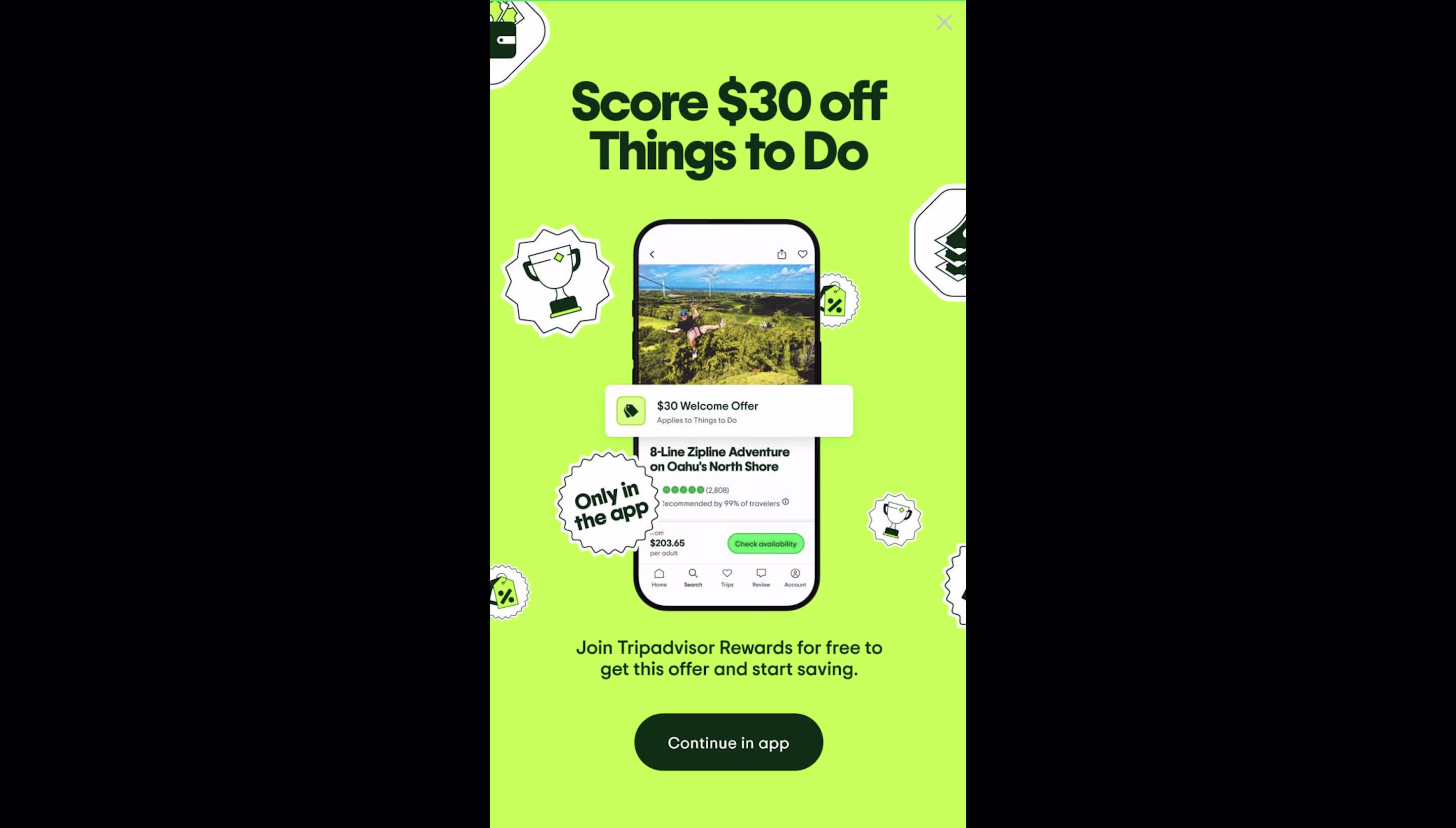
Arounda’s Fix:
- Make navigation transparent and balanced.
- Avoid visual dominance that pressures users into actions they didn’t choose.
- Let users continue freely without interruptions or misleading prompts.
Excessive Scrolling
This dark pattern forces users to scroll through long or repetitive interfaces before they can continue, whether it’s terms and conditions, a cookie consent form, or even an onboarding page.
For example, JetBrains’ PyCharm installer once had a method of requiring users to scroll through a full license agreement before the “Accept” button was active. Although it meaningfully ensured acceptance, its ultimate effect was to leave the user mindlessly scrolling in order to proceed.
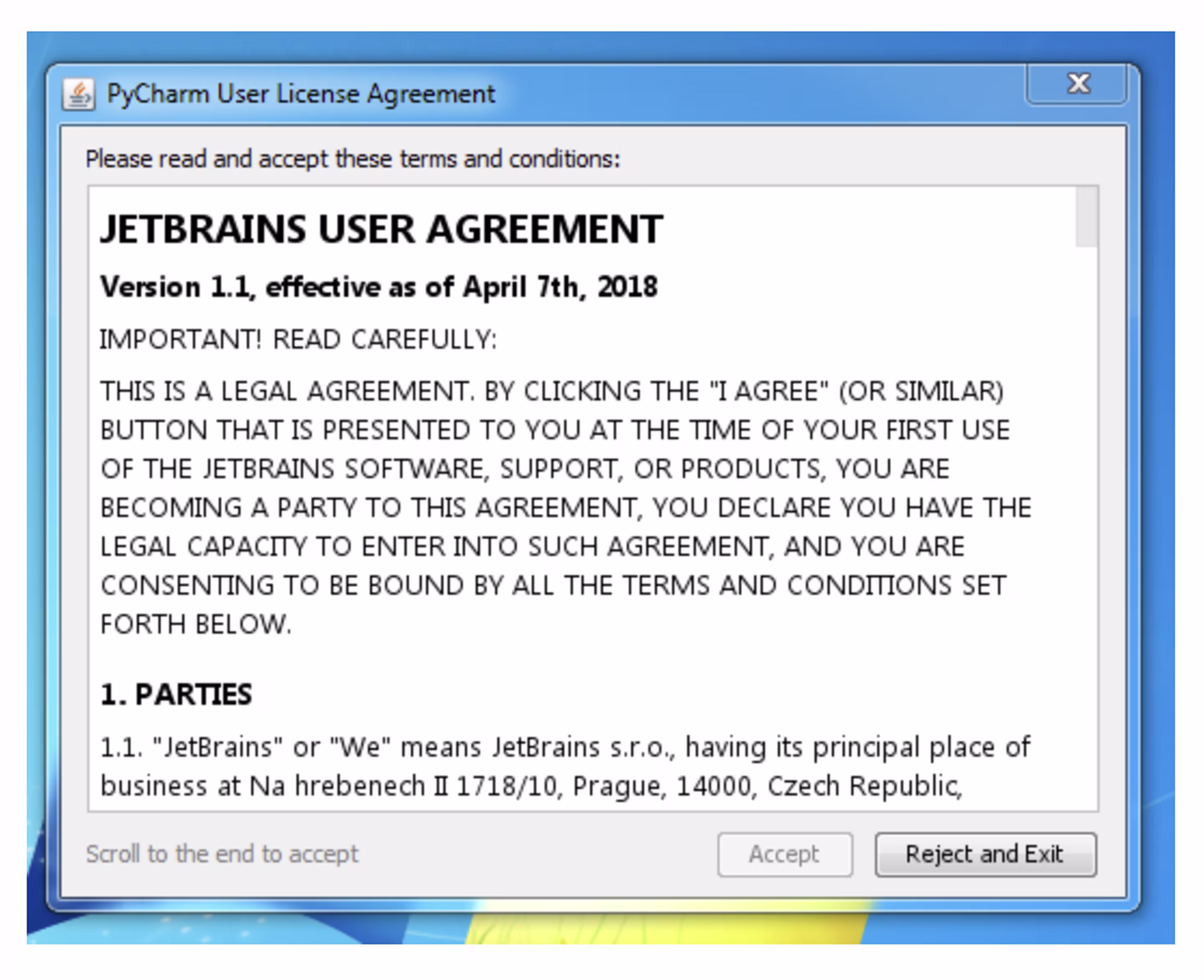
Arounda’s Fix:
- Use short summaries or key-point highlights before showing full content.
- Add a “Read later” or “Show details” option instead of blocking progress.
- Keep critical actions visible without unnecessary scrolling.
Manipulative Feedback
This dark ux pattern implements emotional pressure to affect user behavior. Instead of neutral messages, the interface delivers guilt-tripping or sentimental responses when you don’t act as the app wants.
Duolingo is a well-known example. The app frames inactivity as “letting someone down,” turning feedback into emotional manipulation rather than support.
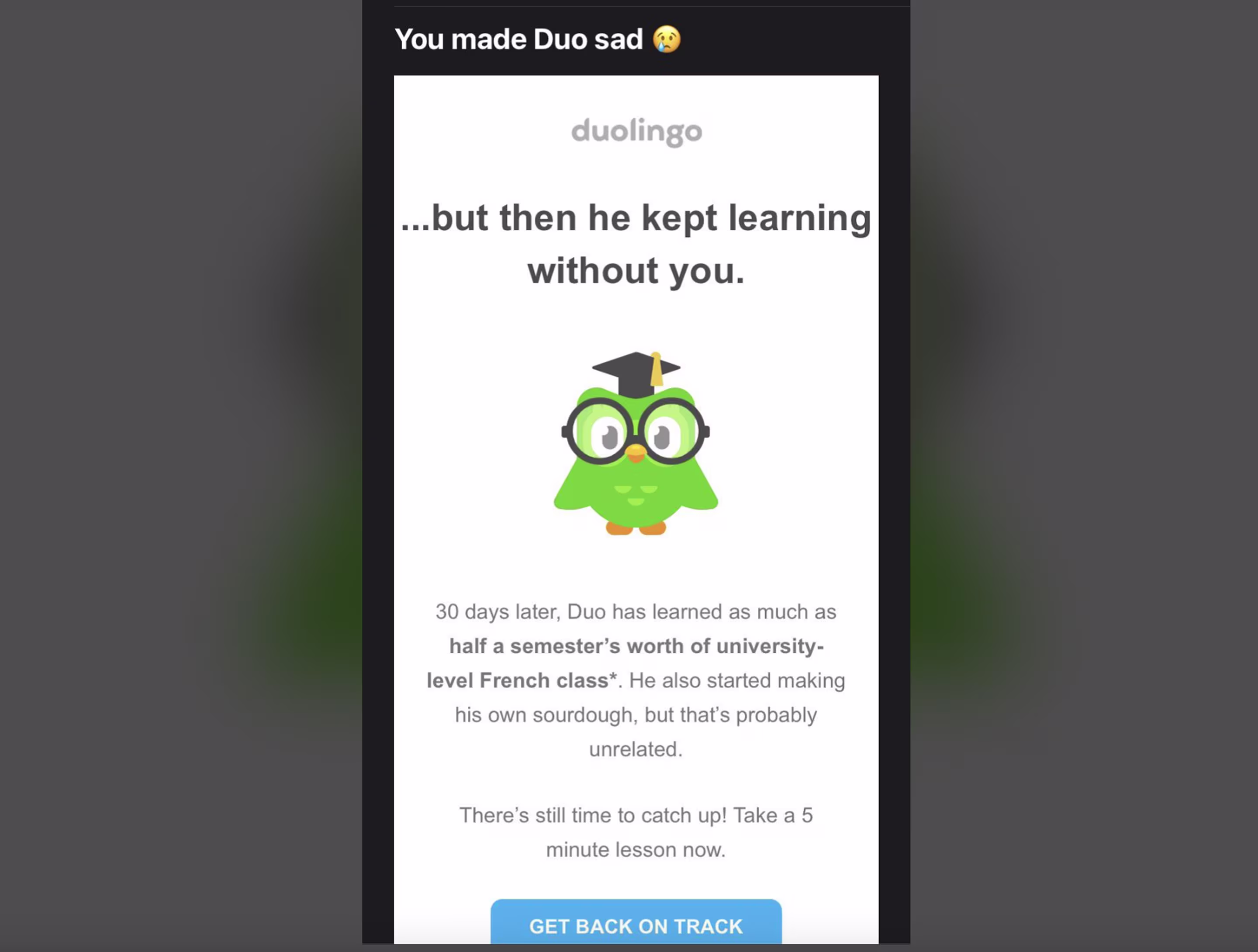
Arounda’s Fix:
- Replace guilt-driven messages with neutral progress updates.
- Use positive reinforcement.
- Add a customizable reminder tone.
UI Dark Patterns
UI dark patterns manipulate how things appear rather than what they say. These patterns use visual tricks to emphasize one choice and hide another.
Disguised Ads
This tactic mixes advertising with real content or components of the interface so that users cannot readily tell the advertising from the normal content.
On CNN’s homepage, product cards are right below the news grid with an identical layout and hierarchy. The only clue is a small gray “Advertisement” label that most users miss. It feels like part of the news feed, creating confusion and distrust.

Arounda’s Fix:
- In the design system, replace common ad and content components with a separate “Promoted Unit” pattern.
- Add a semantic layer specific to advertising content, with identifiable contrast ratios and “Ad” labels.
Interface Interference
Dark UI patterns like interface interference occur when the design deliberately makes it hard to see or choose a neutral option. The interface prioritizes what the company wants you to click and not what you came for.
In this example from The Telegraph, the subscription pop-up dominates the screen and visually blocks access to the free article option. The “Claim now” button looks like the only way forward, while the real choice is hidden behind smaller text or background elements.
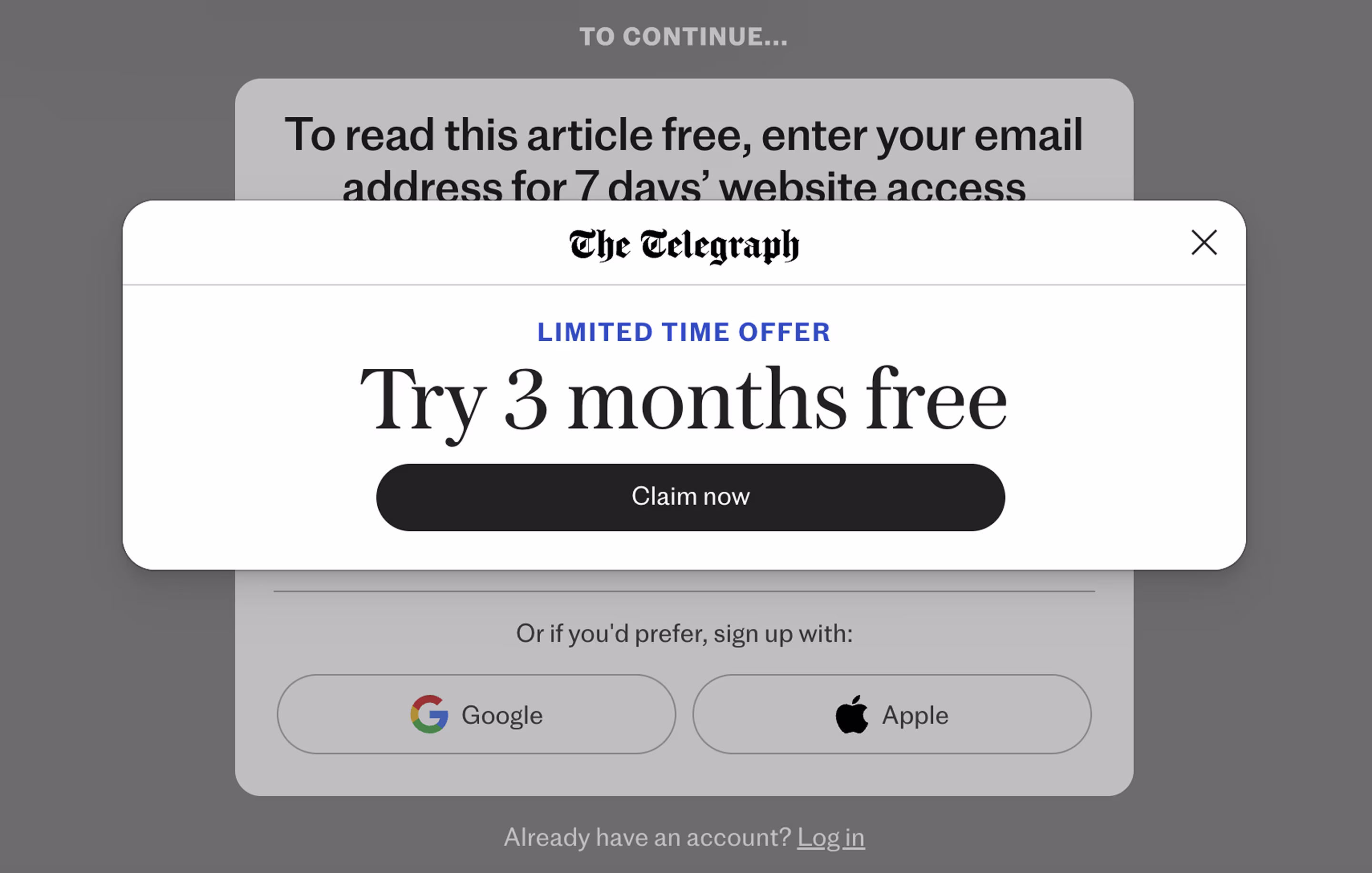
Arounda’s Fix:
- Replace the blocking pop-up with a non-intrusive banner that doesn’t interrupt reading.
- Use honest, neutral CTAs like “Subscribe for full access” instead of pressure-driven language.
- Add a visible secondary option “Continue for free”.
Forced Continuity
This pattern dark keeps users subscribed longer by making cancellation confusing or exhausting.
On LinkedIn, canceling Premium is not impossible – it’s tedious. You need to find the Manage Subscription page, click through on multiple confirmation screens, answer why you’re leaving, and only then can you finalize the cancellation.
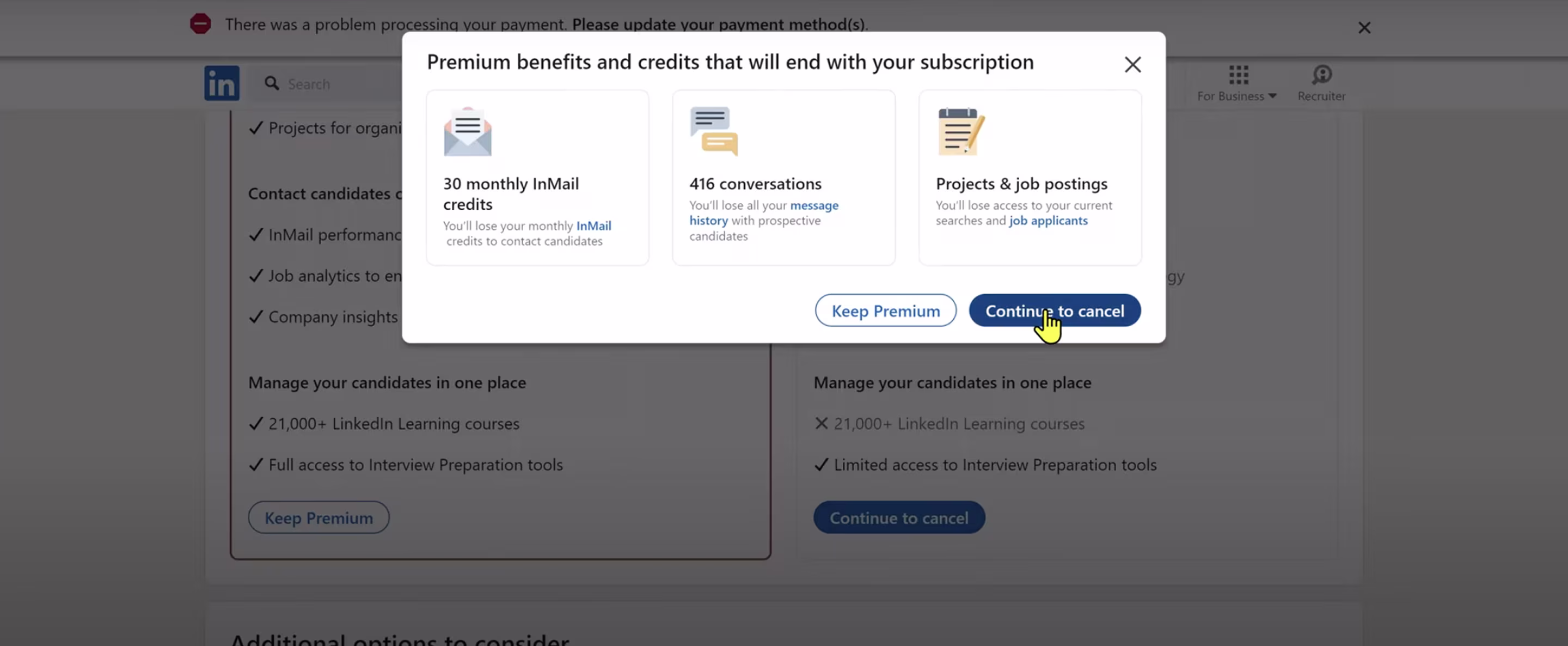
Arounda’s Fix:
- Make subscription management visible under account settings, accessible in one click.
- Allow users to cancel instantly without emotional triggers or multi-step confirmations.
- Send a simple confirmation email with an easy reactivation link.
Pre-Checked Boxes
This pattern makes use of users’ inattention by automatically preselecting additional options. Often this involves promotions or third-party businesses.
On Kiwi.com, the hotel search box comes preselected, leading you to the ’’Booking’’ website when you click on the search button.
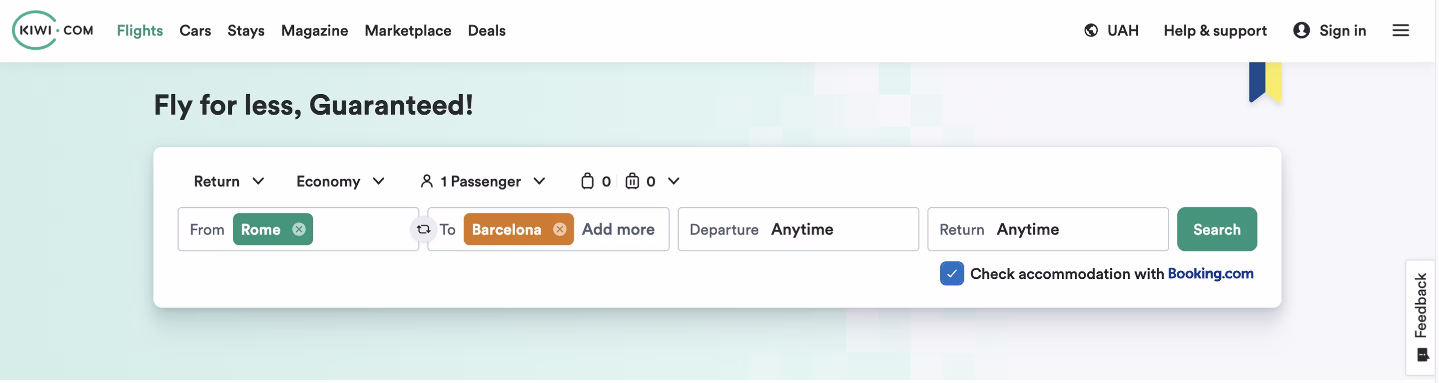
Arounda’s Fix:
- Leave all optional checkboxes off by default.
- Use clear microcopy (“Check if you also want to search for hotels”).
- Place partner offers below the main action instead of merging them with the primary flow.
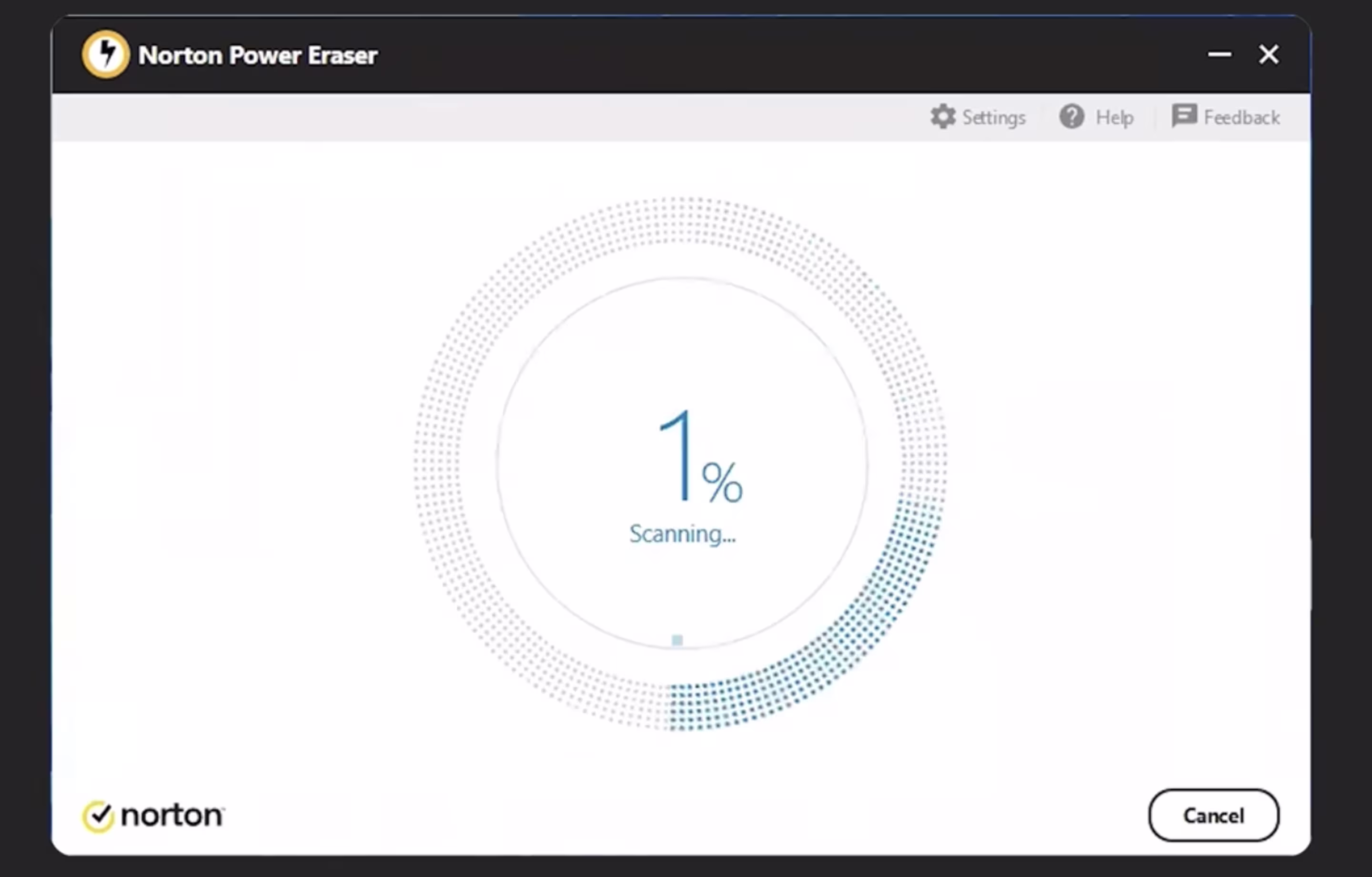
Fake Progress Bars
A fake progress bar creates the illusion of progress when nothing real is happening. The bar moves slowly, pretending to scan or analyze something that would normally take seconds. Some websites use fake loading bars to make users wait, watch ads, or click extra buttons.
It is often found in free online utilities, antivirus applications, and mobile cleaners. An example is Norton Power Eraser (and related products) that show users a slow "deep scan" in order to make them think that their system is being scanned, and then they offer to "fix" the problems by spending money on a premium plan.
Arounda’s Fix:
- Use real-time progress indicators only when actual processing occurs.
- If there’s a delay, show what’s happening in plain text (“Analyzing files…”).
- Avoid manipulative waiting screens, be transparent about time and purpose.
Lessons Learned from Dark Patterns in Real Products
Dark design patterns might drive clicks in the short term; however, they irreparably damage trust. When users understand the value, pricing, and next steps before they act, conversion becomes stable and engagement grows naturally.
Instead of controlling users, our team designs for clarity. Every project at Arounda is centered on outcomes which our clients truly value: optimization of user journeys, better accessibility, stronger retention, and trust, which scales along with the growth. Our aim is not only to make interfaces beautiful, but also to make them functional.
Here’s how we apply these principles in real projects:
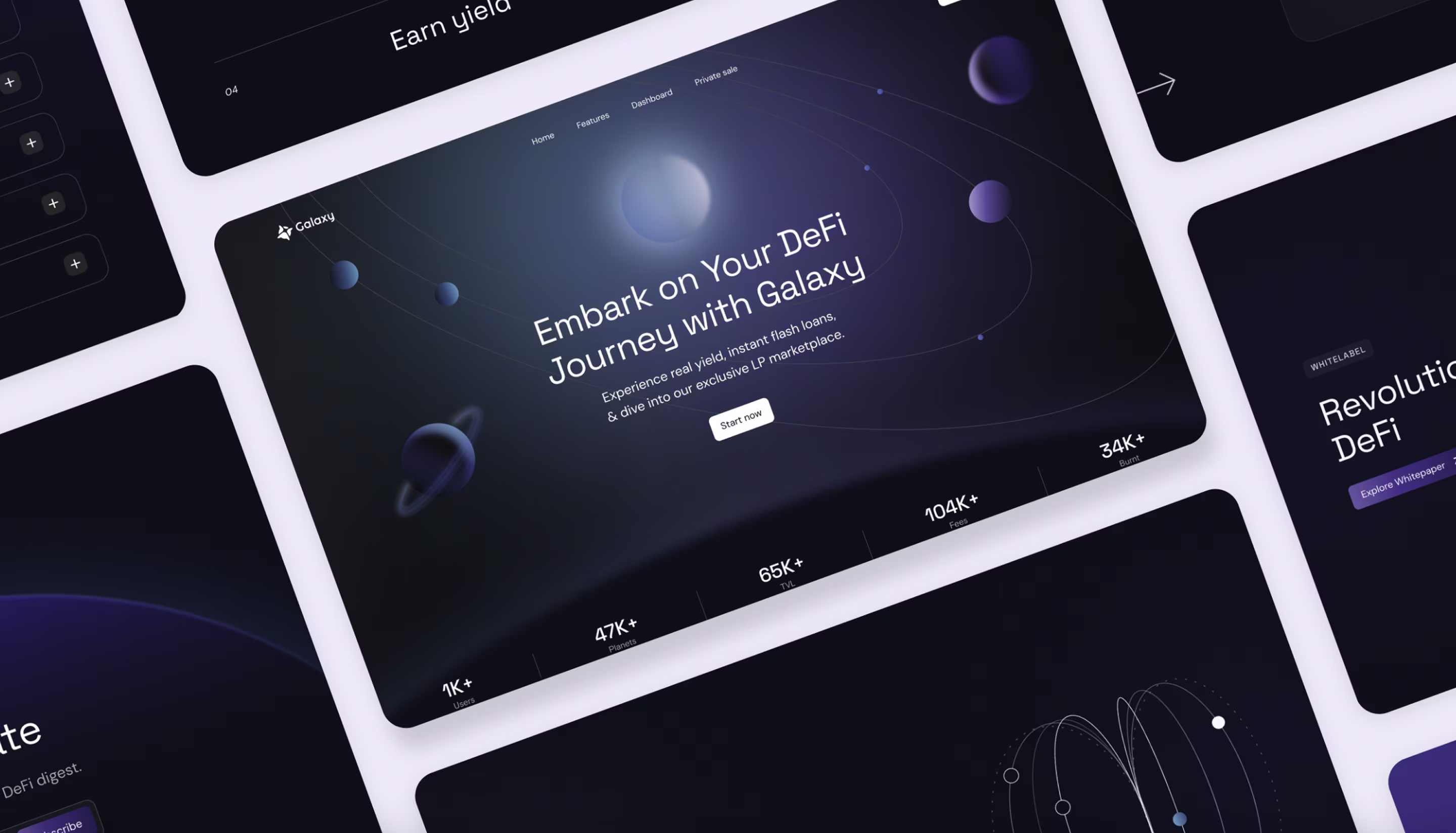
Galaxy
Galaxy is a trading hub for crypto-native users and newcomers to cryptocurrency. They turned to Arounda to clearly and engagingly articulate a complex DeFi offering in simple, trustworthy terms. We worked on their website design, web development, and branding.
Very often, platforms in this niche try to boost engagement by hiding secondary paths, focusing all attention on one dominant CTA, or interrupting exploration with pop-ups and pushy prompts. They expect this to drive quicker signups and more clicks, but the result is usually the opposite.
What we did instead:
Instead of using these manipulative shortcuts, the experience was built around simplicity and trust.
- We focused on simplicity and trust.
- The layout leads users through the product step by step, while short animations explain actions clearly.
- Each screen is light and consistent, and the responsive Webflow build keeps everything smooth on any device.
- A unified design system keeps future updates intuitive and aligned with the brand.
Results:
- +38% onboarding completion.
- +33% session time.
- +45% feature engagement.
- +52% mobile conversion.
Flair
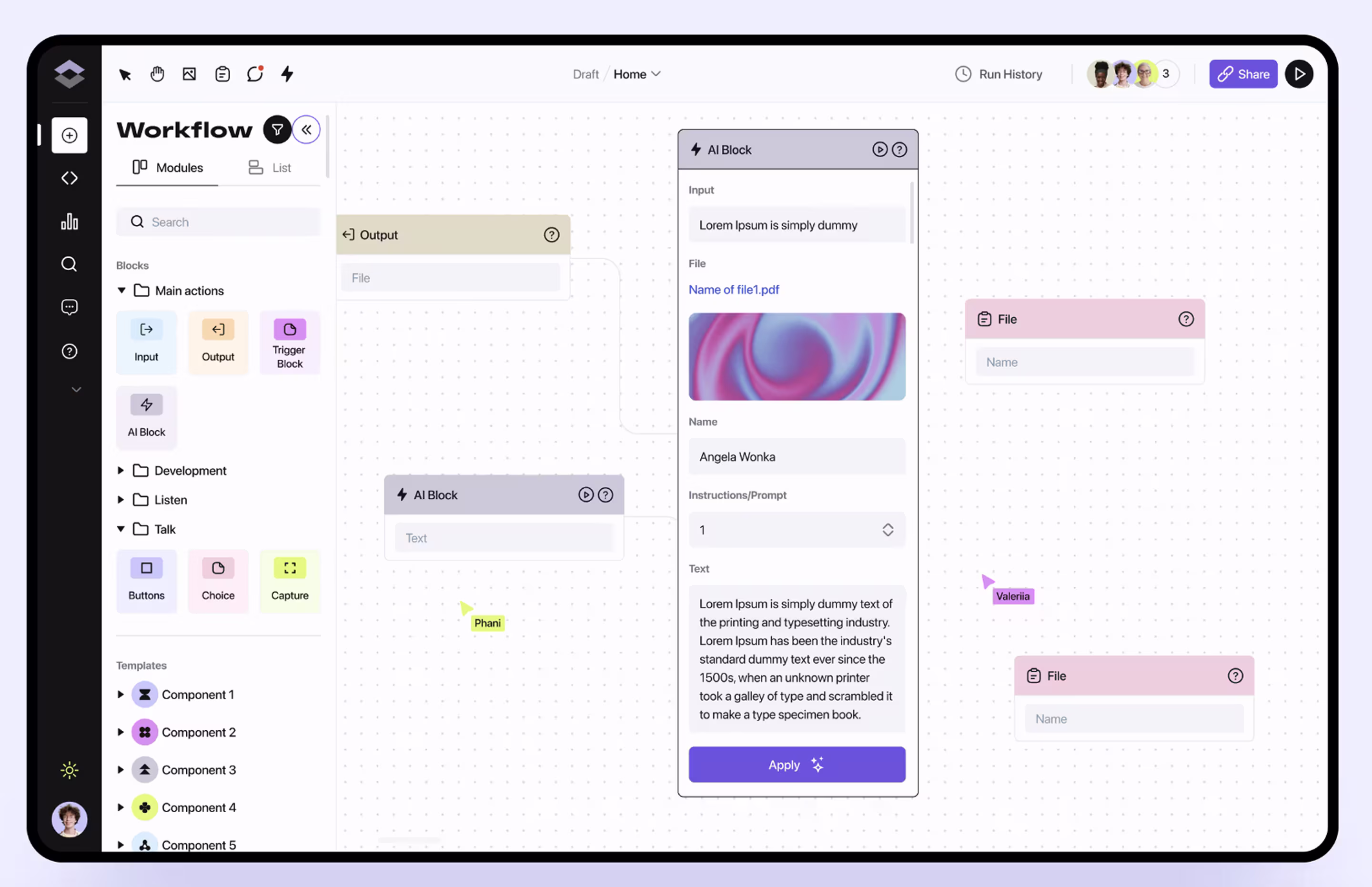
Flair is an AI-based workflow automation platform specifically designed to help teams when it comes to the creation and management of agents, bots, and tasks. They came to us to create a clean and intuitive product experience and website that explained complex AI tools simply.
Many similar platforms are after quick results and push users to start engaging right away. They do this with unskippable tutorials or a ridiculous number of “smart tips” that offer far too much. At first glance, this might seem like a good way to get noticed, but this only leads to confusion, doubt in the product, and poor retention. We take a different approach.
What we did instead:
- We designed a focused and transparent interface that teaches through use, not pressure.
- Navigation was simplified around real workflows, and templates help users see value right away.
- The dashboard is calm, accessible, and free from unnecessary noise, making setup fast and collaboration effortless.
Results:
- Faster onboarding and workflow setup.
- Improved collaboration between teams.
- Higher adoption and user satisfaction.
- Scalable, future-ready product experience.
Best Practices for Ethical UX and UI Design
After analyzing dozens of dark patterns UX examples, we can highlight several key principles that separate ethical design from manipulation.
- Be transparent: show prices, terms, and data use before the user acts.
- Give real choices: keep equal visual weight for “yes” and “no” actions.
- Respect user control: make it easy to unsubscribe, cancel, or edit decisions.
- Avoid emotional pressure: use a neutral tone and supportive microcopy.
- Test for clarity: track frustration points, hesitation, and regret, not just clicks.
It’s also important to note the distinction between guiding users and manipulating them. Good UX helps people make informed decisions. Dark ux design results in quick ones.
How Arounda Can Help You Fix Dark Patterns
Design should bring measurable results, not push people into confusion. By now, it’s clear that manipulation isn’t what drives growth. Design becomes performance through clarity, accessibility, and user confidence.
Arounda has 9+ years of experience and over 250 finished projects in design, redesign, branding, and development. We know well what users expect of your website and how to lead them organically to action without manipulation.
The outcomes speak for themselves. After working with us, our clients report:
- 4.6× revenue growth
- +170% user engagement
- −37% churn
If your product or website isn’t performing, or you want to create a platform that sets a new standard and grows with your business, our redesign and UI/UX Design services can help you get there.
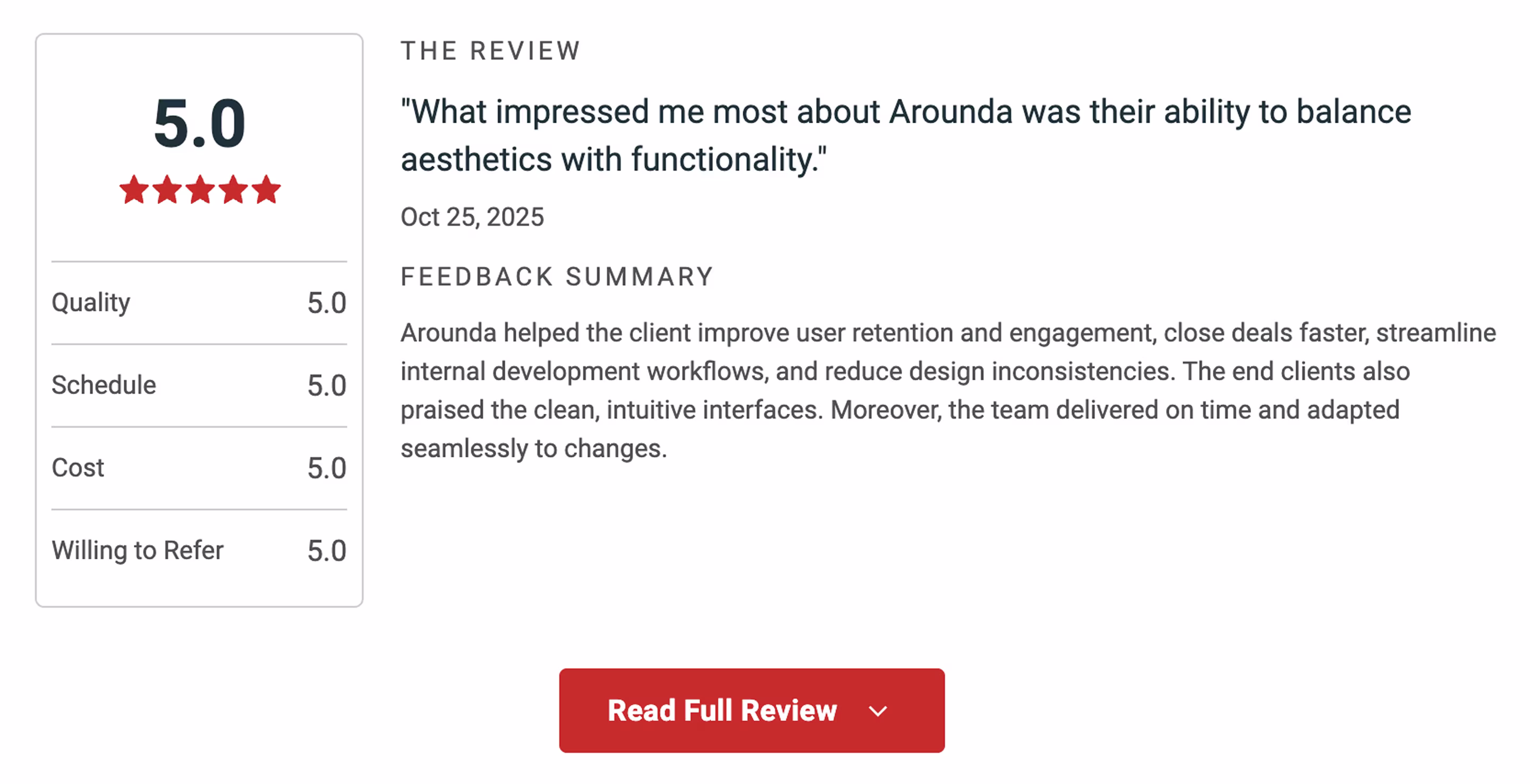
We believe in clarity, structure, and a measurable impact for the business. That’s why our clients often share positive feedback about working with us, mentioning our professionalism, open communication, and the results we deliver.
Summary
Dark patterns design may bring quick clicks, but they always damage trust. In this article, we explored 22 examples of deceptive patterns, explained how to fix them, and shared our projects that prove ethical design drives measurable business growth.
We’d love to help you build a product people love to use. Contact us and we’ll create a design that performs and grows with your goals.


Table of contents


FAQ
Unethical patterns destroy users' trust and create a sense of deception within the user. Users who are deceived tend to recoil from the product, constantly distance themselves from it, and then express their dissatisfaction in the form of negative reviews.
A bad UX happens by accident when the design isn’t tested well. At the same time, UX dark patterns are intentional. They are designed to trick or manipulate users into behaving in the interests of the business, not the user.
While some of the manipulative design techniques are not quite illegal yet, they are still considered unethical. Thankfully, the regulations are beginning to catch up. The EU's privacy laws and the FTC now deal with many of these techniques as deceptive trade practices. Hidden fees, unclear consent boxes, and hard-to-cancel subscriptions can already lead to fines or legal problems in many areas.
Yes, but only if it is temporary. It may increase clicks or sales, but it will not last. When your visitors find out they have been fooled into doing something they would never have done on their own, they will lose confidence in you and will no longer come back, nor will they give you good reviews. Using a manipulative design will hurt rather than help your growth overall.
Yes, that is the best approach to the problem. Test users as to where they stress, where they waver, become puzzled, or reverse an operation. These are the times when there are stages in the flow that are either confusing or alarming to the user.


89+ Reviews
on Clutch

Top Rated Plus Agency
on Upwork

Top 50 Trending team
on Dribbble

Projects are Featured on Behance platform
