
250+
completed in various niches
5.0
on Clutch
$1B+
our partners
Throughout the entire project all I saw was sheer will to keep pushing forward and adapting to whatever the next request was. Terrific job and we couldn't have done it without you.


From startups to
enterprises - our design works prove themselves
Our UI/UX design company has helped many startups and companies design high-quality products that meet business goals and meet users' needs. Check out the success stories of our clients below.

Kessoft, a software consulting company, needed a new website that better reflected its 25 years of expertise and professionalism. Our team redesigned it with an intuitive structure, smooth navigation, and modern UI. The result: +47% engagement, +31% lower bounce rate, and +29% higher conversion rate.

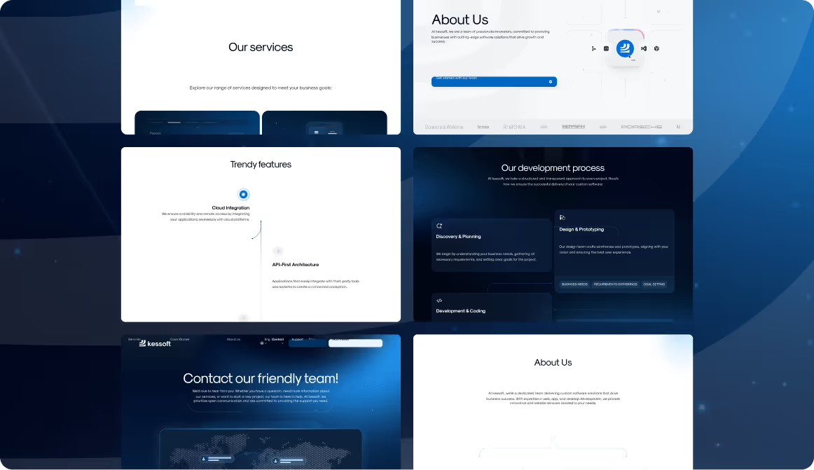


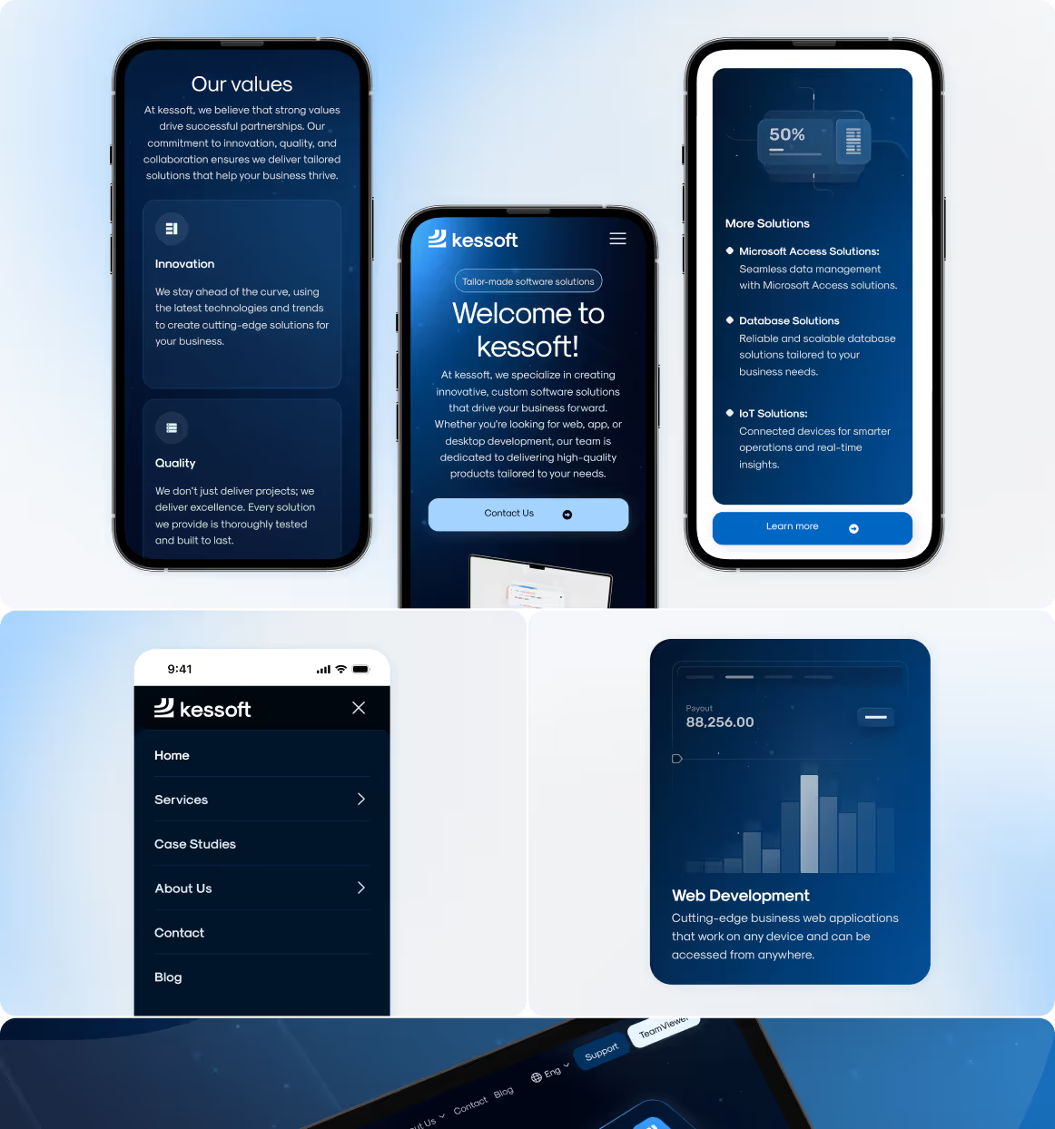

Kessoft, a software consulting company, needed a new website that better reflected its 25 years of expertise and professionalism. Our team redesigned it with an intuitive structure, smooth navigation, and modern UI. The result: +47% engagement, +31% lower bounce rate, and +29% higher conversion rate.


Discover how efficient UX Design company can affect your product

Improved user retention
Reduces the amount of effort needed to reach new customers continually.

Higher user satisfaction
Leads to higher lifetime value of your clients and a stronger brand reputation.

Increased conversion rates
Indicates that a business is effectively converting leads into customers, resulting in higher profits.
Our UI/UX design process wraps around your unique business needs
We unite the Business-Driven and user-centered UX process while creating the product design to meet business goals and users' needs.


While the growth of our clients is what matters most,
it`s nice to get awards

2025

Company 2025

UI/UX Company by Clutch

on Upwork

on Dribbble

by Clutch

by GoodFirms

Behance platform

by Clutch

by Webflow

by Clutch


by Clutch

by Clutch

UI/UX Company by Clutch

on Upwork

on Dribbble

by Clutch

by GoodFirms

Behance platform

by Clutch

by Webflow

by Clutch


Driving growth and success through User Experience Design
Your product's achievements are our success. Our design approach is result-driven, and it's crucial for us to help your product reach its business metrics.

25%
Improved customer satisfaction

Our UX design services for Player’s Health, a finance and insurance platform, have significantly enhanced customer experience.

x3.5
Traffic and engagement boost

Upgraded design and functionality helped the platform increase the flow of new visitors and convert them into active users.

27%
Average retention rate after trial

Users keep using digital voice analysing tool on the MojoCX AI platform over time, which led to an increase in retention rate.


“They understood our idea and gave us more feedback than expected. They did more than we asked them to do, which was excellent. Arounda produces excellent quality work.”


“Their expertise and guidance were instrumental. They demonstrated their commitment to creating a product that resonated with our target audience, which led to improved user satisfaction.”


“The process was something to be admired, they have a great idea of how to turn an idea into a visual product. They would also immediately make changes to any improvements we mentioned.”


“We had a feeling that Arounda is not just a contract outsourcing team but part of our startup company. We had super close communication. ”


“Their UI/UX design skills were very impressive. Modern, creative, and best in class plus they were intuitive and 'got what we wanted' without any hand-holding and minimal direction.”


“Throughout the entire project all I saw was sheer will to keep pushing forward and adapting to whatever the next request was. Terrific job and we couldn't have done it without you.”


“They understood our idea and gave us more feedback than expected. They did more than we asked them to do, which was excellent. Arounda produces excellent quality work.”


“Their expertise and guidance were instrumental. They demonstrated their commitment to creating a product that resonated with our target audience, which led to improved user satisfaction.”


“The process was something to be admired, they have a great idea of how to turn an idea into a visual product. They would also immediately make changes to any improvements we mentioned.”


“We had a feeling that Arounda is not just a contract outsourcing team but part of our startup company. We had super close communication. ”


“Their UI/UX design skills were very impressive. Modern, creative, and best in class plus they were intuitive and 'got what we wanted' without any hand-holding and minimal direction.”


“Throughout the entire project all I saw was sheer will to keep pushing forward and adapting to whatever the next request was. Terrific job and we couldn't have done it without you.”


Well-tried UI/UX Design solutions that cover your needs
Redesign your product and stand out
Get the user-friendly Mobile App Design
Empower your team with Team Extension
Design your first MVP product
Get the right style with UI Concept
Turning projects into trusting partnerships


We get things done with quality

Flexible collaboration
& fixed monthly rate

Guaranteed
on-time deliverables

Hiring system with
immediate start

Work directly with
the designer
Qualified UI/UX designers who know their business


+55
in Arounda team


+55
in Arounda team

FAQ on UI/UX design services
What does a UI UX design agency do?
A UI/UX design agency helps transform your business ideas into user-friendly digital products and achieve your business goals. We combine research, strategy, and design to improve user interaction with your product and its performance.
We deliver:
- UX research and user journey mapping
- Wireframes
- UI design systems
- Interactive prototypes
- Design handoff to developers
Our projects have helped our clients achieve a +60% increase in conversion, a -35% reduction in user churn, and a 2-3x acceleration in adoption after launch.
What’s the difference between UI and UX design?
User experience is the structure and workflow of your product. It helps users easily achieve their goals.
User interface is the visual layer (how it looks). It makes the journey intuitive and brand-appropriate.
How much does a UI/UX service cost?
We pay attention to the scope, complexity, industry nuances (like compliance with requirements). Also, the cost depends on project type (complete product design or only individual parts of it like dashboards, mobile apps, or landing pages). On average, our complete projects start around $6K. If you need a detailed estimate, just contact us.
How long does it take to start and deliver a UI/UX project?
We can start working within 3-5 days after confirming the scope of work. The design project takes 4-8 weeks. But it can take longer if the project is large and complex. Also, we pay attention to the number of iterations.
Do you also handle development or just design?
We do both. Arounda is a full design & development partner. After UX/UI, our dev team can bring your product to life with custom, low-code, or no-code dev solutions. We’ll help you define the best tech model for your project according to your business goals.
How will UI & UX consulting improve my product?
UI/UX consulting will help you identify what elements work and what don't, what confuses your users, and how to make the experience intuitive and goal-oriented. We conduct a UX audit, analyze user flows, and suggest data-driven improvements that can increase engagement, conversion, and retention (often by 60% after implementation).
What information do you need from me to get started on a UX design project?
We need to know your target audience, business goals, current design challenges, details about your brand guidelines, and see user feedback (if you have such information). All of this will be very helpful, but if you don't have it, don't worry! We will conduct our own research. In this case, all we need is your vision!
Do you specialize in certain industries?
We have developed over 250 digital products in various industries and niches, but mainly in Fintech, SaaS, AI Tech, Web3, and healthcare.
Why are UI and UX design services so important?
Because design directly affects your business results. Excellent UX simplifies complex things, and great UI creates an emotional connection. Design is a tool that helps your brand stay visible, be reliable, and generate more leads (and revenue).


