
Responsive Design: Best Practices and Considerations

There are more and more smartphone users worldwide every year. Statistics speak for themselves: the global number of smartphone users will reach 6.1 billion in 2029 (it’s +42.62% each year from now). Thus, the web design ecosystem rapidly transforms with a mobile-first friendly approach.
Today, businesses are significantly less successful in meeting user needs if they cannot create mobile-optimized responsive versions for websites. According to GoodFirms research, about 73% of professional web designers believe that a non-responsive website design is why visitors leave your site. Meaning that the ideal scenario in which users can experience your product is the goal of responsive design best practice.
This article will give you insight into what design efforts you need to take to have a proper, responsive web design for your business. Based on our expert competence, you will learn which responsive design principles and techniques are best for creating successful digital products.
What is responsive design?
Responsive design is a technique used to create designs that adjust technical content, navigation, and elements on a page to fit different screen sizes of desktops, tablets, or mobile devices. This design involves responding to user behavior depending on the size of the screen.
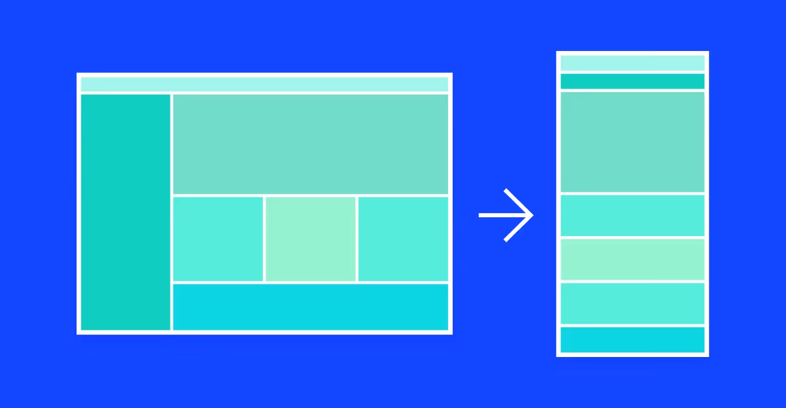
Responsive design is based on flexible grids. All assets, such as images, adapt to different screen sizes and resolutions using CSS media queries. As a result, the user gets a consistent UX regardless of the device: a large desktop monitor or mobile phone screen - the layout automatically switches depending on the resolution. In turn, users can view the desired content on any device.
The adaptive design has specific technical features: responsive layouts, media queries, and flexible visuals.
- Responsive layout is creating responsive grid layouts, whereas grids are created using CSS. The layout comprises columns that automatically resize to fit the screen or web browsers.
- However, one approach to flexible layout is not enough. Here, you can use media queries to optimize the design for various screens. They allow designers to customize different styles for specific browser conditions and devices.
- Flexible visuals are the third characteristic. All responsive design assets are distributed in flexible containers, and these containers change their size when users change the browser window or switch to another device.
Let's look at a few responsive web design examples below to differentiate various options.
You can find both the mobile and not mobile-optimized versions of the Ebay website here. It is becoming clearer why a mobile-first approach to responsive web design deserves priority attention.
Or watch how Marriot, a representative of one of the biggest hotel chains, has approached this concept to deliver an outstanding user experience no matter what device you're using.
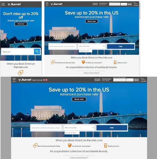
In both cases, the content on the screen is displayed so that it can be easily scaled across devices and adjusted to the user's behavior.
Why is it mandatory to have a Responsive version?
Responsive design can help solve different online business problems, such as:
- Make a website or mobile app more user-friendly;
- Improve its appearance on all devices;
- Increase the amount of time a user spends on your site;
- Improve your search engine results.
What’s more, a responsive design largely affects your sales process. It happens because your audience can access your product on any device they choose in all shapes and sizes. As a result, you can reach a wider audience, attract new leads, and ultimately lead to overall business success and profitability.
Since we live in the age of technology, your application or web solution must be optimized for as many devices as possible so that the user can access your product on any device they want.
In addition, mobile-friendliness will become a ranking factor in search engine algorithms. That means that sites and web applications that are not mobile-friendly can lose their ranking in search engine results, as they will not present a good UX for mobile search engines and users. Moreover, to help you complete your UX audit process successfully, read more on that topic here.
Finally, following the responsive web design guidelines we are going to discuss in the next section, the benefits of choosing a responsive design include:
- Cost efficiency;
- Flexibility;
- Improved user experience;
- Better search engine optimization;
- Ease of management from any type of device.
Responsive Design: 5 Best Practices
From the top of our experience, we can highlight five main responsive web design techniques to keep in mind. By keeping these tools as a resource for creating responsive designs for your website, you can count on delivering a top-level experience of your website across all devices.
1. Responsive layout.
Responsive design uses fixed pixel units to define breakpoints, at which the UI content adapts and scales upwards or downwards. UX/UI designers need to consider the responsive web design breakpoints of the devices that users intend to use and think about what happens between those breakpoints.
2. For responsive interfaces to work properly, 3-4 breakpoints are required.
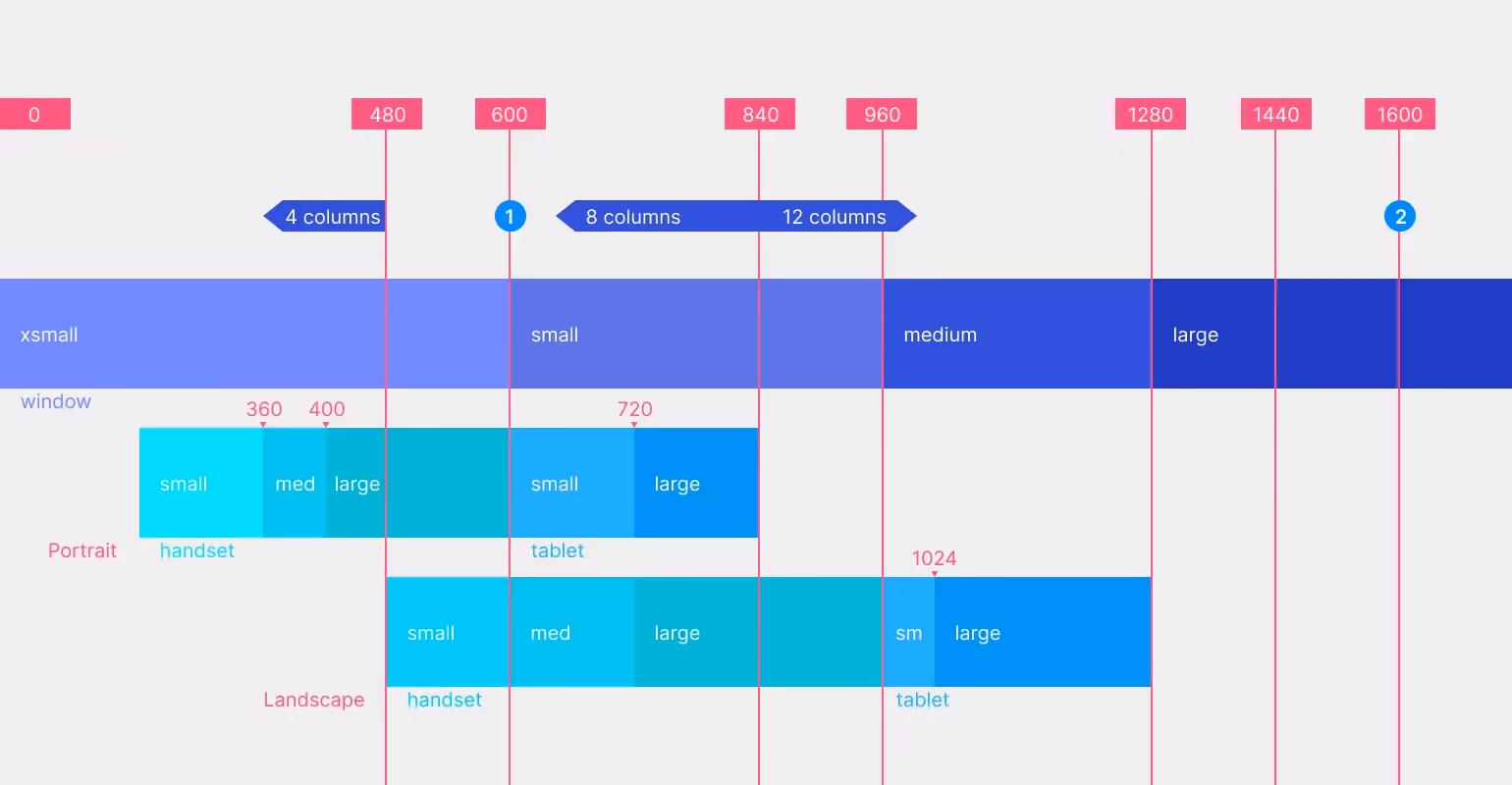
Breakpoints are points in CSS that change the display of content at different screen resolutions. In responsive design, they are usually created using the screen's minimum or maximum pixels width. Typically, breakpoints are shared for mobile, tablet, and desktop. Depending on the size you scale it to, the content adjusts accordingly. It is recommended to use at least three breakpoints. However, there can be even more breakpoints for your choice so that you cover all bases for greater device flexibility.
3. We recommend starting with min-width breakpoints.
There is a minimum and maximum width for each breakpoint in the responsive interface. And if we use a mobile-first approach during development, which is generally recommended, then it is a good rule of thumb to start development with the minimum width of each of the three breakpoints. It is always easier to zoom in than zoom out.
4. Content hierarchy and prioritization.
Typically, responsive design revolves around content. If we stick to the mobile-first approach, we should prioritize important mobile content and add it as the screen size grows. In addition, mobile users prefer shorter and simpler interactions. That means that they will search for the most specific content. It is highly recommended to ensure a smooth user experience. Also, the overall responsiveness of content across devices is one of the key components of a high converting landing page.
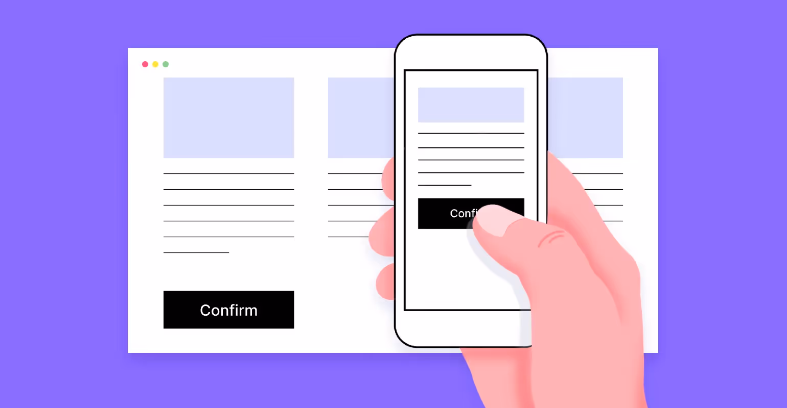
5. Get serious about your buttons.
When it comes to responsive design, button design is paramount. Because, let's say, if you can press a button on the desktop, then if we talk about a tablet, phone, or laptop, the task becomes more complicated. That is because the finger does not have the same precision as a desktop mouse. The average finger pressure area is 44x48 pixels. Therefore, make sure the buttons and pressure areas are well adapted to the average finger size to improve usability.
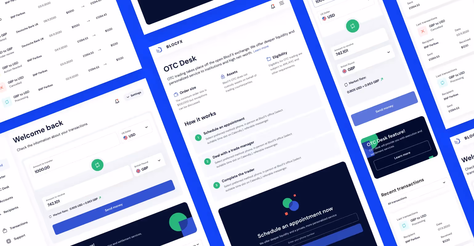
Impactful Arounda Design for Money Transfer Solution
In general, responsive design is a versatile design approach, and there are many ways to display content. The main challenge for UX design is figuring out how to properly present content in a way that does not differ depending on the device on which it is displayed.
You can see our design contribution to the BlocFX project for the fintech niche in the picture above. It is an OTC money transfer platform designed to offer users a two-way exchange of cryptocurrency and fiat money. Users can make payments directly from their accounts and add their wallets and bank accounts.
Our team's main challenge was creating top-level UX, including using the best practices for responsive web design.
Based on our core competence in building digital product designs, we considered all specific technical characteristics such as responsive layout, media queries, and responsive media into proper responsive design. Since our team had to create designs that fit several different screens, we took a mobile-first approach to ensure uniformity and seamlessness for users.
As a result, BlocFX is now meeting all users' needs. Starting with attractive and easy-to-use UX / UI design, we have implemented all the responsive design principles to create user-friendly, SEO-optimized, and beautiful UX design elements.
Make your Web Solution Flexible with Responsive Design from Arounda
To sum up, the importance of developing responsive designs across all devices is driven by the latest technology, trends, and consumer expectations. Neglecting the above practices will likely result in poor user experience and low conversion rates. Nowadays, responsive design is a must-have option for any business to stand out in a crowded online space.
Simply put, responsive web design means your web pages are easy to use, look good, and work at any resolution on any device. The crucial aspects highlighted above are intended to serve as the baseline for creating an exceptional and quality experience for your users.
But before we welcome you to the Arounda website to browse related cases and find examples of responsive design. Arounda is a digital product design agency with a team of professional and experienced UX and UI designers to help you forget all your worries! Don’t hesitate to contact us to discuss your unique creative ideas or ask the design experts for help.


Table of contents


FAQ


89+ Reviews
on Clutch

Top Rated Plus Agency
on Upwork

Top 50 Trending team
on Dribbble

Projects are Featured on Behance platform
