
What a Good Website Conversion Rate Means When Your Buyer Is a Committee

Enterprise teams often judge a website conversion rate as if one person makes the purchase, even though many high-value deals move through a buyer committee with different priorities and a slower path to agreement.
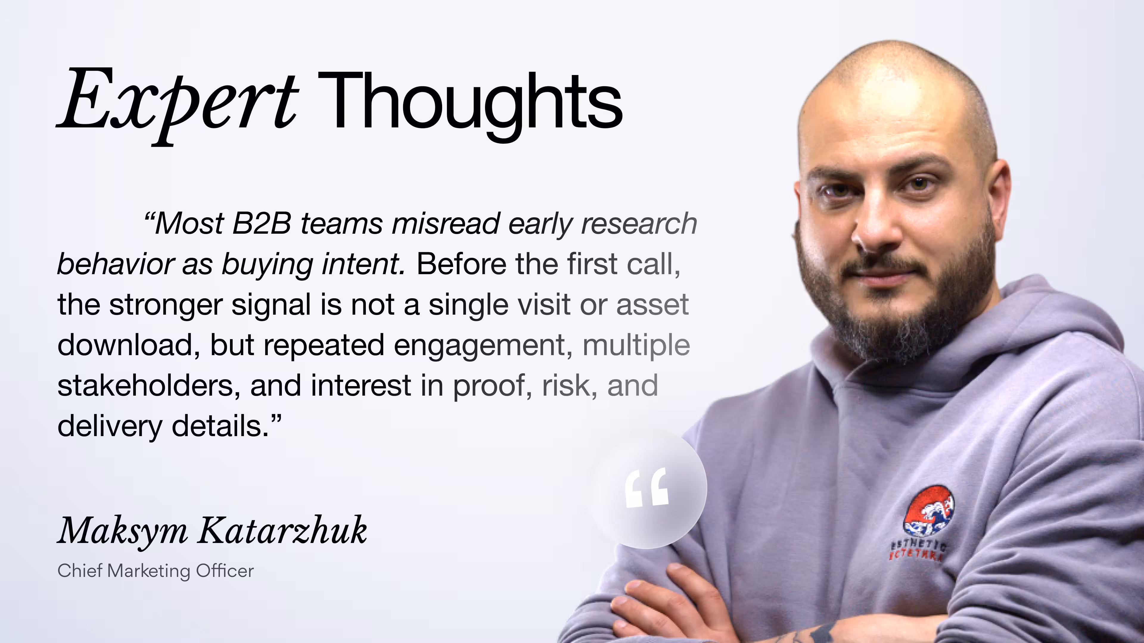
''B2B buyers don't visit your homepage to explore. They visit to assess risk. Before sales. Before procurement. Before technical validation.''
Vlad Gavriluk, Founder & CEO at Arounda
This creates a measurement gap that hides what the website is actually doing during the sales cycle. A conversion number may look healthy while the buying group still lacks the clarity and confidence needed to move forward. Our Arounda team unpacks where that gap comes from and how to evaluate website performance more accurately in committee-led buying.
Article Key Takeaways
This practical overview shows how website conversion rates should be read when enterprise buying involves several stakeholders, longer review cycles, and shared internal approval. It covers:
- Average conversion rate by industry and why standard benchmarks often break down in committee-led buying.
- Expert thoughts, practical tips, and Arounda team insights on designing and developing websites for multiple stakeholders with different concerns.
- The metrics that reveal account-level intent, return visits, and content progression across sessions.
- Common points where B2B websites lose buying groups during evaluation.
- Realistic ways to set conversion expectations when sales cycles stretch over months.
Why Industry Benchmarks Are Lying to Your Marketing Team
Teams ask what is a good website conversion rate and expect a market benchmark to give a clear answer. In enterprise sales, that comparison can create the wrong conclusion. Industry averages do not account for long sales cycles, buying committees, internal review, or the fact that one account may return through different people before sales get involved.
A benchmark may look solid on paper, while the website still fails to support real decision-making. Procurement, leadership, and technical reviewers do not evaluate the site in the same way. Each of them looks for a different kind of proof before the deal can move forward.
Benchmarks mislead marketing teams when they ignore:
- Buying committees instead of single-user journeys
- Repeat visits from the same company across separate sessions
- Content paths that support research, internal sharing, and validation
- Long sales cycles where intent builds before a sales conversation starts
- Conversion actions that signal light interest but not real deal progress
Arounda team suggests:
The better approach is to read conversion rate alongside account-level behavior. Track which companies return, which pages they revisit, and whether they move deeper into pricing, proof, or service content over time. That gives a far clearer picture of whether the website supports real buying progress or just captures surface-level interest.
Average Website Conversion Rate by Industry
Source: Ruler Analytics, Average Conversion Rate by Industry and Marketing Source 2025
These average website conversion rates give teams a practical reference point for judging performance and seeing where the website may be creating friction. The benchmarks in this table come from broader industry groups, though they still give useful context for SaaS, AI, FinTech, healthcare, legal, and industrial websites. Buyer expectations, trust signals, and evaluation cycles vary from one category to another, so the same benchmark can carry a very different meaning depending on the product and sales model.
Our recommendations:
- For SaaS and AI: Focus on product clarity first. Show what the product does, who it helps, and what changes after adoption. Support that story with real examples, product views, and proof that feels specific enough to move a visitor closer to action.
- For FinTech: Make trust easier to build from the first visit. Product logic, security signals, compliance details, and use cases should be easy to understand without extra effort. When these elements stay vague, conversion usually slows down even when interest is real.
- For Healthcare: Strengthen credibility across the full page structure. Visitors need to see expertise, relevant outcomes, and proof that speaks to their situation. A calm and well-organized experience usually works better than pages that push action too early.
- For Legal and Industrial: Keep the path forward simple and highly specific. Visitors respond better when the site reflects a clear case, need, or operational task. Stronger conversion usually comes from relevance, precision, and a next step that feels easy to take.
What Actually Happens Between First Visit and First Call
In B2B, a first call usually happens after two or three visits spread across research, internal sharing, and quiet evaluation. This is where web design starts shaping whether interest turns into action.
- The first visit checks basic fit. Buyers want to know whether the product, service, or expertise is relevant enough to keep exploring.
- The next visit tests confidence. Pricing, case studies, service pages, and proof often matter more than the homepage at that stage.
- Different people look for different answers. One stakeholder checks business value, another looks for proof, delivery details, or risk reduction.
- Open questions delay the call. When key pages leave too much doubt, interest stays real, but action gets pushed back.
A useful place to start is the set of pages people revisit before contacting sales. When those pages do not reduce doubt fast enough, the site conversion rate usually stalls below its real potential.
The Metrics That Replace Overall Conversion Rate
Everyone knows what a website conversion is, so this is usually the first metric teams track. On a B2B site, though, the final action tells only part of the story. By the time someone submits a form or books a call, the account has often already compared pages, shared them internally, and come back with more specific questions. Those steps usually say more about real buying intent than the final conversion itself. Good web development helps capture that path clearly, so teams can see which signals actually move buyers closer to sales.
Key metrics to watch:
- Return visit rate by company. Shows whether an account is coming back to evaluate the offer more seriously.
- Progression into high-intent pages. Tells you when buyers move from general interest to pricing, case studies, service pages, or proof.
- Qualified lead rate. Helps you see whether conversions are turning into the right kind of opportunities.
- Time to first high-intent action. Reveals how long it takes visitors to move from first touch to serious evaluation.
- Content depth across sessions. Separates light curiosity from active review.
Arounda team suggests:
Look closely at the pages people visit right before a qualified lead appears. In long B2B journeys, those pages usually shape conversion quality more than the homepage or traffic source.
Our work with FlowFunds is a strong example of how fintech design and development can improve the path from first visit to qualified lead.
The client needed one coherent product across the landing page, web platform, and mobile app, with a stronger sense of trust and much clearer access to complex financial data. We built a unified design system, reworked the dashboards around common user tasks, added AI-assisted search and recommendations, and supported the product through frontend development and backend integration.
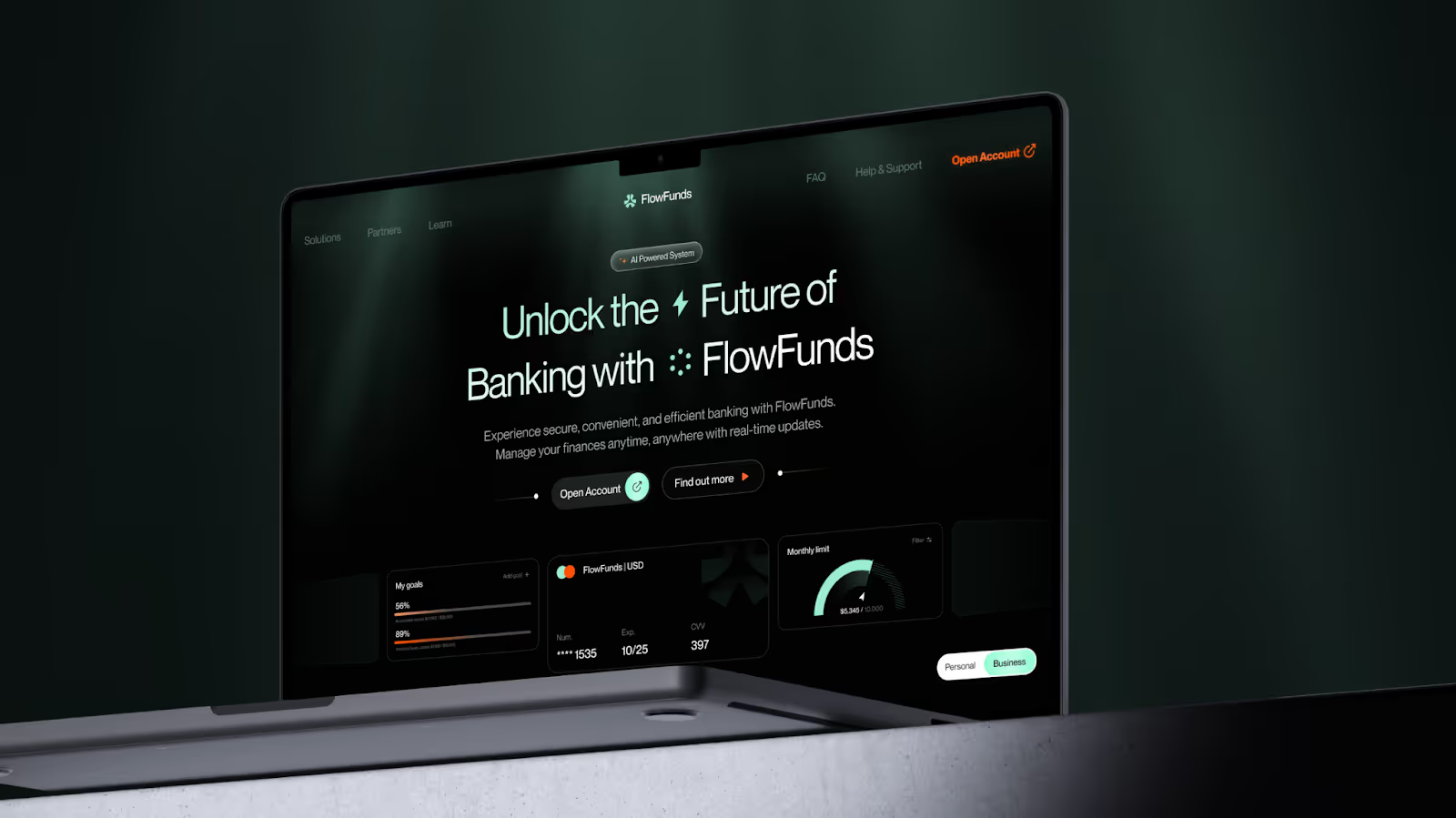
The result was a clearer path from first visit to active use: registered users doubled within six months, monthly user growth passed 150k, average session time grew by 40%, and 90% of surveyed users rated the platform as easy to use.
Return visit rate by company, not by user
Return visits at the company level deserve a place in any serious website conversion analysis because they show whether interest holds up after the first touch. One visit can mean curiosity. A second or third visit from the same account usually points to active evaluation. This metric becomes especially useful in B2B, where progress builds quietly before anyone fills out a form. It also helps explain why lead volume can stay flat while real buying activity is already growing in the background.
What to look for:
- Repeat visits from the same company within a short period
- Movement from overview pages into pricing, proof, or delivery details
- Visits coming from different people inside one account
- Return traffic from target companies that have not converted yet
Content progression across sessions from the same organization
Content progression shows whether an account is moving from light interest to serious evaluation. One session rarely says much on its own. What matters is whether people from the same organization start with general pages, then return to pricing, proof, security, integrations, or delivery details. That shift usually tells you more than a single conversion ever will. Good UI/UX design makes that movement easier by helping different stakeholders find the next layer of information without friction.
What to look for:
- Movement from overview pages into pricing, proof, security, integrations, or delivery details
- Repeated visits to case studies, service pages, or comparison pages
- Deeper page paths in later sessions from the same account
- Journeys that stall before high-intent pages
What to do with this data:
Look for the pages where progress slows down. If accounts keep returning but stay in the same part of the site, those pages usually need clearer value, stronger proof, or a more obvious next step. Prioritize fixes there first.
Why Last-Click Attribution Misses Five of the Six Decision Makers
Last-click attribution credits the final touch before conversion, so the report looks tidy while the real path disappears. By the time a form is submitted, the account may already have compared vendors, revisited key pages, and shared them internally.
Most conversion rate examples in dashboards reduce that process to one click. In reality, the final visitor is rarely the only person who shaped the decision.
What last-click attribution usually hides:
- Early visits that introduced the vendor
- Repeat sessions from the same company
- Proof pages that built confidence
- Internal comparison before outreach
- Different stakeholders reviewing different pages
Arounda team suggests:
Compare the final converting page with the two or three pages that appeared earlier in the same journey. If the same proof, pricing, or service pages keep showing up before conversion, that is usually where real buying confidence is built. Improve those pages first, because they often influence the decision more than the last click ever did.
Conversion Rate by Stakeholder Role
Arounda team suggests:
Map your website around the questions each stakeholder needs answered before the deal can move forward. If the same pages try to speak to everyone at once, decision-makers miss business value, technical reviewers miss proof, and operational teams miss relevance. The strongest B2B sites make the next step clearer for each role instead of pushing every visitor toward the same conversion path.
Where B2B Websites Lose the Committee Without Knowing It
A site can work well for one or two stakeholders and still break the journey for the rest of the buying group. An executive may find the business case quickly, while a technical reviewer cannot find security details, or an operations lead cannot see how the solution fits into day-to-day work. Once one role gets stuck, the whole evaluation slows down.
Here is what our Chief Marketing Officer often points to when reviewing where B2B businesses lose buying committees:
“B2B websites usually lose the deal in underestimated friction points: vague positioning, weak proof, and a lack of content for different decision-makers. A strong website should not just generate leads - it should help the internal champion move the decision forward.”
Maksym Katarzhuk, Chief Marketing Officer
CTAs designed for individuals in a process that requires consensus
This mistake happens when the site asks one person to take the next step before the rest of the buying group has enough confidence to support the decision. A CTA may feel clear in isolation, but in a committee-led process, it can appear too early, too narrow, or too personal for the stage the account is actually in.
How to spot it on your site:
- High traffic reaches pricing, proof, or service pages, but qualified lead volume stays weak
- The same companies return more than once and still do not move into contact
- Case studies and solution pages get attention, but demo requests stay low
- The main CTA pushes sales contact, while pages offer very little support for internal sharing or comparison
- Visitors can book a call, but they cannot easily find the materials needed to justify that call internally
NetGet is one example of a site where users dropped off before taking any meaningful action. When they came to Arounda, they could not identify why traffic was reaching the right pages without converting. The interface presented information without guiding people through a decision. Buying groups could browse, but they had no clear path to compare options, build confidence, or take the next step together.
The redesign focused on structural clarity. Our designers rebuilt the visual hierarchy, standardized UI components into a scalable design system, and restructured product cards so listings were easier to scan and compare. On every key page, the primary action was visible without hunting for it, and supporting content sat close enough to reduce the internal back-and-forth that stalls decisions.
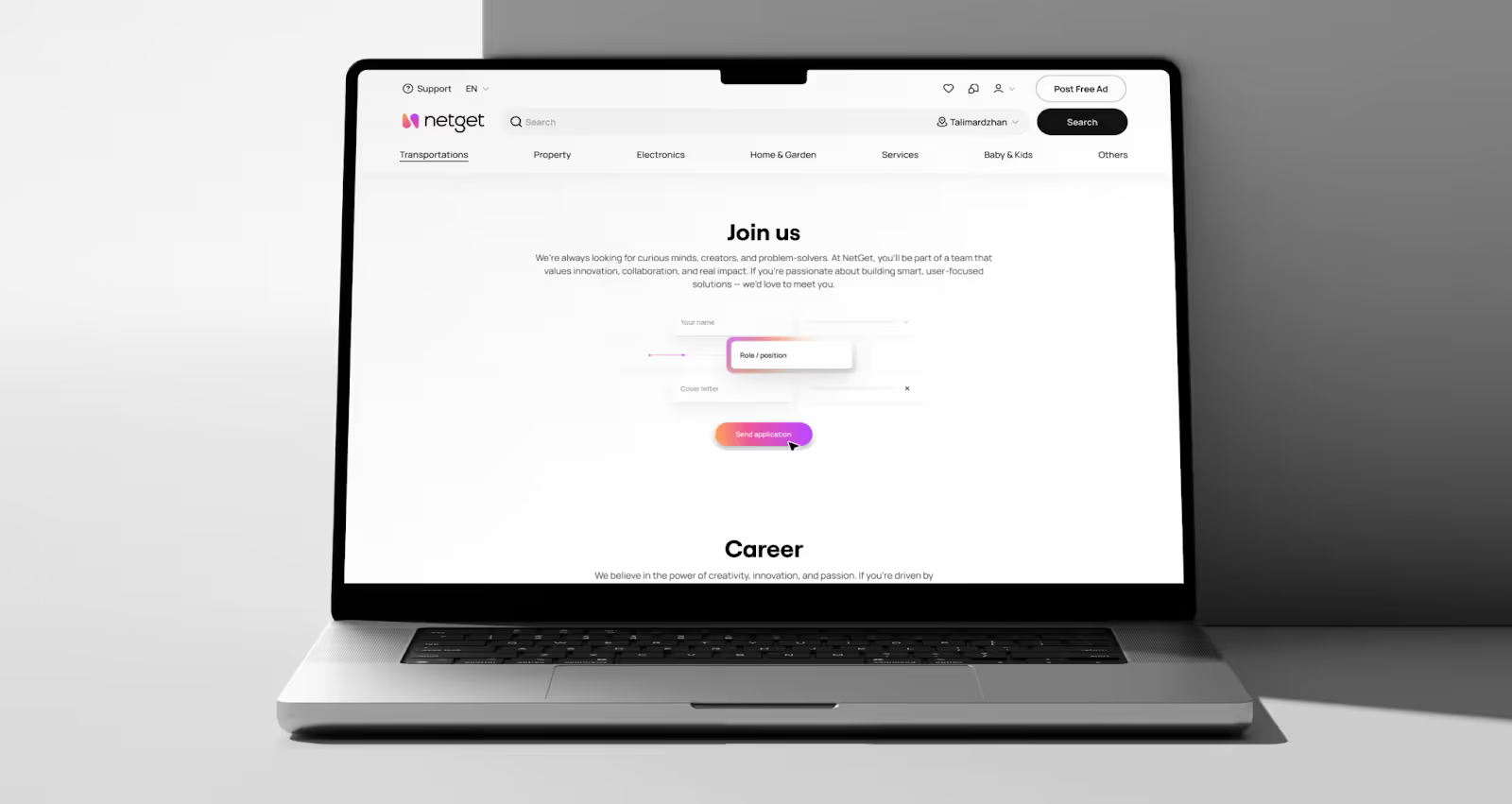
As a result, navigation efficiency improved by 55%, platform usability increased by 45%, brand recall and trust perception rose by 53%, and content readability improved by 41%.
Social proof that convinces one stakeholder and alienates another
Social proof can help one stakeholder move closer to a decision and still leave the rest of the buying group unconvinced. A founder may respond to growth numbers, while a technical reviewer looks for implementation detail, and an operations lead wants to see how the solution worked in practice. When proof speaks to only one perspective, the site creates interest without building enough confidence across the full group.
How to spot it on your site:
- Case studies get visits, but buyers still do not move further into contact or evaluation
- Testimonials sound positive, though they stay too broad to answer real buying questions
- The site highlights outcomes, while process, rollout, or delivery details stay thin
- Proof works well for leadership, but gives technical or operational stakeholders very little to work with
- Buyers return to proof-heavy pages and still continue searching for answers elsewhere
Arounda team suggests:
Review your proof through the lens of each stakeholder involved in the decision. If testimonials, case studies, and outcome claims speak clearly to one audience but leave gaps for the rest, a UX audit can help uncover where the proof loses relevance, where trust weakens, and what the site needs to support the full buying group.
What a Realistic Conversion Benchmark Looks Like for Long Sales Cycles
There is no single conversion benchmark that works equally well across all B2B companies. The longer the sales cycle gets, the more important it becomes to read performance through the full buying journey, not only through the final conversion. A lower conversion rate can still be healthy when the right accounts keep returning, move deeper into proof-heavy pages, and show clear signs of serious evaluation.
Arounda team suggests:
Match your benchmark to the length of the decision cycle before you judge website performance. If deals take months to close, review return visits, page progression, and qualified lead signals first, then read conversion rate in that context. That usually gives a more accurate view of what the website is doing well and where the journey still needs work.
Signals Your Conversion Rate Is Improving Before the Numbers Move
Conversion rate is one of the last numbers to change. Earlier movement shows up in how buyers use the site. The right accounts come back, spend more time with proof-heavy pages, and reach evaluation content with clearer intent. That shift is worth paying attention to because it often shows that the site is doing a better job before the top-line metric reflects it.
Here is what to pay attention to first:
- More return visits from target accounts
- More traffic reaching evaluation pages
- Less delay before high-intent actions
- Stronger engagement across stakeholder-specific pages
- Better lead quality before lead volume changes
A design and development partner can help identify the friction points that stop a buying committee from moving forward, whether that means building a product from the ground up or finding the gaps in an existing one that quietly lose the right accounts.
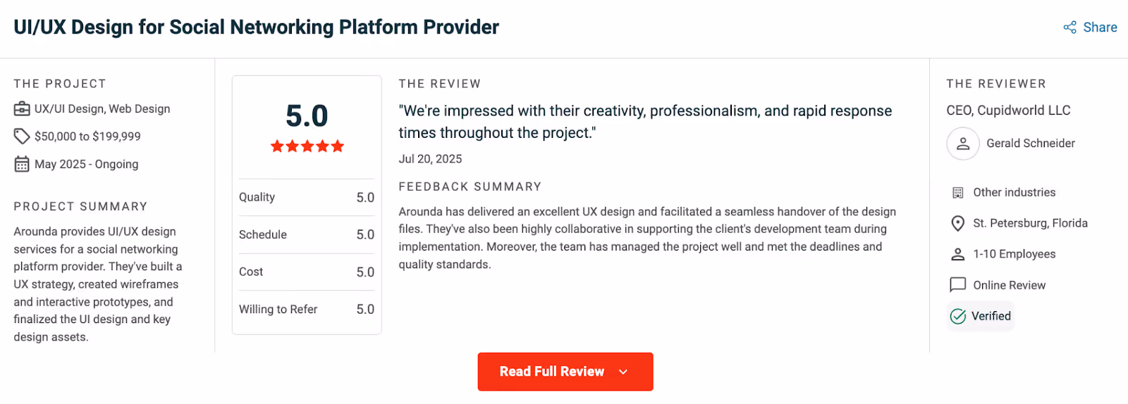
With 10+ years of experience and 350+ delivered projects, Arounda brings together strategic design and dependable development. The results show up in our 5.0 rating on Clutch, backed by reviews from teams who have been through the full process.
Summary
Understanding what the average conversion rate is matters far less than knowing what helps the right buyers move forward. Arounda builds products and websites that reduce friction, strengthen trust, and support real buying decisions through strategic design and reliable development. Ready to make your product clearer, stronger, and easier to choose? Contact us.


Table of contents


FAQ
A healthy conversion rate can hide weak buying intent. In B2B, especially when decisions involve several stakeholders, early conversions often reflect curiosity, research, or internal sharing rather than real sales momentum. In our experience, the pipeline slows down when the website captures interest, but it does not help the wider buying group reach alignment.
The cleanest approach is to look at conversion at the account level, not only at the individual session level. That means tracking repeat visits, content progression, and key actions across people from the same company over time. Based on our work with complex B2B journeys, this gives a much more realistic view of how website influence builds before a deal moves forward.
The website keeps shaping the deal longer than many teams assume. It often remains part of the process through internal reviews, proof checks, pricing discussions, technical validation, and stakeholder buy-in. From what we have seen, the website matters until the buyer has enough clarity and confidence to defend the decision internally.
Board-level reporting should focus on metrics tied to business movement, not surface activity. That usually includes account-level conversion, qualified pipeline influenced by the website, return visits from target companies, progression into high-intent pages, and time from first visit to sales conversation. These signals show whether the website helps move real opportunities forward.
You optimize for patterns, roles, and shared decision needs. That means building a website that supports different stakeholder questions, reduces friction across multiple visits, and gives people clear reasons to return, share, and continue the conversation internally. In practice, strong structure, strong messaging, and clear proof matter more than perfect user-level tracking.
There is no universal number that means ''good'' in a long B2B sales cycle. A realistic benchmark depends on deal size, traffic quality, buying complexity, and how many people are involved in the decision. In our experience, teams get better insight by looking at the quality of converting accounts and the strength of pre-pipeline signals, not just the top-line rate.
A conversion rate of 50% usually means that the conversion is either too shallow or too narrowly defined. It might show actions that don't have a clear goal, internal traffic, repeat visitors, or a metric that doesn't match up with actual buying progress. Before treating a number that high as a performance win, it should be checked for accuracy.


89+ Reviews
on Clutch

Top Rated Plus Agency
on Upwork

Top 50 Trending team
on Dribbble

Projects are Featured on Behance platform
