
Inclusive Design Principles for Products With Millions of Different Users


Inclusive design has gone from being a niche concern to a must-have consideration for all products. Large audiences bring different abilities, contexts, expectations, and ways of using a product. 1.3 billion people worldwide live with disabilities, and many more prefer brands that do not exclude the people around them, making inclusion both part of product reach and product quality. For products with large, diverse audiences, inclusive decisions determine usability, trust, loyalty, and long-term growth.
In this article, our Arounda team will break down the principles, patterns, and product decisions that make inclusive design work in practice, show where exclusion tends to start, and share audit methods for improving digital experiences at scale.
Article Key Takeaways
In this piece, our Arounda team covers:
- What inclusive design means for products built for millions of different users
- How inclusion shapes navigation, input, localization, and customer experience at scale
- Core principles that help teams design for variation without fragmenting the product
- Examples of inclusive design that show how real products support different users in practice
- How to connect inclusive design to customer experience, product performance, and stakeholder priorities
- Practical ways to spot exclusion, audit friction, and improve the experience at the pattern level
- Expert guidance on making inclusive UX design part of the product process, not a final checklist
Why Inclusive Design Is a Product Risk Issue
Inclusive design becomes a product risk issue when the product works well for a narrow default user and loses reliability across a wider audience. As a result, the problem starts affecting core product outcomes such as usability, task completion, product reach, and adoption.
WebAIM’s analysis found detectable WCAG 2 failures on 95.9% of the top one million home pages, with low-contrast text on 83.9% of pages and missing form labels on 51%. These figures measure accessibility barriers, but they also point to a broader inclusion gap in digital products. Many teams still ship experiences that make basic actions harder to read, follow, and complete.
That becomes visible when users:
- Spend more time on basic actions
- Lose confidence in simple flows
- Miss key information
- Leave before they reach value
To prevent these risks, teams need to treat inclusive design as part of product quality from the start. Clearer content, stronger forms, safer navigation, and more resilient task flows help products serve a wider audience with less friction as they grow.
Who Gets Excluded and How It Happens
Users get excluded when a product assumes one familiar way of reading content, moving through the interface, and completing actions. Anyone with different abilities, devices, contexts, confidence levels, or habits starts facing extra effort in places that should feel clear and easy.
This usually begins with small design decisions that seem harmless on their own, then combine into a product experience that supports one group better than the rest.
Assumptions baked into early design decisions
Early design decisions often carry narrow assumptions that lock a product into a limited idea of “normal” user behavior. Once that idea shapes structure, content, and flow logic, the experience starts working smoothly for one group and less reliably for everyone outside that pattern.
Common assumptions include:
- How people read and how much content they can process at once
- What they understand without extra guidance
- Which device, connection quality, and session length do they use
- How confident they feel in forms, settings, and multi-step flows
- How much effort will they tolerate before leaving a journey
These assumptions usually take shape during product discovery, when teams define primary journeys, information structure, and feature priorities. If the team validates only one comfortable scenario at that stage, exclusion gets built into the product before the interface even looks finished.
Our recommendation: pressure-test early decisions against at least three non-default contexts. For example, low confidence, interrupted use, and smaller screens reveal weak assumptions quickly and give the team room to fix them while the product still stays flexible.
When your persona covers 60% and ignores the rest
When your user persona covers only part of the audience, the rest still come into the same product with different expectations, terminology, support needs, and task priorities. The interface starts feeling clear and intuitive for one segment, while other users need extra effort to interpret labels, understand steps, and decide what to do next.
The issue grows when teams treat one well-defined user profile as enough evidence for broader decisions. Content, feature naming, onboarding logic, and help cues begin to reflect a limited slice of the audience, even when the product serves a much wider mix of users. UX Research keeps personas tied to real user behavior and shows where one audience model stops reflecting the journey as people actually experience it.
Edge cases that become mainstream faster than expected
Some edge cases stop looking exceptional as soon as the product reaches broader audiences, more markets, and more varied contexts of use. Teams often treat them as secondary during planning, yet scale turns them into recurring product conditions and exposes how much the experience depends on ideal assumptions.
Examples that often get underestimated include:
- Long-text UI states after translation
- Private actions in non-private settings
- Return after interruption
- Cross-device task continuation
- Shared-device sessions
- First-time users inside expert-oriented flows
Our recommendation: sort edge cases by growth potential and journey sensitivity. Scenarios that can quickly affect comprehension, trust, or task completion deserve priority in the core experience.
Core Inclusive Design Principles for Complex Products
Complex products need clear inclusive design principles to stay usable as audiences grow more varied. These principles include recognizing exclusion early, learning from edge users, designing for one and extending to many, supporting equivalent experiences across interaction modes, and giving users control without hiding functionality.
Recognize exclusion before it becomes a support problem
Recognizing exclusion early means noticing where the product already works unevenly across the audience, even when support volume still looks normal. In large-scale products, that early window matters because the same unclear step can quickly affect far more users than the team expects.
To spot exclusion, pay attention to:
- Pauses in steps that should feel obvious
- Repeated retries after system feedback
- Drop-offs in setup, forms, or recovery flows
- Frequent need for help in basic actions
- The same confusion appears across users or sessions
Learn from the edges, not the average user
Learning from edge conditions helps teams see which assumptions quietly shape the product and who those assumptions leave out. In products with large, varied audiences, this makes inclusive design more practical because it shows where language, navigation, input, and feedback only work well for one type of user behavior.
What this often reveals:
- Labels and prompts that make users hesitate before continuing
- Flows that depend on too much memory, precision, or uninterrupted attention
- Interfaces built around one reading style, interaction habit, or pace
- Weak recovery after confusion, mistakes, or context switching
- Simple actions that become harder for people with lower confidence or less product familiarity
Expert advice: Use edge conditions to study how different users understand the same step, prompt, or navigation path. Small differences in interpretation often point to larger inclusive design gaps.
Design for one, extend to many
One of the strongest principles of inclusive design is solving for a specific user need in a way that tends to be useful well beyond that original case. What starts as support for that specific need turns out to be better UI/UX design decisions overall, with clearer interactions, more flexible use, and stronger usability for a wider range of people.
How to do it:
- Start with one real user need that blocks progress or creates extra effort
- Define what exactly makes the experience harder in that moment
- Turn the response into a clear interaction pattern, feature, or content rule
- Check where the same solution could help other users across the product
- Use the same pattern more broadly once it proves helpful beyond the original case
Equivalent experiences across different interaction modes
Equivalent experiences with different interaction modes mean delivering the same feel of clarity, control, and accomplishment, no matter how the user interacts with the product. A person who uses touch, keyboard, web, or mobile wants the product to feel consistent, predictable, and easy to follow, no matter how they do it.
A large part of that consistency comes by way of responsive web design, allowing the product to morph to different screens and contexts rather than forcing reinterpretation of the experience each time the format changes.
It helps preserve:
- Clear visual hierarchy
- Familiar navigation paths
- Consistent key actions
- Readable content across screen sizes
- Interaction cues that are easy to follow
A good example is our work with FlowFunds, a fintech platform for personal finance, digital banking, and investments. The challenge was to create one coherent experience across the landing page, web platform, and mobile app while keeping financial data clear and navigation consistent.
Arounda solved this with modular layouts, shared navigation logic, touch-optimized mobile interactions, and typography and spacing adapted for smaller screens, so users could switch devices without relearning the interface.
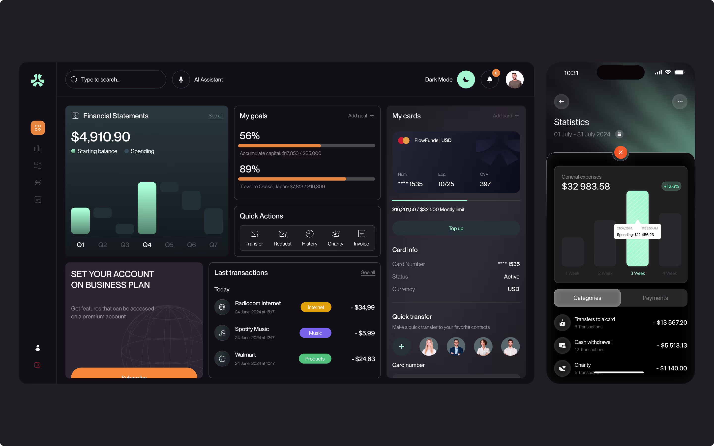
As a result, 90% of surveyed users rated the platform as easy to use, x2 more registered users within the first six months, and 150k+ new users joined every month.
Give users control without hiding functionality
Inclusive design enables users to retain more control over their engagement with a product while keeping access to critical functionality. People should be able to adjust the experience so that it suits them, at their pace, and to their taste, but should not lose out on the key tools, information, and results that everyone else gets.
For example, this can include:
- Adjustable text size, spacing, or contrast
- More than one way to enter, review, or confirm information
- Flexible filtering, sorting, or content views
- Guidance that supports action without taking over the flow
- Settings that simplify the experience without removing essential capability
Expert advice: focus first on controls that help users adjust reading, input, pace, or information density. Then review whether those controls are easy to find, understand, and do not block access to core tasks.
Inclusive Product Design Patterns That Work at Scale
Inclusive product design patterns become especially valuable in large products, where the same design decision can affect many different users in many different conditions. Scalable patterns help the experience stay more stable, usable, and adaptable over time.
Where Inclusive Design Breaks Down in Large Organizations
Inclusive design in large organizations usually breaks down at the points where product decisions get standardized, split across teams, or measured too broadly. Teams do not ignore inclusion on purpose. Scale shifts attention toward consistency, speed, primary flows, and business performance, so variation starts to drop out of the process.
Common breakdown points include:
- Research inputs: teams learn mostly from the easiest users to reach and the most visible behaviors, so less typical needs stay underrepresented
- Design systems: components stay consistent, but support for language variation, content length, interaction differences, or accessibility needs stays too narrow
- Journey prioritization: teams polish the main paths first, while interrupted, lower-frequency, or less predictable scenarios stay fragile
- Cross-team ownership: design, content, research, engineering, localization, and compliance move in parallel, so inclusion gaps slip between functions
- Success metrics: topline numbers look healthy, while specific users still retry more often, abandon more often, or need more support to finish the same task
At this point, teams need to step back and review the product as a system instead of a set of separate screens or isolated decisions. Web design consulting supports the process when inclusion gaps appear across shared patterns, brand logic, and implementation.
Take a look at our work with Piko Health, a personalized health platform from Portugal. The product had to present complex health data in a clear, trustworthy, and easy-to-process way.
Our design team structured the experience around a unified design system, simplified health indicators, clear page sequencing, visible trust and compliance cues, digestible app modules, and mobile layouts built around thumb-friendly navigation and strong contrast.
The app also brings key insights forward first, then opens deeper biomarker data and protocols step by step. This made the experience easier to follow across different contexts.

As a result, perceived interface complexity dropped by 38%, visual consistency improved by 40%, trust perception increased by 29%, and brand differentiation grew by 34%.
This work also earned a 5.0 review on Clutch, where the client shared this feedback:
“Arounda's efforts have resulted in satisfactory deliverables that meet the client's expectations. The team has managed the project excellently and communicated remarkably via virtual meetings throughout the engagement. Moreover, Arounda's designers have been the project's hallmark.”
Eduardo Alves, Founder of Pulsar Finance
Inclusive Design Examples Worth Studying
Inclusive design examples show how product teams can support different users through specific design decisions. The examples below highlight decisions that help different users understand, navigate, and interact with the product more confidently.
Language and localization beyond translation
Language and localization shape whether a product feels clear, familiar, and trustworthy to people in different markets. Inclusive web design takes this into account at the interface level, so users can understand structure, intent, and next steps through patterns that match their language habits and local expectations.
You can apply it through details such as:
- Layouts that still work when text becomes much longer after translation
- Date, time, currency, address, and name formats that match local expectations
- Labels and CTAs rewritten for local meaning and tone, not translated word-for-word
- Examples, visuals, and references that feel familiar in the local context
- Form fields that support different alphabets, name structures, and input formats
- Navigation and content hierarchy adjusted for how local users scan and interpret information
Input flexibility for diverse physical and cognitive needs
Input flexibility gives more users a workable path through the same task, even when they interact with the product differently. This helps inclusive design hold up better in real use, where physical effort, attention, memory, and response speed vary.
Common ways to support this include:
- Support for keyboard, touch, voice, and assistive input
- Larger tap targets and clear spacing between interactive elements
- Shorter forms that split into smaller steps
- Autofill, input suggestions, and visible formatting help
- The option to confirm, review, or edit before submitting
Navigation that does not assume one mental model
Navigation supports inclusion when it gives people more than one clear way to move through a product and reach the same goal. Users do not all explore products in the same way: some look for categories, some search, some think in tasks, and some need a bit more guidance before they feel ready to move on. Products with broad audiences should support those different paths to understanding instead of relying on one expected way of moving through the interface.
This can take shape through solutions like:
- Task-based labels alongside feature or section names
- Search that helps users jump directly to what they need
- Guided entry points for people with low product familiarity
- Dashboards organized around user priorities
- Progressive disclosure for complex feature sets
- Visible orientation cues such as breadcrumbs, step markers, and next actions
- Alternate routes for users who want a faster path
Our work with Health HQ is a good example of navigation designed for different ways of understanding the same product. The team needed to redesign a child health-tracking platform so parents could move through nutrition, symptoms, appointments, and condition data without feeling overwhelmed.
We rebuilt the user journeys, restructured the information architecture, and simplified the meal logging flow into one clearer path. Our UI/UX team also introduced per-child cards, a cleaner hierarchy, consistent navigation, actionable insights that users can reach without searching, and touch-optimized mobile interactions that fit the rhythm of a parent’s day.
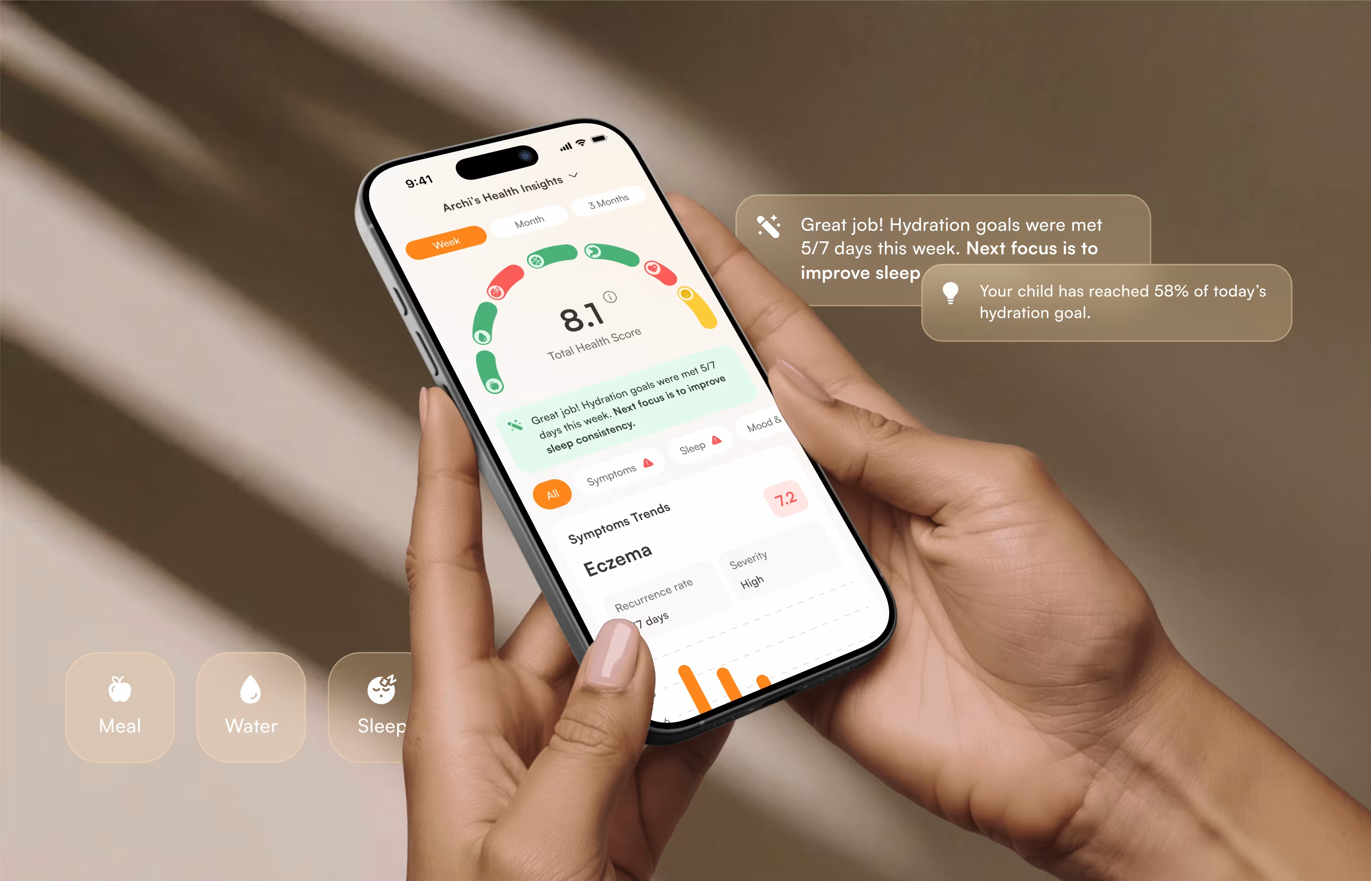
As a result, average session duration increased by 34%, feature engagement rose by 29%, onboarding drop-off decreased by 31%, and 91% of surveyed parents said they felt more confident managing their child’s health data.
The Business Case Stakeholders Will Actually Listen To
Stakeholders start paying attention to inclusive design when teams connect it to product performance and business impact. The best way to frame that conversation is through customer experience, because inclusive decisions shape the way users understand the product, move through important journeys, trust key actions, and stay engaged over time. Those shifts show up in the metrics leadership already tracks:
- Conversion across onboarding, forms, and other key journeys
- Activation and time to value
- Churn and abandonment
- Support volume caused by avoidable friction
- Trust in payments, permissions, settings, and other high-stakes actions
- Retention across a wider range of users, devices, and contexts
“The business case gets clearer once teams stop discussing inclusive design in general terms and point to a specific part of the journey where people hesitate, drop off, or need extra support. That gives leadership something concrete: a visible loss point, a measurable effect, and a product decision that can improve both user experience and commercial results at the same time.”
Vlad Gavriluk, Founder & CEO at Arounda
How to Audit Your Product for Exclusion Patterns
Use this sequence to audit a product for exclusion patterns:
- Choose one high-impact journey with clear business weight, such as onboarding, checkout, setup, or account recovery
- Run that journey for different user states
- Mark every step where a user has to guess, re-enter data, slow down, switch context, or ask for extra help
- Repeat the same journey across devices, screen sizes, language versions, and input methods
- Group repeated issues into patterns, then rank them by impact on comprehension, trust, and task completion
A good UX/UI audit highlights the points where the journey starts excluding people and why that happens. It should reveal which assumptions narrow the experience, where inclusive design patterns weaken under real conditions, and which fixes will improve several moments in the product at once. By the end, the team should have a short list of pattern-level priorities that can guide product decisions.
Expert advice: User-created workarounds deserve special attention during an audit. They often show that the product technically allows completion, yet still makes the intended path harder than it should be for part of the audience.
Making Inclusive UX Design a Default, Not a Checklist
Inclusive UX design becomes part of the product through repeated team decisions. It needs a place in the core product process, such as planning, journey design, content rules, interface patterns, and product reviews, so inclusion stays present throughout the work instead of surfacing only at the final check.
Here is how to build that into the process:
- Bring inclusion into discovery, early flows, and content decisions
- Turn recurring inclusion needs into reusable product patterns
- Review journeys in real conditions, including interruption, lower familiarity, and different ways of interacting
- Regularly track places where effort becomes uneven across users
- Treat repeated friction as a signal to update product rules, not just patch one screen
This approach gives teams a steadier way to improve the product over time. It also creates a stronger foundation for future product redesign, especially in products that already carry fragmented flows, inconsistent patterns, or older decisions that no longer support a broad audience.
Final Thoughts
Products built for millions of different users need design decisions that can hold up across variation in language, behaviour, context, and ability. The principles covered in this article show how inclusive design supports that work through stronger navigation, more flexible interaction, clearer journeys, and better product decisions over time. The long-term impact grows once inclusion becomes part of the process and shapes the product from the start.
Our Arounda team helps design and refine products that work better for broader and more diverse audiences. If you are looking to build inclusive design into a new product or make an existing one easier to use, contact us.


Table of contents


FAQ
Build it into the system rules from the start. Add clear standards for common patterns, use them in reviews and updates, and make sure every team works from the same guidance. That keeps inclusive design consistent across the product instead of turning it into a last-step check.
The biggest impact design patterns are the ones that enable save-and-resume flows, clear recovery and undo options, flexible input, readable content settings, and navigation that can support more than one way of finding the next step. These patterns improve usability for a broad audience, while making the product more robust when used at scale.
Tie it to product and business outcomes that leadership already cares about. Show where inclusive design can reduce drop-off, lower support load, improve activation, strengthen retention, or make a key journey easier to complete. If product leadership can see how one design change improves a journey that already affects revenue, retention, support, or growth, they usually respond well.
In regulated industries, inclusive UX design helps people get important and sometimes sensitive things done accurately enough that they don’t make meaningful mistakes. It serves people with lower confidence, less familiarity, and lower reading ability while still serving legal, security, and compliance requirements. In practice, that often shows up as clearer explanation, better form guidance, easier review before submission, stronger recovery from mistakes, and flows that remain legible when the rules are strict.
Measure whether more people can complete the same key journeys with similar clarity, effort, and success. Watch for changes in drop-off, error rates, retries, support volume, task completion, and time to value across different devices, user states, and contexts of use. A product becomes more inclusive when fewer users require extra effort or extra help to achieve the same outcome.
An effective example demonstrates an actual product issue, how the design solution fixed it, and what happened after. It should define who had difficulties beforehand, what difference the change made, and how that change helped more people use the product more easily. The greatest examples also feature a solution that can be broadly adapted, not merely imitated on a single screen.


89+ Reviews
on Clutch

Top Rated Plus Agency
on Upwork

Top 50 Trending team
on Dribbble

Projects are Featured on Behance platform
