
Visual Weight in B2B SaaS and Mandatory Adoption


Visual weight in design determines which elements attract attention first and whether users complete tasks without confusion. In B2B SaaS built for mandatory adoption (ERP platforms, compliance tools, HR systems, etc.) it should reduce the cognitive load of repetitive work.
Unlike B2C products that use hierarchy to drive engagement, enterprise tools must use it to drive efficiency. When users can't distinguish primary actions from secondary data due to poor distribution of visual weight, the result is operational waste and more support tickets. Valeriia Serohina, Art Director at Arounda
In this article, our expert team covers where enterprise interfaces get hierarchy wrong and how to fix it with visual weight examples, tips, and our insights.
Article Key Takeaways
- You should adapt visual weight for users under cognitive load.
- The biggest hierarchy errors come from designing for demos and procurement reviews, not daily workflows.
- Role-based interfaces require separate hierarchy models per user type. There is no single layout compromise.
- Removing visual clutter can accidentally remove visual landmarks that power users rely on for muscle memory.
- Legacy redesigns must shift hierarchy gradually. Abrupt changes trigger retraining costs that procurement teams rarely budget for.
- Design system governance is the only scalable mechanism for consistent visual hierarchy across multi-team enterprise products.
When Users Have No Choice, Hierarchy Carries More Responsibility
The difference between enterprise B2B and consumer products is that users have no choice.
In consumer products, users self-select. They download an app because it solves a problem they already want solved. If the visual weight in design fails to guide them, they leave.
In enterprise environments, the user stays, but the business suffers. Those tools deployed at the procurement level. And the decision to use the product belongs to a buyer, not the user.
Enterprise interfaces often consider every input field, button, and label with equal importance. This creates a "shouting match" on the screen.
What do we mean?
Imagine John, who processes 50 invoices an hour. Lack of hierarchy causes eye fatigue and increases error rates.
Or Sarah, a warehouse manager using a new inventory platform for the first time because her boss introduced it. She trusted the previous workflow and now has zero tolerance for figuring things out. If the interface doesn't immediately communicate where to act, she stops trying and calls support.
What Changes When Adoption Is Mandatory
Voluntary users scan, involuntary users resist
Voluntary users scan interfaces to find something. They engage with exploratory patterns, testing navigation, reading tooltips, and clicking through menus. Involuntary users don't scan for possibilities; they scan for finishing tasks. They need to find one thing fast, complete it, and leave.
Research from Nielsen Norman Group shows that enterprise users spend an average of 8 seconds on initial orientation before deciding whether they understand an interface well enough to proceed. After that threshold, they escalate. So, the visual weight of the primary action path (contrast ratio, size, proximity to the entry point) has to resolve orientation within that window.
The motivation gap and what it does to attention patterns
Motivation dictates attention. A highly motivated user will dig through complex menus to find a feature they want. A low-motivation user (often in mandatory B2B contexts) has a narrow field of view. They look only for the specific button that moves the task off their desk.
If you place a critical "Submit" button with low visual weight (perhaps a ghost button or text link) and give a secondary "Save Draft" button high prominence, you disrupt the user's primary goal. This friction accumulates over thousands of interactions per day across an organization.
Why onboarding assumptions built on willing users fail at scale
Most enterprise onboarding flows assume a user with 20–30 minutes of focused attention and genuine curiosity. They collapse in mandatory deployments.
A typical 500-seat platform rollout produces three user clusters:
- early adopters (roughly 15%),
- reluctant acceptors (roughly 60%),
- active resistors (roughly 25%).
Onboarding is almost always designed for the first group. Calibrating for the majority requires shorter orientation paths, higher contrast on primary actions, and progressive disclosure that hides complexity until it's explicitly requested.
“In enterprise environments, change must be gradual and validated. We rely on moderated and unmoderated usability testing, A/B testing, and iterative rollouts. And onboarding becomes very critical. It needs prompts, contextual guidance, and progressive exposure to new functionality for different roles.” Diana Makar, Head of Design at Arounda
The Stakeholder Split That Breaks Visual Logic
One of the most common reasons for poor visual weight in design is the disconnect between the person buying the software and the person using it.
The buyer optimizes for features, the user optimizes for survival
Buyers (C-suite, Procurement) look for rich functionality and comprehensive analytics. They are attracted to interfaces with high saturation, large graphs, and impressive dashboards. These elements naturally carry equal visual weight.
But the daily user (the accountant, the dispatcher, the HR manager) optimizes for survival. They need to enter data quickly. To them, the giant, colorful charts are visual noise that pushes their working area below the fold.
When visual weight is designed for the demo, not daily use
- What do you often see in demos?
- Summary cards, analytics widgets, feature menus (because they are colorful, impressive, big, and beautiful)
- What matters most to users?
- Input fields, action buttons, confirmation states (small, not so attractive, but very important elements for daily use).
- What about evaluation and usability?
A procurement team evaluating a platform spends 45–90 minutes in a demo. They want dashboards, reporting views, configuration depth, and integration menus. They evaluate visual richness as a proxy for capability.
Daily users (the finance analyst, the field operations manager, the HR coordinator, etc.) spend 4–6 hours inside the same product. For them, that visual richness signals cognitive work they didn't ask for. Dashboard summaries that procurement values in the demo become friction for a user who needs to enter a single field and exit.
Vlad Gavriluk, CEO & Founder at Arounda, recommends the working approach for any B2B SaaS product. This is his approach to choosing tools for our team.

How procurement decisions create UX debt before development starts
Procurement often mandates feature lists. "Must have chat," "Must have AI reporting," "Must have calendar view." When these requirements are handed to design without prioritization, the interface becomes crowded. If everything is a "must-have," then everything demands high visual weight. And as a result, you’ll get a dashboard where 15 different widgets compete for attention, rendering the interface unusable.
High and Low Visual Weight in Interfaces Nobody Asked For
From our experience, enterprise tools consistently make two opposing errors. The first: an overloaded hierarchy that treats every element as important. The second: minimal styling that users read as broken rather than “clean”.
Overloaded hierarchy in role-based enterprise tools
In complex tools, designers often rely on color to denote status (Red for urgent, Green for good). However, in a table with 50 rows, if every status chip is fully saturated, the screen vibrates with color.
Our UI/UX experts use low visual weight strategies in such projects. Instead of a solid red background for a "Late" tag, use a white background with red text and a thin red stroke. This reduces the retinal load and maintains the semantic meaning.
One more example: HRWorkCycles, a digital HR platform that manages the full employee lifecycle. They partnered with us to design a people-first product experience. And hierarchy was one of our focuses (we aimed to make it simple, clear, and useful for everyday users).
When low visual weight reads as broken, not minimal
Minimalism is dangerous in B2B. In consumer apps, hiding navigation behind a hamburger menu is standard. In a B2B trading terminal, hiding controls is a critical flaw.
If a vital filter bar has extremely low visual weight (e.g., light gray text on a white background) to look "clean," users may assume the feature is disabled or non-existent.
Arounda experience
In one of our SaaS cases, we saw support logs filled with questions like "How do I filter by date?" simply because the date picker was too subtle.
Distribution mistakes that slow task completion in repetitive workflows
The distribution of visual weight across a workflow sequence determines how fast users execute repetitive tasks. If weight is front-loaded (the first screen is visually complex, subsequent steps are visually light), users slow down at entry and accelerate toward completion. This works for infrequent, considered tasks.
For high-frequency, repetitive workflows (daily data entry, ticket processing, approval chains), front-loaded weight creates daily friction. Visual weight should be lightest at the most familiar interaction points and heaviest at genuine decision points. For example, data confirmation screens, exception states, and irreversible actions.
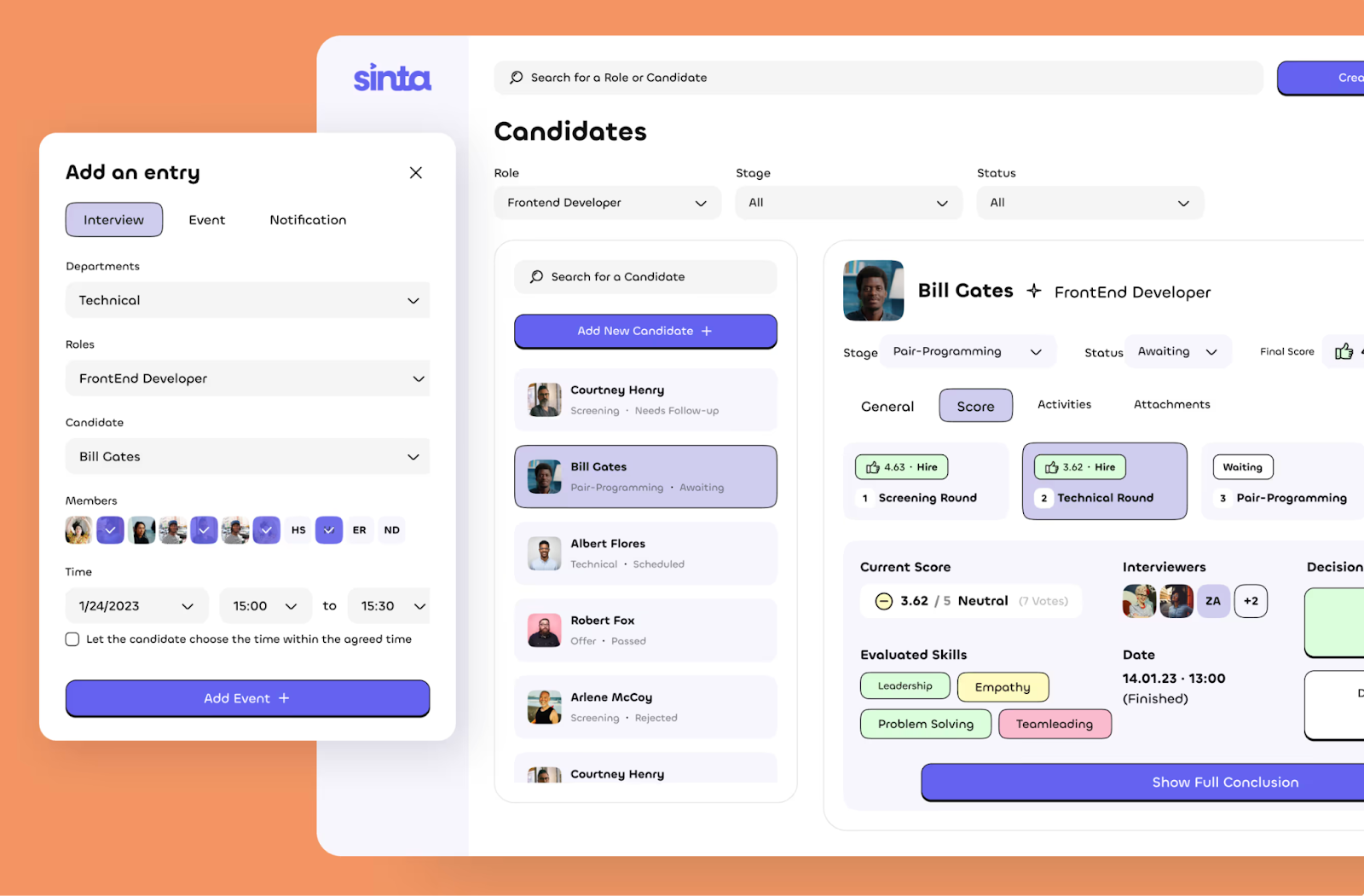
Take a look at another case, Sinta (HR Tech). Our UI/UX designers made decision buttons (Add event, Add new candidate, Show full conclusion) large and visible to help HR teams work faster without confusion or irritation.
Redistributing Visual Weight for Reluctant Users
Designing for the first 30 days of forced adoption
The first 30 days of platform adoption determine long-term engagement. Visual weight in design should prioritize guided completion over feature discovery. Primary actions need the highest contrast ratios in the interface. Secondary features (reporting, configuration, integrations) should carry minimal weight until users have completed their primary workflow enough times to feel oriented.
Arounda experts recommend temporarily increasing the visual weight of onboarding assistance and "Help" resources. Then, dynamically reduce them as user proficiency scores increase.
This is a pattern we rarely see in B2B, but it’s highly effective.
Expert tip from Vlad Gavriluk, Founder & CEO of Arounda:
"My team always recommends a 'day 30 audit' for enterprise products. Take your actual usage data (where users go in the first month, where they drop off, what they skip) and compare it to your visual hierarchy. If the paths don't match, your visual weight is working against your adoption curve. Fixing this alone has moved retention metrics by 15–20% in products we've worked on."
Reducing cognitive load in high-frequency tasks
For tasks repeated 100 times a day, visual weight in design must be stripped to the bone.
- Remove decorative icons.
- Reduce the contrast of structural lines (borders).
- Maximize the contrast of the active data.
This approach creates a "heads-up display" effect where the UI recedes, and the data comes forward.
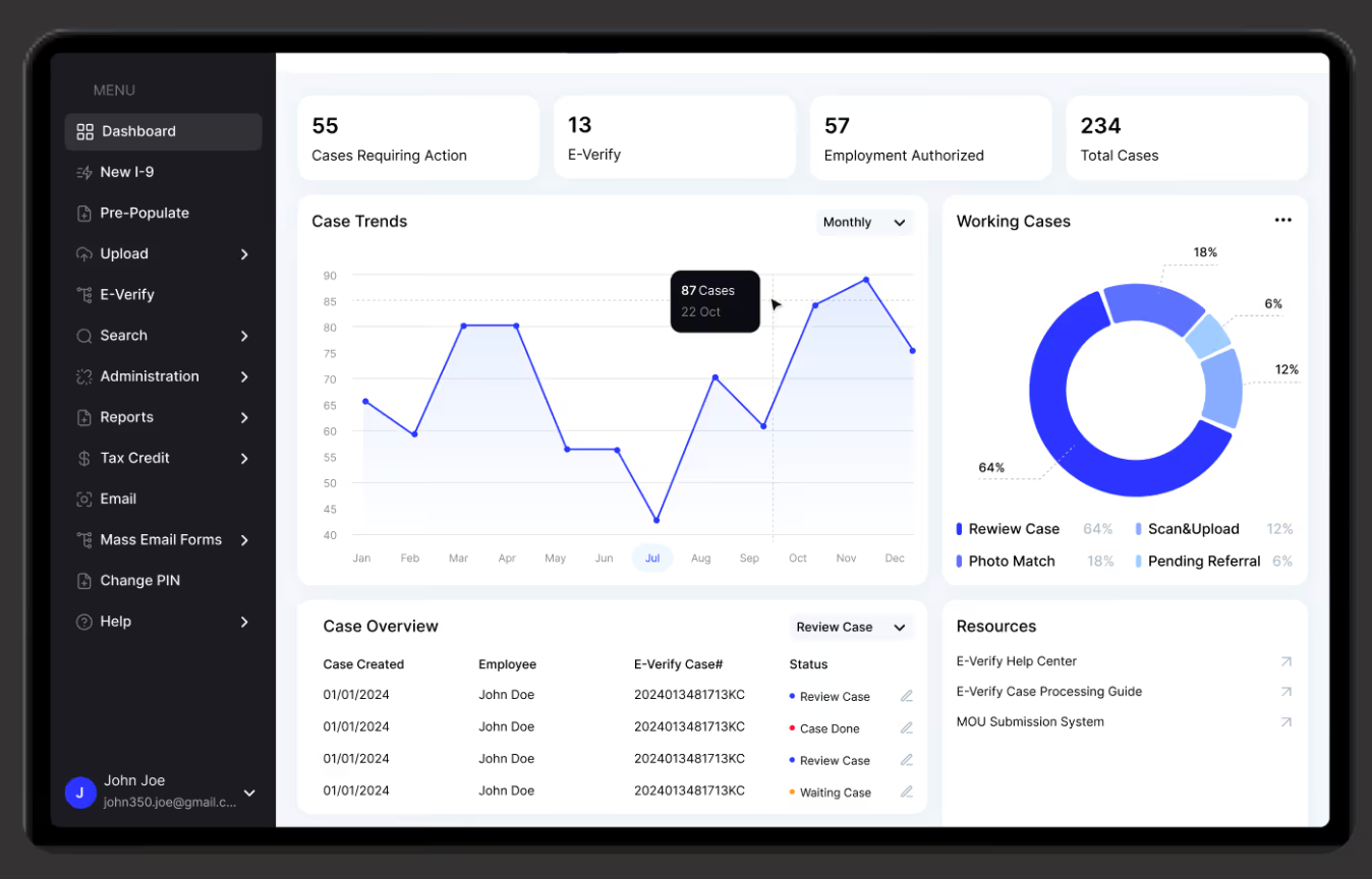
Take a look at the AdvisorWorld dashboard, which should show a large amount of data. Our experts included all essential information, removed decorative elements, reduced border contrast, and highlighted important data and buttons.
Visual Weight Across Roles in the Same Platform
A single SaaS platform often serves three distinct personas: The Exec, The Manager, and The Maker.
- The exec who needs high-level aggregation. Visual weight examples include large KPIs, trend lines, and summary cards. They rarely interact with buttons.
- The manager who needs to see exceptions. Design solutions should focus on status indicators (who is late? what is over budget?).
- The maker who needs to execute tasks. Design elements should focus on input fields and action buttons.
Role-based visual weight requires three things:
- Separate entry states per role with hierarchy calibrated to primary workflows.
- Suppressed weight on non-role features in views where they're irrelevant.
- Consistent hierarchy rules across roles so users moving between roles encounter predictable logic.
If you serve the "Maker" a dashboard designed for the "Exec," they can’t do their job. We approach this segmentation in every SaaS design project.
What Enterprise Design Reviews Get Wrong
Enterprise design reviews evaluate interfaces against criteria that don't predict user performance. Reviewers check whether features are present and whether the interface looks professional. They don't evaluate task efficiency under realistic conditions.
Based on our 10 years of experience, our designers have seen three patterns that produce systematic weight errors in enterprise reviews:
- Dashboard-first evaluation. Reviewers spend most of their review time on analytics and reporting views, which receive the most design attention and the strongest hierarchy. Data entry and workflow views receive a weaker hierarchy.
- Single-role testing. The hierarchy gets validated for one persona; when the product deploys across six roles, it works for one and creates friction for five.
- Approval without usage. Problems appear in repetitive, time-pressured use. The wrong element, which draws attention to the 40th transaction of the day, is invisible during a 60-minute review.
Arounda experts suggest
Fixing this requires usage-based criteria in reviews:
- Task completion time on primary workflows
- Error rates on first use
- Time-to-orientation for new users
Visual Weight When Modernizing Legacy Products
Users with years of muscle memory and a redesigned interface
Muscle memory in interface use is measurable. Experienced users of complex software have familiar navigation patterns with minimal conscious attention. They execute sequences automatically. When the primary action changes position or contrast, users lose automatic processing and must consciously re-navigate.
Arounda observation:
For a user processing 50 transactions per day, losing automatic navigation for two weeks represents thousands of conscious micro-decisions that weren't there before. This cost rarely appears in redesign business cases but influences the UI/UX solutions.
Shifting hierarchy without triggering retraining costs
The rule applied at Arounda for legacy redesigns: never change visual weight and position simultaneously. If an element needs to move, keep its weight consistent during the transition. If an element needs a hierarchy change, keep its position consistent. Changing both at once eliminates both spatial and visual orientation cues.
For large-scale enterprise redesigns, a phased hierarchy migration over 3–6 product releases reduces retraining costs by approximately 40–60% compared to a full hierarchy overhaul in a single release. Vlad Gavriluk, CEO & Founder at Arounda
When familiarity outweighs optimal hierarchy
There are cases where the "correct" visual hierarchy is not the right hierarchy to deploy, because the disruption cost exceeds the efficiency gain. If users have operated with a specific pattern for 3+ years and achieved high proficiency, the productivity gain from an optimized hierarchy must exceed the temporary productivity loss from re-learning. For high-volume, high-frequency workflows, this calculation often favors incremental adjustment over optimization.
Signals Your Visual Weight Is Working Against Adoption
- Support ticket clustering on primary workflows. Consistent confusion at the same 2–3 interface points indicates a UI/UX problem at those locations.
- High time-on-page on pages that should be fast. A 30-second task averaging 90 seconds across users means the interface isn't directing attention efficiently.
- Low feature adoption despite high login rate. Users avoiding specific features often means that navigation is hard or they are hard to find.
- Manager-mediated onboarding as the norm. When "let me walk you through it" becomes standard, the self-service hierarchy has failed.
- Consistent abandonment at the same workflow step. Drop-off at a specific step identifies where visuals created an unresolvable moment of confusion.
Visual Weight Inside Enterprise Design System Governance
Without governance, design decisions drift.
One case from UX audit experience:
One team ships a primary action button at 3:1 contrast. Another ships the same button at 5:1. A third adds a bold label to a secondary field because it "looked weak" in their view. They teach users contradictory rules about what matters, and users in mandatory-adoption products have no patience for contradictions.
This is the cost of ungoverned hierarchy: eroded trust. Users stop reading visual signals as meaningful and start clicking by trial and error.

So, how to set it up?
Our team offers the minimum viable structure:
- Define a hierarchy scale with 4–5 levels.
- Assign a reviewer to each design system contribution.
- Document role-specific variants explicitly.
- Create a deprecation path for pre-governance components.
Final Note
We've run this process across SaaS products ranging from 50 to 50,000 seats. The teams that introduce governance before their second major product area is built spend significantly less time on hierarchy disputes in sprint reviews. The teams that retrofit it later spend 3–4x as long because they're correcting decisions that are already load-bearing. Our team helps fix that with strategy and data-driven decisions.
And one last question: How long does it take a new hire to work independently on your platform?
If the answer is weeks, the interface is carrying training costs it shouldn't. We've cut that timeline for enterprise products, and we can do it for your product, so contact us.


Table of contents


FAQ
In B2C, it guides motivated users who have chosen the product. High-weight elements signal value and reward exploration. In enterprise B2B, design elements must guide users who may be resistant, stressed, or time-pressured. Enterprise interfaces require greater primary-action contrast, earlier task orientation, and reduced reliance on non-task elements.
Of course, it’s the main goal. Redistributing weight on primary workflow screens improves task completion time and reduces support ticket volume without a full redesign. And in legacy redesigns, phased hierarchy migration over 3–6 releases reduces retraining costs significantly. But our key constraint: don't change weight and position simultaneously. Users need at least one stable orientation cue during transition.
Arounda designers separate hierarchy by role at the information architecture level. The default state for each role applies the design elements configured for its primary workflow. Our hierarchy rule is to stay consistent across roles even when the prominent elements differ. This requires role-specific component variants in the design system.
User resistance increases when visual hierarchy forces cognitive work that users didn't budget for. An overloaded hierarchy requires users to interpret the interface before they can execute their task. Voluntary users tolerate that cost. In mandatory-adoption contexts, users under task pressure experience it as friction and escalate. Visuals that match the task sequence and reduce interpretation reduce the cognitive tax on reluctant users.
As soon as more than one designer is working on a single product interface. For enterprise products with multiple teams working on them, we recommend establishing the governance before the second major product area. Modernizing hierarchical governance after product scaling requires component audits, decommissioning plans, and migration roadmaps. You'll need more time than establishing governance early on


89+ Reviews
on Clutch

Top Rated Plus Agency
on Upwork

Top 50 Trending team
on Dribbble

Projects are Featured on Behance platform
