
50 Best Landing Page Examples for SaaS in 2025

What do a restaurant menu and a landing page have in common? Both help people decide fast if they should stay, try something, or walk away. Therefore, you should place every element logically in the right position and make it helpful and visually pleasing to the client’s eye.
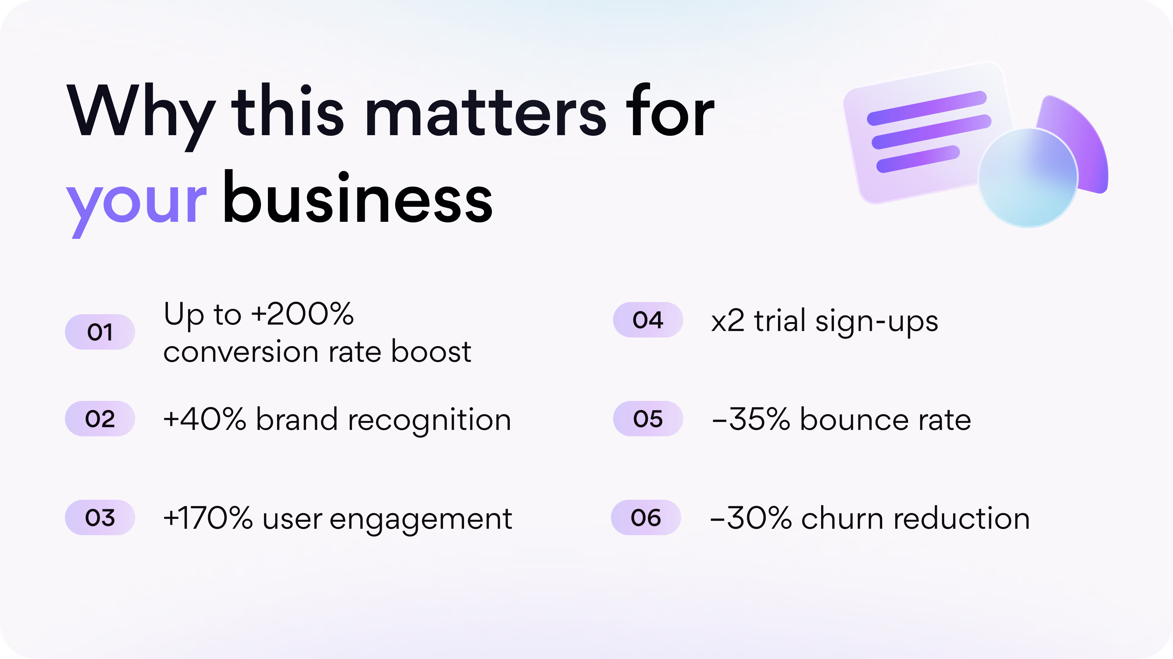
A poorly designed landing page can burn thousands of potential signups. But Arounda knows how to avoid this and create an effective landing page that can double conversions and earn loyal customers. After designing or redesigning and developing SaaS products, our clients reached results like 4.6x revenue growth, +170% engagement, and -37% churn. Strong design and conversion-focused landing pages really do change business outcomes.
That’s why we gathered the 50 best landing page examples for SaaS in 2025. These landing page ideas will show you how top companies build trust, hook attention, and guide visitors straight to “Start Free Trial” or “Book a Demo.”
Article Key Takeaways
This article is a complete guide to SaaS landing page design with 50 curated examples from global brands like Slack, Dropbox, Basecamp, Notion, Figma, Calendly, LinkedIn, Zoom, and others. You’ll learn:
- What makes a landing page effective.
- Expert reviews of famous and successful SaaS landing pages.
- Expert insights.
- Practical takeaways for founders and decision-makers on how to design landing pages that sell, scale, and convert.
- Measurable benefits of high-quality design.
- Red flags to avoid.
- Best product-oriented landing pages and their approaches.
This guide gives you actionable insights, expert analysis, and proven SaaS landing examples so you can build a page that turns visitors into customers, increases conversions, trust, and measurable ROI.
What is a truly effective landing page?
A landing page is a website screen where your visitor decides whether to start a free trial, book a demo, or bounce. We asked our Arounda experts, “What makes a landing page truly effective?”. They answered:
- Clarity from the first second.
Like in Documotor, Slack, or Dropbox. The landing page must instantly tell visitors what your product does and why it matters to them without jargon, complex words, and technical nuances.
- One main goal and one clear CTA.
Like in Metricly, Netflix, or Shopify Start. They guide people toward one action.
- Trust signals everywhere.
Like in MOJO CX, Zendesk, or Mailchimp. SaaS buyers want proof that your product works, so social proof removes doubts and builds confidence. It can be testimonials, case studies, client logos, or security badges.
- Fast and seamless experience.
Like in World Delete, Calendly, or Stripe. More than half of mobile users leave if a page takes over 3 seconds to load. Your landing page must load fast, work on every device, and not frustrate visitors.
- Emotional + logical appeal.
Like in Gradwork, Notion, or Miro. Pages highlight the pain point (“managing projects feels messy”) and show the clear benefit (“our tool cuts your project time in half”).
Arounda designers have tested and refined these principles across dozens of SaaS projects. These solutions helped increase retention, engagement, and conversion rates for each of our works.
What is the goal of a landing page?
You can bring thousands of people to your website, but if they don’t take action, the traffic means nothing! The main goal of a landing page is to turn attention into action.
Arounda tip: Don’t distract visitors with menus, multiple offers, or endless scrolling. Instead, focus on one clear outcome. It could be:
- Sign up for a free trial.
- Book a demo.
- Join a waitlist.
- Download a resource.
- Collect emails for a newsletter.
- Encourage account creation.
- Invite users to explore a product tour.
- Download a mobile app.
- Join a webinar or live product event.
- Promote limited-time offers.
- Upgrades from freemium to paid plans.
When your page delivers clear answers, visitors follow your CTA. Our clients cut bounce rates by 35% and increased plan signups by 27% after reworking their landing page goals and flow. That’s proof that a landing page is a growth tool.
Now, let’s move from the best practices to website landing page examples for SaaS. Our experts share insights, explain why they are so successful, and what you can learn from them.
Saas Landing Page Examples
The following examples of a landing page show how strategic design turns clicks into customers. Some pages win with creative storytelling, others with clear CTAs, or with clever product demos. Each one is an opportunity to gather ideas and adapt them to your product. Let’s go!
Documotor
Niche: Productivity | Business automation SaaS
Documotor is a SaaS platform that helps businesses automate document creation and management. Teams can generate error-free, professional documents instantly. Our Arounda team partnered with Documotor to redesign their platform and landing page to improve clarity, usability, and conversion.
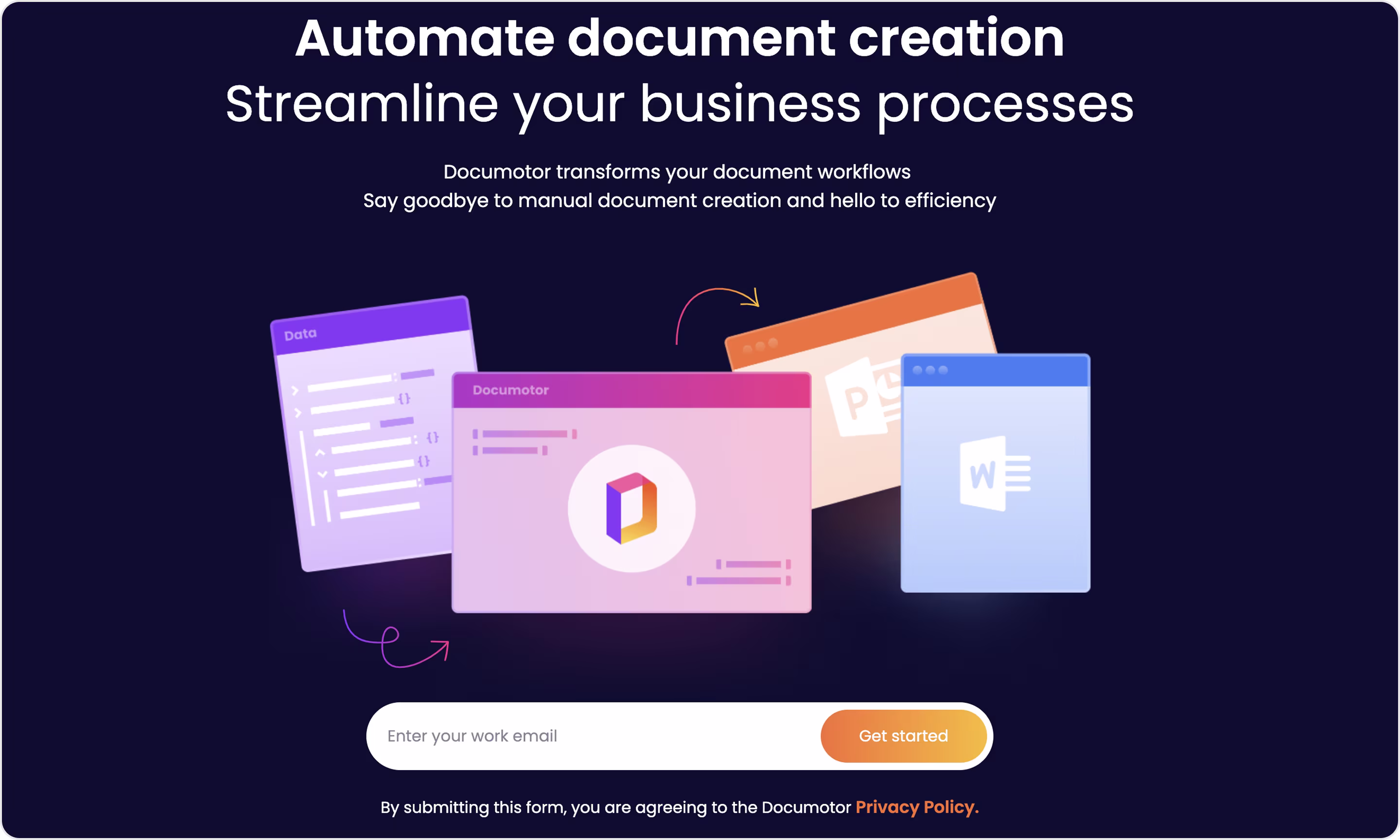
Our experts' take on this design:
- Straight-to-the-point headline that communicates value.
- Strong hierarchy (headline, subheadline, and CTA are visually prioritized for quick scanning).
- Conversion-first design where email input and “Get started” button in the hero section reduce steps to sign up.
- Visual storytelling clearly shows what the tool integrates with.
- A dark background with orange and purple accents effectively highlights the CTA.
- No heavy navigation or multiple competing CTAs. Focus is purely on lead generation.
Have a product like this? The Arounda team recommends:
- Keep the hero section clear with one promise and one CTA.
- Pair visual metaphors with real product screens for credibility.
- Always make the CTA transparent so users know exactly what to expect after clicking.
WordPress
Niche: Website development
We took the WordPress for Agencies page for analysis. This landing page example offers agencies specialized tools, referral earnings, and support to grow their business with website development.
We parted with WordPress to deliver website design and branding services. The result of our cooperation: +5% engagement rate, +22% increased traffic, x2 custom retention, and 20% reduced bounce rate.
Ola Olusoga, Vice President at WordPress, left great feedback after our partnership:
“Throughout the entire project all I saw was sheer will to keep pushing forward and adapting to whatever the next request was. Terrific job and we couldn't have done it without you.”
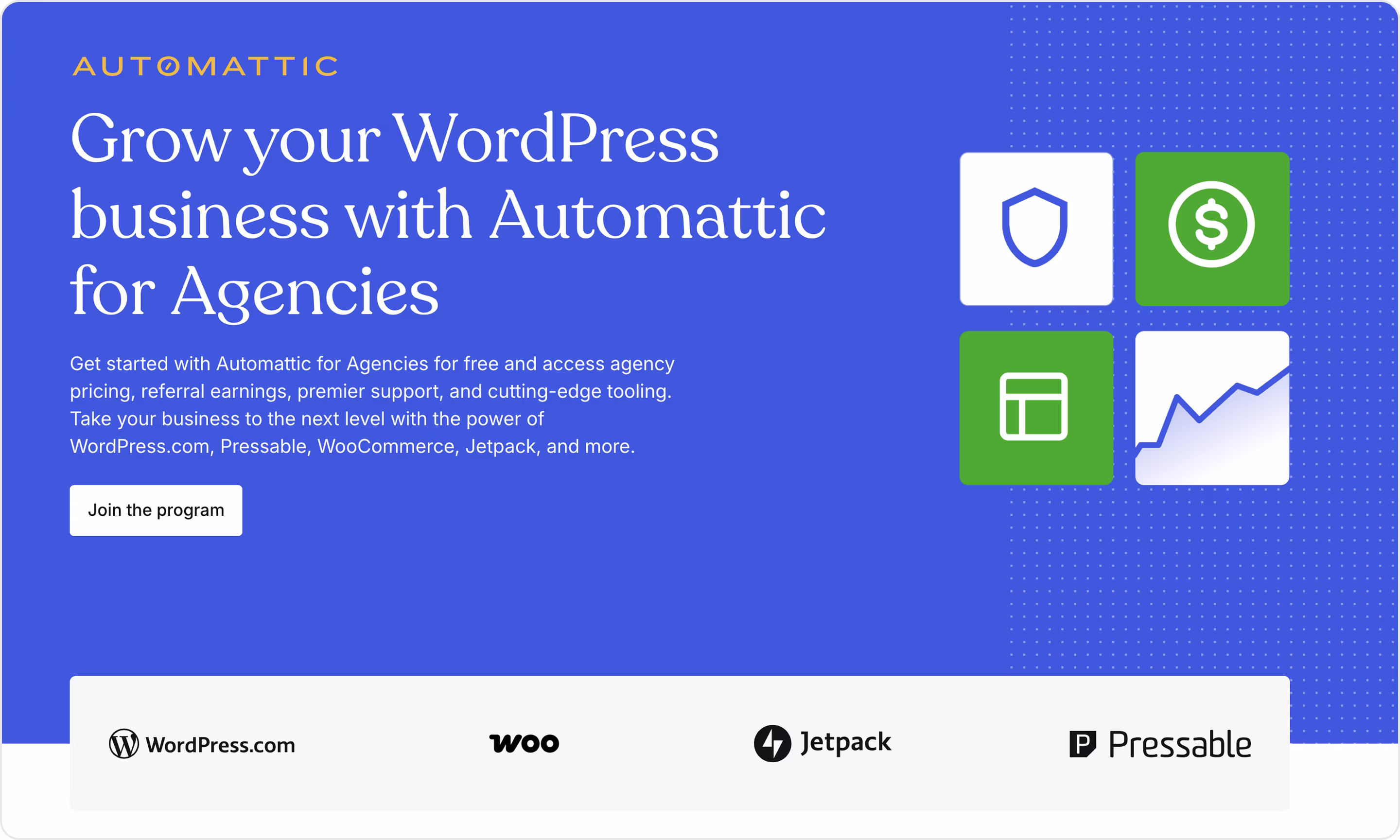
Our experts' take on this design:
- A clear headline and focus speak directly to the specific audience.
- Concise supporting text explains program benefits without overwhelming visitors.
- Strong primary CTA is actionable and positioned prominently.
- Familiar brand logos add instant trust.
- Visual hierarchy creates a clean reading flow.
- Consistent branding makes the design professional and familiar.
Have a product like this? The Arounda team recommends:
- Target your CTA to your audience’s main pain point. For agencies, that’s growth and profitability.
- Always add trust elements (testimonials, partner quotes, or metrics) to improve conversions.
- Show the product in action with dashboards, mockups, or sample results to make the offer more believable.
World Delete
Niche: Cybersecurity
World Delete is a SaaS platform that helps individuals and businesses remove harmful content from the internet and protect their online reputation. We collaborated with World Delete to redesign their website for a better user experience and increased conversion rates. This is one of the product landing page examples that focuses strongly on building trust and urgency.
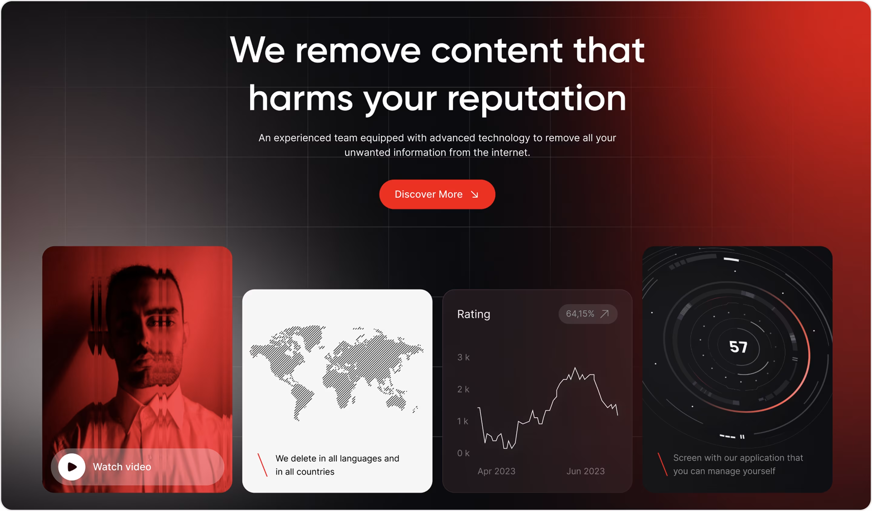
Our experts' take on this design:
- A powerful headline instantly resonates with pain points.
- Emotional storytelling with visuals to convey urgency and seriousness.
- Focused CTA directs users into the journey without distractions.
- World map graphic reinforces multilingual and international reach.
- Charts and metrics add a professional, data-backed look.
- An immersive dark theme with red contrasts grabs attention and emphasizes security.
Have a product like this? The Arounda team recommends:
- Start with emotion, close with proof.
- Use cool visual storytelling to capture attention, but back it up with data.
- If your service operates across borders, emphasize compliance, security standards, and case studies from multiple regions.
- Make onboarding simple and ensure visitors know exactly what happens after clicking the CTA.
Adobe Creative Cloud
Niche: Creative software | SaaS for design and media
Adobe Creative Cloud offers different tools to produce visual content. This landing page specifically drives free trial signups and makes it easy for users to explore the Creative Cloud ecosystem before committing to a paid plan.
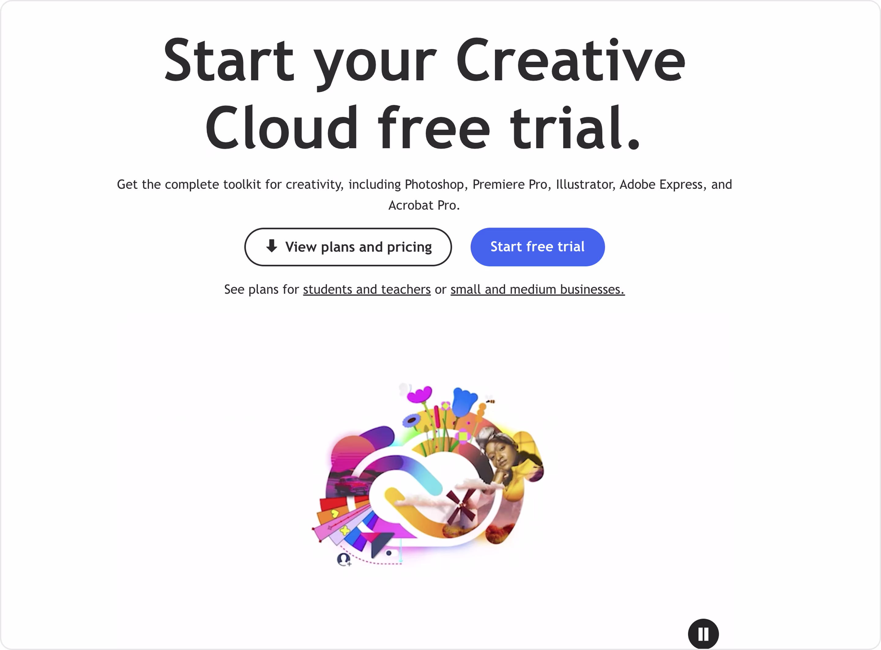
Our experts' take on this design:
- Focused blue CTA draws attention immediately.
- Supportive secondary CTA gives hesitant users more context without derailing the funnel.
- Links for students, teachers, and small businesses help tailor offers to different groups.
- Clean design with just one visual element (Creative Cloud logo artwork) keeps focus on the trial.
Have a product like this? The Arounda team recommends:
- Use a primary and secondary CTA to capture decisive and hesitant users.
- Speak directly to different audience types with segmented offers (students, enterprises, small teams).
- Back up with proof. Even strong brands like Adobe benefit from adding stats or customer quotes.
MOJO CX
Niche: Contact center SaaS
MOJO CX is a SaaS platform that uncovers agent potential and improves contact center performance. After collaborating with Arounda, MOJO CX achieved a 32% increase in customer reach and an 80% user satisfaction rate.
We asked Aetienne Sardon, Founder at MYSO Finance, about his impression of working with us, and we’re very thankful for his honest and great feedback:
“Their expertise and guidance were instrumental. They demonstrated their commitment to creating a product that resonated with our target audience, which led to improved user satisfaction.”
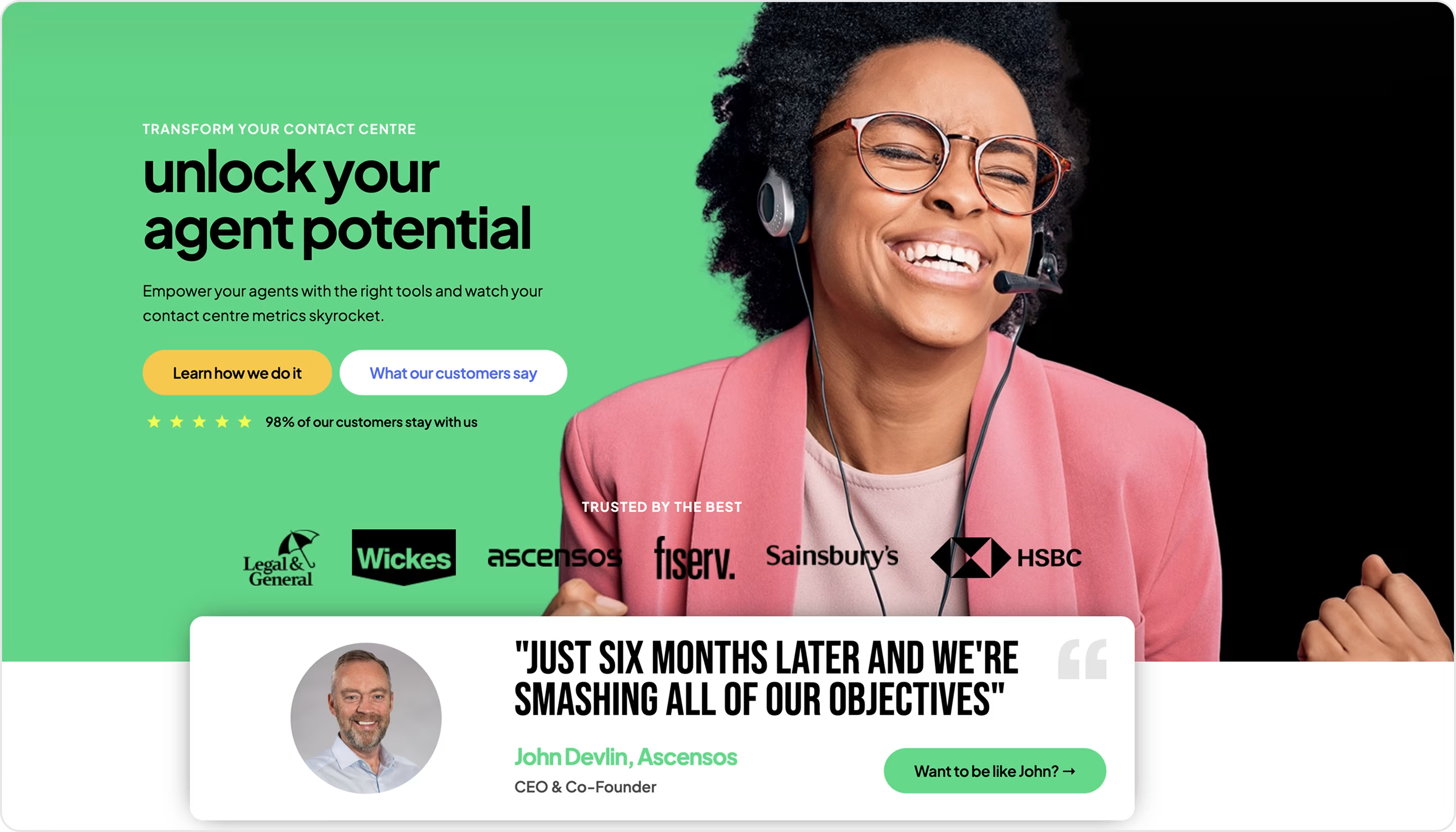
Our experts' take on this design:
- Engaging headline that speaks to the target audience’s goals.
- Strong visual storytelling with the happy agent image that humanizes the product and builds trust.
- Two CTA buttons create a guided journey.
- Trust signals of client logos establish credibility.
- Customer testimonial highlights real-world success with measurable impact.
- The retention metric (98% of our customers stay with us) works as powerful social proof.
Have a product like this? The Arounda team recommends:
- Add measurable benefits, client’s feedback, and/or client logos to increase credibility.
- Balance visuals with product context.
- Humanize your landing page with people's pictures.
- Keep one clear conversion goal, with supporting links secondary.
Semrush
Niche: Marketing
Semrush is an SEO and digital marketing platform. Our team analyzed the Enterprise solution landing page. It’s for large organizations that need advanced workflows, scalable data, and integration options. This is one of the strongest landing page design examples in the SEO niche with bold messaging and data-driven storytelling.
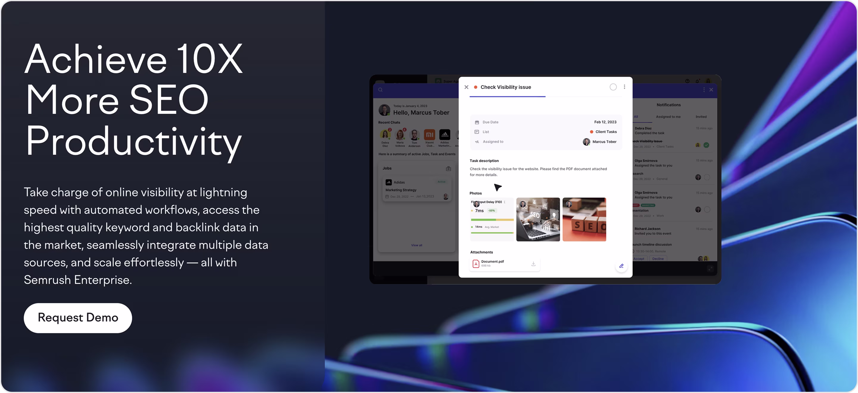
Our experts' take on this design:
- The headline grabs attention with a strong promise.
- Value-packed subtext explains exactly how the platform works.
- Focused CTA is clear and matches enterprise buyer intent.
- A product screenshot gives a quick glance into the interface and adds transparency.
- Enterprise positioning with premium design.
- Modern visual style with dark background and neon accents.
Have a product like this? The Arounda team recommends:
- Headlines must instantly hook busy executives if C-level is your target audience.
- Case studies, numbers, and testimonials convert better than abstract promises.
- Screenshots or short videos of your product help reduce hesitation.
- Enterprise design must be clean with premium aesthetics.
Metricly
Niche: Cloud cost management | AWS optimization
Metricly is a SaaS solution that helps businesses analyze, manage, and optimize AWS costs with automation and data-driven insights. Metricly is the Arounda’s project, where our team delivered a product and landing page redesign to improve usability and increase conversions.
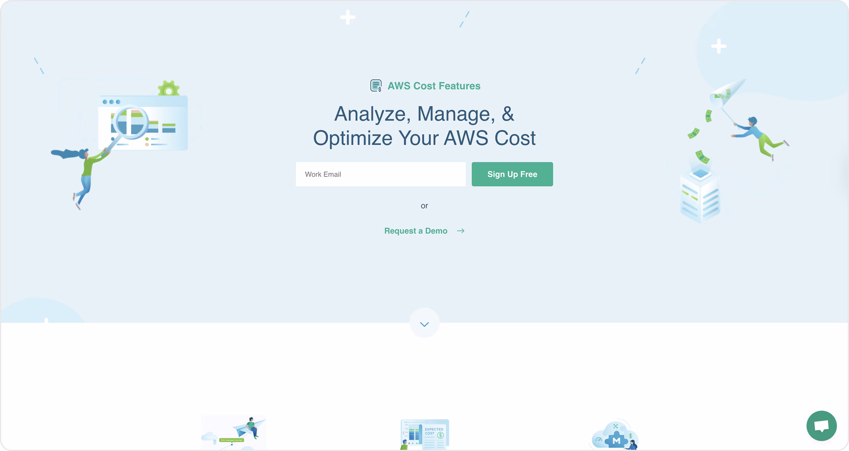
Our experts' take on this design:
- A clear headline communicates the product’s purpose.
- Conversion-first design, where the email input + CTA button are in the hero to reduce steps.
- Dual CTA covers self-serve and enterprise buyers.
- Minimal design with cool illustrations and plenty of white space keeps attention on the CTA.
- Illustrative storytelling with graphics visualizes the idea of saving AWS costs.
Have a product like this? The Arounda team recommends:
- Balance simplicity with proof.
- Minimal design helps users focus on the key action.
- SaaS buyers convert faster when they see how the product works.
- Request brand illustrations to visualize the product’s idea for better engagement.
Mailchimp
Niche: Marketing | Email automation SaaS
Mailchimp helps businesses of all sizes create personalized email campaigns, improve deliverability, and optimize engagement with real-time reporting. This example landing page showcases the platform’s power and convinces visitors to get started with email marketing quickly.
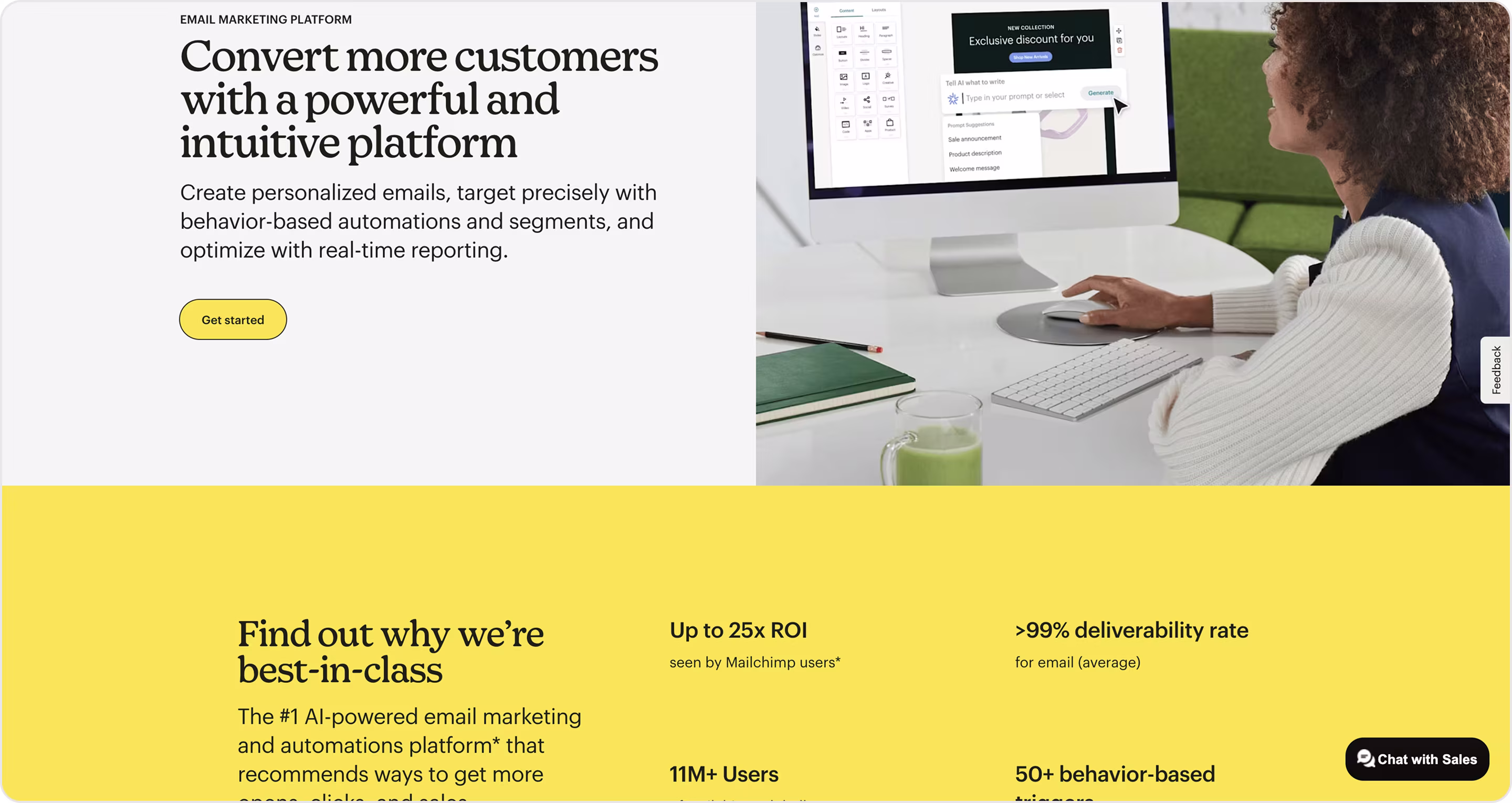
Our experts' take on this design:
- Value-driven headline appeals to business goals.
- The product screenshot shows functionality in action.
- Brand identity with a signature yellow background ensures instant recognition and memorability.
- Trust-building proof with metrics establishes credibility.
- Messages professionally speak to businesses of different sizes.
Have a product like this? The Arounda team recommends:
- Use bold branding for recognition.
- Balance emotion and logic, appeal to business goals, and show technical advantages.
- Cater to SMBs with free signup and to enterprises with demo requests.
- Place the visualized results.
Gradwork
Niche: Recruitment
Gradwork is a recruitment platform that connects graduates with employers and simplifies the hiring process through smart matchmaking. This landing pages example attracts students who seek opportunities and companies looking for fresh talent. Arounda partnered with Gradwork to design their platform to increase usability and conversion rates, and make the UX clean and clear.
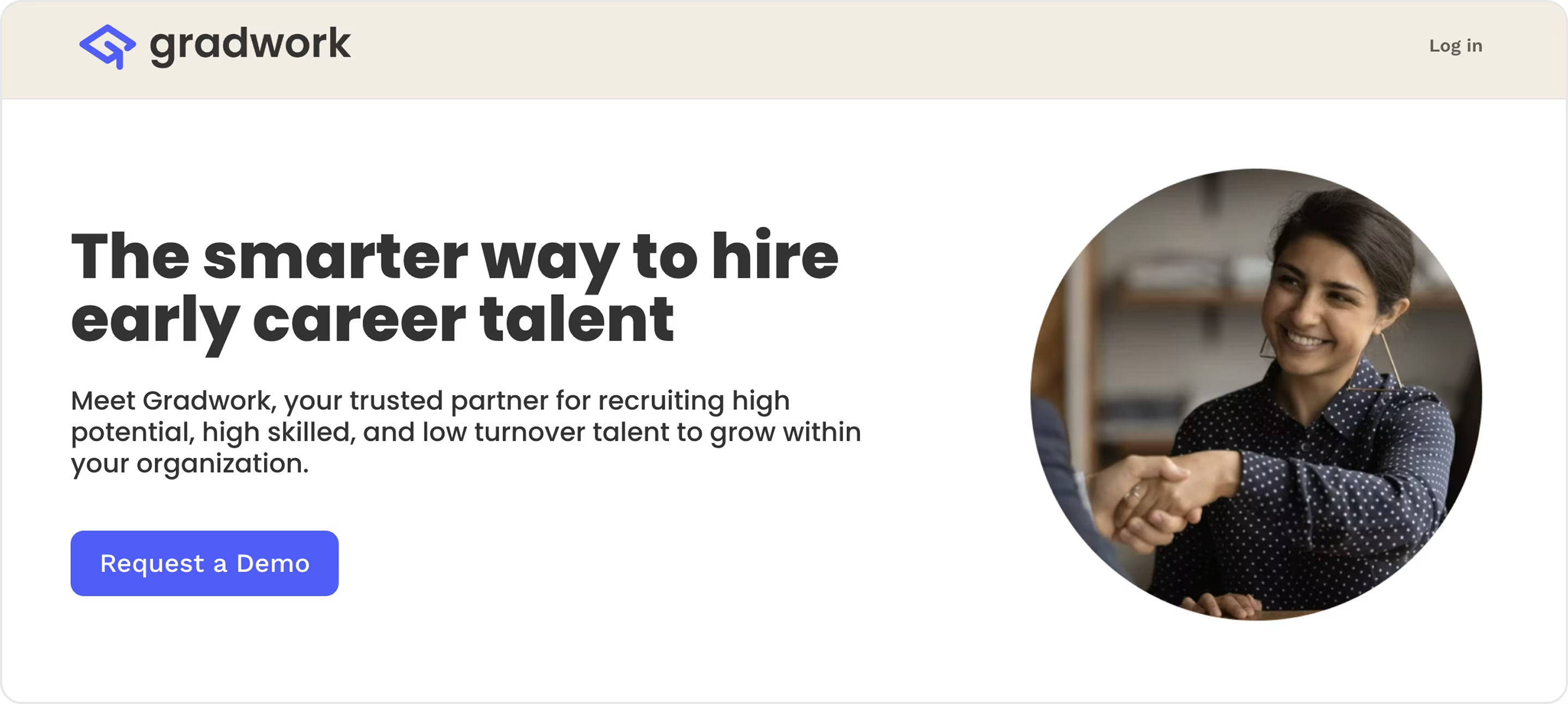
Our experts' take on this design:
- Audience-focused messaging that speaks directly to graduates and employers.
- Balanced, professional, and approachable design.
- Clear CTA flow.
- Visual clarity with strong typography and clean layouts.
- Trust-building approach.
Have a product like this? The Arounda team recommends:
- If your SaaS serves both sides, make sure CTAs are tailored to each.
- Short stories of successful matches improve trust and relatability.
- Make onboarding seamless.
- Keep layouts understandable so users can act without friction.
Niche: Professional networking
LinkedIn connects millions of people with opportunities, companies, and communities. Its homepage is one of the most recognizable examples of landing pages that serve multiple audiences at once.
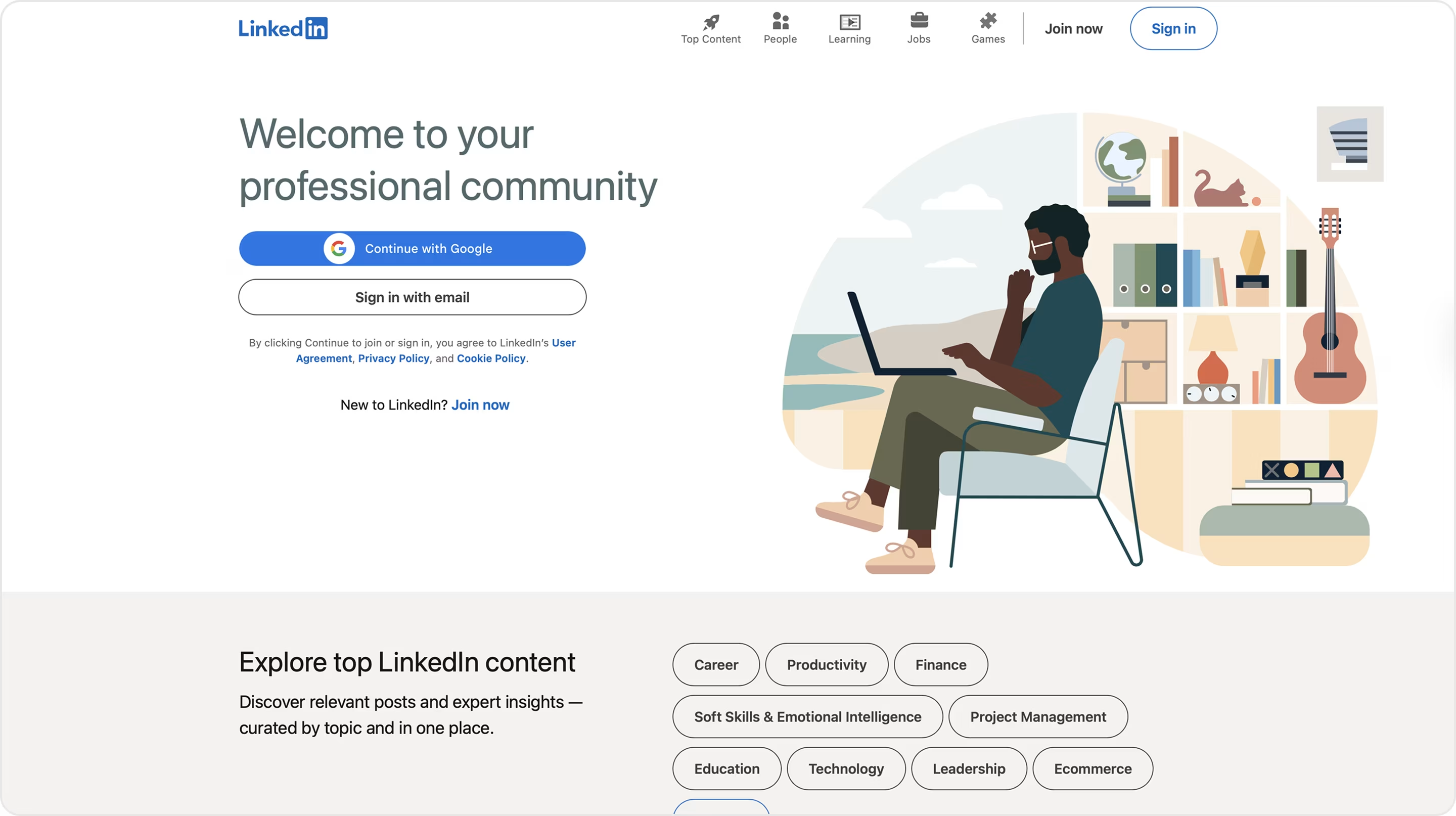
Our experts' take on this design:
- Messaging covers job seekers, professionals, and companies.
- Strong brand recognition reduces the need for excessive proof.
- Approachable design with neutral colors and clean layouts keeps the focus on content.
- Value positioning where copy emphasizes building connections, exploring opportunities, and learning.
Have a product like this? The Arounda team recommends:
- If your SaaS serves multiple groups, provide tailored CTAs for each.
- Balance brand with usability. Keep designs clean, but also show how the product works.
- Guide visitors toward one immediate step (sign up, start free, request demo).
QTalent
Niche: Recruitment | Talent marketplace
Qtalent is a digital recruitment platform that connects employers with high-quality talent through an innovative and streamlined hiring process. Arounda collaborated with Qtalent to design their platform that resonates with HR teams and business leaders.
Results: 45% increased popularity among recruiters, +52% professional community expansion, x3.5 traffic and engagement boost, and x2 talent base growth.
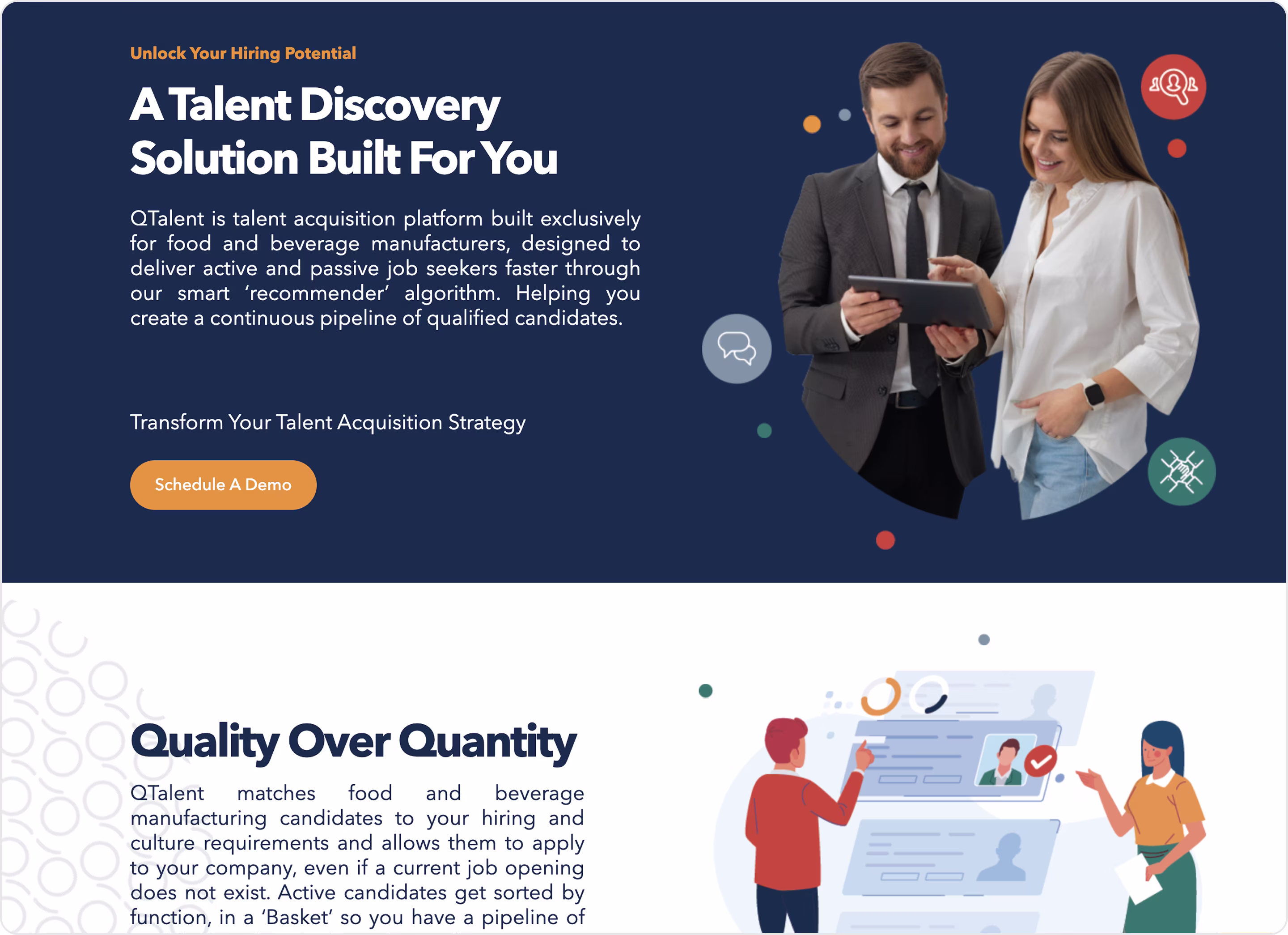
Our experts' take on this design:
- Employer-focused messaging.
- Clear CTA guides decision-makers effectively.
- Professional aesthetic.
- Value proposition clarity highlights efficiency, access to quality candidates, and reduced hiring friction.
- Easy navigation.
Have a product like this? The Arounda team recommends:
- Focus on employer success with metrics, benefits, and case studies.
- Emphasize what makes your platform unique.
- Keep the page clean, but add proof points below the fold.
- Use product previews.
Latana
Niche: Marketing analytics
Latana helps businesses measure and optimize their brand health through advanced analytics and consumer insights. This example of landing page is optimized for decision-makers in marketing and brand management.
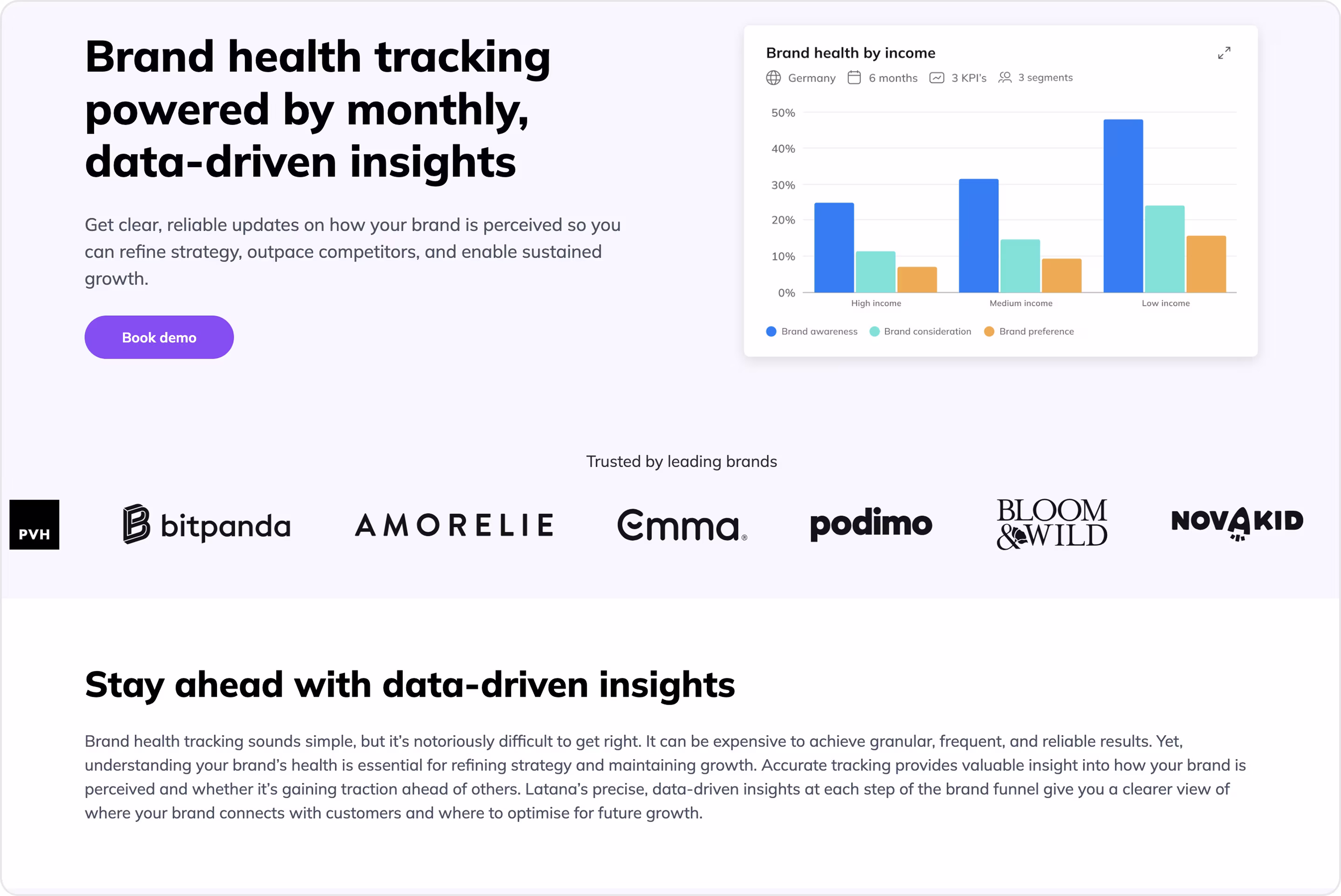
Our experts' take on this design:
- Lantana educates the target audience. Instead of just selling, the page explains why brand tracking matters.
- Data-driven graphics and infographics build authority and credibility.
- Deep product storytelling. The copy shows how insights impact long-term ROI.
Have a product like this? The Arounda team recommends:
- SaaS products in emerging niches should mix product selling with thought-leadership content.
- Visualize dashboards, sample KPIs, and real brand tracking outputs.
- Integrate recognizable brand logos, independent research references, or third-party awards.
- Use bolded numbers, short bullet benefits, and interactive blocks for busy CMOs.
Slack
Niche: Enterprise сollaboration
Slack is a global collaboration tool. Its Enterprise solution targets large organizations that need scalability, compliance, and advanced integrations.
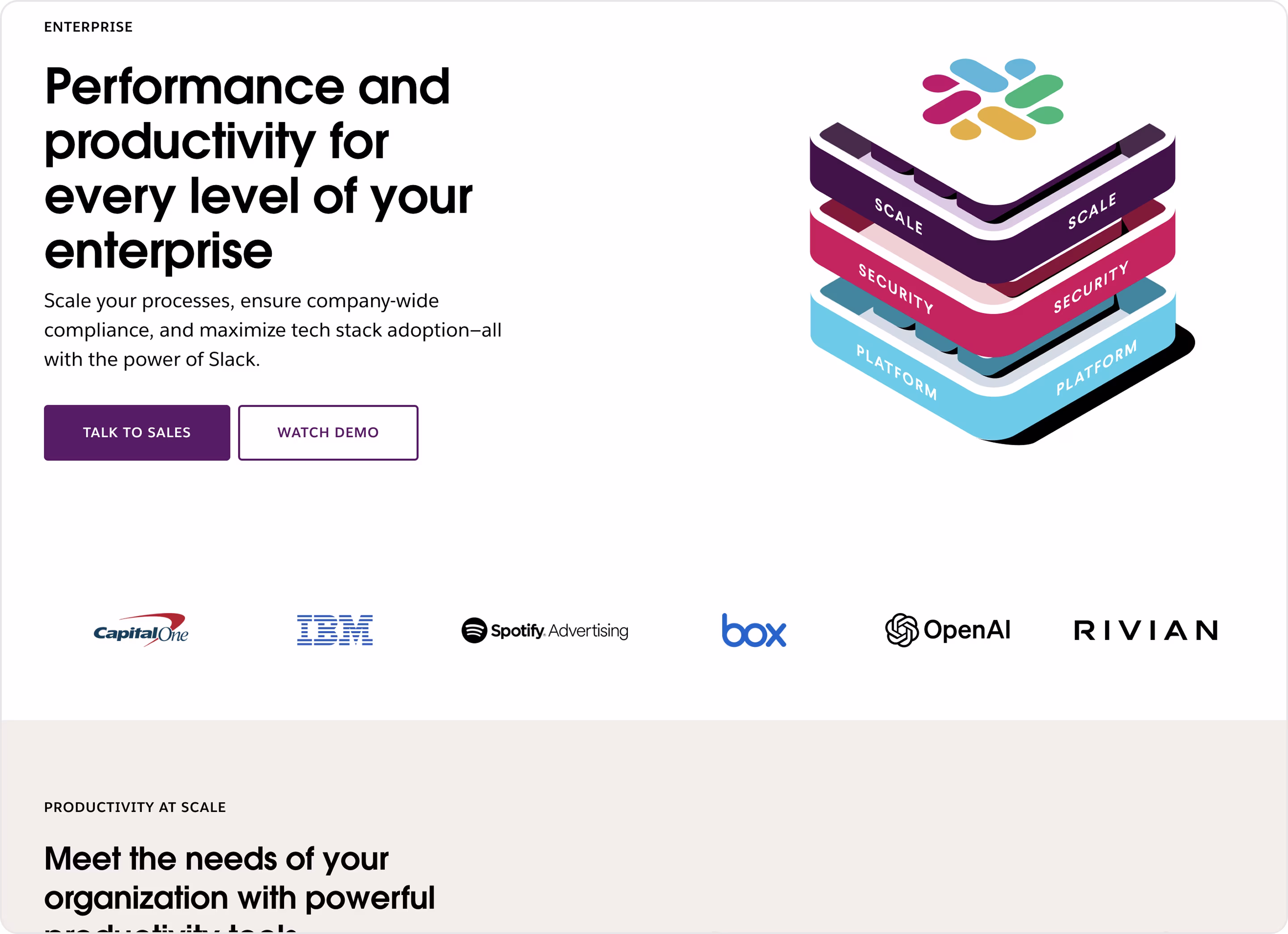
Our experts' take on this design:
- Enterprise-focused messaging.
- Dual CTA strategies reflect different buyer stages.
- Trust logos of recognizable brands build instant credibility.
- Stacked platform graphics communicate scalability, security, and flexibility simply.
- Professional design with a minimalistic but premium look aligns with enterprise positioning.
- The hierarchy of benefits is front and center.
Have a product like this? The Arounda team recommends:
- Big names and big numbers drive trust in B2B SaaS.
- Keep both demo and sales calls, but design them with a clear hierarchy.
- Use visuals strategically. Show real product dashboards alongside metaphoric illustrations.
- Enterprise decisions involve IT, compliance, and operations, so messaging should address each.
SafetyKit
Niche: AI SaaS | Fraud detection & risk management
SafetyKit is an AI-powered SaaS platform that protects digital businesses from fraud, abuse, and policy violations.
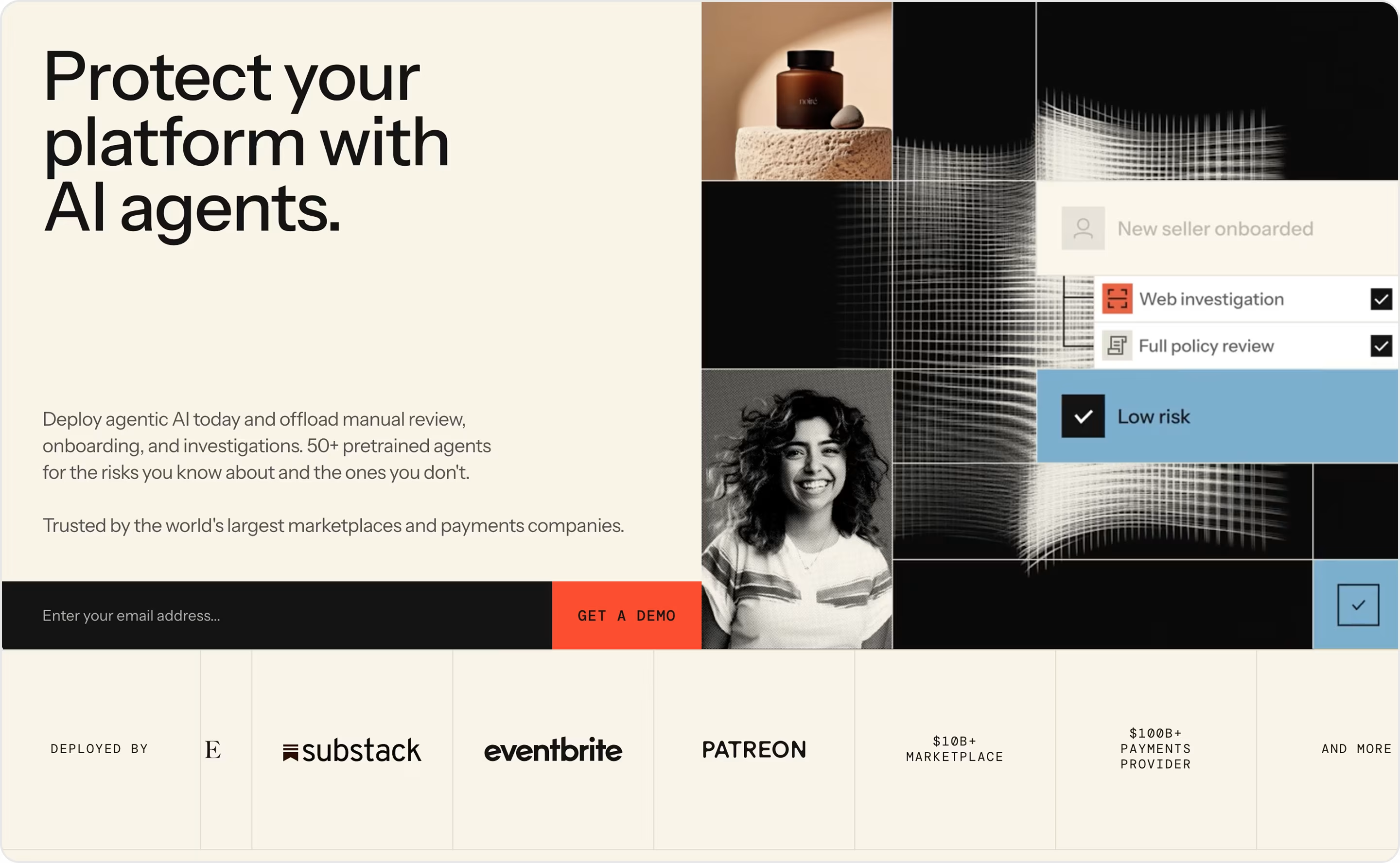
Our experts' take on this design:
- A headline is concise, powerful, and benefit-focused.
- The page explains practical use cases.
- Muted background with bold accent colors (red, black, blue) creates a tech-focused feel.
- Balanced trust signals combine client logos with industry-scale proof.
Have a product like this? The Arounda team recommends:
- Enterprise clients need logos, metrics, testimonials, and emotional trust.
- Use visuals of the actual risk dashboards or case flows.
- Tailor messaging to marketplaces, fintech, SaaS, or subscription businesses.
Airtable
Niche: Collaboration SaaS
Airtable is a low-code productivity platform that combines the flexibility of spreadsheets with the power of databases. The Portals landing page showcases how organizations can securely share curated data externally.
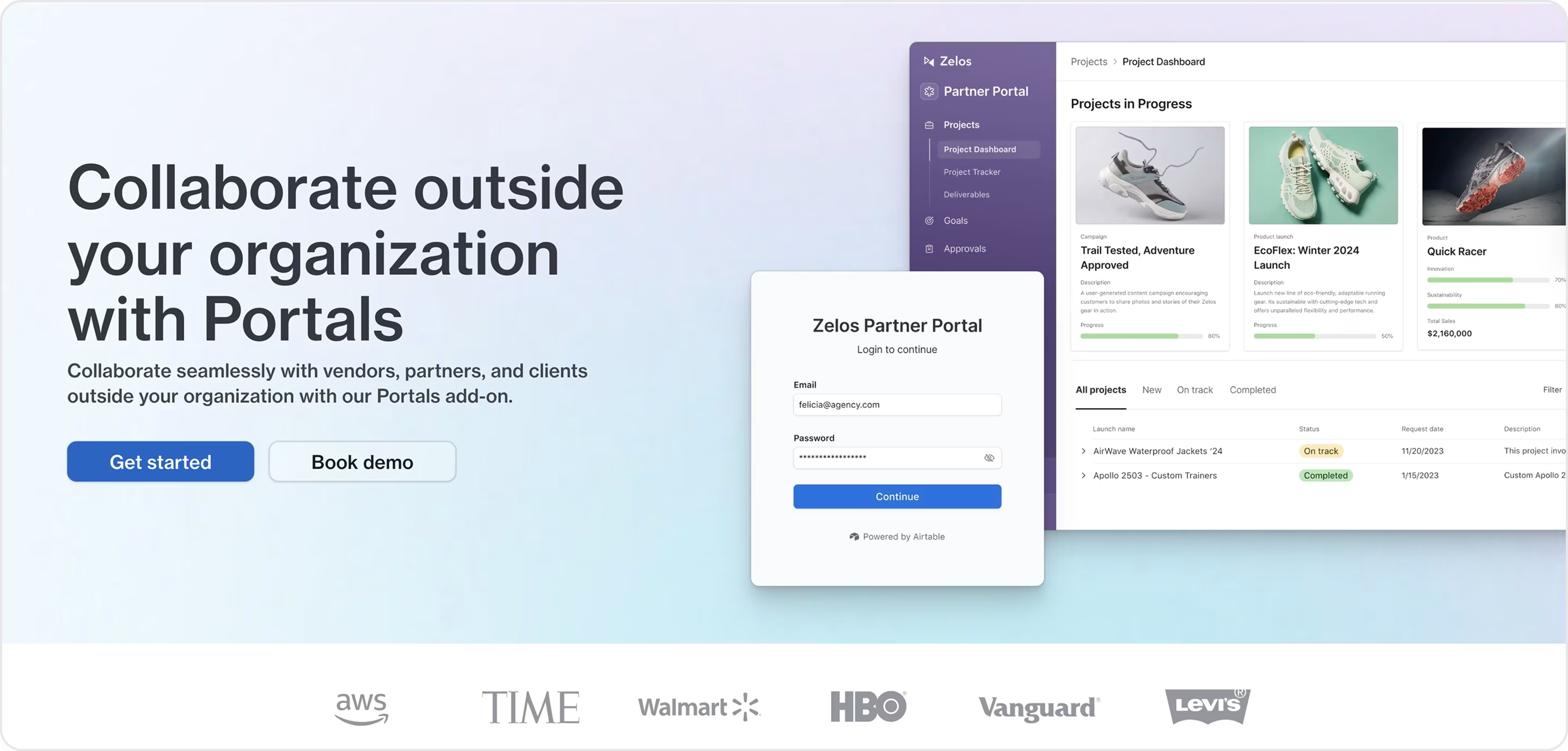
Our experts' take on this design:
- Use-case specificity drills down into different landings with features.
- Explains why Portals matter, not just what they are.
- Plain and accessible language.
- Sophisticated visual hierarchy with clear typography and interactive design elements ensures smooth scanning.
- Ideal for teams that need controlled data sharing.
- Design matches Airtable’s broader identity but differentiates with feature-specific storytelling.
Have a product like this? The Arounda team recommends:
- Create feature-focused land pages to educate and convert specific audiences.
- Offer interactive previews. Complex SaaS products convert better when users can see and try functionality early.
- Segment messaging.
Zoom
Niche: Communication
Zoom is a global leader in video conferencing and unified communications. Its Team Chat product page highlights how messaging complements Zoom’s video-first platform.
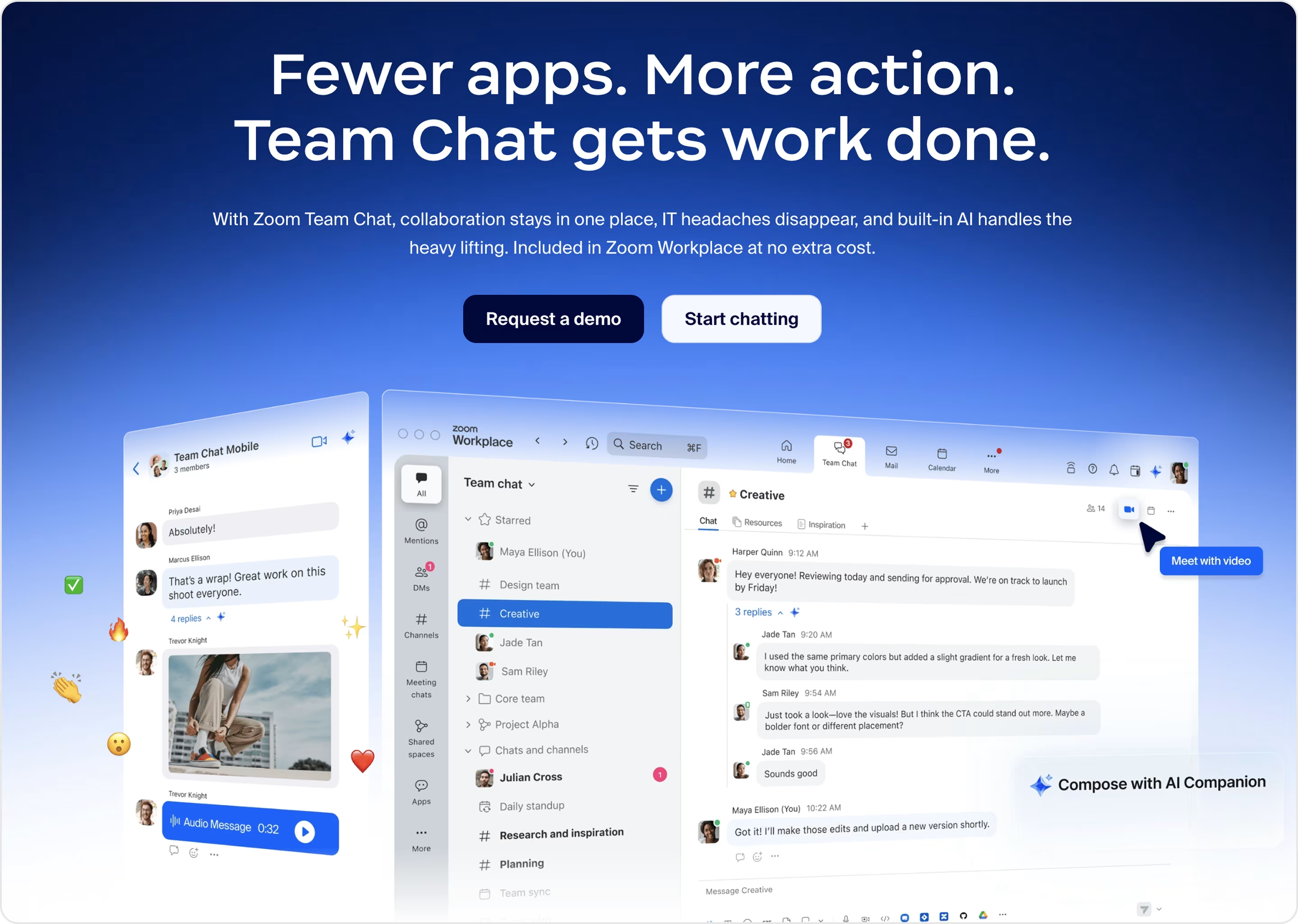
Our experts' take on this design:
- Team Chat is framed not as an add-on but as a core solution and helps Zoom move into Slack/Microsoft Teams territory.
- Copy stresses real-time collaboration and integration with meetings for hybrid teams.
- Screenshots of chat interfaces ground the abstract promise in familiar UX.
- The page bridges Zoom Meetings and Chat to encourage existing users to expand adoption.
- Value emphasis.
- Modern, enterprise-ready branding.
Have a product like this? The Arounda team recommends:
- Even if it starts as a side feature, dedicate a landing page to build standalone adoption.
- Demonstrate how your solution outperforms or integrates more effectively than competitors.
- If your SaaS has a large user base, use product landing pages to expand feature adoption.
- Demonstrate visually how using the feature saves time or improves team communication.
Okta
Niche: Cybersecurity
Okta’s Identity Threat Protection page highlights how enterprises can secure user accounts against attacks. This is one of the land page examples that effectively combines urgency, trust, and enterprise authority to capture security-conscious buyers.
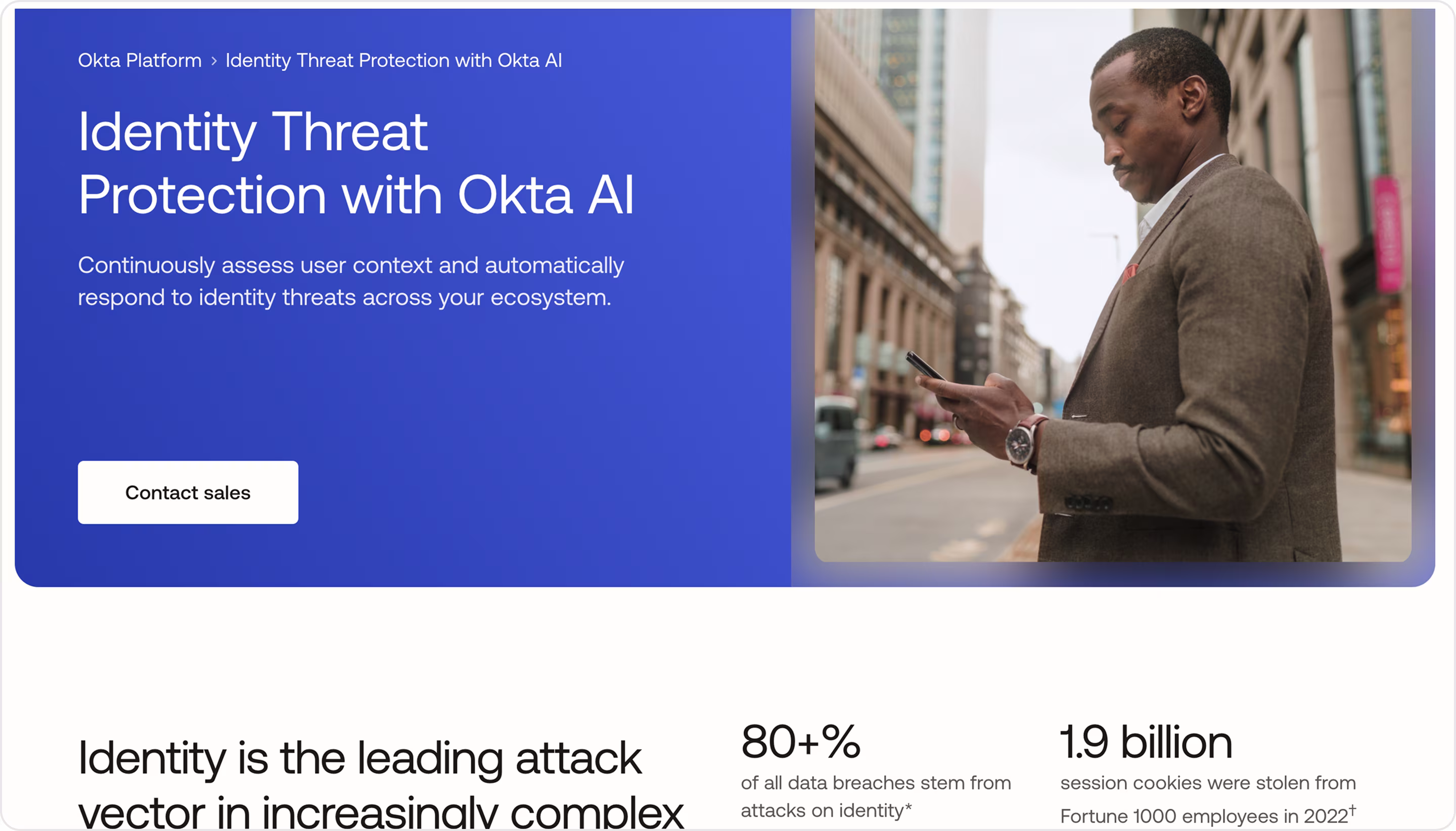
Our experts' take on this design:
- Security-first messaging.
- Urgency framing highlights rising digital threats. It makes the solution feel essential rather than optional.
- Enterprise authority.
- Technical product details are alongside high-level business benefits to satisfy IT teams and executives.
- Diagrams and data security visuals strengthen the sense of trust and control.
Have a product like this? The Arounda team recommends:
- Anchor your message in pain points.
- Certifications, compliance badges, and enterprise client stories reinforce authority.
- Frame value as proactive. Position the product not just as a defense, but as a way to enable safe business growth.
Notion
Niche: Productivity | Knowledge management SaaS
Notion Enterprise page is an ideal choice for large organizations seeking advanced collaboration, compliance, and scalability. This landing page demonstrates how a consumer-loved product can reposition itself for enterprise adoption without losing its approachable identity.
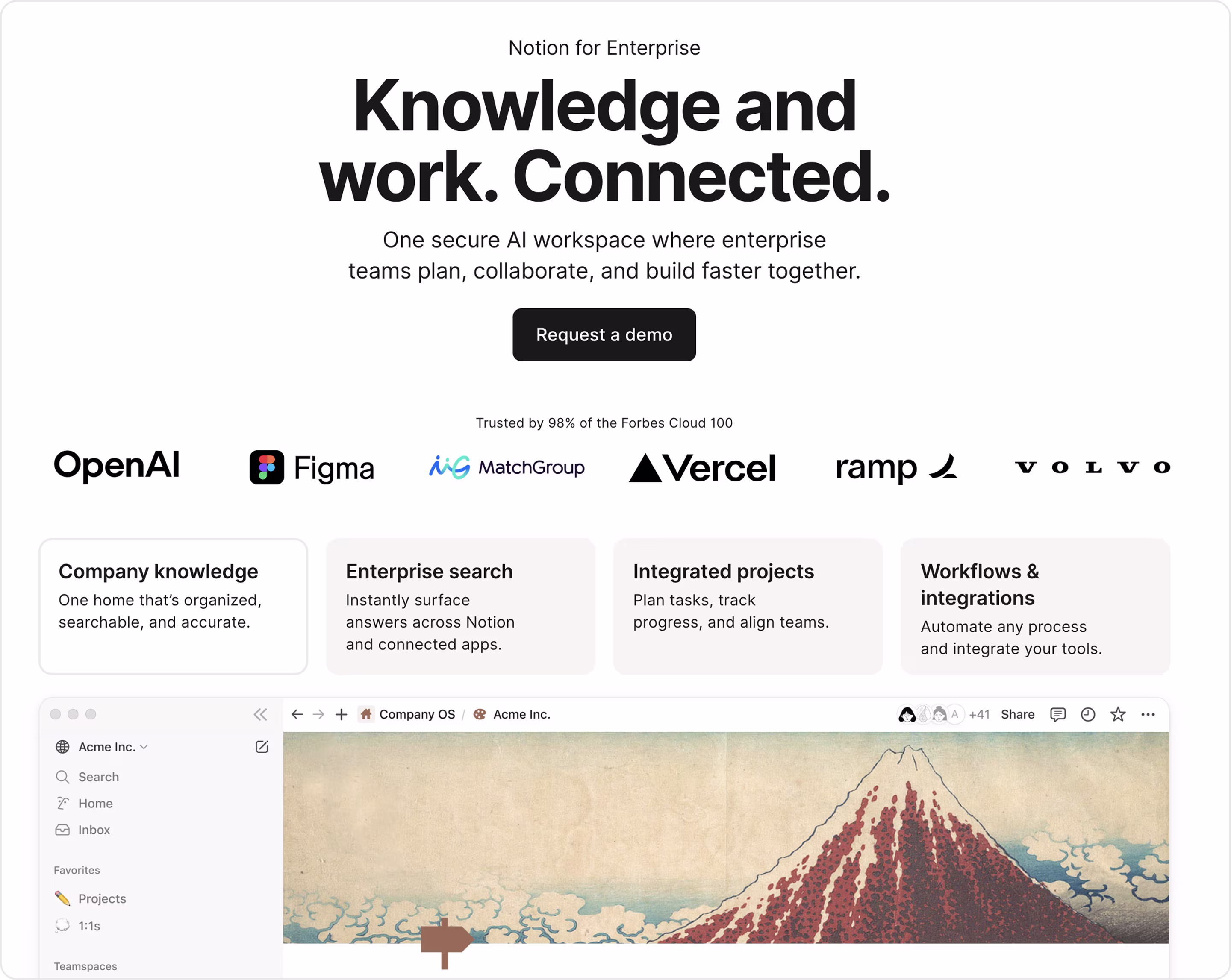
Our experts' take on this design:
- The design keeps Notion’s playful, user-friendly aesthetic but adds enterprise-grade credibility.
- Familiar product storytelling where screenshots and animations show the product in use.
- Hierarchy of benefits.
- The page highlights recognizable companies already using Notion.
- It explains compliance features (SSO, SOC2, GDPR) in plain, reassuring language.
Have a product like this? The Arounda team recommends:
- If individuals love your SaaS, keep this approachable tone but add enterprise credibility.
- Enterprise landing pages should speak differently to executives, IT, and team leads.
- Pair emotional appeal with hard metrics to strengthen the case.
- Highlight migration support, compliance, and scalability in everyday and direct language.
Framer
Niche: Design | website-building SaaS
Framer is a website design and prototyping tool known for its beautiful websites built without code. The Agencies page targets design and creative firms, and positions Framer as a tool and a partner for client projects.
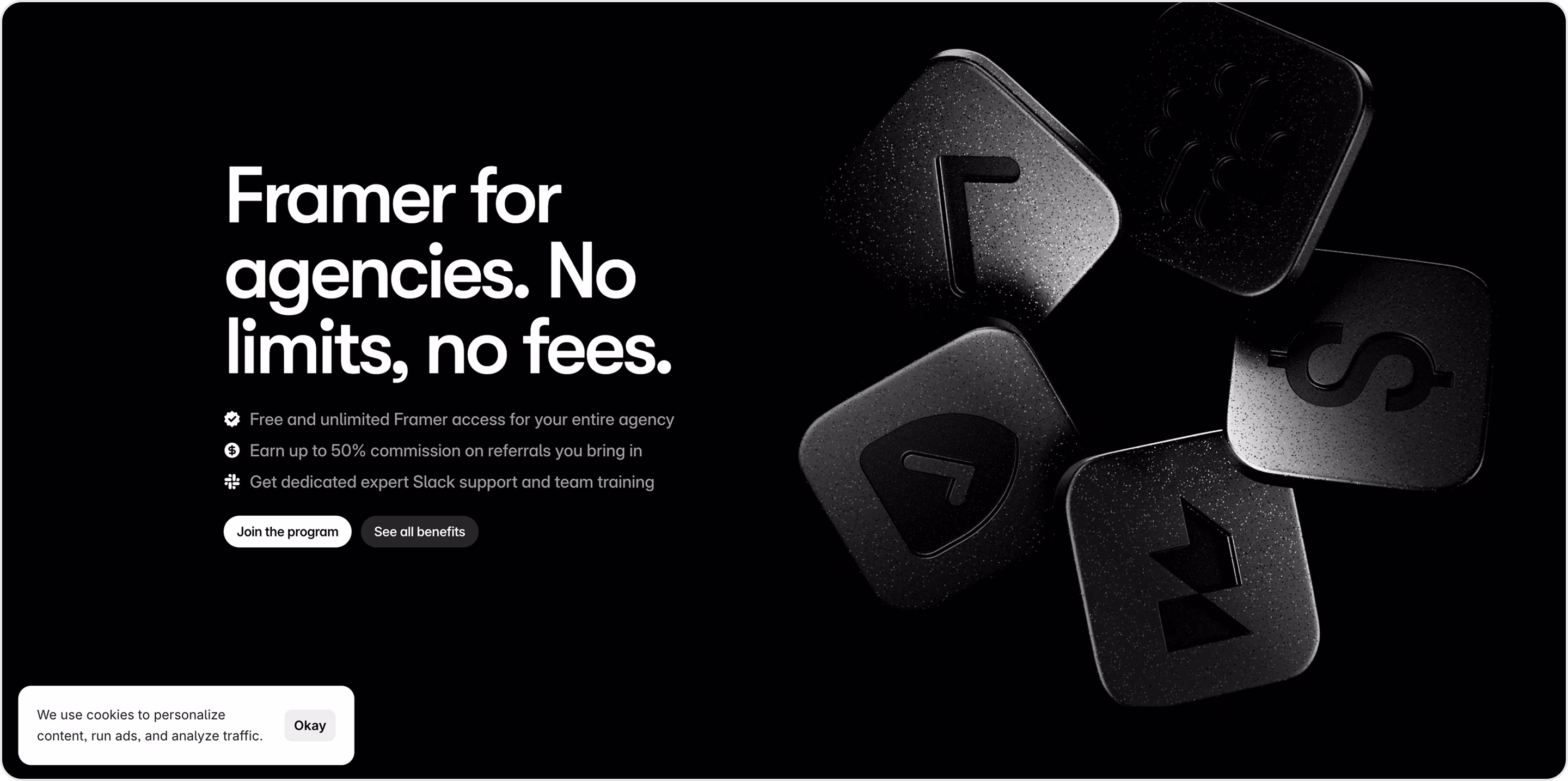
Our experts' take on this design:
- Every visual element aligns with Framer’s promise and feels like a portfolio in itself.
- Messaging is directly for agencies, not general users.
- The use of live previews and visuals reflects the product’s real strengths.
- Agency-focused benefits address specific pain points.
Have a product like this? The Arounda team recommends:
- Make your landing page a proof of product.
- Turn the landing page into a showcase. Include customer projects as living proof of what’s possible.
- Highlight efficiency gains.
Udemy
Niche: Education
Udemy Business provides companies with access to 30,000+ courses across multiple languages and certifications. It helps organizations upskill teams and close learning gaps. This landing page shows how Udemy tailors solutions for large-scale workforce training.
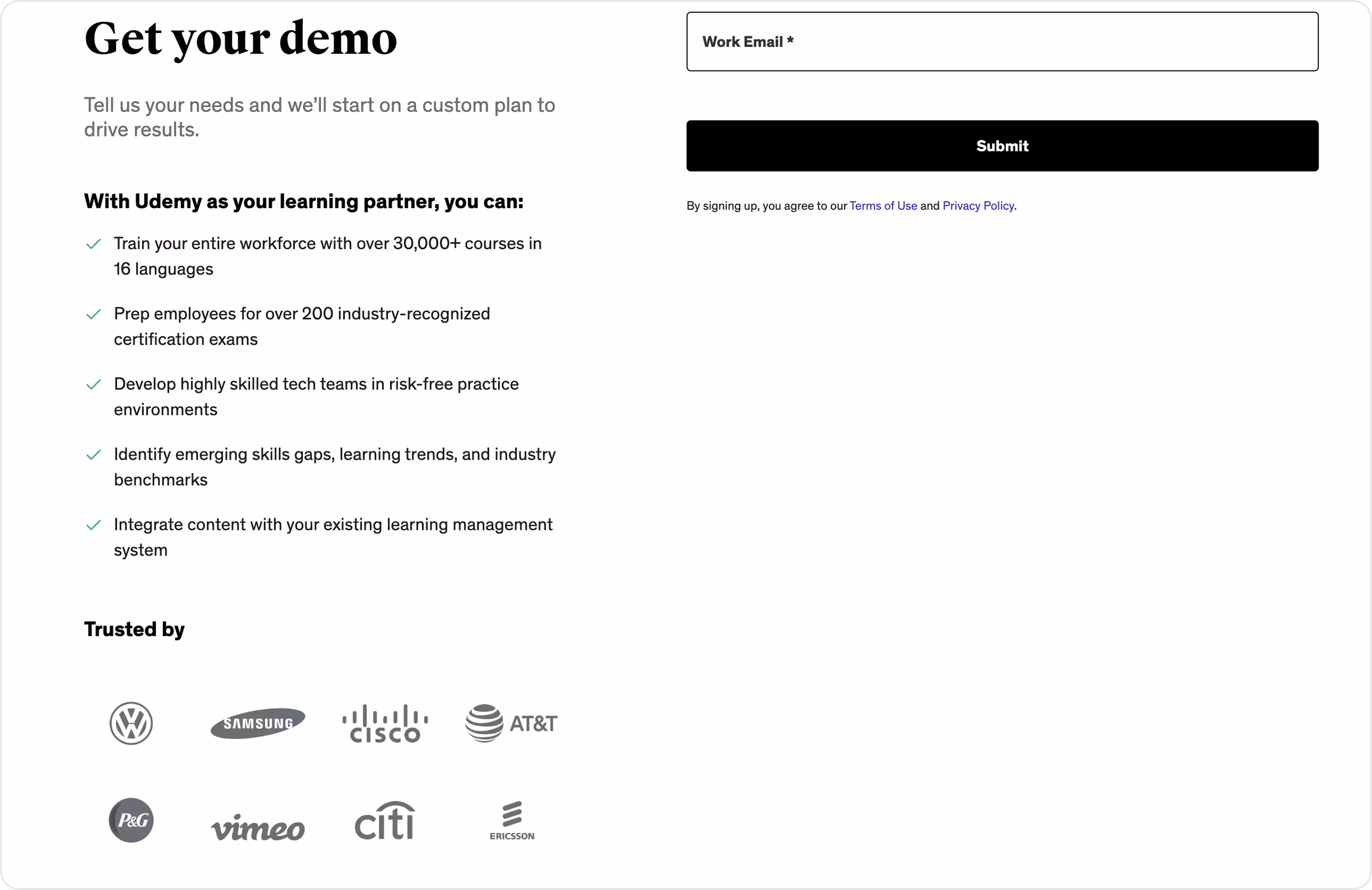
Our experts' take on this design:
- The headline “Get your demo” immediately establishes the page’s goal without distraction.
- Value-focused bullets. The list highlights practical outcomes (certification prep, risk-free practice, LMS integration).
- Strong social proof.
- Enterprise-first tone.
- Frictionless form lowers barriers to conversion.
Have a product like this? The Arounda team recommends:
- Make the form simple to increase conversion.
- Show the platform’s benefits with proof.
- Metrics on employee retention, certification success, or productivity gains matter more to executives.
- Tailor the landing page experience to HR, IT, and leadership stakeholders.
Campaign Monitor
Niche: Marketing | Email automation
Campaign Monitor is an email marketing platform for easy-to-build campaigns. Its Email Template Builder page attracts marketers who want flexibility without needing technical skills.
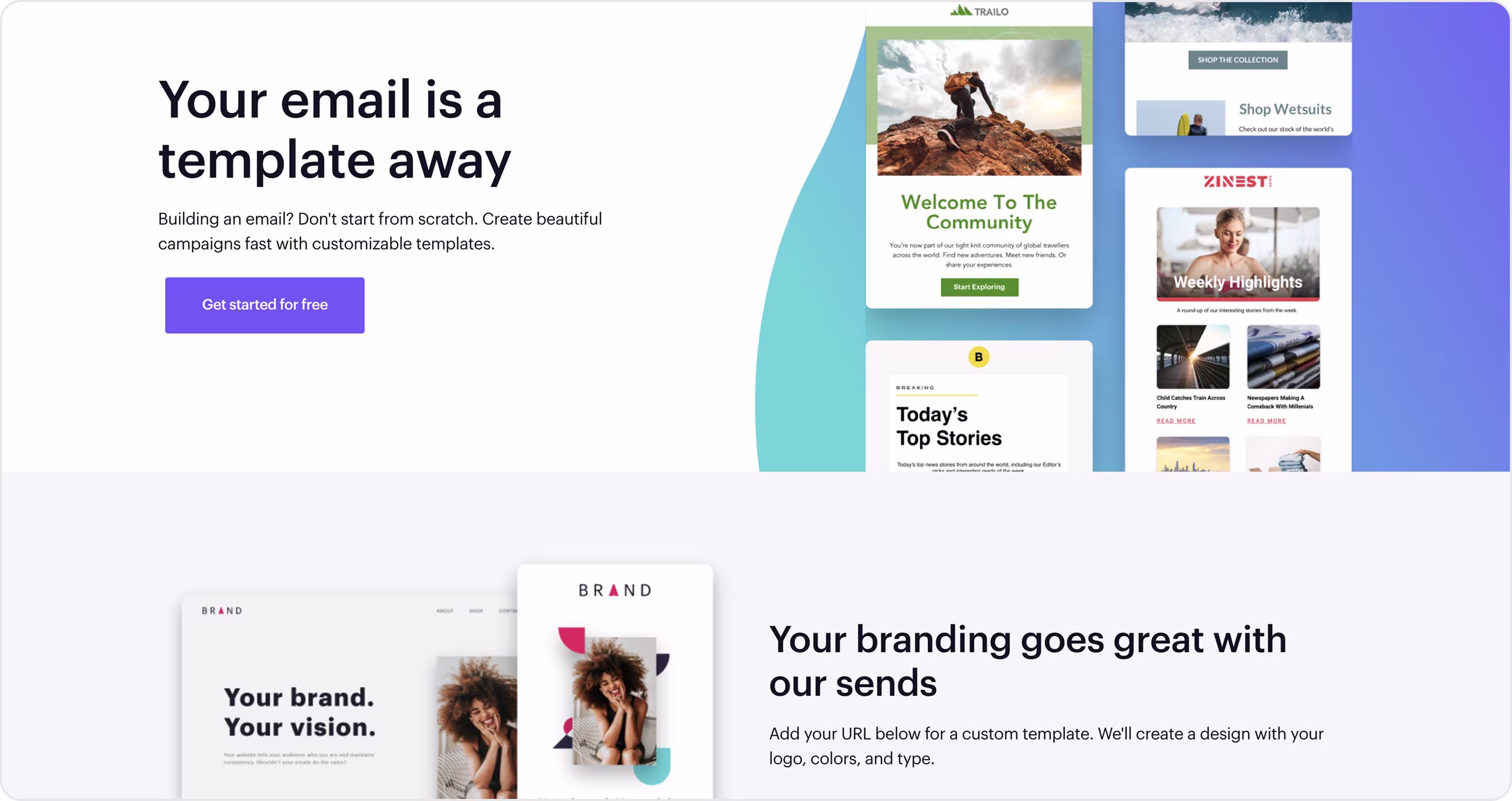
Our experts' take on this design:
- Good product-led messaging.
- Clarity for non-technical users.
- Visual credibility.
- Balanced tone that mixes imaginative freedom with productivity cues.
- Great segmentation by role with relevance in the feature for each.
Have a product like this? The Arounda team recommends:
- Spotlight one tool that solves a clear pain point, then create a landing for this.
- Visualize ease of use.
- Pair creativity with ROI.
- Use bold CTAs, low-friction trials, or interactive previews to reduce hesitation.
Zendesk
Niche: Customer support
Zendesk AI Agents page highlights how automation can improve support efficiency without losing the human touch. This is a beautiful example of how enterprise SaaS companies can combine authority, technical explanation, and emotional reassurance.
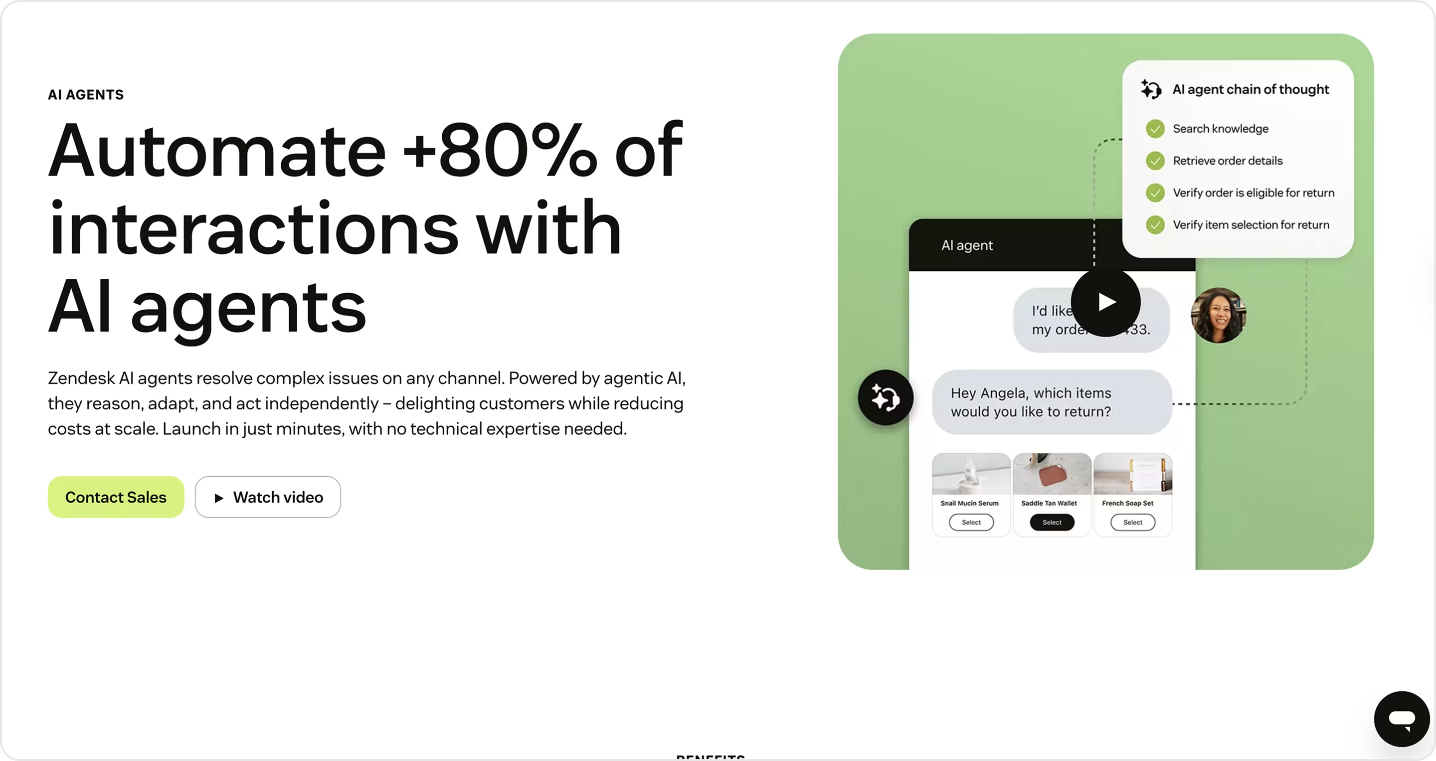
Our experts' take on this design:
- Human + AI balance reduces resistance to automation.
- The page explains what AI agents are, why they matter, and how they fit into existing workflows.
- Good gradients, illustrations, and micro-animations elevate the page’s look.
- Benefit-driven structure.
- Enterprise tone combines trust-building language with reassurance around control, compliance, and adaptability.
Have a product like this? The Arounda team recommends:
- Position automation as an assistant to ease adoption fears.
- Anchor benefits in numbers.
- Design for enterprise trust as visual polish and compliance cues reassure large organizations.
ContentSquare
Niche: Analytics
ContentSquare is a digital experience analytics platform that helps businesses understand user behavior to optimize customer journeys. Its Travel & Hospitality page positions the platform as a growth driver for airlines, hotels, and booking platforms.
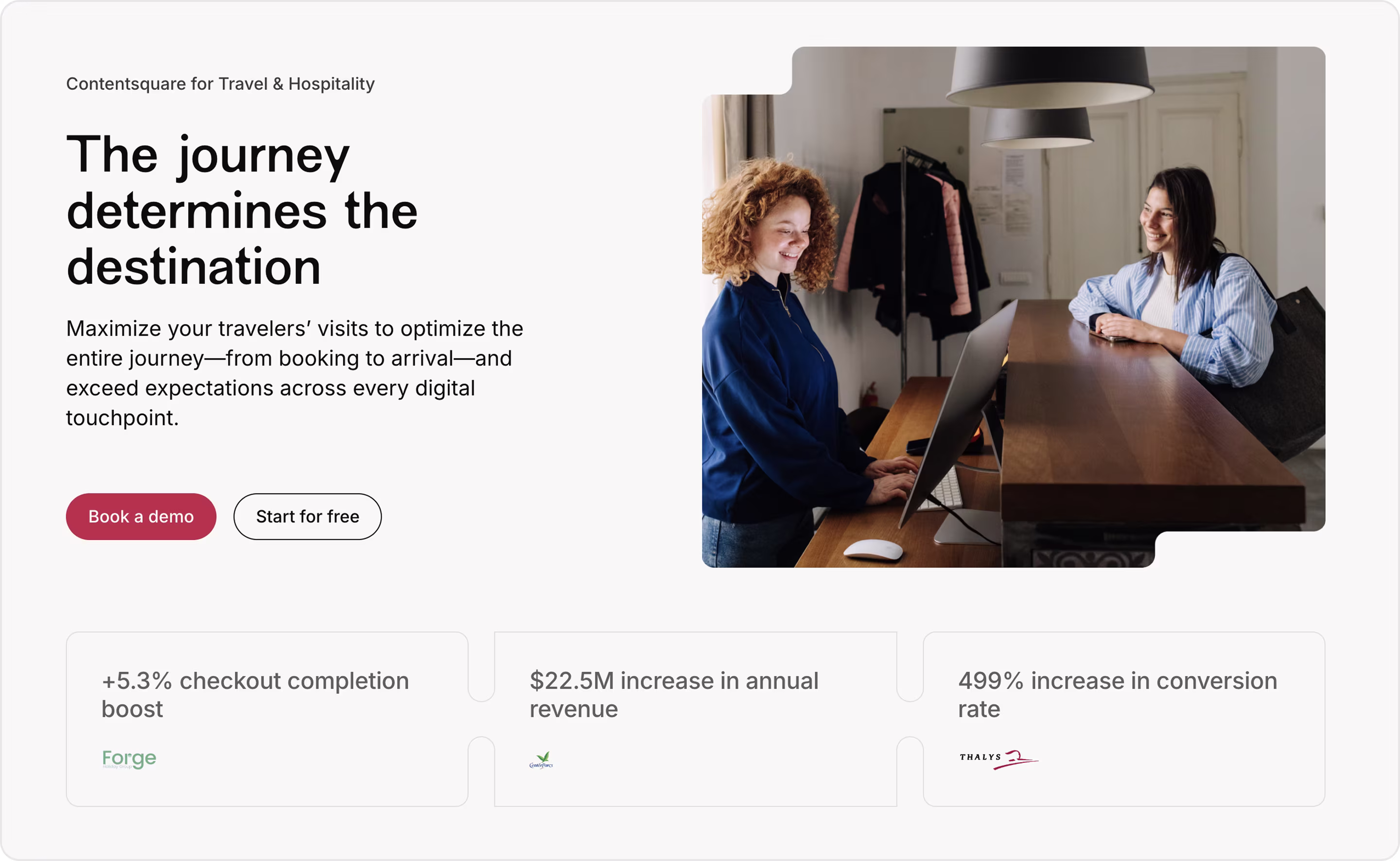
Our experts' take on this design:
- Industry targeting.
- Outcome-driven messaging.
- Emotional appeal. It connects analytics to better guest experiences.
- Enterprise authority.
- Strong CTA flow.
- Visual storytelling.
Have a product like this? The Arounda team recommends:
- Executives in hospitality care more about occupancy and revenue than technical details.
- Visualize the story and show dashboards or journeys to reduce abstraction.
- Show how recognizable brands in the same industry already succeed with your product.
Hypercomply
Niche: Security | Compliance SaaS
Hypercomply helps businesses optimize security questionnaires and automate compliance workflows. Its Trust Page is one of the examples in the compliance niche because it has a good strategy for converting enterprise buyers.

Our experts' take on this design:
- Compliance, certifications, and security practices set the tone of reliability.
- Good use of transparency, where users can see details about data handling and risk management practices.
- Best practices for credibility reassure security-conscious buyers.
- Concise and professional design.
- Strong alignment with ICP.
Have a product like this? The Arounda team recommends:
- Combine certifications, client trust logos, and case studies to show credibility from multiple angles.
- Balance technical and business language. Security leaders need detail, but executives want to understand business impact.
- Pair compliance transparency with CTAs that move leads into sales conversations.
Netflix
Niche: Entertainment | Streaming SaaS
Netflix on-demand movies, series, and original content. Its homepage doubles as one of the best landing pages in consumer SaaS.
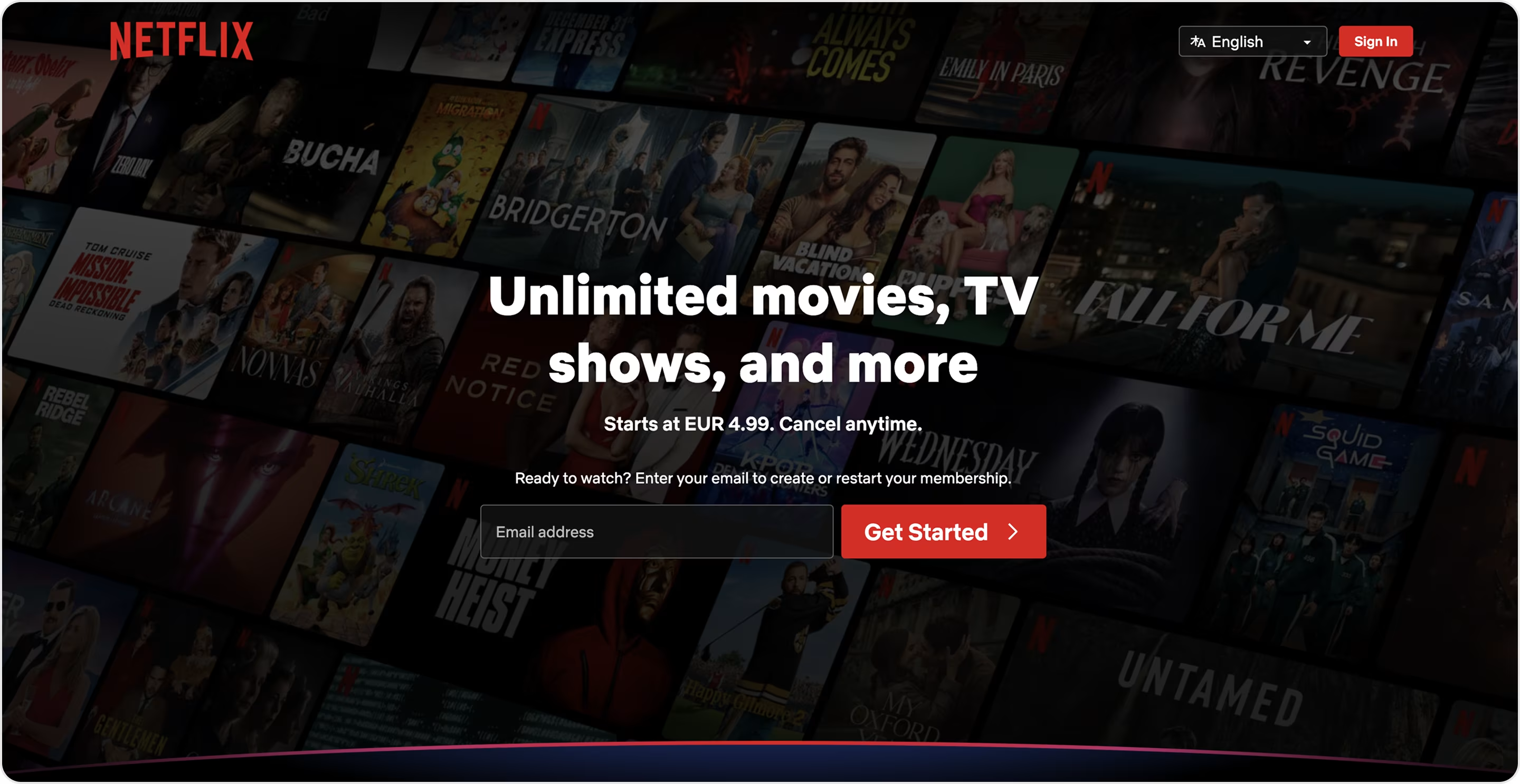
Our experts' take on this design:
- Clear, minimalistic, direct design converts visitors into subscribers within seconds.
- Immediate value, clarity, and a single conversion goal.
- Good use of simplicity.
- Background visuals of shows and characters remind visitors of what they’re missing.
- Localization and language options at the top make the landing page helpful worldwide.
- Require just an email to get started to reduce signup resistance.
Have a product like this? The Arounda team recommends:
- Landing pages mustn’t overcomplicate things, so use one headline, one CTA, and one explicit action.
- Use emotion + product proof.
- Collect the bare minimum to capture signups fast.
- If your SaaS has international potential, design for localization or create architecture for easy scaling.
Canva
Niche: Design
Canva helps millions of individuals and teams create visuals without needing advanced design skills.
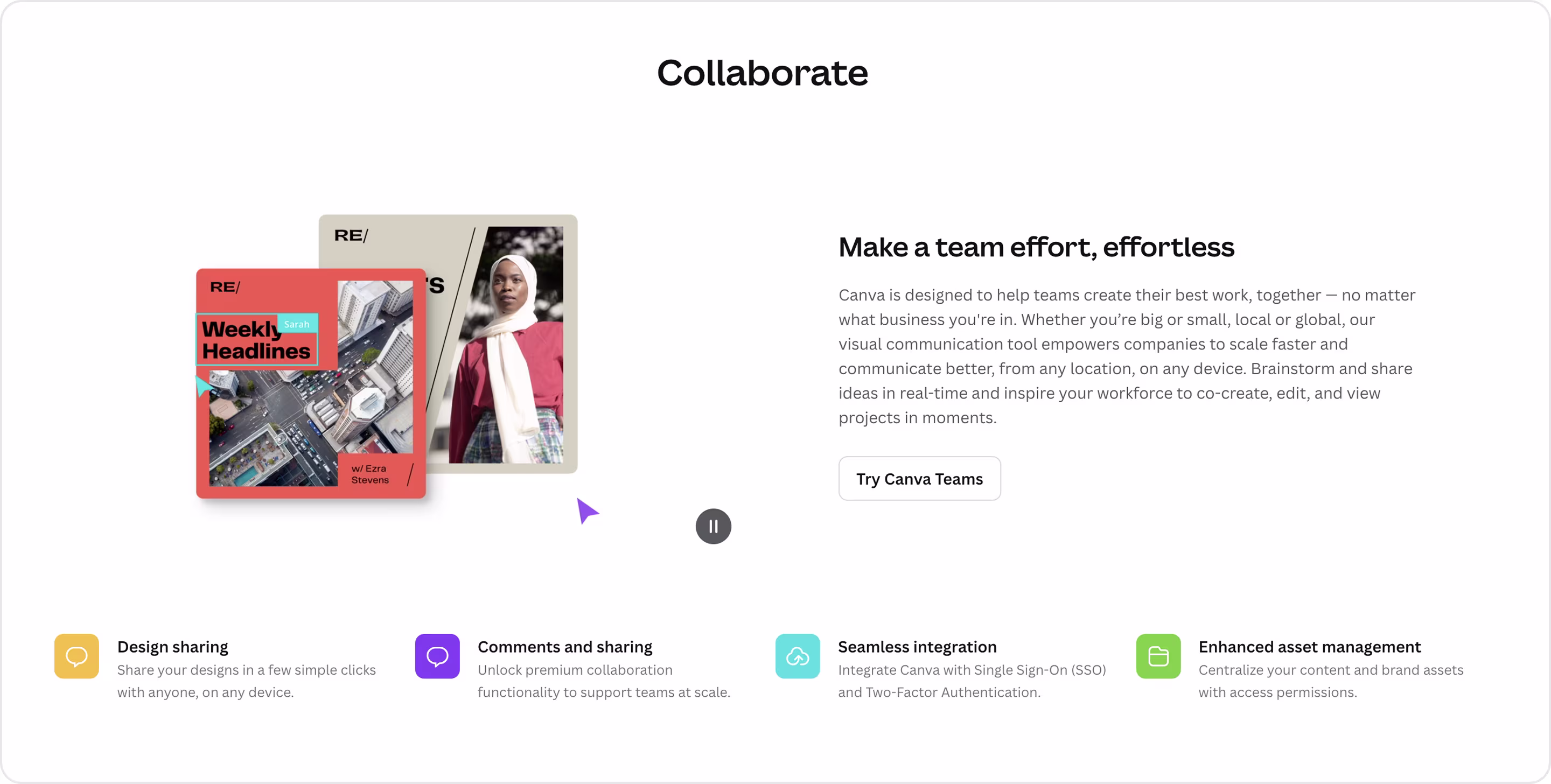
Our experts' take on this design:
- Audience segmentation.
- Visual storytelling.
- Approachable tone for individuals, yet credible for enterprises.
- Vibrant, playful visuals mirror Canva’s product experience and make the page itself feel like a Canva design.
Have a product like this? The Arounda team recommends:
- Segment your buyers early.
- Reflect your product visually.
- Consumer-friendly visuals can work even for enterprises if paired well with trust signals.
Calendly
Niche: Productivity | Scheduling SaaS
Calendly simplifies meeting coordination. The Small Business Solutions page is a good example of how to speak directly to small business owners.
Our experts' take on this design:
- Persona-driven messaging.
- Value framing emphasizes saving time, reducing no-shows, and improving client experiences.
- Beautiful and functional visuals.
- Use-case clarity.
Have a product like this? The Arounda team recommends:
- SMBs care about simplicity and affordability, so show it in design.
- Anchor value in everyday outcomes.
- Make onboarding frictionless.
- Small business owners trust testimonials from others like them more than polished case studies.
Klu
Niche: AI SaaS | Productivity & knowledge management
Klu is an AI-powered knowledge assistant that helps teams and individuals search, organize, and access company knowledge instantly. Its homepage serves as a landing page for early-stage SaaS companies.

Our experts' take on this design:
- The design leans into the current AI productivity trend and appeals to tech-savvy early adopters.
- Minimalistic visuals reflect speed, focus, and clarity.
- The page invites users to imagine a world where company knowledge is no longer scattered.
Have a product like this? The Arounda team recommends:
- Pair AI promises with hard evidence to increase conversions.
- Visuals of how the AI assistant works will ease adoption barriers.
- Position the product differently for executives, managers, and employees.
Atlassian
Niche: Collaboration | Enterprise SaaS
Atlassian is collaboration and workflow software. Its Enterprise Success page attracts large organizations for scaling teamwork across global enterprises.
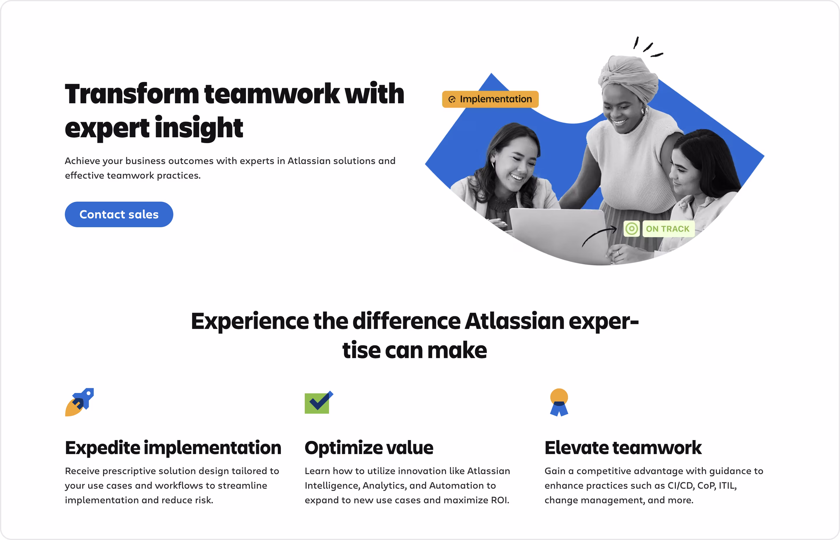
Our experts' take on this design:
- Tiered value structure with three pillars that align with CIO-level goals.
- Trust-building visuals.
- It mixes high-level benefits for executives with tactical detail for managers and IT leaders.
- Strategic storytelling.
Have a product like this? The Arounda team recommends:
- Group enterprise benefits into 2–3 clear categories to make complex value easier to digest.
- Position your SaaS as a trusted partner to add credibility at the enterprise level.
- Match CTAs to buyer roles.
Perspective Funnels
Niche: Marketing Automation / CRM SaaS
Perspective Funnels helps businesses create mobile-first sales funnels and CRM workflows. Its CRM product page is a landing example that shows how the tool simplifies customer management and integrates with marketing funnels.
Our experts' take on this design:
- Mobile-first aesthetic. Visuals emphasize phone screens and responsive interfaces.
- Social proof logos.
- Users see features in structure with icons and short descriptions, so it’s easy to scan on mobile.
- Strong branding.
Have a product like this? The Arounda team recommends:
- Lean into your USP. If mobile-first is your differentiator, reinforce it through visuals and use cases.
- Make ROI visible.
- Tailor messaging by role. Different buyer personas need different reasons to convert.
Rogo
Niche: AI SaaS | Financial services
Rogo is an AI platform for investment banking and financial institutions. Its landing page targets decision-makers in finance and demonstrates a mix of authority, trust, and innovation.
Our experts' take on this design:
- Industry-specific positioning.
- Enterprise credibility.
- A professional aesthetic with sleek typography, muted colors, and structured layouts conveys seriousness in the finance niche.
- Outcome-driven messaging.
Have a product like this? The Arounda team recommends:
- In the finance SaaS sector, ROI and risk reduction are the strongest selling points.
- Pair the enterprise tone with product visuals to reassure buyers.
- Analysts, managers, and executives each have different pain points to address, so target them and offer layered conversion paths.
Webflow Conf
Niche: Development SaaS | Event marketing
Webflow is a no-code website development platform. Its Webflow Conf landing page shows how SaaS companies can promote events to their community and drive deeper brand adoption.
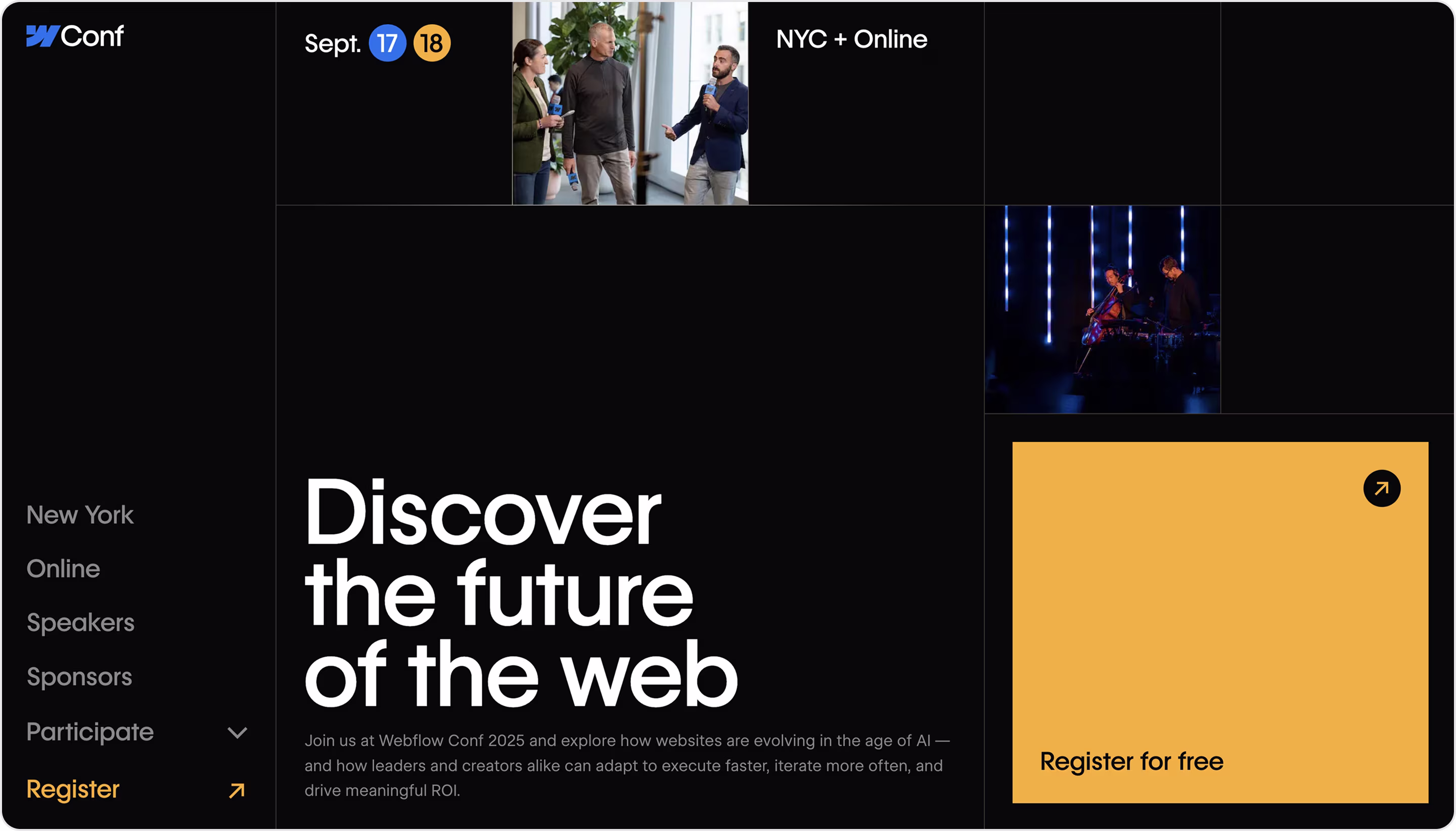
Our experts' take on this design:
- Event-first messaging captures attention with an aspirational promise.
- Choices for in-person (NYC) and online participation meet different audience needs.
- Community storytelling highlights speakers, sponsors, and participation opportunities to create FOMO and excitement.
- Visual branding.
- Low barrier to entry.
Have a product like this? The Arounda team recommends:
- A well-designed event landing page strengthens brand and product adoption.
- Appeal to emotion + logic.
- Create urgency with proof.
- Free or one-click registration maximizes reach and engagement.
Cohabs
Niche: Real estate
Cohabs is a co-living platform that offers fully furnished, community-driven housing for modern urban dwellers. The New York booking landing page balances lifestyle storytelling with practical booking functionality.
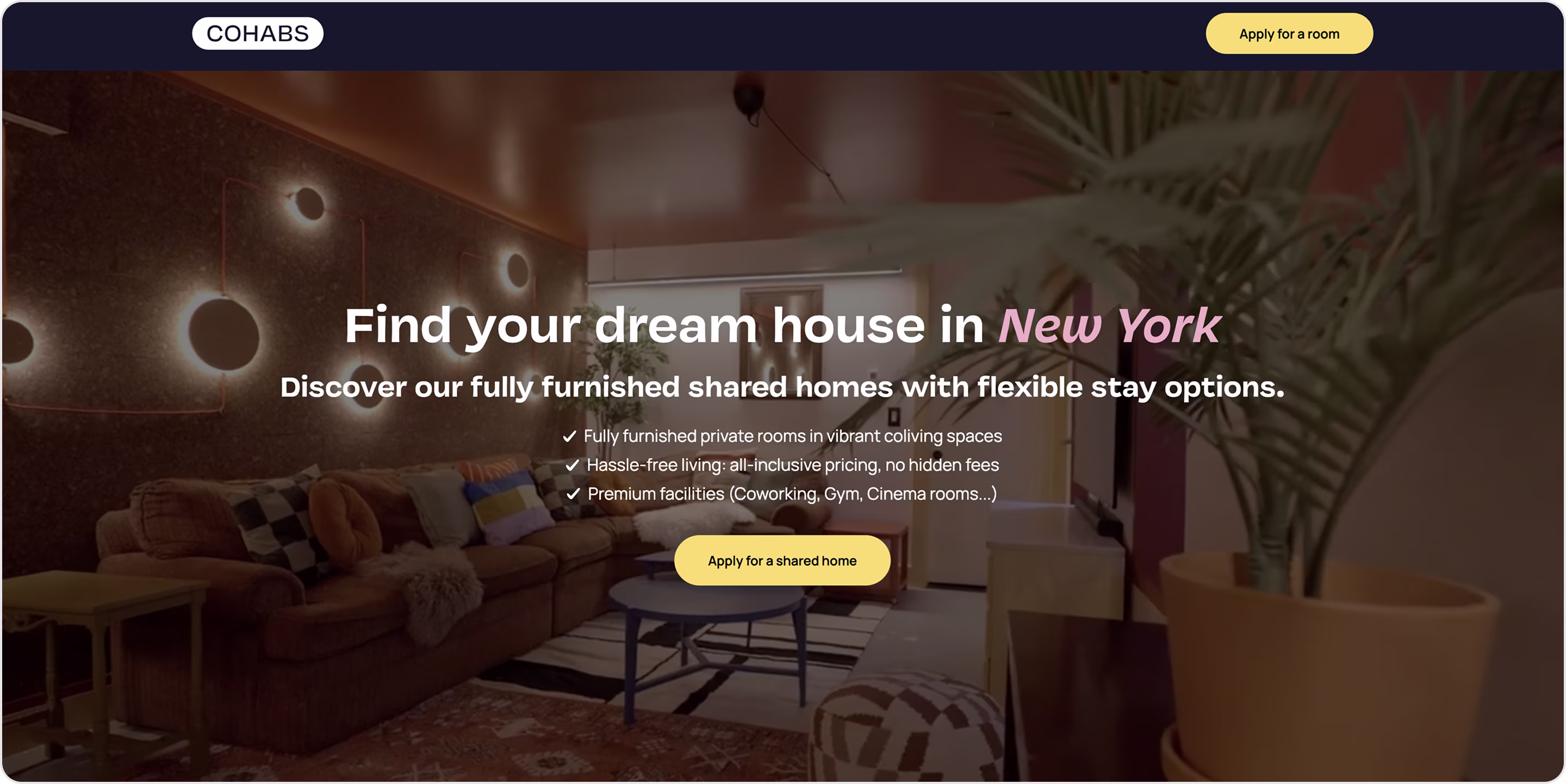
Our experts' take on this design:
- Location-focused promise.
- Lifestyle storytelling.
- Clarity of offer.
- Trust-building cues.
- High-intent targeting.
Have a product like this? The Arounda team recommends:
- Ensure ad clicks lead directly to location-specific, conversion-focused pages.
- Sell lifestyle as much as product.
- Add clear next steps in the application process and show transparent pricing.
- Combine real-time availability, testimonials, and local market comparisons to drive faster decisions.
Grammarly
Niche: Writing
Grammarly is a writing assistant that helps users write clearly and confidently. The Professionals landing page attracts lawyers, consultants, marketers, and other knowledge workers who rely on high-quality communication.
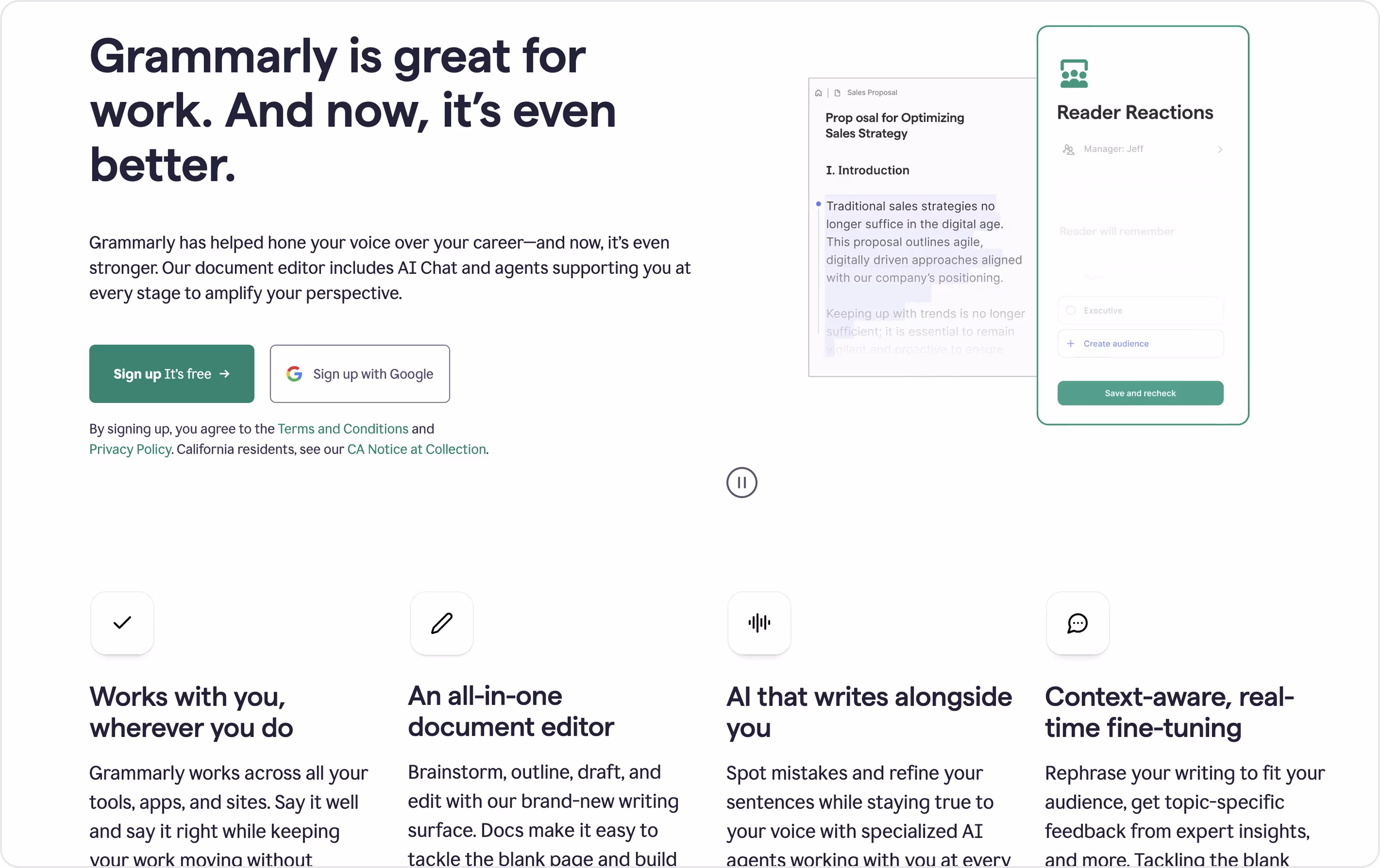
Our experts' take on this design:
- Persona-driven focus.
- Outcome framing.
- Product transparency.
- Trust reinforcement.
- Professional tone.
Have a product like this? The Arounda team recommends:
- Quantify professional value. Time saved, improved client satisfaction, or faster document turnaround are compelling ROI points.
- Demonstrate the tool in action and the confidence it instills in professionals.
- Testimonials from respected professionals build stronger authority than broad user stats.
Freshworks
Niche: IT service management
Freshservice is a part of the Freshworks product suite. It optimizes workflows, automates processes, and improves service delivery.
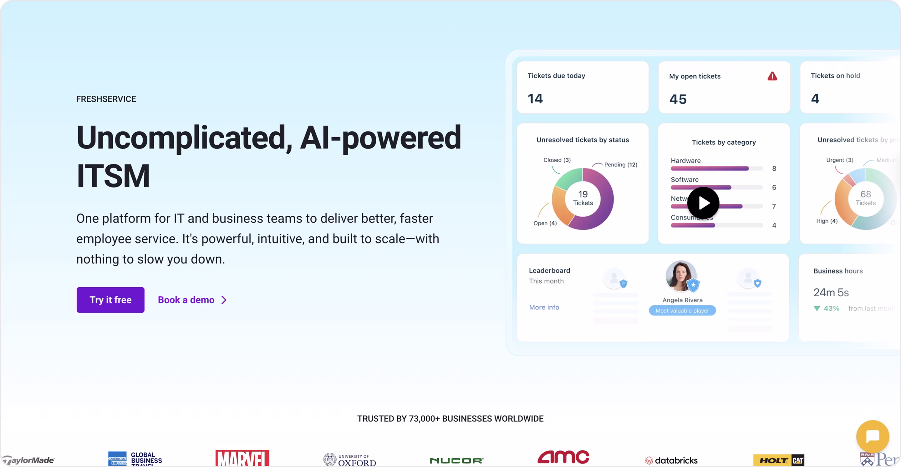
Our experts' take on this design:
- Product transparency.
- Credibility reinforcement.
- Scannable structure.
- Integration emphasis.
Have a product like this? The Arounda team recommends:
- Balance features with outcomes because enterprise buyers care about what the product does and how it impacts KPIs.
- Make a proof visual. Awards, customer logos, and analyst quotes add weight when presented prominently.
- Translate complexity into simplicity through icons, visuals, and plain language.
Box
Niche: Cloud storage
Box is a secure cloud content management platform. Its Security & Compliance landing page reassures risk-conscious organizations that Box meets the highest standards of data protection and regulatory compliance.

Our experts' take on this design:
- Authority-building visuals.
- Combines industry standards with Box’s own security innovations.
- Enterprise tone.
- Global credibility.
Have a product like this? The Arounda team recommends:
- Add certifications and compliance badges as they are conversion drivers.
- Balance risk with opportunity.
- Highlight proactive features.
- We would add interactive content as it engages visitors more than static blocks.
Relato
Niche: Knowledge management
Relato helps teams organize and share knowledge through AI-powered workspaces. Its Workspaces page demonstrates how Relato transforms scattered company knowledge into structured, actionable insights.
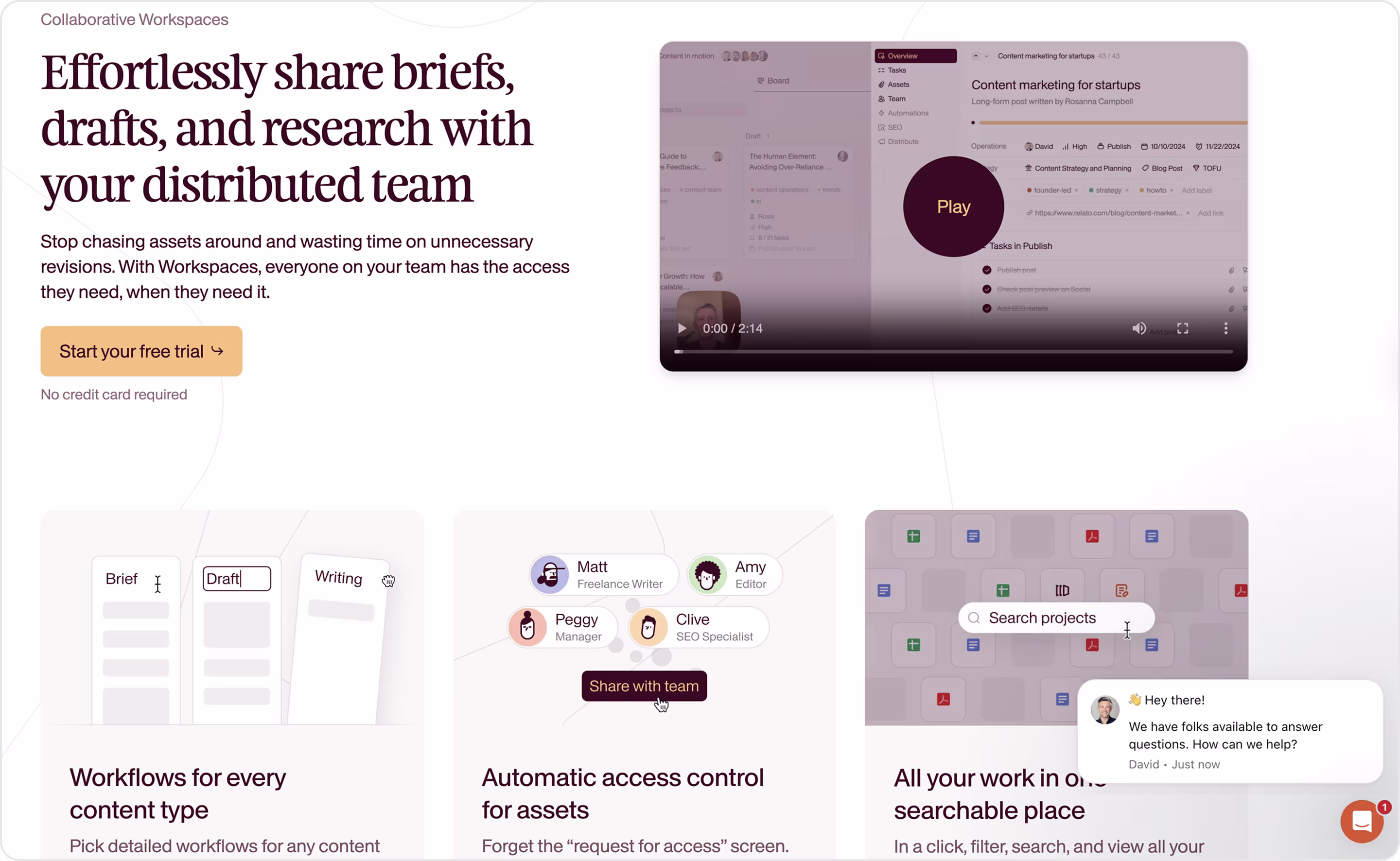
Our experts' take on this design:
- Clean UI screenshots reinforce credibility and give users a preview of the experience.
- Copy emphasizes reduced chaos, faster knowledge sharing, and team alignment.
- Minimalist design and strong typography align with the modern SaaS productivity space.
- Educational tone explains why structured workspaces are critical for scaling teams.
Have a product like this? The Arounda team recommends:
- Emphasize the frustration of knowledge chaos and how your product solves it.
- Use numbers to quantify time savings, productivity boosts, or reduced duplicate work.
- Highlight unique workflows or AI features.
GitHub
Niche: Development | Collaboration
GitHub launched Spark to provide developers with AI-powered productivity features inside their workflow. This landing positions Spark as a tool to accelerate coding, collaboration, and project delivery.
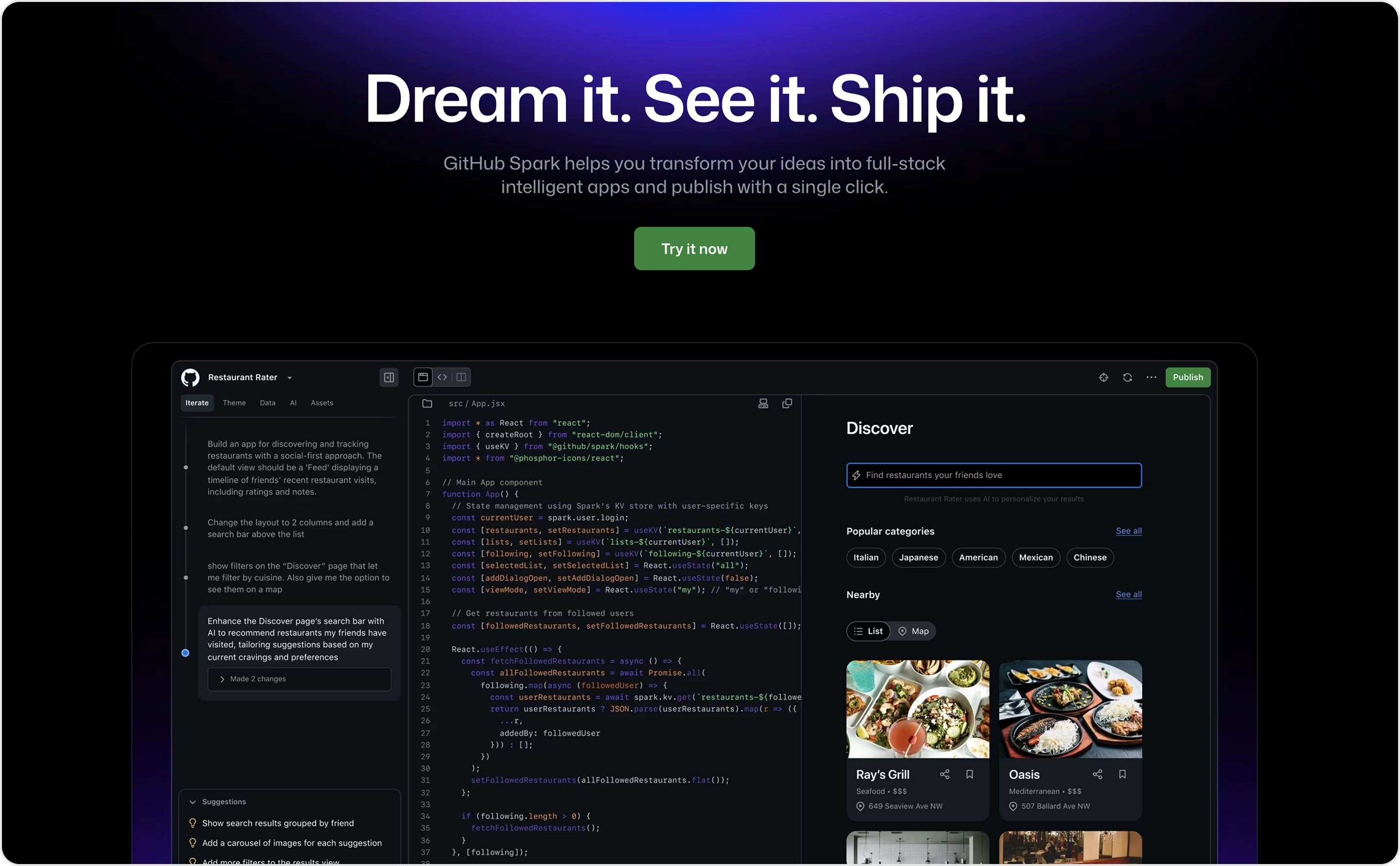
Our experts' take on this design:
- Screenshots and code previews demonstrate how AI suggestions appear in real workflows.
- Developer-centric tone and community credibility.
- Dark theme, coding visuals, and animations align with GitHub’s brand identity for developers.
Have a product like this? The Arounda team recommends:
- Balance tech with outcomes and show how it saves time or improves code quality.
- Segment by persona. Developers want workflow speed; executives want ROI and security.
- Use the community as leverage. Open-source credibility, testimonials, and early adopters can supercharge trust.
GitLab
Niche: DevOps
GitLab is an all-in-one DevOps platform. Its Application Security Testing page focuses on enterprise development teams that need to secure applications earlier in the software lifecycle.
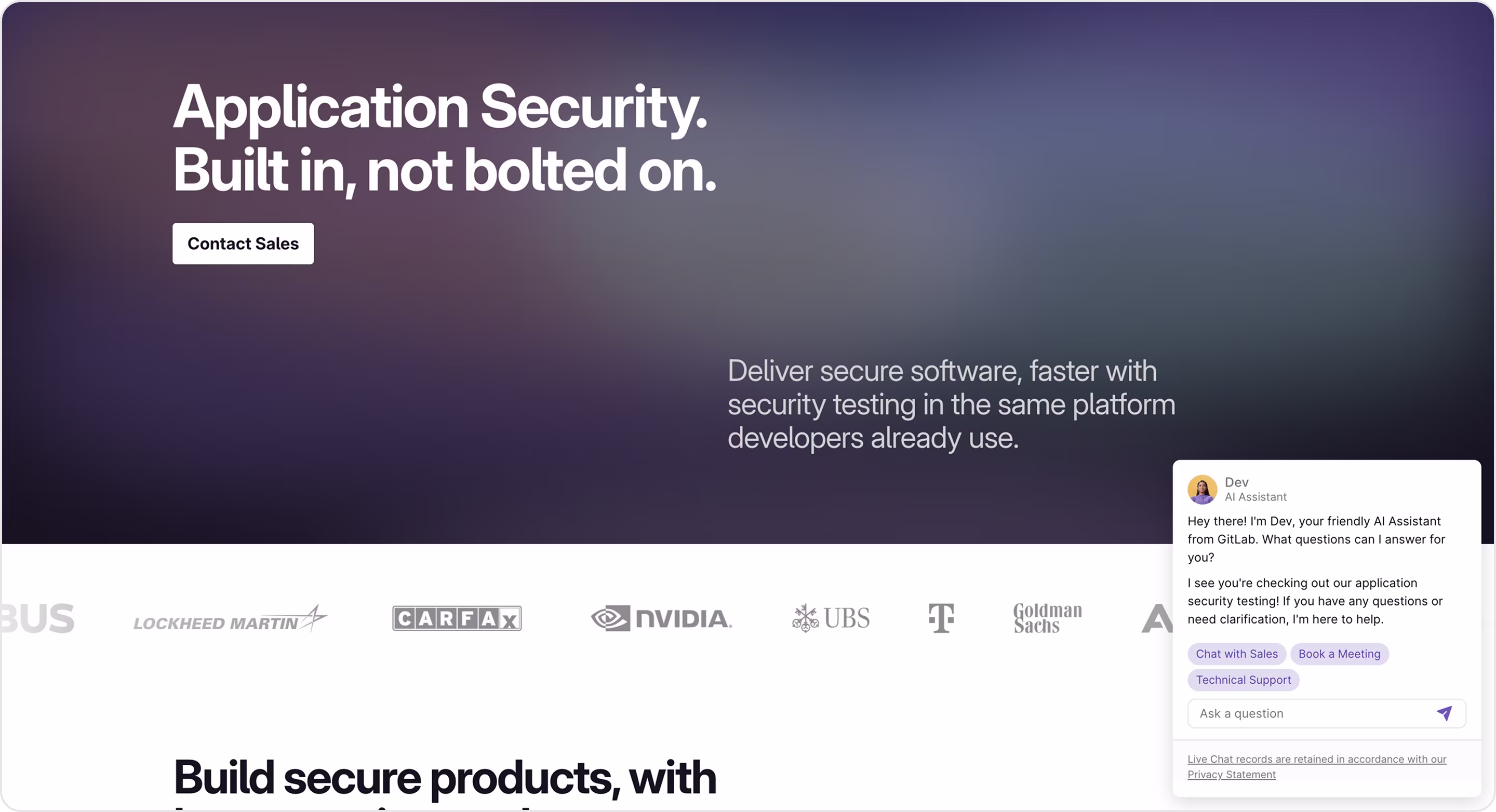
Our experts' take on this design:
- Integration-first positioning emphasizes that security is part of the workflow.
- Enterprise credibility with value-driven messaging.
- Product transparency makes the benefits tangible.
- Educational tone explains multiple testing types and appeals to technical buyers.
Have a product like this? The Arounda team recommends:
- Show outcomes.
- Design for layered audiences.
- Balance education with simplicity.
- Offer multiple paths to adoption.
DoorDash
Niche: Food delivery
The DoorDash homepage also functions as a landing page. It converts three key audiences at once: customers ordering food, restaurants joining the marketplace, and drivers signing up for delivery.
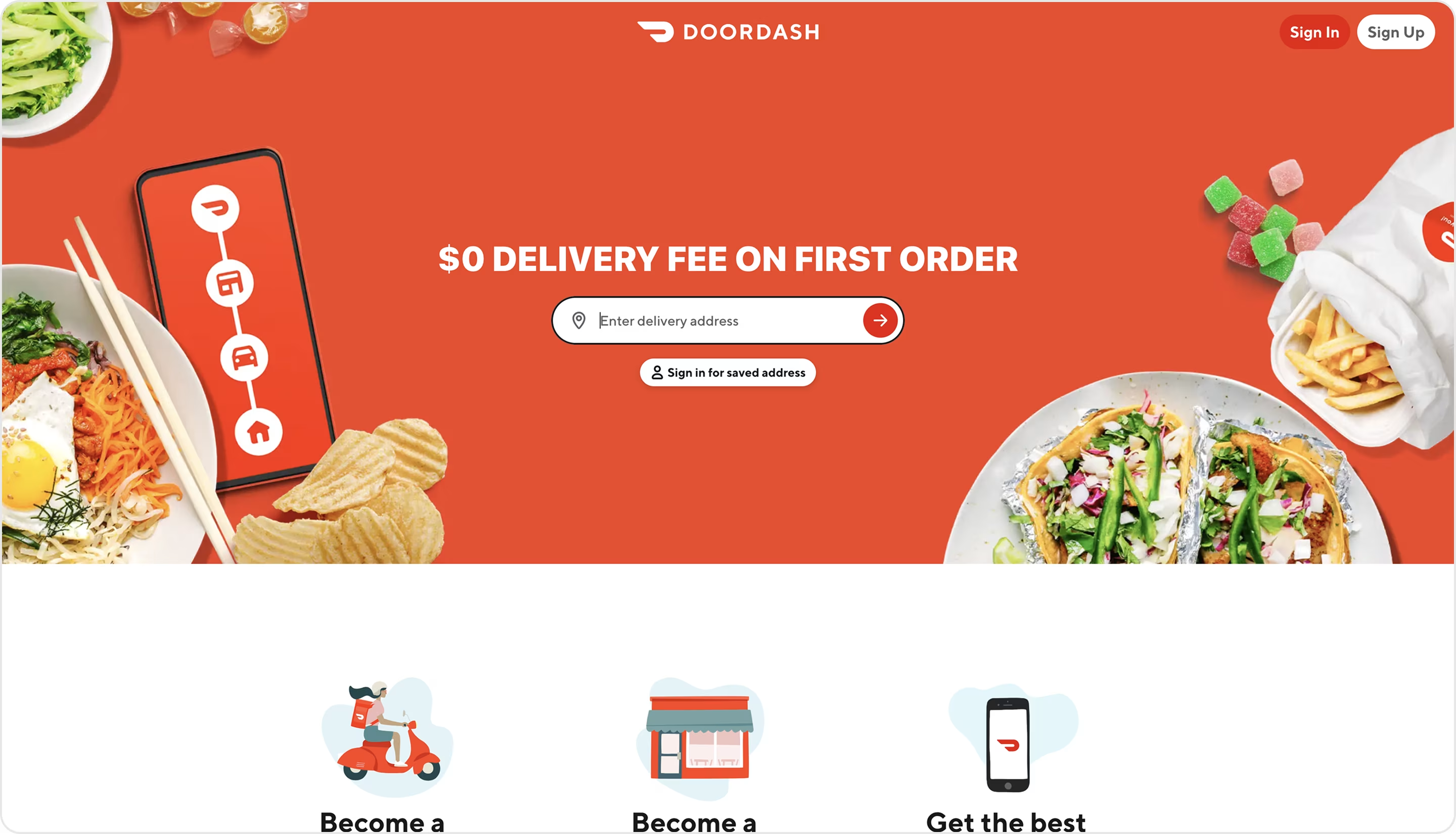
Our experts' take on this design:
- Despite serving multiple personas, the page remains clear and action-oriented.
- Frictionless onboarding.
- Food visuals connect immediately with appetite and urgency.
- Strong brand trust.
- The spacy background makes navigation intuitive.
Have a product like this? The Arounda team recommends:
- If your SaaS serves customers, partners, and contractors, create tailored CTAs for each.
- Use urgency because immediacy drives conversions in this niche.
- Pair food imagery with metrics and testimonials.
- Think mobile-first, as consumer SaaS adoption happens primarily on smartphones.
ServiceNow
Niche: Workflow automation for life sciences
Description
ServiceNow is an enterprise SaaS platform for workflow automation and digital transformation. Its Life Sciences landing page is an example of how SaaS companies can tailor messaging to highly regulated industries.

Our experts' take on this design:
- Speaks directly to life sciences with tailored language and visuals around compliance, regulation, and research.
- Muted visuals and clean layouts align with enterprise and regulated industry expectations.
- Content layering balances high-level outcomes for executives with detailed solution breakdowns for managers.
Have a product like this? The Arounda team recommends:
- Tailor landing pages by industry.
- Simplify navigation if the page is content-heavy.
- Visualize workflows.
- Quantify impact.
- Highlight integrations.
Dropbox Dash
Niche: Cloud storage
Dropbox Dash is an AI-powered universal search and productivity tool within Dropbox. The Protect & Control landing page reassures users about security and administrative control and promotes Dash’s collaboration features.
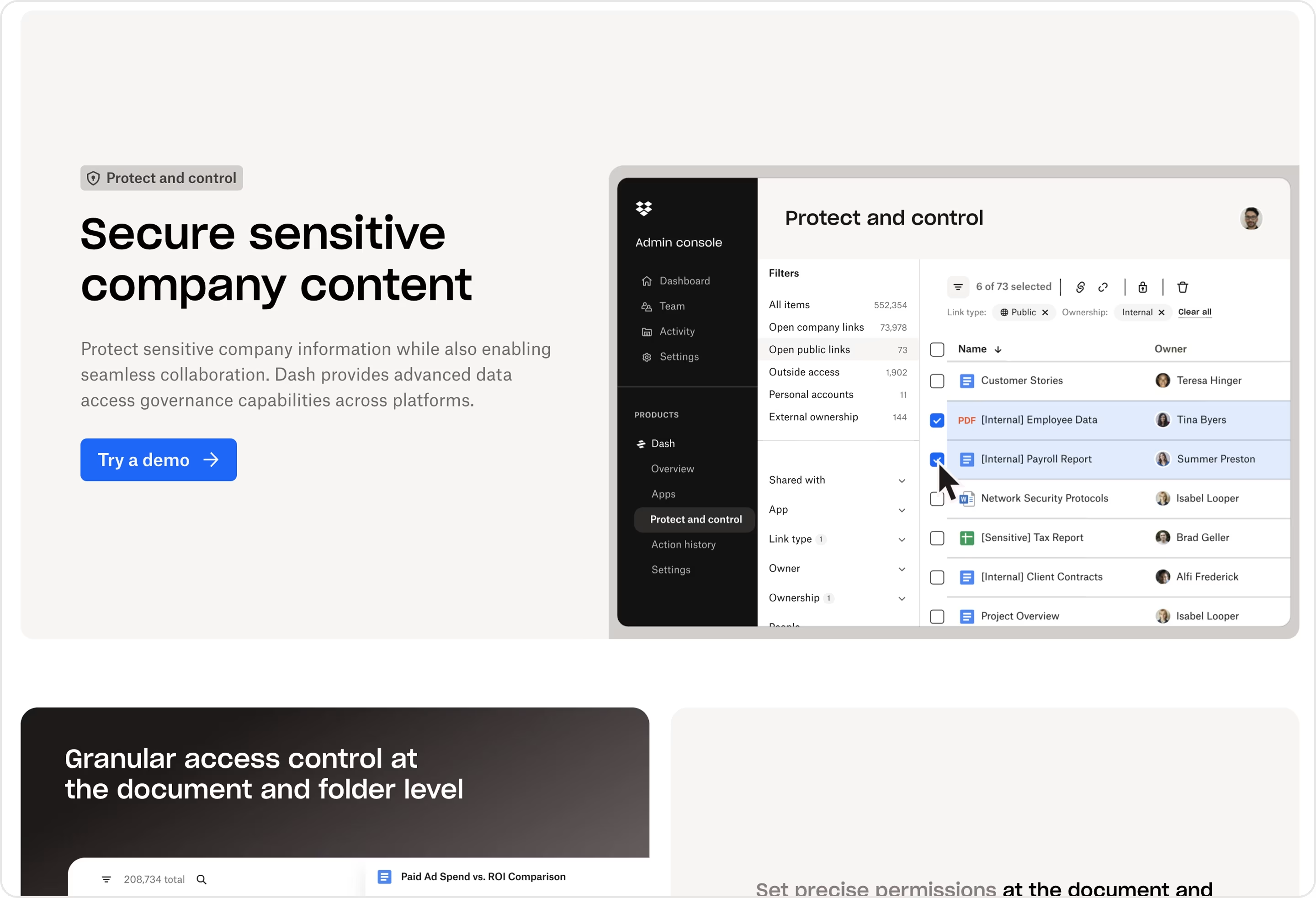
Our experts' take on this design:
- Trust-oriented messaging.
- Clear visual hierarchy.
- Minimalism makes the page approachable but maintains authority.
- Feature visualization.
- Multi-audience resonance.
Have a product like this? The Arounda team recommends:
- For this niche, certifications, numbers, and peer validation build trust.
- Make security visual. Dashboards, permissions, and access logs must be in context.
- Frame controls as empowering collaboration.
Hootsuite
Niche: Marketing
Hootsuite manages social media at scale. Its Analytics landing page converts marketers who need better reporting, insights, and ROI measurement from their social channels.
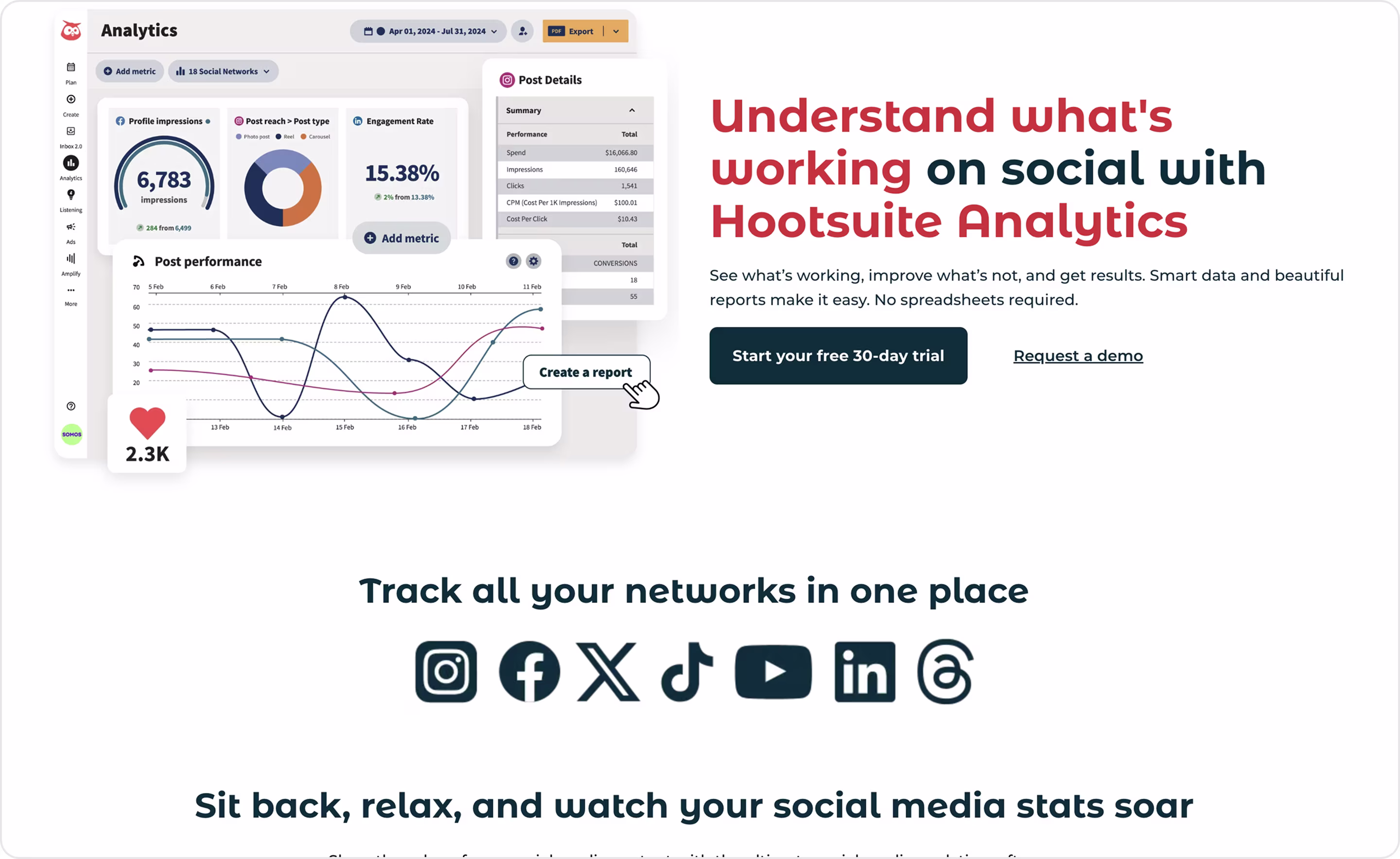
Our experts' take on this design:
- Outcome-driven headline.
- Product visualization.
- Audience clarity.
- Trust elements.
- Balanced hierarchy.
Have a product like this? The Arounda team recommends:
- Show charts and connect insights to revenue, engagement, or time savings.
- Design for decision-makers.
- Free trials capture smaller teams, demos win enterprises. Decide what you need.
- Use client success stories and quantified results to strengthen persuasion.
Shopify
Niche: E-commerce
The Shopify Start page is a focused landing page designed for entrepreneurs who want to launch their online store quickly. The page highlights Shopify’s ease of use and all-in-one features. It lowers the barrier for first-time founders to begin selling online.
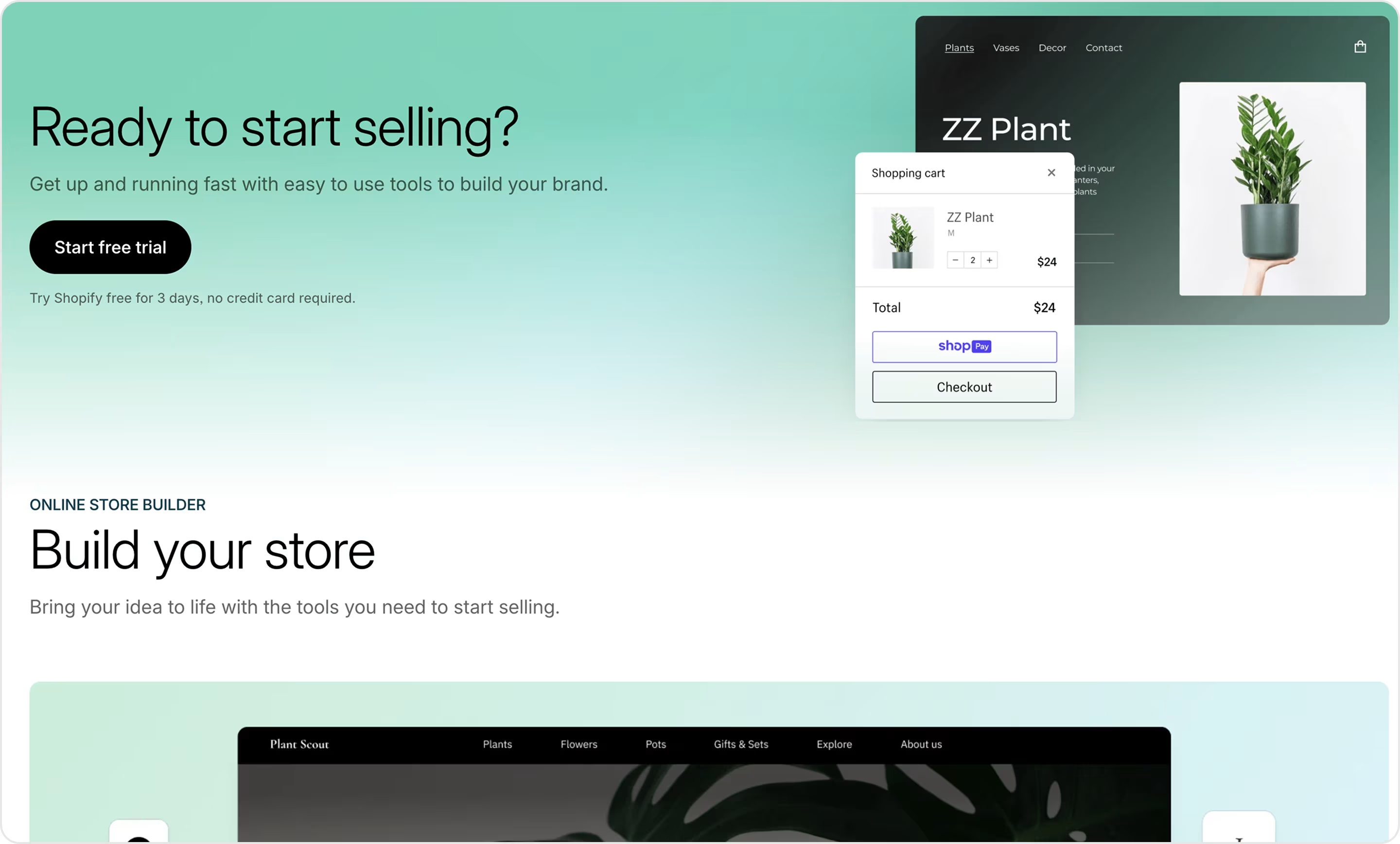
Our experts' take on this design:
- Direct, plain, and motivational headline.
- The copy speaks to entrepreneurial ambition, not just technical features.
- One primary action keeps visitors focused on signing up.
- Subtle cues reference Shopify’s global community of millions of entrepreneurs.
- Mobile-friendly layout.
Have a product like this? The Arounda team recommends:
- Use single-field forms or instant trials to reduce signup friction.
- Show real results and recognizable brands using your platform.
- Design for scale.
- Visualize product experience.
Fable
Niche: Entertainment
Fable is a social reading app that lets users discover, share, and discuss books in digital book clubs. Its homepage is a landing page that attracts readers and creates a social connection around books.
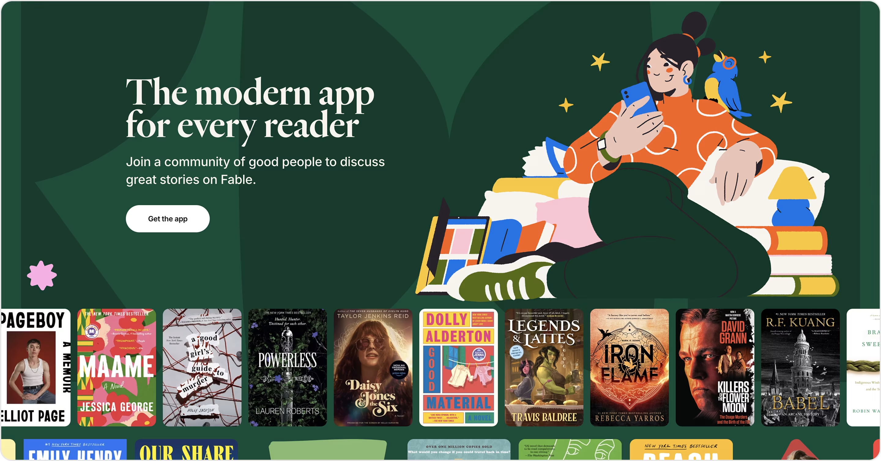
Our experts' take on this design:
- Strong visual storytelling.
- App-first focus.
- Community positioning.
- Clean and inviting design.
- Onboarding simplicity.
Have a product like this? The Arounda team recommends:
- Sell the lifestyle, not the app. Reading is emotional, so rely on community, joy, and creativity.
- Numbers, active clubs, and author partnerships build credibility.
- Emphasize what makes your app uniquely social compared to alternatives.
HomeLoanGurus
Niche: Mortgage SaaS
HomeLoanGurus is a digital mortgage platform that helps users find and compare home loan options quickly. Its Buy a Home landing page targets prospective buyers with a mix of education, reassurance, and clear CTAs that guide them through what is often a complex, stressful process.
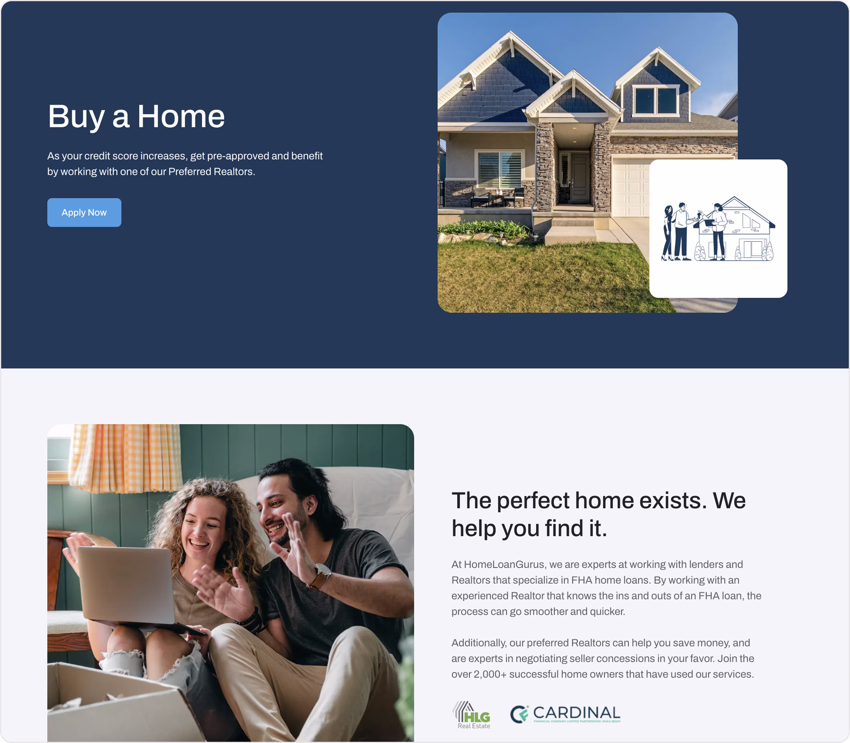
Our experts' take on this design:
- Customer-first messaging.
- Plain conversion funnel.
- Educational structure.
- Trust-building tone.
- Strong use of contrast and whitespace keeps the flow digestible and straightforward.
- Mobile-ready design.
Have a product like this? The Arounda team recommends:
- Use testimonials, certifications, and recognizable partners for trust.
- Show real dollar amounts or percentages users can save.
- Guide users step by step.
- Use emotional design. Combine logical proof (rates, savings) with lifestyle visuals that appeal to aspirations.
Miro
Niche: Collaboration | Productivity SaaS with AI
Miro is a collaboration platform, and its AI landing page highlights how artificial intelligence enhances brainstorming, planning, and execution.
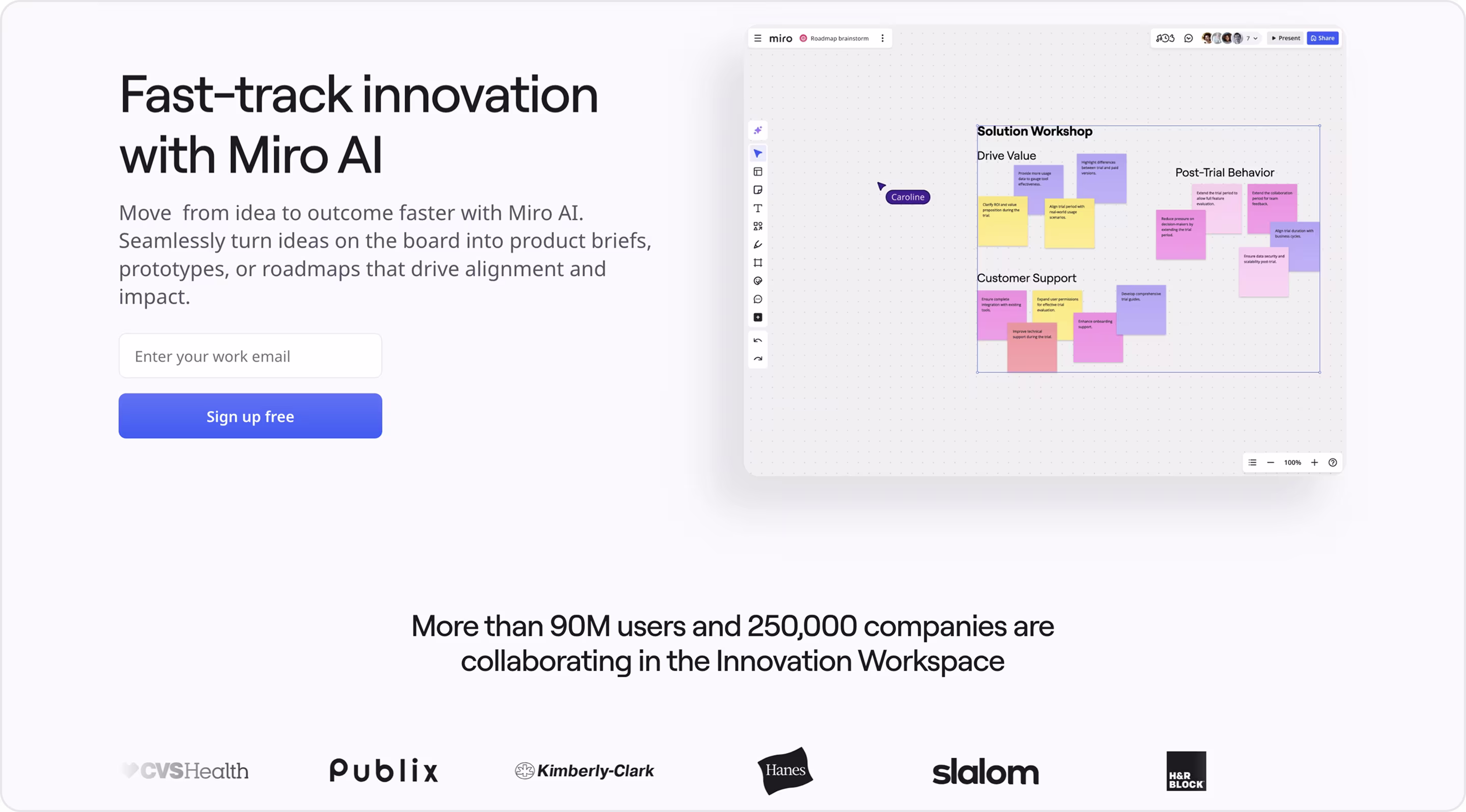
Our experts' take on this design:
- Clear visuals and screenshots show exactly how AI integrates into whiteboards.
- Multiple use cases with ideation, meeting notes, and diagramming outlines to broaden appeal.
- Feature explanations address curiosity and skepticism about AI.
Have a product like this? The Arounda team recommends:
- Users understand AI better when they see it in action, so visuals and demos are key.
- Time saved, better ideas, and faster workflows resonate more than feature lists.
- Transparency about data handling in AI features reassures enterprise buyers.
Gong
Niche: Sales
Gong is a revenue intelligence platform that helps sales teams analyze calls, track deals, and improve performance. Its Celebrate event landing page is a part of event promotion and brand storytelling. It showcases how Gong builds culture and community around sales success.
Our experts' take on this design:
- Bold emotional branding.
- Event-driven conversion.
- Strong use of vibrant imagery, videos, and event branding creates excitement.
- Aspirational tone.
- Minimal navigation keeps the focus on event signups.
Have a product like this? The Arounda team recommends:
- Landing pages for events should strengthen community and product positioning.
- Highlight numbers, exclusivity, or limited seats to push registrations.
- Pair excitement with concrete agendas or takeaways.
- Create a conversion path beyond the event. Ensure the landing page nurtures non-attendees into leads.
KloudMate
Niche: DevOps | API monitoring
KloudMate is a platform for real-time API monitoring and debugging. Its API Monitoring page balances technical detail with clarity to appeal to practitioners and decision-makers.
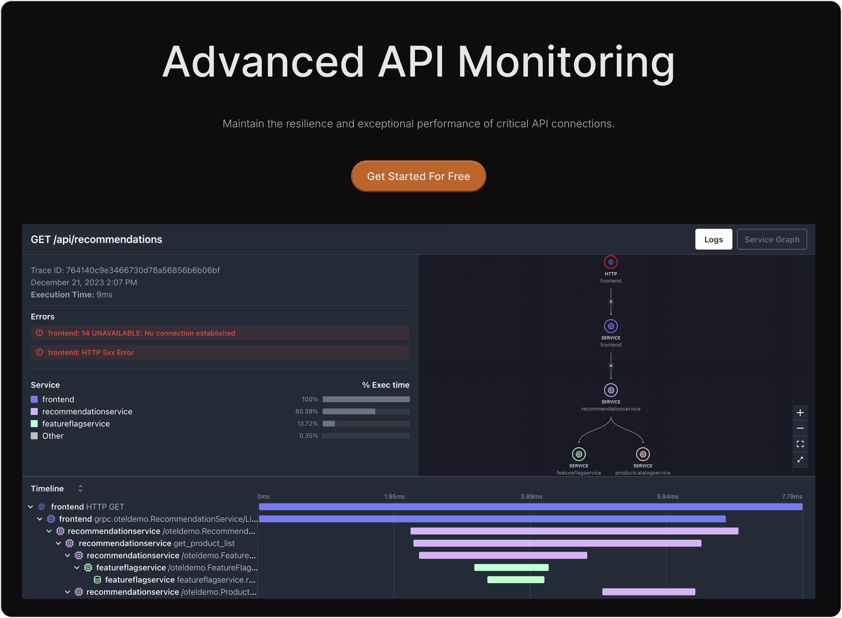
Our experts' take on this design:
- Screenshots of dashboards and error-tracking tools give transparency into the platform.
- Developer-first tone avoids fluff and speaks in straightforward, technical language that engineers trust.
- Pain-point targeting.
- Concise sections explain what the product does and why it matters without overwhelming.
Have a product like this? The Arounda team recommends:
- Developers and CTOs trust measurable improvements in performance and uptime.
- Make demos interactive.
- Show unique features.
- Provide technical credibility and keep the flow accessible.
QuickBooks. Intuit
Niche: Accounting
QuickBooks by Intuit is a global accounting platform. Its Accountants Software landing page attracts professional accountants and firms with tools that simplify bookkeeping, tax prep, and client management.
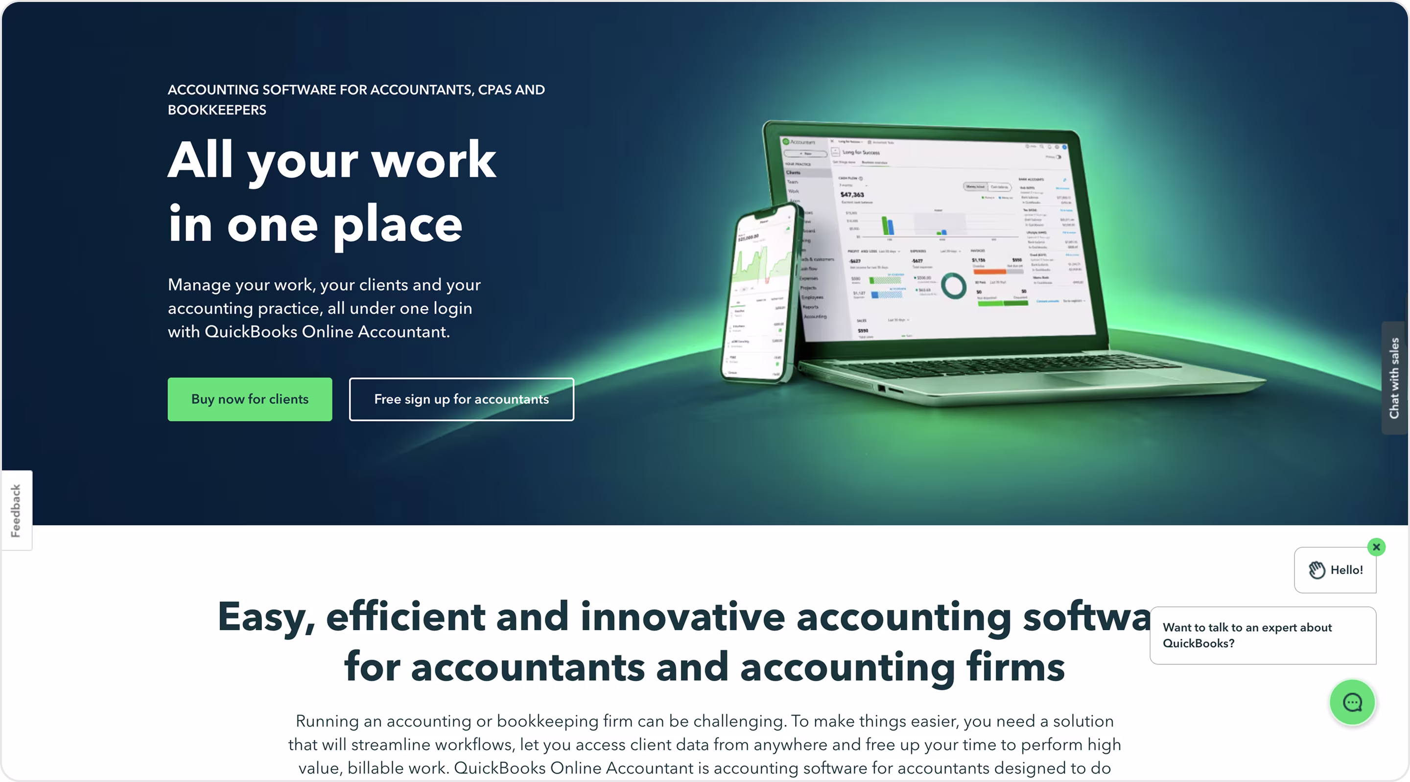
Our experts' take on this design:
- Professional targeting.
- Pricing visibility gives clarity and helps users self-qualify quickly.
- Highlights automation, tax support, and reporting to save time and improve accuracy.
- Intuit’s global brand authority adds instant credibility.
- Pricing segmentation makes it accessible for solo accountants and up to large firms.
Have a product like this? The Arounda team recommends:
- When targeting professionals, tailor messaging to their day-to-day challenges.
- Show ROI in numbers.
- Offer layered CTAs. Free trials attract individuals, and pricing clarity helps firms commit.
- Testimonials from accountants build stronger credibility than brand authority alone.
Okay, now let’s talk about unnoticed things that changed the rules in design.
Which Brilliant Designs Go Unnoticed Because They Work So Seamlessly?
Perfect digital designs are often invisible. Why? Because they guide users so smoothly that we rarely stop to notice them.
For example:
- Search bars that “just work”
Think of Google. No clutter, no instructions, yet billions use it daily without confusion.
- Progress indicators
A plain loading bar or step counter in a checkout flow reduces anxiety and keeps people from dropping off.
- Undo buttons
From Gmail’s “Undo Send” to design tools like Figma, this tiny detail saves mistakes and builds trust.
- Clear error messages
Instead of cryptic codes, excellent SaaS tools explain the problem and suggest a fix in plain language.
As one Redditor put it: “You don’t notice the door that opens smoothly — you only notice the one that sticks.” The same applies in digital design.
Red Flags to Watch for in Landing Page Examples
Seamless design is invisible when it works. But when it doesn’t, the problems are costly. Our team gathered the biggest red flags to watch for when reviewing landing page examples for services.
- Too many CTAs.
- Cluttered design with walls of text, endless buttons, or competing colors.
- Slow load speed (more than 3 seconds to load).
- Generic headlines. If users can’t answer “what’s in it for me?” in 5 seconds, it’s exactly the red flag headline.
- Weak or missing social proof.
- Unclear CTAs like “Click Here” or “Submit”.
- Mobile neglect (keep in mind that over 60% of traffic comes from phones).
- No clear next step.
- Overuse of stock visuals.
- Low-contrast colors, tiny fonts, or missing alt text.
If you notice some, then it's time to improve your landings. But if you want to be 100% sure that your landing page is modern, accessible, converting, and trustworthy, we can audit it fast!
What Are the Best Examples of Product-oriented Landing Pages?
The strongest product-oriented landing pages showcase the product front and center. They use real screenshots, demos, or previews to make benefits tangible. They guide users toward a single clear action.
Examples:
- Slack
- Basecamp
- Square
- Evernote
- Mailchimp
- Notion
- Figma
- Calendly
- Airtable
- Miro
- Canva
Why are they so impressive?
- They are transparent, clear, benefit framing, and show trust signals.
- They make visitors think, “I can see myself using this right now.”
- They remove guesswork and let the product do the selling.
How can Arounda help with your landing page design?
Our Arounda team has been designing landing pages for over 9 years. Our approach is to clearly and interestingly tell your product’s story, build trust, and move visitors to action. So, if you need a page to capture leads, validate your idea, and sell a SaaS product, we create designs that will reach your business goals.
How we do it:
- Proven results. Our designs helped companies double signups, increase engagement by 170%, and increase conversion rates up to 85%.
- Conversion-focused design. Every section, color, and button guides your user toward one clear goal.
- User research & strategy. We analyze your audience’s pain points and motivations to create messaging that resonates.
- Fast, responsive, and mobile-ready. Because over 60% of traffic comes from mobile, and you can’t afford to lose it.
- Custom solutions for your SaaS. We’ve helped 250+ clients across various industries design pages that sell.
Client testimonial
“We chose to work with Arounda because of their proven track record of creating visually stunning and user-friendly landing page designs. Their portfolio impressed us with the diversity and quality of their work.”
Kirill Onasenko, CEO at VOXE
👉 Ready to increase conversions? Let’s design your high-converting landing page today.
Final Thoughts
The best landing pages are purposeful. They show the product clearly, speak to real user pain points, and guide every click toward a goal. From SaaS giants like Slack and Notion to consumer favorites like Netflix and Canva, the lesson is the same: clarity, trust, and focus win conversions.
At Arounda, we’ve helped 250+ companies design landing pages that double signups, improve engagement, and increase revenue.
Book a call with our team and boost your conversions with the correct and impressive landing page.


Table of contents


FAQ


89+ Reviews
on Clutch

Top Rated Plus Agency
on Upwork

Top 50 Trending team
on Dribbble

Projects are Featured on Behance platform
