
55 Best B2B Website Design Examples for 2026 – by Arounda


Five seconds. That’s how long people give your site before they switch tabs. If your story doesn’t land fast, you lose the lead.
That’s why the Arounda team collected 55 B2B website design examples that convert. You’ll see the best web design patterns in action and grab website design ideas you can use today. We’ll break down what works, why it works, and how to adapt it to your product and sales cycle.
Why trust us? 9+ years, Arounda has designed and developed high-performing B2B websites end-to-end. Strategy, UX, UI, branding, and code in one place. We know what helps founders increase revenue with design.
Ready to turn your site into a growth channel? Let’s explore and analyze.
Article Key Takeaways
This guide reviews 55 B2B website design examples across Fintech, SaaS, Web3, AI, and Healthcare, like Coinbase, Stripe, Notion, Revolut, Shopify Magic, Synthesia, Slack for Healthcare, Doximity, and others (with several projects designed by our team at Arounda).
You’ll see how each company approaches navigation, storytelling, visual hierarchy, trust signals, CTAs, and user flows to make complex products easy to understand, high-converting, and benefit-oriented.
This article provides examples, expert insights, and actionable tips to help you create or redesign your B2B website the right way.
As a bonus, we’re offering a free UX audit of your B2B product. Just contact us, or, if you’re planning a full design or redesign, explore our B2B services and see how we’ve helped 250+ businesses reach their goals.
.avif)
The Best SaaS Designs
SaaS buyers want to see value and search fast. The best website designs make the path from “what is this?” to “let’s try it” feel obvious.
What great SaaS layouts do?
- Lead with the outcome.
- Show the product early.
- Offer clear CTAs.
- Place proof near the action.
- Explain in layers.
- Make pricing simple.
- Surface trust signals.
- Designed for speed.
Now, time to see the samples.
1. WordPress
WordPress is an open-source CMS and website builder for small and large-scale businesses. And WordPress is our client. Our goal was to improve user interaction with the platform and deliver a high quality UI/UX design to increase traffic and engagement and reduce bounce rate.
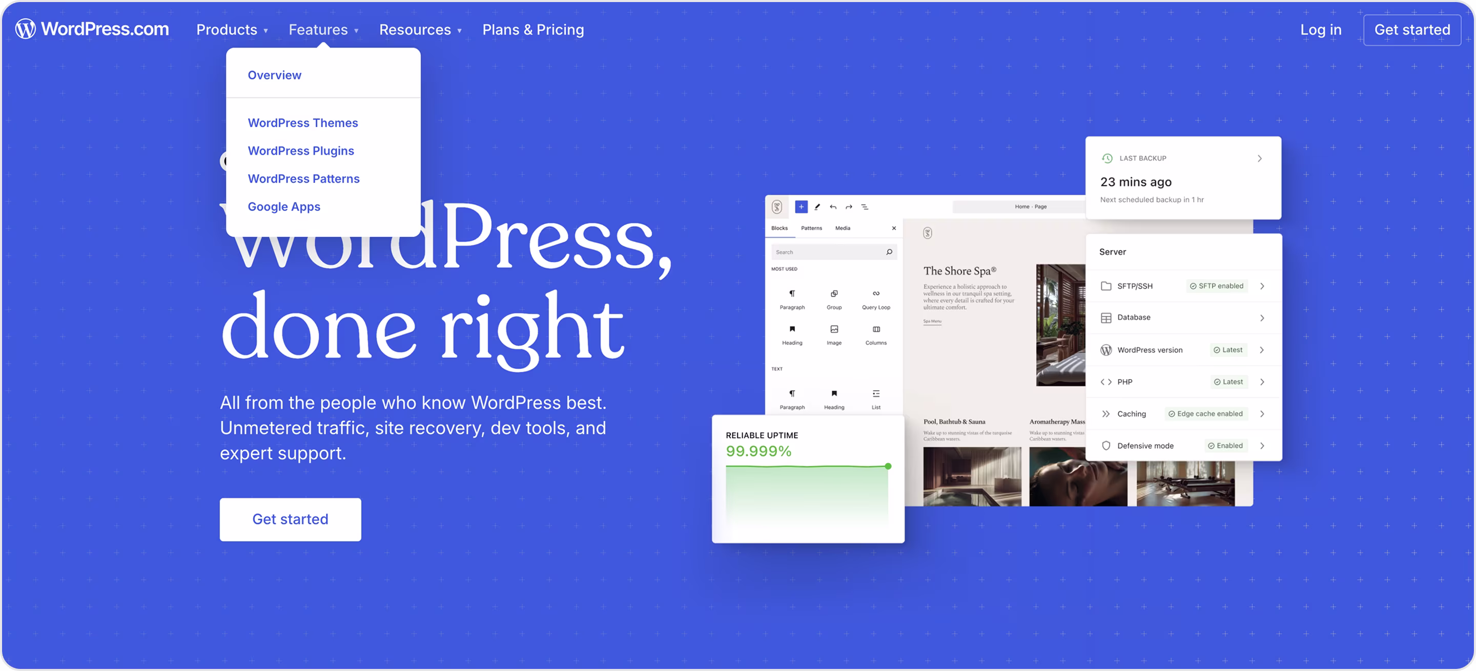
Why is this design impressive?
- Clear paths for different buyers. The content splits into Products, Features, and Resources, with a visible Plans & Pricing item, so users know where to go.
- A persistent CTA keeps the next step obvious.
- Strong product taxonomy.
- Ecosystem-first thinking. Quick access signals extensibility and reduces pre-sales objections about limitations.
- Strong on-brand design.
Takeaway for founders
If you like their approach and design, then Arounda suggests:
- If your SaaS has multiple products or add-ons, mirror WordPress’s taxonomy approach (name your modules upfront), so buyers understand the scope at a glance.
- Link to integrations, templates, or plugin equivalents near the hero to kill the “will it scale with us?” objection.
- Keep a single primary CTA.
- Pair the CTA with trust elements (logos, ratings, or quick metrics).
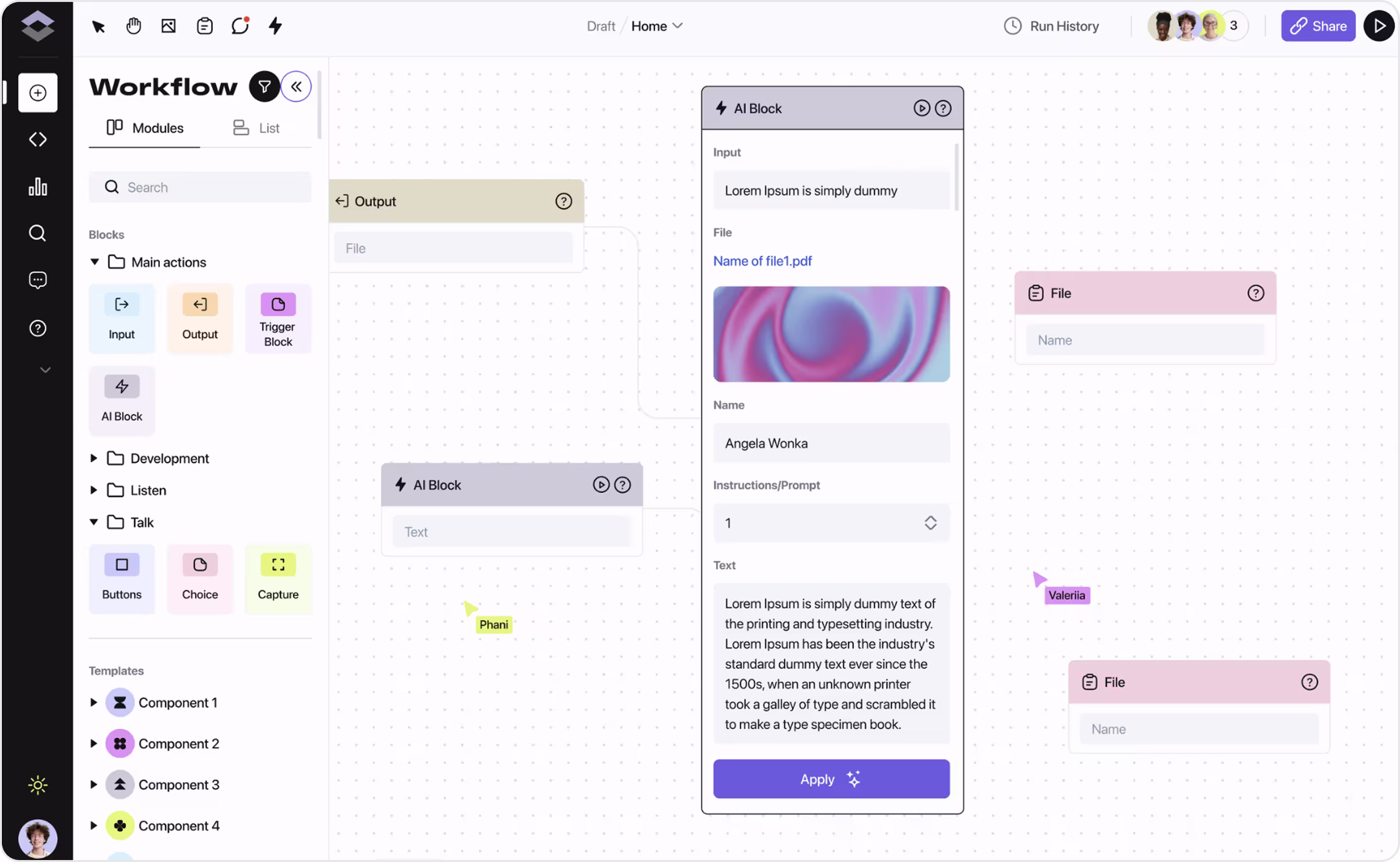
2. Notion
Notion is a collaborative workspace for notes, docs, projects, and AI-powered knowledge.
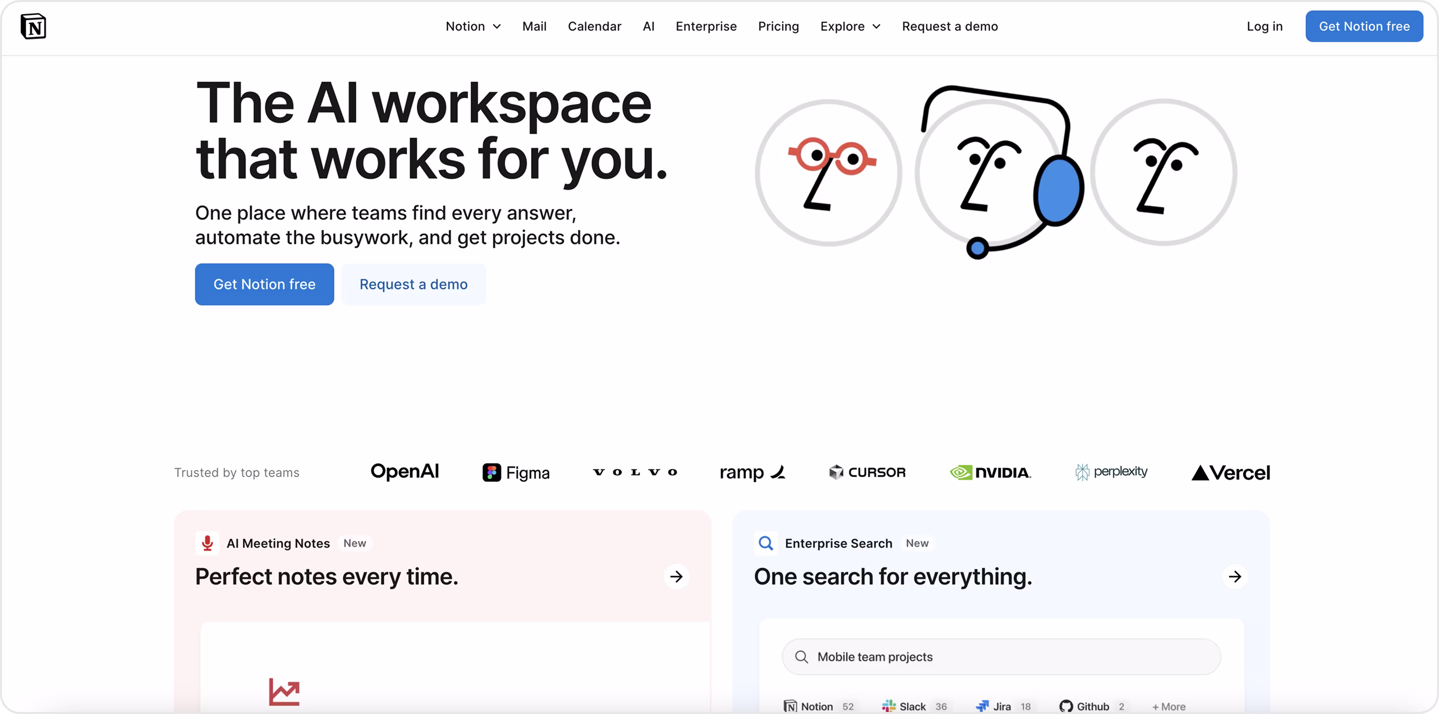
Why is this design impressive?
- Outcome-first hero with clear promise and no jargon.
- Instant social proof.
- Feature cards show real UI and a one-line value.
- Simple line characters soften a technical product and make the brand memorable.
- High-contrast buttons, plenty of white space, and a sticky header keep the action obvious.
Takeaway for founders
Like their sample? Then Arounda suggests:
- Group products in the header so buyers grasp the scope fast.
- Place your strongest customer logos under the hero.
- Give each key capability a card with UI, one benefit line, and (if relevant) a small “New” badge.
- Use a friendly brand layer with simple illustrations or micro-icons to add warmth.
- Big type, clean spacing, and high-contrast buttons drive focus and clicks.
- Segment enterprise needs. Add an Enterprise tab with security, admin, and rollout info to calm objections before sales.
3. ClickUp
ClickUp is an all-in-one work platform for tasks, docs, chat, whiteboards, dashboards, and AI. It is pitched as “the everything app for work.”
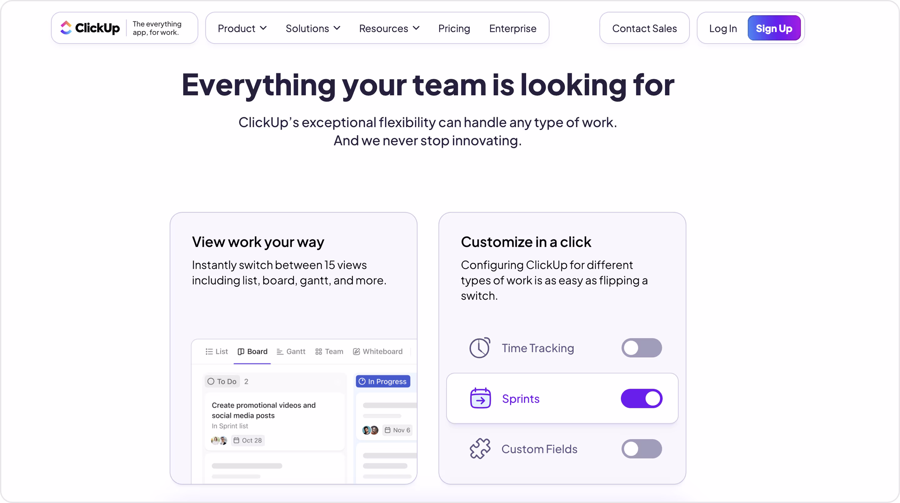
Why is this design impressive?
- Proof before the scroll.
- Clear problem/solution story.
- AI as a platform (not a feature).
- Every feature collapses into tidy lists.
- Customer quotes, G2/TR badges, “Weekly updates,” and “Secure & compliant” calm fears about maturity and support.
Takeaway for founders
This is a good web design, and if you like it, then Arounda suggests:
- Create one line that states the outcome + a zero-risk CTA to increase trial starts without more ad spend.
- Show your suite as tiles for each module to help buyers map your value fast and lift conversion.
- Tell a CFO-friendly story with results and benefits.
- If you have AI, frame it as a workflow with UI.
- Route visitors to “solutions” or “teams” pages with ready-to-use templates to reduce evaluation time and help non-technical buyers.
4. Sinta
Sinta is a hiring platform that helps HR teams run faster interviews with AI tools, customizable templates, and video transcripts. Arounda partnered with Sinta to deliver the MVP, full UI/UX, and website for this SaaS product. This is one of our top website designs with cute and eye-catching designs.
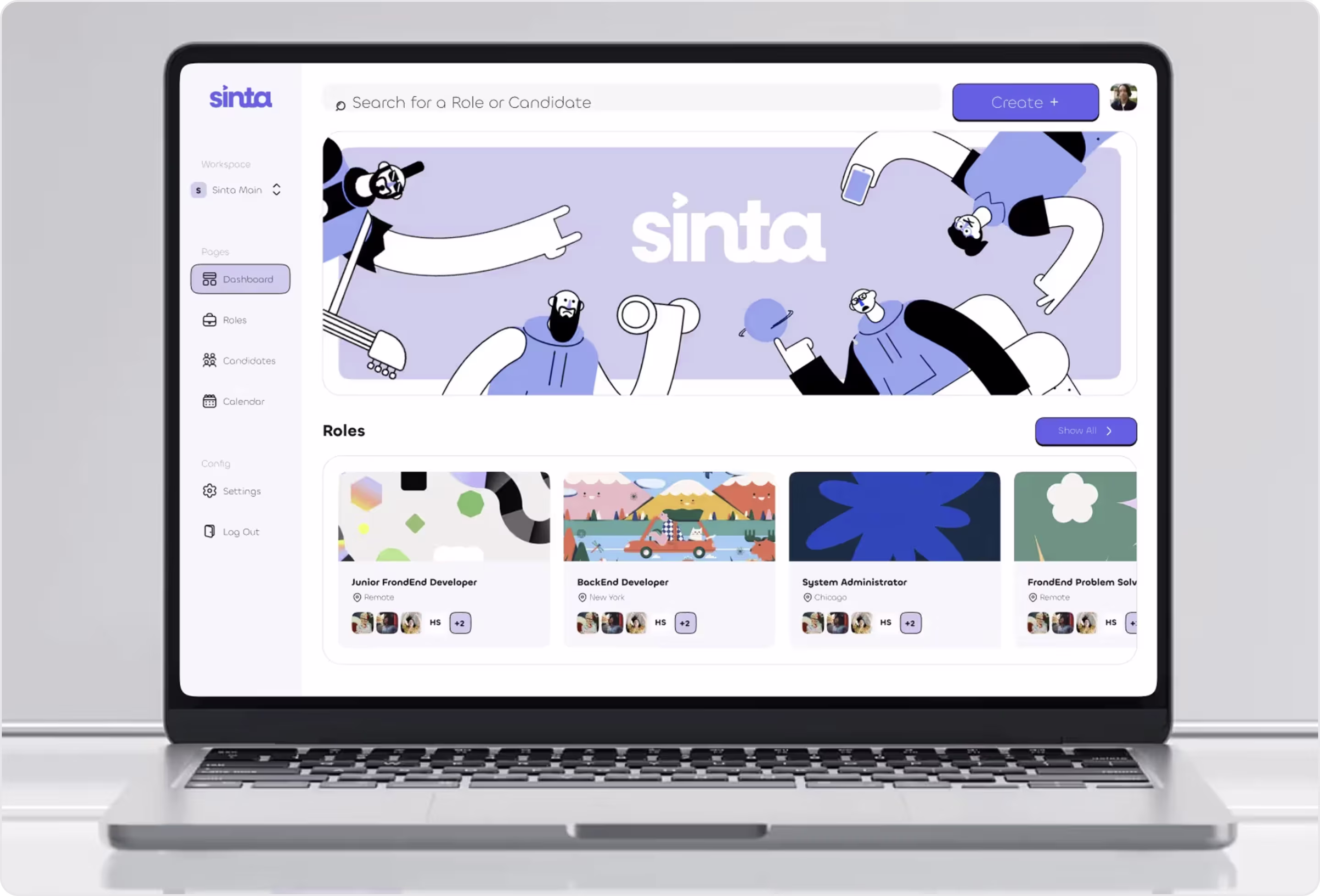
Why is this design impressive?
- One flow for every role to cut training time and remove handoff friction.
- HR specialists get position templates, a question bank, and structured notes during and after interviews.
- The platform lets teams add candidates or import from LinkedIn, track stage and sentiment, and tag strengths/risks in one place (decisions get faster).
- Distinct, unique, and practical branding.
- Despite broad functionality, the product stays easy to navigate.
Takeaway for founders
If you prefer this style, then Arounda suggests:
- Unify roles and simplify ops (your onboarding shrinks and adoption rises).
- Template what you can to increase activation and retention.
- Decide on your brand system early to make your product consistent and scalable.
- Put real UI (not illustrations) next to every value claim.
- Validate complexity before code to cut rework and protect the roadmap.
5. Trello
Trello is Atlassian’s simple, Kanban-style workboard for organizing tasks and projects across teams.
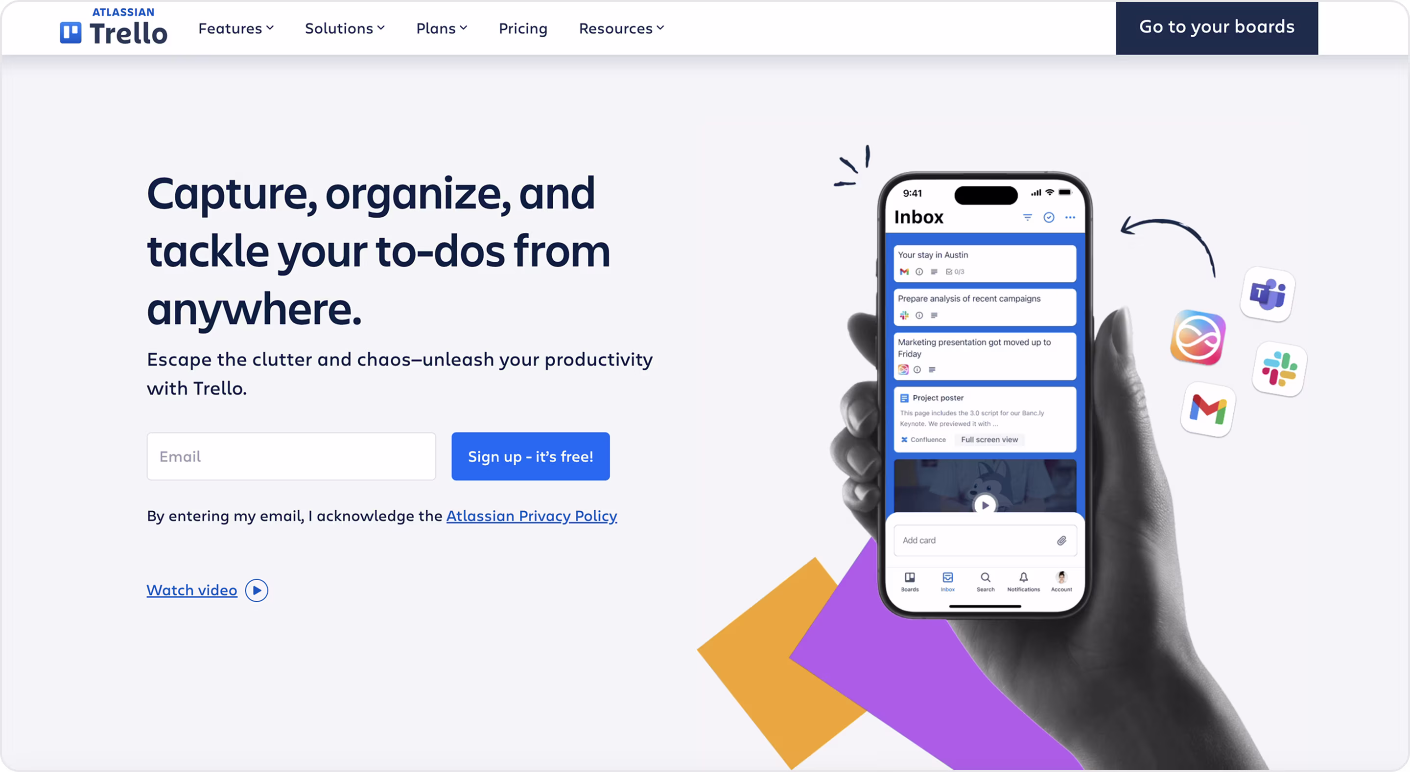
Why is this design impressive?
- Clear promise in plain language is the hallmark of the best website design.
- Form-in-hero = fewer clicks.
- Navigation that maps to buyer questions.
- “Watch video” offers a 60-second demo for busy buyers who won’t read long copy.
- Friendly visuals with high contrast.
Takeaway for founders
Our recommendations for you:
- If you’re product-led, add an email field + single CTA to increase signups and lower CAC.
- Add a top-right shortcut for active users (“Go to your…”) and a main CTA for new users.
- Display the 4–6 logos your ICP already uses to speed procurement.
- Create a quick explainer video to convert skimmers and drive internal sales.
- Use a high-contrast, accessible UI.
6. Q Talent
Q Talent is a hiring platform that helps teams find and close candidates faster with a collaborative workflow. Q Talent partnered with Arounda to increase traffic, engagement, and popularity among recruiters, expand the professional community, and candidate base. We delivered UI/UX and web design services to make their platform fast, intuitive, and helpful.
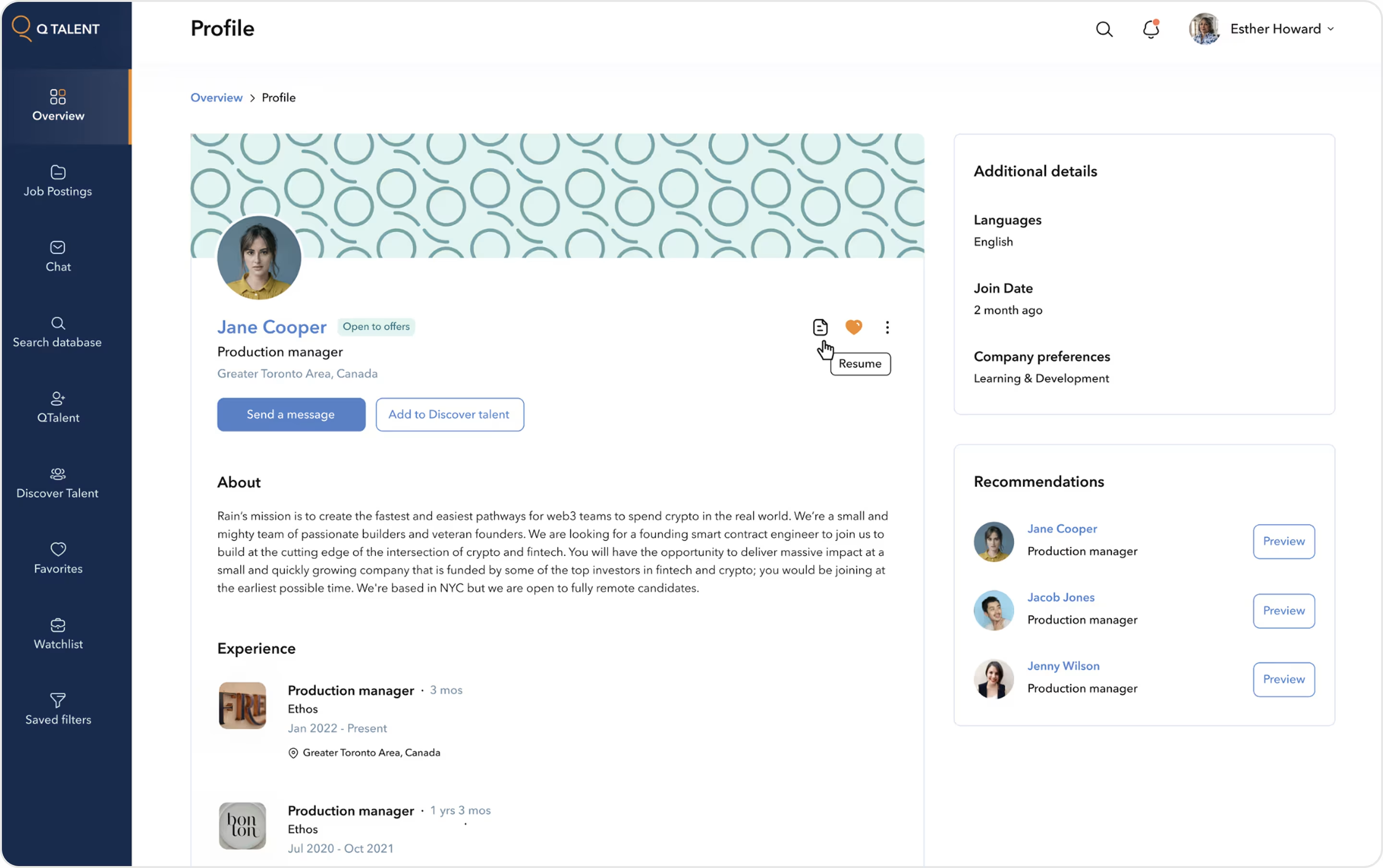
Why is this design impressive?
- Clear, calm layout keeps daily actions one click away, so recruiters move fast.
- Action-first profile that speeds outreach and reduces handoffs.
- Core details in the center; “Additional details” and “Recommendations” on the right. You see context and next-best candidates without leaving the page.
- Experience, notes, and company preferences use consistent cards.
- Built-in collaboration. Chat, watchlists, saved filters, and discover lists turn a solo search into a shared pipeline.
- A friendly visual system keeps focus on what the user needs right now.
Takeaway for founders
Love the order? Our recommendations:
- Put the 3 most common actions in the first screen.
- Make qualification instant. Use badges and micro-metadata near the name to cut time-to-hire.
- Keep context in view and show side panels for faster pipeline movement.
- Card-based sections and required fields create apples-to-apples comparisons.
- Build collaboration into the UI. Add chat, saved filters, and watchlists.
- Use clear type, high contrast, and calm colors to reduce cognitive load.
- Show recommendations for faster navigation and understanding.
7. Monday.com
Monday.com is a work OS for projects, sales, marketing, and ops with boards, dashboards, automations, integrations, and AI in one place. We consider it one of the best website design examples.
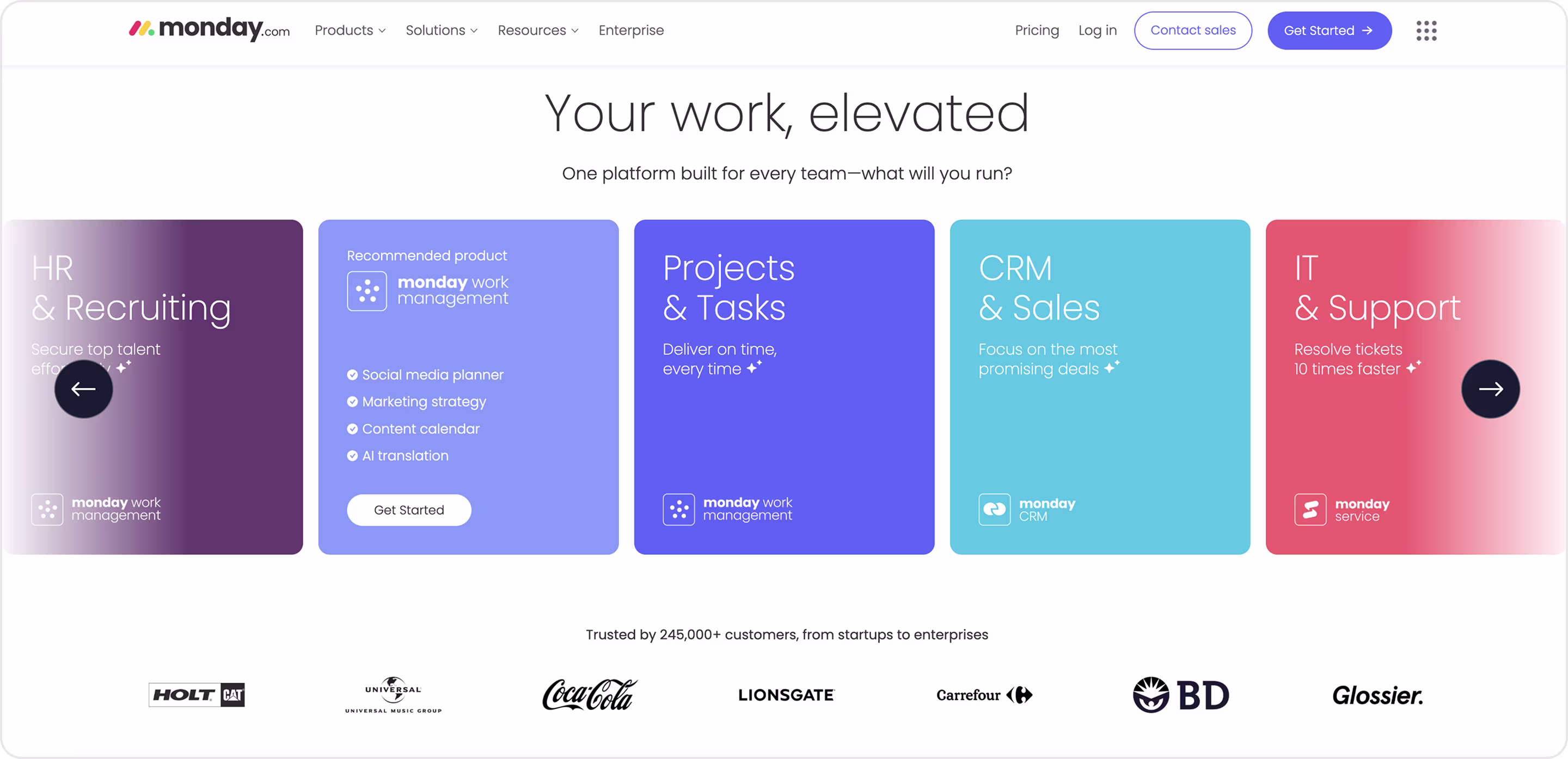
Why is this design impressive?
- Boards, statuses, and dashboards appear above the fold, so buyers “get it” immediately.
- A visible gallery for projects, CRM, marketing, and IT helps teams start in minutes.
- Clear paths by team and use cases reduce decision fatigue and shorten evaluation.
- Automation + integrations are clearly framed.
- Pricing is scannable and easy to find (no hidden info).
- Security, governance, and admin pages calm risk and speed procurement.
Takeaway for founders
We recommend:
- Provide a template gallery by role/industry to drop time-to-value and increase activation.
- Organize by problems. Navigation that mirrors buyer questions shortens the sales cycle.
- Visualize automations and common integrations.
- Place logos, ratings, and short quotes beside CTAs to nudge trials and demos.
- Keep pricing obvious.
- An Enterprise/Security path removes blockers and opens bigger deals.
8. Miro
Miro is a visual collaboration platform to share boards for planning, roadmaps, research, workshops, and team alignment for product, design, engineering, marketing, PMO, and IT teams.
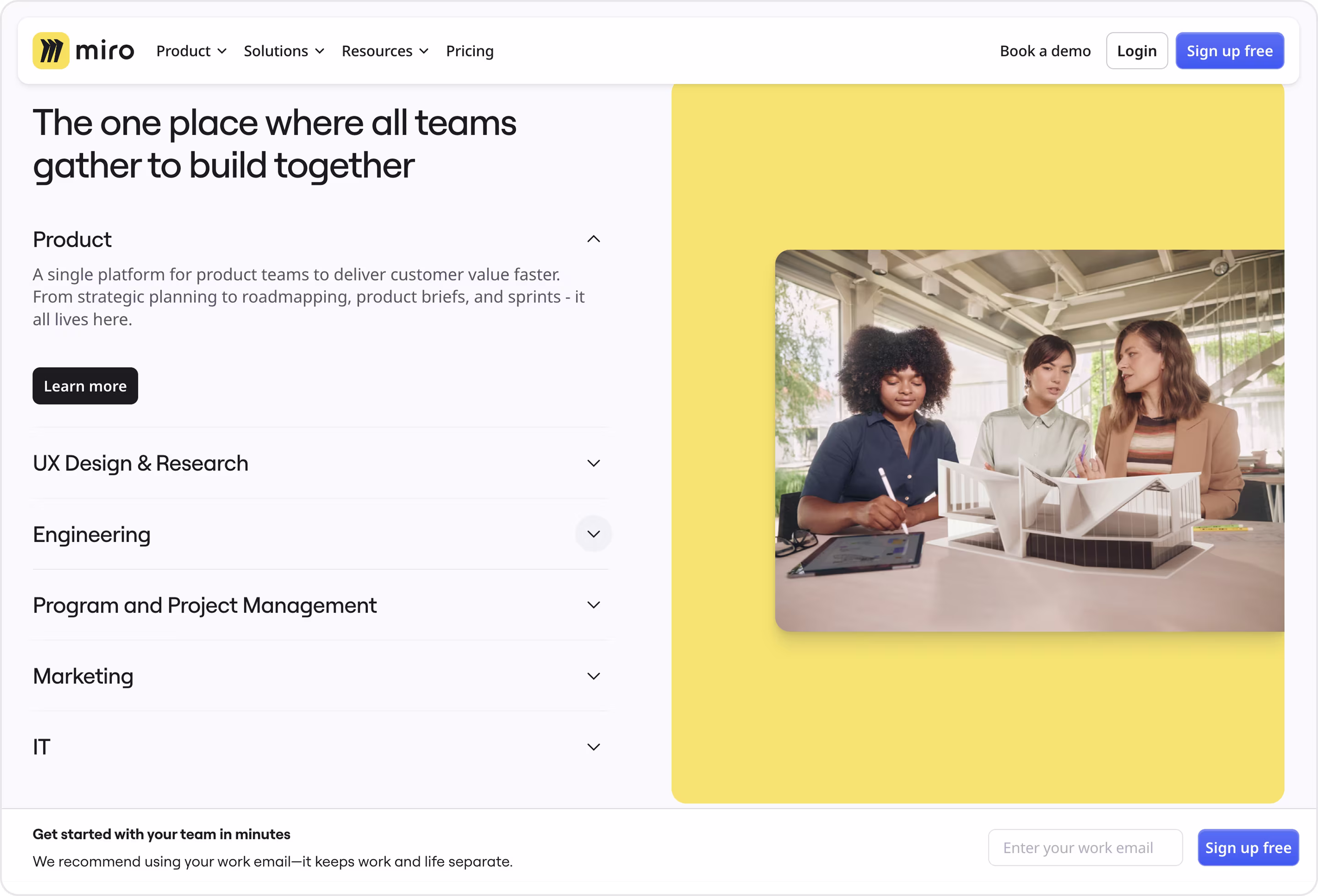
Why is this design impressive?
- Clear value in one line (exactly what you see in cool website designs).
- Role-based layout.
- Instant start bar.
- Real collaboration imagery inside a bold color block keeps attention.
- Simple, scannable structure.
- Big type, generous spacing, and short descriptions reduce cognitive load and bounce.
Takeaway for founders
Looks great for your business? Then our tips are the following:
- Give each function a collapsible block or lane to shorten the sales cycle.
- Keep “Start free” and “Book a demo” side by side to convert PLG traffic and enterprise interest.
- Add a sticky email capture.
- Design for decision speed.
- Map navigation to business questions to reduce drop-offs.
9. Webflow
Webflow is a visual development platform that lets teams design, build, and ship websites without heavy engineering. Arounda is its professional partner, and our experts help businesses develop websites on Webflow.
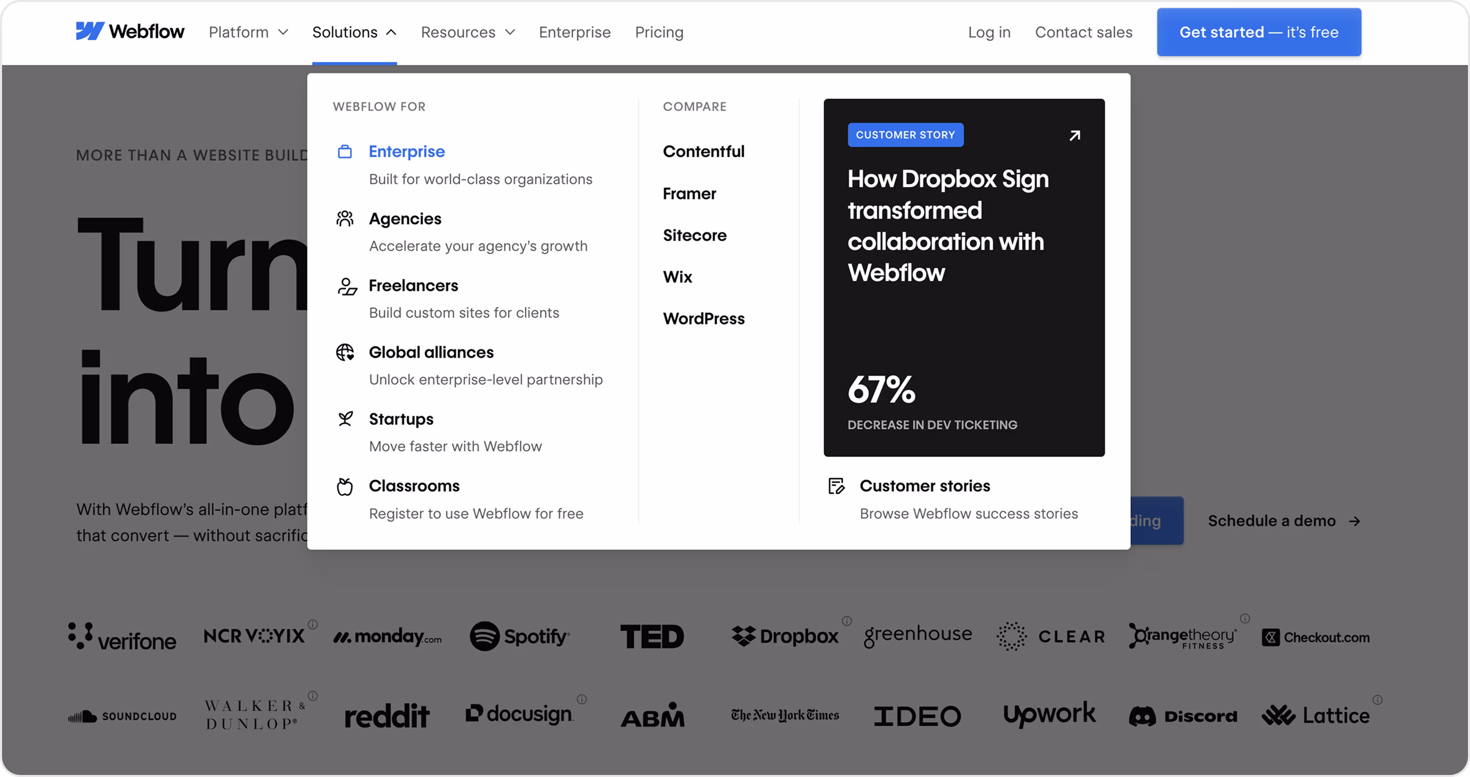
Why is this design impressive?
- The Solutions mega-menu splits paths for Enterprise, Agencies, Freelancers, Startups, and more. Visitors land on the right story in one click. This is the exact behavior you want from web design examples that convert.
- Comparison built into navigation (useful solution).
- Proof inside the menu for credibility.
- Recognizable brands stack social proof.
- Clear product language.
Takeaway for founders
Good for you? Then, Arounda suggests:
- Segment the experience from the header.
- Add a “Compare” cluster for high-intent searches and to control the narrative (great for SEO and win rate).
- Label navigation like questions. “What is it?” (Platform), “Is it for me?” (Solutions), “Who else uses it?” (Resources/Stories), “How much?” (Pricing).
- Tie every story to ROI because metrics make budget approvals simple.
10. Figma
Figma is a collaborative platform for interface design, prototyping, and developer handoff.
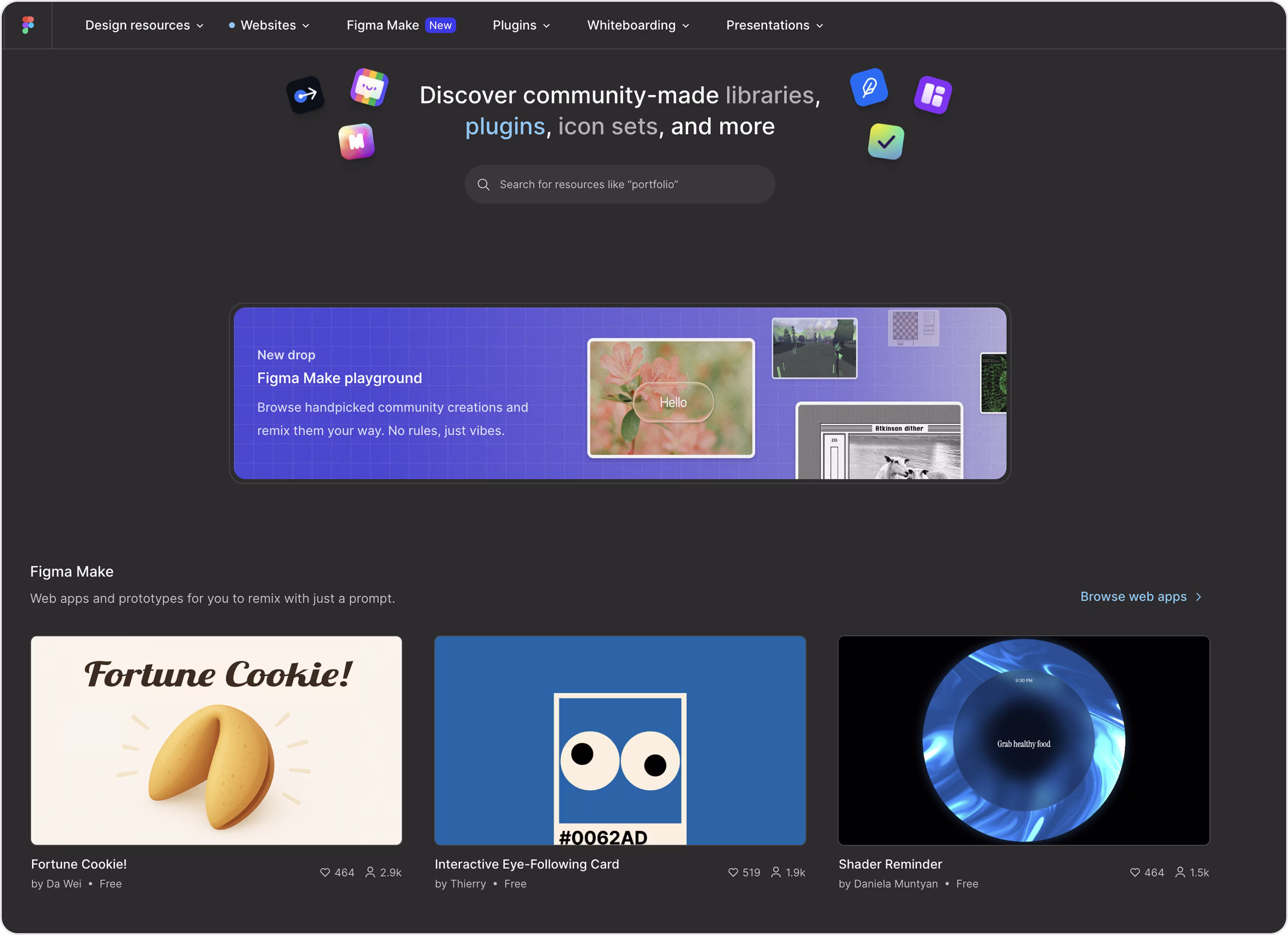
Why is this design impressive?
- Real canvas, components, prototypes, and Dev Mode appear above the fold, so visitors understand the value.
- Templates, plugins, and a visible community signal adoption and lower perceived risk.
- Enterprise trust signals where security, SSO/SCIM, governance, and compliance get their own lane.
- Resources, tutorials, and event links help active users onboard teammates without sales calls.
Takeaway for founders
Build something familiar? Here are our design tips:
- Show the product doing the job (comprehension rises; demo dependency drops).
- Use community assets.
- Make handoffs a business story.
- Put security up front.
- Keep copy short and plain because executives decide faster when the value is obvious.
11. Linear
Linear is a fast issue tracker and product workflow for software teams with roadmaps, cycles, bug tracking, and tight Git/GitHub integrations.
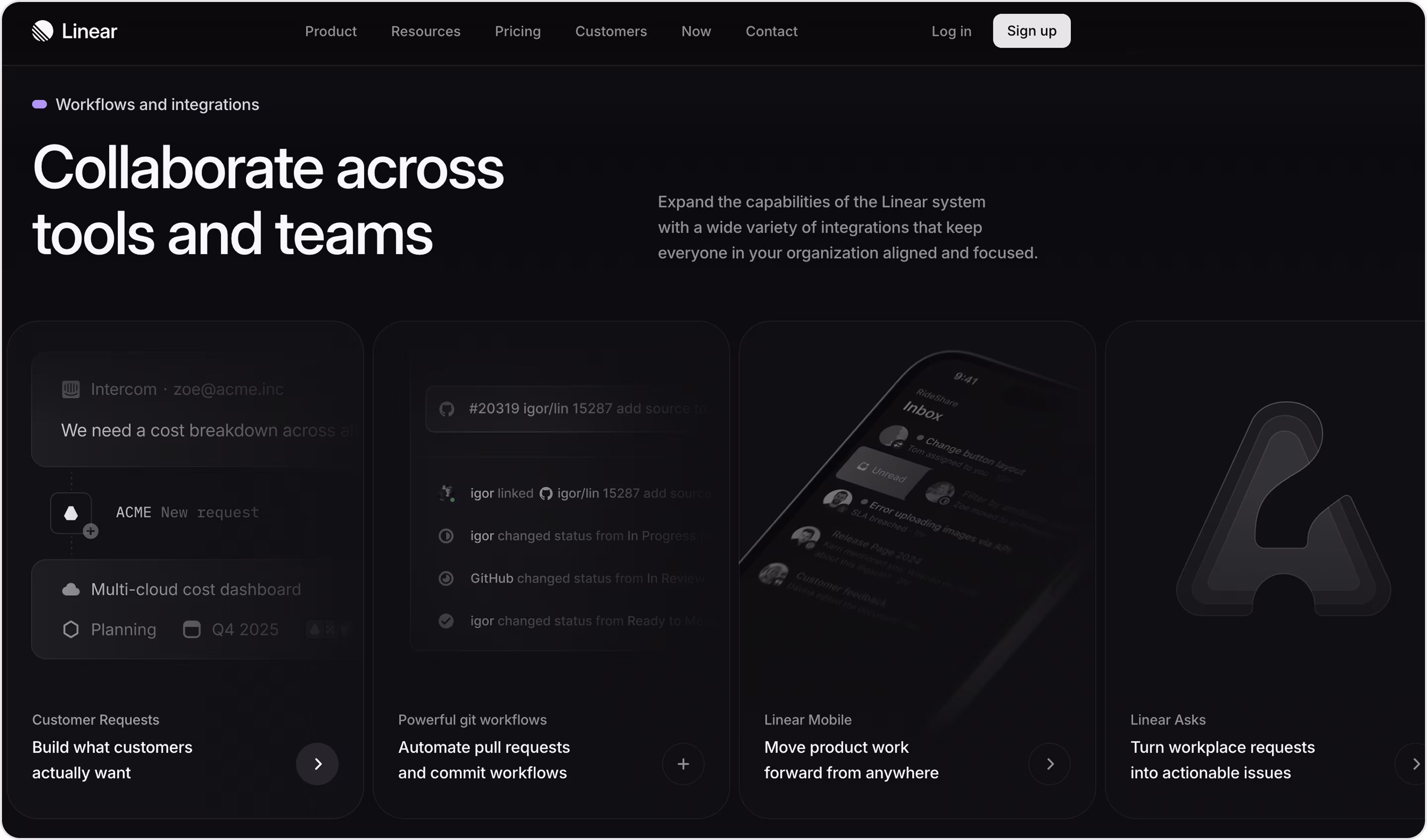
Why is this design impressive?
- One idea per screen, so each section sells a single benefit.
- Premium minimalism is great for enterprise buyers.
- Micro-interactions that teach.
- Dark-mode native for tech lovers.
Takeaway for founders
Choose a modern style? Amazing choice, so we recommend:
- Create one message per section. This helps busy execs understand you in under a minute.
- Fewer colors, more space, and strong type make your product look elegant and enterprise-ready.
- Keep navigation ruthless with 5–6 top items max.
- Use motion with intent where tiny, fast animations explain actions.
We've shared the best website design examples in the SaaS industry, but if you're interested in more, we invite you to explore our case studies. And then, let’s move to the Fintech best design websites.
The Best Fintech Project Designs
Trust is money. People won’t move funds, link a bank, or confirm a trade if the page looks shaky. So, Fintech website designs must reduce risk, explain rules, and guide action without friction.
Clean fintech UX lifts form completion, increases first funding rates, cuts support costs, and speeds compliance sign-off. It also helps you pass vendor reviews with partners and banks.
Ready to see the top rated website design examples and how to apply some elements to your product? Let’s do it!
12. Klasha
Klasha is a fintech company that provides cross-border payment solutions for businesses and individuals to and from Africa. Klasha partnered with Arounda to get UI/UX design and branding that their clients would love.
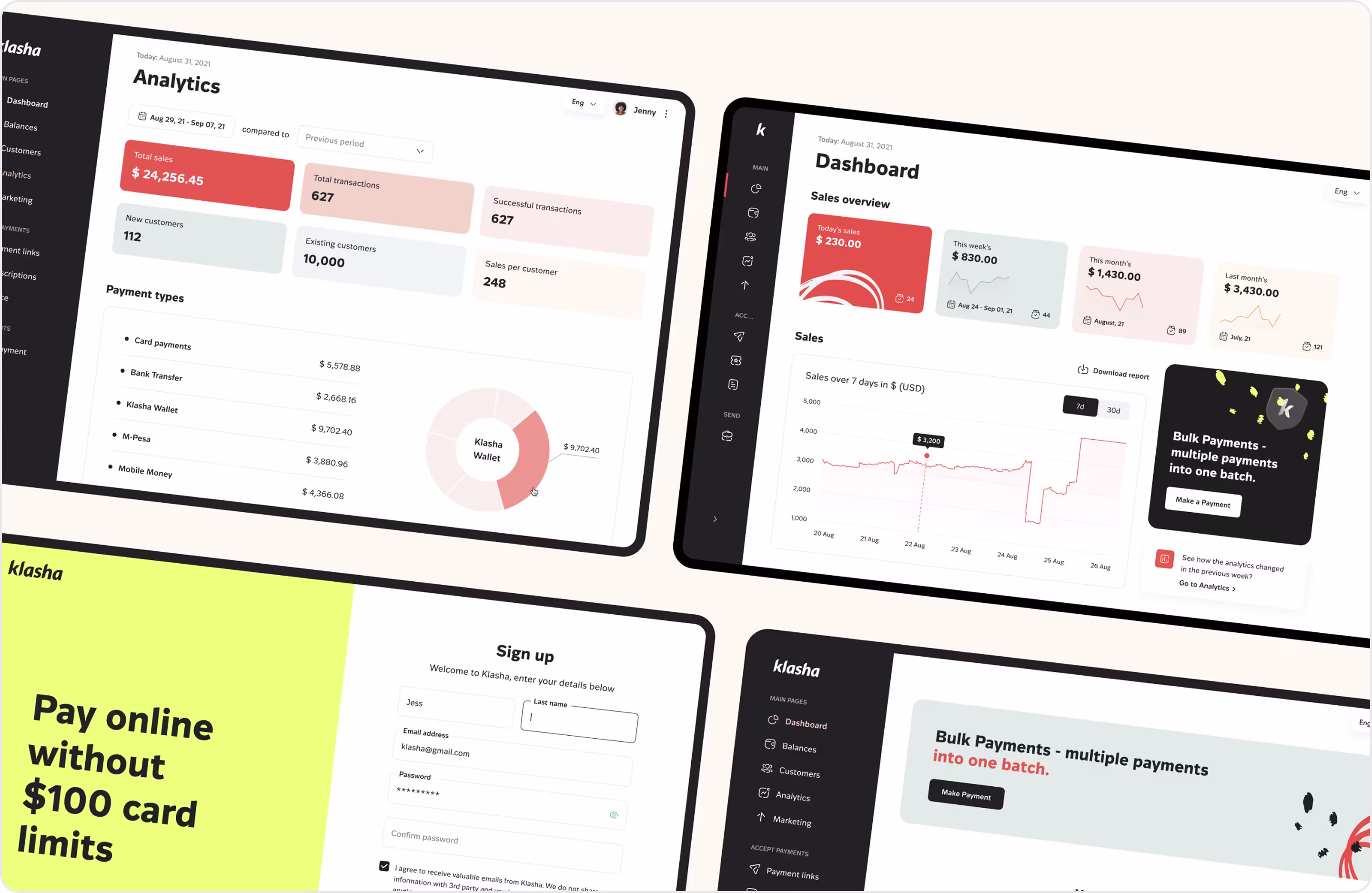
Why is this design impressive?
- Clear routes for businesses and a separate consumer app.
- Country-level clarity. That transparency reduces drop-off in regulated flows.
- Hard-currency payouts are stated simply for clear value.
- Customer stories back the promise with operational impact.
- We delivered a UI kit and style guide so Klasha could ship new features fast without breaking consistency.
Takeaway for founders
- Segment by user type from the header to cut confusion and shorten the path to signup or sales.
- List supported methods, currencies, and fees for each market to answer pre-sales questions and lift conversion.
- Describe fintech operations in plain language.
- Publish simple ROI stories.
- Invest in a design system early. A shared UI kit keeps speed and quality as you add compliance screens, partner pages, and pricing updates.
13. Wise
Wise is a global money platform for sending, spending, and receiving across borders. It offers personal and business accounts, a multi-currency card, and international transfers.
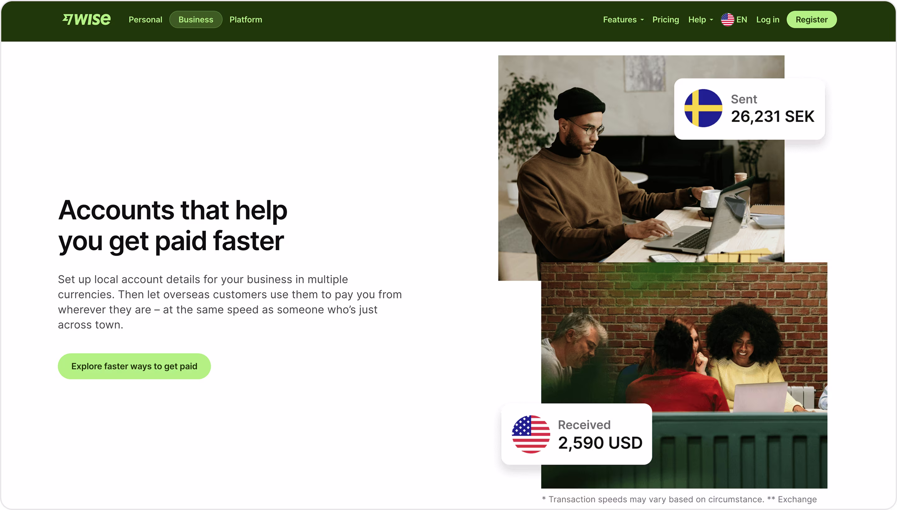
Why is this design impressive?
- It explains every step in plain language and ties fees to real routes.
- “Use it today” story to make activation faster.
- Creative website designs that focus on real-life usage win trials fast.
- Photos for personality and live effect.
- Business journeys on one screen.
Takeaway for founders
- Pair a live fee/rate explainer with route-level costs. Educated users convert more and open fewer support tickets.
- Add adoption stats and simple regulatory language near CTAs.
- Highlight instant card provisioning, wallets, or integrations your buyer can use today.
- Explain the hard stuff in plain words.
- Add personality with amazing photos, don't be afraid to be informal. Fintech is also about people.
14. Stripe
Stripe is a financial infrastructure platform for global businesses. It provides payments, billing, revenue operations, and fintech services on one AI-powered stack.
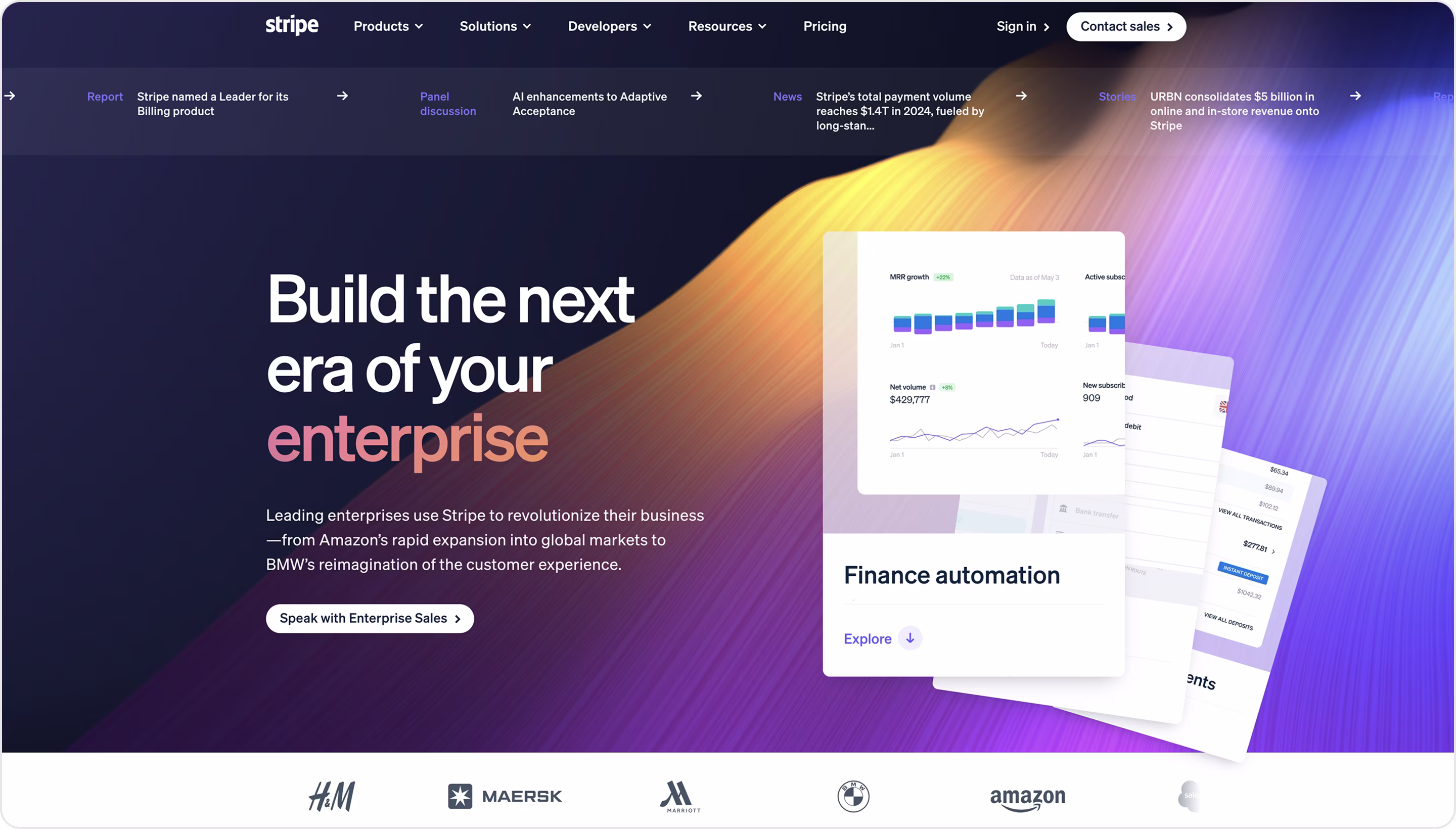
Why is this design impressive?
- The enterprise promise is simple.
- Proof through capability (not nice adjectives).
- Stripe highlights 135+ currencies and localized pricing that is critical for expansion without custom builds.
- Reliability as a selling point.
- Clear paths by segment.
- Billing, Payments, Issuing, Identity, or Tax are visible from the top-level navigation and are easy to scan.
Takeaway for founders
- Lead with revenue lift, new lines of business, and automation. It earns exec attention fast.
- Translate features into money. That’s the language that opens the budget.
- Show global readiness. This removes expansion blockers and speeds go-to-market.
- Publish request volumes, uptime targets, and peak-season wins for trust.
- Show every product pillar in one clean nav. It helps leaders picture a single vendor for payments, billing, tax, and cards.
15. Brex
Brex is a complete T&E and spend platform. Corporate cards, travel, expense management, budgets, B2B software, and reimbursements for mid-size and enterprise companies.
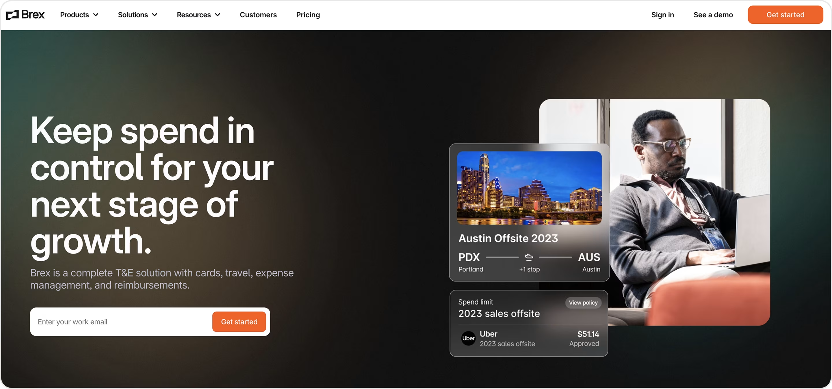
Why is this design impressive?
- Two solution lanes with clear paths for Mid-size companies and Enterprise. Each page tells a different story without making you hunt.
- Navigation that mirrors finance questions.
- Benefits before features.
- High-contrast and premium look.
Takeaway for founders
- Capture email in the hero and add one field + one button. More visitors start, and CAC goes down.
- Show the job being done. Use UI tiles that match your claim.
- Segment by company size and tailor proof, integrations, and rollout. Conversion rises because each buyer sees themselves.
- Tie features to CFO metrics.
- Keep the brand calm and premium.
16. Revolut
Revolut Business is a global money platform where clients get one business account for multi-currency balances, cards, expenses, payments, FX, and tools for invoicing and payouts.
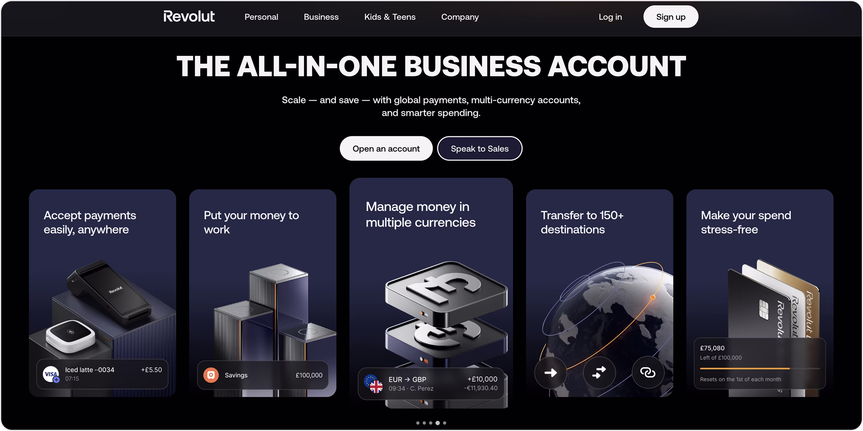
Why is this design impressive?
- UI tiles show cards, approvals, and expense flows next to the claim.
- Clean tiers with a monthly/annual toggle and one highlighted plan.
- Copy and visuals call out multi-currency, international transfers, and local rails.
- Accounting and ops tools appear beside finance features to signal a smooth rollout.
- Big type, soft gradients, and focused sections make a complex suite simple.
Takeaway for founders
- Promise control, savings, or speed in one line.
- Put UI of limits, approvals, and policies next to claims.
- Make pricing obvious. Faster decisions, fewer sales calls.
- List currencies, transfers, and payout options early. It removes expansion doubts and speeds legal review.
- Stack credibility close to CTAs. Logos, simple compliance copy, and short quotes reduce hesitation at the moment of action.
17. Xpence
Xpence is a corporate spend platform with smart cards, approvals, reimbursements, and real-time controls for finance teams. Arounda partnered with Xpence and delivered UI/UX design and MVP design for their expense management platform.
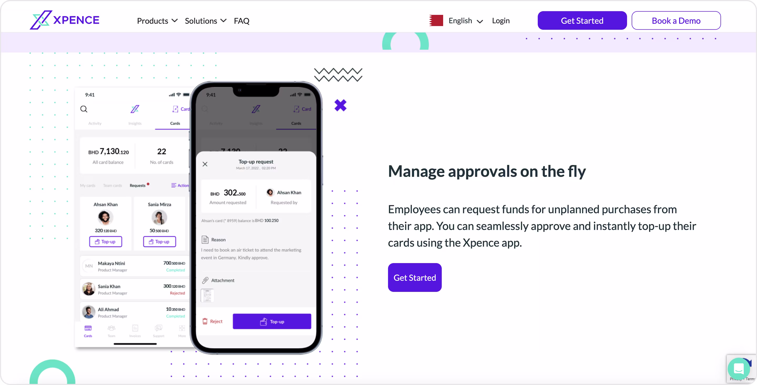
Why is this design impressive?
- The Corporates page speaks to finance leaders who need scale, control, and audit-ready records.
- Card limits, merchant locks, and receipt capture show up near the hero, so buyers “see” control in action.
- Chips and short lines explain per-diems, budgets, role permissions, and multi-level approvals (no feature soup).
- Procurement-friendly structure. Easy to scan, easy to say yes.
- Clear next steps.
Takeaway for founders
- Show the control layer. Finance teams believe what they can see (demo requests go up).
- Organize pages by CFO questions. This cuts evaluation time.
- Name the policies you support in plain language.
- Keep two CTAs close and active. Open an account for PLG and Book a demo for enterprise. You capture both funnels on one screen, which lowers CAC.
- Surface finance integrations near features. It signals low switching cost and speeds procurement.
18. Mercury
Mercury is a banking platform for startups and tech companies. It offers business accounts, cards, payments, Treasury, and capital tools, backed by FDIC insurance through partner banks.
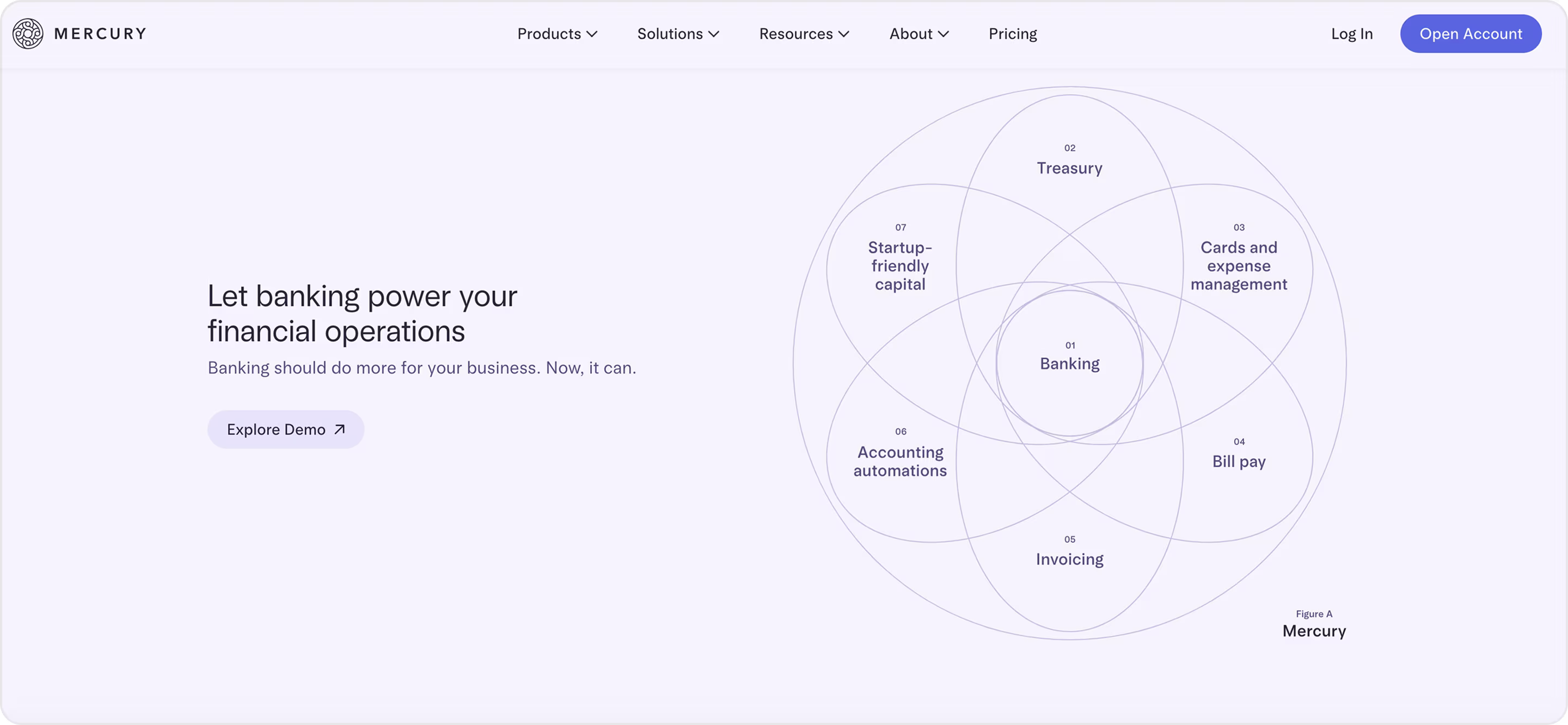
Why is this design impressive?
- Dashboard, cards, and transfers appear above the fold, so you understand the core workflows in seconds.
- Plain-English compliance.
- You can scan the suite and plan your rollout fast.
- Clear paths for company formation / international founders show you can start even without a U.S. entity.
Takeaway for founders
- Show the first mile. Prospects imagine day-one value and finish KYC more often.
- Place compliance next to action.
- Group features under 4–5 clear pillars.
- Publish “what you’ll need.” List documents for verification right on the page.
- Create a lane for global founders. Spell out incorporation and onboarding options.
19. Plaid
Plaid is the finance data network behind bank connections, account verification, payments, and identity.
Why is this design impressive?
- The page starts with the problems finance products solve and then routes you to the right solution.
- Outcome → product map.
- Security badges, coverage stats, and regulatory language appear near action.
- Simple diagrams and flow visuals show where Plaid sits in your stack.
- Regional clarity.
Takeaway for founders
- Lead with a business problem your product solves.
- Show the build recipe. For each use case, list the 2–4 components required.
- Use a simple architecture diagram. One graphic can answer five technical questions and cut a week of emails.
- Publish a rollout plan.
- Tie each module to a KPI (fewer failed payments, faster payout, lower fraud).
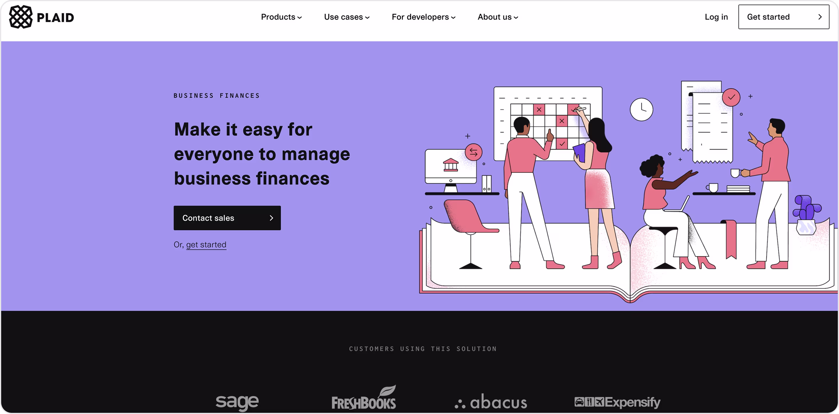
20. Players Health
Players Health provides insurance, athlete-safety tools, and finance services for youth sports, fitness clubs, sports schools, and sports brokers/agents. Its goal is to reduce risk and protect young athletes. Players Health partnered with Arounda to get an innovative UI/UX, website, and MVP design.
Why is this design impressive?
- Crystal-clear product map. From the header, you see the three pillars (Insurance, Athlete Safety, and Financial Services).
- Segmented by audience, so it routes each stakeholder to a tailored story.
- Enterprise-grade operations up top.
- Trust through mission and proof.
- Depth where risk lives. Solution pages spell out coverages and safety tooling, explain all risks, solutions, and benefits for maximum clarity.
Takeaway for founders
- Route by role/sector with relevant proof faster.
- If you have claims, certificates, or compliance, link them in the header.
- Show the hard stuff plainly. List coverages, controls, and safety workflows in simple bullets.
- Lead with mission + outcomes. Open with a human promise and back it with partners or news.
- Design a measurable first mile. For this project, we simplified onboarding into clear steps, defined the account/sub-account hierarchy, and reduced clicks to purchase an insurance policy.
21. Payoneer
Payoneer is a global payments platform for SMBs and enterprises. Their clients can receive and send cross-border payments, hold multi-currency balances with local receiving accounts, withdraw to a bank, issue payouts, and use other banking services.
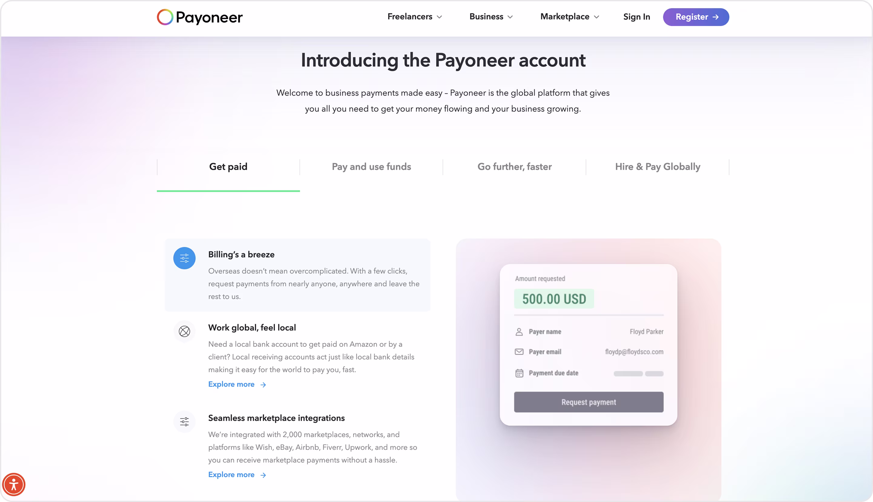
Why is this design impressive?
- Outcome-first hero with clear value in one scan and a single primary CTA.
- Visualizes the hard concept.
- Transparent pricing hub.
- Use-case navigation.
- Enterprise-grade payouts story.
Takeaway for founders
- Use one promise + one action to lift conversions.
- Explain complex money flows with a picture.
- Publish fees early.
- For payouts or APIs, add a 1-2-3 diagram and a brief developer blurb beside the CTA. It calms engineering concerns and boosts demo requests.
- Show local details.
22. Deel
Deel is a global HR and payroll platform to hire, pay, and manage teams in 150+ countries. Contractors, EOR employees, and in-country payroll are on one system.
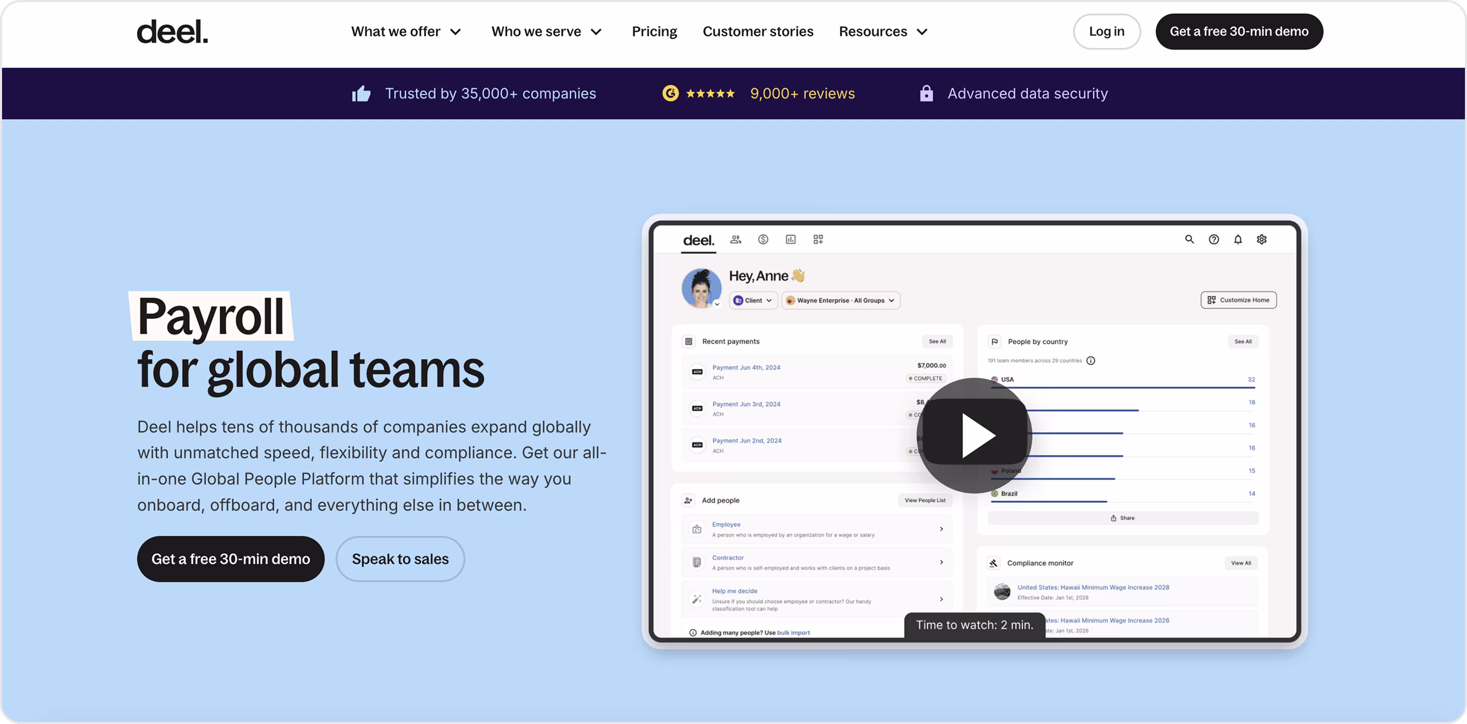
Why is this design impressive?
- “Hire, pay, and manage teams in 150+ countries” – one line, one promise, and an obvious CTA. Visitors know the value in seconds.
- Tidy structure, where each path explains the job it solves.
- A transparent pricing hub and help center specifics set expectations before signup.
- SOC and ISO badges are on a security page you can reach in one click.
Takeaway for founders
- Put your global coverage or scale metric in the hero to win exec attention and lift demo clicks.
- Group pages by jobs-to-be-done.
- Make pricing a trust play.
- Show global readiness with proof.
- Add a three-step start module (Book a call → Create account → Run first payroll) for more conversions.
Now let’s shift to Web3 and crypto to see good website design examples that turn wallet connect, swaps, staking, and KYC into secure journeys.
The Best Web3 & Crypto Designs
Web3 UX has zero chance for confusion. One unclear step and people close the tab, so the best crypto designs must make every high-risk action simple and safe.
23. Unlocks Calendar
A Web3 analytics platform that tracks upcoming token unlocks so investors can forecast supply, spot catalysts, and plan strategy. Arounda partnered with Unlocks Calendar and designed the product UI/UX and website.
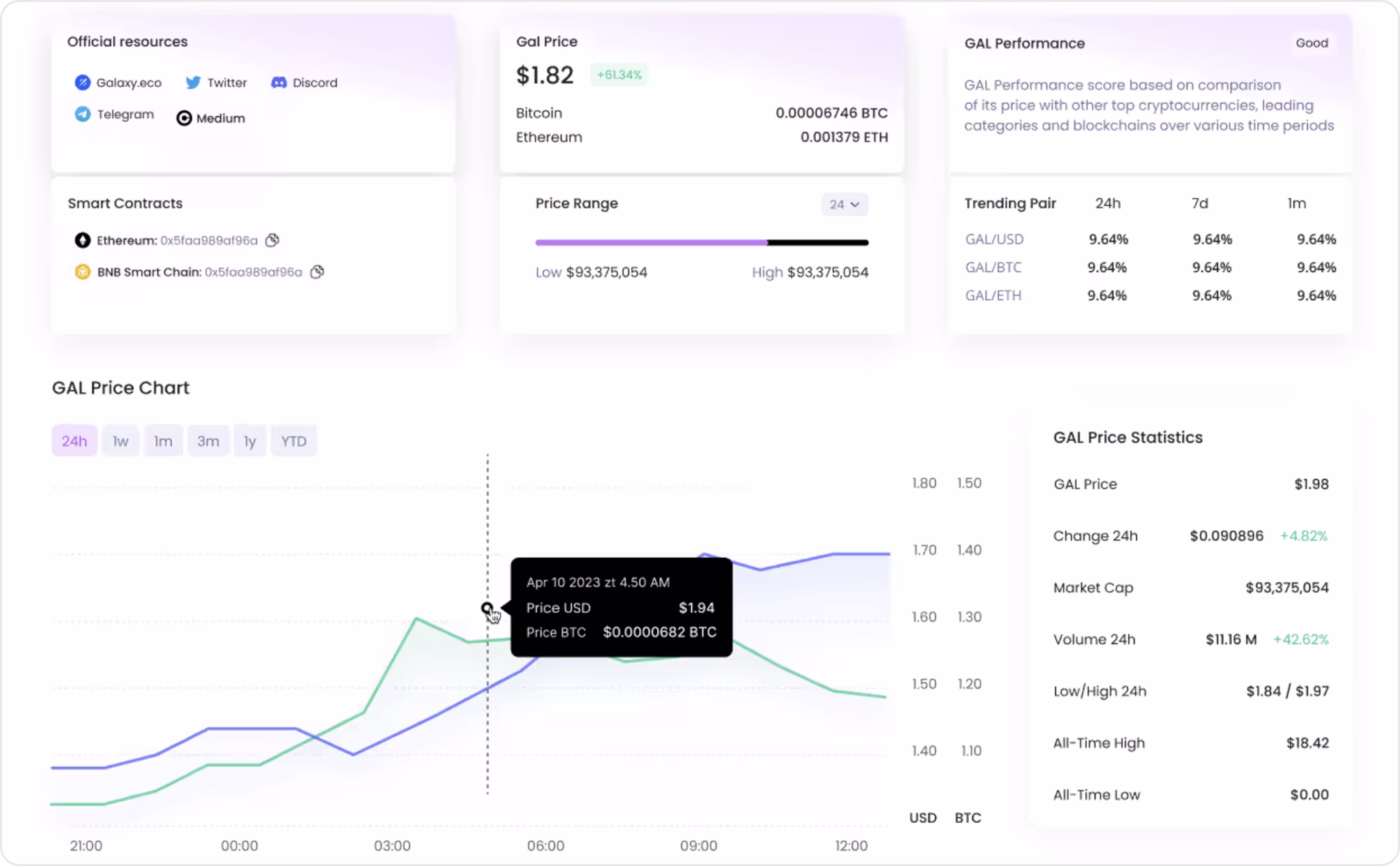
Why is this design impressive?
- We prioritized a clean event timeline and readable data cards, so users grasp “what unlocks, when, and how much” in one scan.
- Decision-first layout. Key context (project, date, amount, notes) appears before deep details.
- Simple subscription on the site keeps analysts alerted to new or revised unlocks without extra clicks.
- Proven UX cleanup. Our audit resolved over 15 usability issues that hindered comprehension and flow.
Takeaway for founders
- Lead with the one metric that drives action.
- Design for “scan → decide.” Use concise cards, consistent labels, and sortable lists. Avoid dense tables on mobile devices because they reduce bounce rates on volatile days.
- Automate re-engagement. Add lightweight email/alerts for watchlists. It compounds retention without adding app complexity.
- A quick UX audit to remove micro-frictions can lift comprehension and conversions immediately.
24. Ledger
Ledger Enterprise is a self-custody platform for institutions (custody, trading, staking, tokenization, and NFT management), built on Ledger’s hardware security.
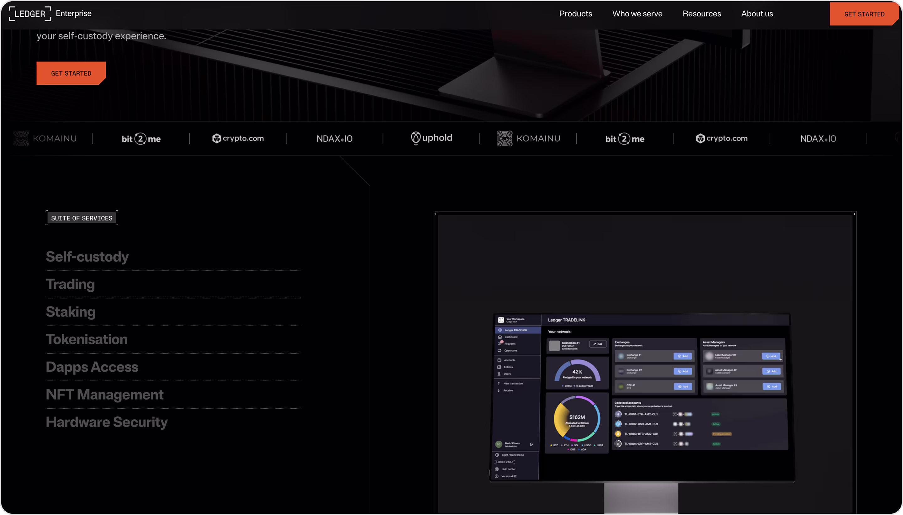
Why is this design impressive?
- The homepage maps the full platform in one scan.
- Segmented by buyer.
- Trust near action.
- Proof that calms risk.
- Clarity in content.
- Effective, beautiful Web3 style.
Takeaway for founders
- Put all product pillars with crisp labels above the fold.
- Route by role/segment.
- Publish operational claims with named testimonials. That’s enterprise-grade proof.
- Explain your risk model plainly.
- Consider incorporating Web3 design approaches to stay competitive.
25. Coinbase Institutional
Coinbase serves companies, institutions, and startups/SMBs for trading, financing, and qualified custody.
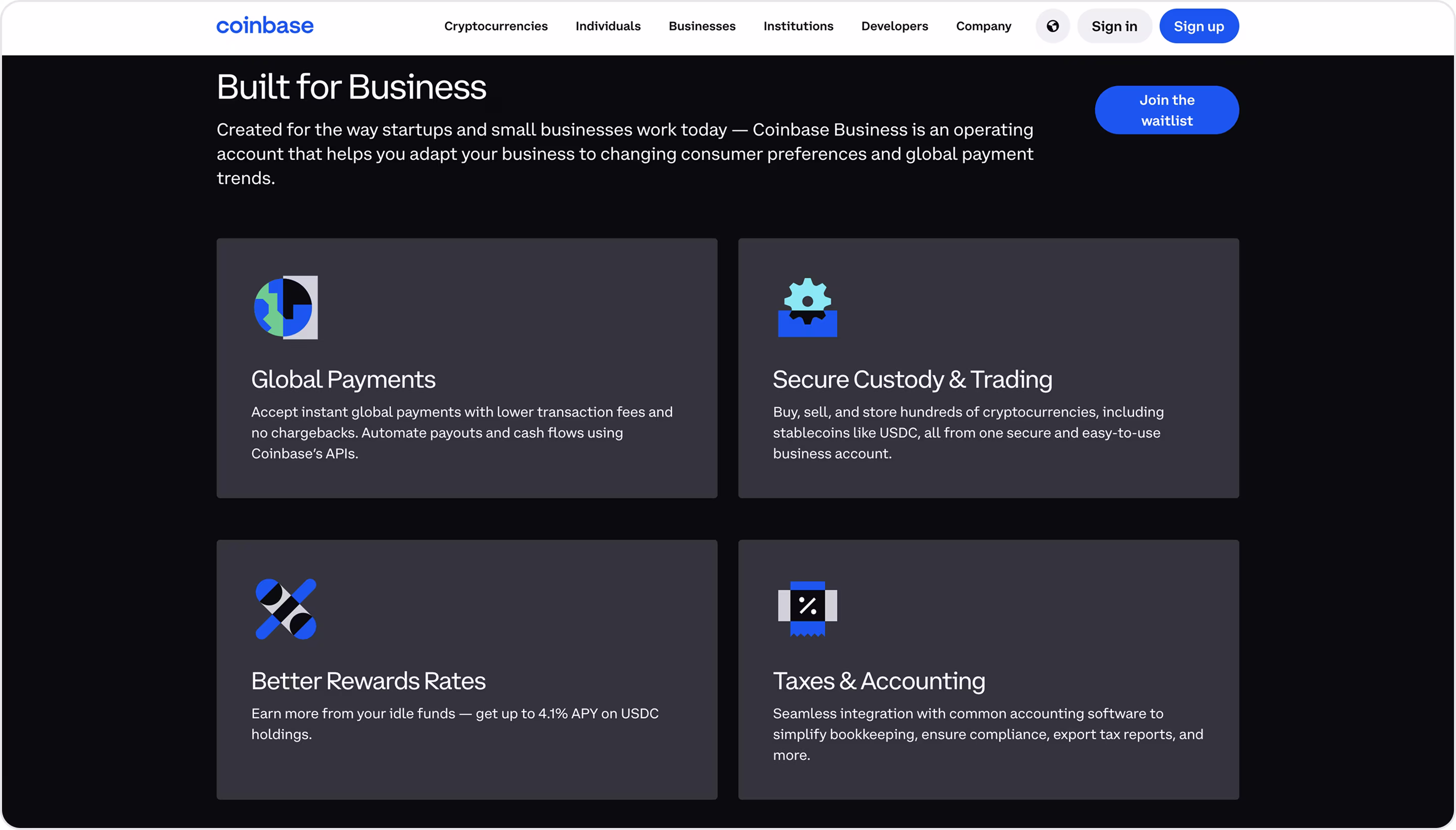
Why is this design impressive?
- ICP segmentation in the global navigation.
- Modular “pillar” layout.
- Compliance and status are close to conversion.
- Content adjacency for evaluators.
- Card-based feature system for SMB.
- Friction-aware microcopy.
Takeaway for founders
- Create top-level lanes by audience.
- Organize your suite into 3–5 modules with identical structure (title, 2–3 lines, visual, CTA).
- Add a compact metrics grid beside or just after the core pitch to lift trust without long copy.
- Pin docs, help, and insights in the primary nav so technical and risk teams can quickly validate.
- Adopt card systems for benefits.
- Use microcopy to reduce friction.
26. Zerion
Zerion is a smart, non-custodial Web3 wallet and portfolio tracker. One place for tokens, DeFi, and NFTs across Ethereum, Solana, and 50+ EVM networks.
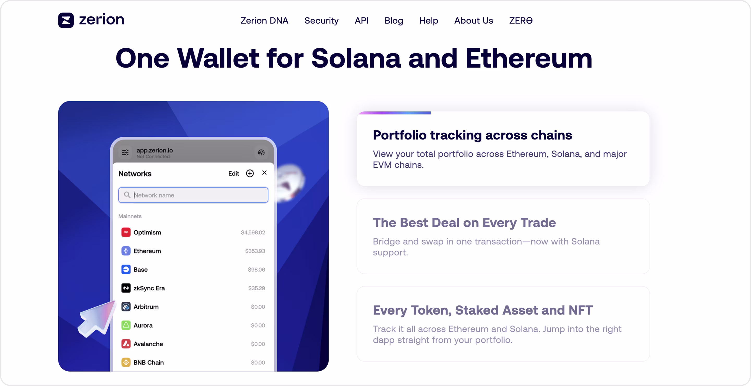
Why is this design impressive?
- The hero describes the whole product.
- A multichain grid and short, plain lines explain cross-chain actions without jargon.
- Trust is built into the UI.
- The web app lets people connect a wallet and explore before importing or creating one.
- One design system for many devices.
Takeaway for founders
- Show the system, visualize networks, and core actions with short labels.
- Add human-readable transaction previews and approval warnings near the confirm button.
- Let visitors track wallets or portfolios without creating one yet.
- Design for device reality.
27. MetaMask Institutional
MetaMask Institutional is MetaMask’s offering for organizations that brings custodial integrations, portfolio controls, and DeFi access to funds, fintechs, and enterprises.
Why is this design impressive?
- Single-product architecture for many audiences with familiar flows.
- Content clusters around clear capabilities.
- The design leans on integrations to show governance choice and compliance readiness.
- Plain-English risk framing.
Takeaway for founders
- Unify surfaces to reduce cognitive load. Familiar patterns → faster adoption and fewer tickets.
- Tell the integration story visually.
- Keep evaluators in flow.
- Explain the risk model in human words.
28. Chainalysis
Chainalysis is the blockchain data platform behind investigations, compliance, and risk for governments, exchanges, and financial institutions.
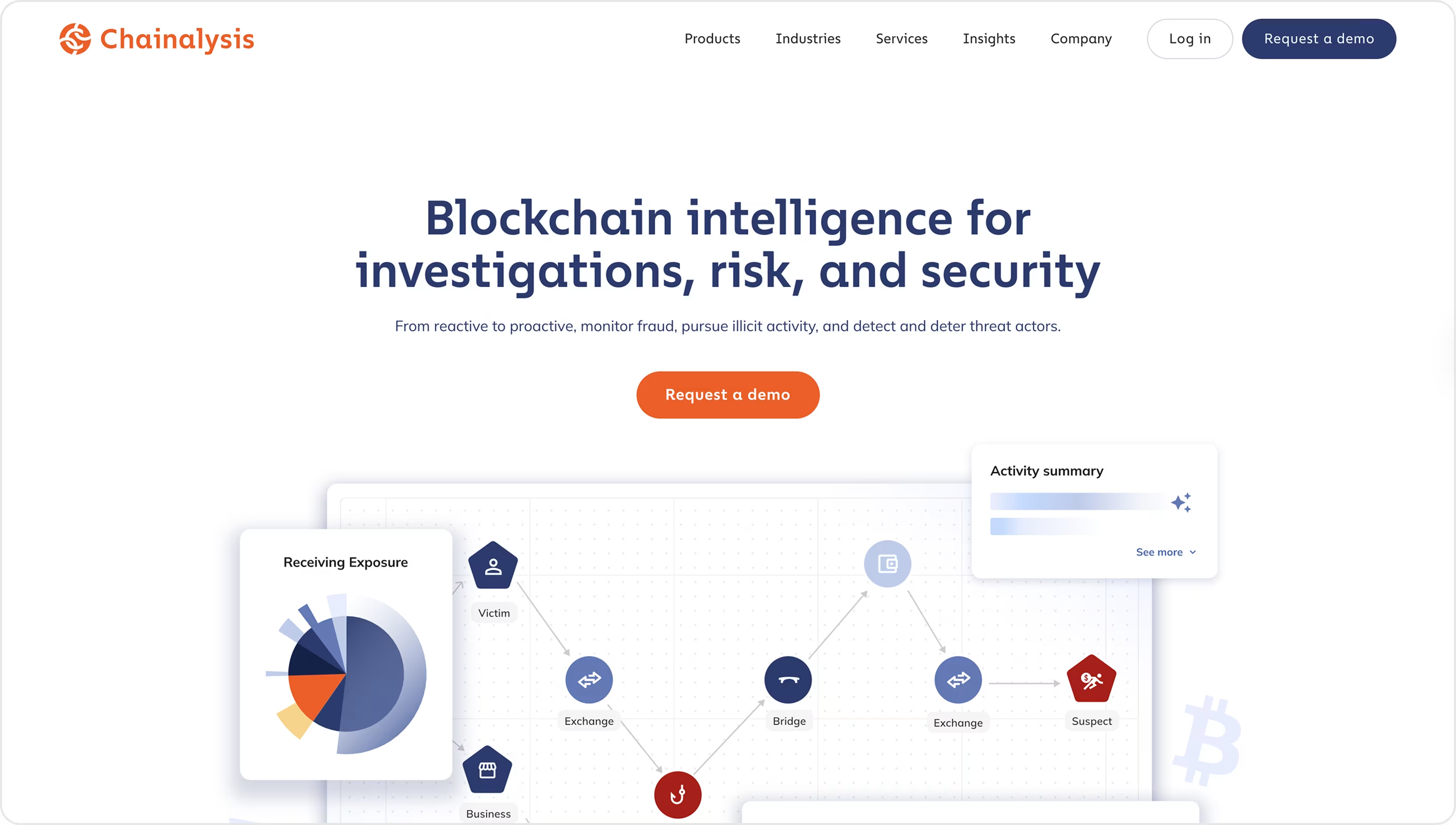
Why is this design impressive?
- Audience-first routing.
- Clear product pillars.
- Use-case pages with solutions and the components you’ll use.
- Academy lessons and certification programs are near the product narrative.
Takeaway for founders
- Give each product the same card pattern.
- On each use-case page, list the exact components buyers will use. It reduces perceived integration risk and accelerates internal approvals.
- Link current research or reports from product pages. Fresh numbers build trust.
- Place training/certification links next to CTAs. When analysts can upskill and validate fast, demo acceptance and close rates rise.
29. Marketspotter
A Web3 trading platform with advanced indicators that turns complex market data into clear insights. Marketspotter partnered with Arounda to redesign the product UI/UX and website.
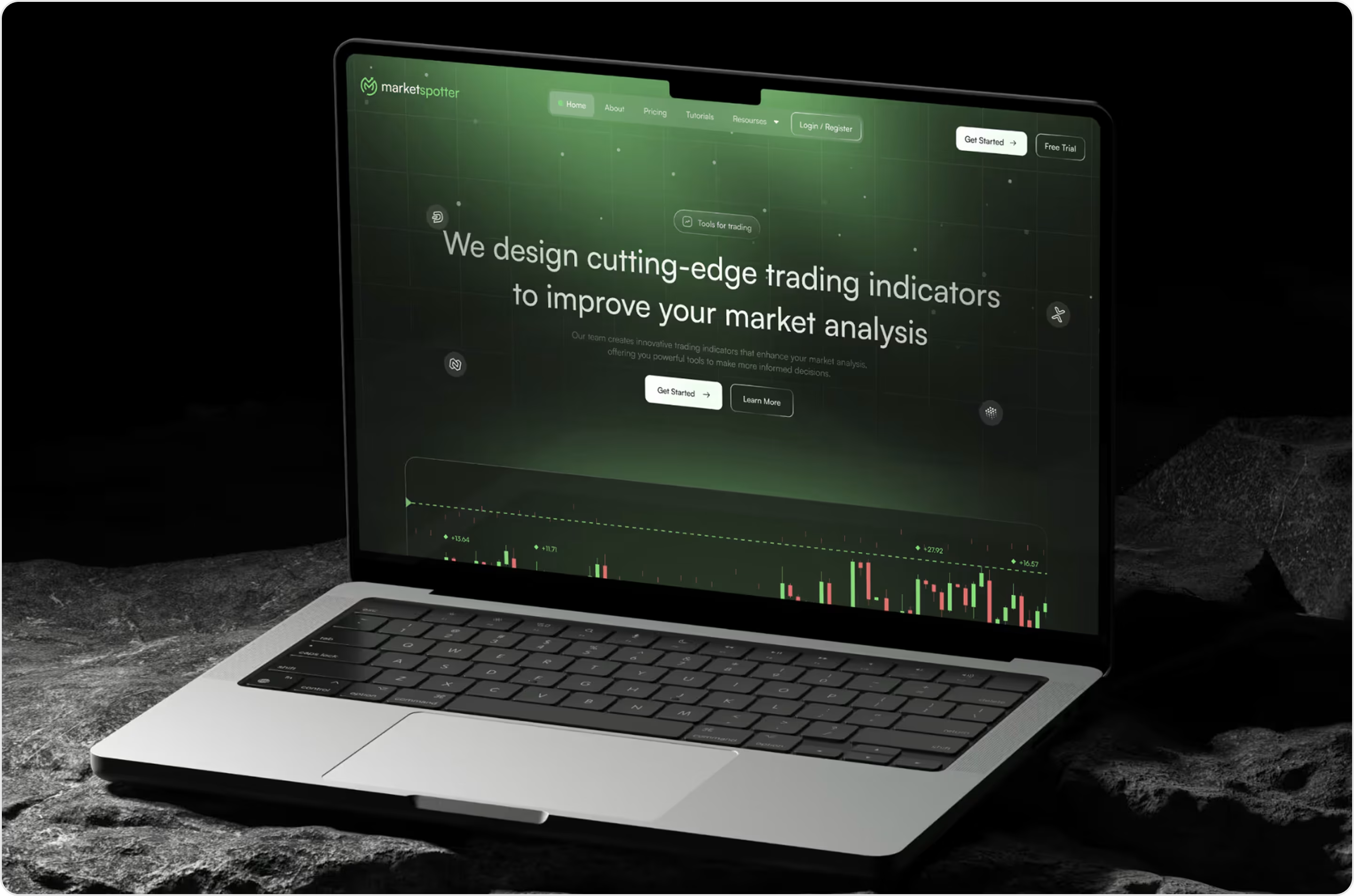
Why is this design impressive?
- We replaced messy, hard-to-scan charts with clean visuals and a tighter hierarchy.
- Key context appears before deep detail.
- Micro-interactions reveal more only when needed.
- A touch-friendly, responsive system keeps the same focus and speed on phones.
- Onboarding drop-off down 28%, mobile usage share up 50%, user engagement up 35% after the redesign.
Takeaway for founders
- Put “what/when/how much” up top; hide the rest behind progressive reveal.
- Use bold type, spaced grids, and consistent card patterns so eyes land on signals, not noise.
- Trim signup to essentials and show real value in the first session.
- Make mobile a first-class citizen.
- Create a compact design system, so brand trust grows with every release.
30. BitGo
BitGo is an institutional digital-asset platform. For businesses, it combines qualified custody, real-time settlement, and access to liquidity from one UI and API.
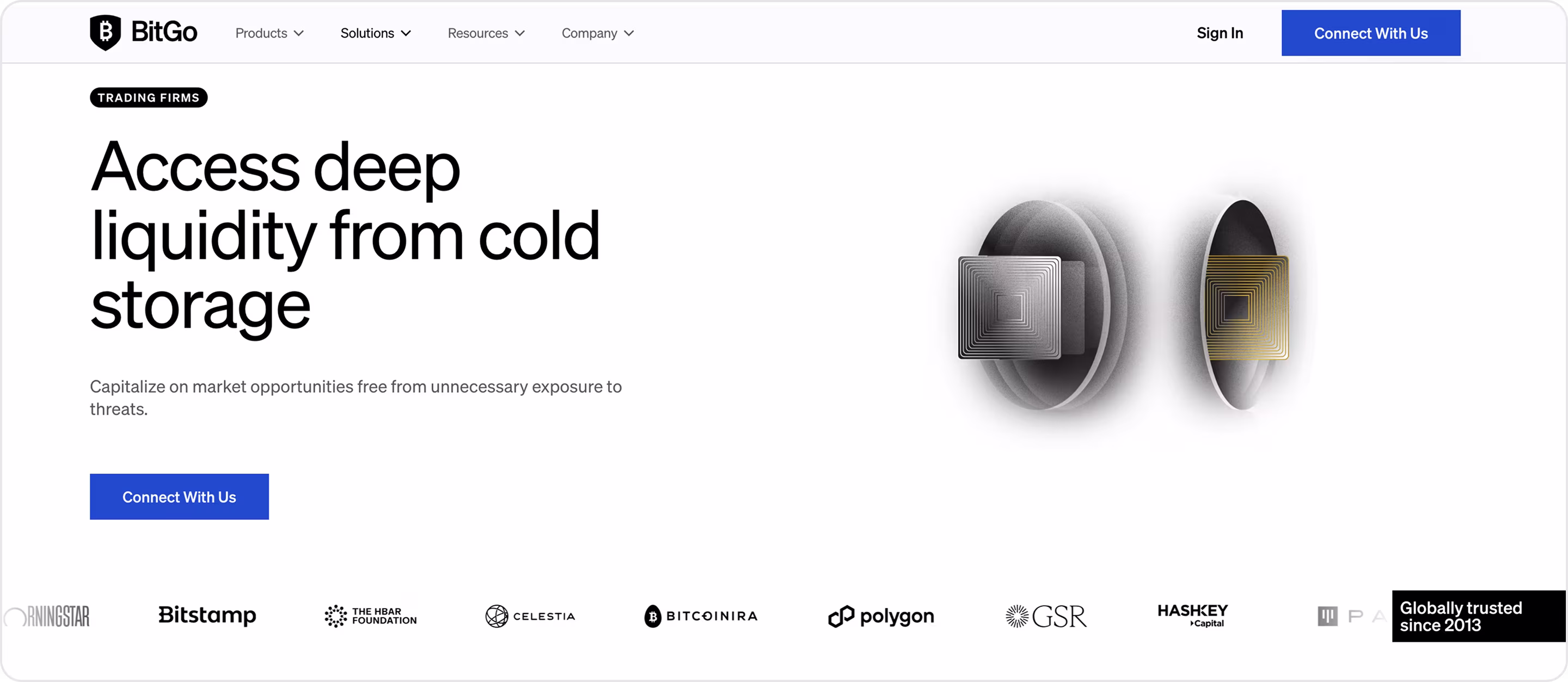
Why is this design impressive?
- Outcome + risk posture in one line.
- Clear, scannable, and benefit-first design.
- Trust near action.
- Network story with concrete paths.
- Credibility cues baked in.
- Security depth is one click away.
Takeaway for founders
- State the win and the protection together.
- Summarize the platform in three benefits that users remember.
- Tell the network story with modules.
- Segment by trading archetype.
- Keep proof within one scroll.
31. Fireblocks
Fireblocks is an institutional digital-asset platform that offers direct custody (MPC), Wallets-as-a-Service, payments, tokenization, Fireblocks Network, APIs, SDKs, and docs for builders.
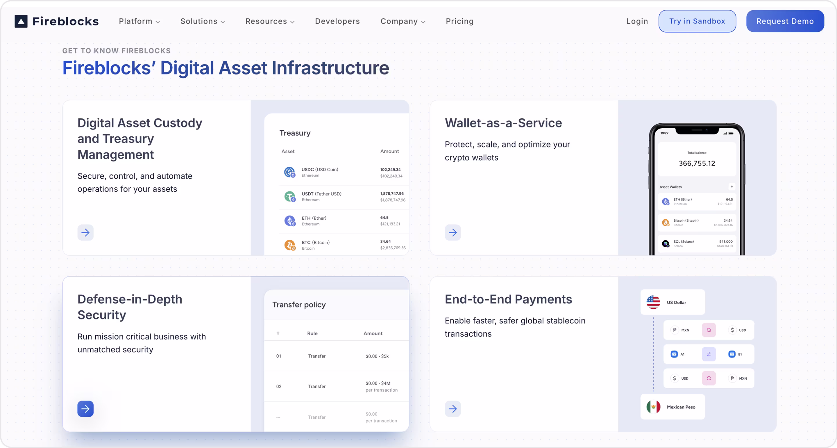
Why is this design impressive?
- The site frames the suite as modular, each with a short benefit line and a focused CTA.
- Segmented by real use cases.
- Proof with numbers, metrics, and names.
- The network story is visible.
- Blog and partner updates highlight current scale and new integrations.
Takeaway for founders
- Name each pillar, add a one-line outcome, a visual, and a single CTA.
- Tell the network effect.
- Educate in plain English.
- Use quantified customer stories.
- Show deployment paths.
32. Alchemy
Alchemy is a complete Web3 development platform for apps, wallets, and rollups.
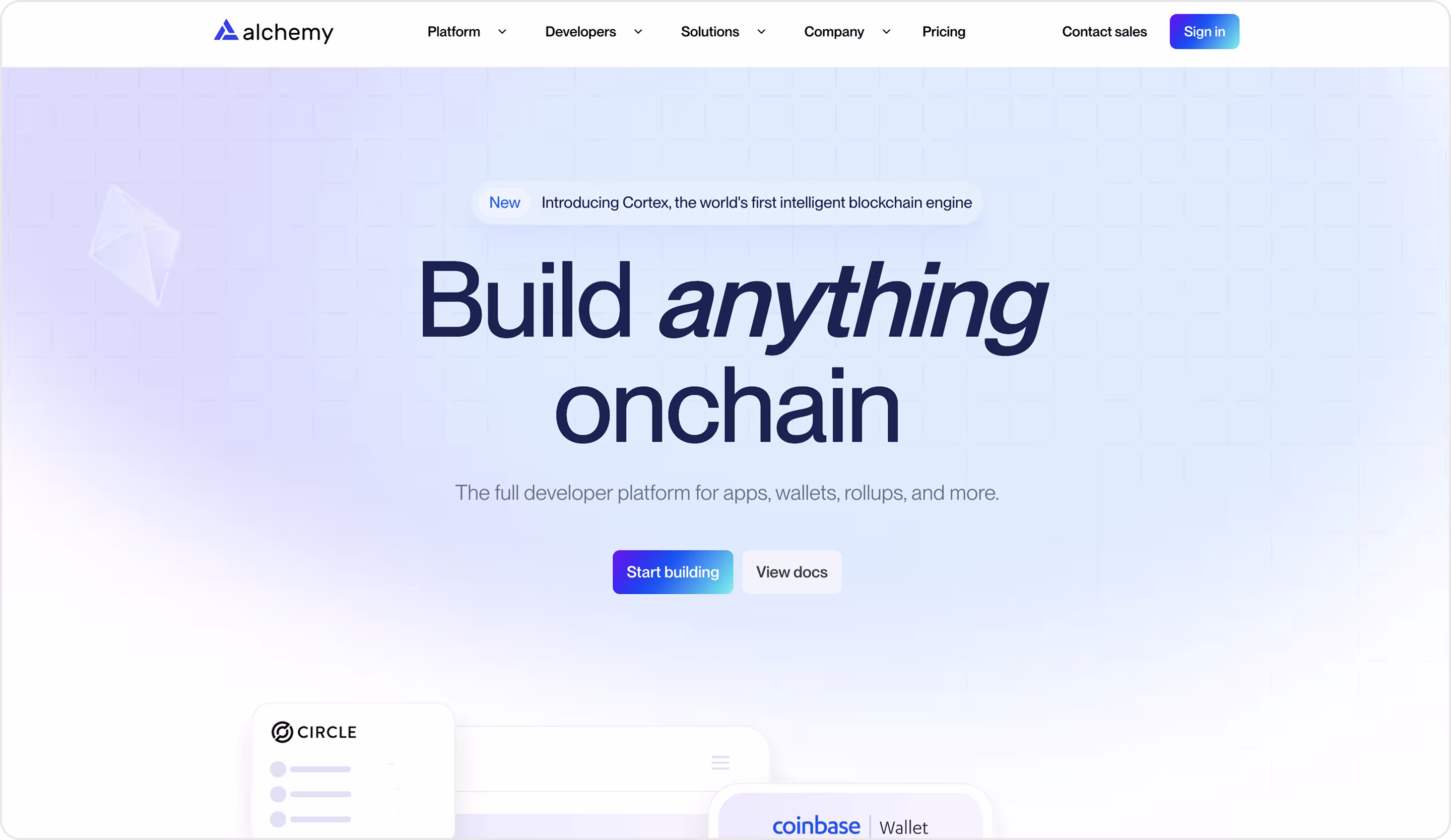
Why is this design impressive?
- Persuasive microcopy.
- Crystal product pillars, each with a short explainer and guide links.
- Economic clarity.
- Ecosystem proof.
- New pillars are flagged right on the homepage.
Takeaway for founders
- Run dual CTAs for two buyers.
- Package your suite into 3–4 pillars.
- Use plain-English risk reducers.
- Place the docs and capabilities next to the button.
- Make pricing legible to finance.
- Show ecosystem context.
33. Celo
Celo is an Ethereum L2 built for real-world use. It’s mobile-first, low fees, and a strong ReFi (regenerative finance) ecosystem.
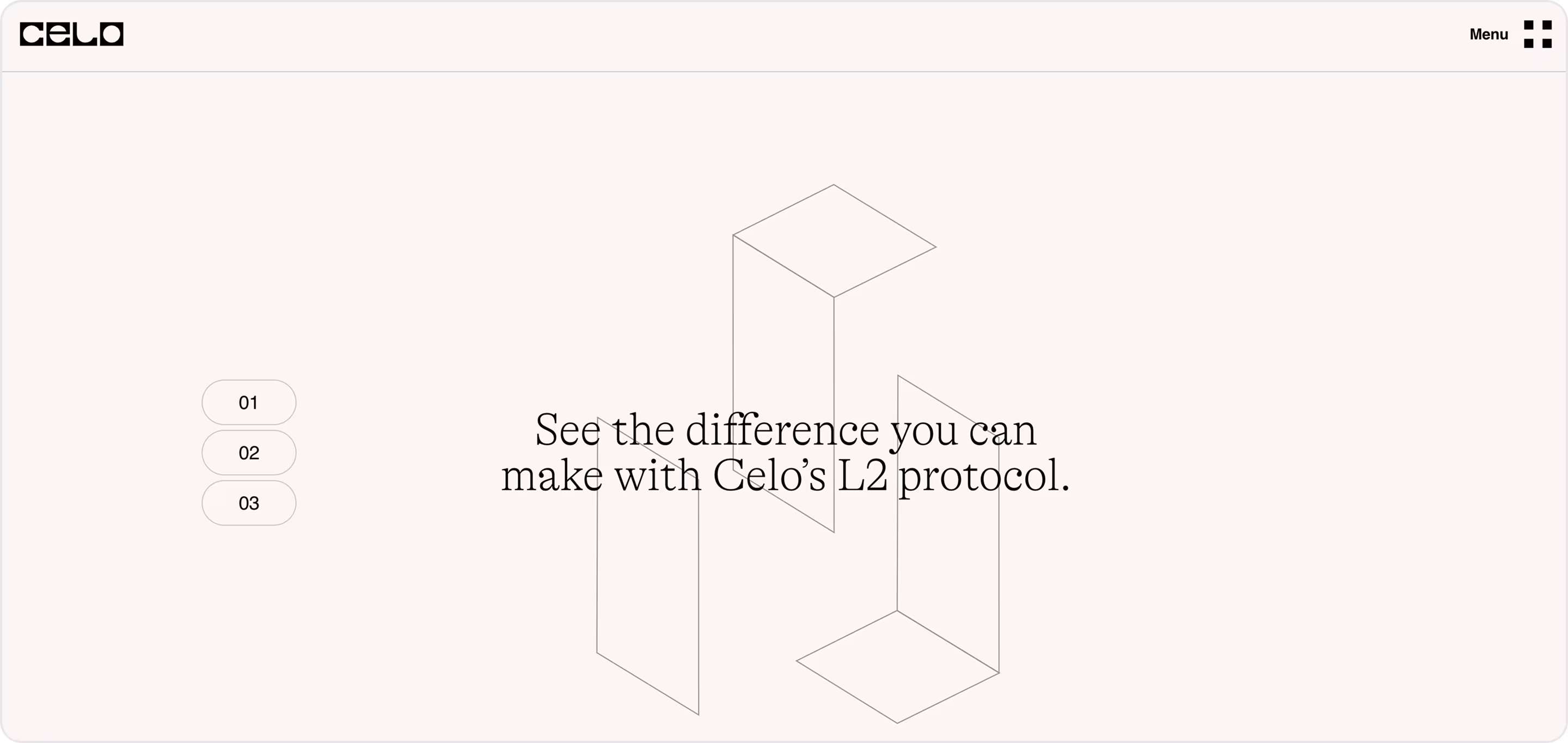
Why is this design impressive?
- Minimalistic, clear design.
- Proof-as-metrics near the fold.
- Mobile-first story, spelled out.
- Use-case tiles over features.
- Audience lanes in the nav.
- Conversion helpers in the footer.
Takeaway for founders
- State category + differentiator in the hero.
- Quantify trust early.
- Route by audience from the header.
- Sell by use case.
- Show your network.
- Surface Docs, Security, Kits, and White papers in one viewport.
Now we shift to AI. Let’s see website style examples that turn model power into simple flows, plain language, and clicks that convert.
The Best AI Product Designs
AI products demand interfaces that balance complex functionality with clarity and trust. The nicest AI product designs showcase clean layouts, seamless onboarding, and intuitive data visualization. Good website design is just as important as powerful algorithms.
34. Shopify Magic
Shopify Magic is Shopify’s suite of built-in AI features. It’s embedded across the admin to help merchants start, run, and grow faster.
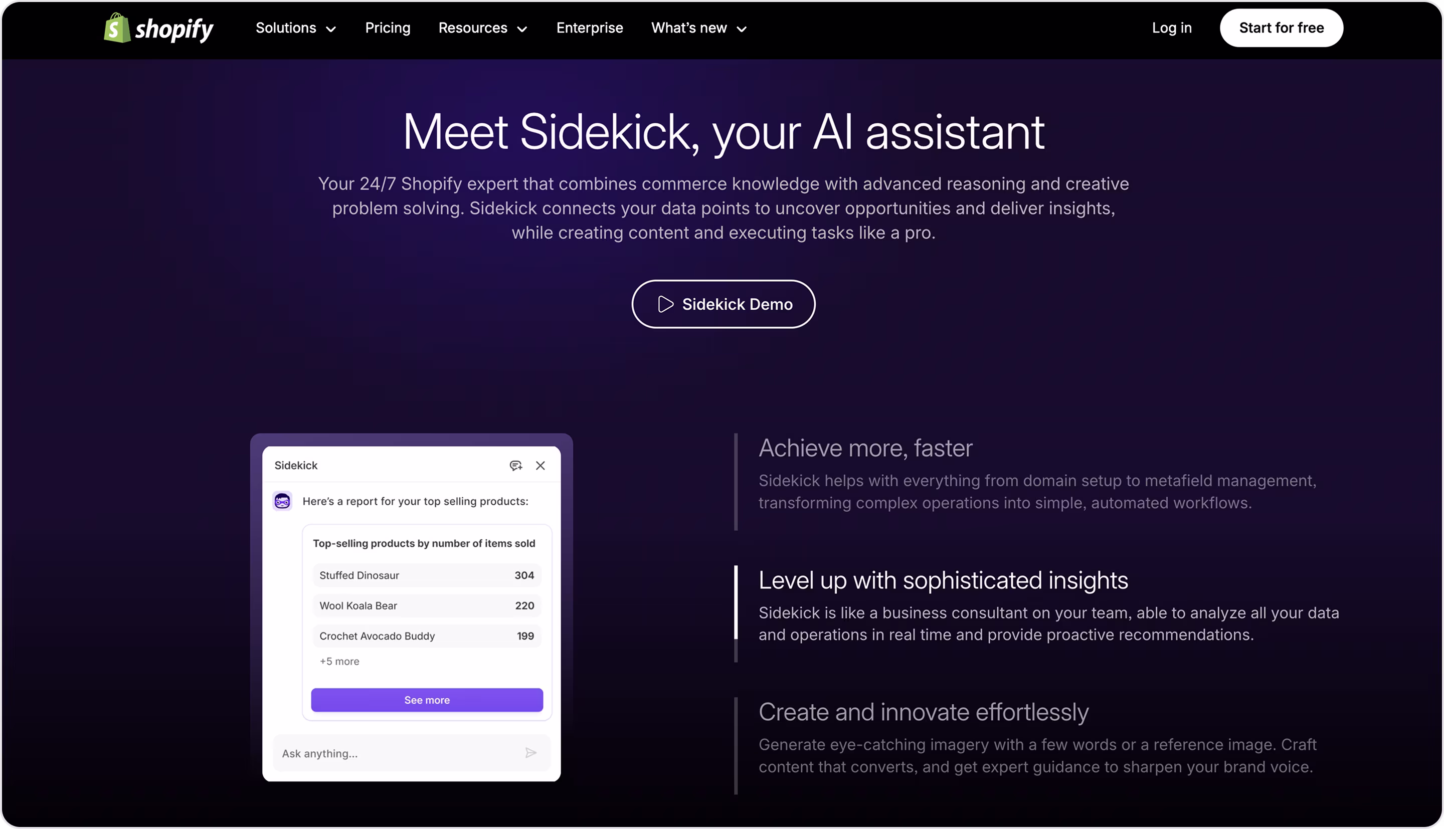
Why is this design impressive?
- One system, many surfaces with a single mental model.
- Scannable pillar cards.
- Most Magic tools are free across plans with clear availability notes.
- Risk and policy clarity.
- The new AI Store Builder promises three complete store layouts from keywords.
Takeaway for founders
- Pair a simple promise with a tiny, visual demo.
- Make AI a layer, not a page.
- Package features as repeatable cards.
- Publish availability and privacy plainly.
- Keep the iconography consistent.
35. Flair
Flair is an AI-powered platform where teams create and manage agents, bots, and multi-step workflows. Flair worked with Arounda to get the UI/UX, website, and MVP design that is scalable and user-centered.
Why is this design impressive?
- The AI supports many workspaces per account with clear switching.
- Modular templates let users spin up flows fast.
- Find anything, anywhere. A global search spans agents, workflows, and data. It reduces time to value in complex setups.
- Real-time collaboration.
- Interactive charts and configurable panels surface KPIs next to actions.
- Reported gains include faster setup, better collaboration, higher satisfaction, and scalable handling of multiple data sources.
Takeaway for founders
- Design for multi-tenant reality.
- Provide a template library.
- Add a command-K/global search.
- Make collaboration native.
- Put KPIs next to actions. Interactive, customizable dashboards help operators decide without leaving the page.
- Invest in a design system to keep new agents, widgets, and pages consistent as you scale.
36. Jasper
Jasper is an AI platform for marketing teams with brand voice control, workflows, and content creation.
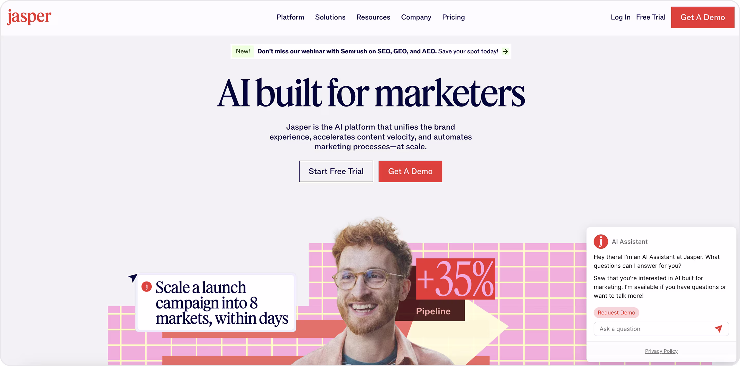
Why is this design impressive?
- One pattern for many stories (fast to read, fast to scale).
- The pages explain how Jasper enforces voice/tone/style and flags off-brand content.
Pricing, plans, and a 7-day free trial sit one click away, so teams can test without a sales call. - Proof via research.
- Role-based routing.
Takeaway for founders
- Use a consistent card layout (title → one-line outcome → visual → CTA).
- If brand or compliance matters, dedicate a page like Brand Voice that shows controls and pre-publish checks.
- Publish clear plans + free trial in one click from product pages so teams can test immediately.
- Back claims with fresh research.
37. MOJO CX
MOJO‑CX is a B2B SaaS platform for contact centers that unifies three legacy tools into one product and layers AI on top. It offers real‑time coaching, conversational prompts, and post‑call summaries. Arounda team designed MOJO CX product to improve conversion, engagement, and satisfaction rates.
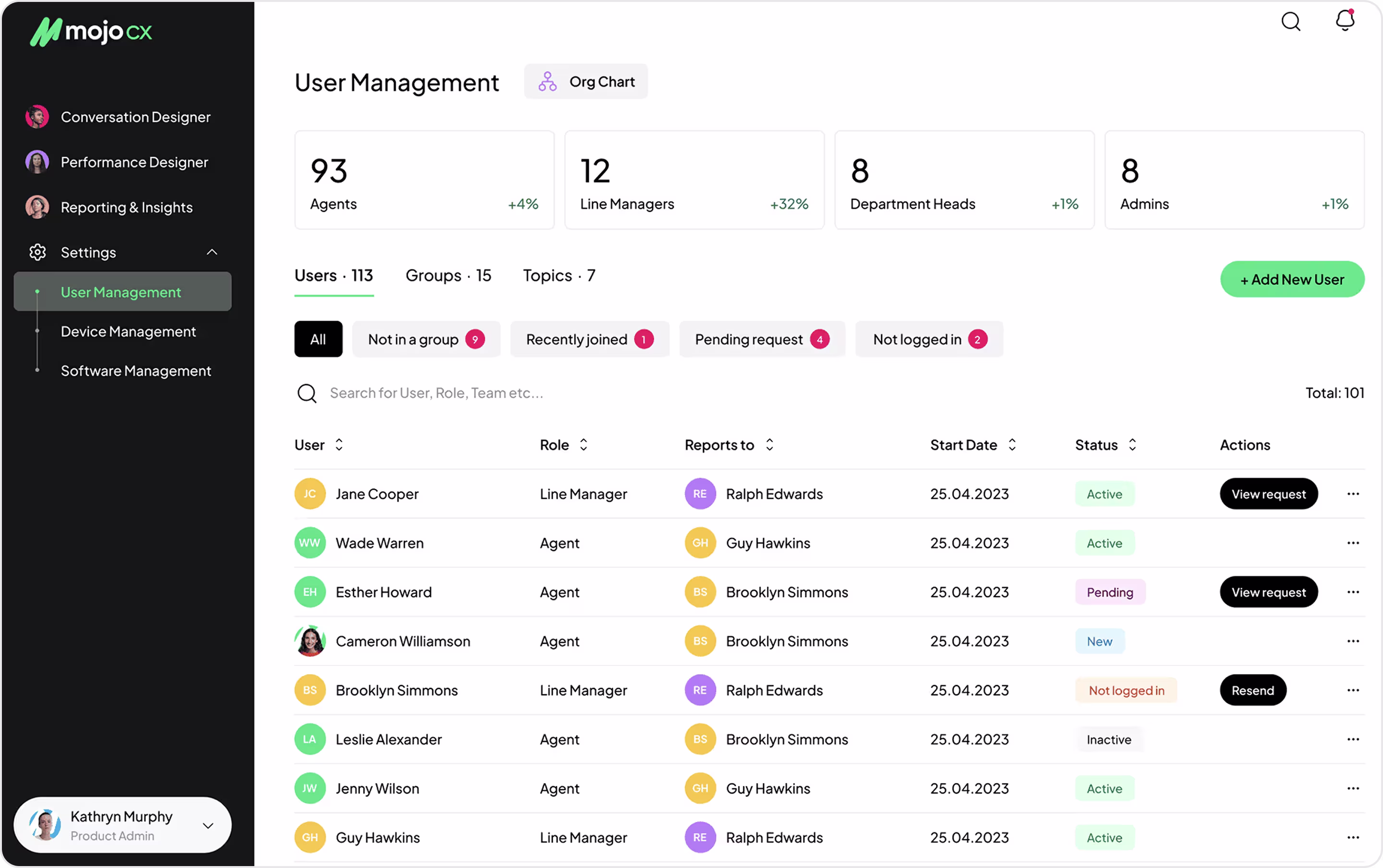
Why is this design impressive?
- The team merged separate products into a single, coherent information architecture.
- Role‑specific UX.
- The agent widget keeps call controls and AI coaching permanently accessible.
- High‑fidelity wireframes, app flows, and clickable prototypes de‑risked complexity early and aligned stakeholders before costly build.
- A restrained palette, logo‑inspired patterns, and a comprehensive design system create a professional B2B tone and scale across surfaces.
- Upfront competitive analysis informed feature prioritization and ensured parity where needed.
Takeaway for founders
- Unify fragmented workflows into one platform to cut costs and speed onboarding.
- Design per role, not per screen.
- Put guidance inside the primary task flow.
- Use flows, wireframes, and clickable prototypes to validate logic and reduce rework.
- Invest in a design system early.
- Let the brand support clarity and choose a timeless, minimal style that scales.
38. Synthesia
Synthesia is an AI video creation platform. It allows businesses to turn text into professional videos in minutes with realistic AI avatars and voiceovers without cameras, studios, or actors.
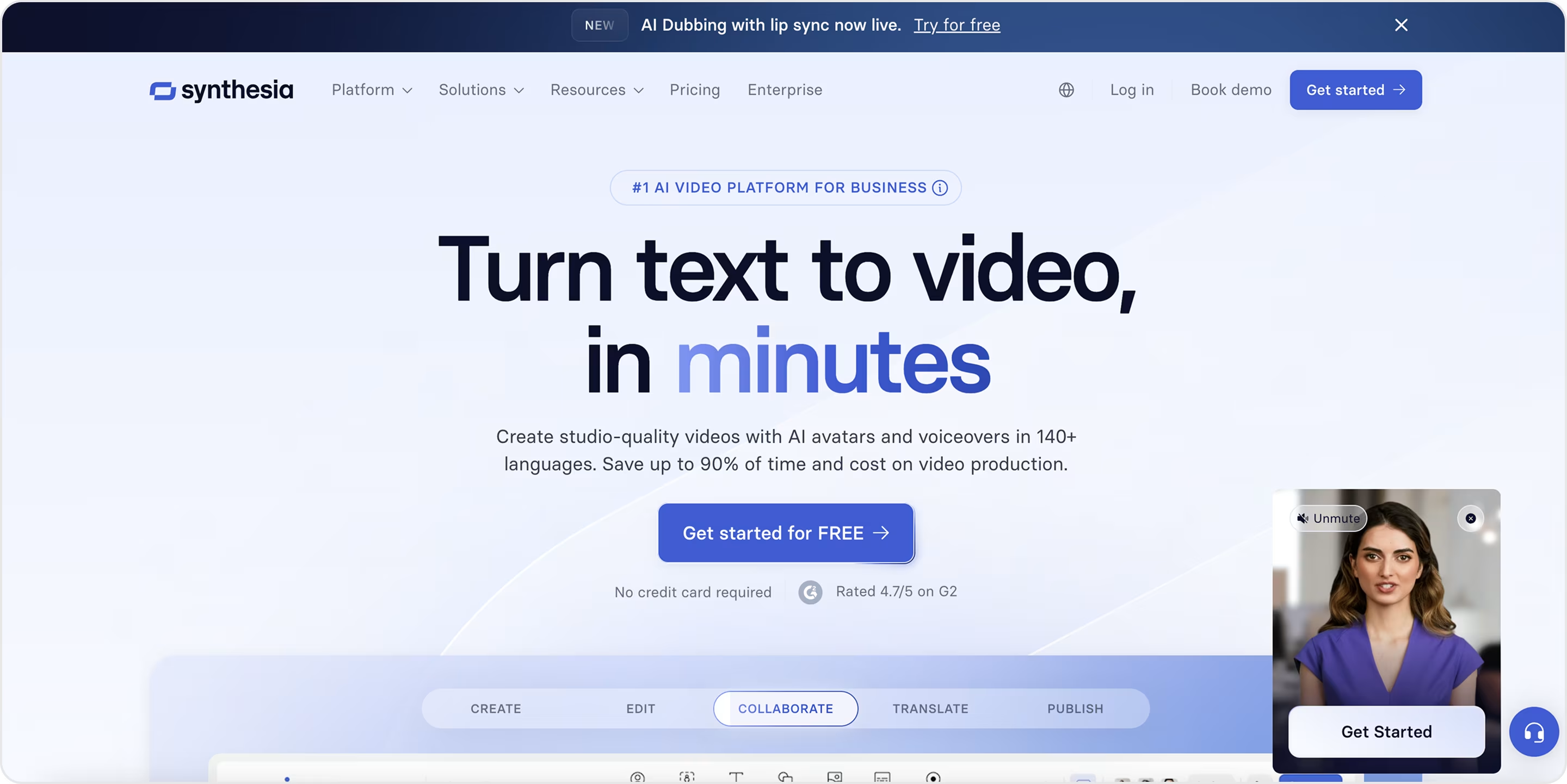
Why is this design impressive?
- Immediate value communication.
- Interactive product storytelling.
- The UI keeps things minimal and approachable.
- Trust and credibility signals.
- Consistent visual hierarchy.
- Conversion-optimized flow.
Takeaway for founders
- Demonstrate how AI powers your product visually in the first 5 seconds instead of explaining in paragraphs.
- Hide technical layers behind intuitive interfaces.
- Case studies, client logos, and security highlights are not “extras” but conversion drivers in B2B AI.
- Guide users through a clean funnel with CTAs at every stage.
- Minimal, professional design helps your AI product look credible to enterprises that may be cautious about new tech.
39. Copy.ai
Copy.ai is an AI-powered platform that helps businesses create marketing copy, blog posts, emails, and other content in seconds.
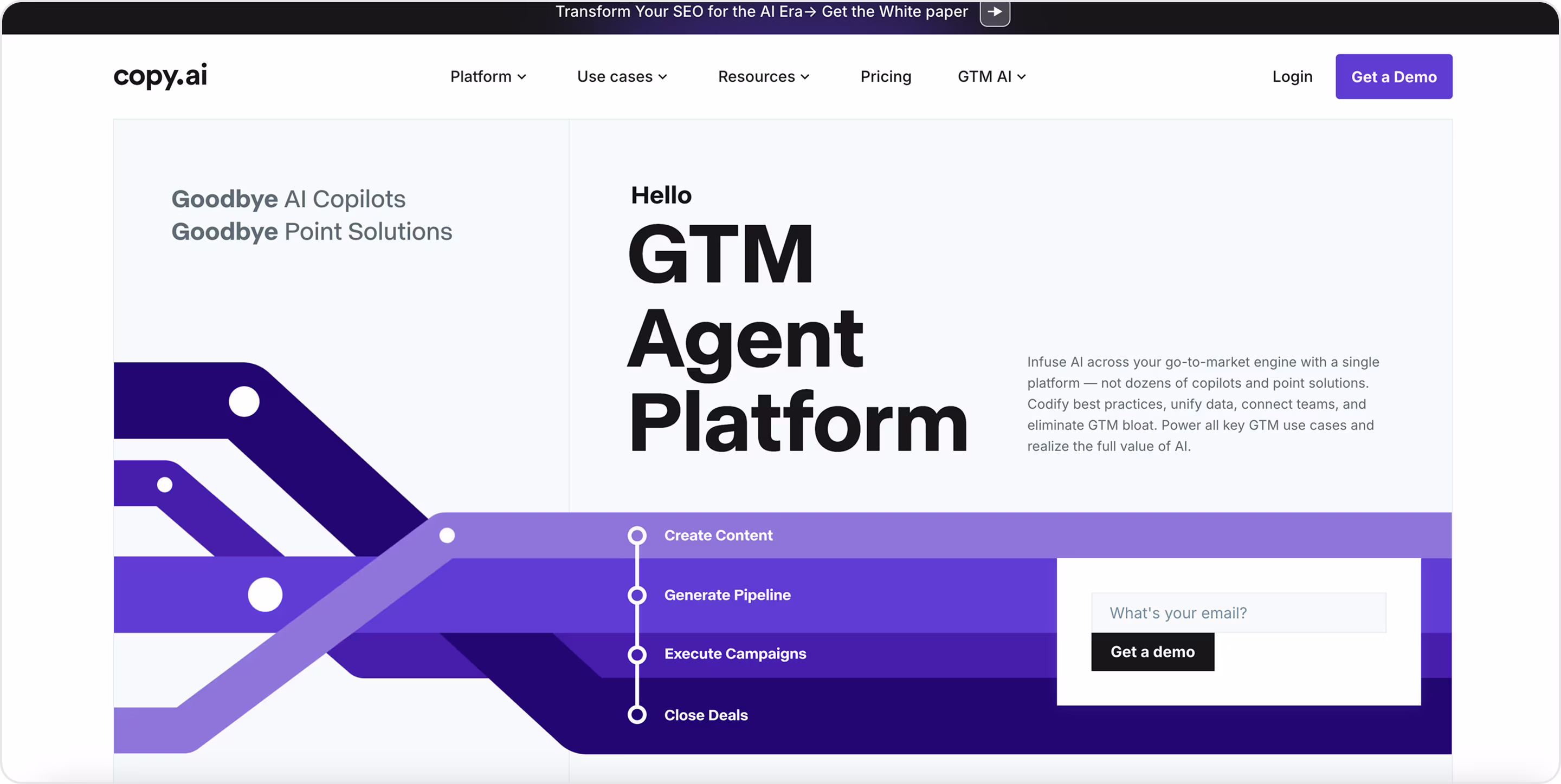
Why is this design impressive?
- Clear positioning right away.
- Strong product-led storytelling.
- Use-case driven navigation.
- Enterprise-friendly credibility.
- Modern, minimal design.
- Optimized for conversion.
Takeaway for founders
- Product previews and real templates help users picture success faster than words alone.
- Organize around use cases.
- Build credibility signals in. Enterprise clients look for proof.
- Drive multiple paths to action.
40. Descript
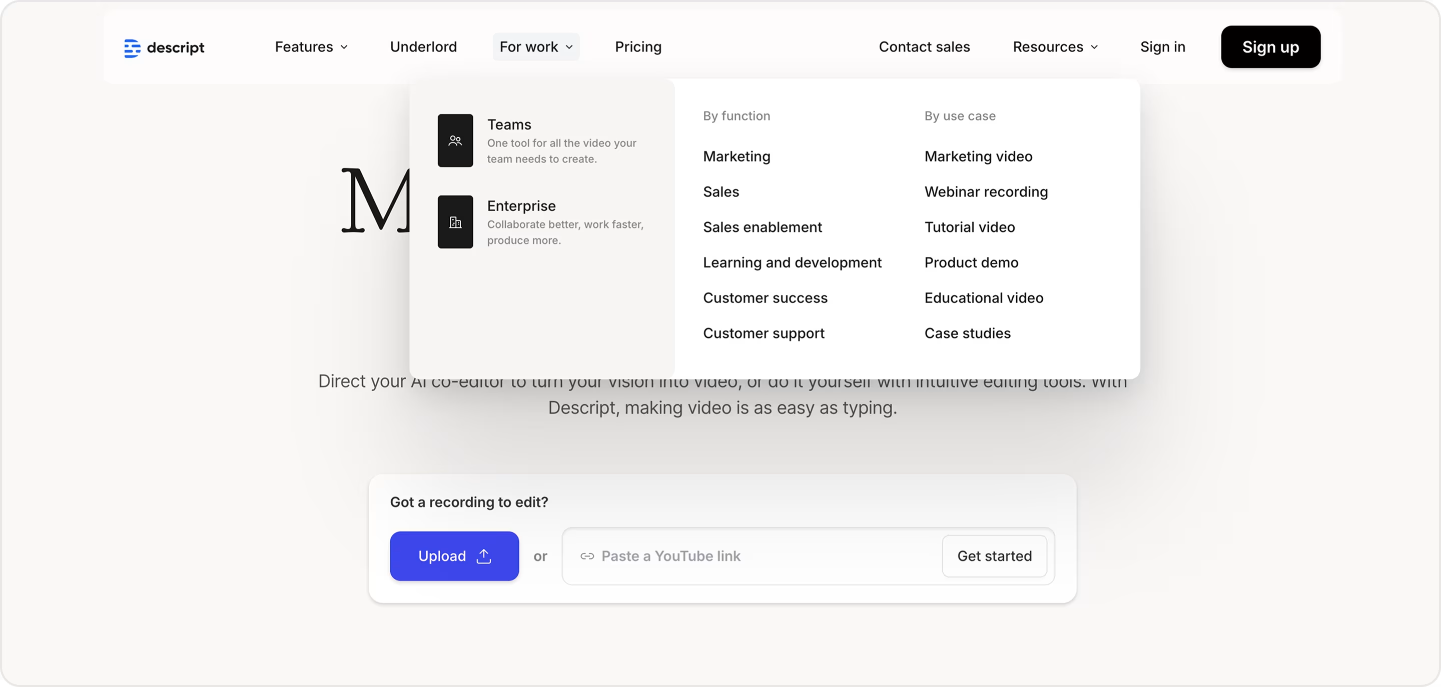
Descript is an AI-powered video and podcast editing platform. It lets users edit audio and video and offers AI voice cloning, screen recording, multitrack editing, and collaboration tools.
Why is this design impressive?
- Strong product demos.
- Playful yet professional visuals.
- Education-driven navigation.
- Clear segmentation.
- Conversion-friendly funnel.
Takeaway for founders
- Explain your product in one line.
- Show the product in action.
- Use brand personality wisely.
- Lower the learning curve.
- Design for all buyer types.
41. Rewind
Rewind is an AI-powered “searchable memory” for your life. It records everything you see, hear, and say on your computer, making it instantly searchable later.
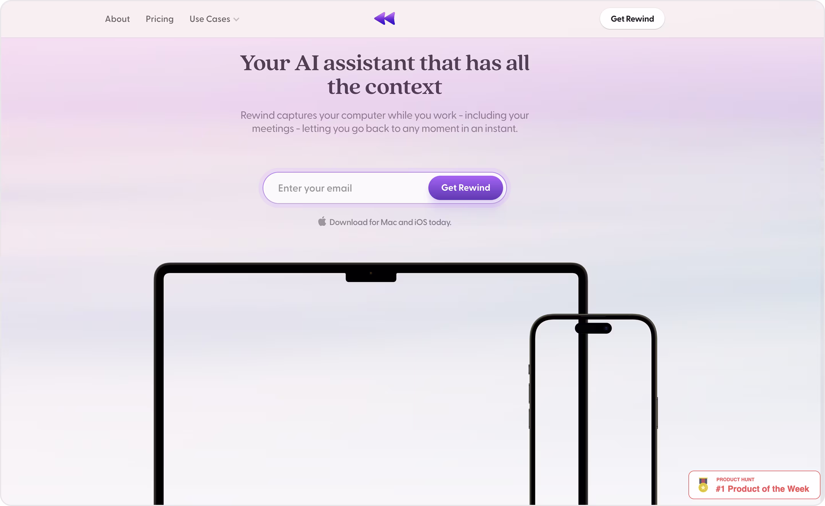
Why is this design impressive?
- Simple visuals and smooth animations.
- Clear product narrative.
- Trust and transparency focus.
- Use-case storytelling.
- Strong conversion flow.
Takeaway for founders
- Balance innovation with reassurance.
- Showing workflows and how tasks improve the business process makes value tangible.
- Use exclusivity wisely. Waitlists and early access can build anticipation while testing market fit.
- Design for trust.
42. Gamma.app
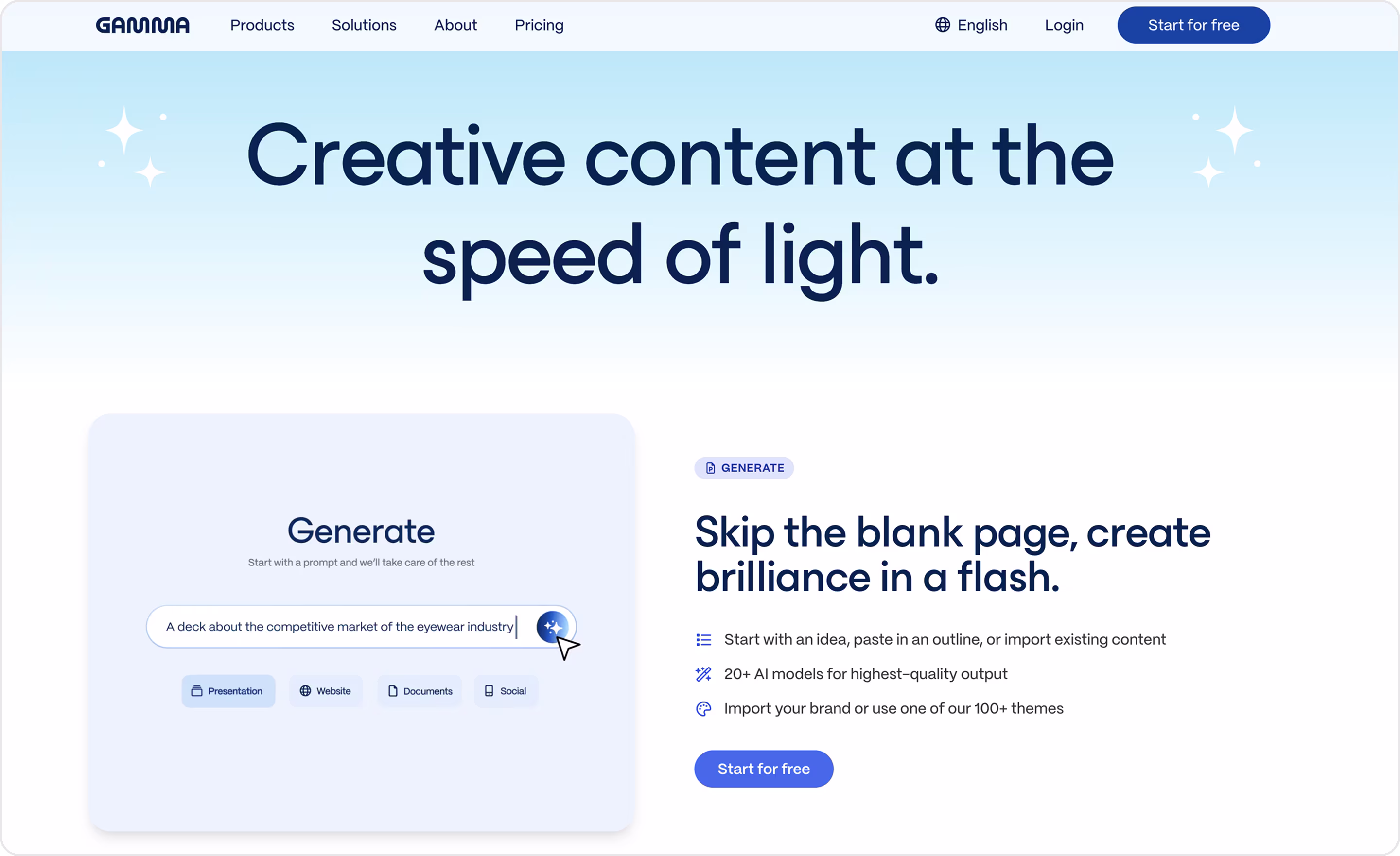
Gamma is an AI tool for creating beautiful, slide-free presentations, documents, and web pages.
Why is this design impressive?
- A clean dark/light interface, elegant typography, and interactive previews.
- Strong product demo upfront.
- AI-first storytelling.
- Use-case driven.
- Multiple clear prompts guide different types of users smoothly into action.
Takeaway for founders
- Differentiate in one line.
- Let visuals carry the pitch.
- Make AI the hero.
- Segment your buyers.
- Prioritize fast wins.
43. Perplexity
Perplexity is an AI-powered search and knowledge assistant. The enterprise edition helps teams search across internal documents and trusted sources with AI-driven precision.
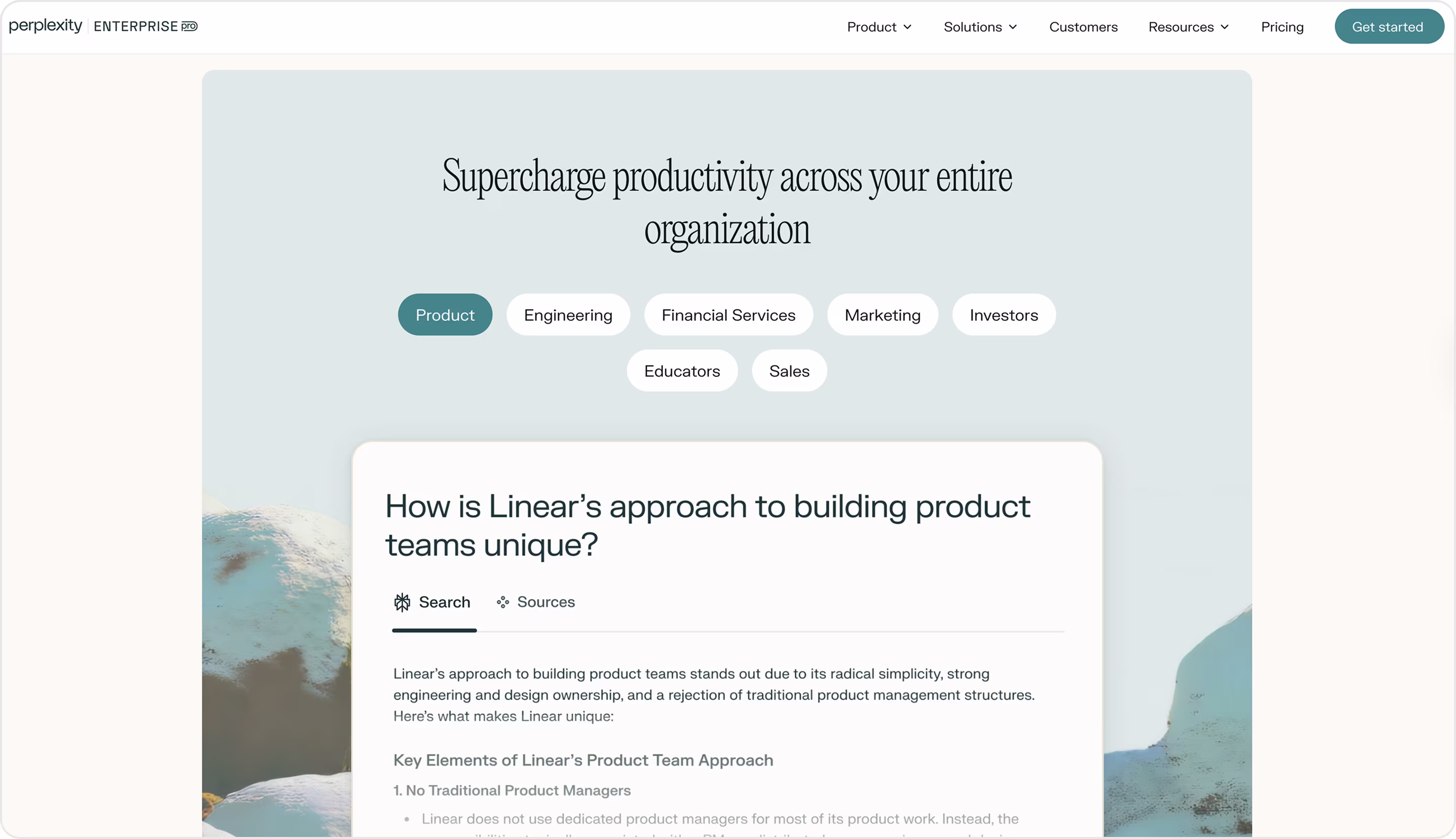
Why is this design impressive?
- Enterprise trust signals.
- Large typography, generous spacing, and monochrome branding with subtle accents make the content easy to scan and serious in tone.
- Storytelling through outcomes.
Takeaway for founders
- Keep it simple. The design should echo the product’s promise: speed and clarity.
- Highlight security, privacy, and compliance to win the trust of corporate buyers.
- Use design to signal seriousness. Minimal layouts and strong typography reinforce authority in B2B markets.
- Sell outcomes, not algorithms.
- Match product and brand.
44. Notably
Notably is an AI research platform that helps teams organize, analyze, and synthesize user research. It turns messy notes, transcripts, and feedback into clear insights.
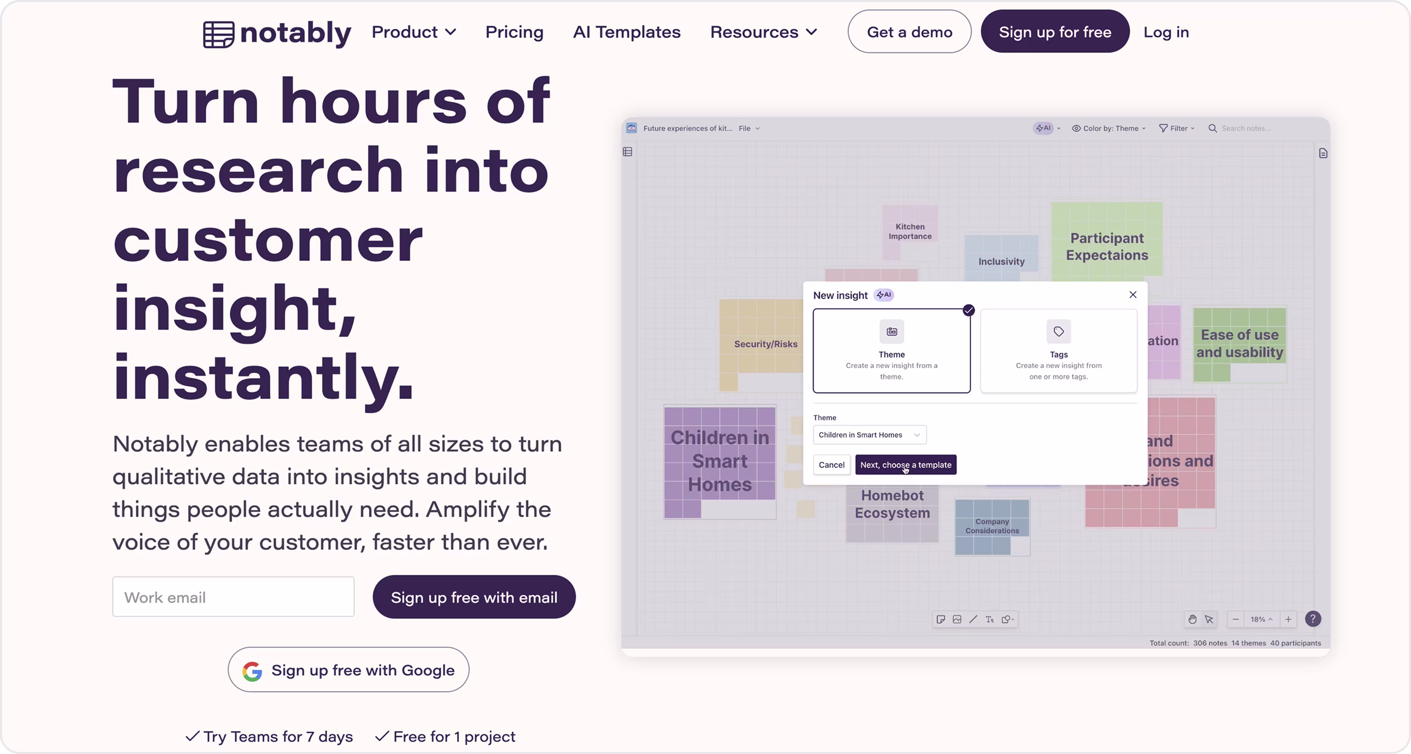
Why is this design impressive?
- Focused positioning.
- Clean and calm visuals.
- Product-driven storytelling.
- Benefit-oriented navigation.
- Trust and credibility.
Takeaway for founders
- Position your AI product for a clear audience and problem instead of trying to be everything for everyone.
- Reflect value in visuals.
- Show the transformation.
- Frame navigation and copy around business benefits.
After AI, let’s turn to healthcare, where great design means clarity, trust, and empathy. Here are some examples of well designed healthcare websites.
The Best Healthcare Project Designs
Healthcare is one of the most demanding fields for design because every interface must balance precision with compassion. The best healthcare website design makes complex information accessible, builds trust, and creates experiences that support patients and providers alike.
45. Slack for Health Teams
Slack for Healthcare is a secure, HIPAA-compliant version of the popular workplace messaging tool. It helps care teams, administrators, and partners collaborate in real time and securely share patient information across organizations.
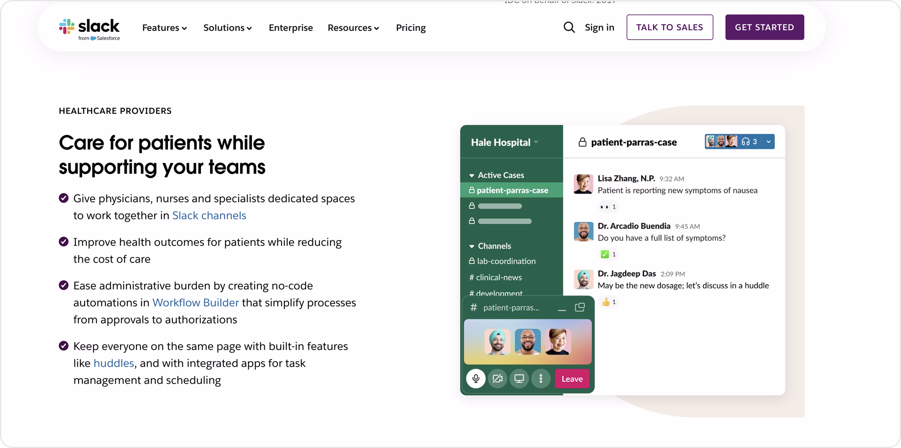
Why is this design impressive?
- Healthcare-specific positioning.
- HIPAA compliance, security standards, and enterprise-grade features are highlighted up front.
- Outcome-oriented copy.
- Scenarios for hospitals, providers, and pharma are outlined for fast decision-making.
- Slack’s signature friendly, colorful branding is present, but paired with a more professional tone suitable for healthcare.
Takeaway for founders
- Adapt your product to the industry.
- In regulated industries, proving you meet standards like HIPAA or GDPR should be front and center.
- Speak in outcomes.
- Tailor case studies and examples so potential clients immediately see relevance.
- Keep your identity, but adapt tone and visuals to resonate with healthcare.
46. Cedar
Cedar is a healthcare financial engagement platform that helps providers and payers deliver a modern, transparent, and personalized billing experience.
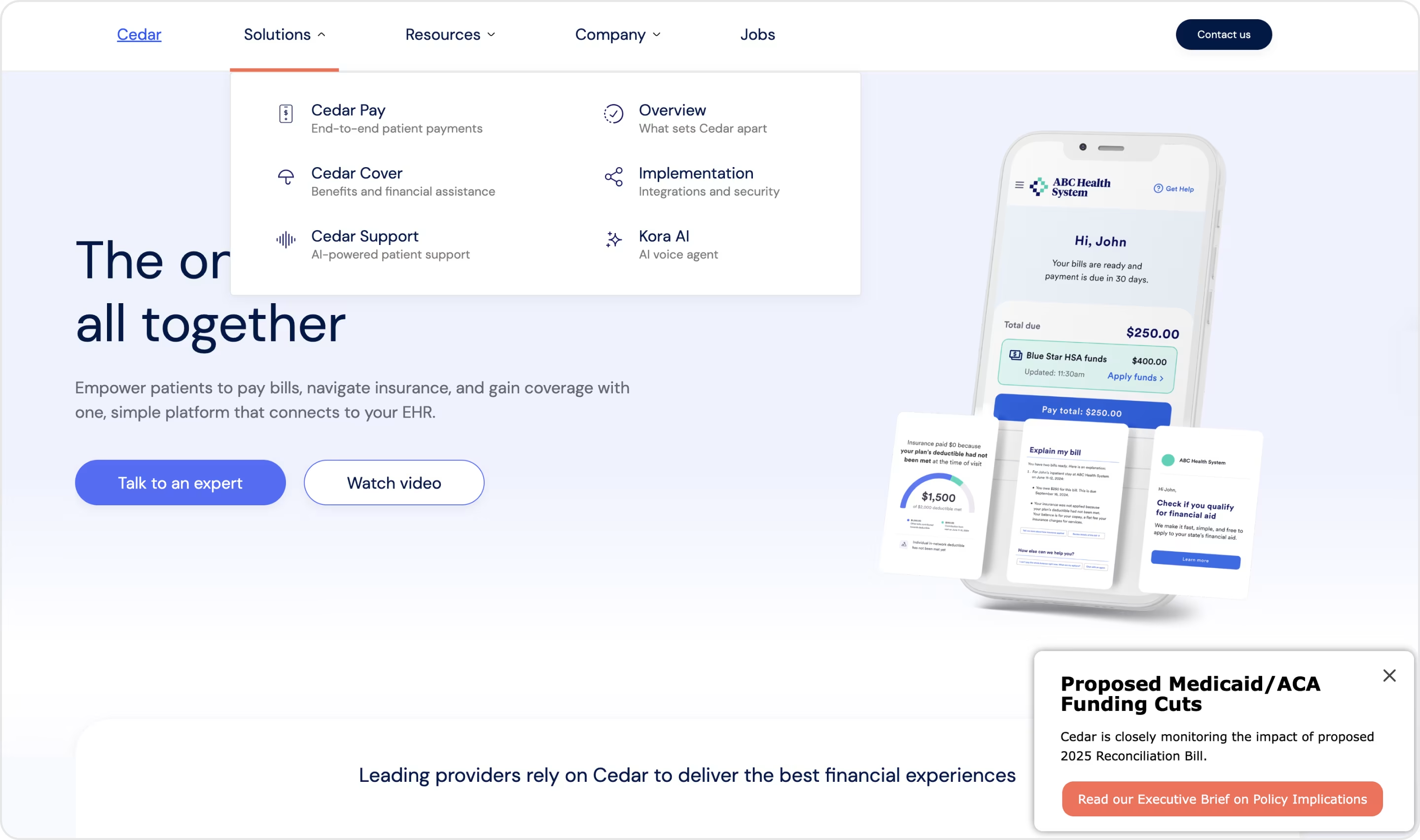
Why is this design impressive?
- Professional, clean visuals.
- Clear product storytelling.
- Balanced brand personality.
- Conversion-driven structure.
Takeaway for founders
- Design should emphasize patient experience as much as organizational efficiency.
- Simplify the complex financial workflows.
- Balance tone for dual audiences.
- Build credibility with evidence (case studies and metrics).
- Guide all user types.
47. Oscar Health
Oscar Health is a technology-driven health insurance company. It’s a modern alternative to traditional insurers as it focuses on ease of use, transparency, and better member experiences through digital tools.
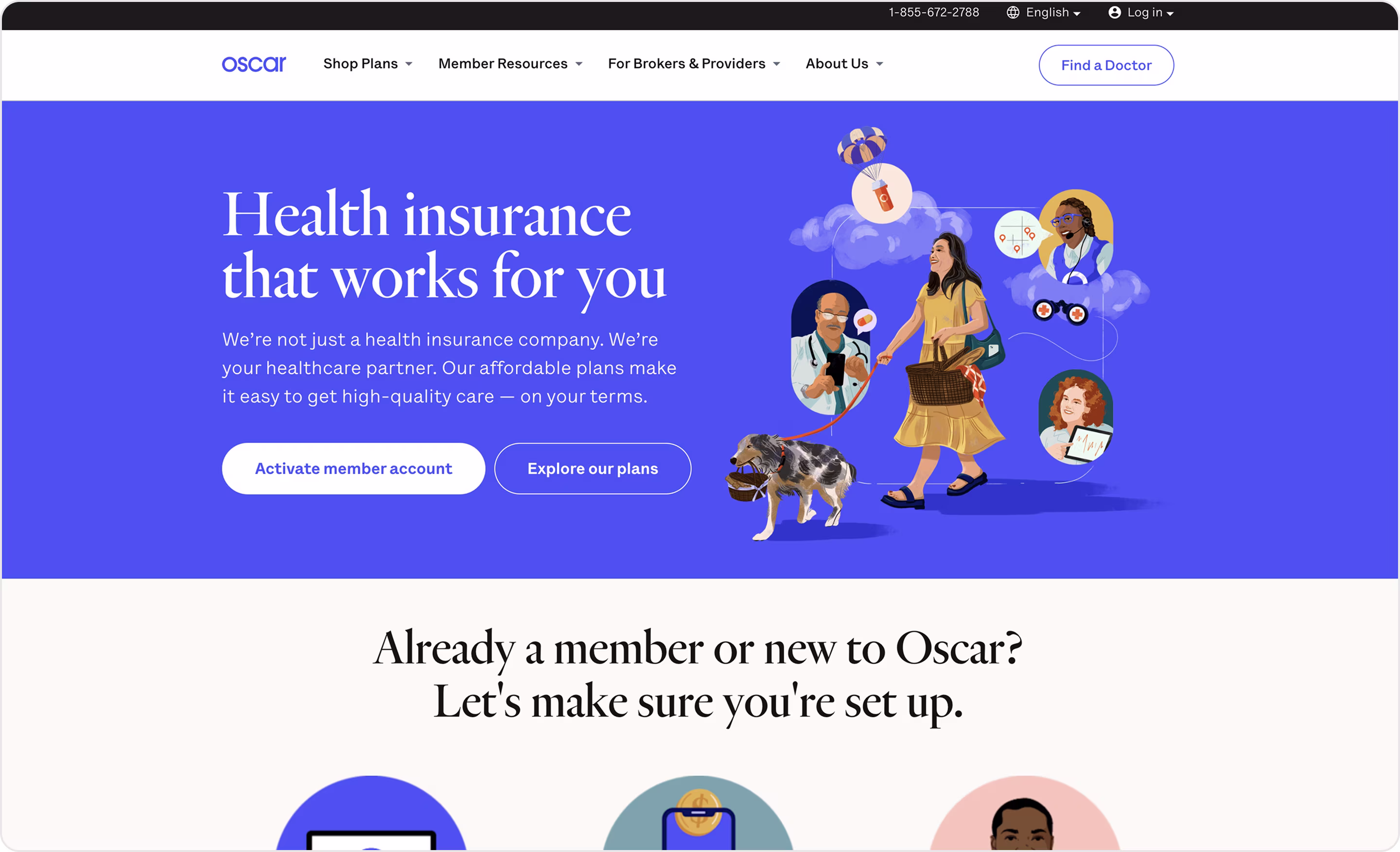
Why is this design impressive?
- Friendly, consumer-first branding.
- Clarity in navigation.
- Value communication instantly conveys differentiation.
- Strong use of storytelling.
- Security, compliance, and network size with a friendly design avoid overwhelming users.
Takeaway for founders
- Humanize serious industries.
- Segment your audience.
- Simplify the message with direct, benefit-driven copy.
- Bright, friendly branding can make intimidating processes less stressful.
- Design for mobile-first.
48. Butterfly Network
Butterfly Network is a healthtech company that developed a handheld, portable ultrasound device powered by AI and connected to the cloud.
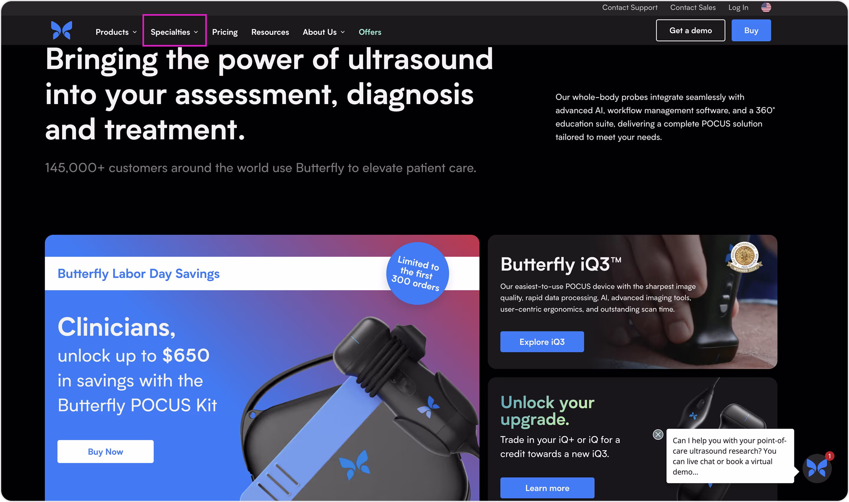
Why is this design impressive?
- Clear product showcase.
- A black-and-white color scheme with high-resolution product photography conveys innovation and medical-grade professionalism.
- Strong credibility.
- Education-first approach. Sections with tutorials, webinars, and training materials reduce adoption barriers and build trust.
Takeaway for founders
- Show the device or tool in action immediately so visitors understand its value in seconds.
- In healthcare, futuristic branding must be grounded with regulatory proof and clinical evidence.
- Educate to drive adoption.
49. Doximity
Doximity is a professional network for U.S. healthcare providers. It offers tools for secure communication, physician collaboration, telehealth, and career opportunities.
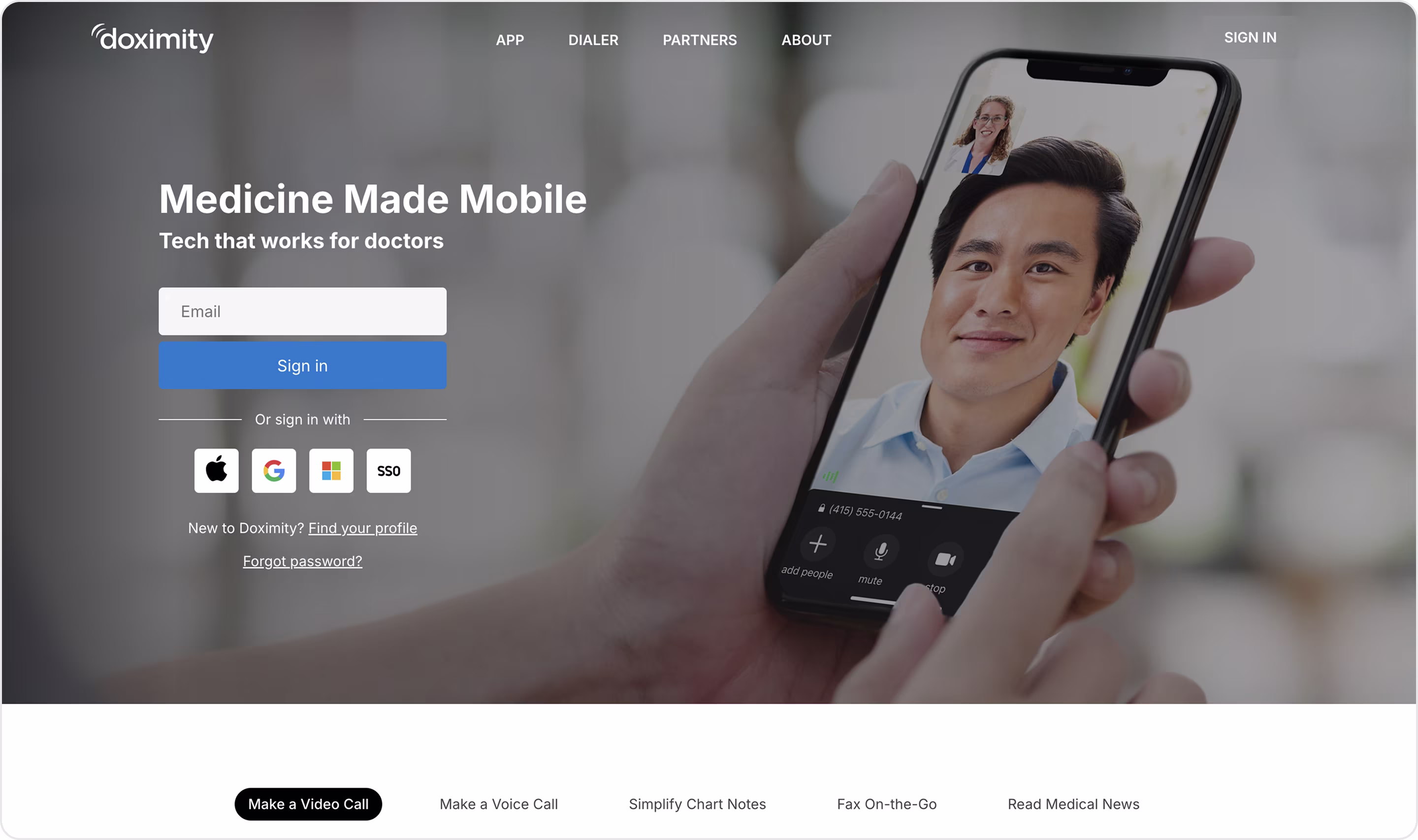
Why is this design impressive?
- Professional and approachable branding.
- Audience-specific positioning.
- Strong community emphasis.
- Integrated product storytelling.
- Simple, action-driven CTAs.
Takeaway for founders
- Visual design should communicate professionalism and reliability.
- Speak directly to the intended users with tailored copy and visuals.
- Highlight community scale.
- Tell stories feature by feature.
- Keep actions simple.
50. Commure
Commure is a healthcare technology company that builds a connected ecosystem for providers.
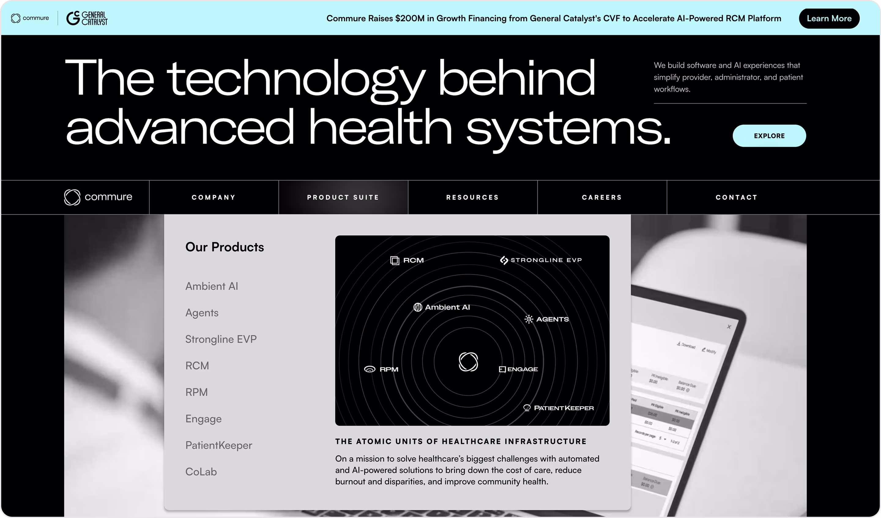
Why is this design impressive?
- Clear mission-driven messaging.
- Enterprise-first visuals.
- Storytelling with impact.
- Trust signals throughout.
- Balance of clarity and complexity.
- Conversion-friendly flow.
Takeaway for founders
- Get a professional branding to signal stability and readiness for large-scale adoption.
- Use visuals and narratives to make complex ecosystems understandable.
- Prove impact with stories.
- B2B healthcare buyers want a clear path, so your demo requests, partnerships, and enterprise contact forms should be prominent.
51. Healthie
Healthie is a practice management and telehealth platform for healthcare providers. It offers scheduling, charting, billing, telehealth, and client engagement tools in one place.
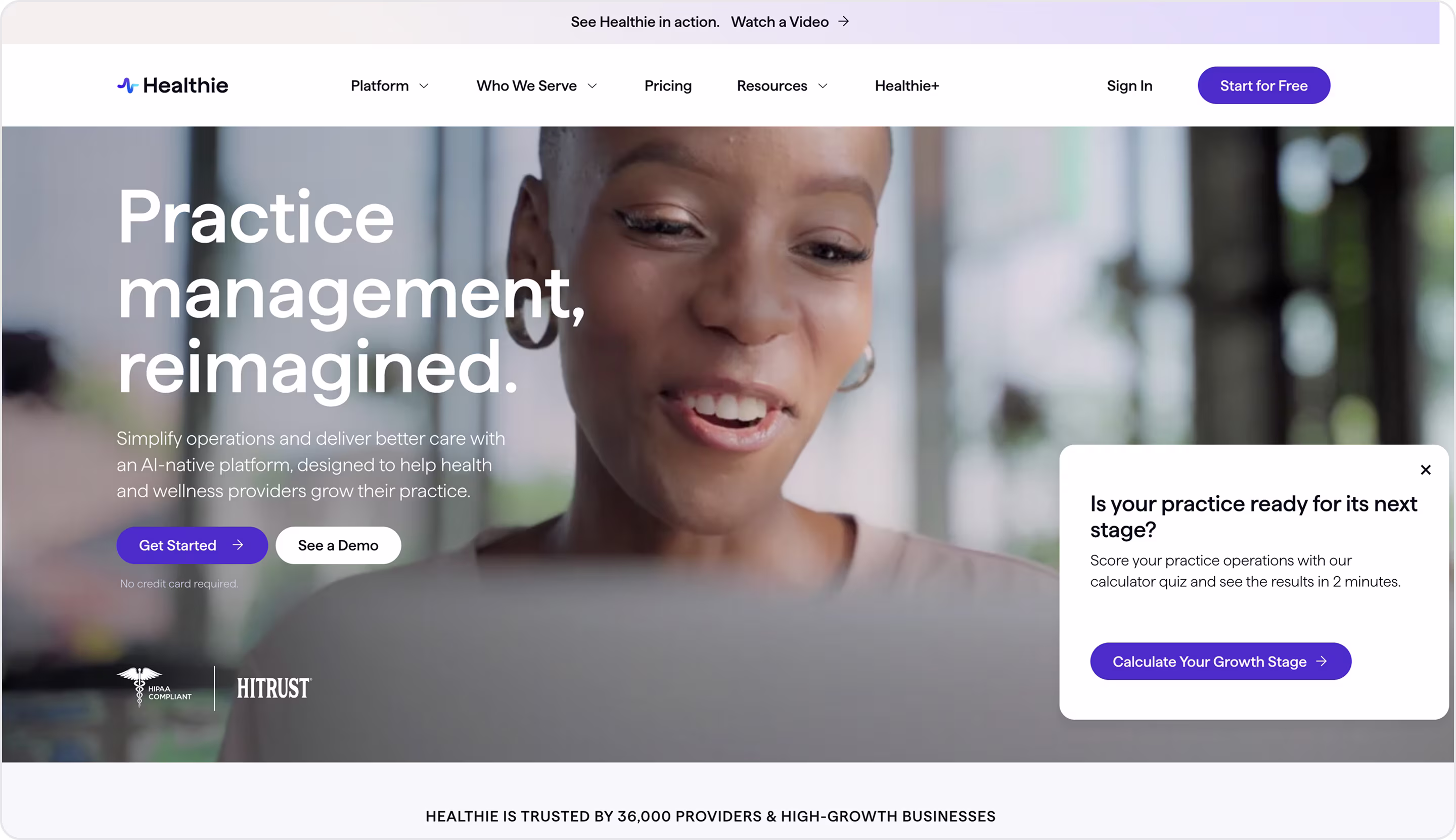
Why is this design impressive?
- Friendly and accessible branding.
- The homepage focuses on what matters to small practices.
- Screenshots and interface previews show exactly how Healthie works.
- Tailored navigation.
- Trust-building elements.
Takeaway for founders
- Use approachable branding to make even complex healthcare solutions accessible.
- Keep messaging benefit-first.
- Show the product clearly.
- Offer flexible entry points.
52. Hippocratic AI
Hippocratic AI is a healthcare-focused large language model that provides safe, reliable, and compliant conversational AI for healthcare organizations.
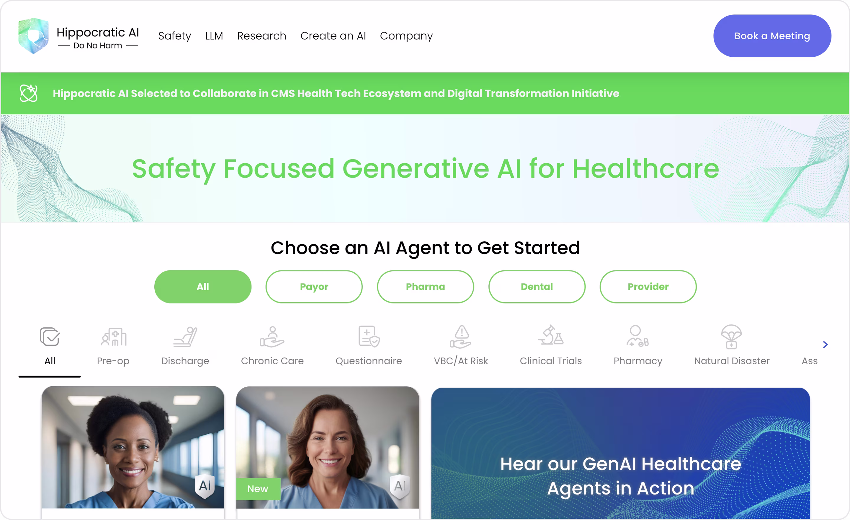
Why is this design impressive?
- A clean, minimal design with medical-grade visuals and calm color tones reflects credibility and patient safety.
- Clear differentiation.
- Emphasis on empathy + safety.
- Evidence-backed storytelling.
Takeaway for founders
- Position your AI as healthcare-specific to make it more credible than a general tool.
- Professional branding reassures stakeholders in sensitive industries.
- Use research results, clinical validation, or pilots to build confidence in enterprise buyers.
- In emerging tech, design your funnel around collaboration (pilots, demos, partnerships) rather than mass signups.
53. ProPharma Group
ProPharma is a global provider of regulatory, clinical, and compliance solutions for the life sciences industry.
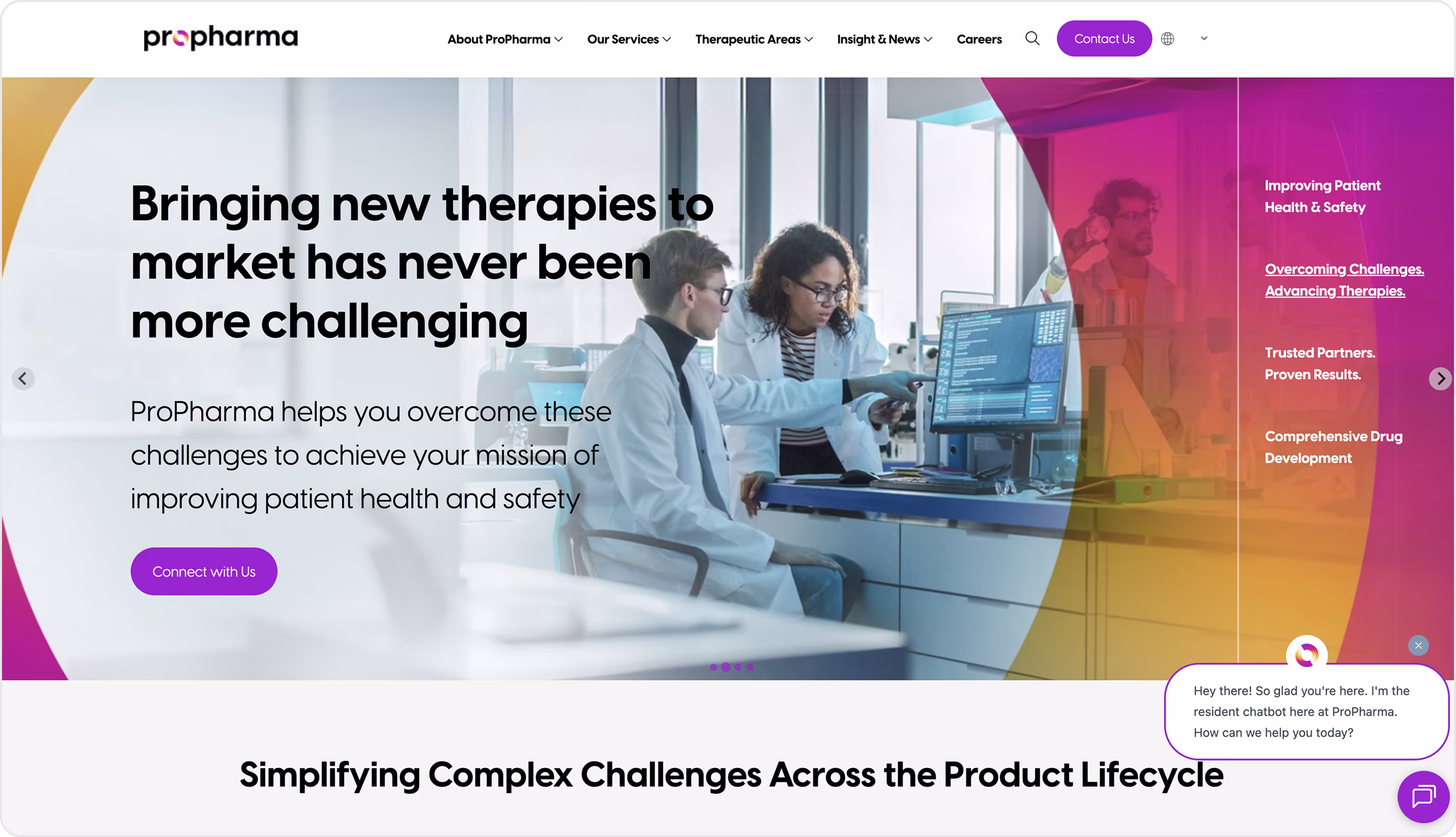
Why is this design impressive?
- Enterprise-first clarity.
- Professional, global branding.
- Structured navigation.
- Authority through proof.
- Content depth.
Takeaway for founders
- Highlight your niche expertise.
- Design for trust and authority.
- Organize services clearly.
- Use proof as persuasion.
- Pair depth with accessibility.
54. Ciklum
Ciklum is a global digital solutions company that offers specialized IT services for healthcare providers, payers, and life sciences organizations.
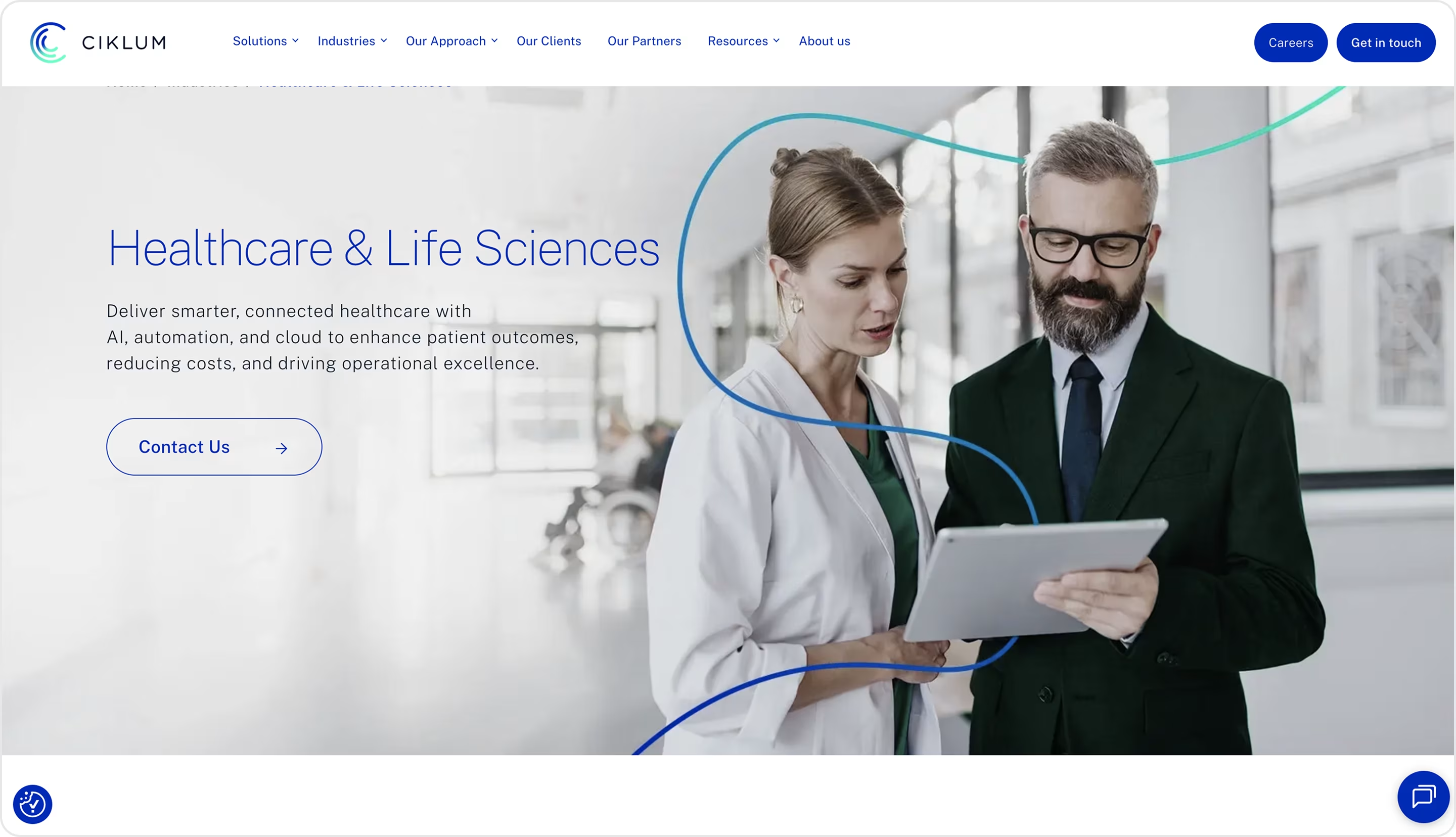
Why is this design impressive?
- Clean corporate design, structured layouts, and professional visuals for trustworthiness.
- Benefit-oriented copy.
- Clear service breakdown.
- Trust signals.
Takeaway for founders
- Tailor your IT or SaaS offering to a specific vertical to increase credibility.
- Highlight compliance early.
- Break down complex offerings into simple, outcome-driven categories.
- Prove with evidence. Case studies and compliance badges go further than abstract claims.
55. Teladoc Health
Teladoc Health provides telehealth, mental health, chronic condition management, and general medical services for employers, insurers, health systems, and patients.
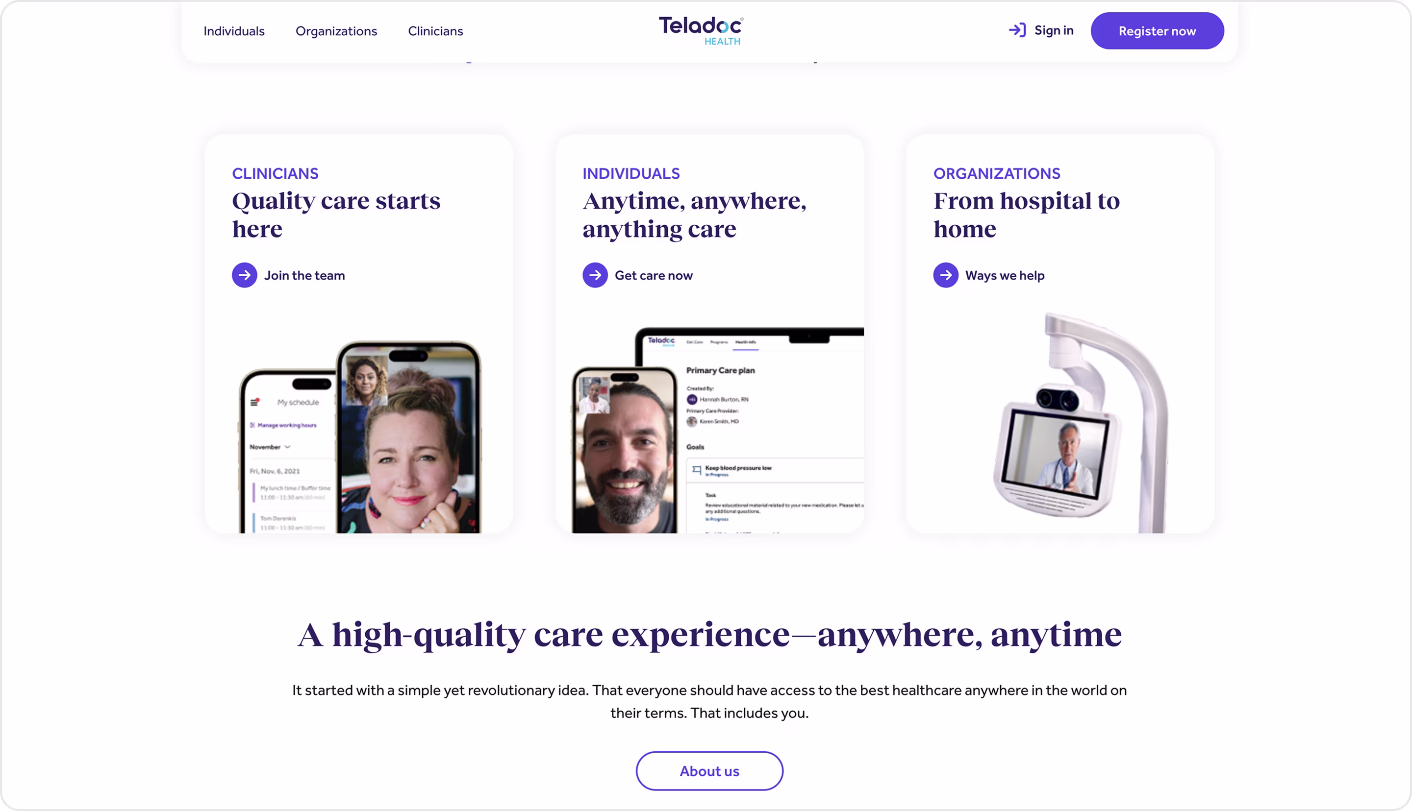
Why is this design impressive?
- Clear segmentation.
- Human-centered visuals.
- Outcome-driven messaging.
- Proof and authority.
- Conversion-friendly flow.
Takeaway for founders
- Highlight global presence and partnerships to build trust.
- Design for multiple audiences.
- Balance corporate messaging with visuals that highlight empathy and inclusivity.
- Show measurable outcomes.
- Ensure CTAs cover enterprise leads, partnerships, and individual signups without overwhelming the experience.
🎉 Yesss, you made it! We’ve just walked through all 55 B2B website examples together. Thanks for sticking with us till the very end! But don’t close the tab just yet… we’ve prepared a little gift for you ↓
Summary
After exploring 55 website examples, do you agree that great design is about building trust, simplifying complexity, and guiding users to action? Hope that yes, because after 9+ years of experience, we are sure!
As a thank-you for reading till the end, we’re offering a free UX audit of your B2B product. Just reach out to us. And if you’re ready for a full design or redesign, explore our B2B services or contact us directly. We’d love to help you create a website that delivers results.

Table of contents


FAQ


89+ Reviews
on Clutch

Top Rated Plus Agency
on Upwork

Top 50 Trending team
on Dribbble

Projects are Featured on Behance platform
