
35 Best SaaS Profile Page Design Examples


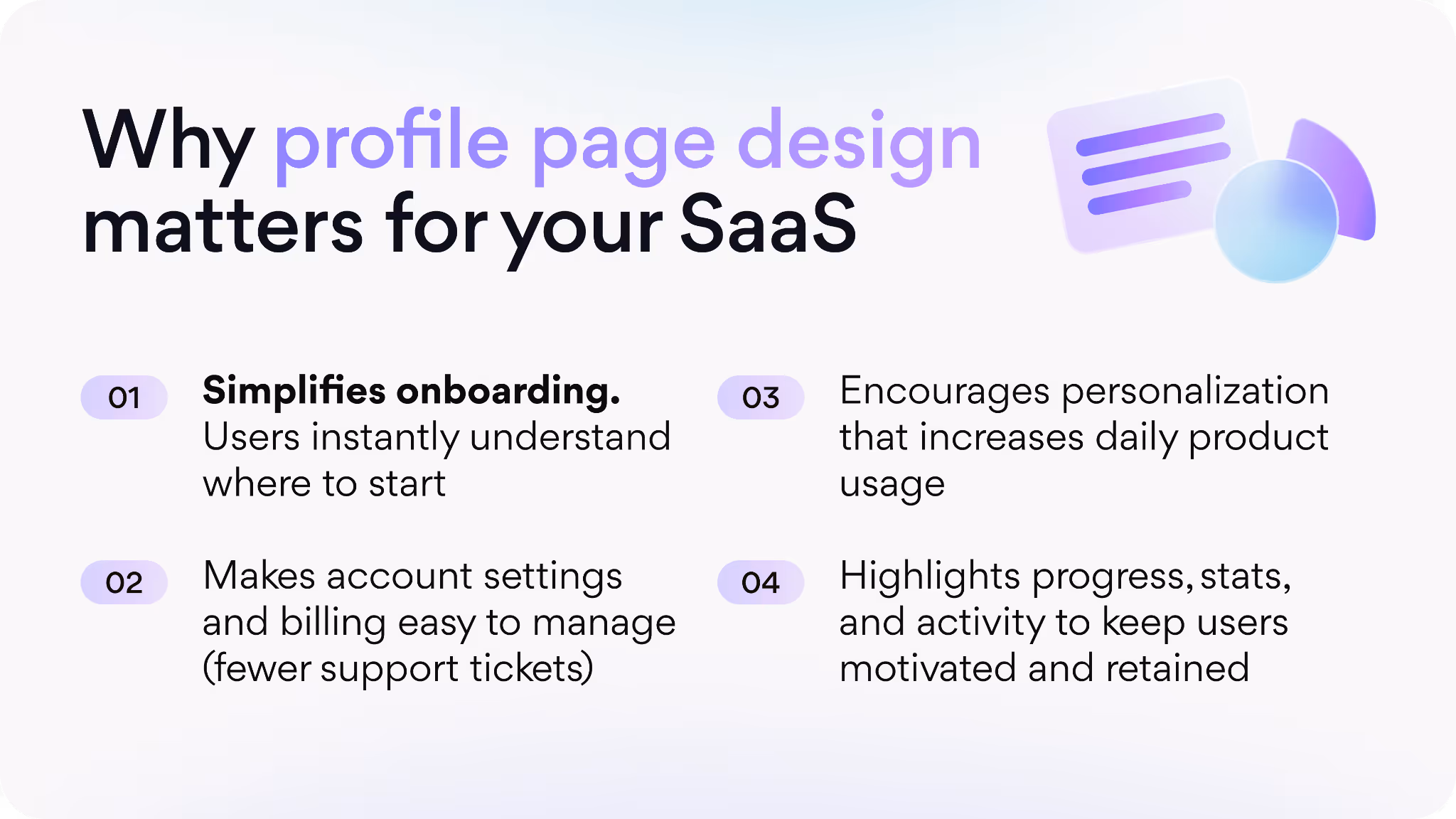
The profile page is where a SaaS product ceases to be abstract software and becomes personal. It is the space where users become community members and customers become advocates. The format and functionality of this page, from structure and navigation to visual branding and micro-interactions, will increase trust, engagement, and long-term retention. Clear structure, contemporary visuals, and mindful UX keep folks engaged, instead of churning out.
At Arounda, we have dedicated over 9 years to the design and development of SaaS products and delivered 250+ projects. We have learned from experience that profile page design is frequently the unsung hero of retention and loyalty.
That's why we've put together this guide that includes a variety of profile page designs. Inside, you will see layouts, UI patterns, and modern trends that leading companies use to convert a plain profile into an engine of growth.
Article Key Takeaways
Often, user profile pages can be cluttered, unclear, or highly generic, which can lead to trust and engagement issues for users. The solution to this is: thoughtful design with clear layouts, smooth user experience (UX), a speedy product, and visuals that contextualize personal relevance and trust.
In this guide, we highlight 35 fantastic SaaS profile page design examples, outline why they work well, and offer actionable tips for you to test out on your own product! Our Arounda team has 9+ years of experience and 250+ projects under our belt, and we offer expertise on how strong profile design can improve engagement, retention, and long-term growth.
What Is a Profile Page and Its Key Elements?
A profile page serves as the digital identity for your user. It is where users manage their personal data, update preferences, and view their activity within the product. Smart profile page design decreases friction-led onboarding time, makes account handling seamless, keeps the user in mind, and leads to core retention.
Here are the essential components that should be included when you design a profile page:
- Profile photo or avatar
- User name and contact details
- About / bio section
- Account and settings panel
- Activity or progress indicators
- Preferences and personalization options
- Call-to-action or next steps
You create a solid profile page when you appeal to clarity, simplicity, and personalization. The profile page should feel productive, easy to find, and maintain consistency with the brand.
Types of Profile Pages on Web and Mobile
Profiles exist on the web and in apps, but the priorities in their designs differ. The same elements, such as photos, names, settings, and activities, could look and work differently depending on the platform.
Web Profile Pages
- More information - Web interfaces allow sections such as billing history, advanced settings, and team management to be detailed.
- Complex navigation - it’s common for web apps to include things such as sidebars, tabs, and multi-column layouts, providing users with fast and easy access to many actions.
- Visual depth - more screen real estate allows for features such as banners, cover images, or in-depth activity dashboards.
- Focus on productivity - users primarily interact at the desktop, so this feature's profile is for multi-tasking and work-related experience.
Mobile Profile Pages
- Simplified UI - in profile page app design, small screens force prioritization by showing only the most relevant info.
- Vertical structure - content stacks, scrolling provides easy access, secondary options are hidden in menus.
- Bigger touch targets - buttons and actions must be easily tapped with very little chance of misclicks.
- Speed and clarity - mobile users expect immediacy, responsiveness, and simple actions on the move.
Arounda suggests:
When collaborating with designers on your profile page, don’t just say “clean UI.” Request a clear hierarchy for primary actions (edit profile, upgrade plan, invite teammates) so they are easily distinguishable on both web and mobile. Insist on mobile-first design previews, as most users interact with profiles on mobile first. And always ask designers to show how the profile looks when missing data - empty states are often the deciding factor in whether new users finish onboarding or churn.
Saas Profile Page Designs
To visualize design decisions at play, let’s look at a few real SaaS profile pages. These examples demonstrate the design impact of intentional UI/UX and provide profile page design inspiration.
QTalent
In talent platforms, trust is the defining moment – and QTalent is an example of how profile page design can establish that trust from the first click.
Working with QTalent, we had to design a dual-product ecosystem: one app for professionals and another for companies, while keeping a unified design language. The key component was building an in-depth professional profile and employer profile page, which provided recruiters with access to talent data, evaluation history, and context on candidates, while giving professionals a place to highlight their stories, skills, and opportunities.
The results were phenomenal: +45% recruiter usage, +52% expansion in professional community, 2× growth in our talent pool, and a further 3.5× increase in traffic + engagement, associated with updated UI/UX and profile-first features.
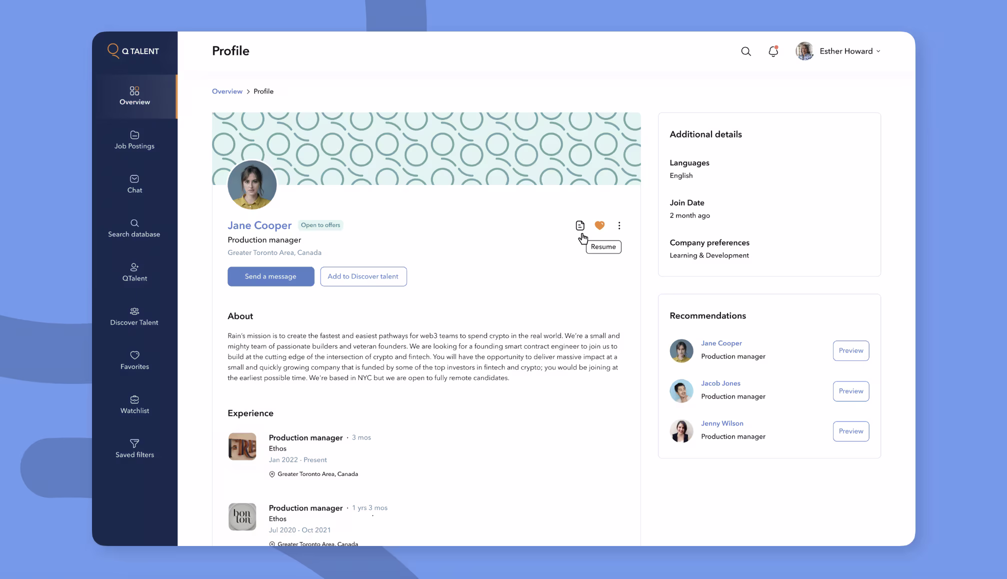
Expert recommendations:
- Include narrative elements (stories, experiences) in profiles to help candidates differentiate themselves.
- On two-sided platforms, profiles need to serve both sides (employer and professional).
- Build modular components so profiles can grow or scale (skills, endorsements, case studies).
- Embed recommendations or related profiles in each page to inspire exploration and dwell time.
Sinta
One of the best illustrations of a profile web page design is reflected in our project with Sinta, an HR platform designed to simplify hiring and evaluation.
We worked with Sinta to design the entire product from scratch - UI/UX, website design, and MVP development. Our primary focus was on profile pages, which in this context was way more than what you would consider a personal account. We created dynamic profiles for candidates, roles, and teams. Our biggest challenge was creating experiences that made the complex flows of interactions feel intuitive while keeping the interface light and contemporary.
As a result, Sinta received a strategic product identity, functional candidate and role profiles, and a responsive, scalable MVP ready for growth. The new profile design allowed the platform to communicate data clearly, represent phases of evaluation, and minimize friction in team collaboration.
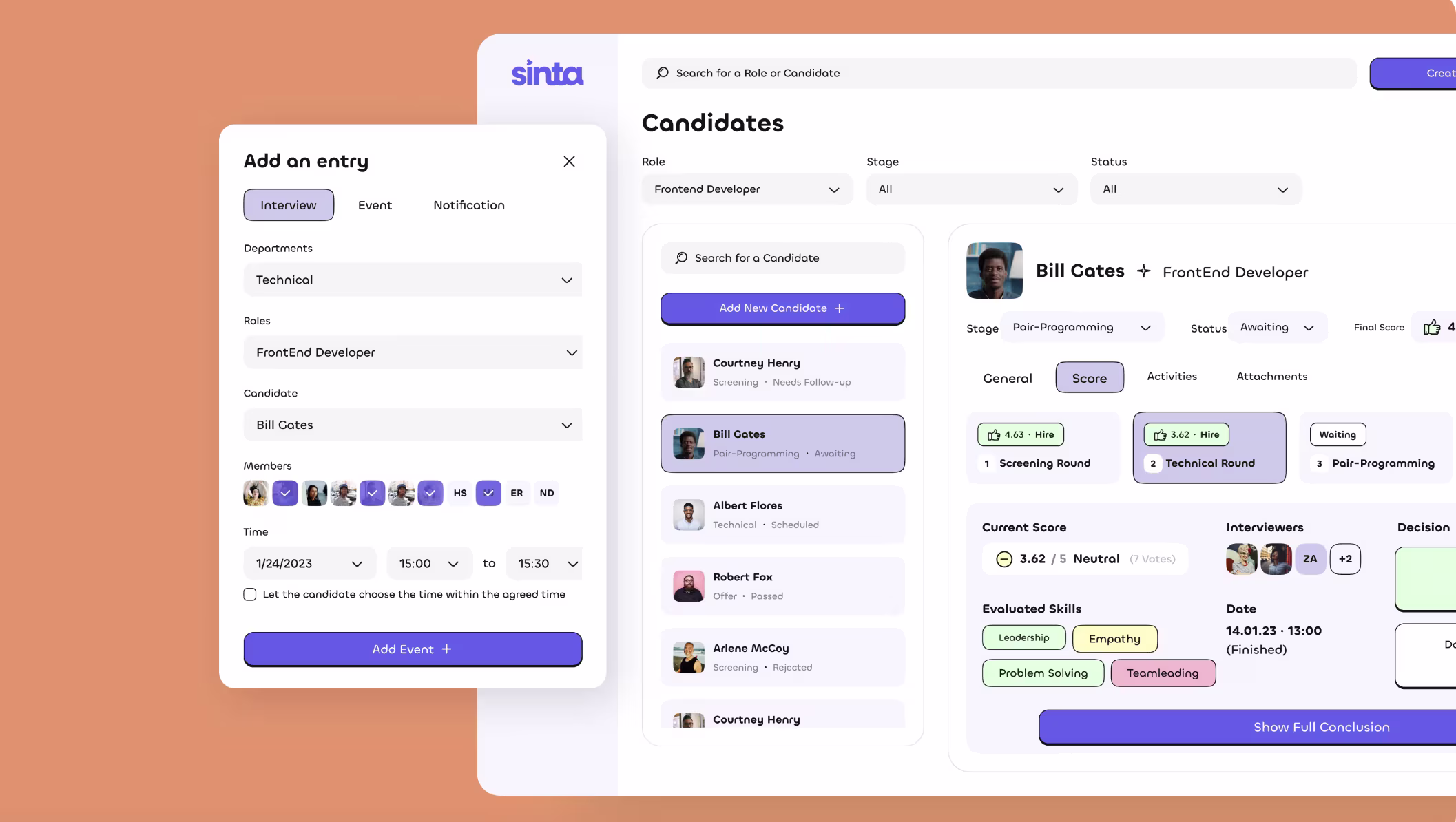
Expert recommendations:
- When creating profile pages, determine immediately whether the pages will represent individuals, teams, or objects, because the structure will be very different.
- Be clear about visualizing the process.
- Ensure at least one action point (invite, evaluate, assign) is present on each profile.
Gradwork
Another strong example of design for profile page comes from Gradwork, which is a career-centric product that connects graduates to growing technology companies.
For this project, the main challenge was designing for four different user groups while keeping the interface clean. We designed profiles that not only operated for individual users, but also for aggregate states like a career fair, where users view multiple candidate cards simultaneously. This showed that profile pages in platforms like this one are more than just personal accounts; they can display entire groups, events, and networks.
As a result of our work, Gradwork had a standardized design system, easy access to separated learning and job sections, a responsive mobile web app with profiles, and an original brand identity that enhances scale and credibility.
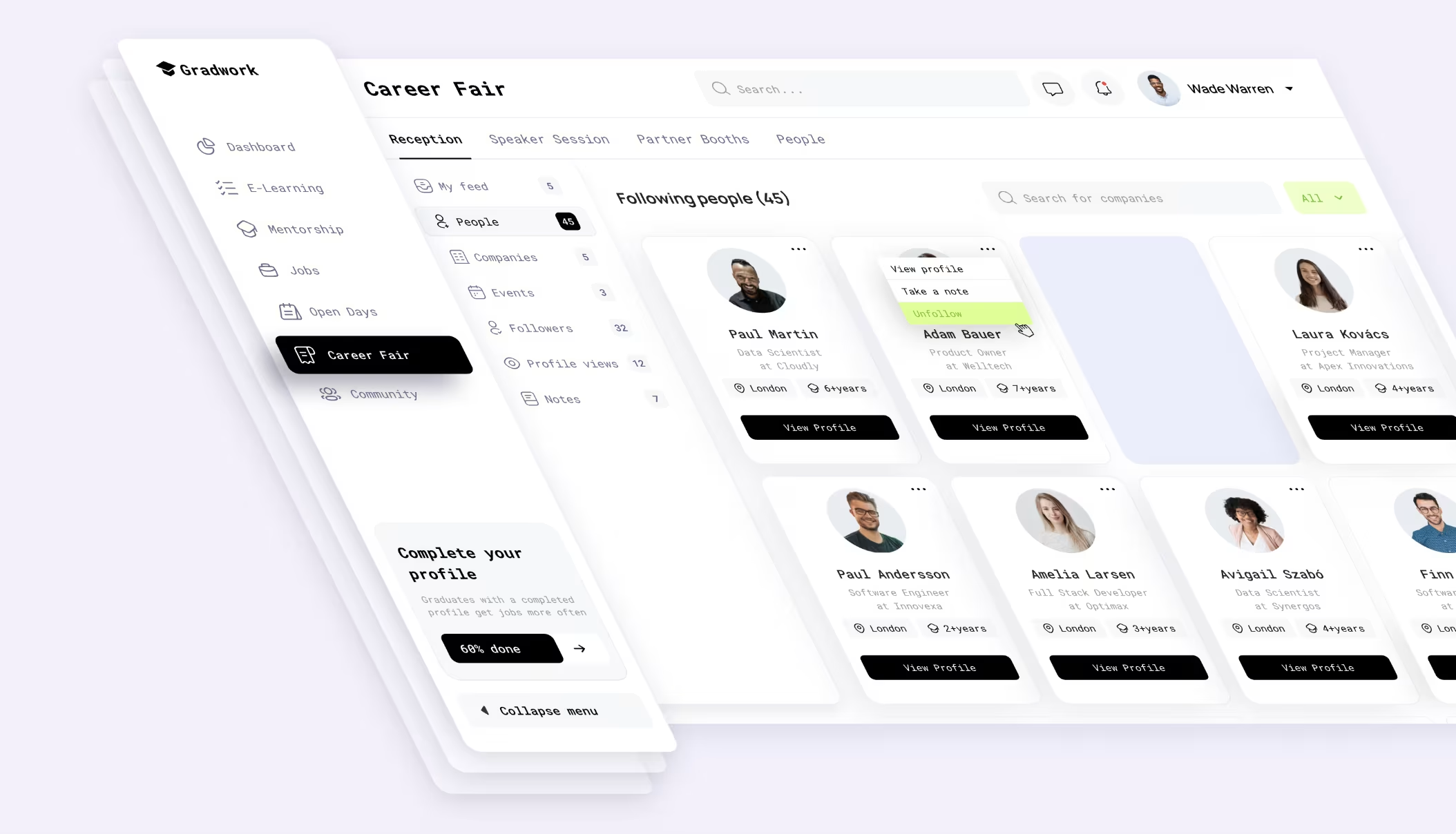
Expert recommendations:
- You can format profile pages as collections.
- Add completion indicators to create motivation for users to enrich their profiles.
- Make sure your calls-to-action are basic and straightforward (“View Profile”, “Follow”, “Complete Your Profile”) to encourage users to engage.
Userlist
Userlist is a user messaging and user management tool. The profile page here serves as a thorough user record, showing identifiers, signup time, activity log, and company relationships - a nice feature for support and growth teams that want full sight of how the customer is using the product.
The layout is balanced, with a set of structured tabs; there’s no information overload. But the profile feels dense with information, and a stronger visual hierarchy could preserve key actions from getting lost within information clutter.
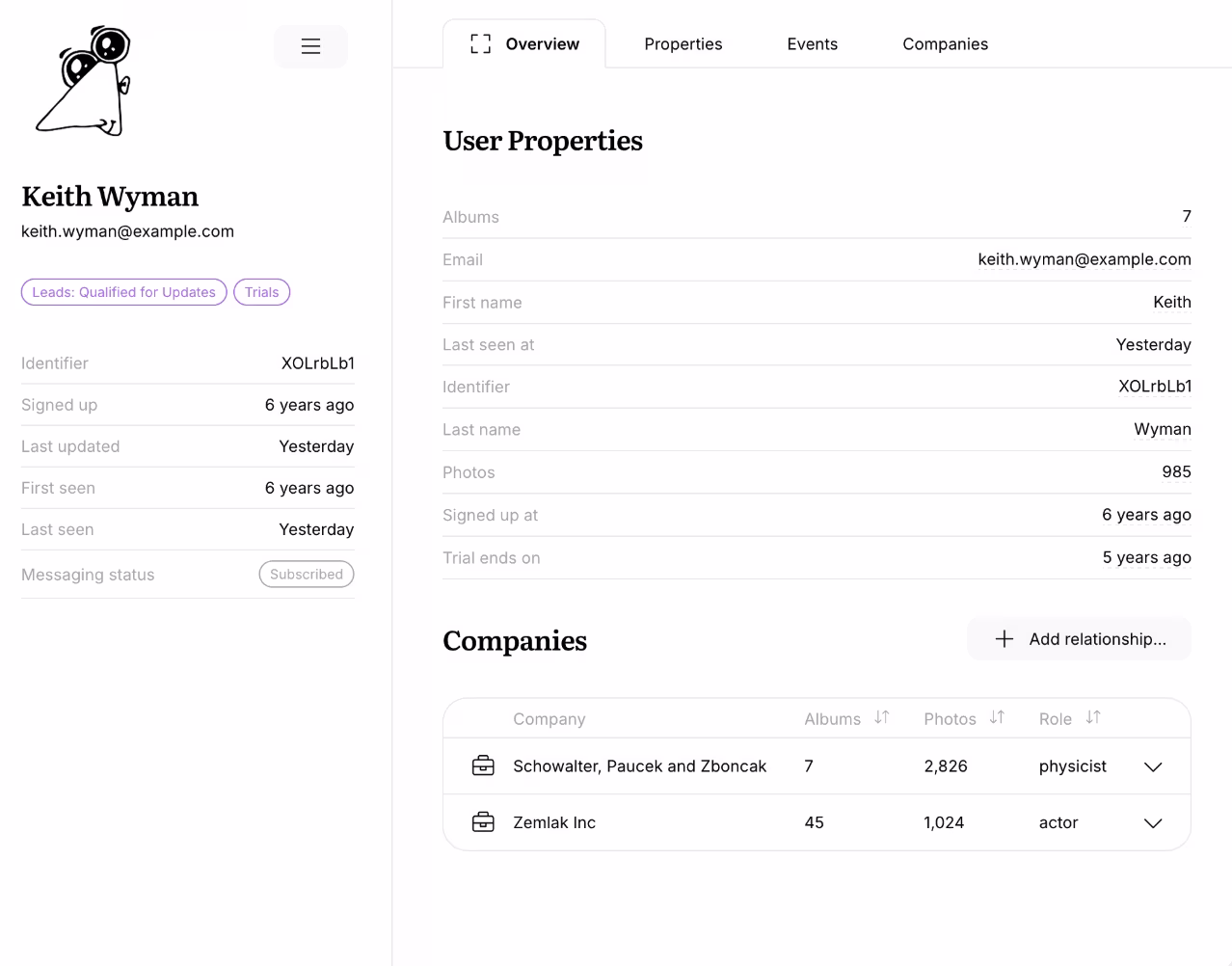
Expert recommendations:
- Maintain tab structure - While there’s a lot of data, following structured tabs will keep the pool of data organized.
- Highlight your action items (sending messages, updating the status) rather than hiding in the properties.
- Avoid super-long plain-text tables.
Slack
Slack is a top-notch team collaboration app that promotes quick communication through profiles. The profile screen is simple and utility-focused, featuring a photo, role, pronouns, status, local time, and contact information. But options for quick actions like Message or Video make it more of a functional center of activity rather than just a card. The downside is that there's limited space to personalize or showcase more of who you are.
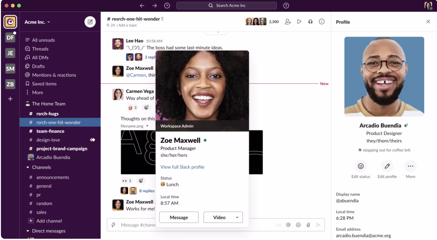
Expert recommendations:
- Have core elements (role, status, time zone) stay visible.
- Add quick actions for speed.
- Avoid information overload - simpler is better.
- Use lightweight context tags (projects, skills) to upgrade profiles.
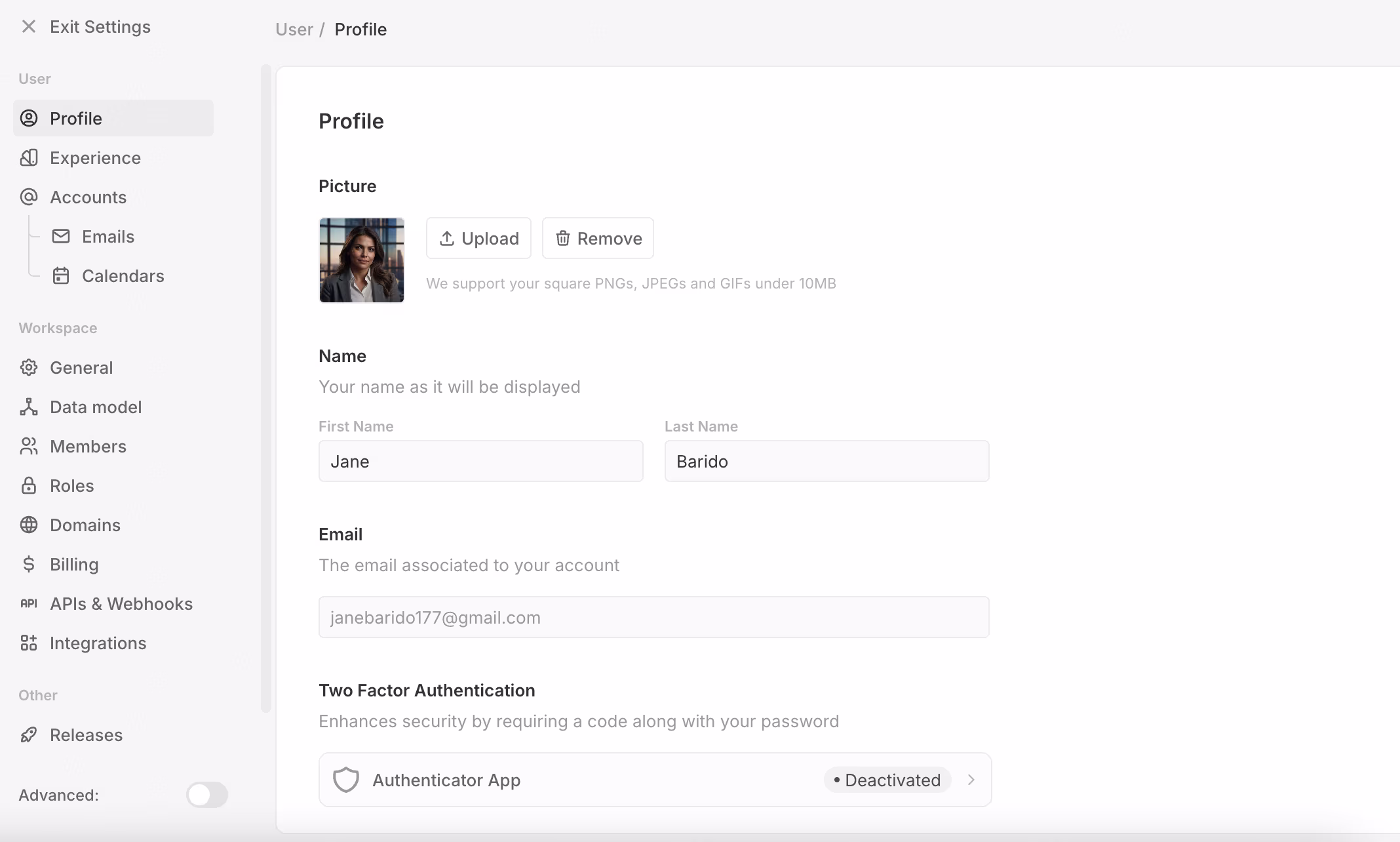
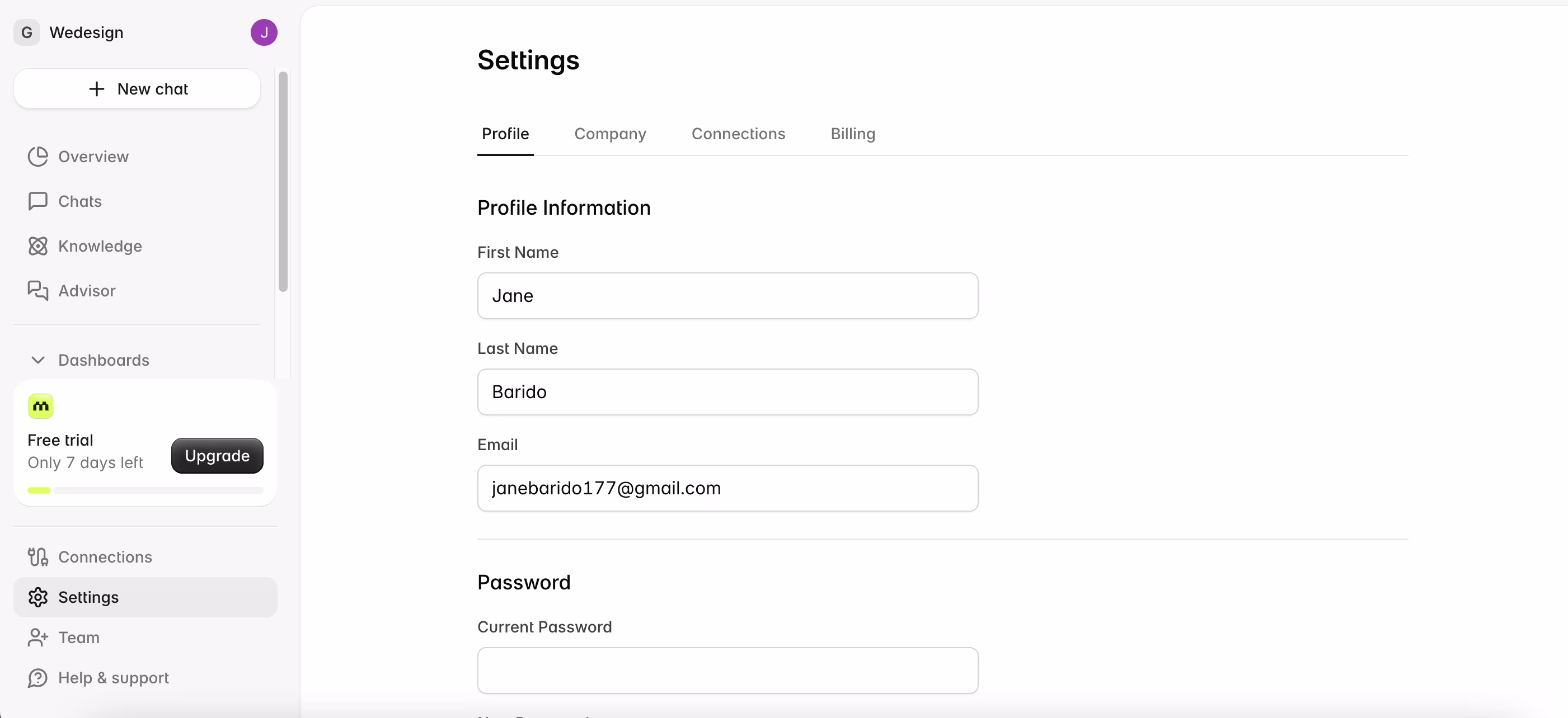
Airtable
Airtable shows that profile pages do not need to mimic their social counterparts. In this case, the profile serves as a personal account hub to manage personal data, credits, and workspace settings, while also providing access to technical features such as API keys. This type of user profile page design is centered on control and functionality, and not interaction.
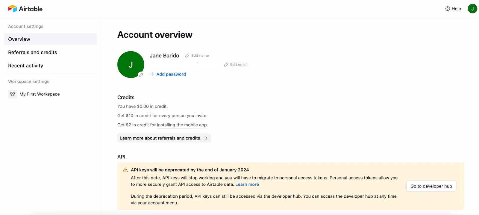
Expert recommendations:
- Keep account essentials (email, groups, integrations) in one place so they can be accessed easily.
- Don’t go too far with nesting menus of settings (keep it to what gets used consistently).
- For enterprise-focused companies, prioritize usability over branding in internal accounts.
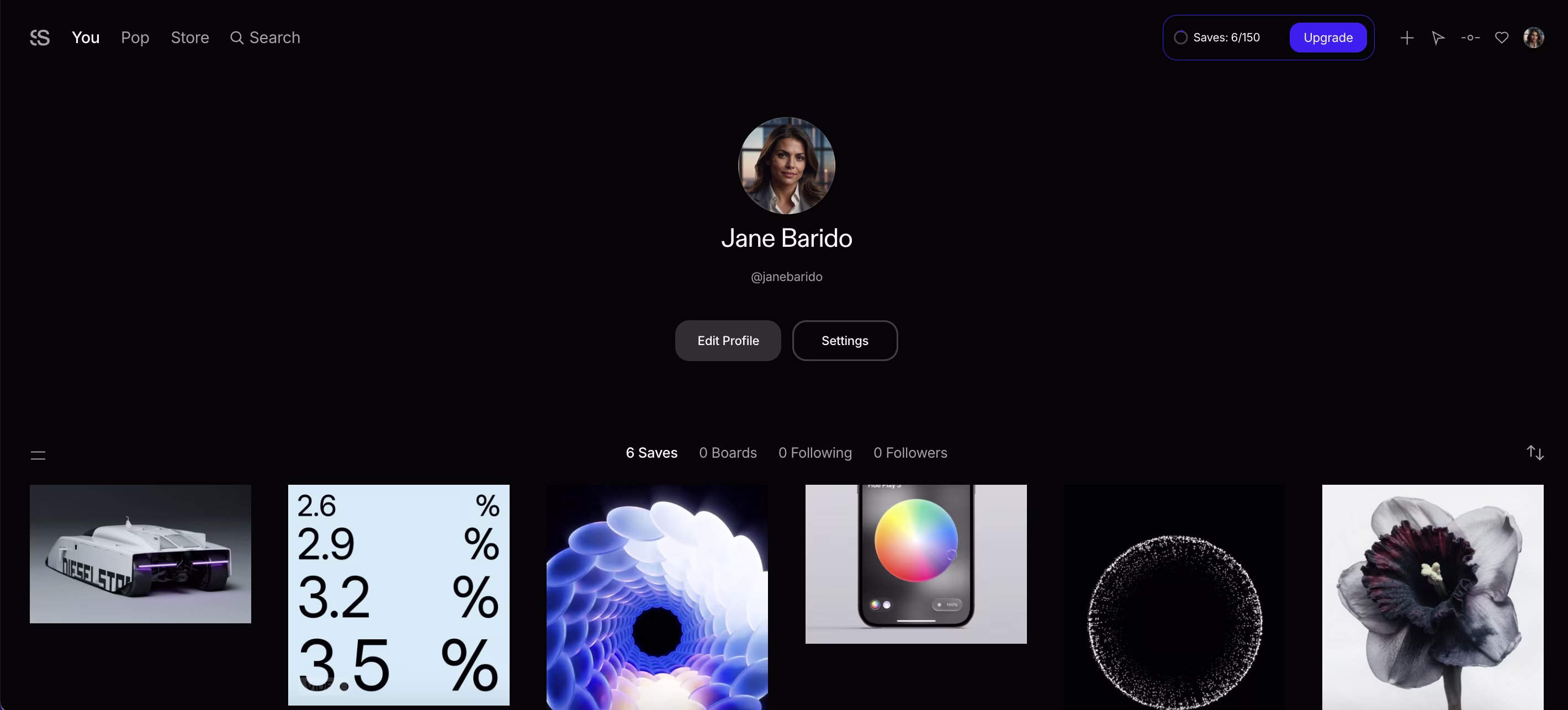
Savee
Savee is an innovative platform that serves as an interactive visual library for creatives. Savee differs from Airtable’s feature-driven dashboard and Slack’s team cards. Here, it transforms the profile page into a visual portfolio.
The profile is transformed into a public space for taste, aesthetic, and style. The profile enables users to curate their personal narrative and develop their identity through the content they create.
Expert Recommendations:
- The option for personalization (bio, tags, social links) allows profiles to be unique, not simply storage grids.
- Don’t think of a profile as only a gallery – portfolios can feel impersonal and harder to relate to without context.
- Provide the ability for seamless navigation (easy switching between portfolio, saved items, and account settings) to keep users in a creative flow.
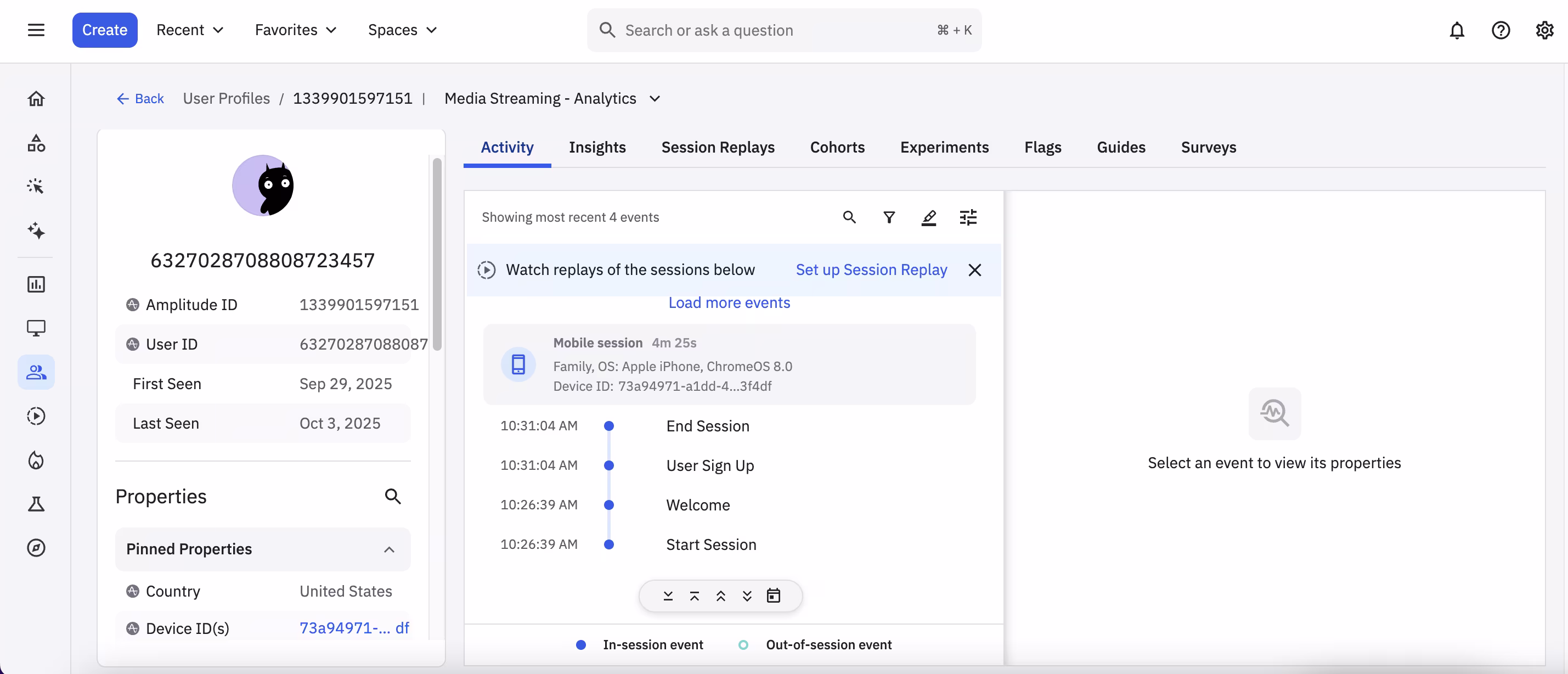
Amplitude
Amplitude is an analytics platform that isn’t just about who the user is, but how they engage. The profile page doesn’t have static profile fields; it includes device data, cohorts, and session replays. Key identifiers were pinned on the first line, while the Activity, Insights, and Session Replays tabs provide a clear pathway for team members to move from raw events to analysis. A profile page serves as a decision preparation tool, not a data repository.
Expert Recommendations:
- Front-load the most critical behavior and allow advanced analytics to be expandable.
- Add visual context, such as inline charts or funnels, to help speed up decision-making.
- Use an intuitive layout that a technical analyst and non-technical managers can read quickly.
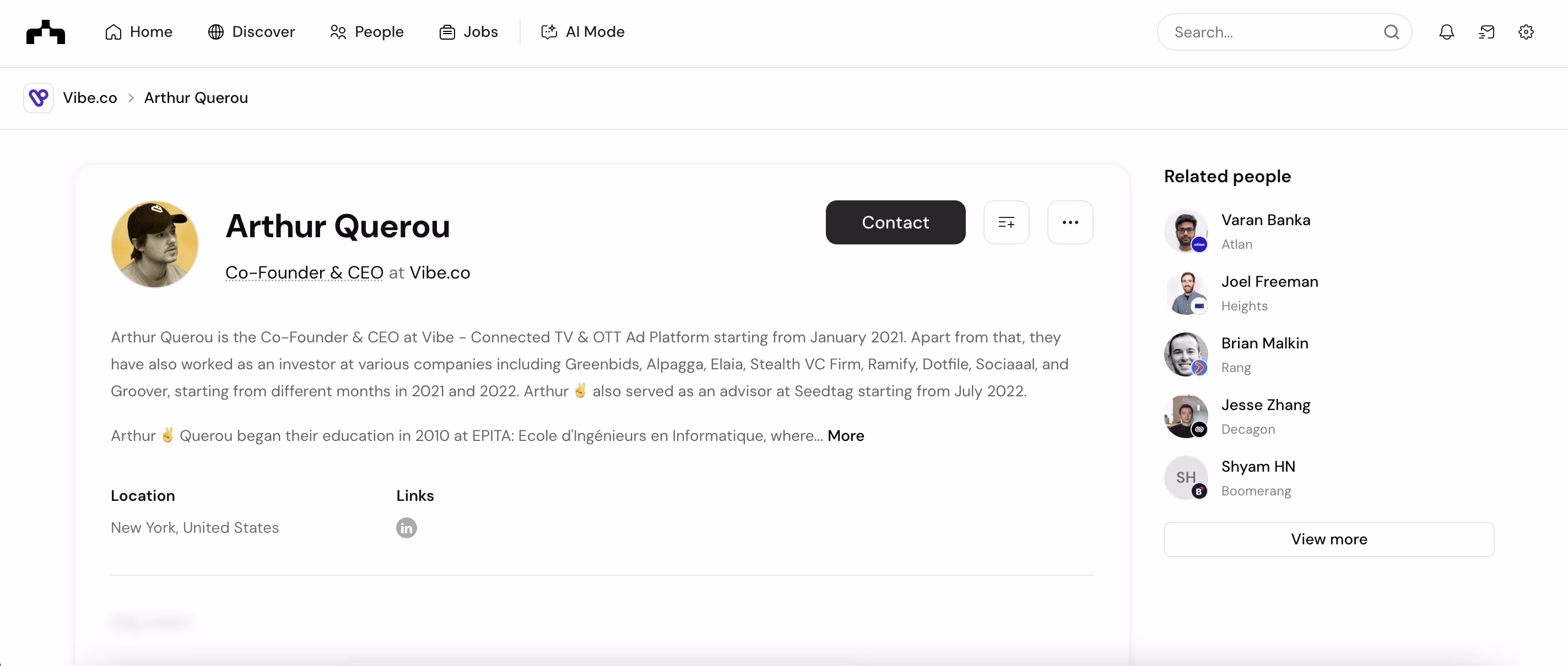
The Org
The Org revolves around organizational transparency, allowing users to dive into the company’s hierarchy and understand the people who make up that organization. The simplified visual design, robust hierarchy, and related-people area tie back to the platform’s mission of mapping networks of professionals in an informative and easy-to-navigate manner.
Expert recommendations:
- Make sure long bios are easy to scan by adding sections or highlights.
- Keep CTAs (“Contact” or “Connect”) at the top so it’s easily visible.
- Incorporate richer media (projects/achievements/major milestones) to add additional dimensions beyond text.
- Maintain the related-people module, but allow filtering by team, department, or specialty.
Reflag
Reflag is a tool to manage feature flags and experiments. The profile page is not an interface of what will be used by the customer; rather, it is an area for the user to manage their account information. The palette is minimal and monochrome, recognizing it is a B2B product - it is for access, roles, and easy organization switching.
Expert Recommendations:
- Profiles should be concise while still keeping mission-critical actions (account/account org/billing) no more than one click away.
- Don't bog down the profile with second-tier settings – move them deeper into menus to keep only the necessary visible.
- For multi-Org, think of the profile as a control panel, and make it clear which workspace the user is in at all times.
Make
Make is an automation platform with a profile page functioning as a control hub – grouping, managing organizations, permissions, and user settings in one location. Where other tools take an identity-driven approach, Make takes a functional and straightforward approach to smoothly transition between workspaces and roles.
Expert Recommendations:
- Keep org context clear.
- Separate personal vs. team settings.
- Tailor visibility by role.
- Use tooltips and microcopy.
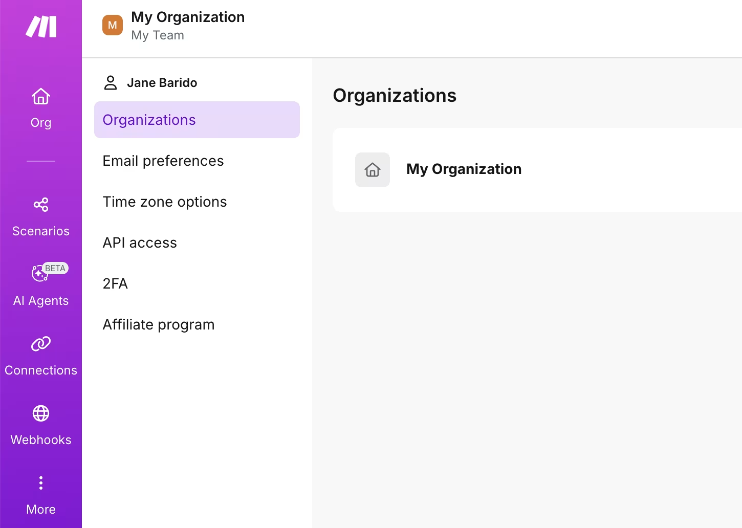
Asana
Asana is a commonly used project management platform, and their profile page implements a clean, form-based approach as well. The strength is clarity: photo, name, pronouns, title, team, role, and bio are all in editable fields. This gives team members quick context regarding who you are and how you work. The weakness is that it feels purely functional - more like submitting a form than creating personal presence.
Expert recommendations:
- Include a place for personality (tagline, tools, fun fact) to break the utilitarian feel.
- Utilize visual hierarchy so that key fields (name, role, availability) are clear.
- Don’t surface too many fields at a time - it’s better to use progressive disclosure.
- Include little interactions (status, quick contact) to make the profile feel alive.
Lindy
Lindy is an AI platform that engages users with agents that manage scheduling, outreach, and customer service. They’ve stripped the profile field down to what they think matters most: avatar, name, email, password, and theme settings. The purpose of the page isn’t to create a narrative, build trust, or represent a user’s work or character - Lindy intentionally prioritizes clarity and quick navigation over engaging storytelling.
Expert recommendations:
- Design the profile page to have a light feel, but ensure that critical actions (edit info, security, and billing) stand out and are easily accessible.
- Add some contextual microcopy.
- Don't go overboard, as profiles that are too bare feel lifeless and unconnected.
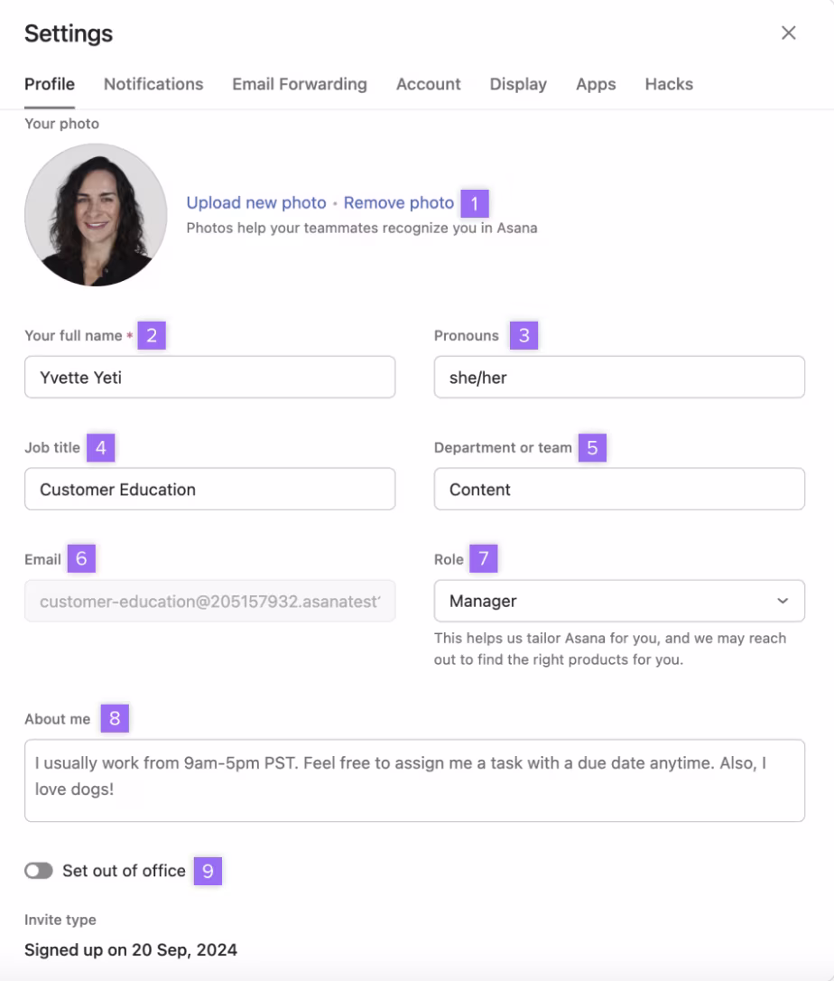
Dropbox
Dropbox is a cloud storage and collaboration tool. Their profile page is account settings, not identity. It is a well-designed and practical product, but it does feel more like a control panel. There’s no identifiable identity block to speak of, meaning they missed out on an opportunity to reinforce the user’s connection to the product.
Expert recommendations:
- Utilize key usage statistics to show the value of the product.
- Cluster advanced toggles (e.g., early access, timezone, etc.) in drop-down menu formats to tidy up the interface and preserve real estate.
- Add some light branding or micro-interactions to move the profile from a basic settings page to a piece of the Dropbox experience.
Twenty
Twenty is a CRM platform for managing customer relationships and data. The profile page is pretty basic. While the minimalist layout supports crisp and clear presentation and is efficient, it feels a little too bare, with not much role context, activity updates, or even some integration shortcuts to make the experience fun and connected to the CRM experience.
Expert Recommendations:
- To provide clarity when working as a team, consider adding context (for example, user permissions or roles).
- Do not overload this page with CRM data - we want it to stay user-focused.
- Emphasize security and integrations more visually - as CRMs often have sensitive data.
Jasper
Jasper is a content creation platform whose profile page has a design that is minimal and nearly invisible in the process. By collecting job title and department, it connects the user’s identity to the mechanisms by which the AI will tailor output - it is a clever connection of user information to the product’s value. Nevertheless, the profile page feels underutilized: rather than simply acting as a storage area for details, it could display writing history, style preferences, or team performance metrics, creating an engaging yet simple form into a creative tool that builds trust.
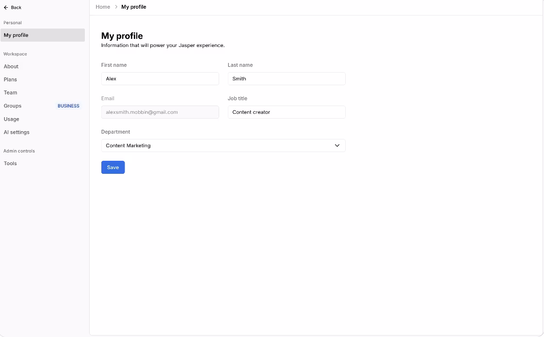
Expert Recommendations:
- Strive for a low-friction setup by simplifying forms.
- Link profile fields (e.g., job title or department) directly to how AI results are customized.
- Go beyond static fields - emphasize activity, saved outputs, or workspace contributions.
- Harness the profile page to showcase product value by demonstrating progress, usage, or achievements.
Aviyel
Aviyel is a platform that builds a community around open-source contributions. It also turns the profile page into a community hub instead of a settings page. The avatars, bios, and handles sit beside rewards, activity logs, and contribution badges, allowing the personal identity to be an obvious record of activity. The page is less about account management and more about reputation, motivation, and community.
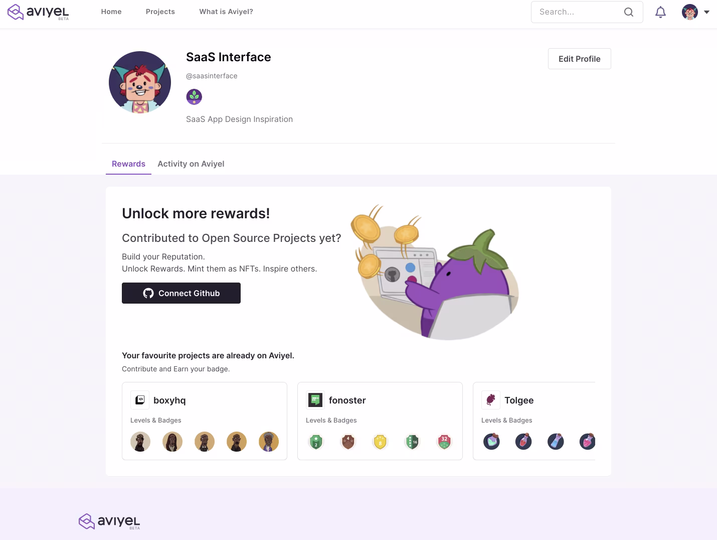
Expert Recommendations:
- Keep gamification components front of mind; badges and rewards will engage users.
- Have playful visuals and color, but balanced with a clean, professional layout for credibility.
- Don’t make the rewards the point of focus, but rather be able to showcase skills or expertise.
Vimeo
Vimeo is a video hosting platform where profiles act as public pages for creators. They include more than just account information, offering a bio, social links, and, most crucially, a grid of videos organized using tags. It’s less about settings, more about exhibiting work - a profile has become a performance stage for visibility and community.
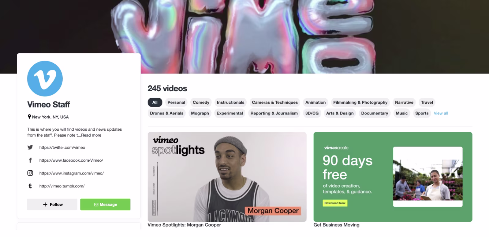
Expert Recommendations:
- Keep profiles personal, not just functional, while balancing identity and content.
- Use categories and tags to help users navigate.
- Don’t allow external links to overtake native engagement tools – make sure engagement stays within the platform.
- Consider modular sections to allow profiles to grow from simple bios into more complex creator hubs.
Miro
Miro is a platform for collaborative whiteboarding and team planning. Users complete a few basic details, including name, role, organization, and industry, as well as a simple avatar option. This approach leads to quick onboarding and allows templates to be customized later. The onboarding worked well for account setup, but it missed the opportunity to build a sense of identity in the platform.
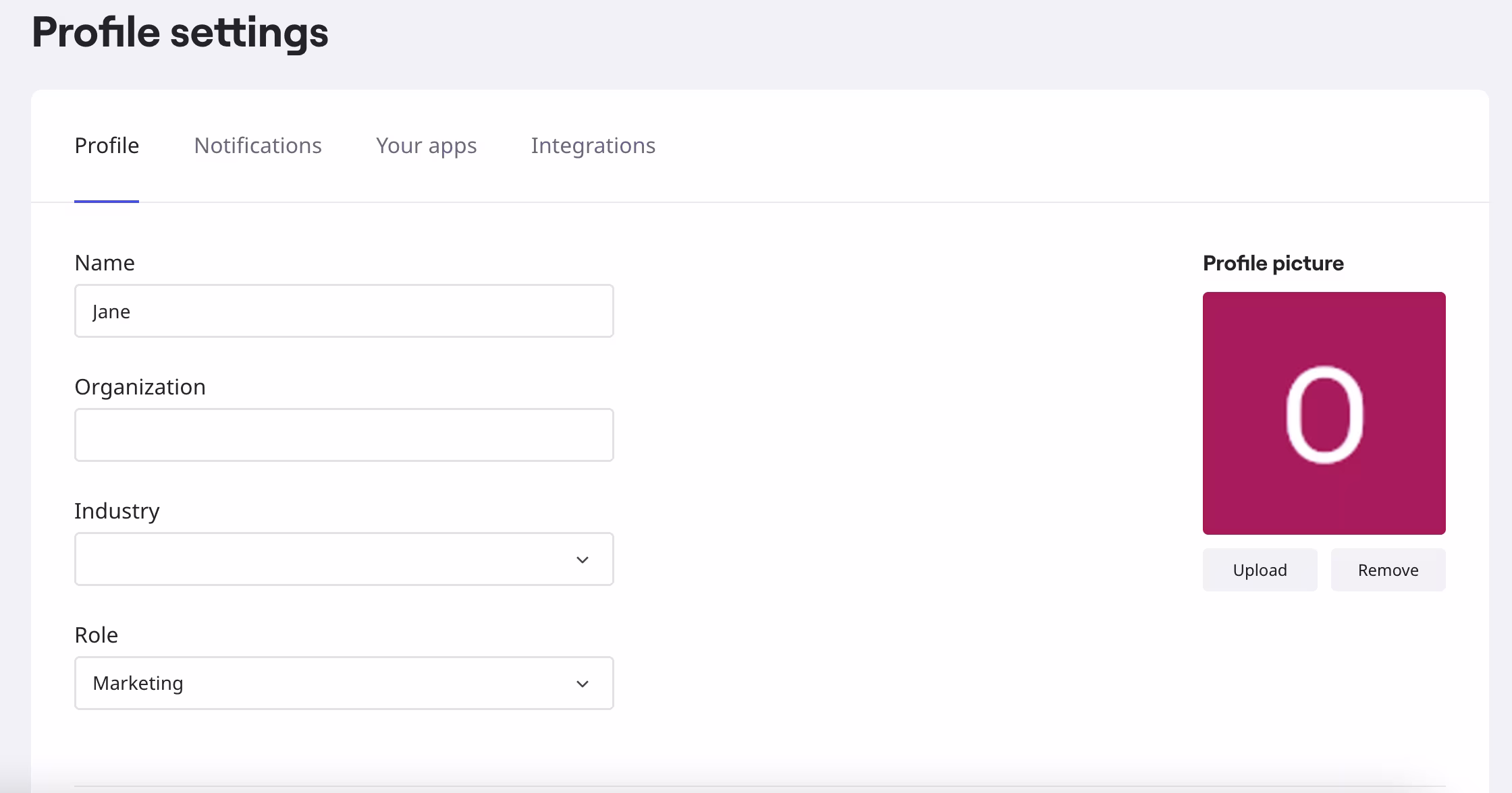
Expert Recommendations:
- Keep organization and industry fields, but explain their importance later.
- While the slim layout is excellent, it’d be nice to add very brief hints explaining each field’s importance.
- Don’t make avatar seem basic - allow users to pick colors or styles to allow for non-generic profiles.
- The static page isn’t always perfect - We’d give context with a quick preview of how profile info appears in shared boards.
Trello
Trello is Atlassian's project and task management tool, and here the user profile web page design mirrors Atlassian's design experience in the larger ecosystem. Users have a spot to set a username, a bio, and basic visibility preferences, with straightforward attention to privacy and clarity. It is simple and functional, staying true to Trello's no-nonsense collaboration experience.
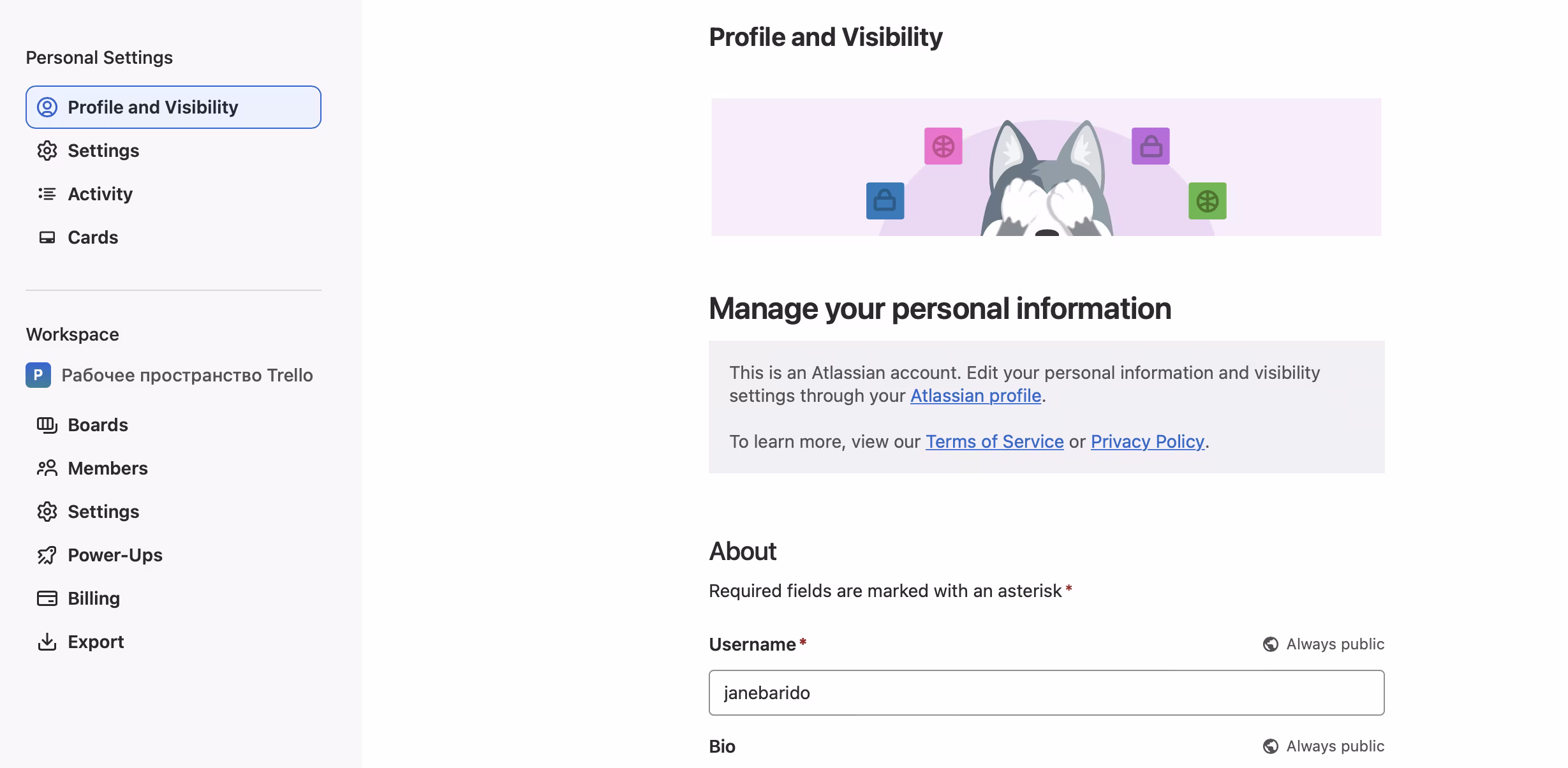
Expert Recommendations:
- Show recent user contributions to cards, boards, or tasks to make profiles feel connected.
- Add shortcuts to boards, teams, or preferred workflows for easy navigation.
- Don’t make it a one-way visibility settings page – this misses the potential for engagement.
Outseta
Outseta is an app that brings all the CRM, billing, and customer support into the same tool. The profile page is very basic, only including photo, name, email, and phone. The cool thing is how it connects to business operations such as plans, billing, and team management, so it stays functional and focused on a task. However, it feels more like a settings screen than an actual profile page, due to a lack of context, such as role, activity, or collaboration history.
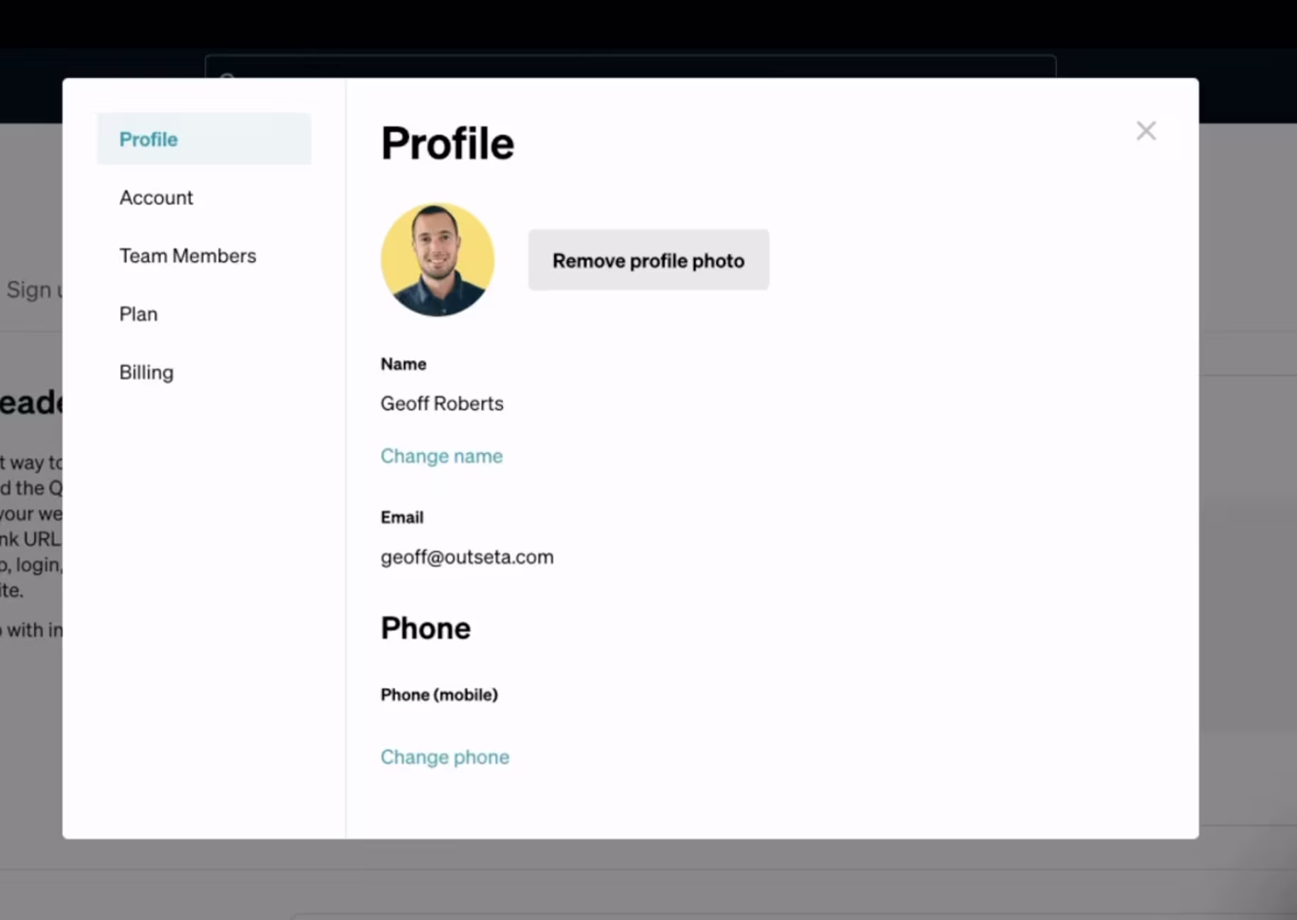
Expert Recommendations:
- Offer a quick view of account activity to make the profile feel more alive.
- Don’t leave the page too barren - minimalism shouldn’t take away the character of the experience.
- Utilize profile space to create trust, like showing billing status and team roles.
Freckle
Freckle is a platform that focuses mainly on data enrichment and integrations. The product is very streamlined and organized around managing accounts rather than identifying users. This is certainly appropriate for a tool focused on backend management, but the page reads more like a setup form than a profile – there are additional opportunities for activity highlights, data usage, and personalization.
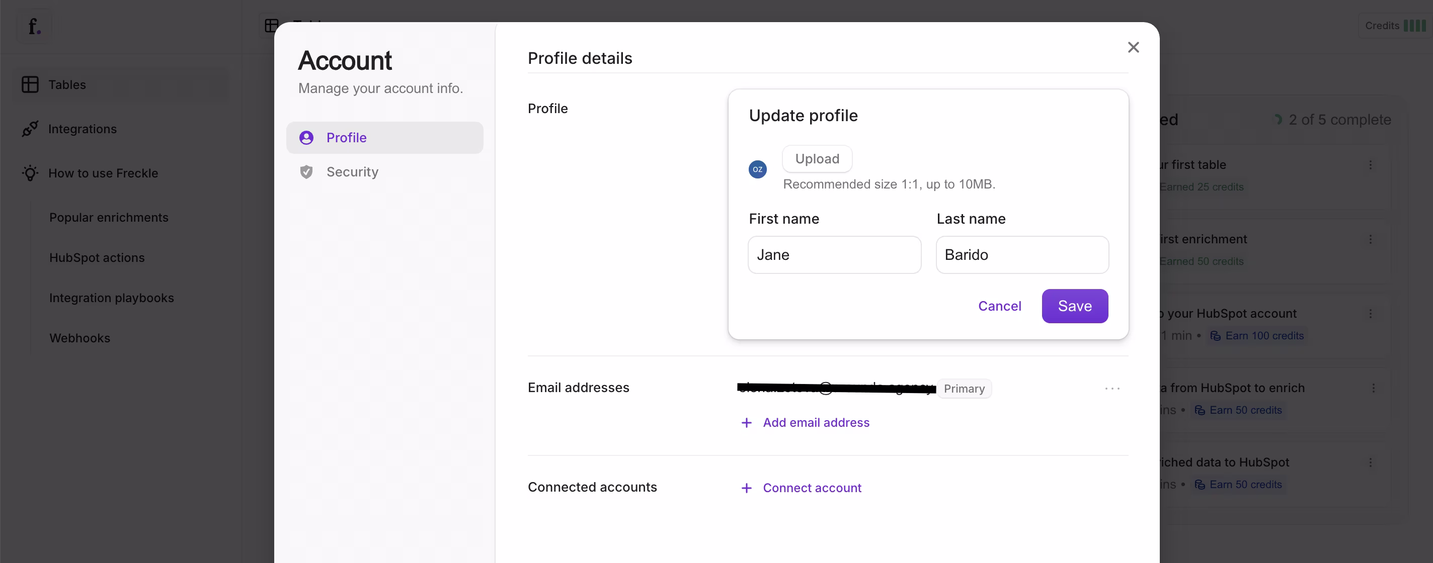
Expert Recommendations:
- Retain the light form for fast onboarding, but add optional profile details for richer context.
- Don’t let the profile be just a static input form – it will appear useless to users.
- Use this space to help build trust by showing related accounts or data security signals.
Midjourney
MidJourney is a product for AI-generated visuals. The account settings are laid out like a clear backend dashboard to provide easy access to IDs, linked accounts, and cookie preferences, and the emphasis on structure and clarity makes it all easy to manage. Given the solid structure as a base, the profile page also has more opportunities to translate some of the product’s creative spirit to inspire users just as much as the tool itself.
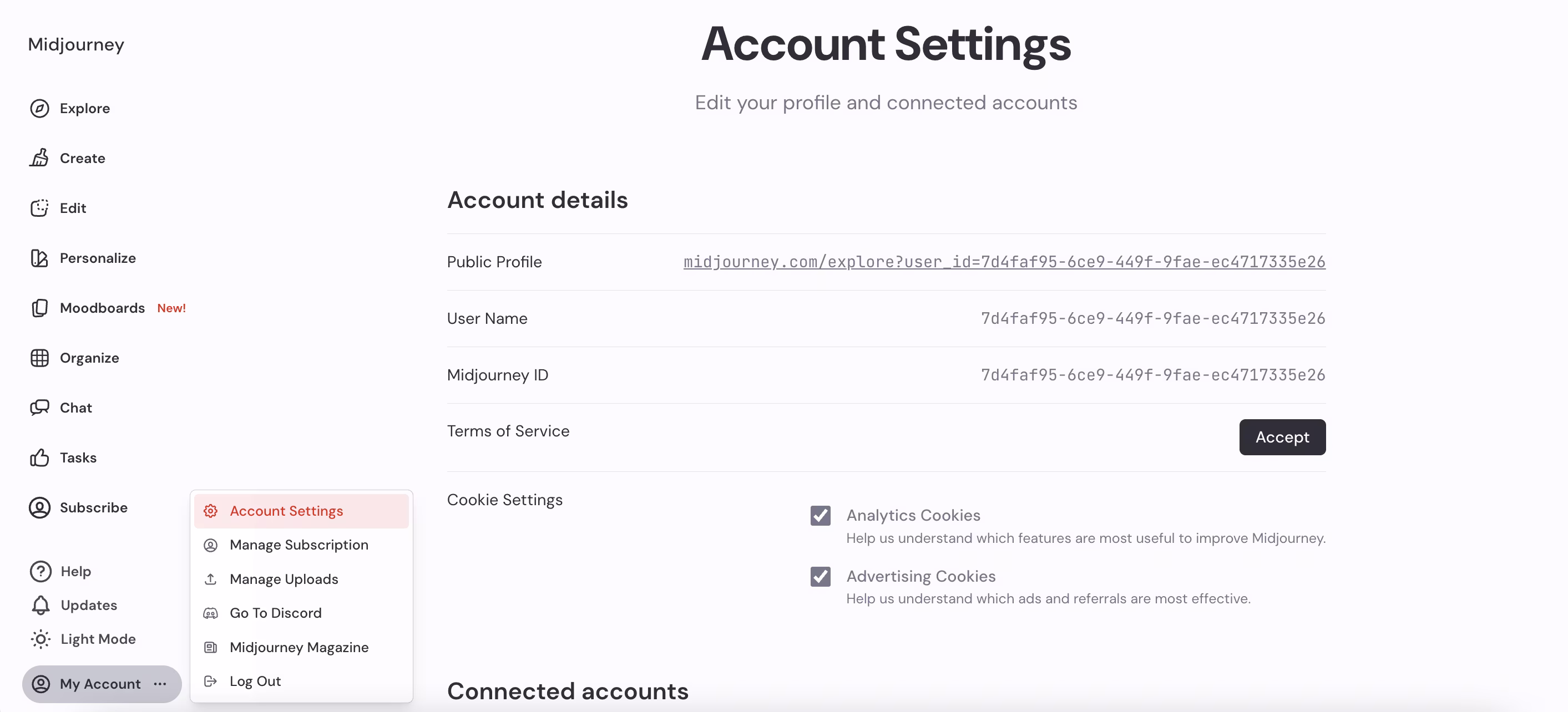
Expert Recommendations:
- Incorporate a small preview zone for user-generated work to emphasize profiles in creativity.
- The platform shouldn’t feel strictly operational – there shouldn’t be a disconnect between the brand’s promise and user experience.
- A simple personalization feature, like color themes or an avatar, could represent MidJourney’s artistic essence better.
Untapped
Untapped is a recruitment and career development platform. The profile serves as a structured portal between candidates and employers: resumes, links, demographics, and brief bios all live on this page. The structured page is very effective for data aggregation, but does not facilitate engagement or storytelling.
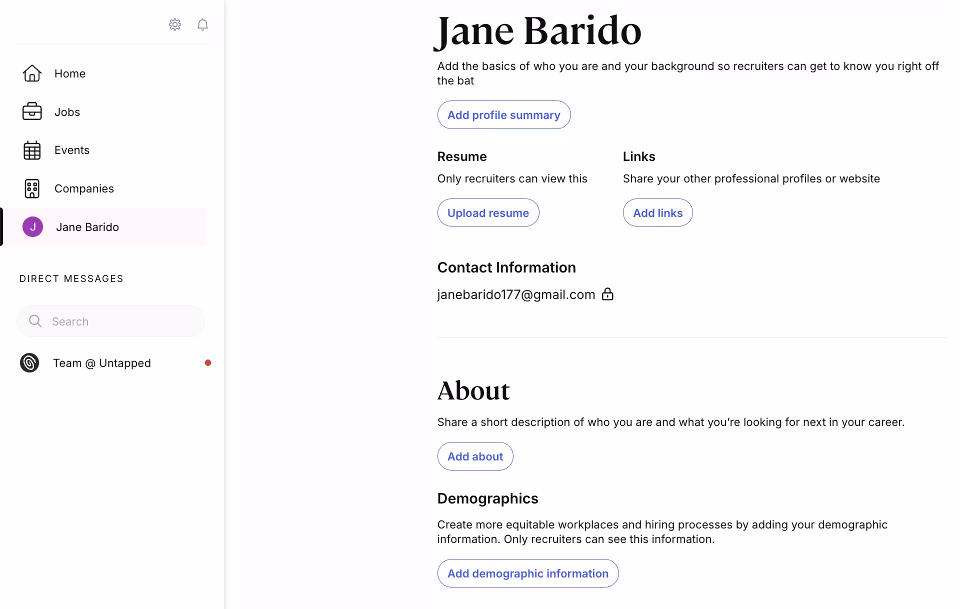
Expert Recommendations:
- Allow candidates to showcase their career goals or recent achievements on the page.
- Provide recruiters instant highlights (e.g., “Top 3 skills” or “Open to new opportunities”) to eliminate search time.
- Don’t bury all value under uploads – enhance plain resumes with visual or structured summaries.
Quora
Quora is a knowledge-sharing platform, and its account page takes a straightforward, utilitarian approach: email, password, and security settings are kept simple and clear. The separation of administrative tasks allows users to manage accounts and not get distracted, while the main platform experience is intended for discovery and engagement.
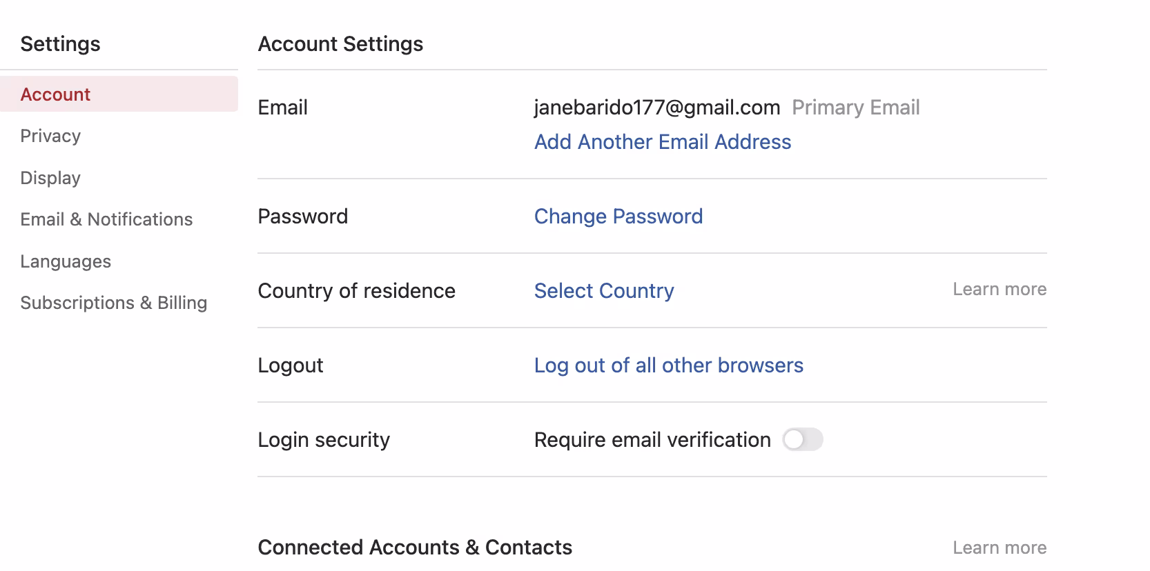
Expert Recommendations:
- Add microcopy that links settings to better content relevance.
- Keep the utility clean, but weave in subtle brand voice.
- Don’t make the page feel like a template form.
- Give quick links or prompts to encourage users to ask or answer.
Calendly
Calendly is an excellent planning and meeting management platform. Unlike other platforms where profiles hide somewhat in the background, here they provide a publicly facing touchpoint. The page combines a basic profile (name, photo, and location) with a welcome message, which frames how others will see you and interact with you directly.
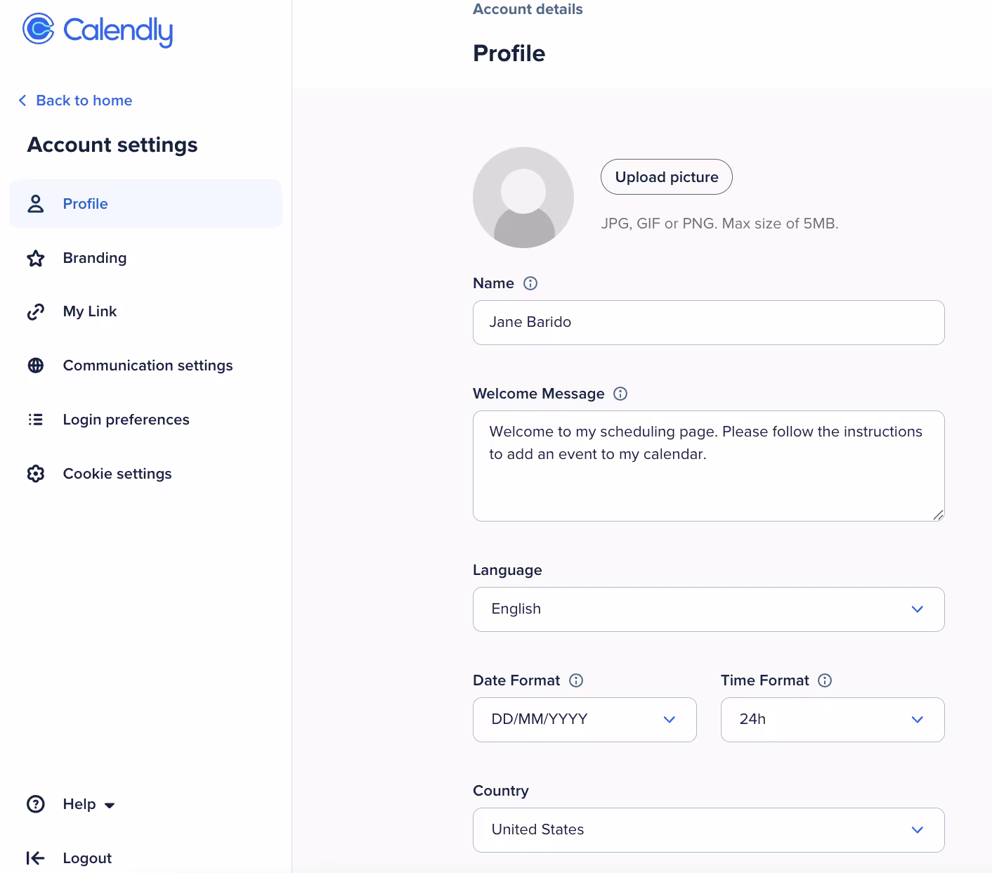
Expert Recommendations:
- Add lighter customization (colors, banners) to allow personal or company branding.
- Highlight surface availability or meeting stats to add more to the page.
- Keep the balance: Don’t overcrowd the page, but make the profile look more like a professional card, not just a settings page.
Maybe Finance
Maybe Finance is a software-as-a-service tool for more intelligent financial planning. Its landing page focuses on credentials and security, working with the product’s trust-first proposition. It’s a clean structure, although it is mostly form fields, and misses a moment of reminding users of their financial progress or other linked accounts.
Expert Recommendations:
- Build trust through transparency: indicate when and where the account was last accessed.
- Include a quick snapshot of linked banks or integrations so the profile feels connected to financial activity.
- Don’t stop with static inputs – finance tool profiles should feel relevant to the decision-making process, not just admin work.
Craft
Craft is a product management tool that has a super-lean profile screen. It’s simple and keeps everything organized, which is consistent with the product’s minimalist philosophy. The page serves its purpose, but it could also showcase a little more about the user’s role and work within the workspace.
Expert Recommendations:
- "Provide a role-based context (e.g., “Product Manager in Workspace X”) to personalize identity with how the tool acts.
- Provide light metrics (like “active projects” or maybe “last updated”) to feel connected, not static, dynamic.
- Don’t allow the photo and name to float alone, incorporate them into the larger product story so the page feels intentional."
Huly
Huly is a project management tool where its profile section integrates identity and workspace management. The corresponding design is also clean, and presents easy and quick access to the user’s core info, like name and login identities, and its spaces.
Expert Recommendations:
- Prioritize login management – it builds trust on multiple account types.
- Use minimal personalization (status, role, or activity overview) to avoid sterile profiles.
- Incorporate light onboarding prompts (“Without a social link, your collaboration is limited”) to turn static input into engagement outputs.
Mangomint
Mangomint is a salon & spa management tool. Rather than treating the profile page design app like a static account settings page, it combines personal identity with quick links to operations. The page functions as a single point of access for running the business as opposed to simply editing your profile.

Expert Recommendations:
- Make profile pages action-oriented if the platform is for high-frequency tasks.
- KPIs, such as sales numbers or daily totals, could turn the profile into a productivity tool.
- Don't overlook identity cues – a role, team, or recent activity would build more context.
- Put support and learning links directly in the profile page, as that's where users go for help.
ClickUp
ClickUp’s app profile page design is closely intertwined with workspace management. Along with a variety of configurations offered, users can choose theme modes, select a language, and dictate how the app responds. While these options reflect a degree of ownership, the page feels more like a checklist than an expression of where the user fits into the platform.
Expert Recommendations:
- Link preferences with productivity – e.g., if time format or language is set, communicate how this helps/supports collaboration across teams.
- This is a place to show usage insights, too – “you spent 60% of your time in Planner last week” will help to liven the page.
- Don't bury advanced personalization deep in settings; bring it out to the profile to reinforce ClickUp’s flexibility and adaptability.
Hypermode
Hypermode is a unique platform where the profile view transitions from the human user to the AI agent. Instead of the usual personal details, the screen presents the bot as a professional entity with its own name, avatar, description, instructions, and activity stats. It makes the agent feel more personable and more trustworthy.
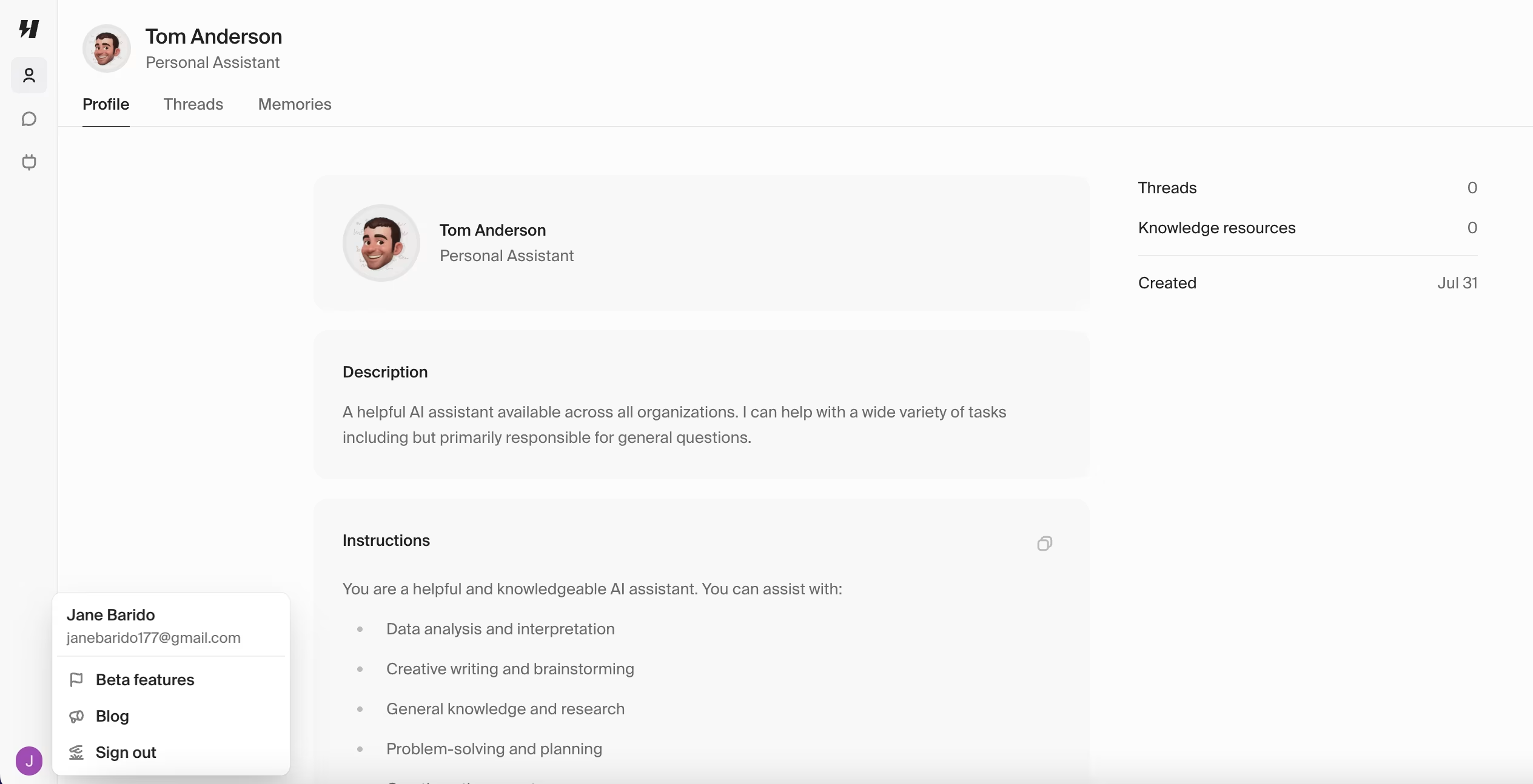
Expert Recommendations:
- Treat AI agents as branded identities, not faceless utilities.
- Show performance stats or history.
- Avoid making agent profiles too static – users need to see growth or adaptation over time.
Linear
Linear is an issue tracking and product management platform. The profile screen was designed with simplicity in mind: picture, email, full name, and username. This aligns with Linear’s value of speed and simplicity – but it seems almost too simple.
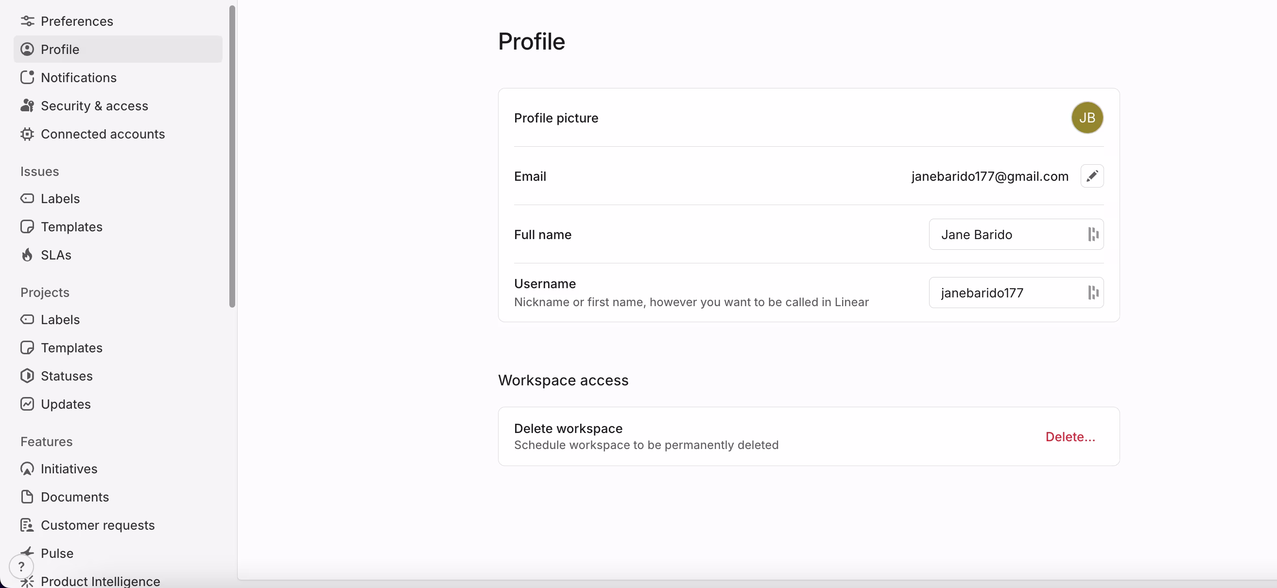
Expert Recommendations:
- Incorporate context (role, team, active projects) to connect work to identity.
- Utilize lightweight analytics (“issues closed this week”) to foster a sense of impact.
- Individualize workspace visuals (themes, quick links) to increase the non-transactional feel of the page.
Zapier
Zapier is centered around automations, and the profile page exemplifies that thinking: clean inputs, organized fields, and minimal visual noise. It serves reliability and security well, but does not utilize the page as a growth or engagement touchpoint.
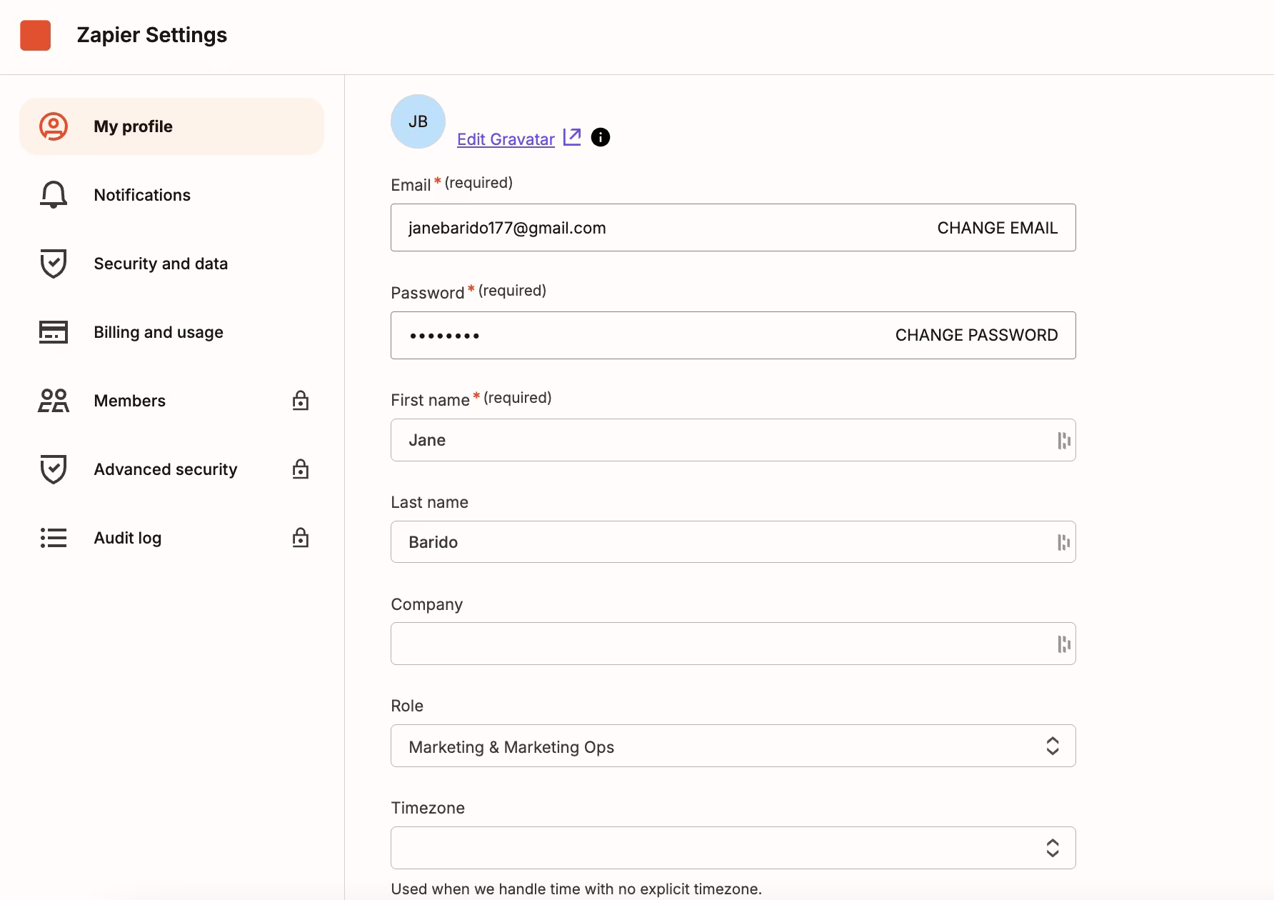
Expert Recommendations:
- Use role/timezone to suggest relevant workflows.
- Highlight top or recent automations directly in the profile.
- Show quick stats (“X tasks automated this week”).
Evervault
Evervault is a SaaS platform specializing in data encryption and safety, and its profile screen communicates that vision. Just three fields for name and email, a password reset link, and a prominent “Danger zone” for account deletion.
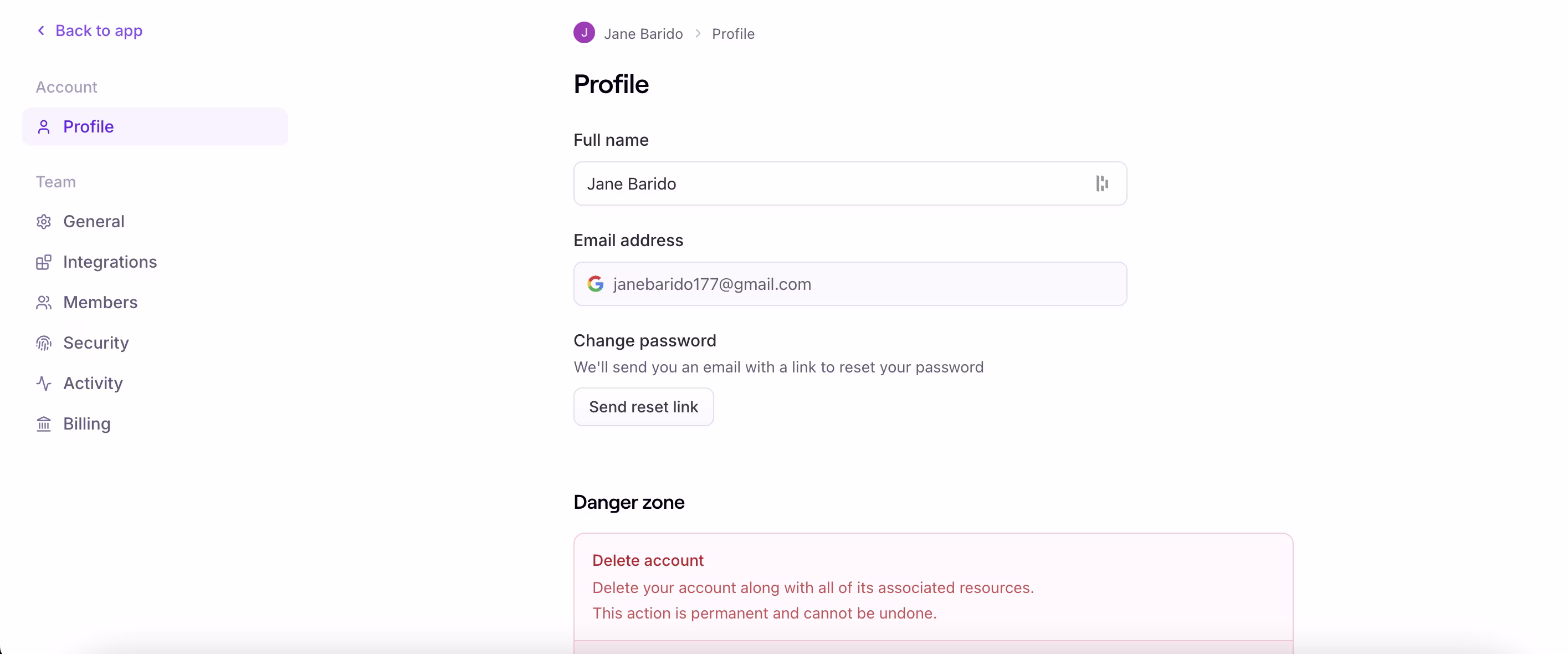
Expert Recommendations:
- Maintain a strong security focus yet include some trust cues (e.g., security badges, last login history).
- You may also want to consider including transparency of usage (e.g., “X encrypted requests today”) to mentally tie the profile back to the product value.
Premium Tips for Effective Profile Page Design
Upon reviewing app and web design profile page examples, it became apparent that the best profiles were not just background screens. They were quiet conversion levers, as they inspired trust and influenced how users viewed the product.
UI/UX Best Practices
Rather than becoming "just settings," profile pages have the potential to influence retention and upsells when appropriately executed.
Design profile page according to these best practices:
- Use roles as custom dashboard or template triggers.
- Include microcopy demonstrating the value of each field.
- Place sensitive actions beneath sections of clarity and trust.
- Consider timelines or usage stats to show progress.
- Add subtle upgrade prompts that are framed as feedback versus sales.
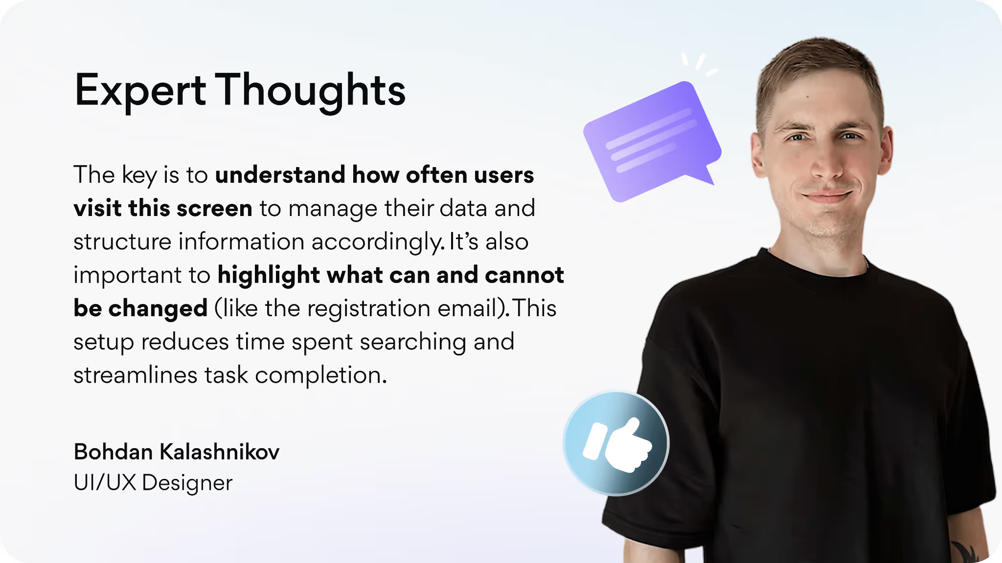
At Arounda, we’ve spent over nine years designing SaaS products, and there’s one clear takeaway: even the smallest element of an interface can have an impact on trust, retention, and a brand’s image. To help wrap our heads around it, we talked to our expert UI/UX Designer, who has worked on many products and has firsthand experience with how profile pages design affect both usability and brand image.
We asked for his advice on the profile page’s small details in design that actually influence how users view the brand.
“My advice here is to keep this page simple, straightforward, and use micro animations. When a user uploads a photo, show progress. When they change data, display a success message or update the button title from ‘Save’ to ‘Saved ’. This approach helps users see that the app is responsive and that their action was successful.”
Bohdan Kalashnikov, UI/UX Designer
Key design patterns that attract attention
Patterns in a sample profile page design make it easy to draw attention to the right levers without overwhelming users with information.
- Identity cards with context (photo, title, and organization) create instant recognition.
- Light gamification touch points, such as a progress bar or historical progress milestones, create desire in users to complete their setup.
- Tactical callouts help identify integrations, unused features, or “unlockable” rewards right in the profile.
- Anchor Navigation with sticky menus lets users go directly to components (security, billing, usage).
How to go from inspiration to creating a unique design
When companies see competitors’ settings pages, their instinct is to mimic them, and they still miss the unique opportunity for growth that this page represents. The smarter question to ask is: what role does the identity play in product growth? This is the point of departure for design.
Step-by-step instructions on how to decide what your profile page should do:
- Clarify the business purpose of the profile: a driver of retention, a hub for personalization, or a trust-builder.
- Define what metrics can also serve as motivators (credits, activity streaks, feature utilization).
- Differentiate what metrics have to be user-facing, and what metrics can remain hidden to mitigate information overload.
- Draw inspiration from ecosystems that utilize identity-centric solutions (ecosystems in gaming, creator platforms, learning apps).
- Remember that your overall design decisions should be consistent with your brand story/who you are.
How can Arounda help with your profile page design?
At Arounda, we’ve partnered with SaaS companies to redesign and develop products that got 4.6x revenue growth, +170% engagement, and -37% churn as a result of that work. We don’t just design profile pages - we integrate them into a consistent, dependable, and conversion-ready product experience.
If you want your product and all elements from profile pages to dashboards to perform, check out our UI/UX Design Services. Our team makes sure that your product looks outstanding, performs excellently, and drives real business results.
Summary
The profile screen is where the product shows its “true face.” Here, users evaluate if they can trust the platform, if it feels like it was designed for them, and if it’s worth sticking around. Good design is able to elevate this screen to a growth lever; poor design renders it undetectable.
Want each detail of your SaaS to inspire trust and encourage conversions? Reach out to us - Arounda can support you in designing profiles and products that succeed, not just exist.

Table of contents


FAQ
A user profile page is the user’s personal space within a product. Account info, preferences, activity history, and sometimes social activity are contained here. In any tool, the profile page helps users manage their identity, trust the product, and connect with the service.
Products tend to have cluttered screen layouts, slow load speeds, and poor mobile responsiveness. They often hide too much important action when users need to click too many times. Another big mistake is to build a site that is completely informational (with not even a little bit of space for personalization or engagement).
A good profile page UI design makes profiles intuitive, visually attractive, and simple to edit. When users quickly access what they need and clearly see their data, they will be more likely to explore more features and sustain use over time.
Customization shifts a static page to one that morphs to the user’s needs. Avatars, themes, tracked activities, and personalized dashboards enable customization. This increases ease of use and satisfaction with the design.
Mobile design should be lightweight, superfast, and optimized for smaller screens, meaning having simple navigation with large tap targets and little to no clutter. For web profiles, complicated layouts and fancy hover interactions are acceptable since users have more room and expect more functionality.


89+ Reviews
on Clutch

Top Rated Plus Agency
on Upwork

Top 50 Trending team
on Dribbble

Projects are Featured on Behance platform
