
40 Best Digital AI Product Design Examples in 2025

AI has gone from being a piece of software to the backbone of all digital products. And it's design that makes AI tools usable, trustworthy, and loved. Recent research shows that 52% of AI builders say design is more important for AI-powered products compared to non-AI products.
Obvious, right? AI products have lots of complexity under the hood, but businesses want people to feel like those products are simple on the surface. The best design hides the business and technical weight, delivering a seamless, human experience.
At Arounda, we have spent over 9 years developing end-to-end digital products, from strategy and UI/UX design to branding and code, and we know how to help AI products grow and succeed.
This article was created by our team of experts, who compiled 40 of the best AI digital product design examples in 2025. These cases illustrate how leading companies make AI simple, valuable, and trustworthy.
Article Key Takeaways
AI products are powerful but often too complex without good design. Poor UX creates suspicion, confusion, and raises the barrier to AI adoption.
The answer is a clear and consistent UI/UX that hides complexity, helps users navigate the system, and builds trust. When design helps simplify advanced AI products, they become something people enjoy using.
This guide highlights 40 of the best AI product design examples in 2025, ranging from front-runners like ChatGPT, Claude, and Midjourney to products solving productivity, creativity, automation, and marketing problems, giving you a roadmap to design AI products that capture users and drive growth.

What is Digital AI Product Design?
Product design is critical to how people ultimately use AI-enabled tools. The goal is to make information-rich and sophisticated systems natural, safe, and valuable.
AI design is primarily focused on two key tasks:
- First, it needs to convert technical intelligence into a human experience that makes sense.
- Second, it must establish trust, demonstrate that the AI is reliable, transparent, and will always act in the user's best interest.
As AI continues to evolve and create new content, designers must consider how to guide users through uncertainty, establish context, and maintain predictable interactions.
When designed well, a digital AI product can make complex technology feel like a simple tool.
What factors indicate a well-designed product?
A great digital AI is characterized not only by its features but by how seamlessly it adapts into everyday use. These products share some interesting and identifiable characteristics:
- Clarity. The interfaces are clean, focused, and easy to scan. Users understand at the very start where to look and what to do.
- Consistency. The visual language, interactions, and feedback are stable across the product. This leads to trust.
- Efficiency. Navigating between tasks takes less time because the design has removed unnecessary friction to flow. The flows feel concise and direct, with appropriate guidance.
- Adaptability. The product feels open to interpretation at will and adjusts its output tailored to user goals (without rushing them).
- Trustworthiness. Indicators of trustworthiness include a transparent explanation of outcomes, errors, and ethical decisions.
Market Leaders
Below are some ultimate digital AI examples of product design from leaders in the field. These organizations set the standard for usability, trust, and innovation. They illustrate how design can leverage advanced AI to create products that people use daily.
ChatGPT
ChatGPT is OpenAI's iconic conversational AI platform, used by millions of people for research, work, and other tasks in their daily lives.
What stands out:
It transforms generative AI into a mainstream product by combining technical depth with a minimal interface anyone can use.
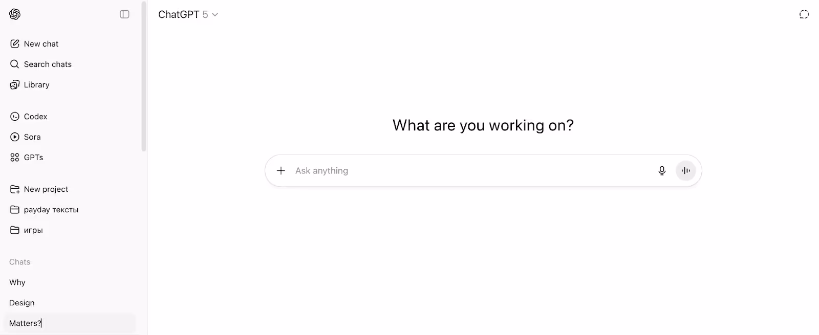
Design takeaways:
- Having one input bar is a way to reduce friction and invite immediate practice.
- Contextual prompts like "What are you working on?" might ease blank-page anxiety.
- A clean sidebar contextualizes and supports channels without causing distraction.
- Enhanced typography and spacing allow longer conversations to skim easily.
- A layout that scales, suits casual as well as enterprise users.
Claude
Claude is a conversational AI assistant, known for its emphasis on safety, transparency, and long-form reasoning.
What stands out:
Claude's design spaces create a calm, "document-like" space for reading and writing, and make complex outputs feel professional and straightforward.
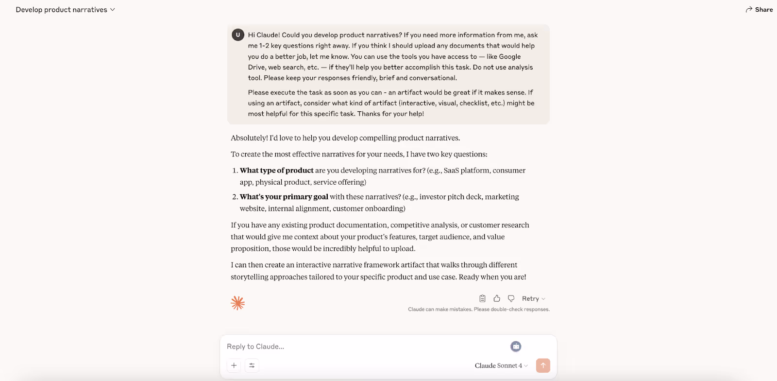
Design takeaways:
- The document-like layout provides an organic reading experience for lengthy content.
- Clear typography hierarchy improves scanning and comprehension.
- A broad text canvas enables detailed reasoning to be presented without any clutter.
- Soft colors + minimal chrome keep focus on the content.
- Inline citations add transparency and trust.
Perplexity
Perplexity is an AI-powered search tool that merges conversational answers with cited sources to help a user examine a topic with both speed and precision.
What stands out:
The interface combines basic search functionality with academic research transparency to provide users with immediate answers they can verify.
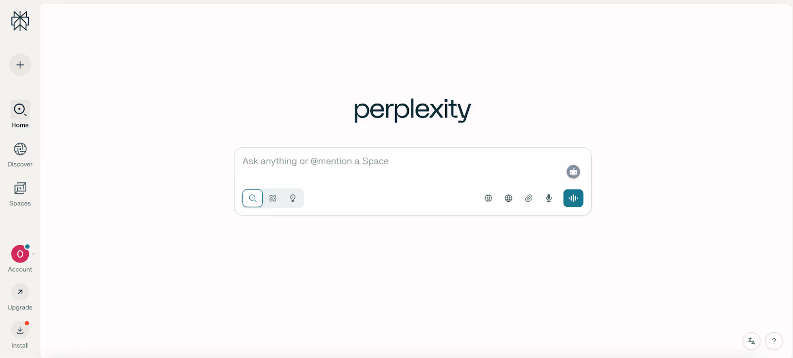
Design takeaways:
- The Search-first input bar provides an easy-to-use interface that makes interactions feel natural, so new users can learn quickly.
- Inline citations and sources build trust by showing exactly where answers come from.
- The minimal centered layout creates a clean design that eliminates distractions to focus on the main query as the central action.
- Icon-driven controls (search, re-run, voice, upload) expand function without cluttering the interface.
- The visual identity maintains consistency through clean typography and a calm color palette, which establishes credibility.
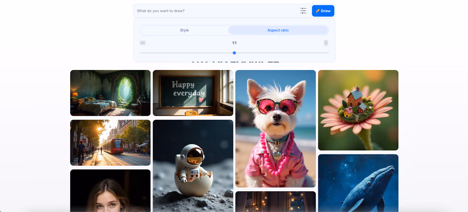
DALL·E 3
DALL·E 3 is a great example of product design that can produce highly detailed images from natural language input and has been widely adopted in design, marketing, and the creative industries.
What stands out:
The structural design enables complex text-to-image visuals to be created with a simplistic input structure, providing space for any user level to create their own professional visual.
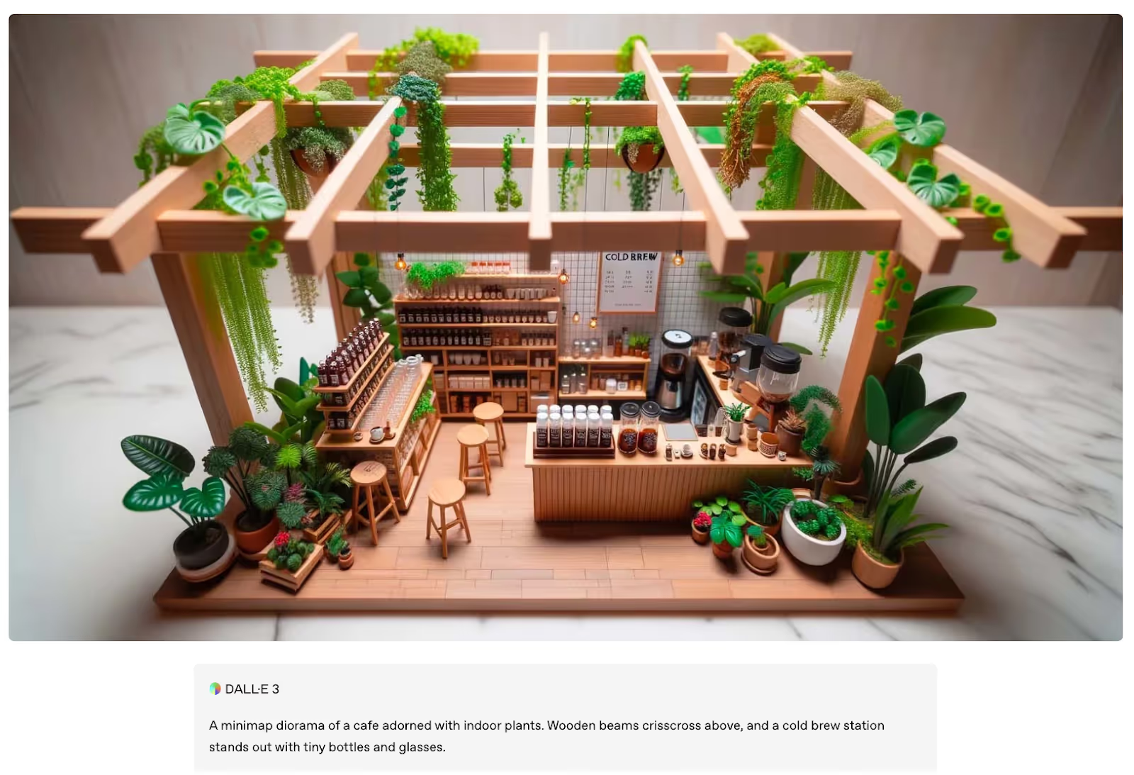
Design takeaways:
- Prompt-driven UI allows natural language to be edited to visuals with very little friction.
- Iterative previews effectively allow users to learn prompt engineering through a feedback loop.
- Focused canvas layout provides clear outputs and reduces visual noise from the interface.
- Clear separation of text and visuals enables users to control the output while also providing inspiration.
- Visual hierarchy gives equal separation to the prompts, images, and actions.
Midjourney
Midjourney is a generative AI system designed to create artistic images, which has become popular among designers, artists, and creative teams for its unique aesthetics.
What stands out:
The design positions AI generation as a creative studio, balancing robust control with a gallery experience.
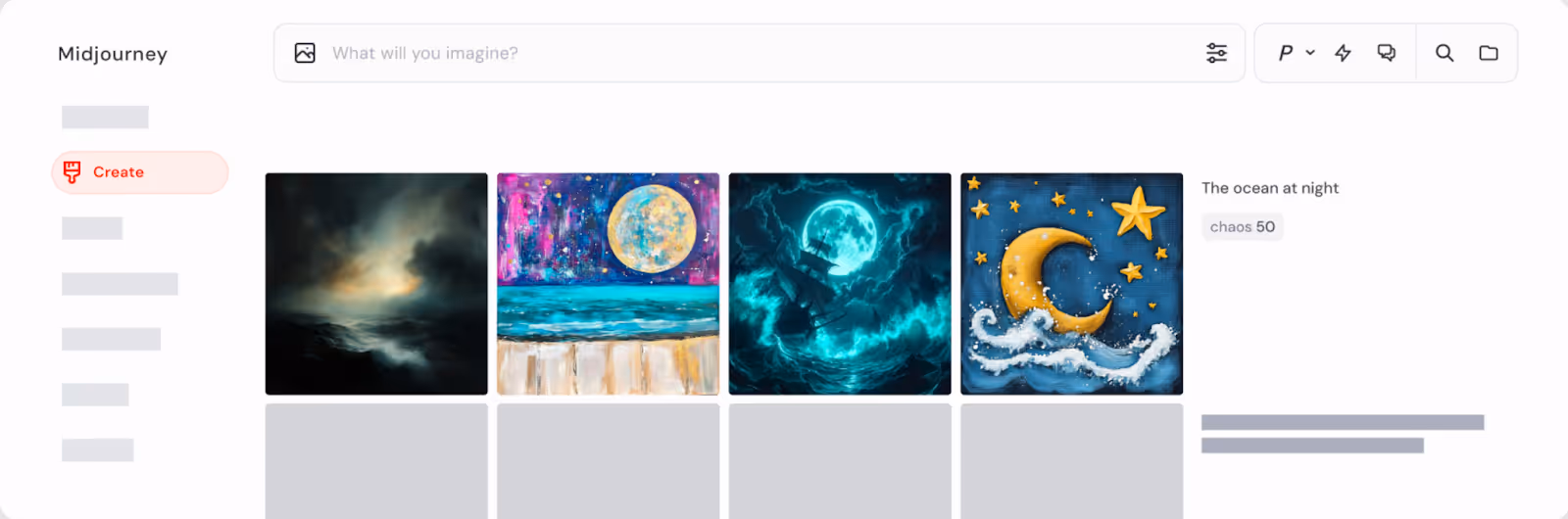
Design takeaways:
- Prompt bar + gallery view put creation and iteration at the center.
- Side-by-side outputs make artistic comparison intuitive.
- Compact icons expose advanced controls without clutter.
- Instant previews guide users toward refined styles.
- Minimal navigation mirrors a focused studio workflow.
Stable Diffusion
Stable Diffusion is an image generation model with a flexible and detailed range of customization and features for developers, creators, and enterprises in all sectors.
What stands out:
It was designed to provide casual users with a straightforward way to generate images, along with robust controls for experts. This has made it one of the most versatile creative AI tools available.
Design takeaways:
- Easy input field lowers threshold for new users.
- Style and aspect sliders display precise visual appearance controls without complex drop-down menus.
- Bright preview system lets you iterate quickly, good for creative work, creating flow.
- An open design format gives room for strength to support plugins and extensions for the community.
AI Marketing & Sales Tools
Here we highlight digital design examples that automate outreach, personalize customer journeys, and improve sales processes.
Flair
Flair is an AI-based platform for creating and managing agents, bots, and multi-step workflows. Our team designed the UI/UX, website, and MVP, providing the product with scaling potential through a user-focused, intuitive, and professional design. We took a technically complex tool and transformed it into a well-defined and polished platform, ready for growth.
What stands out:
Flair combines a visual workflow builder and advanced AI automation. Every block, action, and connection provides teams the confidence to manage even the most complex workflows.
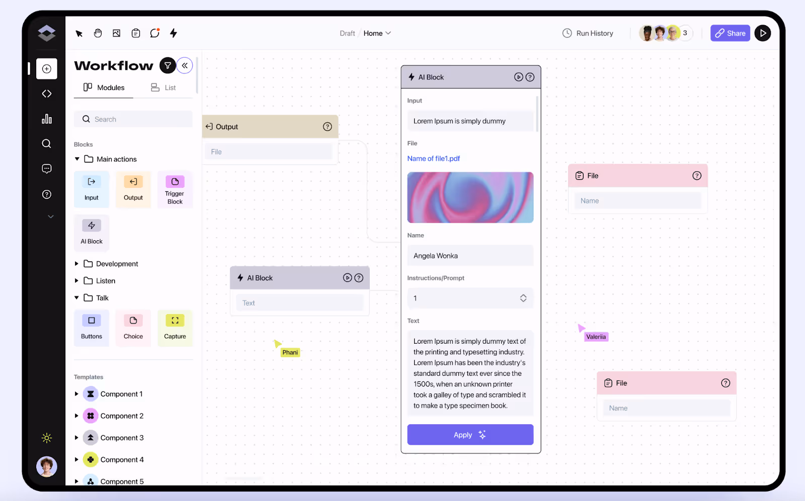
Design takeaways:
- Block-based logic turns automation into a drag-and-drop experience.
- Workspace navigation provides easy switching between projects.
- Modular templates and flexible menus speed up workflow and support scalability.
- Real-time visualization (charts, flows, dashboards) provides transparency and easy monitoring.
- Consistent visual language ensures the product has a professional feel.
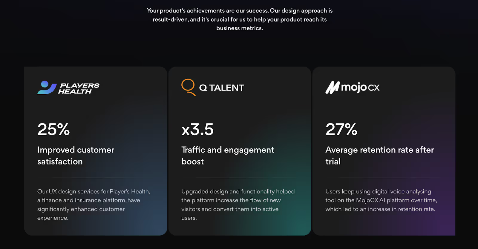
Mojo CX
Mojo CX is a SaaS platform that helps contact centers reduce costs, improve revenue, and improve call quality with AI coaching. We redesigned the workflows, created a simple UX, and developed an MVP that consolidated three separate tools into a unified platform. Additionally, we provided a modern, professional look that feels cohesive and scalable.
What stands out:
Agents receive AI coaching in real-time during calls, and managers have organised dashboards to monitor performance. The design is easy and effective, even for complicated operations.
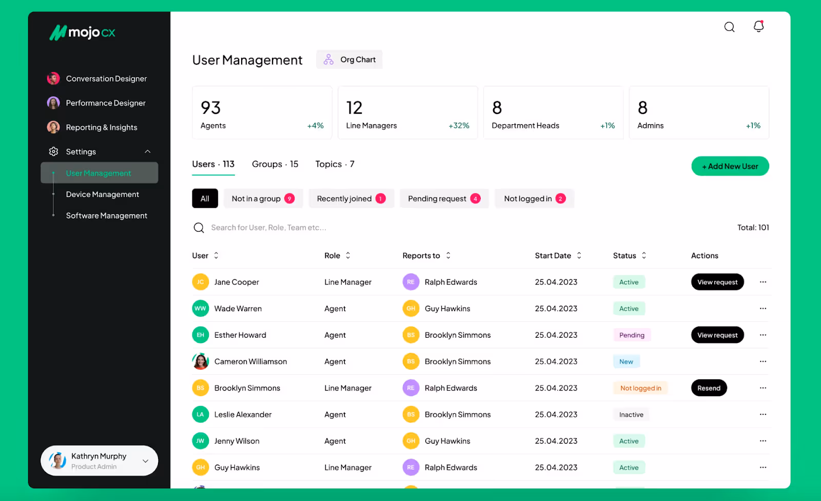
Design takeaways:
- One transparent ecosystem opposed to three separate tools.
- Interfaces are designed for different roles, allowing agents and managers to remain focused.
- AI coaching is always visible during calls with no extra clicks needed.
- Prototypes and wireframes helped align everyone before development.
- A modern visual style that looks savvy and easy to scale.
HubSpot
HubSpot is an AI-powered CRM solution that enables companies to manage customer data, sales pipelines, and marketing campaigns all in one place.
What stands out:
The design presents a lot of customer information to the user without confusing or overwhelming them. HubSpot takes complicated, complex workflows and turns them into simple dashboards, based on user roles that keep teams together.
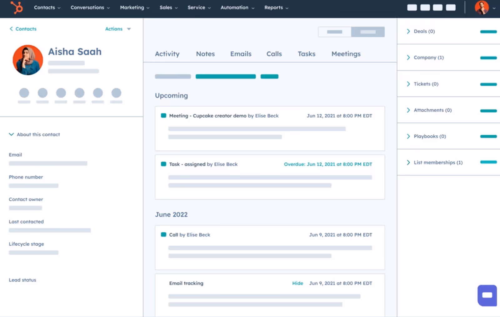
Design takeaways:
- Contact profile cards display emails, calls, and tasks in a single timeline view.
- Related objects, like deals, tickets, and attachments, can be found in the right-side panels for quick context.
- A clear visual hierarchy displays key actions, while secondary details are collapsed.
Apollo
Apollo is a sales intelligence and engagement platform designed to help teams identify leads, score prospects, and execute outreach campaigns.
What stands out:
You can quickly filter, compare, and act upon complex prospecting data due to the design. The interface transforms a massive database into a clean canvas, allowing sales reps to operate efficiently without getting bogged down.
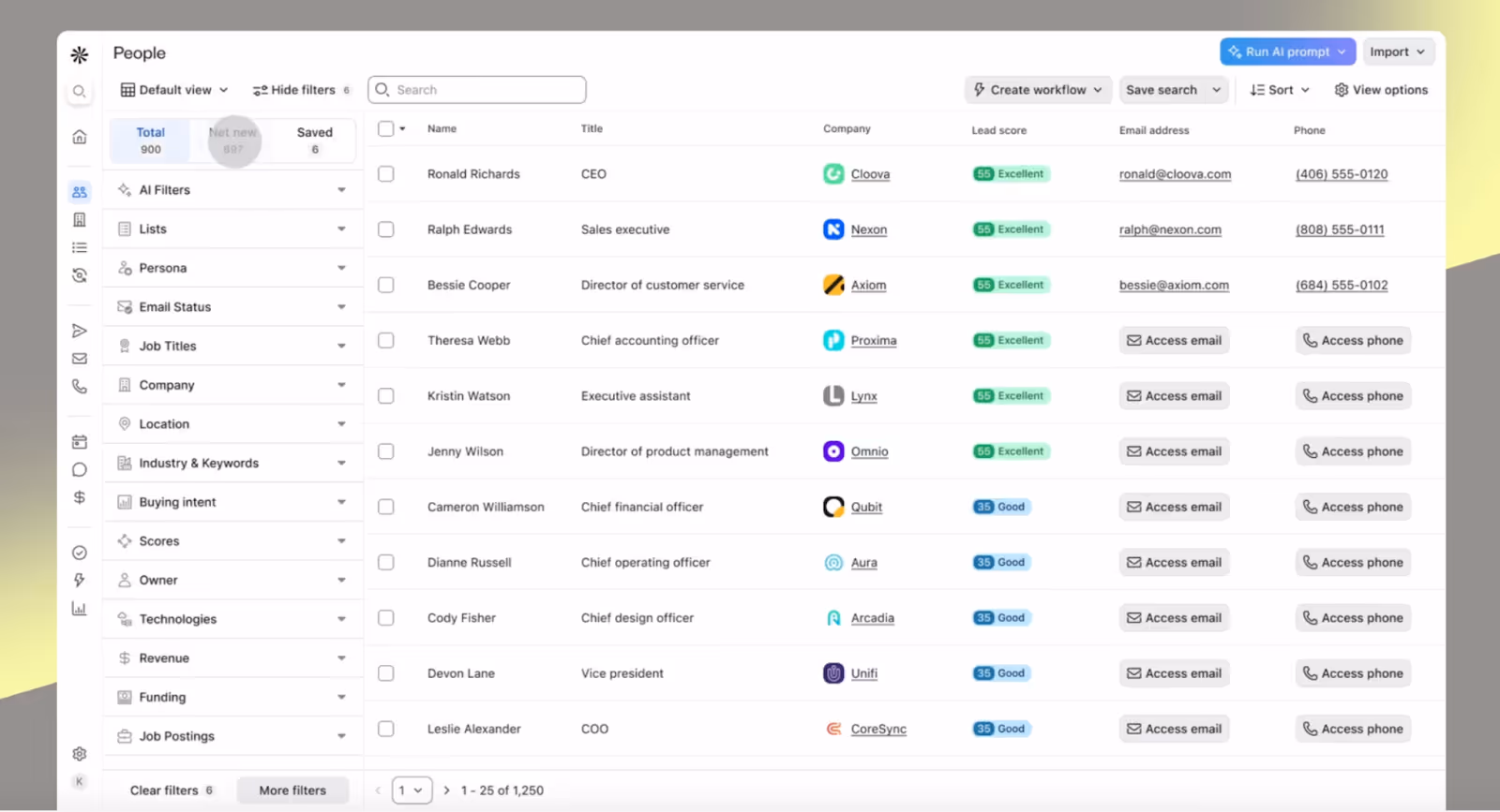
Design takeaways:
- Sidebar filters instantly filter for industry, role, and buying intent.
- The tabular view organizes prospects, including names, job titles, companies, and scores, all in one place.
- Lead scoring is colored, providing quick and easy scanning and understanding of details.
- Inline actions allow users to call or email a client directly from the list view.
Seamless.ai
Seamless.ai is a sales prospecting platform that provides teams with verified leads and real-time contact information.
What stands out:
Its design is fast and clear. Applying filters feels natural; results update instantly; and the design of result information allows you to quickly scan important information like name, role, and company.
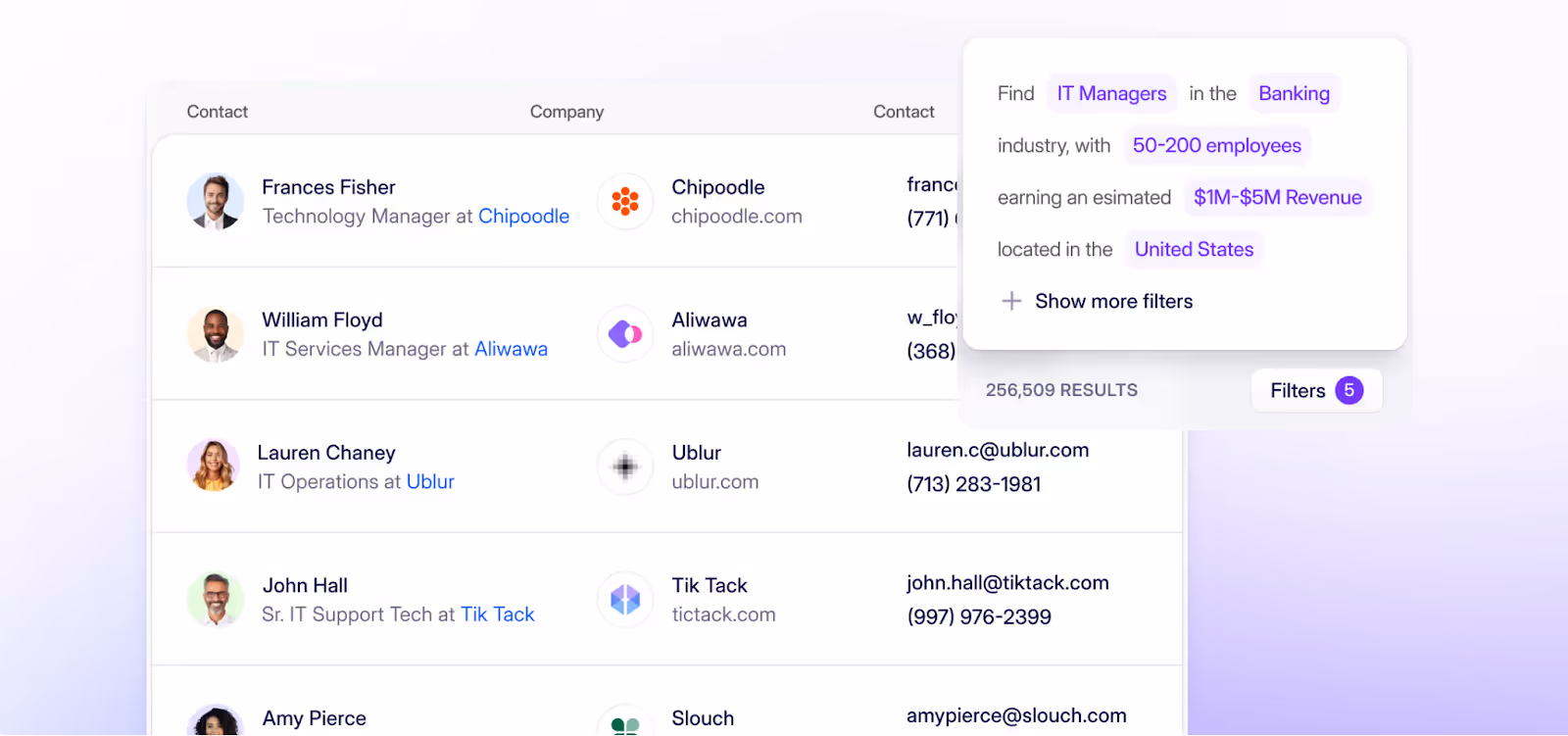
Design takeaways:
- Using dynamic filters as tags makes search criteria visible and editable.
- Search results are live- this enhances confidence in the data.
- Profile rows will highlight name, title, and company first to keep the view human-oriented.
- Light background and accent colors create a clean and friendly look.
Surfer SEO
Surfer SEO is a content optimization platform designed for marketers and writers to develop SEO-friendly articles using data-driven recommendations.
What stands out:
The product design leverages complex SEO metrics, making it easy to take action. It combines analytics, scoring, and writing into one workspace that enables teams to improve ranking while maintaining the integrity of content development.
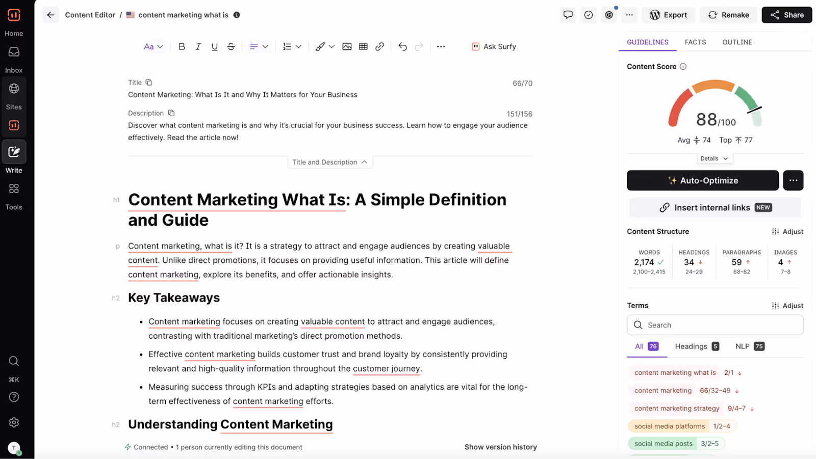
Design takeaways:
- The real-time content score indicates how closely the writer's text aligns with the SEO goals.
- The guideline tool identifies main topics and key terms and indicates length and structure without bombarding the editor.
- A single, integrated writing environment shows both analytics and writing editing on one screen.
- The visual feedback showing green, orange, and red scores makes optimization easy for writers without SEO expertise.
AI Automation
These AI automation tools illustrate that when design is approached and executed well, complex and repeated workflows can be changed into a visual, rapid, and even fun experience.
Altflow
Altflow is an AI platform that centralizes SEO articles and content workflows, allowing users to create content quickly and expertly manage workflow in one place. Our team worked on UI, UX, website, and MVP. We aimed to take a technical tool and create a clean, scalable product that felt simple for everyday users, yet powerful enough to accommodate an entire growing team.
What stands out:
Altflow provides a guided and structured experience for AI content creation. Instead of using multiple tools, Altflow gives a one-tool dashboard for generating, editing, and tracking content seamlessly.
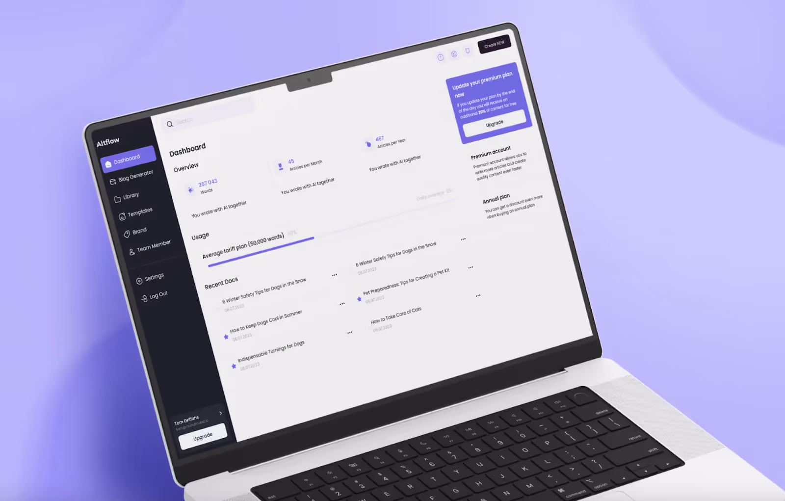
Design takeaways:
- The dashboard overview summarizes usage stats and recent docs in one place for better time optimization.
- The templates enable users to start faster and maintain consistency in their content.
- Loading progress bars and usage tracking give visibility into scale for development and planning.
- A minimal style that is consistent builds trust and makes the product easy to learn.
GT Protocol
GT Protocol is a web3 investment and trading platform that uses AI to help streamline DeFi, CeFi, and NFT protocols.
When we worked with GT Protocol, our team picked up the entire path - from UX and UI design, to brand identity, website, and complete web development. We wanted to create an ultimate product that looked bold, felt like an interface you could trust, and one that people could trade and invest in across platforms.
What stands out:
GT Protocol provides clarification in one of the most confusing markets possible. The combination of conversational AI, modular dashboards, and strong visual identity leverages DeFi, CeFi, and NFT trading for the masses.
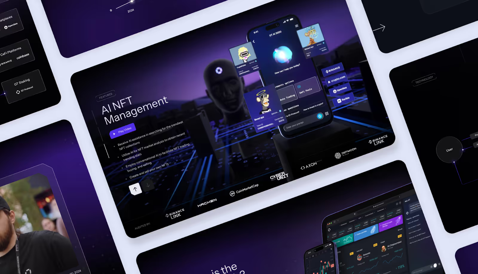
Design takeaways:
- Conversational AI helps lower entry barriers and build user trust.
- Dark, futuristic visuals promote validation of innovation, while readable UIs ensure accessibility.
- Consistent use of design language helps encourage confidence in a high-risk industry.
- Responsive layouts and professional web development help ensure product readiness for scale.
Zapier AI
Zapier AI enables teams to automate workflows across apps by layering an AI experience that suggests steps, builds automations, and keeps the process running without manual setup.
What stands out:
The design simplifies the complex concept of multi-step automation, making it feel as straightforward as a visual map. The Copilot assistant embeds itself right into the interface, which is a step-by-step process that reduces friction to building sophisticated workflows.
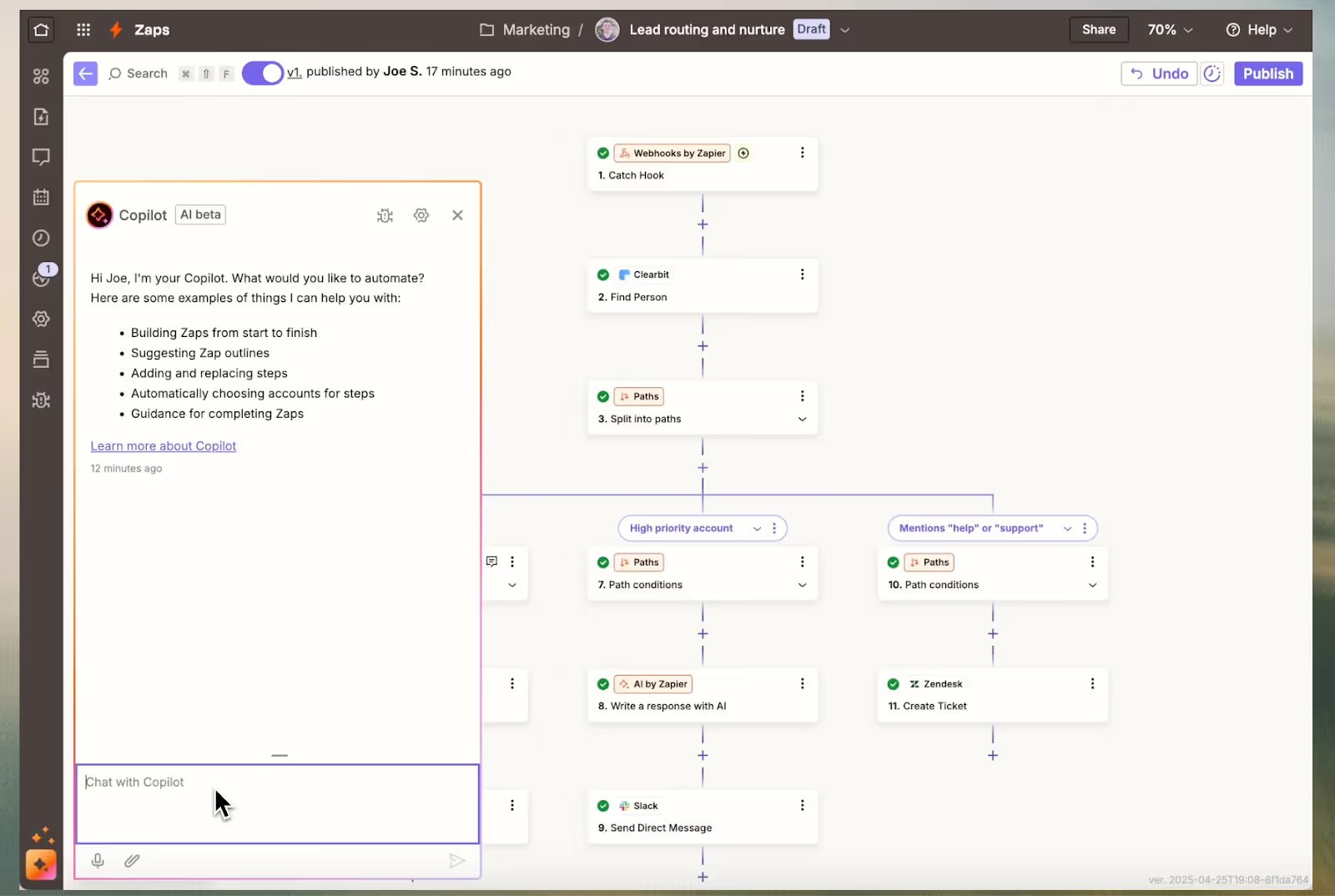
Design takeaways:
- Visual flow editor makes complex automations clear at first glance.
- AI Copilot panel suggests actions, lays out steps, and replaces manual setup.
- Inline editing keeps the user focused on a single screen vs jumping between menus.
- Flexible layout allows for simple two-step flows as well as enterprise-level automation.
Make
Make is a visual automation tool that enables users to build robust no-code workflows.
What stands out:
Make changes automation into a visual path. The modules and conditional branches with real-time feedback make the system feel easy to navigate.
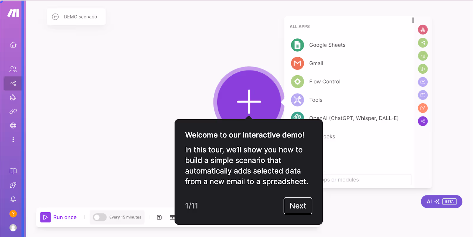
Design takeaways:
- Visual blocks allow for easy stacking and connecting of workflows.
- A clean structure makes dashboards and panels clear.
- AI manages logic, branching, and scale.
- Live feedback allows for error flagging.
n8n
n8n is an open-source automation platform that allows teams to connect apps, create workflows, and build custom logic to extend functionality.
What stands out:
The combination of drag-and-drop clarity with the depths of coding is what makes it unique. The platform looks like a visual playground for automation, but underneath the surface, advanced integrations make it valuable for no-code users and developers alike.
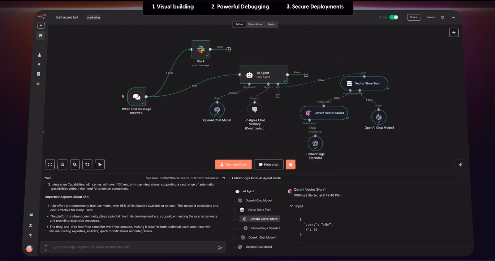
Design takeaways:
- The node-based builder enables users to create complex flows that are easy to follow.
- The dark theme keeps users visually on track.
- Inline testing shows errors in real-time.
- Expandable nodes give users the opportunity to use the tool from beginner to professional levels.
- Open-source design creates trust and easy adoption.
AI Productivity Tools
The following AI productivity tools highlight how design can enable users to work more efficiently, focus better, and accomplish more with less effort.
SageExpress
SageExpress is an AI-powered data discovery tool that helps users surface patterns and insights in large datasets. Our team defined the UI/UX for both web and mobile, created the brand identity, and even developed a design system to ensure a cohesive visual application. We made a product that encourages exploration and leads users seamlessly through a complex dataset.
What stands out:
Design makes data seem less intimidating and more inviting. Simple and interactive charts, and a consistent visual language, give users permission to explore and find insights rather than just look at numbers.
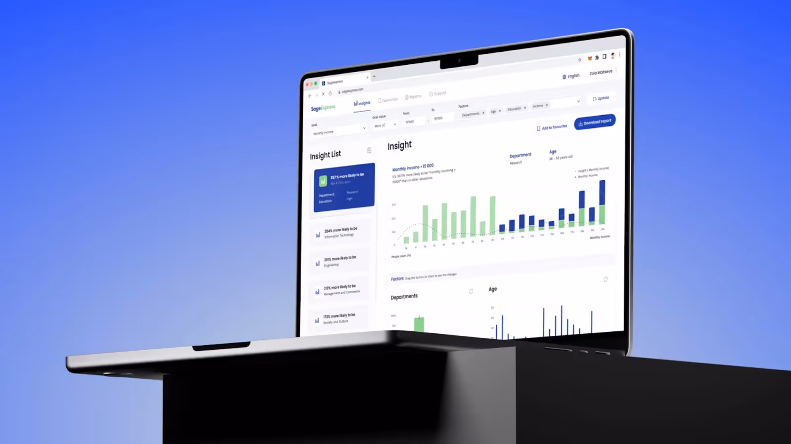
Design takeaways:
- Readable, well-designed visualizations enable users to spot trends at a glance and with ease.
- Consistent visual language (tone and style guide + design) builds trust and creates a seamless experience across screens.
- Data is available on both desktop and mobile, allowing users to analyze it anytime and anywhere.
- QR login and smart onboarding reduce the friction for new users.
Grammarly
Grammarly is an AI-aided writing assistant and one of the best examples of digital design that enables users to refine clarity, tone, and correctness in real-time.
What stands out:
The design is distraction-free and intentional, with a clear focus. Clean layouts, understated highlights, and contextual side panels make corrections feel organic rather than overbearing.
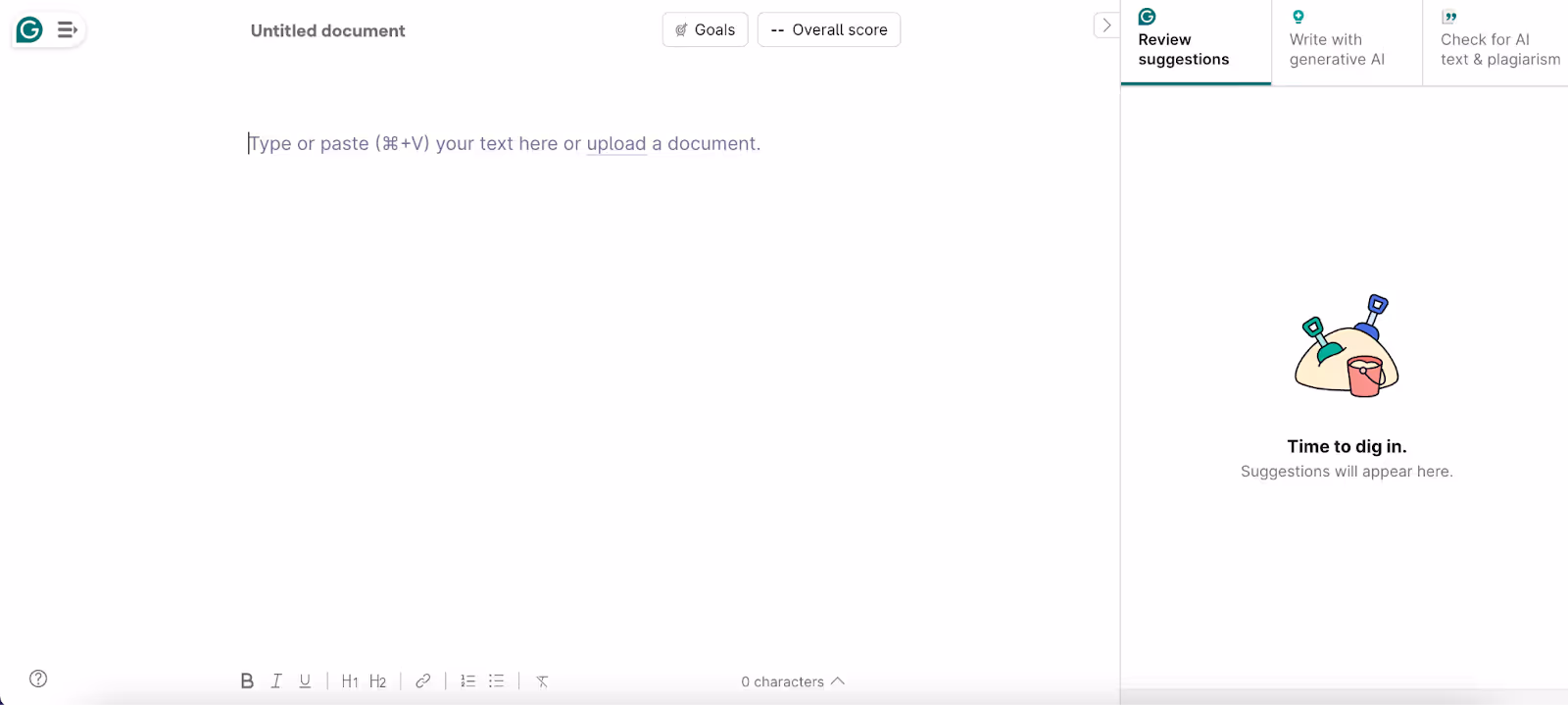
Design takeaways:
- Minimal writing canvas directs user focus to content, not tools.
- The contextual suggestions panel can provide corrections and insights without displacing focus.
- Soft color coding makes clear feedback.
- Design is consistent across web, desktop, and plugins, linking up relevance and seamless multi-platform experience.
Adobe Acrobat Studio
Adobe Acrobat Studio is an AI-enabled workspace for managing documents, PDFs, and creative assets.
What stands out:
The design combines Adobe's Creative DNA with productivity-first layouts. A bright dashboard shows the most common actions + suggested AI tools lead users immediately to what matters.
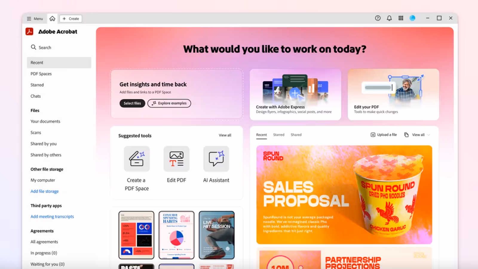
Design takeaways:
- Dashboard-centric design highlights core actions upfront (“Edit,” “Create,” “AI Assistant”).
- Contextual tools take less time searching through menus.
- AI-powered tools streamline complex editing, like text recognition and intelligent formatting.
NotebookLM
NotebookLM is Google's AI research assistant, helping users curate, organize, and analyze research from multiple sources in a single format.
What stands out:
The interface consists of three distinct panels - Sources, Chat, and Studio. This layout makes it easy to upload materials, ask questions, and create summaries, audio previews, or visual mind maps immediately.
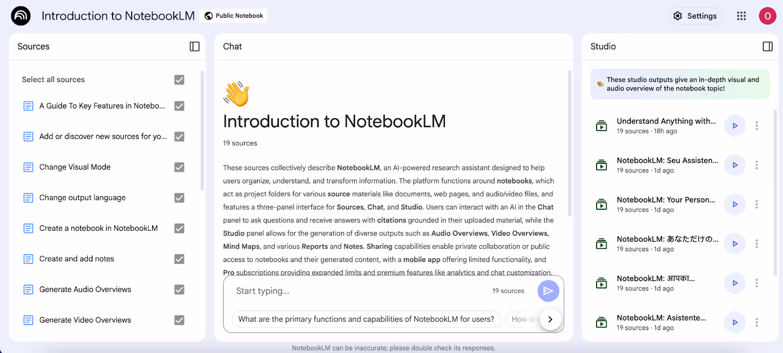
Design takeaways:
- A three-panel layout helps to organize research and reduces cognitive load and context switching.
- The AI chat panel provides AI-powered responses that can be traced back to uploaded and annotated sources.
- Studio View turns your research density into mind maps, reports, audio, or video overviews.
- A good, minimal, light design draws attention to the content rather than the tool.
Otter AI
Otter AI is a transcription and meeting assistant that records conversations into real-time, searchable transcripts and summaries.
What stands out:
The interface combines chat transcript and structured meeting summary views. This double view enables the user to follow the flow of a live meeting while later capturing the essential action points.
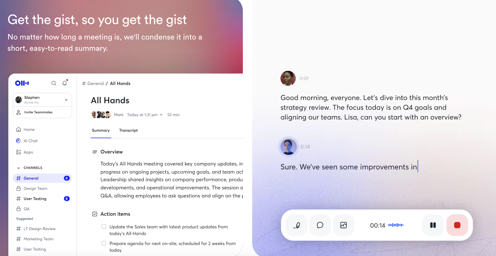
Design takeaways:
- The dual pane layout combines live transcription with structured meeting notes.
- The chat-like transcript format makes long text easy to scan.
- Soft gradients and light visuals allow a heavy task to feel approachable.
- Collaborating with channels and teams makes it easy to return to the context quickly.
ClickUp
ClickUp is a universal productivity tool designed to help teams manage their tasks, projects, and workflows in a single application, with flexible views and AI assistance.
What stands out:
There's a focus on flexibility in the design: users can customize their dashboards, scheduling tool, and reporting structures to their teams' workflows. The clean layout and modular design make the complexity of project management feel achievable.
Design takeaways:
- Custom layouts enable teams to create dashboards, lists, and timelines tailored to their specific needs.
- AI integration reduces repetitive tasks and can improve decision-making.
- The uncluttered and functional design makes it easy to navigate large amounts of data.
- Hierarchy and labeling reduce clutter, enabling users to find the proper context quickly.
Notion
Notion is a customizable workspace that combines documents, databases, wikis, and AI capabilities into one platform for teams and individuals.
What stands out:
Notion's modular interface allows users to build anything from simple notes to complex project dashboards.

Design takeaways:
- A minimalist UI helps keep even complex workspaces accessible and distraction-free.
- Block-based architecture makes any page customizable, from quick notes to entire product road maps.
- Built-in AI assistant converts notes and docs into actionable information.
- Clean collaboration tools for teams consolidate knowledge and projects in one place.
Cursor
Cursor is a powerful AI-powered code editor designed for developers seeking to accelerate writing, refactoring, and debugging code.
What stands out:
Cursor is more than a text editor with autocomplete. It understands complete codebases, suggests changes directly in context, and learns from every developer's workflow. The side panel with conversational AI turns specific complicated edits into what feels like a conversation with a coding collaborator.
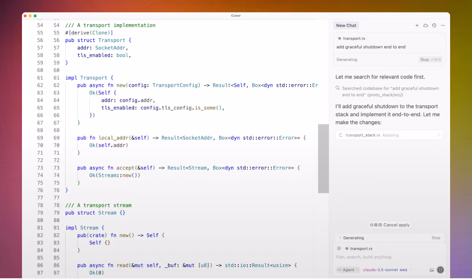
Design takeaways:
- Includes a full-featured chat panel for AI/ML-assisted editing right in the code flow.
- AI/ML provides context to reduce redundancy and increase the flow and speed of development.
- Simple syntax highlighting and a structured layout for easy scanning of the interface.
- Cleaner, developer-first design delivers powerful AI features within the simplicity of a familiar IDE.
AI Design & Creative Tools
Design and creative tools have a significant influence over the production process and how ideas are materialized. The good ones, inspired by product design examples ideas, feel intuitive, ignite creativity, and remove friction.
Adobe Express
Adobe Express is a lightweight yet powerful creative platform that brings Adobe’s design capabilities to a broader audience through simplicity and AI assistance.
What stands out:
Adobe Express integrates several AI-powered tools that streamline everyday creative work. Its AI presentation maker transforms simple text prompts into polished slide layouts, the AI text-to-image engine turns ideas into custom visuals in seconds, and its intelligent design suggestions automatically refine color, layout, and typography to keep every asset consistent and professional.
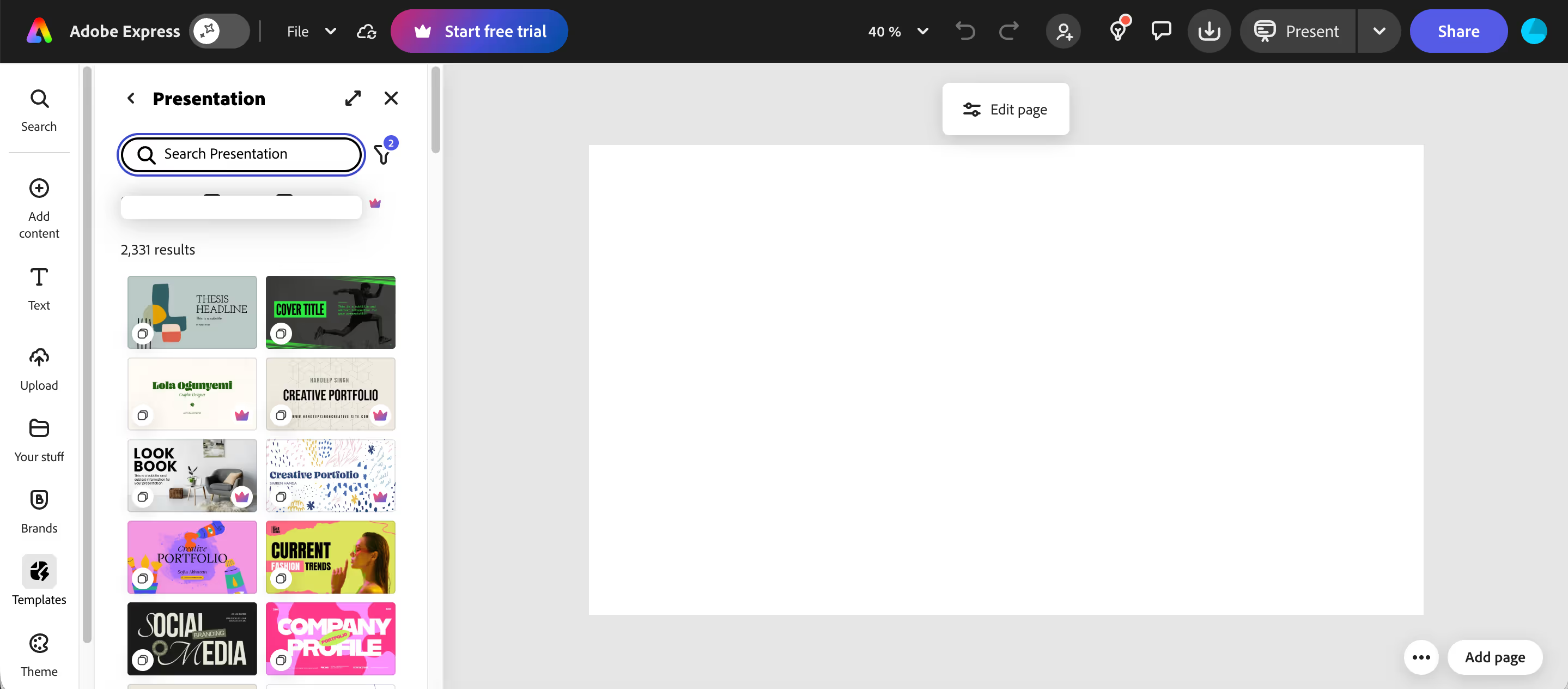
Design takeaways:
- AI-assisted templates help users move from concept to polished designs quickly.
- A guided interface makes it easy for beginners while still offering flexibility for advanced users.
- Smart layout recommendations ensure visual balance without requiring design knowledge.
- A clear, modular workspace keeps essential tools visible and minimizes cognitive load.
Canva
Canva is a design tool that powers fast and effortless creation of visuals, with new AI features and thousands of templates ready to go.
What stands out:
Canva's design stands out because of easy layouts, playful colors, and easy-to-scan categories. The interface meets the need for freedom while also creating structure, enabling users to explore their creative ideas and helping them stay simple and organized in their workflows.
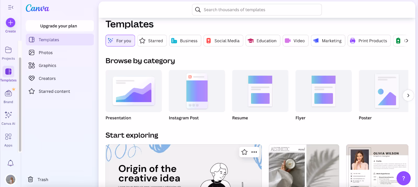
Design takeaways:
- The clean, grid layout helps keep the navigation stress-free.
- There are AI suggestions to generate ideas in a flash.
- Easy-to-read icons and colors make using the tools easier.
- Instant previews minimize edits and rework.
- Templates satisfy the need for speed and creativity.
Adobe Firefly
Adobe Firefly is Adobe's generative AI platform that generates images, video, audio, and vector graphics from text prompts.
What stands out:
A prompt-focused canvas with clear categories keeps the flow easy. Soft gradients, generous white space, and the large “Generate” CTA showcase outputs.
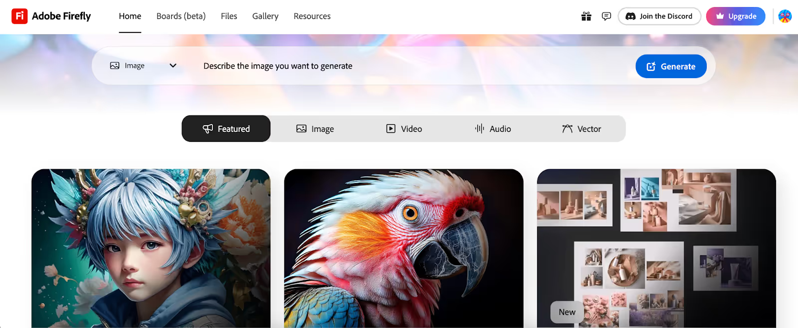
Design takeaways:
- Centered prompt bar minimizing initial friction and pointing to the first action.
- Mode Tabs (image, video, audio, vector) ease cognitive load.
- Large latent gallery-like previews allow for scanning and reviewing outputs.
- Subtle use of gradients and space keeps attention on the output.
Uizard
Uizard is an AI design tool that allows teams to create interactive prototypes using sketches, wireframes, and ideas in minutes.
What stands out:
Features like sticky notes, instant style suggestions, and one-click code export allow designers, developers, and product managers to work together seamlessly.
Design takeaways:
- A drag-and-drop builder lowers the entry barrier for non-designers.
- Real-time collaborative tools keep product managers, designers, and developers in lock step.
- Auto-suggested styles and components help speed iteration without overwhelming users.
Moonchild.ai
Moonchild AI is a design platform that rethinks how teams prototype, edit, and test ideas with the help of AI, while utilizing an expressive and visual narrative.
What stands out:
The system design accommodates linear workflows, allowing design, editing, and prototyping to occur simultaneously.
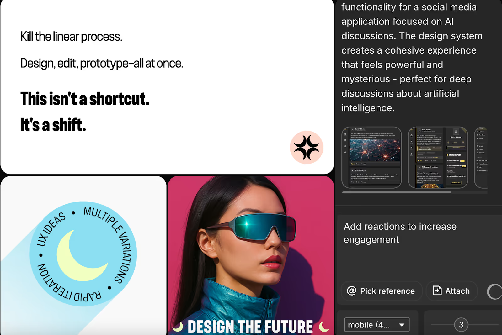
Design takeaways:
- The non-linear nature of the process promotes faster iteration and experimentation.
- The visual identity itself embodies design as a form of movement, not solely function.
- A playful but edgy brand appeals to innovative teams and creators.
Runway
Runway ML is a suite of AI-powered creative tools that enables designers, filmmakers, and creators to leverage video and image generation processes.
What Stands Out:
The platform expertly combines dark, modern aesthetics with intuitive session-oriented workflows. Its organization of assets as private, shared, and favorited gives professionals the structure they need without losing flexibility.
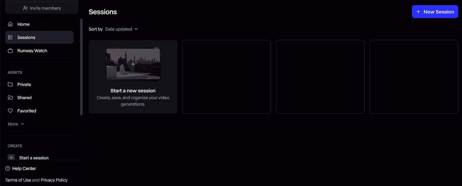
Design Takeaways:
- Session-based navigation creates simple management and returns across projects.
- Clean layouts minimize friction and encourage users to start or continue work.
- Clear separation of assets (private, shared, and favorited) supports collaboration without cluttering.
Lummi AI
Lummi is a visual AI creation platform that allows users to create photos, illustrations, and 3D renders in seconds.
What Stands Out:
The interface elevates creativity with streamlined, image-first design, as style, format, and shot type are a click away.
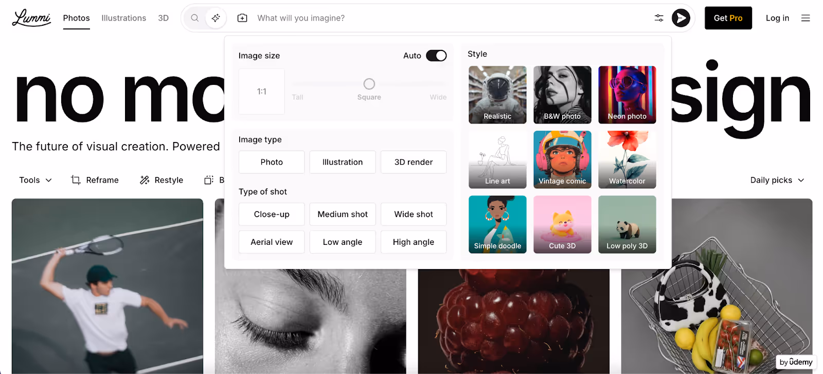
Design Takeaways:
- The clear card style gives users an easy-to-scan overview of their style and format choices.
- The strong visual previews take away the guesswork and encourage rapid exploration of the content.
- The white space helps to keep the overall UI light while providing focus on the generated results.
Soundraw.io
Soundraw is an AI music generator that allows creators to compose tracks by selecting genres, moods, and themes.
What Stands Out:
The interface is like a music studio reduced to the essentials—clean dark mode, bold genre tags, and waveform previews help users explore sounds with few distractions.
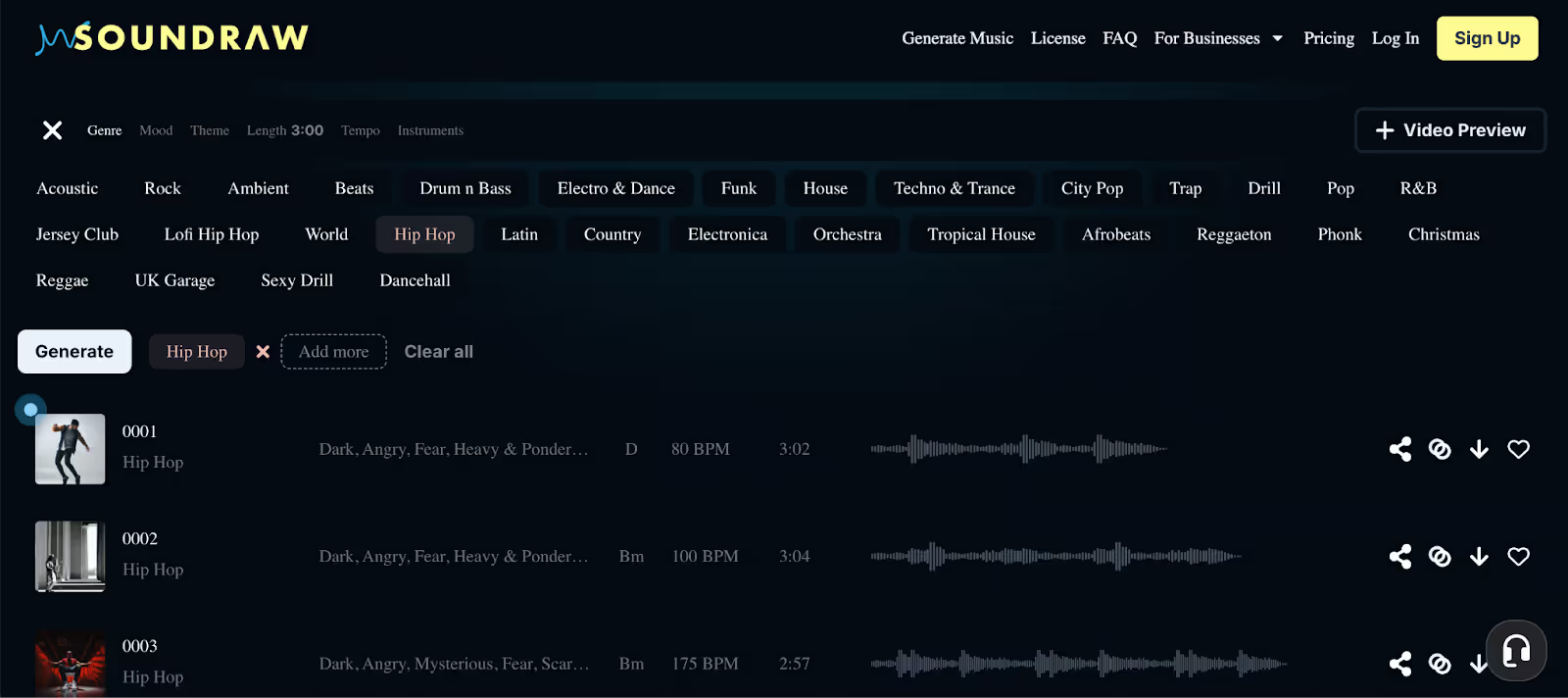
Design Takeaways:
- Tag-based navigation allows users to blend genre, mood, and tempo in seconds.
- Waveform previews and playback controls create immediate feedback loops.
- Minimalist layout removes barriers for non-musicians and is still helpful for pros.
Ideacue10X
XLSCOUT's Ideacue10X is an AI-driven ideation tool that assists innovators in rapidly creating, refining, and validating patentable ideas.
What Stands Out:
Advanced filters, such as keywords, assignees, and date ranges, make the workflow more detailed with a seamless and uncluttered app interface.
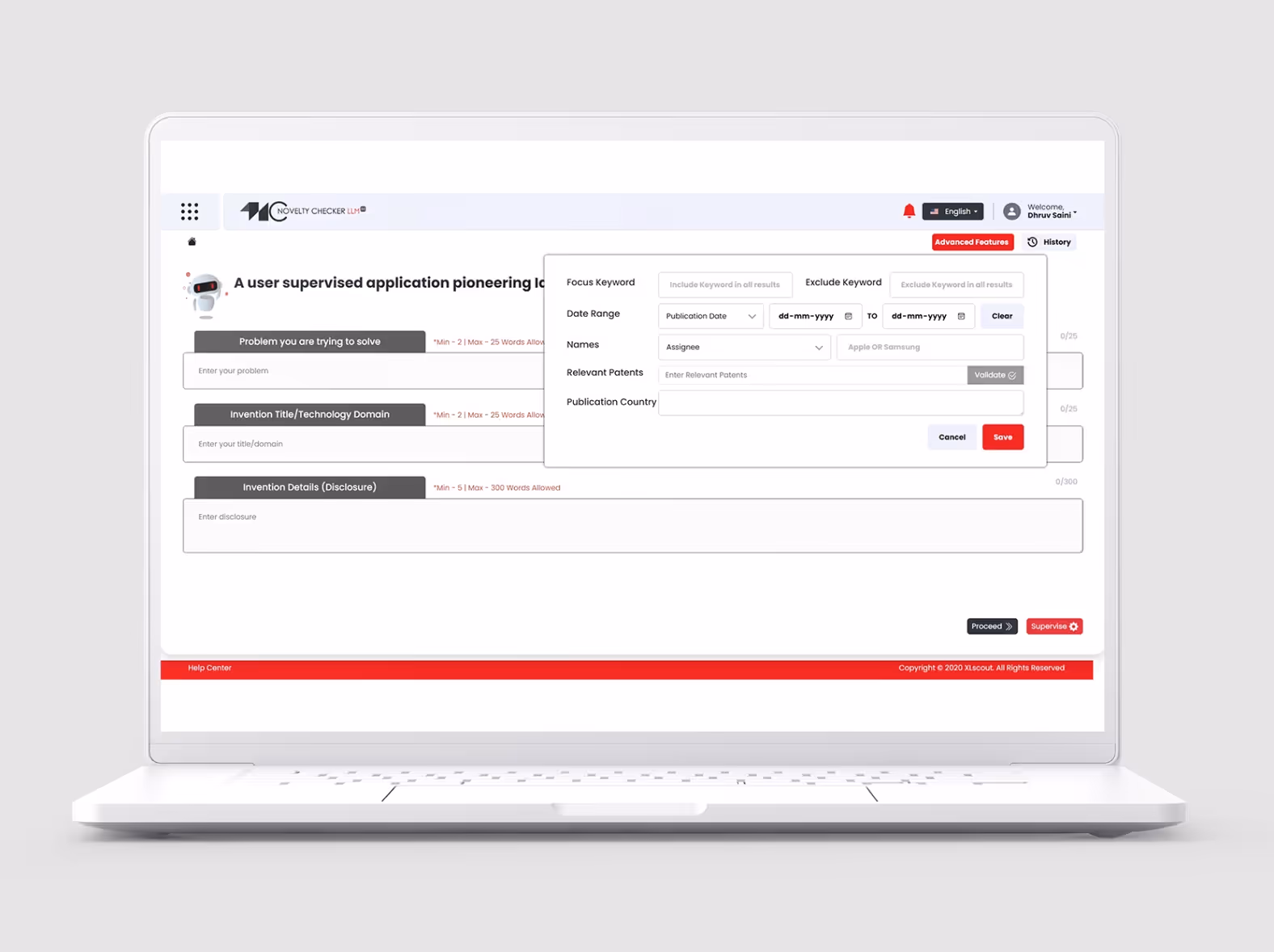
Design Takeaways:
- A step-by-step structure guides users from the problem statement to disclosure, minimizing cognitive load.
- Sophisticated filters are housed in pop-ups to keep the primary screen free of excessive content.
- Very few colors are used to focus users on the input fields and validation tools.
Luma AI
Luma AI is a creative platform that can produce realistic 3D graphics and video scenes from text or images.
What Stands Out:
It's a great example of product design where the interface takes everything away, leaving you with a dark canvas that emphasizes prompts and outputs. Filters, references, and adjustment options can be accessed in the background without cluttering the experience itself.
Design Takeaways:
- The simplistic dark UI helps to focus on the content that is created.
- The prompt-first design makes the workflow feel smooth and direct.
- The preview and edit impressions in real-time cut down on trial-and-error.
Figma AI
Figma AI seamlessly integrates generative design tools directly into the Figma workspace.
What Stands Out:
Figma AI will introduce artificial intelligence actions into the familiar workspace, such as image generation, asset finding, and auto-interactions, without presenting an entirely new interface.
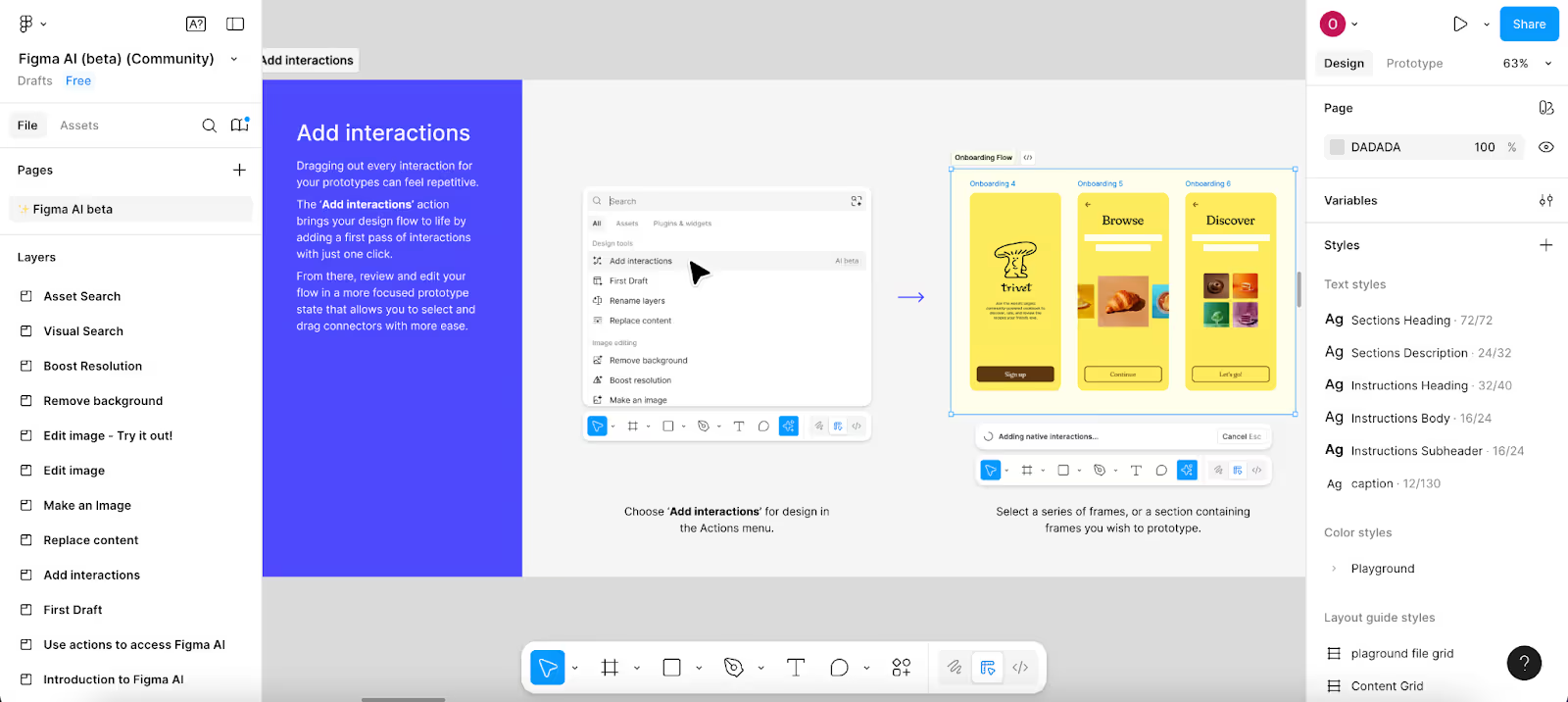
Design Takeaways:
- AI tools are integrated into the regular Figma menus, making the experience natural and efficient.
- Intelligent tools, such as auto-interactions and visual search, reduce repetitive work.
- Clean integration means designers don't lose their immediate flow because of a tool switch.
Wix AI Website Builder
Wix AI is a website builder that creates full site layouts, themes, and content based on conversational prompts.
What Stands Out:
Instead of manually dragging blocks in place, users describe their goal and the AI does the rest - creating a fully designed output that they can go live with.
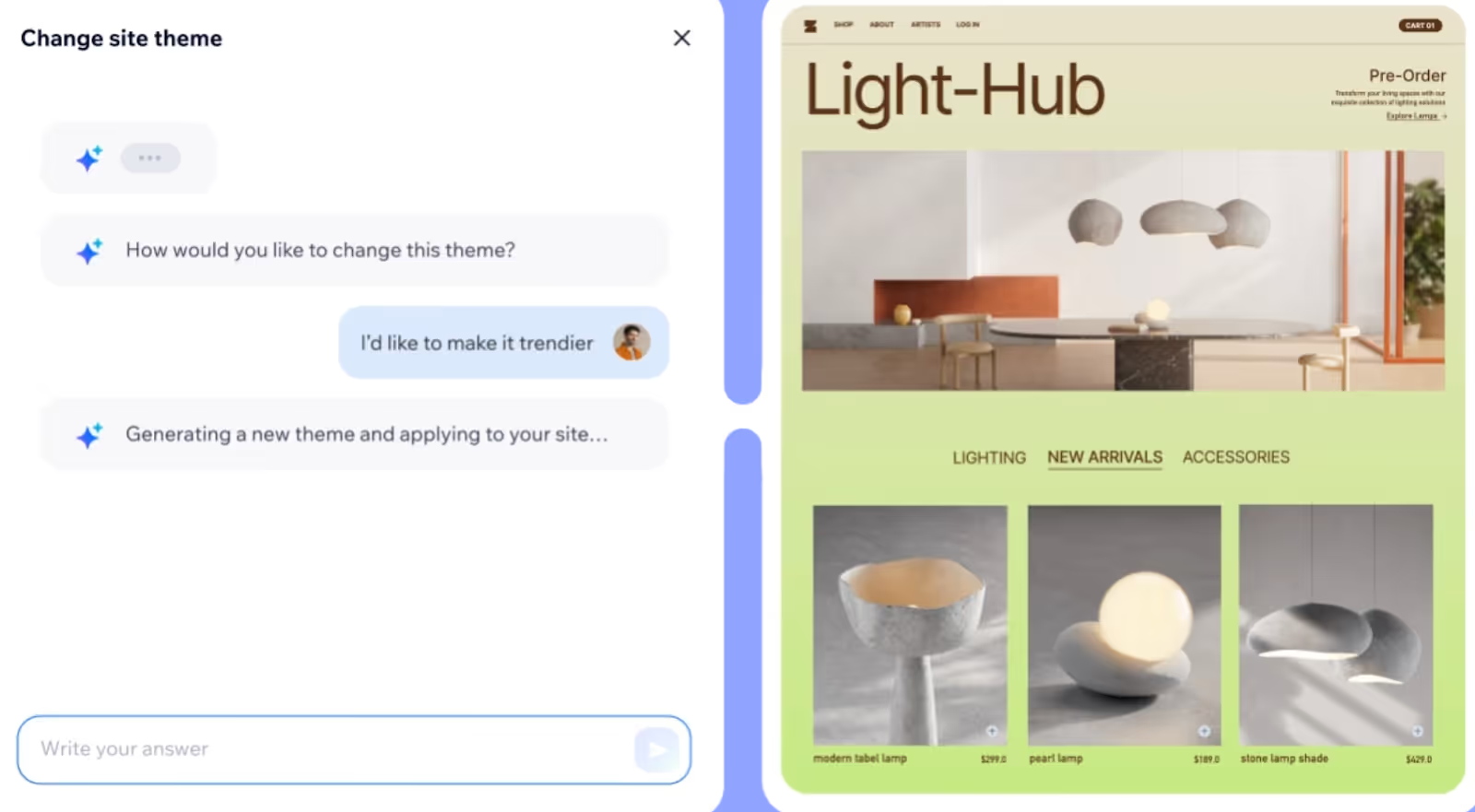
Design Takeaways:
- Conversational UI makes it feel more like chatting than building.
- AI-generated templates immediately adapt to user intent (style, tone, branding).
- Preview revisions are updated in real-time, offering immediate feedback.
- Balances automation with manual tweaks, allowing users to still customize freely.
Kaiber AI
Kaiber AI is one of the best software product design examples that allows users to create videos, images, and audio.
What Stands Out:
The entire platform is playful and easy to use with a mascot-style assistant, and offers clear entry points for image, video, and audio creation.
Design Takeaways:
- A centralized mascot is a dynamic guide that removes a learning barrier to new users.
- The bright circular icons depict a variety of creation modes without visual distraction.
- The simplified canvas design still engages users in the generative aspect.
Fronty
Fronty is an AI-powered platform that turns your design mockups or image files into clean, production-ready HTML and CSS code.
What Stands Out:
Fronty converts static images into code, making the transition from design to development seamless to the user.
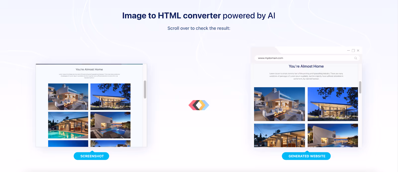
Design Takeaways:
- Upload-to-code flow offers a user-friendly, intuitive experience.
- A clean layout conveys the transformation before/after.
- The integrated editor combines design changes with live code preview.
D-ID
D-ID is an AI service that creates talking avatars using text or audio.
What Stands Out:
Design for clarity and concentration - the user interface is clean, with side panels for inputs and a real-time video preview, so users stay focused on the avatar they just created, rather than the tool itself.
Design Takeaways:
- With a split-screen layout, settings and live preview are balanced, minimizing friction while editing.
- The limited use of color highlights the primary actions of upload, play, or regenerate.
- The realistic presentation of the avatar keeps the use case as the focus and aligns with the product promise.
Khroma
Khroma is an AI-driven color tool that creates palettes and combinations tailored to your preferences, helping designers achieve the desired visual mood more quickly.
What Stands Out:
It has a clean user interface in a card layout, but lets color be the star of the show while keeping navigation minimalistic and functional.
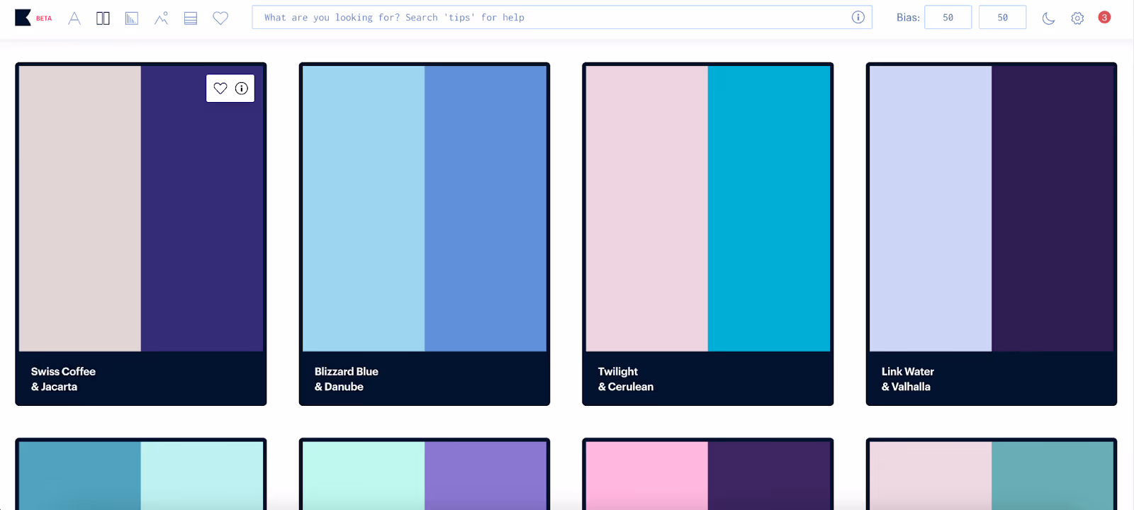
Design Takeaways:
- Full-screen palette previews put color front and center in the experience.
- Card format lets you compare multiple combinations effortlessly.
- Few fonts and a dark border give palettes a gallery vibe.
- AI personalization feels built-in instead of bolted-on, making the flow seamless.
Which genius designs often go unnoticed because their excellence feels seamless?
The best designs are often completely overlooked because they seem so natural. You don't even think about them - you simply use them.
- Take Netflix's Skip Intro button. A tiny touch that saves hours of our lives and makes binge-watching seamless. Nobody asked for it explicitly, but everyone wanted it.
- Or your phone that auto-fills verification codes from a text message. No copying and pasting, no going back and forth between apps — it appears right when you need it. Pure magic? Nope, just great design.
- And the mother test: if your mom can open a site and start using it without a single question, you know the designers did their jobs.
Sometimes it's these little touches that make the whole product feel simple, friendly, and effortless for anyone.
.avif)
How can Arounda help with your digital product design?
At Arounda, we have 9+ years of experience turning ideas into scalable products. With over 250 projects completed, we know how to make AI products functional, approachable, and ready for market adoption.
Building an AI product is never about just the technology alone. It needs to feel simple, create trust, and convert users into loyal paying customers. That's precisely what our UI/UX design service delivers.
Our expertise allows us to deliver products that:
- Cut time-to-market and increase ROI.
- Engage users and reduce churn.
- Establish credibility through a transparent and scalable design.
- Demystify complex AI technology into something everyone can enjoy!
Wrapping Up
Throughout these 40 best product design examples, we've seen how great visuals and smooth flows can make AI tools clear and simple to use. The key takeaway is that good craft turns complex technology into something accessible, enjoyable, and seamlessly built into a user's daily routine.
Take inspiration from these examples, and contact us if you are ready to start developing your own AI idea into a product that your users can't live without.


Table of contents


FAQ
Take note of elements such as typography, colors, design, and flow. Understand what works and take a cue to use the same ideas in your projects.
Select a product design sample from your own niche or with a similar audience. You'll get more usable inspiration.
Clarity, efficiency, simplicity, hierarchy, detail. Users should be able to understand it in seconds.
Minimalism, responsiveness, bold type, AI functionality, and personalization - all these trends are crucial for speed and simplicity.


89+ Reviews
on Clutch

Top Rated Plus Agency
on Upwork

Top 50 Trending team
on Dribbble

Projects are Featured on Behance platform
